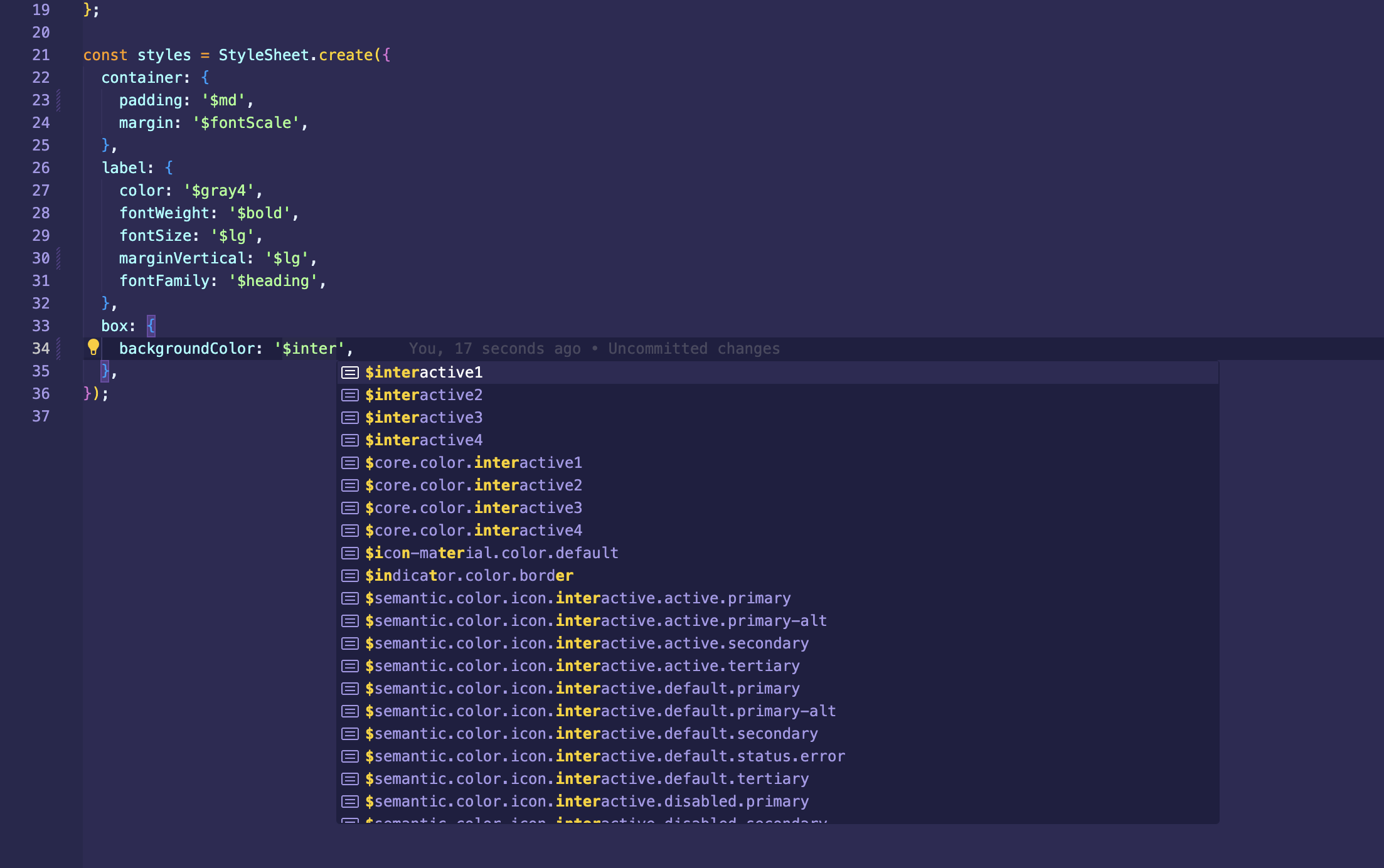
import { StyleSheet } from '@uhg-abyss/mobile';The StyleSheet module is a utility for defining and organizing styles in an application. It provides a way
to create an abstraction over native styles, ensuring performance optimization and consistency across different platforms.
Key Features
-
Platform Consistency: By using
StyleSheet, you can define styles that work across both iOS and Android, ensuring a uniform look and feel for your application.
-
Performance Optimization: `StyleSheet optimizes style calculations which can significantly improve the rendering performance of your app. It ensures that styles are calculated once then applied efficiently.
-
Readability and Maintainability: Using
StyleSheet.create, you can separate style definitions from your component logic, making your code more readable and easier to maintain.
Abyss StyleSheet vs. React Native StyleSheet
The Abyss StyleSheet extends the React Native StyleSheet API, so it can be used as a direct replacement and adds additional features. The additional functionality works in conjunction with the useStyleSheet hook.
Token Typescript Support
StyleSheet extends the normal TypeScript declarations by allowing additional values to be placed in as values, such as
tokens, pixels and rem values.

Media Query
Media queries allows to have different styles for different screens, platform, direction and orientation.
They are supported as properties with @media prefix.
- width:
<length> - height:
<length> - min-width:
<length> - min-height:
<length> - max-width:
<length> - max-height:
<length> - direction: (
ltr|rtl) - platform: (
ios|web|android) - orientation: (
landscape|portrait) - aspect-ratio:
<ratio>
Resize browser window to see changes on the box.
const themedStyles = StyleSheet.create({
  label: {
    fontWeight: '$core.font-weight.bold',
    textAlign: 'center',
    '@media (min-width: 800) and (max-width: 1100)': {
      color: '$semantic.color.text.label.status.info',
    },
    '@media (orientation: portrait)': {
      paddingHorizontal: 16,
    },
    '@media (orientation: landscape)': {
      paddingHorizontal: 44,
    },
    '@media (min-width: 900px)': {
      color: '$semantic.color.text.body.alt',
    },
  },
  box: {
    width: 250,
    height: 200,
    justifyContent: 'center',
    backgroundColor: '$semantic.color.surface.container.tertiary',
    '@media web': {
      borderRadius: 8,
    },
    '@media (max-width: 700px)': {
      width: 150,
      backgroundColor: '$semantic.color.surface.container.status.error.tint',
    },
    '@media (min-width: 900px)': {
      width: 350,
      backgroundColor:
        '$semantic.color.surface.container.status.success.saturated',
    },
  },
});

render(() => {
  const styles = useStyleSheet(themedStyles);
  return (
    <View style={styles.box}>
      <Text style={styles.label}>
        Resize browser window to see changes on the box.
      </Text>
    </View>
  );
});
Pixel and Rem Support
Similar to CSS3 rem unit it allows to define any integer value as relative to the root element. In our case the root value
is set to 16. It makes it easy to scale app depending on screen size and other conditions.
StyleSheet also accepts string pixel values (e.g. '16px'), which typically isn't available in React Native.
Operations
Any value can contain one of following math operations: * , /, +, -. Operands can be numbers, tokens, pixels or rems.
There must be a space between operands and operations.
Methods
create()
static create(styles: Object): Object;Creates a StyleSheet style reference from the given object.
createThemed()
static createThemed(theme: Theme, styles: Object): Object;If you have direct access to a theme and do not want to use the useStyleSheet hook,
you can add the theme directly as a parameter to the createThemed function and use token
values in the StyleSheet. If your theme has token overrides, those can be used as well.
compose()
static compose(style1: Object, style2: Object): Object | Object[];Combines two styles such that style2 will override any styles in style1.
If either style is falsy, the other one is returned without allocating an array,
saving allocations and maintaining reference equality for PureComponent checks.
flatten()
static flatten(style: Object[]): Object;Flattens an array of style objects, into one aggregated style object.
setStyleAttributePreprocessor()
static setStyleAttributePreprocessor( property: string, process: (propValue: any) => any,);Sets a function to use to pre-process a style property value. This is used internally to process color and transform values. You should not use this unless you really know what you are doing and have exhausted other options.
Properties
absoluteFill
A very common pattern is to create overlays with position absolute and zero positioning
(position: 'absolute', left: 0, right: 0, top: 0, bottom: 0), so absoluteFill can be
used for convenience and to reduce duplication of these repeated styles. If you want, absoluteFill
can be used to create a customized entry in a StyleSheet.
absoluteFillObject
Sometimes you may want absoluteFill but with a couple tweaks - absoluteFillObject can be used to create a customized entry in a StyleSheet.
hairlineWidth
This is defined as the width of a thin line on the platform. It can be used as the thickness of a border or division between two elements
Usage with Abyss component
All Abyss components are able to parse objects from the StyleSheet directly, so there is no need to
use the useStylesheet hook if the styles are only going into Abyss components.