`:**
The table uses a visually hidden caption to ensure screen reader accessibility.
- **Description (`description` prop, optional):**
Provides additional information after the heading in a paragraph (``).
- If `hideHeader` is set, the description is also visually hidden, making it useful for describing complex implementations to screen reader users (who will still hear this information).
```jsx
```
## Subcomponents
`DataTable` is broken into multiple sub-components that can be used to customize the layout above and below the table.
All sub-components must be nested within the `DataTable` component.
```jsx
```
- `DataTable.DownloadDropdown`
- `DataTable.Table`
- `DataTable.GlobalFilter`
- `DataTable.TableSettingsDropdown`
- `DataTable.Pagination`
- `DataTable.BulkActionsDropdown`
- `DataTable.SlotWrapper`
## Layout organization
Teams have complete control over what is placed below and above the `DataTable.Table`.
To help with spacing between elements, teams can use the `DataTable.SlotWrapper` subcomponent. This is a styled flexbox `` with some built-in spacing. Using it is not required; it is simply a convenience.
```tsx
{/* ... */}
{/* ... */}
{/* ... */}
{/* ... */}
{/* ... */}
```
Use the `css` prop to add additional styling to the `DataTable.SlotWrapper` component:
```tsx
{/* ... */}
```
Teams looking for design guidance should use the default Figma link inside the Abyss Design Library.
```jsx live-in-view
() => {
const { data } = dataTableUtils.useDocMockData(25, 4);
const [hideHeader, setHideHeader] = useState(false);
const columns = React.useMemo(
() => [
{
header: 'Column 1',
accessorKey: 'col1',
footer: 'Footer 1',
},
{
header: 'Column 2',
accessorKey: 'col2',
footer: 'Footer 2',
},
{
header: 'Column 3',
accessorKey: 'col3',
footer: 'Footer 3',
},
{
header: 'Column 4',
accessorKey: 'col4',
footer: 'Footer 4',
},
],
[]
);
const dataTableProps = useDataTable({
initialData: data,
initialColumns: columns,
paginationConfig: {
enablePagination: true,
},
});
return (
);
};
```
## useDataTable hook
The `useDataTable` hook serves as the foundation for the `DataTable` component, centralizing table state management and providing a comprehensive API for controlling table behavior.
Please refer to the [Integration tab](/web/data-table/overview/?tab=integration) for a list of props that can be provided to the `useDataTable` hook. Below is an example of the hook's return value.
```jsx render
() => {
const { data } = dataTableUtils.useDocMockData(5, 4);
const { data: newData } = dataTableUtils.useDocMockData(10, 4, true);
const columns = React.useMemo(
() => [
{
header: 'Column 1',
accessorKey: 'col1',
},
{
header: 'Column 2',
accessorKey: 'col2',
},
{
header: 'Column 3',
accessorKey: 'col3',
},
{
header: 'Column 4',
accessorKey: 'col4',
},
],
[]
);
const dataTableProps = useDataTable({
initialData: data,
initialColumns: columns,
});
return (
          useDataTable return:
          {Object.keys(dataTableProps)
            .sort() // Sort keys alphabetically
            .map((key) => (

                {key}:{' '}
                {JSON.stringify(dataTableProps[key], null, 2)}

            ))}
);
};
```
## Best practices
Before beginning development, please do the following:
**Ensure your design is aligned with the Abyss Design System.** This helps ensure consistency and usability across all components and prevents you, the developer, from having to recreate the wheel.
**Spend some time familiarizing yourself with `DataTable` documentation.** This will help you understand the capabilities and foundations of the component. There are many examples and use cases to help you get started.
**Test out features and functionality.** All examples are live and can be modified to see how the component behaves; this is a great way to learn how the component works and what features are available.
The data table headers accurately describe the data contained in the rows and columns.
If the data table has labels, they should be clear and concise.
Resources
W3C WAI-ARIA Authoring Practices Table Design Pattern covers the usage of ARIA names, state and roles, as well as the expected keyboard interactions.
W3C Tutorial - Table Concepts covers the usage of various tables, headers, and captions.
IBM Accessibility Requirements:
- 1.3.1 Info and Relationships (WCAG Success Criteria 1.3.1)
- 1.3.2 Meaningful Sequence (WCAG Success Criteria 1.3.2)
- 2.1.1 Keyboard (WCAG Success Criteria 2.1.1)
- 2.4.3 Focus Order (WCAG Success Criteria 2.4.3)
- 2.4.6 Headings and Labels (WCAG Success Criteria 2.4.6)
- 2.4.7 Focus Visible (WCAG Success Criteria 2.4.7)
- 4.1.2 Name, Role, Value (WCAG Success Criteria 4.1.2)
```jsx live-in-view
() => {
const doc = AdditionalLibs.pdfCreater();
const [sorting, setSorting] = useState([]);
const [resizeMode, setResizeMode] = useState('onChange');
const [columnVisibility, setColumnVisibility] = React.useState({
col1: true,
col2: true,
col3: true,
col4: true,
col5: true,
col6: true,
});
const [highlightedRows, setHighlightedRows] = React.useState([
{ rowId: '00', color: '#eedef2' },
{ rowId: '01', color: '#eedef2' },
{ rowId: '02', color: '#eedef2' },
{ rowId: '08', color: '#eedef2' },
{ rowId: '09', color: '#eedef2' },
{ rowId: '11', color: '#eedef2' },
{ rowId: '12', color: '#eedef2' },
{ rowId: '13', color: '#eedef2' },
{ rowId: '14', color: '#eedef2' },
{ rowId: '15', color: '#eedef2' },
{ rowId: '16', color: '#eedef2' },
{ rowId: '17', color: '#eedef2' },
]);
const toggleColumnVisibility = (columnKey) => {
setColumnVisibility((prevVisibility) => ({
...prevVisibility,
[columnKey]: !prevVisibility[columnKey],
}));
};
const individualActions = [
{
onClick: ({ deleteRow, row }) => {
deleteRow(row);
console.log('Deleted row: ', row);
},
icon: ,
label: 'Delete Row',
isSeparated: true,
},
{
onClick: ({ modifyRow, row }) => {
modifyRow(row, { col4: 'Modified Cell' });
},
checkDisabled: (row) => {
const value = row.getValue('col4');
return value === 'Completed';
},
label: (row) => {
const value = row.getValue('col4');
return value === 'Completed'
? `Can't modify (${value}) cell`
: `Modify column 4 cell (${value})`;
},
icon: (row) => {
const value = row.getValue('col4');
return ;
},
},
{
onClick: ({ modifyRow, row }) => {
modifyRow(row, {
col1: 'Modified Col 1',
col2: 'Modified Col 2',
col3: 'Modified Col 3',
col4: 'Modified Col 4',
col5: 'Modified Col 5',
col6: 'Modified Col 6',
});
},
label: 'Modify Row',
icon: ,
},
];
const dropdownConfig = {
iconOnly: (
),
outline: false,
};
const columns = React.useMemo(
() => [
{
header: () => {
return (
Name
);
},
meta: { isRowHeader: true, headerLabel: 'Name' },
accessorKey: 'col1',
footer: 'Name',
cell: (props) => {
return ;
},
},
{
header: 'Living/Medium',
accessorKey: 'col2',
enableMultiSort: true,
footer: 'Living/Medium',
cell: (props) => {
return ;
},
},
{
header: 'Breed',
accessorKey: 'col3',
enableMultiSort: true,
footer: 'Breed',
cell: (props) => {
return ;
},
},
{
header: 'Age',
meta: { textAlign: 'center' },
accessorKey: 'col4',
minSize: 50,
size: 60,
maxSize: 100,
enableMultiSort: true,
footer: 'Age',
cell: (props) => {
return ;
},
},
{
header: () => {
return (
{' '}
Sex
);
},
meta: { textAlign: 'center', headerLabel: 'Sex' },
accessorKey: 'col5',
enableMultiSort: true,
minSize: 70,
size: 150,
maxSize: 170,
footer: 'Sex',
cell: (props) => {
return ;
},
cell: (props) => {
const value = props.getValue();
const options = [
{ value: 'Male', label: 'Male' },
{ value: 'Female', label: 'Female' },
];
if (value == 'Male')
return (
{value}
);
else
return (
{value}
);
},
},
{
header: 'Checked-in',
meta: { textAlign: 'center' },
accessorKey: 'col6',
minSize: 70,
size: 140,
maxSize: 160,
enableMultiSort: true,
footer: 'Date',
cell: (props) => {
return ;
},
},
],
[]
);
const dataTableProps = useDataTable({
initialData: [
{
uniqueId: '00',
col1: 'Snoopy',
col2: 'Comics',
col3: 'Beagle',
col4: 12,
col5: 'Male',
col6: '10/21/1958',
},
{
uniqueId: '01',
col1: 'Lady',
col2: 'Movie animation',
col3: 'Cocker Spaniel',
col4: '3',
col5: 'Female',
col6: '04/16/1963',
},
{
uniqueId: '02',
col1: 'Tramp',
col2: 'Movie animation',
col3: 'Mixed breed',
col4: '7',
col5: 'Male',
col6: '03/07/1962',
},
{
uniqueId: '03',
col1: 'Rin Tin Tin',
col2: 'Living',
col3: 'German Shepherd',
col4: '5',
col5: 'Male',
col6: '08/12/1923',
},
{
uniqueId: '04',
col1: 'Lassie',
col2: 'Living',
col3: 'Collie',
col4: '5',
col5: 'Female',
col6: '02/17/1959',
},
{
uniqueId: '05',
col1: 'Toto',
col2: 'Living',
col3: 'Cairn Terrier',
col4: '8',
col5: 'Male',
col6: '04/15/1938',
},
{
uniqueId: '06',
col1: 'Hooch',
col2: 'Living',
col3: 'Dogue de Bordeaux',
col4: '7',
col5: 'Male',
col6: '07/31/1985',
},
{
uniqueId: '07',
col1: 'Frank',
col2: 'Living',
col3: 'Pug',
col4: '12',
col5: 'Male',
col6: '11/12/1986',
},
{
uniqueId: '08',
col1: 'Grommit',
col2: 'Claymation',
col3: 'Mixed / unknown',
col4: '8',
col5: 'Male',
col6: '11/30/1992',
},
{
uniqueId: '09',
col1: 'Pluto',
col2: 'Movie animation',
col3: 'Mixed / unknown',
col4: '16',
col5: 'Male',
col6: '05/12/1929',
},
{
uniqueId: '10',
col1: 'Beethoven',
col2: 'Living',
col3: 'St. Bernard',
col4: '6',
col5: 'Male',
col6: '04/04/1984',
},
{
uniqueId: '11',
col1: 'Bolt',
col2: 'Movie animation',
col3: 'Huskie mix',
col4: '3',
col5: 'Male',
col6: '05/05/1993',
},
{
uniqueId: '12',
col1: 'Pongo',
col2: 'Movie animation',
col3: 'Dalmatian',
col4: '6',
col5: 'Male',
col6: '06/11/1967',
},
{
uniqueId: '13',
col1: 'Perdita',
col2: 'Movie animation',
col3: 'Dalmatian',
col4: '5',
col5: 'Female',
col6: '08/21/1968',
},
{
uniqueId: '14',
col1: 'Clifford',
col2: 'Book',
col3: 'Unknown (Red)',
col4: '2',
col5: 'Male',
col6: '04/18/2002',
},
{
uniqueId: '15',
col1: 'Max',
col2: 'Book',
col3: 'Mixed',
col4: '8',
col5: 'Male',
col6: '02/28/1997',
},
{
uniqueId: '16',
col1: 'Scooby Doo',
col2: 'Cartoon',
col3: 'Great Dane',
col4: '8',
col5: 'Male',
col6: '03/13/1981',
},
{
uniqueId: '17',
col1: 'Scrappy Doo',
col2: 'Cartoon',
col3: 'Great Dane (miniature)',
col4: '2',
col5: 'Male',
col6: '03/25/1971',
},
{
uniqueId: '18',
col1: 'Benji',
col2: 'Living',
col3: 'Golden mixed',
col4: '12',
col5: 'Male',
col6: '08/23/1977',
},
{
uniqueId: '19',
col1: 'Old Yeller',
col2: 'Living',
col3: 'Golden Retriever / Mixed',
col4: '9',
col5: 'Male',
col6: '06/13/1947',
},
{
uniqueId: '20',
col1: 'Dog (Owner J. Wick)',
col2: 'Living',
col3: 'Pit Bull',
col4: '2',
col5: 'Male',
col6: '12/07/2018',
},
{
uniqueId: '21',
col1: 'Eddie',
col2: 'Living',
col3: 'Jack Russel Terrier',
col4: '6',
col5: 'Male',
col6: '01/31/1998',
},
{
uniqueId: '22',
col1: 'Uggie',
col2: 'Living',
col3: 'Parsons Russel Terrier',
col4: '12',
col5: 'Male',
col6: '10/24/2018',
},
{
uniqueId: '23',
col1: 'Bruiser',
col2: 'Living',
col3: 'Chihuahua',
col4: '4',
col5: 'Female',
col6: '05/23/1988',
},
{
uniqueId: '24',
col1: 'Buddy',
col2: 'Living',
col3: 'Golden Retriever',
col4: '3',
col5: 'Male',
col6: '01/10/2020',
},
{
uniqueId: '25',
col1: 'Hercules',
col2: 'Living',
col3: 'Mastiff Mix',
col4: '7',
col5: 'Male',
col6: '05/12/1996',
},
{
uniqueId: '26',
col1: 'Milo',
col2: 'Living',
col3: 'Golden Retriever',
col4: '1',
col5: 'Male',
col6: '04/13/1974',
},
{
uniqueId: '27',
col1: 'Milo',
col2: 'Living',
col3: 'Jack Russel Terrier',
col4: '7',
col5: 'Male',
col6: '07/18/1994',
},
{
uniqueId: '28',
col1: 'Krypto',
col2: 'Living',
col3: 'Miniature Schnauzer Mix',
col4: '5',
col5: 'Male',
col6: '08/15/2025',
},
{
uniqueId: '29',
col1: 'Shilo',
col2: 'Living',
col3: 'Beagle',
col4: '13',
col5: 'Male',
col6: '05/30/2022',
},
{
uniqueId: '30',
col1: 'Skip',
col2: 'Living',
col3: 'Jack Russel Terrier',
col4: '9',
col5: 'Male',
col6: '05/15/1995',
},
{
uniqueId: '31',
col1: 'Shadow',
col2: 'Living',
col3: 'Golden Retriever',
col4: '14',
col5: 'Male',
col6: '09/19/2003',
},
{
uniqueId: '32',
col1: 'Buckley',
col2: 'Living',
col3: 'Beagle',
col4: '6',
col5: 'Male',
col6: '09/18/2007',
},
{
uniqueId: '33',
col1: 'Daisy',
col2: 'Living',
col3: 'Beagle',
col4: '1',
col5: 'Female',
col6: '11/21/2012',
},
],
initialColumns: columns,
dragAndDropConfig: {
enableColumnReorder: true,
onColumnsReordered: (oldIndex, newIndex, prevData, updatedData) => {
console.log(`Column moved from index ${oldIndex} to ${newIndex}.`);
console.log('Previous Data: ', prevData);
console.log('Updated Data: ', updatedData);
},
enableRowReorder: true,
onRowsReordered: (oldIndex, newIndex, prevData, updatedData) => {
console.log(`Row moved from index ${oldIndex} to ${newIndex}.`);
console.log('Previous Data: ', prevData);
console.log('Updated Data: ', updatedData);
},
},
paginationConfig: {
enablePagination: true,
},
initialStateConfig: {
initialPinnedColumns: {
left: ['col1'],
},
},
tableConfig: {
enableColumnFilters: true,
enableColumnResizing: true,
columnResizeMode: resizeMode,
onColumnVisibilityChange: setColumnVisibility,
isMultiSortEvent: (e) => {
return true;
},
enableRowSelection: (row) => {
return row.original.col2 == 'Living';
},
maxMultiSortColCount: 2,
enableSorting: true,
enableMultiSort: true,
state: {
sorting,
columnVisibility,
},
onSortingChange: setSorting,
},
columnFilterConfig: {
individualSettings: {
col1: {
filterMode: 'basic',
inputConfig: {
type: 'text',
},
},
},
},
selectColumnConfig: { selectionMode: 'multi' },
editCellConfig: {
enableColumnEdit: true,
customAction: {
actionMode: 'dropdown',
items: individualActions,
dropdownConfig: dropdownConfig,
},
},
});
const selectedRows = dataTableProps.tableInstance
.getSelectedRowModel()
.flatRows.map((row) => row.original);
const dropdownMenuItems = [
{
title: 'Download All Data',
onClick: 'exportAllData',
csvFilename: 'AllData.csv',
icon: ,
},
{
title: 'Custom PDF Export',
onClick: () => {
let yPosition = 10; // Initial y position
const pageHeight = doc.internal.pageSize.height; // Page height
selectedRows.forEach((row, rowIndex) => {
Object.keys(row).forEach((key, keyIndex) => {
if (yPosition > pageHeight - 10) {
// Check if we need to add a new page
doc.addPage();
yPosition = 10; // Reset y position for new page
}
doc.text(`${key}: ${row[key]}`, 10, yPosition);
yPosition += 10; // Move y position down for the next property
});
yPosition += 10; // Add extra space between rows
});
doc.save('DataChecked.pdf');
},
icon: ,
},
];
const topLeftSkipLinkStyles = {
'abyss-skip-link-root': {
top: '-50px',
left: '-50px',
},
};
return (
Skip to start of table
Skip to first row
Skip to pagination
Back to global filter
setResizeMode(e.target.value)}
value={resizeMode}
>
);
};
```
```jsx live-in-view
() => {
const data = [
{
col1: 'Electronics',
col2: 'Various electronic products',
subRows: [
{
col1: 'Mobile Devices',
col2: 'Smartphones and tablets',
subRows: [
{
col1: 'Smartphones',
col2: 'Android and iOS smartphones',
subRows: [
{
col1: 'Android Phones',
col2: 'High-performance Android devices',
},
{
col1: 'iPhones',
col2: 'Apple iOS smartphones',
},
],
},
{
col1: 'Tablets',
col2: 'Android and iOS tablets',
subRows: [
{
col1: 'Android Tablets',
col2: 'Versatile tablets with Android OS',
},
{
col1: 'iPads',
col2: 'Apple iOS tablets',
},
],
},
],
},
{
col1: 'Computers',
col2: 'Desktops and laptops',
subRows: [
{
col1: 'Laptops',
col2: 'Various models and brands',
subRows: [
{
col1: 'Gaming Laptops',
col2: 'High-performance laptops for gaming',
},
{
col1: 'Business Laptops',
col2: 'Laptops optimized for business applications',
},
],
},
{
col1: 'Desktops',
col2: 'Stationary computers for home and office',
subRows: [
{
col1: 'All-in-One',
col2: 'Space-saving desktops with integrated components',
},
{
col1: 'Towers',
col2: 'Modular desktops with customizable components',
},
],
},
],
},
],
},
{
col1: 'Home Appliances',
col2: 'Devices used in home management',
},
{
col1: 'Gaming',
col2: 'Video games and consoles',
},
{
col1: 'Outdoor',
col2: 'Equipment and gear for outdoor activities',
subRows: [
{
col1: 'Camping Equipment',
col2: 'Tents, sleeping bags, and other camping essentials',
},
],
},
];
const columns = React.useMemo(
() => [
{
header: 'Department',
accessorKey: 'col1',
meta: {
isRowHeader: true,
},
},
{
header: 'Description',
accessorKey: 'col2',
},
],
[]
);
const [grouping, setGrouping] = React.useState(['Department']);
const [expanded, setExpanded] = useState({
0: true,
});
const [columnFilters, setColumnFilters] = useState([
{
id: 'col1',
value: [{ value: 'Computer', condition: 'contains' }],
},
]);
const renderSubComponent = ({ row }) => {
const { col1, col2 } = row.original;
const content = `${col1} description is ${col2}.`;
return (
{content}
);
};
const dataTableProps = useDataTable({
initialData: data,
initialColumns: columns,
expandColumnConfig: { expandMode: 'subRows' },
tableConfig: {
filterFromLeafRows: true,
enableColumnFilters: true,
state: {
columnFilters,
expanded: expanded,
},
onColumnFiltersChange: setColumnFilters,
onExpandedChange: setExpanded,
paginationConfig: {
enablePagination: true,
},
DISABLED_enableGrouping: true,
DISABLED_onGroupingChange: setGrouping,
DISABLED_state: {
grouping: grouping,
},
},
DISABLED_expandColumnConfig: {
expandMode: 'subComponent',
renderSubComponent,
subComponentHeight: 60,
},
});
return (
);
};
```
---
id: migrating
category: DataTable
title: DataTable - Migration Guide
sidebar_label: Migration Guide
description: Displays a matrix of information with columns, rows, and information that can operate dynamically.
design: https://www.figma.com/design/TlKDpeSY68pCS8OyghIiCM/Docs---Web-Global?node-id=12638-189
sourcePath: ui/DataTable/DataTable.tsx
---
```jsx
import { DataTable } from '@uhg-abyss/web/ui/DataTable';
import { useDataTable } from '@uhg-abyss/web/hooks/useDataTable';
```
This is a migration guide from V1 `DataTable` to the new `DataTable`. `DataTable` is a complete rewrite of the V1 `DataTable` component. While this means migrating will require more effort compared to other V2 components, the benefits of the new `DataTable` are worth it.
Before digging into the details, here are some of the changes and benefits of the new `DataTable`:
## Benefits
### Sub-componentization
- `DataTable` is now broken up into sub-components. This will allow for more flexibility and customization.
List of sub-components:
- `DataTable.DownloadDropdown`
- `DataTable.Table`
- `DataTable.GlobalFilter`
- `DataTable.TableSettingsDropdown`
- `DataTable.Pagination`
- `DataTable.BulkActionsDropdown`
- `DataTable.SlotWrapper`
### Column filtering
- Filtering can now be achieved at the column level. This means you no longer need to open a modal dialog to filter an individual column. Instead, you can filter directly from the column header.
- There are now two types of column filtering: `'basic'` and `'advanced'`.
- Basic filtering provides a `TextInput`, `SelectInput`, or a `DateInput` depending on the column type.
- Advanced filtering uses a `Popover` that allows for multiple conditions to be added.
- We have also added the ability to use the disjunctive operator (OR) in addition to the conjunctive operator (AND) when applying multiple conditions to a single column.
### Custom filtering and sorting logic
- Custom global or column filtering and sorting logic can be seamlessly integrated into the `DataTable` component. If the built-in logic does not work for your use case, you can simply provide your own functionality.
### Editable cells
- Cells within the table can now be made editable, meaning that users can edit the contents of a cell directly within the table.
- These editable cells are able to be a `TextInput`, `SelectInput`, or `DateInput`, depending on the column type.
### Virtualization
- Virtualization is completely built into the table. This allows for a smoother experience when working with very large datasets.
### Server-side pagination
- We have completely reworked the server-side API. Instead of using a built in `apiPaginationCall` function as before, we now provide teams complete control over the API logic.
- This allows for a more seamless experience when working with server-side data and gives you full control over the API call(s) and loading state.
- We recommend teams use [TanStack Query](https://tanstack.com/query/latest) for server-side data fetching, as much of the `DataTable` is built on TanStack libraries, but you are free to use any other library you prefer.
### Sticky/pinned columns
- Columns can now be pinned to the left or right side of the table. This allows for a more seamless experience when working with datasets with many columns.
- Pinned columns will always be visible, even when scrolling horizontally.
### Drag-and-drop columns
- Columns can now be reordered by dragging and dropping them, just as rows could be reordered in the V1 `DataTable`.
- The ability to reorder rows is still available.
---
## Migrating
As noted above, migrating to the `DataTable` will require more effort than migrating to other components. After reading through the benefits above, it should be clear why.
Before beginning the migration, we recommend reading through the `DataTable` documentation to get a better understanding of how the new component works.
### Troubleshooting
If you encounter any issues during the migration process, please post your questions, problems, or findings on GitHub Discussions. This will allow all teams to see, respond to, and benefit from shared solutions. If someone has already asked a similar question, consider adding your insights or upvoting the existing discussion rather than creating a duplicate. This helps keep the conversation organized and makes it easier for everyone to find relevant information.
[Go to the V2DataTable - Migration Support Discussion](https://github.com/uhc-tech/abyss/discussions/4873)
---
id: data
category: DataTable
title: DataTable - Data
sidebar_label: Data
description: Displays a matrix of information with columns, rows, and information that can operate dynamically.
design: https://www.figma.com/design/TlKDpeSY68pCS8OyghIiCM/Docs---Web-Global?node-id=12638-189
sourcePath: ui/DataTable/DataTable.tsx
---
```jsx
import { DataTable } from '@uhg-abyss/web/ui/DataTable';
import { useDataTable } from '@uhg-abyss/web/hooks/useDataTable';
```
## Initial columns and data
The `initialColumns` property specifies the columns to display in the table on the first render. It accepts an array of objects, each of which must contain the `header` and `accessorKey` values.
```tsx
{
header: string;
accessorKey: string;
}
```
The `initialData` property determines the entries to display in the table on the first render. It accepts an array of objects, where each object represents a row. Each row must have a unique identifier field. By default, the table expects this field to be named `uniqueId`, but you can specify a different field name using the `rowIdKey` prop.
```tsx
{
uniqueId: string; // Default identifier field
[accessorKey: string]: any; // Other properties can be added as needed
}
```
Here is an example using the default `uniqueId` field:
```tsx
[
{
uniqueId: '1dc47178-a614-4fcf-8511-ae05bc9bf511',
col1: 'Col 1/Row 1',
col2: '12/31/2022',
col3: 0,
col4: 'Completed',
},
{
uniqueId: '4109763d-9cea-4cbc-8a17-973b01c484e2',
col1: 'Col 1/Row 2',
col2: '1/1/2023',
col3: 1,
col4: 'In Progress',
},
];
```
### Using a custom ID field
If your data uses a different field name for the unique identifier, specify it with the `rowIdKey` prop:
```tsx
// Data with custom ID field
const data = [
{ applicationGuid: 'abc-123', col1: 'Row 1', col2: 'Data' },
{ applicationGuid: 'def-456', col1: 'Row 2', col2: 'Data' },
];
const dataTableProps = useDataTable({
initialData: data,
initialColumns: columns,
rowIdKey: 'applicationGuid', // Specify your custom ID field
});
```
**Note**: When using TypeScript, `rowIdKey` is automatically **required** if your data type lacks a `uniqueId` field. This compile-time enforcement prevents configuration errors. See [Types documentation](/web/data-table/types#row-identification-and-type-safety) for details.
### Why row identifiers matter
The unique identifier field (whether `uniqueId` or a custom field via `rowIdKey`) is critical for `DataTable` to efficiently track and manage row state. It's used for:
**Direct features:**
- [Highlighting rows](/web/data-table/row-operations/#row-highlighting)
- [Selecting rows](/web/data-table/row-operations/#programmatically-select-rows)
- [Editing rows](/web/data-table/editable-data/#programmatically-edit-cells)
**Behind the scenes:**
- [Drag-and-drop rows](/web/data-table/drag-and-drop/#drag-and-drop-rows)
- [Bulk actions](/web/data-table/actions/#bulk-actions)
If using data from a remote API, ensure your back-end provides a stable unique identifier for each row.
### Basic example
Use the `initialData` and `initialColumns` in combination to set the initial state of your `DataTable`.
```jsx live-in-view
() => {
const { data } = dataTableUtils.useDocMockData(10, 4);
const columns = React.useMemo(
() => [
{
header: 'Column 1',
accessorKey: 'col1',
},
{
header: 'Column 2',
accessorKey: 'col2',
},
{
header: 'Column 3',
accessorKey: 'col3',
},
{
header: 'Column 4',
accessorKey: 'col4',
},
],
[]
);
const dataTableProps = useDataTable({
initialData: data,
initialColumns: columns,
});
return (
          Data:
          {JSON.stringify(dataTableProps.data, null, 2)}
);
};
```
## Updating data
Use the `setColumns` and `setData` methods to update the columns and rows in the table. Do **not** mutate initial state data as a way to update data on the client side.
**Note:** These methods are not compatible with [server-side pagination](/web/data-table/server-side-operations).
```jsx live-in-view
() => {
const { data } = dataTableUtils.useDocMockData(5, 4);
const { data: newData } = dataTableUtils.useDocMockData(10, 4, true);
const columns = React.useMemo(
() => [
{
header: 'Column 1',
accessorKey: 'col1',
},
{
header: 'Column 2',
accessorKey: 'col2',
},
{
header: 'Column 3',
accessorKey: 'col3',
},
{
header: 'Column 4',
accessorKey: 'col4',
},
],
[]
);
const newColumns = React.useMemo(
() => [
{
header: 'New Column 1',
accessorKey: 'col1',
},
{
header: 'New Column 2',
accessorKey: 'col2',
},
{
header: 'New Column 3',
accessorKey: 'col3',
},
{
header: 'New Column 4',
accessorKey: 'col4',
},
],
[]
);
const dataTableProps = useDataTable({
initialData: data,
initialColumns: columns,
});
const handleUpdateData = () => {
dataTableProps.setData(newData, true);
};
const handleUpdateColumns = () => {
dataTableProps.setColumns(newColumns, true);
};
const handleReset = () => {
dataTableProps.setData(data, true);
dataTableProps.setColumns(columns, true);
};
return (
          Data:
          {JSON.stringify(dataTableProps.data, null, 2)}
);
};
```
A second parameter of type `boolean` can be passed to `setColumns` and `setData` to skip page reset; the default is `false`.
- **Note:** If you click "Update Data (Skip Page Reset)", you will see an issue with it staying on a blank page.
- **Reason:** Skipping the page reset can cause the table to display outdated or incorrect data, leading to potential issues with data consistency and user experience.
```jsx live-in-view
() => {
const { data } = dataTableUtils.useDocMockData(20, 4);
const { data: newData } = dataTableUtils.useDocMockData(5, 4);
const [pagination, setPagination] = useState({
pageIndex: 1,
pageSize: 10,
});
const columns = React.useMemo(
() => [
{
header: 'Column 1',
accessorKey: 'col1',
},
{
header: 'Column 2',
accessorKey: 'col2',
},
{
header: 'Column 3',
accessorKey: 'col3',
},
{
header: 'Column 4',
accessorKey: 'col4',
},
],
[]
);
const dataTableProps = useDataTable({
initialData: data,
initialColumns: columns,
paginationConfig: {
enablePagination: true,
},
tableConfig: {
state: {
pagination,
},
onPaginationChange: setPagination,
},
});
const handleOnClick = (type) => {
dataTableProps.setData(newData, type);
};
return (
          Data:
          {JSON.stringify(dataTableProps.data, null, 2)}
);
};
```
## Data defaults and overrides
By default, `DataTableautomatically left-aligns all values.
Teams can oveDataTablebehavior on a per-column basis by using the column definition's `meta` property and providing a custom `textAlign` value:
If you want to turn a column into a row header, pass the `isRowHeader: true` prop to an individual column `meta` property.
```tsx
{
header: 'Column 1',
accessorKey: 'col1',
meta: {
textAlign: 'center', // 'left' | 'right' | 'center'
isRowHeader: true,
},
},
```
```jsx live-in-view
() => {
const { data } = dataTableUtils.useDocMockData(10, 4);
const columns = React.useMemo(
() => [
{
header: 'Column 1 (isRowHeader)',
accessorKey: 'col1',
meta: {
isRowHeader: true,
},
},
{
header: 'Column 2',
accessorKey: 'col2',
},
{
header: 'Column 3 (Center)',
accessorKey: 'col3',
meta: {
textAlign: 'center',
},
},
{
header: 'Column 4',
accessorKey: 'col4',
},
],
[]
);
const dataTableProps = useDataTable({
initialData: data,
initialColumns: columns,
});
return (
          Data:
          {JSON.stringify(dataTableProps.data, null, 2)}
);
};
```
## Downloading data
The `DataTable.DownloadDropdown` sub-component provides a dropdown menu for downloading data from the table. It can be used to export data in CSV format, and it can be customized with various download options.
```tsx
```
### Standard export options
Abyss has three built-in export options:
- `'exportAllData'` - Exports all data in the table.
- `'exportVisibleData'` - Exports all visible data displayed. If using [pagination](/web/data-table/pagination), it will export only the current page.
- `'exportFilteredData'` - Exports data with [sorting](/web/data-table/sorting) and [filtering](/web/data-table/filtering) rules applied. If using pagination, it will export all pages.
```tsx
const dropdownMenuItems = [
{
title: 'Example Data',
onClick: 'exportAllData', // 'exportAllData' | 'exportVisibleData' | 'exportFilteredData'
csvFilename: 'example_data.csv',
icon: ,
},
];
;
```
**Note:**
- When using [drag-and-drop columns](/web/data-table/drag-and-drop/#drag-and-drop-columns), the current column order will be reflected in the exported CSV file.
- [Hidden columns](/web/data-table/columns/#column-display) will not be included in the exported CSV file.
Refer to the [Custom download options](#custom-download-options) section below to learn more about advanced export configuration.
```jsx live
() => {
const { data } = dataTableUtils.useDocMockData(50, 4);
const columns = React.useMemo(
() => [
{
header: 'Column 1',
accessorKey: 'col1',
},
{
header: 'Column 2',
accessorKey: 'col2',
},
{
header: 'Column 3',
accessorKey: 'col3',
},
{
header: 'Column 4',
accessorKey: 'col4',
},
],
[]
);
const dataTableProps = useDataTable({
initialData: data,
initialColumns: columns,
paginationConfig: {
enablePagination: true,
},
tableConfig: {
enableSorting: true,
enableColumnFilters: true,
},
selectColumnConfig: { selectionMode: 'multi' },
});
const dropdownMenuItems = [
{
title: 'Download All Data',
onClick: 'exportAllData',
csvFilename: 'AllData.csv',
icon: ,
},
{
title: 'Download Current Page',
onClick: 'exportVisibleData',
csvFilename: 'CurrentPageData.csv',
icon: ,
},
{
title: 'Download Filtered Data',
onClick: 'exportFilteredData',
csvFilename: 'FilteredData.csv',
icon: ,
},
];
return (
);
};
```
### Remove CSV columns
Use the `removeCsvColumns` prop to remove columns from the built-in export options. This prop accepts an array containing the `accessorKey` values from the columns you would like removed.
**Note:** Predefined columns such as the row reordering handle, row selection checkboxes, individual action buttons, etc. will be removed by default.
```tsx
```
```jsx live
() => {
const { data } = dataTableUtils.useDocMockData(50, 4);
const columns = React.useMemo(
() => [
{
header: 'Column 1',
accessorKey: 'col1',
},
{
header: 'Column 2',
accessorKey: 'col2',
},
{
header: 'Column 3',
accessorKey: 'col3',
},
{
header: 'Column 4',
accessorKey: 'col4',
},
],
[]
);
const dataTableProps = useDataTable({
initialData: data,
initialColumns: columns,
paginationConfig: {
enablePagination: true,
},
tableConfig: {
enableSorting: true,
enableColumnFilters: true,
},
selectColumnConfig: { selectionMode: 'multi' },
});
const dropdownMenuItems = [
{
title: 'Download All Data',
onClick: 'exportAllData',
csvFilename: 'AllData.csv',
icon: ,
},
{
title: 'Download Current Page',
onClick: 'exportVisibleData',
csvFilename: 'CurrentPageData.csv',
icon: ,
},
{
title: 'Download Filtered Data',
onClick: 'exportFilteredData',
csvFilename: 'FilteredData.csv',
icon: ,
},
];
return (
);
};
```
### Custom CSV cell
The `customSetCellCsv` property is a function that returns the cell value (within a value property) when downloading the table data CSV file. Use this whenever you're performing any custom rendering within the cell to ensure the data is also properly rendered within the CSV.
```tsx
const renderColData = (value) => {
const { colName, rowName } = value;
return `${colName} / ${rowName}`;
};
{
header: 'Column 1',
accessorKey: 'col1',
cell: (props) => {
const value = props.getValue();
const renderedValue = renderColData(value);
return renderedValue;
},
meta: {
customSetCellCsv: ({ value }) => {
return renderColData(value);
},
},
},
```
Download the CSV file example below to see the use case of prop and how the column without `customSetCellCsv` attempts to render the full object.
```jsx live
() => {
const createData = (count) => {
const data = [];
for (let i = 0; i < count; i++) {
data.push({
col1: { colName: 'Col 1', rowName: `Row ${i + 1}` },
col2: { colName: 'Col 2', rowName: `Row ${i + 1}` },
uniqueId: `row-${i + 1}`,
});
}
return data;
};
const renderColData = (value) => {
const { colName, rowName } = value;
return `${colName} / ${rowName}`;
};
const columns = React.useMemo(
() => [
{
header: () => {
return (
Home Column
);
},
accessorKey: 'col1',
cell: (props) => {
const value = props.getValue();
const renderedValue = renderColData(value);
return renderedValue;
},
meta: {
customSetCellCsv: ({ value }) => {
return renderColData(value);
},
// This will be displayed in the downloaded CSV file
headerLabel: 'Custom CSV Column 1',
},
},
{
header: 'Column 2',
accessorKey: 'col2',
cell: (props) => {
const value = props.getValue();
const renderedValue = renderColData(value);
return renderedValue;
},
},
],
[]
);
const data = React.useMemo(() => [...createData(10)], []);
const dataTableProps = useDataTable({
initialData: data,
initialColumns: columns,
paginationConfig: {
enablePagination: true,
},
tableConfig: {
enableSorting: true,
enableColumnFilters: true,
},
selectColumnConfig: { selectionMode: 'multi' },
});
const dropdownMenuItems = [
{
title: 'Download All Data',
onClick: 'exportAllData',
csvFilename: 'AllData.csv',
icon: ,
},
{
title: 'Download Current Page',
onClick: 'exportVisibleData',
csvFilename: 'CurrentPageData.csv',
icon: ,
},
{
title: 'Download Filtered Data',
onClick: 'exportFilteredData',
csvFilename: 'FilteredData.csv',
icon: ,
},
];
return (
);
};
```
### Custom download options
Teams looking for anything more advanced than the basic exports should be looking at this section. Teams are free to export the data however they see fit. One option is to use the [downloadCsv](/web/tools/download-csv) utility from `@uhg-abyss/web/tools/downloadCsv`.
To create a custom download option, provide a function to the menu item's `onClick` property. The handler receives the table instance for advanced exports.
**Note:** Using a custom function means that you will be responsible for handling the data export logic. This means the `csvFilename` and `removeCsvColumns` props are not applicable.
```tsx
const dropdownMenuItem = {
title: 'Custom Export Example',
onClick: (tableInstance) => {
// Use the tableInstance to access the current state of the table, including selected rows, columns, filters, etc.
downloadCsv({
columns: //...,
data: //...,
filename: 'custom-download-csv',
});
},
icon: ,
};
```
This example below uses [downloadCsv](/web/tools/download-csv) to generate a CSV and the [jsPDF](https://github.com/parallax/jsPDF) library to generate a PDF. Try selecting some rows and then clicking the "Custom Export PDF" / "Custom CSV Export" option in the download dropdown to see how it works!
**Disclaimer:** The PDF generated is not accessible and is just a simple example of what can be done. Teams looking to implement a PDF export should work with their accessibility teams to ensure the generated file meets accessibility standards.
```jsx live
() => {
const { data } = dataTableUtils.useDocMockData(50, 4);
// jsPDF is a library that allows you to generate PDF files
const doc = AdditionalLibs.pdfCreater();
const columns = React.useMemo(
() => [
{
header: 'Column 1',
accessorKey: 'col1',
},
{
header: 'Column 2',
accessorKey: 'col2',
},
{
header: 'Column 3',
accessorKey: 'col3',
},
{
header: 'Column 4',
accessorKey: 'col4',
},
],
[]
);
const dataTableProps = useDataTable({
initialData: data,
initialColumns: columns,
paginationConfig: {
enablePagination: true,
},
initialStateConfig: {
initialSelectedRows: {
0: true,
1: true,
},
},
tableConfig: {
enableSorting: true,
enableColumnFilters: true,
},
selectColumnConfig: { selectionMode: 'multi' },
});
const handleCsvExport = (tableInstance) => {
const excludedColumnIds = new Set(['abyss-select']);
const selectedData = tableInstance
.getSelectedRowModel()
.flatRows.map((row) =>
Object.fromEntries(
Object.entries(row.original).filter(
([key]) => !excludedColumnIds.has(key)
)
)
);
const selectedColumns = tableInstance
.getAllLeafColumns()
.filter((column) => {
const accessorKey = column.id;
return !excludedColumnIds.has(column.id);
})
.map((column) => {
return {
id: column.id,
header: column.columnDef?.header,
};
});
downloadCsv({
columns: selectedColumns,
data: selectedData,
filename: 'custom-download-csv',
});
};
const dropdownMenuItems = [
{
title: 'Download All Data',
onClick: 'exportAllData',
csvFilename: 'AllData.csv',
icon: ,
},
{
title: 'Custom CSV Export',
onClick: handleCsvExport,
icon: ,
},
{
title: 'Custom PDF Export',
onClick: (tableInstance) => {
const selectedRows = tableInstance
.getSelectedRowModel()
.flatRows.map((row) => row.original);
let yPosition = 10; // Initial y position
const pageHeight = doc.internal.pageSize.height; // Page height
selectedRows.forEach((row, rowIndex) => {
Object.keys(row).forEach((key, keyIndex) => {
if (yPosition > pageHeight - 10) {
// Check if we need to add a new page
doc.addPage();
yPosition = 10; // Reset y position for new page
}
doc.text(`${key}: ${row[key]}`, 10, yPosition);
yPosition += 10; // Move y position down for the next property
});
yPosition += 10; // Add extra space between rows
});
doc.save('DataChecked.pdf');
},
icon: ,
},
];
return (
);
};
```
Component Tokens
**Note:** Click on the token row to copy the token to your clipboard.
---
id: columns
category: DataTable
title: DataTable - Columns
sidebar_label: Columns
description: Displays a matrix of information with columns, rows, and information that can operate dynamically.
design: https://www.figma.com/design/TlKDpeSY68pCS8OyghIiCM/Docs---Web-Global?node-id=12638-189
sourcePath: ui/DataTable/DataTable.tsx
---
```jsx
import { DataTable } from '@uhg-abyss/web/ui/DataTable';
import { useDataTable } from '@uhg-abyss/web/hooks/useDataTable';
```
## Column properties
### Header
You can modify the displayed header by using the `header` property in the column configuration. This accepts either a string, for a basic header, or a function, for more customization.
**Note:** If `header` (or the function return value) is not a string value, you _must_ also use the `headerLabel` property for accessibility and configuration reasons.
```tsx
{
header: () => {
return (
Home Column
);
},
accessorKey: 'col1',
meta: {
headerLabel: 'Home Column',
},
}
```
```jsx live-in-view
() => {
const { data } = dataTableUtils.useDocMockData(5, 2);
const columns = React.useMemo(
() => [
{
header: () => {
return (
Home Column
);
},
accessorKey: 'col1',
footer: 'Footer 1',
meta: {
headerLabel: ' Home Column',
},
},
{
header: 'String Header',
accessorKey: 'col2',
footer: 'Footer 2',
},
],
[]
);
const dataTableProps = useDataTable({
initialData: data,
initialColumns: columns,
});
return (
);
};
```
### Row headers (accessibility requirement)
For accessibility purposes, you will need to define which column best labels the contents of its row. This changes cells in that column from `` to ` | ` to help screen reader users more clearly understand data in that row.
```tsx
const dataTableProps = useDataTable({
// ...
initialColumns: [
{
header: 'Name',
accessorKey: 'name',
meta: {
isRowHeader: true,
},
},
// ...
],
// ...
});
```
### Cell
Use the `cell` property to modify the display value of the cells in a column. If the `cell` property is not used, the cell will simply display the data value.
**Note:** By default, all built-in sorting and filtering is performed on the underlying data itself. Refer to the [Cell filtering and sorting](#cell-filtering-and-sorting) section for more information.
```tsx
{
header: 'Column 1',
accessorKey: 'col1',
cell: (props) => {
const value = props.getValue();
return (
{value}
);
},
}
```
```jsx live-in-view
() => {
const { data } = dataTableUtils.useDocMockData(5, ['index', 'index']);
const columns = React.useMemo(
() => [
{
header: 'Modified Cell',
accessorKey: 'col1',
cell: (props) => {
const value = props.getValue();
return (
{value}
);
},
footer: 'Footer 1',
},
{
header: 'Unmodified Cell',
accessorKey: 'col2',
footer: 'Footer 2',
},
],
[]
);
const dataTableProps = useDataTable({
initialData: data,
initialColumns: columns,
});
return (
);
};
```
### Footer
Use the `footer` property to add a footer to the column. Like `header`, this accepts either a string, for a basic footer, or a function, for more customization.
```tsx
{
header: 'Column 1',
accessorKey: 'col1',
footer: 'Footer 1',
}
```
By default, the column footer is not sticky. To enable this behavior, set the `stickyFooter` prop to `true` on the table component.
```tsx
return (
// ...
// ...
);
```
```jsx live-in-view
() => {
const createData = (count) => {
const data = [];
for (let i = 0; i < count; i++) {
const statusChance = Math.random();
data.push({
age: Math.floor(Math.random() * 30),
visits: Math.floor(Math.random() * 100),
status:
statusChance > 0.66
? 'relationship'
: statusChance > 0.33
? 'complicated'
: 'single',
});
}
return data;
};
const data = React.useMemo(() => [...createData(75)], []);
const [stickyFooter, setStickyFooter] = React.useState(true);
const columns = React.useMemo(
() => [
{
header: 'Column 1',
accessorKey: 'age',
footer: (props) => {
const rows = props.table.getRowModel().rows;
const values = rows.map((row) => row.getValue(props.column.id));
const numberValues = values.filter(
(v) => typeof v === 'number' && !isNaN(v)
);
const avg = numberValues.length
? numberValues.reduce((acc, val) => acc + val, 0) /
numberValues.length
: 0;
return (
Avg: {Math.round(avg * 100) / 100}
);
},
},
{
header: 'Column 2',
accessorKey: 'visits',
footer: (props) => {
const rows = props.table.getRowModel().rows;
const values = rows.map((row) => row.getValue(props.column.id));
const numberValues = values.filter(
(v) => typeof v === 'number' && !isNaN(v)
);
const avg = numberValues.length
? numberValues.reduce((acc, val) => acc + val, 0) /
numberValues.length
: 0;
return (
Avg: {Math.round(avg * 100) / 100}
);
},
},
{
header: 'Column 3',
accessorKey: 'status',
footer: (props) => (
Status
),
},
],
[]
);
const dataTableProps = useDataTable({
initialData: data,
initialColumns: columns,
paginationConfig: {
enablePagination: true,
},
});
return (
);
};
```
## Cell filtering and sorting
When using only the `cell` property to format display values, all built-in sorting and filtering operations will still use the original underlying data. For formatted values (like dates or currency) to work properly with sorting and filtering, use the `accessorFn` property to transform the data at the source level.
Here are two examples that show it being used and working correctly and the other not working correctly (not using `accessorFn`).
**Note:** `cell` should primarily be used for display purposes only. If you need to format the data for sorting or filtering, use `accessorFn` instead.
```tsx
// Correct setup
{
header: 'Formatted Date',
accessorKey: 'col2',
accessorFn: (row) => dayjs(row.col2).format('MMMM D, YYYY'),
},
// Incorrect setup
{
header: 'Formatted Date',
accessorKey: 'col2',
cell: ({ getValue }) => {
return dayjs(getValue()).format('MMMM D, YYYY');
},
},
```
Still need more control over filtering and sorting? Refer to our custom sorting and filtering examples
- [Custom global filtering](/web/data-table/filtering/#custom-global-filtering)
- [Custom column filtering](/web/data-table/filtering/#custom-column-filters)
- [Custom sorting](/web/data-table/sorting/#custom-sorting)
```jsx live-in-view
() => {
const randomDate = (start, end) => {
const diff = end.diff(start, 'days');
const random = Math.floor(Math.random() * diff);
return start.add(random, 'days');
};
// Function to create mock data
const createData = (count) => {
const data = [];
for (let i = 0; i < count; i++) {
const date = randomDate(
dayjs().subtract(2, 'year').startOf('year'),
dayjs()
);
data.push({
uniqueId: `${i}`,
col1: date,
});
}
return data;
};
const [globalFilter, setGlobalFilter] = React.useState('March');
const columnsWorking = React.useMemo(
() => [
{
header: 'Formatted Date',
accessorKey: 'col1',
accessorFn: (row) => dayjs(row.col1).format('MMMM D, YYYY'),
cell: ({ getValue }) => getValue(),
},
],
[]
);
const columnsNotWorking = React.useMemo(
() => [
{
header: 'Formatted Date',
accessorKey: 'col1',
cell: ({ getValue }) => {
return dayjs(getValue()).format('MMMM D, YYYY');
},
},
],
[]
);
const data = React.useMemo(() => [...createData(50)], []);
const dataTablePropsWorking = useDataTable({
initialData: data,
initialColumns: columnsWorking,
paginationConfig: {
enablePagination: true,
},
tableConfig: {
state: {
globalFilter,
},
onGlobalFilterChange: setGlobalFilter,
},
});
const dataTablePropsNotWorking = useDataTable({
initialData: data,
initialColumns: columnsNotWorking,
paginationConfig: {
enablePagination: true,
},
tableConfig: {
state: {
globalFilter,
},
onGlobalFilterChange: setGlobalFilter,
},
});
return (
);
};
```
## Column configuration
### Column width
By default, all columns have a width of `175px`. To override this default value and/or to specify minimum or maximum widths, use the `tableConfig.defaultColumn` property. This property accepts an object with the following properties:
- `minSize`: The minimum width of the column.
- `size`: The default width of the column.
- `maxSize`: The maximum width of the column.
```tsx
const dataTableProps = useDataTable({
// ...
tableConfig: {
defaultColumn: {
size: 200,
minSize: 100,
maxSize: 300,
},
},
// ...
});
```
`maxSize`, `size`, and `minSize` can also be provided to individual columns for more granular adjustment.
```tsx
{
header: 'Column 1',
accessorKey: 'col1',
minSize: 100,
size: 150,
maxSize: 300,
}
```
```jsx live-in-view
() => {
const { data } = dataTableUtils.useDocMockData(5, 4);
const columns = React.useMemo(
() => [
{
header: 'Overriding Default - 500px',
accessorKey: 'col1',
},
{
header: 'Default Width - 175px',
accessorKey: 'col2',
size: 175,
},
{
header: 'Max Width - 300px',
accessorKey: 'col3',
maxSize: 300,
},
{
header: 'Min Width - 200px',
accessorKey: 'col4',
minSize: 200,
},
],
[]
);
const dataTableProps = useDataTable({
initialData: data,
initialColumns: columns,
tableConfig: {
defaultColumn: {
size: 500,
},
},
});
return (
);
};
```
### Customizing column order
To change the order of the columns, use the `initialColumnOrder` property of the `initialStateConfig` object.
**Note:** `initialColumnOrder` should be an array of **ALL** column IDs. Columns managed by Abyss will be prefixed with `'abyss-'`.
```tsx
const dataTableProps = useDataTable({
// ...
initialStateConfig: {
initialColumnOrder: ['col4', 'abyss-reorder-row', 'col3', 'col2', 'col1'],
// ...
},
});
```
To programmatically change the column order, use the `setColumnOrder` method.
```tsx
const dataTableProps = useDataTable({
// ...
});
const reorderColumns = () => {
const newOrder = ['col4', 'col3', 'col2', 'abyss-reorder-row', 'col1'];
dataTableProps.columnOrderState.setColumnOrder(newOrder);
};
// ...
return ;
```
**Note:** [Sticky/pinned columns](#stickypinned-columns) will always appear to the left or right of the table regardless of the specified column order. For instance, in the example below, the `abyss-reorder-row` column will always be the first column in the table.
```jsx live-in-view
() => {
const { data } = dataTableUtils.useDocMockData(10, 4);
const columns = React.useMemo(
() => [
{
header: 'Column 1',
accessorKey: 'col1',
},
{
header: 'Column 2',
accessorKey: 'col2',
},
{
header: 'Column 3',
accessorKey: 'col3',
},
{
header: 'Column 4',
accessorKey: 'col4',
},
],
[]
);
const dataTableProps = useDataTable({
initialData: data,
initialColumns: columns,
dragAndDropConfig: {
enableRowReorder: true,
},
initialStateConfig: {
initialColumnOrder: ['abyss-reorder-row', 'col4', 'col3', 'col2', 'col1'],
},
});
const shuffleArray = (array) => {
let shuffledArray = array.slice();
for (let i = shuffledArray.length - 1; i > 0; i--) {
const j = Math.floor(Math.random() * (i + 1));
[shuffledArray[i], shuffledArray[j]] = [
shuffledArray[j],
shuffledArray[i],
];
}
return shuffledArray;
};
const reorderColumns = () => {
const newOrder = shuffleArray([
'col4',
'col3',
'col2',
'abyss-reorder-row',
'col1',
]);
dataTableProps.columnOrderState.setColumnOrder(newOrder);
};
return (
          Column Order:
          {JSON.stringify(dataTableProps.columnOrderState.columnOrder, null, 2)}
);
};
```
### Resizing columns
The ability to resize columns is disabled by default. To enable resizing for all columns, set `tableConfig.enableResizing` to `true`.
```tsx
const dataTableProps = useDataTable({
// ...
tableConfig: {
enableColumnResizing: true;
}
// ...
});
```
`enableResizing` can also be set on individual columns for more granular control.
```tsx
{
header: 'Column 1',
accessorKey: 'col1',
enableResizing: true,
}
```
With the default setting, `columnResizeMode: 'onChange'`, columns resize in real time as you drag the resizer handle.
**Note:** `'onChange'` mode can cause performance issues with large tables, so it is recommended to set `tableConfig.columnResizeMode` to `'onEnd'` for better performance.
```jsx live-in-view
() => {
const { data } = dataTableUtils.useDocMockData(5, 4);
const [resizeMode, setResizeMode] = useState('onChange');
const columns = React.useMemo(
() => [
{
header: 'Column 1 - Cannot be resized',
accessorKey: 'col1',
enableResizing: false,
},
{
header: 'Column 2',
accessorKey: 'col2',
},
{
header: 'Column 3',
accessorKey: 'col3',
},
{
header: 'Column 4',
accessorKey: 'col4',
},
],
[]
);
const dataTableProps = useDataTable({
initialData: data,
initialColumns: columns,
tableConfig: {
enableColumnResizing: true,
columnResizeMode: resizeMode,
},
});
return (
setResizeMode(e.target.value)}
value={resizeMode}
>
);
};
```
### Sticky/pinned columns
Sticky (or pinned) columns are columns that remain fixed in place while the rest of the table scrolls. This is useful for keeping important information visible while scrolling through large data sets. To pin columns, use the `initialStateConfig.initialPinnedColumns` property. This property accepts a `left` and `right` array of column accessors.
**Note:** All Abyss-managed columns are pinned internally, so there is no need to include them in the `initialPinnedColumns` array. However, they can be included to override the default order and placement.
```tsx
const dataTableProps = useDataTable({
// ...
initialStateConfig: {
initialPinnedColumns: {
left: ['abyss-reorder-row', 'abyss-select', 'abyss-expand'],
right: ['abyss-edit-action', 'abyss-action'],
},
// ...
},
});
```
To programmatically change the pinned column order, use the `setColumnPinning` method.
```tsx
const dataTableProps = useDataTable({
//...
});
const pinNewColumns = () => {
const newPinning = {
left: ['col1'],
right: ['col4', 'col5'],
};
dataTableProps.columnPinningState.setColumnPinning(newPinning);
};
//...
return ;
```
```jsx live-in-view
() => {
const { data } = dataTableUtils.useDocMockData(10, 8);
const columns = React.useMemo(
() => [
{
header: 'Column 1',
accessorKey: 'col1',
},
{
header: 'Column 2',
accessorKey: 'col2',
},
{
header: 'Column 3',
accessorKey: 'col3',
},
{
header: 'Column 4',
accessorKey: 'col4',
},
{
header: 'Column 5',
accessorKey: 'col5',
},
{
header: 'Column 6',
accessorKey: 'col6',
},
{
header: 'Column 7',
accessorKey: 'col7',
},
{
header: 'Column 8',
accessorKey: 'col8',
},
],
[]
);
const individualAction = [
{
onClick: ({ deleteRow, row }) => {
console.log('Deleted Row: ', row);
deleteRow(row);
},
checkDisabled: (row) => {
const value = row.getValue('col4');
return value === 'Completed';
},
label: 'Delete',
},
];
const pinRandomColumns = () => {
const columnKeys = [
'col1',
'col2',
'col3',
'col4',
'col5',
'col6',
'col7',
'col8',
'abyss-select',
'abyss-action',
];
const getRandomColumns = (count) => {
let shuffled = columnKeys.sort(() => 0.5 - Math.random());
return shuffled.slice(0, count);
};
const totalCount = Math.floor(Math.random() * 3) + 1;
const randomColumns = getRandomColumns(totalCount);
const splitIndex = Math.ceil(randomColumns.length / 2);
const leftColumns = randomColumns.slice(0, splitIndex);
const rightColumns = randomColumns.slice(splitIndex);
const newPinning = {
left: leftColumns,
right: rightColumns,
};
dataTableProps.columnPinningState.setColumnPinning(newPinning);
};
const dataTableProps = useDataTable({
initialData: data,
initialColumns: columns,
initialStateConfig: {
initialPinnedColumns: {
left: ['col1'],
right: ['col4'],
},
},
selectColumnConfig: { selectionMode: 'multi' },
actionColumnConfig: { items: individualAction, actionMode: 'button' },
});
return (
          Column Pinning:
          {JSON.stringify(
            dataTableProps.columnPinningState.columnPinning,
            null,
            2
          )}
);
};
```
## Column display
### Table settings dropdown
The `DataTable.TableSettingsDropdown` subcomponent provides a dropdown menu for editing column visibility and order as well as [table density](/web/data-table/row-operations#table-settings-dropdown).
```tsx
```
By default, empty columns—columns with no content in the cells—are visible by default. This can be changed by setting `defaultSettingsConfig.hideEmptyColumns` to `true`.
```tsx
const dataTableProps = useDataTable({
// ...
defaultSettingsConfig: {
hideEmptyColumns: true,
},
// ...
});
```
**Note:** It is not required to use `DataTable.TableSettingsDropdown` to take advantage of `defaultSettingsConfig.hideEmptyColumns`. Currently, `DataTable.TableSettingsDropdown` does not contain a way for users to toggle the visibility of empty columns, so this must be done [programmatically](#programmatically-change-column-visibility).
```jsx live-in-view
() => {
const { data } = dataTableUtils.useDocMockData(5, [
'date',
'empty',
'number',
'status',
]);
const columns = React.useMemo(
() => [
{
header: 'Column 1',
accessorKey: 'col1',
},
{
header: 'Column 2',
accessorKey: 'col2',
},
{
header: 'Column 3',
accessorKey: 'col3',
},
{
header: 'Column 4',
accessorKey: 'col4',
},
],
[]
);
const dataTableProps = useDataTable({
initialData: data,
initialColumns: columns,
});
return (
);
};
```
### Programmatically change column visibility
To programmatically change the visibility of columns, provide a function to the `tableConfig.onColumnVisibilityChange` property and set the `state.columnVisibility` property; we recommend using `useState` for this, as shown below.
```tsx
const [columnVisibility, setColumnVisibility] = useState({
columnId1: true,
columnId2: false,
columnId3: true,
});
const dataTableProps = useDataTable({
//...
tableConfig: {
onColumnVisibilityChange: setColumnVisibility,
state: {
columnVisibility,
},
},
// ...
});
```
The `enableHiding` property can also be provided to individual columns for more granular adjustment.
```tsx
{
header: 'Column 4',
accessorKey: 'col4',
enableHiding: false,
}
```
**Note:** When `enableHiding` is set to `false`, the column visibility checkbox in the table settings dropdown will be disabled. However, it is still possible to hide the column programmatically. To prevent this, you will need to ensure that the column is not included in the `columnVisibility` state when updating it.
```jsx live-in-view
() => {
const { data } = dataTableUtils.useDocMockData(5, [
'date',
'empty',
'number',
'status',
]);
const [columnVisibility, setColumnVisibility] = React.useState({
col1: true,
col2: false,
col3: true,
col4: true,
});
const columns = React.useMemo(
() => [
{
header: 'Column 1',
accessorKey: 'col1',
},
{
header: 'Column 2',
accessorKey: 'col2',
},
{
header: 'Column 3',
accessorKey: 'col3',
},
{
header: 'Column 4',
accessorKey: 'col4',
enableHiding: false,
},
],
[]
);
const toggleColumnVisibility = (columnKey) => {
setColumnVisibility((prevVisibility) => ({
...prevVisibility,
[columnKey]: !prevVisibility[columnKey],
}));
};
const toggleAllColumnsVisibility = () => {
const allVisible = Object.values(columnVisibility).every(
(visible) => visible
);
setColumnVisibility({
col1: !allVisible,
col2: !allVisible,
col3: !allVisible,
col4: !allVisible,
});
};
const dataTableProps = useDataTable({
initialData: data,
initialColumns: columns,
tableConfig: {
onColumnVisibilityChange: setColumnVisibility,
state: {
columnVisibility,
},
},
});
return (
          columnVisibility:
          {JSON.stringify(columnVisibility, null, 2)}
);
};
```
Component Tokens
**Note:** Click on the token row to copy the token to your clipboard.
---
id: row-operations
category: DataTable
title: DataTable - Row Operations
sidebar_label: Row Operations
description: Displays a matrix of information with columns, rows, and information that can operate dynamically.
design: https://www.figma.com/design/TlKDpeSY68pCS8OyghIiCM/Docs---Web-Global?node-id=12638-189
sourcePath: ui/DataTable/DataTable.tsx
---
```tsx
import { DataTable } from '@uhg-abyss/web/ui/DataTable';
import { useDataTable } from '@uhg-abyss/web/hooks/useDataTable';
```
## Row selection
To enable row selection, use the `selectColumnConfig.selectionMode` property. This accepts either `'single'` or `'multi'`.
```tsx
const dataTableProps = useDataTable({
// ...
selectColumnConfig: { selectionMode: 'multi' },
// ...
});
```
The `dataTableProps.rowSelectionState.getSelectedRows` function returns all information about the currently selected rows.
The `dataTableProps.rowSelectionState.getSelectedRowIds` function returns an array of the selected rows' IDs. These IDs are the `uniqueId` values provided for each row; refer to the [Table data](/web/data-table/data#initial-columns-and-data) section for further information.
### Single row selection
Single row selection allows users to select only one row at a time using radio buttons.
```jsx live-in-view
() => {
const { data } = dataTableUtils.useDocMockData(20, 4);
const columns = React.useMemo(
() => [
{
header: 'Column 1',
accessorKey: 'col1',
},
{
header: 'Column 2',
accessorKey: 'col2',
},
{
header: 'Column 3',
accessorKey: 'col3',
},
{
header: 'Column 4',
accessorKey: 'col4',
},
],
[]
);
const dataTableProps = useDataTable({
initialData: data,
initialColumns: columns,
tableConfig: {},
selectColumnConfig: { selectionMode: 'single' },
paginationConfig: {
enablePagination: true,
},
});
return (
          Selected Rows Count:
          {JSON.stringify(
            dataTableProps.rowSelectionState.getSelectedRows().length,
            null,
            2
          )}


          Selected Rows IDs:
          {JSON.stringify(
            dataTableProps.rowSelectionState.getSelectedRowIds(),
            null,
            2
          )}


          Selected Rows Data:
          {JSON.stringify(
            dataTableProps.rowSelectionState.getSelectedRows(),
            null,
            2
          )}
);
};
```
### Multi-row selection
Multi-row selection allows users to select multiple rows at once using checkboxes. The selection column header contains a "Select All" checkbox that allows users to select all rows on the current page at once.
**Note:** The "Select All" checkbox only selects rows on the current page. This is intentional because it provides a better user experience and avoids issues that can arise from accidental bulk actions across pages users haven't viewed.
Teams wanting to select rows across all pages should implement their own logic to handle this use case. Can reference the [programmatically select rows section](/web/data-table/row-operations#programmatically-select-rows) to learn more.
```jsx live-in-view
() => {
const { data } = dataTableUtils.useDocMockData(50, 4);
const columns = React.useMemo(
() => [
{
header: 'Column 1',
accessorKey: 'col1',
},
{
header: 'Column 2',
accessorKey: 'col2',
},
{
header: 'Column 3',
accessorKey: 'col3',
},
{
header: 'Column 4',
accessorKey: 'col4',
},
],
[]
);
const dataTableProps = useDataTable({
initialData: data,
initialColumns: columns,
selectColumnConfig: { selectionMode: 'multi' },
paginationConfig: {
enablePagination: true,
},
});
return (
          Selected Rows Count:
          {JSON.stringify(
            dataTableProps.rowSelectionState.getSelectedRows().length,
            null,
            2
          )}


          Selected Rows IDs:
          {JSON.stringify(
            dataTableProps.rowSelectionState.getSelectedRowIds(),
            null,
            2
          )}


          Selected Rows Data:
          {JSON.stringify(
            dataTableProps.rowSelectionState.getSelectedRows(),
            null,
            2
          )}
);
};
```
### Disabling row selection
To disable row selection for specific rows, use the `tableConfig.enableRowSelection` function. This function receives the row data as an argument and should return a boolean value indicating whether the row is selectable. The example below disables selecting rows where the value of `col4` is `'Completed'`.
```tsx
const dataTableProps = useDataTable({
// ...
tableConfig: {
enableRowSelection: (row) => {
return row.original.col4 !== 'Completed';
},
},
// ...
});
```
```jsx live-in-view
() => {
const { data } = dataTableUtils.useDocMockData(5, 4);
const columns = React.useMemo(
() => [
{
header: 'Column 1',
accessorKey: 'col1',
},
{
header: 'Column 2',
accessorKey: 'col2',
},
{
header: 'Column 3',
accessorKey: 'col3',
},
{
header: 'Column 4',
accessorKey: 'col4',
},
],
[]
);
const dataTableProps = useDataTable({
initialData: data,
initialColumns: columns,
tableConfig: {
enableRowSelection: (row) => {
return row.original.col4 !== 'Completed';
},
},
selectColumnConfig: { selectionMode: 'multi' },
});
return (
          Selected Rows Count:
          {JSON.stringify(
            dataTableProps.rowSelectionState.getSelectedRows().length,
            null,
            2
          )}


          Selected Rows IDs:
          {JSON.stringify(
            dataTableProps.rowSelectionState.getSelectedRowIds(),
            null,
            2
          )}


          Selected Rows Data:
          {JSON.stringify(
            dataTableProps.rowSelectionState.getSelectedRows(),
            null,
            2
          )}
);
};
```
### Programmatically select rows
To default certain rows to selected on initial render, use the `initialStateConfig.initialSelectedRows` property. This property accepts an object where the keys are the unique IDs of the rows and the values are booleans indicating whether that row should be selected.
```tsx
const dataTableProps = useDataTable({
// ...
initialStateConfig: {
initialSelectedRows: {
'0': true,
'1': true,
},
// ...
},
});
```
To programmatically update which rows are selected, use `setRowSelection` method, which accepts the same object format as `initialStateConfig.initialSelectedRows`.
```tsx
const dataTableProps = useDataTable({
// ...
});
const selectRow = () => {
dataTableProps.rowSelectionState.setRowSelection((prevSelection) => ({
...prevSelection,
2: true,
}));
};
// ...
return ;
```
```jsx live-in-view
() => {
const { data } = dataTableUtils.useDocMockData(10, 4);
const columns = React.useMemo(
() => [
{
header: 'Column 1',
accessorKey: 'col1',
},
{
header: 'Column 2',
accessorKey: 'col2',
},
{
header: 'Column 3',
accessorKey: 'col3',
},
{
header: 'Column 4',
accessorKey: 'col4',
},
],
[]
);
const dataTableProps = useDataTable({
initialData: data,
initialColumns: columns,
selectColumnConfig: { selectionMode: 'multi' },
initialStateConfig: {
initialSelectedRows: {
0: true,
1: true,
},
// ...
},
});
const selectRow = () => {
dataTableProps.rowSelectionState.setRowSelection((prevSelection) => ({
...prevSelection,
2: true,
}));
};
return (
          Selected Rows Count:
          {JSON.stringify(
            dataTableProps.rowSelectionState.getSelectedRows().length,
            null,
            2
          )}


          Selected Rows IDs:
          {JSON.stringify(
            dataTableProps.rowSelectionState.getSelectedRowIds(),
            null,
            2
          )}


          Selected Rows Data:
          {JSON.stringify(
            dataTableProps.rowSelectionState.getSelectedRows(),
            null,
            2
          )}
);
};
```
## Display settings
### Table settings dropdown
The `DataTable.TableSettingsDropdown` subcomponent provides a dropdown menu for editing the table density (i.e., the height of the rows) as well as [column visibility and order](/web/data-table/columns#table-settings-dropdown).
```tsx
```
The available options are "Comfortable" (48px), "Cozy" (40px), or "Compact" (34px). The default value is "Comfortable", but this can be overridden with the `defaultSettingConfig.rowHeight` property.
```tsx
const dataTableProps = useDataTable({
// ...
defaultSettingsConfig: { rowHeight: 'compact' },
// ...
});
```
**Note:** It is not required to use `DataTable.TableSettingsDropdown` to take advantage of `defaultSettingsConfig.rowHeight`. Not using it simply means that users will not be able to configure the row height.
```jsx live-in-view
() => {
const { data } = dataTableUtils.useDocMockData(10, [
'index',
'date',
'status',
'number',
]);
const columns = React.useMemo(
() => [
{
header: 'Column 1',
accessorKey: 'col1',
},
{
header: 'Column 2',
accessorKey: 'col2',
},
{
header: 'Column 3',
accessorKey: 'col3',
},
{
header: 'Column 4',
accessorKey: 'col4',
},
],
[]
);
const dataTableProps = useDataTable({
initialData: data,
initialColumns: columns,
defaultSettingsConfig: { rowHeight: 'compact' },
});
return (
);
};
```
### Row highlighting
#### Configurable row highlighting
Use the `rowConfig.highlightConfig` prop of the `DataTable.Table` sub-component to highlight rows. This prop accepts an object with the key `rowsHighlighted`, which is an array of objects with the row id to highlight (`rowId`). The `rowId` value should match the `row.id` used by the table (which is based on `rowIdKey`). If no color is provided, the default highlight color will be used.
:::info Migration from uniqueId
If you're using `uniqueId` in your highlightConfig, update it to `rowId`. The `uniqueId` property is deprecated and will be removed in a future release.
**Before:**
```tsx
rowsHighlighted: [{ uniqueId: '0', color: 'blue' }]
```
**After:**
```tsx
rowsHighlighted: [{ rowId: '0', color: 'blue' }]
```
:::
```tsx
const highlightConfig = {
rowsHighlighted: [
{
rowId: '0',
},
{
rowId: '1',
color: 'blue',
},
{
rowId: '2',
},
{
rowId: '3',
color: 'yellow',
},
];
};
//...
;
```
```jsx live
() => {
const { data } = dataTableUtils.useDocMockData(10, 4);
const [highlightedRows, setHighlightedRows] = React.useState([
{ rowId: '0' },
{ rowId: '4', color: '#73d0ff' },
{ rowId: '6' },
{ rowId: '9', color: '#FFAD66' },
]);
const columns = React.useMemo(
() => [
{
header: 'Column 1',
accessorKey: 'col1',
},
{
header: 'Column 2',
accessorKey: 'col2',
},
{
header: 'Column 3',
accessorKey: 'col3',
},
{
header: 'Column 4',
accessorKey: 'col4',
},
],
[]
);
const dataTableProps = useDataTable({
initialData: data,
initialColumns: columns,
});
const highlightRandomRow = () => {
const randomRowId = String(Math.floor(Math.random() * 10));
const randomColor = ['#73d0ff', '#dfbfff', '#f27983', '#FFAD66'][
Math.floor(Math.random() * 4)
];
const shouldApplyColor = Math.random() > 0.5;
const highlightedRow = {
rowId: randomRowId,
...(shouldApplyColor && { color: randomColor }),
};
setHighlightedRows([highlightedRow]);
};
return (
          Highlighted Row Ids:
          {JSON.stringify(highlightedRows, null, 2)}
);
};
```
#### Highlighting on hover
Additionally, you can enable or disable highlighting on hover with the `highlightConfig.highlightRowOnHover` property.
```tsx
const highlightConfig = {
highlightRowOnHover: true;
};
/// ...
;
```
**Note:** If a row is highlighted by default using `rowsHighlighted`, its highlight color will be overridden on hover.
```jsx live
() => {
const { data } = dataTableUtils.useDocMockData(10, 4);
const [highlightedRows, setHighlightedRows] = React.useState([
{ rowId: '0' },
{ rowId: '4', color: '#73d0ff' },
{ rowId: '6' },
{ rowId: '9', color: '#FFAD66' },
]);
const columns = React.useMemo(
() => [
{
header: 'Column 1',
accessorKey: 'col1',
},
{
header: 'Column 2',
accessorKey: 'col2',
},
{
header: 'Column 3',
accessorKey: 'col3',
},
{
header: 'Column 4',
accessorKey: 'col4',
},
],
[]
);
const dataTableProps = useDataTable({
initialData: data,
initialColumns: columns,
});
return (
);
};
```
Component Tokens
**Note:** Click on the token row to copy the token to your clipboard.
---
id: sorting
category: DataTable
title: DataTable - Sorting
sidebar_label: Sorting
description: Displays a matrix of information with columns, rows, and information that can operate dynamically.
design: https://www.figma.com/design/TlKDpeSY68pCS8OyghIiCM/Docs---Web-Global?node-id=12638-189
sourcePath: ui/DataTable/DataTable.tsx
---
```jsx
import { DataTable } from '@uhg-abyss/web/ui/DataTable';
import { useDataTable } from '@uhg-abyss/web/hooks/useDataTable';
```
Sorting is disabled by default. To enable sorting for all columns, set `tableConfig.enableSorting` to `true`.
```tsx
const dataTableProps = useDataTable({
// ...
tableConfig: {
enableSorting: true,
},
// ...
});
```
The `enableSorting` property can also be provided to individual columns for more granular adjustment.
```tsx
{
header: 'Column 1',
accessorKey: 'col1',
enableSorting: true,
}
```
To manage the sorting state, provide a function to the `tableConfig.onSortingChange` property and set the `state.sorting` property; we recommend using `useState` for this, as shown below.
```tsx
const [sorting, setSorting] = useState([]);
const dataTableProps = useDataTable({
// ...
tableConfig: {
enableSorting: true,
onSortingChange: setSorting,
state: {
sorting,
},
},
// ...
});
```
## Built-in sorting
By default, there are six built-in sorting functions to choose from:
- `'alphanumeric'`: Sorts by mixed alphanumeric values without case-sensitivity. Slower, but more accurate if your strings contain numbers that need to be naturally sorted.
- `'alphanumericCaseSensitive'`: Sorts by mixed alphanumeric values with case-sensitivity. Slower, but more accurate if your strings contain numbers that need to be naturally sorted.
- `'text'`: Sorts by text/string values without case-sensitivity. Faster, but less accurate if your strings contain numbers that need to be naturally sorted.
- `'textCaseSensitive'`: Sorts by text/string values with case-sensitivity. Faster, but less accurate if your strings contain numbers that need to be naturally sorted.
- `'datetime'`: Sorts by time; use this if your values are `Date` objects.
- `'basic'`: Sorts using basic JavaScript value comparison. This is the fastest sorting function, but may not be the most accurate.
To specify the sorting function for a column, use the `sortingFn` property.
```tsx
{
header: 'Column 1',
accessorKey: 'col1',
sortingFn: 'alphanumeric',
}
```
```jsx live-in-view
() => {
const { data } = dataTableUtils.useDocMockData(50, 4);
const [sorting, setSorting] = useState([]);
const columns = React.useMemo(
() => [
{
header: 'Column 1',
accessorKey: 'col1',
},
{
header: 'Column 2 - Datetime sorting',
accessorKey: 'col2',
sortingFn: 'datetime',
},
{
header: 'Column 3',
accessorKey: 'col3',
},
{
header: 'Column 4 - Cannot be sorted',
accessorKey: 'col4',
enableSorting: false,
},
],
[]
);
const dataTableProps = useDataTable({
initialData: data,
initialColumns: columns,
paginationConfig: {
enablePagination: true,
},
tableConfig: {
enableSorting: true,
state: {
sorting,
},
onSortingChange: setSorting,
},
});
return (
          Sorting:
          {JSON.stringify(sorting, null, 2)}
);
};
```
## Custom sorting
There may be times when the built-in sorting functions do not meet your needs. In these cases, you can create your own custom sorting functions.
```tsx
const myCustomSortingFn = (rowA, rowB, columnId) => {
/*
* This is just a simple example to show how to create a custom sorting function,
* but it is generally not recommended to allocate new objects in sorting functions.
* Especially when working with large data sets, this can cause a noticeable performance hit.
* In this example, it would be best if the row data contained `dayjs` objects instead of strings.
*/
const dateA = dayjs(rowA.original[columnId]);
const dateB = dayjs(rowB.original[columnId]);
return dateA.diff(dateB);
};
// ...
{
header: 'Date',
accessorKey: 'col2',
sortingFn: myCustomSortingFn,
},
```
See the [TanStack Table sorting docs](https://tanstack.com/table/v8/docs/api/features/sorting) for more details.
The example below demonstrates the `'datetime'` sorting function not working correctly when the leading zeros are removed from the months and days in the dates and a custom sorting function to sort the dates correctly.
**Note:** We recommend **not** using what's in this example to display dates (i.e., directly formatting the date as a string in the column data). Instead, use the [`cell` property](/web/data-table/columns/#cell) of the column to format the date for display. The `'datetime'` sorting function works on the underlying data, not the displayed value, so it will sort correctly regardless of how the date is displayed.
```jsx live-in-view
() => {
const { data } = dataTableUtils.useDocMockData(50, ['date', 'date']);
const [sorting, setSorting] = useState([]);
const myCustomSortingFn = (rowA, rowB, columnId) => {
const dateA = dayjs(rowA.original[columnId]);
const dateB = dayjs(rowB.original[columnId]);
return dateA.diff(dateB);
};
const columns = React.useMemo(
() => [
{
header: 'Date (custom function)',
accessorKey: 'col1',
sortingFn: myCustomSortingFn,
},
{
header: 'Date (datetime)',
accessorKey: 'col2',
sortingFn: 'datetime',
},
],
[]
);
data.forEach((item) => {
['col1', 'col2'].forEach((col) => {
const dateParts = item[col].split('/');
const month = dateParts[0].replace(/^0/, ''); // Remove leading zero from month if it exists
const day = dateParts[1].replace(/^0/, ''); // Remove leading zero from day if it exists
const year = dateParts[2];
item[col] = `${month}/${day}/${year}`; // Convert to MM/DD/YYYY format
});
});
const dataTableProps = useDataTable({
initialData: data,
initialColumns: columns,
paginationConfig: {
enablePagination: true,
},
tableConfig: {
enableSorting: true,
state: {
sorting,
},
onSortingChange: setSorting,
},
});
return (
          Sorting:
          {JSON.stringify(sorting, null, 2)}
);
};
```
## Multi-column sorting
Multi-column sorting is disabled by default. To enable multi-column sorting, set `tableConfig.enableMultiSort` to `true`. This requires `tableConfig.enableSorting` to be `true` as well.
```tsx
const dataTableProps = useDataTable({
// ...
tableConfig: {
enableSorting: true,
enableMultiSort: true,
},
// ...
});
```
The `enableMultiSort` property can also be provided to individual columns for more granular adjustment.
```tsx
{
header: 'Column 1',
accessorKey: 'col1',
enableMultiSort: true
}
```
```jsx live-in-view
() => {
const randomDate = (start, end) => {
const diff = end.diff(start, 'days');
const random = Math.floor(Math.random() * diff);
return start.add(random, 'days');
};
// Function to create mock data
const createData = (count) => {
const fruits = ['Apple', 'Banana', 'Cherry'];
const data = [];
for (let i = 0; i < count; i++) {
const fruit1 = fruits[Math.floor(Math.random() * fruits.length)];
const fruit2 = fruits[Math.floor(Math.random() * fruits.length)];
const date = randomDate(
dayjs().subtract(2, 'year').startOf('year'),
dayjs()
);
data.push({
col1: fruit1,
col2: fruit2,
col3: date,
});
}
return data;
};
const [sorting, setSorting] = useState([]);
const columns = React.useMemo(
() => [
{
header: 'Column 1',
accessorKey: 'col1',
enableMultiSort: true,
},
{
header: 'Column 2',
accessorKey: 'col2',
sortingFn: 'datetime',
enableMultiSort: true,
},
{
header: 'Column 3',
accessorKey: 'col3',
cell: ({ getValue }) => {
// The value is a `dayjs` object
return getValue().format('MM/DD/YYYY');
},
},
],
[]
);
const data = React.useMemo(() => [...createData(10)], []);
const dataTableProps = useDataTable({
initialData: data,
initialColumns: columns,
tableConfig: {
enableSorting: true,
enableMultiSort: true,
state: {
sorting,
},
onSortingChange: setSorting,
},
});
return (
          Sorting:
          {JSON.stringify(sorting, null, 2)}
);
};
```
By default, the Shift key is used to trigger multi-column sorting. You can change this behavior with the `tableConfig.isMultiSortEvent` function. This function receives the event as an argument and should return a boolean value indicating whether the event should trigger multi-column sorting.
```tsx
const dataTableProps = useDataTable({
// ...
tableConfig: {
isMultiSortEvent: (e) => {
return true; // Always trigger multi-column sorting
},
// or
isMultiSortEvent: (e) => {
return e.ctrlKey || e.shiftKey; // Use the Control or Shift keys to trigger multi-column sorting
},
},
// ...
});
```
By default, there is no limit to the number of columns that can be sorted at once. Use the `tableConfig.maxMultiSortColCount` property to specify a limit.
```tsx
const dataTableProps = useDataTable({
// ...
tableConfig: {
maxMultiSortColCount: 2, // Only allow up to two columns to be sorted at once
},
// ...
});
```
Here is an advanced multi-column sorting example with a limit of two columns and with multi-column sorting enabled on click.
```jsx live-in-view
() => {
const randomDate = (start, end) => {
const diff = end.diff(start, 'days');
const random = Math.floor(Math.random() * diff);
return start.add(random, 'days');
};
// Function to create mock data
const createData = (count) => {
const fruits = ['Apple', 'Banana', 'Cherry'];
const data = [];
for (let i = 0; i < count; i++) {
const fruit1 = fruits[Math.floor(Math.random() * fruits.length)];
const fruit2 = fruits[Math.floor(Math.random() * fruits.length)];
const date = randomDate(
dayjs().subtract(2, 'year').startOf('year'),
dayjs()
);
data.push({
col1: fruit1,
col2: fruit2,
col3: date,
});
}
return data;
};
const [sorting, setSorting] = useState([]);
const columns = React.useMemo(
() => [
{
header: 'Column 1',
accessorKey: 'col1',
enableMultiSort: true,
},
{
header: 'Column 2',
accessorKey: 'col2',
sortingFn: 'datetime',
enableMultiSort: true,
},
{
header: 'Column 3',
accessorKey: 'col3',
cell: ({ getValue }) => {
return getValue().format('MM/DD/YYYY');
},
},
],
[]
);
const data = React.useMemo(() => [...createData(10)], []);
const dataTableProps = useDataTable({
initialData: data,
initialColumns: columns,
tableConfig: {
isMultiSortEvent: (e) => {
return true;
},
maxMultiSortColCount: 2,
enableSorting: true,
enableMultiSort: true,
state: {
sorting,
},
onSortingChange: setSorting,
},
});
return (
          Sorting:
          {JSON.stringify(sorting, null, 2)}
);
};
```
Component Tokens
**Note:** Click on the token row to copy the token to your clipboard.
---
id: filtering
category: DataTable
title: DataTable - Filtering
sidebar_label: Filtering
description: Displays a matrix of information with columns, rows, and information that can operate dynamically.
design: https://www.figma.com/design/TlKDpeSY68pCS8OyghIiCM/Docs---Web-Global?node-id=12638-189
sourcePath: ui/DataTable/DataTable.tsx
---
```jsx
import { DataTable } from '@uhg-abyss/web/ui/DataTable';
import { useDataTable } from '@uhg-abyss/web/hooks/useDataTable';
```
Abyss supports two types of column filtering:
- Basic filtering allows for one filter per column.
- Advanced filtering allows for multiple filters per column.
**Disclaimer**: The Abyss Design System supports only advanced filtering. Developers can still use basic filtering, but it is not supported by the design system.
The setup is very similar between the two.
Filtering is disabled by default. To enable filtering for all columns, set `tableConfig.enableColumnFilters` to `true`.
```tsx
const dataTableProps = useDataTable({
// ...
tableConfig: {
enableColumnFilters: true,
},
// ...
});
```
The `enableColumnFilter` property can also be provided to individual columns for more granular adjustment.
```tsx
{
header: 'Column 1',
accessorKey: 'col1',
enableColumnFilter: true
}
```
To manage the filter state, provide a function to the `tableConfig.onColumnFiltersChange` property and set the `state.columnFilters` property; we recommend using `useState` for this, as shown below.
```tsx
const [columnFilters, setColumnFilters] = useState([]);
const dataTableProps = useDataTable({
// ...
tableConfig: {
enableColumnFilters: true,
onColumnFiltersChange: setColumnFilters,
state: {
columnFilters,
},
},
columnFilterConfig: {},
// ...
});
```
## Column filtering configuration
All column filtering configuration is done through the `columnFilterConfig` property. Columns can be configured independently using the `columnFilterConfig.individualSettings` property, which accepts an object where the keys are the column `accessorKey` values.
### Default filters
To set default filters, provide an initial value for the `state.columnFilters` property. This is an array of objects, where each object contains the `id` (i.e., the `accessorKey`) of the column and an array of filter objects. Each filter object contains a `value` and a `condition`. See the [Condition options](#condition-options) section for a list of available conditions.
When using basic filtering, the `value` object contains a single filter in the filters array.
```tsx
const [columnFilters, setColumnFilters] = useState([
{
id: 'col2',
value: {
filters: [
// `value` can be a singular string or an array of two strings, depending on the `condition`
{ value: ['20', '40'], condition: 'between' },
],
},
},
]);
```
When using advanced filtering, the `value` object can contain multiple filter objects in the filters array. The `matchType` property accepts either `'all'` or `'any'` and determines how the filters are applied—whether all conditions must be met or only one must be met. The default is `'all'`.
```tsx
const [columnFilters, setColumnFilters] = useState([
{
id: 'col1',
value: {
filters: [
{ value: '10', condition: 'contains' },
{ value: 'Col 1/Row 10', condition: 'notEqual' },
],
},
},
]);
```
### Filtering mode
By default, column filters are set to `advanced`. To apply `basic` filtering for all columns, set `defaultSettings.filterMode` to `basic`.
```tsx
const dataTableProps = useDataTable({
// ...
columnFilterConfig: {
defaultSettings: {
filterMode: 'basic',
},
},
// ...
});
```
The `filterMode` property can also be provided to individual columns for more granular adjustment.
**Note:** It is recommended to pick one filter mode per table for consistency and simpler configuration.
```tsx
const dataTableProps = useDataTable({
// ...
columnFilterConfig: {
defaultSettings: {
filterMode: 'basic',
},
individualSettings: {
col1: {
filterMode: 'advanced',
},
},
},
// ...
});
```
### Case sensitivity
By default, column filters are not case sensitive. To enable case-sensitive filtering for all columns, set `defaultSettings.caseSensitive` to `true`.
```tsx
const dataTableProps = useDataTable({
// ...
columnFilterConfig: {
defaultSettings: {
caseSensitive: true,
},
},
// ...
});
```
The `caseSensitive` property can also be provided to individual columns for more granular adjustment.
```tsx
const dataTableProps = useDataTable({
// ...
columnFilterConfig: {
defaultSettings: {
caseSensitive: true,
},
individualSettings: {
col1: {
caseSensitive: false,
},
},
},
// ...
});
```
### Input type
Column filters can be configured to use different input types with the `inputConfig` property. The available input types are:
- `text`: Utilizes [TextInput](/web/ui/text-input)
- `date`: Utilizes [DateInput](/web/ui/date-input) and [DateInputRange](/web/ui/date-input-range)
- `select`: Utilizes [SelectInput](/web/ui/select-input-single)
#### Text Input
```tsx
{
type: 'text', // This is the default and could be omitted
},
```
```jsx live-in-view
() => {
const { data } = dataTableUtils.useDocMockData(50, ['index']);
const [columnFilters, setColumnFilters] = useState([]);
const columns = React.useMemo(
() => [
{
header: 'Column 1',
accessorKey: 'col1',
},
],
[]
);
const dataTableProps = useDataTable({
initialData: data,
initialColumns: columns,
columnFilterConfig: {
individualSettings: {
col1: {
inputConfig: {
type: 'text', // This is the default and could be omitted
},
},
},
},
paginationConfig: {
enablePagination: true,
},
tableConfig: {
enableColumnFilters: true,
state: {
columnFilters,
},
onColumnFiltersChange: setColumnFilters,
},
});
return (
{dataTableUtils.ColumnFilterDisplay(columnFilters)}
);
};
```
#### Date Input
```tsx
{
type: 'date'
},
```
```jsx live-in-view
() => {
const { data } = dataTableUtils.useDocMockData(50, ['date']);
const [columnFilters, setColumnFilters] = useState([]);
const columns = React.useMemo(
() => [
{
header: 'Column 1',
accessorKey: 'col1',
},
],
[]
);
const dataTableProps = useDataTable({
initialData: data,
initialColumns: columns,
columnFilterConfig: {
individualSettings: {
col1: {
inputConfig: {
type: 'date',
},
},
},
},
paginationConfig: {
enablePagination: true,
},
tableConfig: {
enableColumnFilters: true,
state: {
columnFilters,
},
onColumnFiltersChange: setColumnFilters,
},
});
return (
{dataTableUtils.ColumnFilterDisplay(columnFilters)}
);
};
```
#### Select Input
To use a SelectInput with predefined options, provide an array of objects with `value` and `label` properties to the `options` property.
```tsx
{
type: 'select',
options: [
{ value: 'Not Completed', label: 'Not Completed' },
{ value: 'In Progress', label: 'In Progress' },
{ value: 'Completed', label: 'Completed' },
],
},
```
For API filtering with SelectInput, you'll need to provide additional properties:
```tsx
{
type: 'select',
options: searchResults, // Array of options from API response
onInputChange: handleSearch, // Function to handle search input changes
isLoading: isLoading, // Boolean to indicate loading state
},
```
For more details on API filtering implementation, see [SelectInput](/web/ui/select-input-single#api-filtering-with-debounce).
```jsx live-in-view
() => {
const { data } = dataTableUtils.useDocMockData(50, ['status', 'status']);
const [columnFilters, setColumnFilters] = useState([]);
// State management for SelectInput API filtering
const [searchResults, setSearchResults] = useState([]);
const [isLoading, setIsLoading] = useState(false);
const columns = React.useMemo(
() => [
{
header: 'Predefined Options',
accessorKey: 'col1',
},
{
header: 'Api Filtering',
accessorKey: 'col2',
},
],
[]
);
// Handle API search
const handleSearch = (searchValue) => {
if (!searchValue) {
setSearchResults([]);
return;
}
setIsLoading(true);
// Simulate API call with delay
setTimeout(() => {
// Mock data
const allOptions = [
{ value: 'Not Completed', label: 'Not Completed' },
{ value: 'In Progress', label: 'In Progress' },
{ value: 'Completed', label: 'Completed' },
];
// Filter based on search term
const filtered = allOptions.filter((item) =>
item.label.toLowerCase().includes(searchValue.toLowerCase())
);
setSearchResults(filtered);
setIsLoading(false);
}, 800);
};
// Create debounced version of the search handler
const debouncedSearch = useDebounce(handleSearch, 300);
const dataTableProps = useDataTable({
initialData: data,
initialColumns: columns,
columnFilterConfig: {
individualSettings: {
col1: {
inputConfig: {
type: 'select',
options: [
{ value: 'Not Completed', label: 'Not Completed' },
{ value: 'In Progress', label: 'In Progress' },
{ value: 'Completed', label: 'Completed' },
],
},
},
col2: {
inputConfig: {
type: 'select',
options: searchResults,
onInputChange: debouncedSearch,
isLoading: isLoading,
},
},
},
},
paginationConfig: {
enablePagination: true,
},
tableConfig: {
enableColumnFilters: true,
state: {
columnFilters,
},
onColumnFiltersChange: setColumnFilters,
},
});
return (
{dataTableUtils.ColumnFilterDisplay(columnFilters)}
);
};
```
### Condition options
Each input type supports different filtering conditions:
| Condition | Text | Date | Select |
| :----------------- | :------------: | :------------: | :------------: |
| `contains` | ✅ **Default** | | |
| `startsWith` | ✅ | | |
| `equals` | ✅ | ✅ **Default** | ✅ **Default** |
| `notEqual` | ✅ | ✅ | ✅ |
| `greaterThan` | ✅ | ✅ | |
| `greaterOrEqual` | ✅ | ✅ | |
| `lessThan` | ✅ | ✅ | |
| `lessOrEqual` | ✅ | ✅ | |
| `between` | ✅ | ✅ | |
| `betweenInclusive` | ✅ | ✅ | |
| `empty` | ✅ | ✅ | ✅ |
| `notEmpty` | ✅ | ✅ | ✅ |
To override the default condition for each input type, use the `defaultSettings.textDefaultCondition`, `defaultSettings.dateDefaultCondition`, and `defaultSettings.defaultSelectCondition` properties.
```tsx
const dataTableProps = useDataTable({
// ...
columnFilterConfig: {
defaultSettings: {
textDefaultCondition: 'contains',
dateDefaultCondition: 'equals',
selectDefaultCondition: 'equals',
},
},
// ...
});
```
The `defaultCondition` property can also be provided to individual columns for more granular adjustment.
**Note:** If a condition is not available for the chosen input type, it will be ignored.
```tsx
const dataTableProps = useDataTable({
// ...
columnFilterConfig: {
individualSettings: {
col1: {
defaultCondition: 'startsWith',
},
},
},
// ...
});
```
Use the `defaultSettings.textConditionMap`, `defaultSettings.dateConditionMap` and `defaultSettings.selectConditionMap` properties to specify the options that should appear in the dropdown menu for each input type as well as to specify their order.
```tsx
const dataTableProps = useDataTable({
// ...
columnFilterConfig: {
defaultSettings: {
textConditionMap: [
{ condition: 'contains' },
{ condition: 'equals' },
{ condition: 'empty' },
],
dateConditionMap: [{ condition: 'equals' }, { condition: 'empty' }],
selectConditionMap: [{ condition: 'equals' }, { condition: 'empty' }],
},
},
// ...
});
```
The `conditionMap` property can also be provided to individual columns for more granular adjustment.
```tsx
const dataTableProps = useDataTable({
// ...
columnFilterConfig: {
individualSettings: {
col1: {
conditionMap: [
{ condition: 'contains' },
{ condition: 'equals' },
{ condition: 'startsWith' },
],
},
},
},
// ...
});
```
When using basic filtering, dividers can be added to the condition dropdown by using the `isSeparated` property. If `true` for a given item, a divider will be added after that item. This applies to both the default settings as well as the individual column settings.
```tsx
const dataTableProps = useDataTable({
// ...
defaultSettings: {
textConditionMap: [
{ condition: 'equals', isSeparated: true },
{ condition: 'empty' },
{ condition: 'notEmpty', isSeparated: true },
{ condition: 'contains' },
],
},
individualSettings: {
col1: {
conditionMap: [
{ condition: 'equals', isSeparated: true },
{ condition: 'empty' },
{ condition: 'notEmpty', isSeparated: true },
{ condition: 'contains' },
],
defaultCondition: 'contains',
inputConfig: {
type: 'text',
},
},
},
// ...
});
```
**Note:** The default separators will be removed if you provide your own condition maps, whether in the default settings or individual column settings.
```jsx live
() => {
const { data } = dataTableUtils.useDocMockData(50, [
'index',
'index',
'date',
'date',
'number',
'number',
'status',
'status',
]);
const [columnFilters, setColumnFilters] = useState([
{
id: 'col1',
value: {
matchType: 'all',
filters: [{ value: '4', condition: 'contains' }],
},
},
{
id: 'col4',
value: {
matchType: 'all',
filters: [{ value: '', condition: 'notEmpty' }],
},
},
{
id: 'col5',
value: {
matchType: 'all',
filters: [{ value: '30', condition: 'greaterThan' }],
},
},
{
id: 'col7',
value: {
matchType: 'all',
filters: [{ value: 'Not Completed', condition: 'equals' }],
},
},
]);
const columns = React.useMemo(
() => [
{
header: 'Column 1',
accessorKey: 'col1',
},
{
header: 'Column 2',
accessorKey: 'col2',
},
{
header: 'Column 3',
accessorKey: 'col3',
},
{
header: 'Column 4',
accessorKey: 'col4',
},
{
header: 'Column 5',
accessorKey: 'col5',
},
{
header: 'Column 6',
accessorKey: 'col6',
},
{
header: 'Column 7',
accessorKey: 'col7',
},
{
header: 'Column 8',
accessorKey: 'col8',
},
],
[]
);
const dataTableProps = useDataTable({
initialData: data,
initialColumns: columns,
columnFilterConfig: {
defaultSettings: {
textDefaultCondition: 'greaterThan',
dateDefaultCondition: 'lessThan',
selectDefaultCondition: 'notEqual',
dateConditionMap: [
{ condition: 'equals' },
{ condition: 'empty' },
{ condition: 'notEmpty' },
{ condition: 'lessThan' },
],
selectConditionMap: [
{ condition: 'equals' },
{ condition: 'notEqual' },
],
},
individualSettings: {
col3: {
inputConfig: {
type: 'date',
},
},
col4: {
inputConfig: {
type: 'date',
},
},
col5: {
conditionMap: [
{ condition: 'equals' },
{ condition: 'notEqual', isSeparated: true },
{ condition: 'greaterThan' },
{ condition: 'greaterOrEqual' },
{ condition: 'lessThan' },
{ condition: 'lessOrEqual', isSeparated: true },
{ condition: 'between' },
{ condition: 'betweenInclusive' },
],
defaultCondition: 'equals',
},
col6: {
conditionMap: [
{ condition: 'lessThan' },
{ condition: 'equals' },
{ condition: 'between' },
{ condition: 'greaterThan' },
],
defaultCondition: 'between',
},
col7: {
inputConfig: {
type: 'select',
options: [
{ value: 'Not Completed', label: 'Not Completed' },
{ value: 'In Progress', label: 'In Progress' },
{ value: 'Completed', label: 'Completed' },
],
},
},
col8: {
inputConfig: {
type: 'select',
options: [
{ value: 'Not Completed', label: 'Not Completed' },
{ value: 'In Progress', label: 'In Progress' },
{ value: 'Completed', label: 'Completed' },
],
},
},
},
},
paginationConfig: {
enablePagination: true,
},
tableConfig: {
enableColumnFilters: true,
state: {
columnFilters,
},
onColumnFiltersChange: setColumnFilters,
},
});
const Display = dataTableUtils.ColumnFilterDisplay(columnFilters);
return (
{dataTableUtils.ColumnFilterDisplay(columnFilters)}
);
};
```
## Important filtering callouts
This section contains some important callouts regarding column filtering. We strongly recommend reading through this section and viewing the examples before implementing column filtering.
**Note:** These callouts apply to both basic and advanced filtering.
### Initial render
On initial render, only the filters present in `state.columnFilters` will be applied.
In the example below, even though the `defaultCondition` is set to `'empty'` for `col3`, that filter will not be applied on initial render, as only the filter for `col1` is present in the `columnFilters` state value at that time.
```tsx
const [columnFilters, setColumnFilters] = useState([
{
id: 'col1',
value: {
matchType: 'all',
filters: [{ value: '4', condition: 'contains' }],
},
},
]);
const dataTableProps = useDataTable({
// ...
tableConfig: {
enableColumnFilters: true,
onColumnFiltersChange: setColumnFilters,
state: {
columnFilters,
},
},
columnFilterConfig: {
individualSettings: {
col3: {
defaultCondition: 'empty',
},
},
},
// ...
});
```
### Updating applied filters
Knowing how the `columnFilters` state is managed internally is important for teams using [server-side pagination](/web/data-table/server-side-operations) and/or creating [custom filters](#custom-column-filters).
When a user selects a condition, that column filter will be added to the `columnFilters` state. If that column has an existing filter, the existing filter will be replaced with the new one.
Say we have an initial state like this:
```tsx
columnFilters: [
{
id: 'col1',
value: {
filters: [{ value: '4', condition: 'contains' }],
},
},
];
```
After the user selects the `'contains'` condition for `col3`, our state is this:
```tsx
columnFilters: [
{
id: 'col1',
value: {
filters: [{ value: '4', condition: 'contains' }],
},
},
{
id: 'col3',
value: {
filters: [{ value: '""', condition: 'contains' }],
},
},
];
```
After the user selects the `'equals'` condition for `col1`, our state is this:
```tsx
columnFilters: [
{
id: 'col1',
value: {
filters: [{ value: '""', condition: 'equals' }],
},
},
{
id: 'col3',
value: {
filters: [{ value: '""', condition: 'contains' }],
},
},
];
```
## Advanced filtering
For advanced filtering, no `columnFilterConfig` is necessary. The default filter mode is `'advanced'`, so as long as `tableConfig.enableColumnFilters` is set to `true`, the filters will be available.
```tsx
const dataTableProps = useDataTable({
// ...
columnFilterConfig: {
defaultSettings: {
filterMode: 'advanced',
},
},
// ...
});
```
```jsx live-in-view
() => {
const { data } = dataTableUtils.useDocMockData(50, [
'index',
'date',
'number',
'status',
]);
const [columnFilters, setColumnFilters] = useState([]);
const columns = React.useMemo(
() => [
{
header: 'Column 1',
accessorKey: 'col1',
},
{
header: 'Column 2',
accessorKey: 'col2',
},
{
header: 'Column 3',
accessorKey: 'col3',
},
{
header: 'Column 4',
accessorKey: 'col4',
},
],
[]
);
const dataTableProps = useDataTable({
initialData: data,
initialColumns: columns,
columnFilterConfig: {
individualSettings: {
col2: {
inputConfig: {
type: 'date',
},
},
col3: {
conditionMap: [
{ condition: 'lessThan' },
{ condition: 'equals' },
{ condition: 'greaterThan' },
],
defaultCondition: 'greaterThan',
},
col4: {
inputConfig: {
type: 'select',
options: [
{ value: 'Completed', label: 'Completed' },
{ value: 'Not Completed', label: 'Not Completed' },
{ value: 'In Progress', label: 'In Progress' },
],
},
},
},
},
paginationConfig: {
enablePagination: true,
},
tableConfig: {
enableColumnFilters: true,
state: {
columnFilters,
},
onColumnFiltersChange: setColumnFilters,
},
});
const Display = dataTableUtils.ColumnFilterDisplay(columnFilters);
return (
{dataTableUtils.ColumnFilterDisplay(columnFilters)}
);
};
```
### Default filters
This example contains default filter values for some columns. Note that `col1` has two default conditions.
```jsx live-in-view
() => {
const { data } = dataTableUtils.useDocMockData(50, [
'index',
'date',
'number',
'status',
]);
const [columnFilters, setColumnFilters] = useState([
{
id: 'col1',
value: {
matchType: 'any',
filters: [
{ value: '4', condition: 'contains' },
{ value: '3', condition: 'contains' },
],
},
},
{
id: 'col2',
value: {
matchType: 'all',
filters: [
{ value: ['12/13/2022', '06/20/2026'], condition: 'between' },
],
},
},
{
id: 'col4',
value: {
matchType: 'all',
filters: [{ value: 'Not Completed', condition: 'equals' }],
},
},
]);
const columns = React.useMemo(
() => [
{
header: 'Column 1',
accessorKey: 'col1',
},
{
header: 'Column 2',
accessorKey: 'col2',
},
{
header: 'Column 3',
accessorKey: 'col3',
},
{
header: 'Column 4',
accessorKey: 'col4',
},
],
[]
);
const dataTableProps = useDataTable({
initialData: data,
initialColumns: columns,
columnFilterConfig: {
individualSettings: {
col2: {
inputConfig: {
type: 'date',
},
},
col3: {
conditionMap: [
{ condition: 'lessThan' },
{ condition: 'equals' },
{ condition: 'greaterThan' },
],
defaultCondition: 'greaterThan',
},
col4: {
inputConfig: {
type: 'select',
options: [
{ value: 'Completed', label: 'Completed' },
{ value: 'Not Completed', label: 'Not Completed' },
{ value: 'In Progress', label: 'In Progress' },
],
},
},
},
},
paginationConfig: {
enablePagination: true,
},
tableConfig: {
enableColumnFilters: true,
state: {
columnFilters,
},
onColumnFiltersChange: setColumnFilters,
},
});
const Display = dataTableUtils.ColumnFilterDisplay(columnFilters);
return (
{dataTableUtils.ColumnFilterDisplay(columnFilters)}
);
};
```
### Programmatically setting filters
This example shows how to programmatically add or update advanced filters. This is useful when using server-side pagination.
```jsx live-in-view
() => {
const { data } = dataTableUtils.useDocMockData(50, [
'index',
'date',
'number',
'status',
]);
const [columnFilters, setColumnFilters] = useState([
{
id: 'col1',
value: {
matchType: 'any',
filters: [
{ value: '4', condition: 'contains' },
{ value: '3', condition: 'contains' },
],
},
},
{
id: 'col2',
value: {
matchType: 'all',
filters: [
{ value: ['12/13/2022', '06/20/2026'], condition: 'between' },
],
},
},
{
id: 'col4',
value: {
matchType: 'all',
filters: [{ value: 'Not Completed', condition: 'equals' }],
},
},
]);
const columns = React.useMemo(
() => [
{
header: 'Column 1',
accessorKey: 'col1',
},
{
header: 'Column 2',
accessorKey: 'col2',
},
{
header: 'Column 3',
accessorKey: 'col3',
},
{
header: 'Column 4',
accessorKey: 'col4',
},
],
[]
);
const updateFilter = (id, filterValues, matchType = 'all') => {
setColumnFilters((prevFilters) => {
const newFilter = {
id,
value: {
matchType,
filters: filterValues,
},
};
return [...prevFilters.filter((filter) => filter.id !== id), newFilter];
});
};
const dataTableProps = useDataTable({
initialData: data,
initialColumns: columns,
columnFilterConfig: {
individualSettings: {
col2: {
inputConfig: {
type: 'date',
},
},
col3: {
conditionMap: [
{ condition: 'lessThan' },
{ condition: 'equals' },
{ condition: 'greaterThan' },
],
defaultCondition: 'greaterThan',
},
col4: {
inputConfig: {
type: 'select',
options: [
{ value: 'Not Completed', label: 'Not Completed' },
{ value: 'In Progress', label: 'In Progress' },
{ value: 'Completed', label: 'Completed' },
],
},
},
},
},
paginationConfig: {
enablePagination: true,
},
tableConfig: {
enableColumnFilters: true,
state: {
columnFilters,
},
onColumnFiltersChange: setColumnFilters,
},
});
const Display = dataTableUtils.ColumnFilterDisplay(columnFilters);
return (
{dataTableUtils.ColumnFilterDisplay(columnFilters)}
);
};
```
## Basic filtering
To use advanced filtering, set `columnFilterConfig.defaultSettings.filterMode` to `'basic'`. This will allow for multiple filters per column.
```jsx live
() => {
const { data } = dataTableUtils.useDocMockData(50, [
'index',
'date',
'number',
'status',
]);
const [columnFilters, setColumnFilters] = useState([]);
const columns = React.useMemo(
() => [
{
header: 'Column 1',
accessorKey: 'col1',
},
{
header: 'Column 2',
accessorKey: 'col2',
},
{
header: 'Column 3',
accessorKey: 'col3',
},
{
header: 'Column 4',
accessorKey: 'col4',
},
],
[]
);
const dataTableProps = useDataTable({
initialData: data,
initialColumns: columns,
paginationConfig: {
enablePagination: true,
},
columnFilterConfig: {
defaultSettings: {
filterMode: 'basic',
},
},
tableConfig: {
enableColumnFilters: true,
state: {
columnFilters,
},
onColumnFiltersChange: setColumnFilters,
},
});
const Display = dataTableUtils.ColumnFilterDisplay(columnFilters);
return (
{dataTableUtils.ColumnFilterDisplay(columnFilters)}
);
};
```
### Default filters
This example contains default filter values for some columns as well as a different input type for each.
```jsx live
() => {
const { data } = dataTableUtils.useDocMockData(50, [
'index',
'date',
'number',
'status',
]);
const [columnFilters, setColumnFilters] = useState([
{
id: 'col1',
value: {
filters: [{ value: '4', condition: 'contains' }],
},
},
{
id: 'col3',
value: {
filters: [{ value: '30', condition: 'greaterThan' }],
},
},
{
id: 'col4',
value: {
filters: [{ value: 'Not Completed', condition: 'equals' }],
},
},
]);
const columns = React.useMemo(
() => [
{
header: 'Column 1',
accessorKey: 'col1',
},
{
header: 'Column 2',
accessorKey: 'col2',
},
{
header: 'Column 3',
accessorKey: 'col3',
},
{
header: 'Column 4',
accessorKey: 'col4',
},
],
[]
);
const dataTableProps = useDataTable({
initialData: data,
initialColumns: columns,
columnFilterConfig: {
defaultSettings: {
filterMode: 'basic',
},
individualSettings: {
col2: {
inputConfig: {
type: 'date',
},
},
col3: {
conditionMap: [
{ condition: 'lessThan' },
{ condition: 'equals' },
{ condition: 'greaterThan' },
],
defaultCondition: 'between',
},
col4: {
inputConfig: {
type: 'select',
options: [
{ value: 'Completed', label: 'Completed' },
{ value: 'Not Completed', label: 'Not Completed' },
{ value: 'In Progress', label: 'In Progress' },
],
},
},
},
},
paginationConfig: {
enablePagination: true,
},
tableConfig: {
enableColumnFilters: true,
state: {
columnFilters,
},
onColumnFiltersChange: setColumnFilters,
},
});
const Display = dataTableUtils.ColumnFilterDisplay(columnFilters);
return (
{dataTableUtils.ColumnFilterDisplay(columnFilters)}
);
};
```
### Programmatically setting filters
This example shows how to programmatically add or update basic filters. This is useful when using server-side pagination.
```jsx live
() => {
const { data } = dataTableUtils.useDocMockData(50, [
'index',
'date',
'number',
'status',
]);
const defaultFilters = [
{
id: 'col1',
value: {
filters: [{ value: '4', condition: 'contains' }],
},
},
{
id: 'col3',
value: {
filters: [{ value: '30', condition: 'greaterThan' }],
},
},
];
const [columnFilters, setColumnFilters] = useState(defaultFilters);
const columns = React.useMemo(
() => [
{
header: 'Column 1',
accessorKey: 'col1',
},
{
header: 'Column 2',
accessorKey: 'col2',
},
{
header: 'Column 3',
accessorKey: 'col3',
},
{
header: 'Column 4',
accessorKey: 'col4',
},
],
[]
);
const updateFilter = (id, value, condition) => {
setColumnFilters((prevFilters) => {
const newFilter = {
id,
value: {
filters: [{ value, condition }],
},
};
return [...prevFilters.filter((filter) => filter.id !== id), newFilter];
});
};
const dataTableProps = useDataTable({
initialData: data,
initialColumns: columns,
columnFilterConfig: {
defaultSettings: {
filterMode: 'basic',
},
individualSettings: {
col2: {
inputConfig: {
type: 'date',
},
},
col3: {
conditionMap: [
{ condition: 'lessThan' },
{ condition: 'equals' },
{ condition: 'greaterThan' },
],
defaultCondition: 'greaterThan',
},
col4: {
inputConfig: {
type: 'select',
options: [
{ value: 'Completed', label: 'Completed' },
{ value: 'Not Completed', label: 'Not Completed' },
{ value: 'In Progress', label: 'In Progress' },
],
},
},
},
},
paginationConfig: {
enablePagination: true,
},
tableConfig: {
enableColumnFilters: true,
state: {
columnFilters,
},
onColumnFiltersChange: setColumnFilters,
},
});
const Display = dataTableUtils.ColumnFilterDisplay(columnFilters);
return (
{dataTableUtils.ColumnFilterDisplay(columnFilters)}
);
};
```
## Basic & advanced filtering
This example demonstrates one column using the `basic` filter mode and another column using the `advanced` filter mode.
**Note:** Using multiple filter modes in a single table will require additional setup and configuration for teams. For most teams, one should show `basic` or `advanced` for the entire table.
```jsx live-in-view
() => {
const { data } = dataTableUtils.useDocMockData(50, ['index', 'date']);
const [columnFilters, setColumnFilters] = useState([]);
const columns = React.useMemo(
() => [
{
header: 'Column 1',
accessorKey: 'col1',
},
{
header: 'Column 2',
accessorKey: 'col2',
},
],
[]
);
const dataTableProps = useDataTable({
initialData: data,
initialColumns: columns,
columnFilterConfig: {
individualSettings: {
col2: {
filterMode: 'basic',
inputConfig: {
type: 'date',
},
},
},
},
paginationConfig: {
enablePagination: true,
},
tableConfig: {
enableColumnFilters: true,
state: {
columnFilters,
},
onColumnFiltersChange: setColumnFilters,
},
});
const Display = dataTableUtils.ColumnFilterDisplay(columnFilters);
return (
{dataTableUtils.ColumnFilterDisplay(columnFilters)}
);
};
```
## Custom column filters
There may be times when the built-in column filtering functions do not meet your needs. In these cases, you can create your own custom filtering functions.
The example below shows a simple fuzzy filter function. See the [TanStack Table docs](https://tanstack.com/table/v8/docs/guide/fuzzy-filtering#defining-a-custom-fuzzy-filter-function) for an example of another, more advanced custom fuzzy filter function.
First, define the custom filter function. This function should take the following parameters:
- `row`: The row object being filtered.
- `columnId`: The ID of the column being filtered.
- `filterValue`: The value being used to filter the column.
- `addMeta`: A function to add metadata to the filter.
- `isCaseSensitive`: A boolean indicating whether the filter should be case-sensitive.
```tsx
const fuzzyFilter = (row, columnId, filterValue, addMeta, isCaseSensitive) => {
let rowValue = ensureString(row.getValue(columnId));
let filterValueCopy = filterValue; // Create a copy of filterValue
// Convert both rowValue and filterValue to lowercase if not case-sensitive
if (!isCaseSensitive) {
rowValue = rowValue.toLowerCase();
filterValueCopy = filterValueCopy.toLowerCase();
}
// Split the filter value into individual search terms
const searchTerms = filterValueCopy.split(' ');
// Check if each search term appears in the row value
return searchTerms.every((term) => {
let termIndex = 0;
for (let i = 0; i < rowValue.length; i++) {
if (rowValue[i] === term[termIndex]) {
termIndex++;
}
if (termIndex === term.length) {
return true;
}
}
return false;
});
};
```
Next, add the filter to `columnFilterConfig.additionalFilters`. The key of this object is the name of the filter, which will be used as the `condition`. The value is an object containing the following properties:
- `filter`: The custom filter function.
- `label`: The label to display in the filter dropdown.
- `inputCount`: The number of inputs to display for this filter; either 0 or 1.
```tsx
const dataTableProps = useDataTable({
// ...
columnFilterConfig: {
additionalFilters: {
fuzzy: {
filter: fuzzyFilter,
label: 'Fuzzy',
inputCount: 1,
},
},
},
// ...
});
```
Finally, to enable the filter in a column, use the `conditionMap` property to place the custom filter in the dropdown.
```tsx
const dataTableProps = useDataTable({
// ...
columnFilterConfig: {
individualSettings: {
col1: {
conditionMap: [
{ condition: 'fuzzy' },
{ condition: 'equals' },
{ condition: 'startsWith' },
],
},
},
},
// ...
});
```
**Note:** The built-in filter function names are reserved. Any custom filter function names must be unique and must not conflict with the built-in filter function names.
The built-in filter function names are:
- `'between'`
- `'betweenInclusive'`
- `'contains'`
- `'empty'`
- `'equals'`
- `'greaterOrEqual'`
- `'greaterThan'`
- `'lessOrEqual'`
- `'lessThan'`
- `'notEmpty'`
- `'notEqual'`
- `'startsWith'`
Labels, however, can match the built-in labels. The example below shows how to replace the built-in "Contains" filter with a custom fuzzy filter.
```tsx
const invalidDataTableProps = useDataTable({
// ...
columnFilterConfig: {
additionalFilters: {
// Invalid; the `contains` key is reserved for the built-in filter
contains: {
filter: fuzzyFilter,
label: 'Contains',
inputCount: 1,
},
},
},
// ...
});
const validDataTableProps = useDataTable({
// ...
columnFilterConfig: {
additionalFilters: {
// Valid; the `containsCustom` key is not reserved, even though the label is the same as the default
containsCustom: {
filter: fuzzyFilter,
label: 'Contains',
inputCount: 1,
},
},
},
// ...
});
```
```jsx live-in-view
() => {
const { data } = dataTableUtils.useDocMockData(50, ['index']);
const [columnFilters, setColumnFilters] = useState([
{
id: 'col1',
value: {
filters: [{ value: 'Row 4 Col 1', condition: 'fuzzy' }],
},
},
]);
const columns = React.useMemo(
() => [
{
header: 'Column 1',
accessorKey: 'col1',
},
],
[]
);
// Utility function to ensure the value is a string
const ensureString = (value) => {
return typeof value === 'string' ? value : value?.toString() || '';
};
const fuzzyFilter = (
row,
columnId,
filterValue,
addMeta,
isCaseSensitive
) => {
let rowValue = ensureString(row.getValue(columnId));
let filterValueCopy = filterValue; // Create a copy of filterValue
// Convert both rowValue and filterValue to lowercase if not case-sensitive
if (!isCaseSensitive) {
rowValue = rowValue.toLowerCase();
filterValueCopy = filterValueCopy.toLowerCase();
}
// Split the filter value into individual search terms
const searchTerms = filterValueCopy.split(' ');
// Check if each search term appears in the row value
return searchTerms.every((term) => {
let termIndex = 0;
for (let i = 0; i < rowValue.length; i++) {
if (rowValue[i] === term[termIndex]) {
termIndex++;
}
if (termIndex === term.length) {
return true;
}
}
return false;
});
};
const dataTableProps = useDataTable({
initialData: data,
initialColumns: columns,
columnFilterConfig: {
additionalFilters: {
fuzzy: {
filterFn: fuzzyFilter,
label: 'Fuzzy',
inputCount: 1,
},
},
individualSettings: {
col1: {
conditionMap: [
{ condition: 'fuzzy' },
{ condition: 'equals' },
{ condition: 'startsWith' },
],
inputConfig: {
type: 'text',
},
},
},
},
paginationConfig: {
enablePagination: true,
},
tableConfig: {
enableColumnFilters: true,
state: {
columnFilters,
},
onColumnFiltersChange: setColumnFilters,
},
});
return (
{dataTableUtils.ColumnFilterDisplay(columnFilters)}
);
};
```
## Global filtering
The `DataTable.GlobalFilter` sub-component provides an input field for filtering the entire table, allowing users to search across all columns at once.
```tsx
```
To manage the global filter state, provide a function to the `tableConfig.onGlobalFilterChange` property and set the `state.globalFilter` property; we recommend using `useState` for this, as shown below.
```tsx
const [globalFilter, setGlobalFilter] = React.useState('');
const dataTableProps = useDataTable({
// ...
tableConfig: {
// ...
state: {
globalFilter,
},
// ...
onGlobalFilterChange: setGlobalFilter,
},
// ...
});
```
The `enableGlobalFilter` property can also be provided to individual columns for more granular adjustment. If `false`, the column will not be checked when executing the global filter.
```tsx
{
header: 'Column 1',
accessorKey: 'col1',
enableGlobalFilter: false
}
```
### Built-in global filtering
There are ten built-in global filtering functions to choose from:
- `'includesString'`: Matches all cells that contain the given string (case-insensitive)
- `'includesStringSensitive'`: Matches all cells that contain the given string (case-sensitive)
- `'equalsString'`: Matches all cells that exactly match the given string (case-insensitive)
- `'equalsStringSensitive'`: Matches all cells that exactly match the given string (case-sensitive)
- `'arrIncludes'`: Matches all cells where the array includes the given item
- `'arrIncludesAll'`: Matches all cells where the array includes all of the given items
- `'arrIncludesSome'`: Matches all cells where the array includes at least one of the given items
- `'equals'`: Matches all cells that are strictly equal to the given value (e.g. `1` is not equal to `'1'`)
- `'weakEquals'`: Matches all cells that are loosely equal to the given value (e.g. `1` is equal to `'1'`)
- `'inNumberRange'`: Matches all cells where the number falls within the given range
```jsx live-in-view
() => {
const { data } = dataTableUtils.useDocMockData(50, 4);
const [globalFilter, setGlobalFilter] = React.useState('');
const columns = React.useMemo(
() => [
{
header: 'Column 1',
accessorKey: 'col1',
},
{
header: 'Column 2',
accessorKey: 'col2',
},
{
header: 'Column 3',
accessorKey: 'col3',
},
{
header: 'Column 4',
accessorKey: 'col4',
},
],
[]
);
const dataTableProps = useDataTable({
initialData: data,
initialColumns: columns,
paginationConfig: {
enablePagination: true,
},
tableConfig: {
state: {
globalFilter,
},
globalFilterFn: 'includesStringSensitive',
onGlobalFilterChange: setGlobalFilter,
},
});
return (
);
};
```
### onChange vs onSearch
By default, `DataTable.GlobalFilter` uses `onSearch` mode, applying the filter only after the user presses enter or clicks the search button. This is ideal for API-based filtering to avoid unnecessary requests.
Switching to `onChange` updates the filter instantly as the user types, providing immediate feedback but potentially triggering more frequent updates.
```tsx
```
```jsx live-in-view
() => {
const { data } = dataTableUtils.useDocMockData(50, 4);
const [globalFilter, setGlobalFilter] = React.useState('');
const [searchMode, setSearchMode] = React.useState('onSearch');
const columns = React.useMemo(
() => [
{
header: 'Column 1',
accessorKey: 'col1',
},
{
header: 'Column 2',
accessorKey: 'col2',
},
{
header: 'Column 3',
accessorKey: 'col3',
},
{
header: 'Column 4',
accessorKey: 'col4',
},
],
[]
);
const dataTableProps = useDataTable({
initialData: data,
initialColumns: columns,
paginationConfig: {
enablePagination: true,
},
tableConfig: {
state: {
globalFilter,
},
globalFilterFn: 'includesString',
onGlobalFilterChange: setGlobalFilter,
},
});
return (
);
};
```
### Custom global filtering
There may be times when the built-in column filtering functions do not meet your needs. In these cases, you can create your own custom filtering functions.
**Note:** The setup for custom global filtering is very similar to that of custom column filtering.
The example below shows a simple fuzzy filter function. See the [TanStack Table docs](https://tanstack.com/table/v8/docs/guide/fuzzy-filtering#defining-a-custom-fuzzy-filter-function) for an example of another, more advanced custom fuzzy filter function.
First, define the custom filter function. This function should take the following parameters:
- `row`: The row object being filtered.
- `columnId`: The ID of the column being filtered.
- `filterValue`: The value being used to filter the column.
- `addMeta`: A function to add metadata to the filter.
- `isCaseSensitive`: A boolean indicating whether the filter should be case-sensitive.
```tsx
const fuzzyFilter = (row, columnId, filterValue, addMeta, isCaseSensitive) => {
let rowValue = ensureString(row.getValue(columnId));
let filterValueCopy = filterValue; // Create a copy of filterValue
// Convert both rowValue and filterValue to lowercase if not case-sensitive
if (!isCaseSensitive) {
rowValue = rowValue.toLowerCase();
filterValueCopy = filterValueCopy.toLowerCase();
}
// Split the filter value into individual search terms
const searchTerms = filterValueCopy.split(' ');
// Check if each search term appears in the row value
return searchTerms.every((term) => {
let termIndex = 0;
for (let i = 0; i < rowValue.length; i++) {
if (rowValue[i] === term[termIndex]) {
termIndex++;
}
if (termIndex === term.length) {
return true;
}
}
return false;
});
};
```
Next, to enable the global filter in the column, pass the `fuzzyFilter` to the `tableConfig.globalFilterFn` property. This will override the default global filter function.
```tsx
const dataTableProps = useDataTable({
// ...
tableConfig: {
globalFilterFn: fuzzyFilter, // Set the custom filter function
},
// ...
});
```
```jsx live-in-view
() => {
const { data } = dataTableUtils.useDocMockData(50, ['index']);
const [globalFilter, setGlobalFilter] = React.useState('Row 4 Col 1');
const columns = React.useMemo(
() => [
{
header: 'Column 1',
accessorKey: 'col1',
},
],
[]
);
// Utility function to ensure the value is a string
const ensureString = (value) => {
return typeof value === 'string' ? value : value?.toString() || '';
};
const fuzzyFilter = (
row,
columnId,
filterValue,
addMeta,
isCaseSensitive
) => {
let rowValue = ensureString(row.getValue(columnId));
let filterValueCopy = filterValue; // Create a copy of filterValue
// Convert both rowValue and filterValue to lowercase if not case-sensitive
if (!isCaseSensitive) {
rowValue = rowValue.toLowerCase();
filterValueCopy = filterValueCopy.toLowerCase();
}
// Split the filter value into individual search terms
const searchTerms = filterValueCopy.split(' ');
// Check if each search term appears in the row value
return searchTerms.every((term) => {
let termIndex = 0;
for (let i = 0; i < rowValue.length; i++) {
if (rowValue[i] === term[termIndex]) {
termIndex++;
}
if (termIndex === term.length) {
return true;
}
}
return false;
});
};
const dataTableProps = useDataTable({
initialData: data,
initialColumns: columns,
paginationConfig: {
enablePagination: true,
},
tableConfig: {
state: {
globalFilter,
},
globalFilterFn: fuzzyFilter,
onGlobalFilterChange: setGlobalFilter,
},
});
return (
);
};
```
Component Tokens
**Note:** Click on the token row to copy the token to your clipboard.
---
id: pagination
category: DataTable
title: DataTable - Pagination
sidebar_label: Pagination
description: Displays a matrix of information with columns, rows, and information that can operate dynamically.
design: https://www.figma.com/design/TlKDpeSY68pCS8OyghIiCM/Docs---Web-Global?node-id=12638-189
sourcePath: ui/DataTable/DataTable.tsx
---
```jsx
import { DataTable } from '@uhg-abyss/web/ui/DataTable';
import { useDataTable } from '@uhg-abyss/web/hooks/useDataTable';
```
## Client-side pagination
The `DataTable.Pagination` sub-component utilizes the [Pagination](/web/ui/pagination) component to allow users to see a data set in a more manageable way.
```tsx
```
The simplest way to paginate data with the `DataTable` is to use client-side pagination. This means that the entire data set is loaded into the browser, and the `DataTable` handles the pagination on the client side.
**Note:** For information about server-side pagination, see our [Server-side pagination docs](/web/data-table/server-side-operations).
To enable client-side pagination, set `paginationConfig.enablePagination` to `true`.
```tsx
const dataTableProps = useDataTable({
// ...
paginationConfig: {
enablePagination: true,
},
// ...
});
```
The two parameters used to configure the pagination state are `pageIndex` and `pageSize`. `pageIndex` is the zero-based index of the current page, and `pageSize` is the number of rows to display per page. By default, the `pageIndex` is `0` and the `pageSize` is `10`.
To manage the pagination state, provide a function to the `tableConfig.onPaginationChange` property and set the `state.pagination` property; we recommend using `useState` for this, as shown below.
```tsx
const [pagination, setPagination] = useState({
pageIndex: 0,
pageSize: 10,
});
const dataTableProps = useDataTable({
// ...
tableConfig: {
state: {
pagination,
},
onPaginationChange: setPagination,
},
// ...
});
```
```jsx live-in-view
() => {
const { data } = dataTableUtils.useDocMockData(50, 4);
const [pagination, setPagination] = useState({
pageIndex: 2,
pageSize: 3,
});
const columns = React.useMemo(
() => [
{
header: 'Column 1',
accessorKey: 'col1',
},
{
header: 'Column 2',
accessorKey: 'col2',
},
{
header: 'Column 3',
accessorKey: 'col3',
},
{
header: 'Column 4',
accessorKey: 'col4',
},
],
[]
);
const dataTableProps = useDataTable({
initialData: data,
initialColumns: columns,
paginationConfig: {
enablePagination: true,
pageSizeOptions: [3, 5, 10],
},
tableConfig: {
state: {
pagination,
},
onPaginationChange: setPagination,
},
});
return (
);
};
```
### Extended variant
By default, the `DataTable.Pagination` sub-component uses the `'extended'` variant of the Pagination component.
```tsx
```
```jsx live-in-view
() => {
const { data } = dataTableUtils.useDocMockData(50, 4);
const columns = React.useMemo(
() => [
{
header: 'Column 1',
accessorKey: 'col1',
},
{
header: 'Column 2',
accessorKey: 'col2',
},
{
header: 'Column 3',
accessorKey: 'col3',
},
{
header: 'Column 4',
accessorKey: 'col4',
},
],
[]
);
const dataTableProps = useDataTable({
initialData: data,
initialColumns: columns,
paginationConfig: {
enablePagination: true,
pageSizeOptions: [5, 10, 15],
},
});
return (
);
};
```
### Minimal variant
The `'minimal'` variant is a more compact pagination version.
```tsx
```
```jsx live-in-view
() => {
const { data } = dataTableUtils.useDocMockData(50, 4);
const columns = React.useMemo(
() => [
{
header: 'Column 1',
accessorKey: 'col1',
},
{
header: 'Column 2',
accessorKey: 'col2',
},
{
header: 'Column 3',
accessorKey: 'col3',
},
{
header: 'Column 4',
accessorKey: 'col4',
},
],
[]
);
const dataTableProps = useDataTable({
initialData: data,
initialColumns: columns,
paginationConfig: {
enablePagination: true,
pageSizeOptions: [5, 10, 15],
},
});
return (
);
};
```
### Page size dropdown
By default, the page size dropdown is hidden. To show the page size dropdown, set `showPageSizeDropdown` in the `DataTable.Pagination` component to `true`.
```tsx
```
When enabled, the page size dropdown will display three options: `10`, `15`, and `20`. You can customize the page size options by passing an array of numbers to the `paginationConfig.pageSizeOptions` property.
```tsx
const dataTableProps = useDataTable({
// ...
paginationConfig: {
pageSizeOptions: [10, 20, 30, 40, 50],
},
// ...
});
```
```jsx live-in-view
() => {
const { data } = dataTableUtils.useDocMockData(50, 4);
const columns = React.useMemo(
() => [
{
header: 'Column 1',
accessorKey: 'col1',
},
{
header: 'Column 2',
accessorKey: 'col2',
},
{
header: 'Column 3',
accessorKey: 'col3',
},
{
header: 'Column 4',
accessorKey: 'col4',
},
],
[]
);
const dataTableProps = useDataTable({
initialData: data,
initialColumns: columns,
paginationConfig: {
enablePagination: true,
},
});
return (
);
};
```
## Programmatic pagination
Since the pagination state is managed externally, it is easy to programmatically change the page index. This can be useful for implementing custom pagination controls or for navigating to a specific page based on user input.
```jsx live-in-view
() => {
const { data } = dataTableUtils.useDocMockData(50, 4);
const [pagination, setPagination] = useState({
pageIndex: 2,
pageSize: 10,
});
const columns = React.useMemo(
() => [
{
header: 'Column 1',
accessorKey: 'col1',
},
{
header: 'Column 2',
accessorKey: 'col2',
},
{
header: 'Column 3',
accessorKey: 'col3',
},
{
header: 'Column 4',
accessorKey: 'col4',
},
],
[]
);
const dataTableProps = useDataTable({
initialData: data,
initialColumns: columns,
paginationConfig: {
enablePagination: true,
},
tableConfig: {
state: {
pagination,
},
onPaginationChange: setPagination,
},
});
const goToPage = (pageIndex) => {
dataTableProps.tableInstance.setPageIndex(pageIndex);
};
return (
{JSON.stringify(pagination, null, 2)}
);
};
```
Component Tokens
**Note:** Click on the token row to copy the token to your clipboard.
---
id: actions
category: DataTable
title: DataTable - Actions
sidebar_label: Actions
description: Displays a matrix of information with columns, rows, and information that can operate dynamically.
design: https://www.figma.com/design/TlKDpeSY68pCS8OyghIiCM/Docs---Web-Global?node-id=12638-189
sourcePath: ui/DataTable/DataTable.tsx
---
```jsx
import { DataTable } from '@uhg-abyss/web/ui/DataTable';
import { useDataTable } from '@uhg-abyss/web/hooks/useDataTable';
```
## Individual row actions
`DataTable` provides a way to perform actions on individual rows. This is useful for operations like deleting or programmatically modifying a row's data.
Use the `actionColumnConfig` property to enable the Abyss-managed "Actions" column in the table. This property accepts an object with the following properties:
- `actionMode` determines whether to display a button or a dropdown.
- `'button'` allows for a single action per row.
- `'dropdown'` allows for one or more actions per row.
- `items` is either a single action object or an array of action objects, depending on the `actionMode` selected.
Each action item has the following properties:
| Property | Description |
| :-------------- | :-------------------------------------------------------------------------------------------------------------------------------------------------------------------------------------------------------------------------------------------------------------------------------------------------------------------------------------------------------------------------------------------------- |
| `onClick` | - `row`: The row being interacted with that you'll typically pass to `deleteRow` or `modifyRow`
- `deleteRow`: Function that deletes the specified row from the table
- `modifyRow`: Function that updates cells in the specified row; accepts the row and an object with updates
- `setRowSelection`: Function to programmatically set / clear the selected rows
|
| `checkDisabled` | Optional function that determines if the item should be disabled for a particular row |
Refer to [Single action](#single-action) for more about the `items` object for `actionMode: 'button'`.
Refer to [Multiple actions](#multiple-actions) for more about the `items` object for `actionMode: 'dropdown'`.
**Note:** Both the `deleteRow` and `modifyRow` functions accept an optional Boolean parameter `skipPageReset` that, when `false`, will reset the current page to the first page after the action is performed. By default, this parameter is `true` (i.e., the table will remain on the current page after the action is performed). For example:
```tsx
const dataTableProps = useDataTable({
// ...
actionColumnConfig: {
actionMode: 'button',
items: [
{
label: 'Delete',
icon: { icon: 'delete', position: 'leading' },
onClick: ({ deleteRow, row }) => {
deleteRow(row, false); // Reset to first page after deletion
},
checkDisabled: (row) => {
// Disable the action if the value of `col4` is 'Completed'
return row.getValue('col4') === 'Completed';
},
},
],
},
// ...
});
```
### Single action
`items` when `actionMode` is `button`
| Property | Type | Description |
| :-------------- | :------------------------ | :-------------------------------------------------------- |
| `label` | `ReactNode` or `function` | The text or element displayed for this action |
| `icon` | `Object` or `function` | Refer to [Button](/web/ui/button) for more information |
| `variant` | `string` | Refer to [Button](/web/ui/button) for more information |
| `color` | `string` | Refer to [Button](/web/ui/button) for more information |
| `href` | `string` | Refer to [Button](/web/ui/button) for more information |
| `checkDisabled` | `function` | A function to determine if this action should be disabled |
| `onClick` | `function` | Handler called when the action is clicked |
In this example, the action button is disabled if the value of `col4` is "Completed". The `label` and `icon` are dynamic and will be changed based on if the row can be deleted or not.
```jsx live-in-view
() => {
const { data } = dataTableUtils.useDocMockData(50, 4);
const columns = React.useMemo(
() => [
{
header: 'Column 1',
accessorKey: 'col1',
},
{
header: 'Column 2',
accessorKey: 'col2',
},
{
header: 'Column 3',
accessorKey: 'col3',
},
{
header: 'Column 4',
accessorKey: 'col4',
},
],
[]
);
const individualAction = [
{
label: (row) => {
const value = row.getValue('col4');
return value === 'Completed' ? "Can't delete" : `Delete Row`;
},
onClick: ({ deleteRow, row }) => {
console.log('Deleted row: ', row);
deleteRow(row);
},
icon: (row) => {
const value = row.getValue('col4');
return {
icon: value === 'Completed' ? 'lock' : 'delete',
position: 'leading',
};
},
variant: 'filled',
color: 'destructive',
checkDisabled: (row) => {
const value = row.getValue('col4');
return value === 'Completed';
},
},
];
const dataTableProps = useDataTable({
initialData: data,
initialColumns: columns,
paginationConfig: {
enablePagination: true,
},
actionColumnConfig: {
actionMode: 'button',
items: individualAction,
columnSettingsOverride: {
size: 175,
minSize: 175,
maxSize: 175,
},
},
tableConfig: {
enableSorting: true,
},
});
return (
);
};
```
### Multiple actions
`items` when `actionMode` is `dropdown`
| Property | Type | Description |
| :-------------- | :--------------------------- | :----------------------------------------------------------------------------------- |
| `label` | `string` or `function` | The text displayed for this action |
| `icon` | `ReactElement` or `function` | Icon to display next to the label |
| `isSeparated` | `boolean` | If true, adds a divider after this action |
| `checkDisabled` | `function` | A function to determine if this action should be disabled |
| `checkHidden` | `function` | A function to determine if this action should be disabled based on the selected rows |
| `onClick` | `function` | Handler called when the action is clicked |
In this example, we use a dropdown to provide three actions for each row:
- **Delete Row**: Deletes the rows from the table. This action is never disabled.
- **Modify Cell**: Changes the `col4` field to "Modified Cell". This is disabled if the value of `col4` is "Completed". The `label` and `icon` are dynamic and will be changed based on if that cell can be modified or not.
- **Modify Row**: modifies the values of `col1`, `col2`, `col3`, and `col4` to "Modified Col X".
```jsx live-in-view
() => {
const { data } = dataTableUtils.useDocMockData(50, 4);
const columns = React.useMemo(
() => [
{
header: 'Column 1',
accessorKey: 'col1',
},
{
header: 'Column 2',
accessorKey: 'col2',
},
{
header: 'Column 3',
accessorKey: 'col3',
},
{
header: 'Column 4',
accessorKey: 'col4',
},
],
[]
);
const individualActions = [
{
onClick: ({ deleteRow, row }) => {
deleteRow(row);
console.log('Deleted row: ', row);
},
icon: ,
label: 'Delete Row',
isSeparated: true,
},
{
onClick: ({ modifyRow, row }) => {
modifyRow(row, { col4: 'Modified Cell' });
},
checkDisabled: (row) => {
const value = row.getValue('col4');
return value === 'Completed';
},
label: (row) => {
const value = row.getValue('col4');
return value === 'Completed'
? `Can't modify (${value}) cell`
: `Modify column 4 cell (${value})`;
},
icon: (row) => {
const value = row.getValue('col4');
return ;
},
},
{
onClick: ({ modifyRow, row }) => {
modifyRow(row, {
col1: 'Modified Col 1',
col2: 'Modified Col 2',
col3: 'Modified Col 3',
col4: 'Modified Col 4',
});
},
label: 'Modify Row',
icon: ,
},
];
const dataTableProps = useDataTable({
initialData: data,
initialColumns: columns,
paginationConfig: {
enablePagination: true,
},
actionColumnConfig: {
actionMode: 'dropdown',
items: individualActions,
},
tableConfig: {
enableSorting: true,
},
});
return (
);
};
```
You can completely remove actions from the dropdown menu using the `checkHidden` property. This is useful when an action doesn't make sense in a particular context and should not be shown at all, rather than just being disabled.
**Note:** If all actions are hidden, the menu button will be disabled.
In this example, we hide the "Delete Row" action if any selected row has a status of "Completed".
```jsx live-in-view
() => {
const { data } = dataTableUtils.useDocMockData(50, 4);
const columns = React.useMemo(
() => [
{
header: 'Column 1',
accessorKey: 'col1',
},
{
header: 'Column 2',
accessorKey: 'col2',
},
{
header: 'Column 3',
accessorKey: 'col3',
},
{
header: 'Column 4',
accessorKey: 'col4',
},
],
[]
);
const individualActions = [
{
onClick: ({ deleteRow, row }) => {
deleteRow(row);
console.log('Deleted row: ', row);
},
checkHidden: (row) => {
const value = row.getValue('col4');
return value === 'Completed';
},
icon: ,
label: 'Delete Row',
isSeparated: true,
},
{
onClick: ({ modifyRow, row }) => {
modifyRow(row, { col4: 'Modified Cell' });
},
checkDisabled: (row) => {
const value = row.getValue('col4');
return value === 'Completed';
},
label: 'Modify Cell',
},
{
onClick: ({ modifyRow, row }) => {
modifyRow(row, {
col1: 'Modified Col 1',
col2: 'Modified Col 2',
col3: 'Modified Col 3',
col4: 'Modified Col 4',
});
},
label: 'Modify Row',
icon: ,
},
];
const dataTableProps = useDataTable({
initialData: data,
initialColumns: columns,
paginationConfig: {
enablePagination: true,
},
actionColumnConfig: {
actionMode: 'dropdown',
items: individualActions,
},
tableConfig: {
enableSorting: true,
},
});
return (
);
};
```
You can also pass a `dropdownConfig` object to customize the dropdown trigger
By default, users will still be able to open the dropdown even if all items are disabled. To prevent this behavior, set the `disableWhenAllItemsDisabled` property to `true`.
```tsx
const dataTableProps = useDataTable({
// ...
actionColumnConfig: {
actionMode: 'dropdown',
dropdownConfig = {
iconOnly: (
),
outline: false,
disableWhenAllItemsDisabled: true,
};
},
// ...
});
```
```jsx live-in-view
() => {
const { data } = dataTableUtils.useDocMockData(50, 4);
const columns = React.useMemo(
() => [
{
header: 'Column 1',
accessorKey: 'col1',
},
{
header: 'Column 2',
accessorKey: 'col2',
},
{
header: 'Column 3',
accessorKey: 'col3',
},
{
header: 'Column 4',
accessorKey: 'col4',
},
],
[]
);
const individualActions = [
{
onClick: ({ deleteRow, row }) => {
deleteRow(row);
console.log('Deleted row: ', row);
},
icon: ,
label: 'Delete Row',
isSeparated: true,
},
{
onClick: ({ modifyRow, row }) => {
modifyRow(row, { col4: 'Modified Cell' });
},
checkDisabled: (row) => {
const value = row.getValue('col4');
return value === 'Completed';
},
label: (row) => {
const value = row.getValue('col4');
return value === 'Completed'
? `Can't modify (${value}) cell`
: `Modify column 4 cell (${value})`;
},
icon: (row) => {
const value = row.getValue('col4');
return ;
},
},
{
onClick: ({ modifyRow, row }) => {
modifyRow(row, {
col1: 'Modified Col 1',
col2: 'Modified Col 2',
col3: 'Modified Col 3',
col4: 'Modified Col 4',
});
},
label: 'Modify Row',
icon: ,
},
];
const dropdownConfig = {
iconOnly: (
),
outline: false,
};
const dataTableProps = useDataTable({
initialData: data,
initialColumns: columns,
paginationConfig: {
enablePagination: true,
},
actionColumnConfig: {
actionMode: 'dropdown',
items: individualActions,
dropdownConfig: dropdownConfig,
columnSettingsOverride: {
size: 80,
minSize: 80,
maxSize: 80,
},
},
tableConfig: {
enableSorting: true,
},
});
return (
);
};
```
## Bulk actions
The `DataTable.BulkActionsDropdown` sub-component provides a dropdown that allows users to perform an operation on multiple selected rows at once.
```tsx
```
**Note:** This feature requires [row selection](/web/data-table/row-operations/#row-selection) to be enabled.
```tsx
const bulkActions = [
{
onClick: ({ deleteSelectedRows }) => {
deleteSelectedRows();
},
icon: ,
label: 'Delete Rows',
// Disable deletion for rows with col4='Completed'
checkDisabled: (rows) => {
return rows.some((row) => row.col4 === 'Completed');
},
},
];
;
```
Each bulk action item is defined similarly to the individual actions, but with some additional properties.
| Property | Type | Description |
| :-------------- | :--------------------------- | :----------------------------------------------------------------------------------------------------------------------------------------------------------------------------------------------------------------------------------------------------------------------------------------------------------------------------------------------------------------------------------------------------------------------------------------------------------------------------------------------------------------------------------------------------------------------------------------------------------------------------------------- |
| `label` | `string` or `function` | The text displayed for this action |
| `icon` | `ReactElement` or `function` | Optional icon to display next to the label |
| `isSeparated` | `boolean` | If true, adds a divider after this action |
| `isSingle` | `boolean` | If true, this action is disabled when multiple rows are selected |
| `checkDisabled` | `function` | A function to determine if this action should be disabled based on the selected rows |
| `checkHidden` | `function` | A function to determine if this action should be disabled based on the selected rows |
| `onClick` | `function` | Handler called when the action is clicked. deleteRow: Deletes the specified rowmodifyRow: Updates cells in the specified row; accepts the row and an object with updatesdeleteSelectedRows: Deletes all selected rowsmodifySelectedRows: Updates cells in all selected rows; accepts an object with updatesgetSelectedRowIds: Gets the IDs of selected rowsgetSelectedRows: Gets the selected row objects- `setRowSelection`: Function to programmatically set/clear the selected rows
|
**Note:** Both the `deleteSelectedRows` and `modifySelectedRows` functions accept an optional Boolean parameter `skipPageReset` that, when `false`, will reset the current page to the first page after the action is performed. By default, this parameter is `true` (i.e., the table will remain on the current page after the action is performed). For example:
```tsx
const bulkActions = [
{
onClick: ({ deleteSelectedRows }) => {
deleteSelectedRows(false);
},
icon: ,
label: 'Delete Rows',
// Disable deletion for rows with col4='Completed'
checkDisabled: (rows) => {
return rows.some((row) => row.col4 === 'Completed');
},
},
];
```
In this example, we use a bulk actions dropdown with three actions:
- **Delete Rows**: Deletes all selected rows from the table. This action is never disabled.
- **Modify Cell**: Changes the `col4` field to "Modified Completed" for all selected rows. This action is disabled if any selected row has `col4` value of "Completed". The `label` and `icon` are dynamic and will be changed based on if that cell can be modified or not.
- **Modify Single Row**: Changes `col1` and `col2` fields to "Single Row Modified". This action is only enabled when exactly one row is selected.
```jsx live-in-view
() => {
const { data } = dataTableUtils.useDocMockData(50, 4);
const bulkActions = [
{
onClick: ({ deleteSelectedRows }) => {
deleteSelectedRows();
},
icon: ,
label: 'Delete Rows',
isSeparated: true,
},
{
onClick: ({ modifySelectedRows }) => {
modifySelectedRows({
col4: `Modified Completed`,
});
},
label: (rows) => {
const hasCompleted = rows.some((r) => r.col4 === 'Completed');
return hasCompleted
? `Can't modify cell (one or more rows are Completed)`
: `Modify column 4 cell`;
},
icon: (rows) => {
const hasCompleted = rows.some((r) => r.col4 === 'Completed');
return ;
},
checkDisabled: (rows) => rows.some((row) => row.col4 === 'Completed'),
},
{
onClick: ({ modifySelectedRows }) => {
modifySelectedRows({
col1: 'Single Row Modified',
col2: 'Single Row Modified',
});
},
icon: ,
label: 'Modify Single Row',
isSingle: true,
},
];
const columns = React.useMemo(
() => [
{
header: 'Column 1',
accessorKey: 'col1',
},
{
header: 'Column 2',
accessorKey: 'col2',
},
{
header: 'Column 3',
accessorKey: 'col3',
},
{
header: 'Column 4',
accessorKey: 'col4',
},
],
[]
);
const dataTableProps = useDataTable({
initialData: data,
initialColumns: columns,
paginationConfig: {
enablePagination: true,
},
selectColumnConfig: { selectionMode: 'multi' },
});
return (
);
};
```
You can completely remove actions from the dropdown menu using the `checkHidden` property. This is useful when an action doesn't make sense in a particular context and should not be shown at all, rather than just being disabled.
**Note:** If all actions are hidden, the menu button will be disabled.
In this example, we hide the "Delete Rows" action if any selected row has a status of "Completed".
```jsx live-in-view
() => {
const { data } = dataTableUtils.useDocMockData(50, 4);
const bulkActions = [
{
onClick: ({ deleteSelectedRows }) => {
deleteSelectedRows();
},
icon: ,
label: 'Delete Rows',
isSeparated: true,
checkHidden: (rows) => rows.some((row) => row.col4 === 'Completed'),
},
{
onClick: ({ modifySelectedRows }) => {
modifySelectedRows({
col4: `Modified Completed`,
});
},
label: 'Modify Cell',
checkDisabled: (rows) => rows.some((row) => row.col4 === 'Completed'),
},
{
onClick: ({ modifySelectedRows }) => {
modifySelectedRows({
col1: 'Single Row Modified',
col2: 'Single Row Modified',
});
},
icon: ,
label: 'Modify Single Row',
isSingle: true,
},
];
const columns = React.useMemo(
() => [
{
header: 'Column 1',
accessorKey: 'col1',
},
{
header: 'Column 2',
accessorKey: 'col2',
},
{
header: 'Column 3',
accessorKey: 'col3',
},
{
header: 'Column 4',
accessorKey: 'col4',
},
],
[]
);
const dataTableProps = useDataTable({
initialData: data,
initialColumns: columns,
paginationConfig: {
enablePagination: true,
},
selectColumnConfig: { selectionMode: 'multi' },
});
return (
);
};
```
## Header actions dropdown
Use the `headerActionsDropdownConfig` prop of the `DataTable.Table` sub-component to provide actions a user can perform on all cells in a specific column. This feature is useful for [hiding columns](/web/data-table/columns/#programmatically-change-column-visibility), [sorting](/web/data-table/sorting), and more.
This prop accepts an object with the following properties:
- `hideColumnActions`: An array of column IDs for which the actions should be hidden.
- `items`: An array of action objects, similar to the individual actions.
```tsx
const headerActionsDropdownConfig = {
hideColumnActions:[
'col2'
],
items: [
{
predefinedAction: 'sortAsc',
isSeparated: false,
},
{
label: 'Custom Action',
onClick: () => {
console.log('Custom action clicked');
},
isSeparated: false,
},
{
predefinedAction: 'sortDesc',
isSeparated: true,
},
];
}
```
**Note:** Refer to the [Custom actions](#custom-actions) section below for more information on creating custom actions.
### Built-in actions
There are eight built-in actions that can be used in the header actions dropdown:
- `clearFilter`
- `clearSort`
- `groupBy`
- `hideColumn`
- `showAllColumns`
- `sortAsc`
- `sortDesc`
- `ungroupBy`
Certain column settings will prevent certain actions from displaying in the dropdown for those columns. For example:
- If `enableHiding` is `false`, `hideColumn` will be removed.
- If `enableSorting` is `false`, `sortAsc` and `sortDesc` will be removed.
- If `enableFiltering` is `false`, `clearFilter` will be removed.
In this example, sorting and filtering are enabled by default for all columns, but `col1` has sorting disabled, `col2` has hiding disabled, and `col3` has filtering disabled. Take a look at each column's actions dropdown to see which actions are available.
```jsx live
() => {
const { data } = dataTableUtils.useDocMockData(50, 4, true);
const columns = React.useMemo(
() => [
{
header: 'Column 1',
accessorKey: 'col1',
enableSorting: false,
},
{
header: 'Column 2',
accessorKey: 'col2',
enableHiding: false,
},
{
header: 'Column 3',
accessorKey: 'col3',
enableColumnFilter: false,
},
{
header: 'Column 4',
accessorKey: 'col4',
},
],
[]
);
const dataTableProps = useDataTable({
initialData: data,
initialColumns: columns,
individualSettings: {
col2: {
inputConfig: {
type: 'date',
},
},
col4: {
inputConfig: {
type: 'select',
options: [
{ value: 'Not Completed', label: 'Not Completed' },
{ value: 'In Progress', label: 'In Progress' },
{ value: 'Completed', label: 'Completed' },
],
},
},
},
paginationConfig: {
enablePagination: true,
},
tableConfig: {
enableSorting: true,
enableMultiSort: true,
enableColumnFilters: true,
},
});
const headerActionsDropdownConfig = {
items: [
{ predefinedAction: 'clearSort', isSeparated: true },
{ predefinedAction: 'sortAsc' },
{ predefinedAction: 'sortDesc' },
{ predefinedAction: 'clearFilter', isSeparated: true },
{ predefinedAction: 'hideColumn', isSeparated: true },
{ predefinedAction: 'showAllColumns' },
],
hideColumnActions: ['col4'],
};
return (
);
};
```
### Custom actions
There may be times when the built-in column header actions do not meet your needs. In these cases, you can create your own custom actions.
```tsx
const headerActionsDropdownConfig = {
hideColumnActions: [], // Array of column IDs to hide the actions for
items: [
{
label: 'Custom Action', // The label for a custom menu item
onClick: () => {
// The onClick handler for the custom menu item
console.log('Custom action clicked');
},
isSeparated: false, // Optional boolean to indicate if the item should be separated
},
],
};
```
In this example, we add a custom action to the header actions dropdown to clear the global filter.
```jsx live
() => {
const { data } = dataTableUtils.useDocMockData(50, 4, true);
const columns = React.useMemo(
() => [
{
header: 'Column 1',
accessorKey: 'col1',
},
{
header: 'Column 2',
accessorKey: 'col2',
},
{
header: 'Column 3',
accessorKey: 'col3',
},
{
header: 'Column 4',
accessorKey: 'col4',
},
],
[]
);
const dataTableProps = useDataTable({
initialData: data,
initialColumns: columns,
paginationConfig: {
enablePagination: true,
},
individualSettings: {
col2: {
inputConfig: {
type: 'date',
},
},
col4: {
inputConfig: {
type: 'select',
options: [
{ value: 'Not Completed', label: 'Not Completed' },
{ value: 'In Progress', label: 'In Progress' },
{ value: 'Completed', label: 'Completed' },
],
},
},
},
tableConfig: {
enableSorting: true,
enableMultiSort: true,
enableColumnFilters: true,
},
});
const headerActionsDropdownConfig = {
items: [
{ predefinedAction: 'clearSort', isSeparated: true },
{ predefinedAction: 'sortAsc' },
{ predefinedAction: 'sortDesc' },
{ predefinedAction: 'clearFilter', isSeparated: true },
{ predefinedAction: 'hideColumn', isSeparated: true },
{ predefinedAction: 'showAllColumns' },
{
label: 'Clear Global Filter',
onClick: () => {
dataTableProps.tableInstance.resetGlobalFilter();
console.log('Custom action clicked');
},
isSeparated: false,
},
],
hideColumnActions: ['col4'],
};
return (
);
};
```
## Header display settings
When using the header actions dropdown, you may want to hide the default sorting and grouping buttons. Use the `hideSortingButton` and `hideGroupingButton` properties in `defaultSettingsConfig.headerDisplaySettings` to achieve this. Both properties are `false` by default.
```tsx
const dataTableProps = useDataTable({
//...
defaultSettingsConfig: {
headerDisplaySettings: {
hideSortingButton: true,
hideGroupingButton: true,
},
},
// ...
});
```
In this example, we remove the default sorting buttons. The header actions dropdown will still allow sorting, but the buttons will not be displayed in the header.
```jsx live
() => {
const { data } = dataTableUtils.useDocMockData(50, 4, true);
const columns = React.useMemo(
() => [
{
header: 'Column 1',
accessorKey: 'col1',
enableSorting: false,
},
{
header: 'Column 2',
accessorKey: 'col2',
enableHiding: false,
},
{
header: 'Column 3',
accessorKey: 'col3',
enableColumnFilter: false,
},
{
header: 'Column 4',
accessorKey: 'col4',
},
],
[]
);
const dataTableProps = useDataTable({
initialData: data,
initialColumns: columns,
individualSettings: {
col2: {
inputConfig: {
type: 'date',
},
},
col4: {
inputConfig: {
type: 'select',
options: [
{ value: 'Not Completed', label: 'Not Completed' },
{ value: 'In Progress', label: 'In Progress' },
{ value: 'Completed', label: 'Completed' },
],
},
},
},
paginationConfig: {
enablePagination: true,
},
tableConfig: {
enableSorting: true,
enableMultiSort: true,
enableColumnFilters: true,
},
defaultSettingsConfig: {
headerDisplaySettings: {
hideSortingButton: true,
},
},
});
const headerActionsDropdownConfig = {
items: [
{ predefinedAction: 'clearSort', isSeparated: true },
{ predefinedAction: 'sortAsc' },
{ predefinedAction: 'sortDesc' },
{ predefinedAction: 'clearFilter', isSeparated: true },
{ predefinedAction: 'hideColumn', isSeparated: true },
{ predefinedAction: 'showAllColumns' },
],
hideColumnActions: ['col4'],
};
return (
);
};
```
Component Tokens
**Note:** Click on the token row to copy the token to your clipboard.
---
id: editable-data
category: DataTable
title: DataTable - Editable Data
sidebar_label: Editable Data
description: Displays a matrix of information with columns, rows, and information that can operate dynamically.
design: https://www.figma.com/design/TlKDpeSY68pCS8OyghIiCM/Docs---Web-Global?node-id=12638-189
sourcePath: ui/DataTable/DataTable.tsx
---
```jsx
import { DataTable } from '@uhg-abyss/web/ui/DataTable';
import { useDataTable } from '@uhg-abyss/web/hooks/useDataTable';
```
## Editable cells
To seamlessly integrate editable cells into your `DataTable`, use the `EditableTableCell` sub-component.
```tsx
import { EditableTableCell } from '@uhg-abyss/web/ui/DataTable';
```
```tsx
{
header: 'Column 1',
accessorKey: 'col1',
cell: (props) => {
return ; // Pass in all the props from cell into EditableTableCell
},
footer: 'Footer 1',
}
```
To display an Abyss-managed column containing buttons for editing data, set `editCellConfig.enableColumnEdit` to `true`.
```tsx
const dataTableProps = useDataTable({
//...
editCellConfig: {
enableColumnEdit: true,
},
//...
});
```
Here is a basic example with no configuration:
```jsx live-in-view
() => {
const { data } = dataTableUtils.useDocMockData(5, 4);
const columns = React.useMemo(
() => [
{
header: 'Column 1',
accessorKey: 'col1',
cell: (props) => {
return ;
},
footer: 'Footer 1',
},
{
header: 'Column 2',
accessorKey: 'col2',
cell: (props) => ,
footer: 'Footer 2',
},
{
header: 'Column 3',
accessorKey: 'col3',
cell: (props) => {
return ;
},
footer: 'Footer 3',
},
{
header: 'Column 4',
accessorKey: 'col4',
cell: (props) => {
return ;
},
footer: 'Footer 4',
},
],
[]
);
const dataTableProps = useDataTable({
initialData: data,
initialColumns: columns,
editCellConfig: {
enableColumnEdit: true,
},
});
return (
          Rows In Edit Mode:
          {JSON.stringify(dataTableProps.editRowState.rowsInEditMode, null, 2)}


          Data:
          {JSON.stringify(dataTableProps.data, null, 2)}
);
};
```
This example shows how to use the value of the cell to determine if the cell should be editable or not.
```tsx
{
header: 'Column 4',
accessorKey: 'col4',
cell: (props) => {
if (props.getValue() !== 'Completed') {
return ;
}
return props.renderValue();
},
footer: 'Footer 4',
}
```
By default, when a row is not being edited, the cell value is the return value of the `renderValue` method. This example combines editable data with [custom cell rendering](/web/data-table/columns/#cell).
```tsx
{
header: 'Column 4',
accessorKey: 'col4',
cell: (props) => {
const value = props.getValue();
const table = props.table;
const row = props.row;
if (table.options.meta.editActions.rowsInEditMode[row.id]) {
return ;
}
// Custom formatting when not being edited
return (
{value}
);
},
footer: 'Footer 4',
}
```
Here is an advanced example of editable data with additional configuration.
- Columns 1 and 2 are editable.
- Column 3 uses a custom cell renderer when not in edit mode.
- Column 4 does not allow the value to be edited if the value is `'Completed'`.
```jsx live-in-view
() => {
const { data } = dataTableUtils.useDocMockData(5, 4);
const columns = React.useMemo(
() => [
{
header: 'Column 1',
accessorKey: 'col1',
cell: (props) => {
return ;
},
footer: 'Footer 1',
},
{
header: 'Column 2',
accessorKey: 'col2',
cell: (props) => ,
footer: 'Footer 2',
},
{
header: 'Column 3',
accessorKey: 'col3',
cell: (props) => {
const table = props.table;
const row = props.row;
if (table.options.meta.editActions.rowsInEditMode[row.id]) {
return ;
}
return '(Custom Formatting) Age: ' + props.renderValue();
},
footer: 'Footer 3',
},
{
header: 'Column 4',
accessorKey: 'col4',
cell: (props) => {
if (props.getValue() !== 'Completed') {
return ;
}
return props.renderValue();
},
footer: 'Footer 4',
},
],
[]
);
const dataTableProps = useDataTable({
initialData: data,
initialColumns: columns,
editCellConfig: {
enableColumnEdit: true,
},
});
return (
          Rows In Edit Mode:
          {JSON.stringify(dataTableProps.editRowState.rowsInEditMode, null, 2)}


          Data:
          {JSON.stringify(dataTableProps.data, null, 2)}
);
};
```
## Inputs
### Input types
To change the input type of an editable cell, use the `inputType` prop of the `EditableTableCell` sub-component. The available input types are:
- `text`, which renders a `TextInput` (this is the default)
- `date`, which renders a `DateInput`
- `select`, which renders a `SelectInput`
```tsx
{
header: 'Column 4',
accessorKey: 'col4',
cell: (props) => {
return ;
},
}
```
For type `'select'`, you must also provide the `options` prop, which is an array of objects with `value` and `label` properties.
```tsx
{
header: 'Column 4',
accessorKey: 'col4',
cell: (props) => {
const options= [
{ value: 'Completed', label: 'Completed' },
{ value: 'Not Completed', label: 'Not Completed' },
{ value: 'In Progress', label: 'In Progress' }
]
return ;
},
}
```
```jsx live-in-view
() => {
const { data } = dataTableUtils.useDocMockData(5, 4);
const columns = React.useMemo(
() => [
{
header: 'Column 1',
accessorKey: 'col1',
cell: (props) => {
return ;
},
},
{
header: 'Column 2',
accessorKey: 'col2',
cell: (props) => {
return ;
},
},
{
header: 'Column 3',
accessorKey: 'col3',
cell: (props) => {
return ;
},
},
{
header: 'Column 4',
accessorKey: 'col4',
cell: (props) => {
const options = [
{ value: 'Not Completed', label: 'Not Completed' },
{ value: 'In Progress', label: 'In Progress' },
{ value: 'Completed', label: 'Completed' },
];
return (
);
},
},
],
[]
);
const dataTableProps = useDataTable({
initialData: data,
initialColumns: columns,
editCellConfig: {
enableColumnEdit: true,
},
});
return (
          Rows In Edit Mode:
          {JSON.stringify(dataTableProps.editRowState.rowsInEditMode, null, 2)}


          Data:
          {JSON.stringify(dataTableProps.data, null, 2)}
);
};
```
### Customizing inputs
You can customize the behavior and appearance of each input type using their respective configuration props: `textConfig`, `selectConfig`, and `dateConfig`.
```tsx
// TextInput
// DateInput
// SelectInput
```
#### TextInput
Use `textConfig` to customize the TextInput behavior and appearance. The available props are:
- `type`
- `mask`
- `maskConfig`
- `maxLength`
- `placeholder`
- `autoComplete`
- `inputLeftElement`
- `leftAddOn`
- `rightAddOn`
- `leftAddOnDescription`
- `rightAddOnDescription`
- `prefix`
- `suffix`
- `preserveWhitespace`
- `returnUnmaskedValue`
- `emptyMaskChar`
To learn about prop usage, refer to [TextInput](/web/ui/text-input).
**Note:** When using `mask` / `maskConfig` with `EditableTableCell`, most times you will set `returnUnmaskedValue` to `true` to maintain consistent data structure for filtering, sorting, and database storage.
```jsx live-in-view
() => {
const initialData = [
{ id: 0, col1: '1234567890' },
{ id: 1, col1: '9876543210' },
{ id: 2, col1: '5551234567' },
{ id: 3, col1: '8885551234' },
{ id: 4, col1: '3105551234' },
];
const columns = React.useMemo(
() => [
{
header: 'Phone Number',
accessorKey: 'col1',
cell: (props) => {
return (
);
},
},
],
[]
);
const dataTableProps = useDataTable({
initialData: initialData,
initialColumns: columns,
rowIdKey: 'id',
editCellConfig: {
enableColumnEdit: true,
},
columnFilterConfig: {
defaultSettings: {
filterMode: 'basic',
},
individualSettings: {
col1: {
inputConfig: {
type: 'text',
},
},
},
},
tableConfig: {
enableColumnFilters: true,
},
});
return (
          Data:
          {JSON.stringify(dataTableProps.data, null, 2)}
);
};
```
#### DateInput
Use `dateConfig` to customize the DateInput behavior. The available props are:
- `enableOutsideScroll`
- `hidePlaceholder`
- `inputLeftElement`
- `inputOnly`
- `maxDate`
- `minDate`
- `excludeDate`
To learn about prop usage, refer to [DateInput](/web/ui/date-input).
```jsx live-in-view
() => {
const initialData = [
{ id: 0, col1: '01/15/2024' },
{ id: 1, col1: '02/20/2024' },
{ id: 2, col1: '03/10/2024' },
{ id: 3, col1: '04/05/2024' },
{ id: 4, col1: '05/18/2024' },
];
const columns = React.useMemo(
() => [
{
header: 'Input Only',
accessorKey: 'col1',
cell: (props) => {
return (
),
description: 'Schedule appointment',
},
}}
/>
);
},
},
],
[]
);
const dataTableProps = useDataTable({
initialData: initialData,
initialColumns: columns,
rowIdKey: 'id',
editCellConfig: {
enableColumnEdit: true,
},
columnFilterConfig: {
defaultSettings: {
filterMode: 'basic',
},
individualSettings: {
col1: {
inputConfig: {
type: 'date',
},
},
},
},
tableConfig: {
enableColumnFilters: true,
},
});
return (
          Data:
          {JSON.stringify(dataTableProps.data, null, 2)}
);
};
```
#### SelectInput
Use `selectConfig` to customize the SelectInput behavior. The available props are:
- `isSearchable`
- `inputLeftElement`
- `enableOutsideScroll`
- `virtual`
- `maxListHeight`
To learn about prop usage, refer to [SelectInput](/web/ui/select-input-single).
```jsx live-in-view
() => {
const { data } = dataTableUtils.useDocMockData(5, ['status']);
const columns = React.useMemo(
() => [
{
header: 'Non Searchable SelectInput',
accessorKey: 'col1',
cell: (props) => {
const options = [
{ value: 'Not Completed', label: 'Not Completed' },
{ value: 'In Progress', label: 'In Progress' },
{ value: 'Completed', label: 'Completed' },
];
return (
);
},
},
],
[]
);
const dataTableProps = useDataTable({
initialData: data,
initialColumns: columns,
editCellConfig: {
enableColumnEdit: true,
},
columnFilterConfig: {
defaultSettings: {
filterMode: 'basic',
},
individualSettings: {
col1: {
inputConfig: {
type: 'select',
options: [
{ value: 'Not Completed', label: 'Not Completed' },
{ value: 'In Progress', label: 'In Progress' },
{ value: 'Completed', label: 'Completed' },
],
},
},
},
},
tableConfig: {
enableColumnFilters: true,
},
});
return (
          Data:
          {JSON.stringify(dataTableProps.data, null, 2)}
);
};
```
## Row Editing
In the Abyss-managed Edit column, there are three buttons associated with each row:
- The edit button toggles editing mode for the row
- The cancel button reverts any changes to the previous unedited data
- The confirm button updates the table data state to reflect the changes
By default, when `editCellConfig.enableColumnEdit` is `true`, all rows will be editable. To disable editing for specific rows, use the `editCellConfig.canEditRow` function. This function receives the row data as an argument and should return a boolean value indicating whether the row is editable. The example below disables editing for rows where the value of `col4` is `'Completed'`.
```tsx
const dataTableProps = useDataTable({
// ...
editCellConfig: {
enableColumnEdit: true,
canEditRow: (row) => {
return row.col4 !== 'Completed';
},
},
// ...
});
```
```jsx live-in-view
() => {
const { data } = dataTableUtils.useDocMockData(5, 4);
const columns = React.useMemo(
() => [
{
header: 'Column 1',
accessorKey: 'col1',
cell: (props) => ,
footer: 'Footer 1',
},
{
header: 'Column 2',
accessorKey: 'col2',
cell: (props) => ,
footer: 'Footer 2',
},
{
header: 'Column 3',
accessorKey: 'col3',
cell: (props) => ,
footer: 'Footer 3',
},
{
header: 'Column 4',
accessorKey: 'col4',
cell: (props) => {
const options = [
{ value: 'Not Completed', label: 'Not Completed' },
{ value: 'In Progress', label: 'In Progress' },
{ value: 'Completed', label: 'Completed' },
];
return (
);
},
footer: 'Footer 4',
},
],
[]
);
const dataTableProps = useDataTable({
initialData: data,
initialColumns: columns,
editCellConfig: {
enableColumnEdit: true,
canEditRow: (row) => {
return row.col4 !== 'Completed';
},
},
});
return (
          Rows In Edit Mode:
          {JSON.stringify(dataTableProps.editRowState.rowsInEditMode, null, 2)}


          Data:
          {JSON.stringify(dataTableProps.data, null, 2)}
);
};
```
Use the `editCellConfig.onEditCompleted` callback to perform additional actions, such as synchronizing changes with a back-end server, when editing is completed. This callback receives two arguments: `previousRow` and `updatedRow`, which represent the row data before and after editing, respectively.
**Note:** If the data is unchanged, the callback will not be executed.
```ts
const dataTableProps = useDataTable({
// ...
editCellConfig: {
enableColumnEdit: true,
onEditCompleted: (previousRow, updatedRow) => {
console.log('Previous row data:', previousRow);
console.log('Updated row data:', updatedRow);
// Additional logic to handle changes
},
},
// ...
});
```
```jsx live-in-view
() => {
const { data } = dataTableUtils.useDocMockData(5, 4);
const columns = React.useMemo(
() => [
{
header: 'Column 1',
accessorKey: 'col1',
cell: (props) => ,
footer: 'Footer 1',
},
{
header: 'Column 2',
accessorKey: 'col2',
cell: (props) => ,
footer: 'Footer 2',
},
{
header: 'Column 3',
accessorKey: 'col3',
cell: (props) => ,
footer: 'Footer 3',
},
{
header: 'Column 4',
accessorKey: 'col4',
cell: (props) => ,
footer: 'Footer 4',
},
],
[]
);
const dataTableProps = useDataTable({
initialData: data,
initialColumns: columns,
editCellConfig: {
enableColumnEdit: true,
onEditCompleted: (previousRow, updatedRow) => {
console.log('Previous row data:', previousRow);
console.log('Updated row data:', updatedRow);
// Additional logic to handle changes
},
},
});
return (
          Rows In Edit Mode:
          {JSON.stringify(dataTableProps.editRowState.rowsInEditMode, null, 2)}


          Data:
          {JSON.stringify(dataTableProps.data, null, 2)}
);
};
```
## Validation
Input validation ensures data quality and consistency before saving changes. The `EditableTableCell` component provides flexible validation by accepting a custom `validate` function that receives both the cell value and the entire row data, allowing for contextual and cross-field validation.
**Note:** `inputType="select"` does not allow usage of `validate` since an item will always be selected and the options provided will always be valid.
### Custom Validation
To add validation to an editable cell, use the `validate` prop. This function is called on every value change and should return an error message, as a string, if validation fails, or `undefined` if the value is valid. The function receives two arguments:
- `value`: The current cell value being validated
- `row`: The entire row data, enabling cross-field validation logic
```tsx
{
header: 'Status',
accessorKey: 'status',
cell: (props) => {
return (
{
// Basic required validation
if (!value || (typeof value === 'string' && value.trim() === '')) {
return 'This field is required';
}
// Minimum length validation
if (typeof value === 'string' && value.length < 3) {
return 'Must be at least 3 characters';
}
return undefined; // Validation passes
}}
/>
);
},
}
```
### Common Validation Patterns
**Pattern validation**: Enforce specific formats using regular expressions.
```tsx
validate={(value, row) => {
if (typeof value === 'string' && value && !/^[A-Z0-9]+$/.test(value)) {
return 'Only uppercase letters and numbers allowed';
}
return undefined;
}}
```
**Cross-field validation**: Validate based on the values of other cells in the same row.
```tsx
validate={(value, row) => {
if (!value) return 'End date is required';
const startDate = new Date(row.startDate);
const endDate = new Date(value as string);
if (endDate <= startDate) {
return 'End date must be after start date';
}
return undefined;
}}
```
The save button is automatically disabled when any cell has validation errors. Clicking cancel reverts changes and clears all validation errors.
### Interactive Example
```jsx live-in-view
() => {
const { data } = dataTableUtils.useDocMockData(3, 3);
const columns = React.useMemo(
() => [
{
header: 'Column 1 (Required)',
accessorKey: 'col1',
cell: (props) => (
{
if (
!value ||
(typeof value === 'string' && value.trim() === '')
) {
return 'This field is required';
}
return undefined;
}}
/>
),
footer: 'Footer 1',
},
{
header: 'Column 2 (Future Date Required)',
accessorKey: 'col2',
cell: (props) => (
{
if (!value) {
return 'Date is required';
}
const selectedDate = new Date(value);
const today = new Date();
today.setHours(0, 0, 0, 0);
if (selectedDate < today) {
return 'Date must be in the future';
}
return undefined;
}}
/>
),
footer: 'Footer 2',
},
{
header: 'Column 3 (Numbers Only)',
accessorKey: 'col3',
cell: (props) => (
{
if (value && !/^[0-9]+$/.test(value)) {
return 'Only numbers allowed';
}
return undefined;
}}
/>
),
footer: 'Footer 3',
},
],
[]
);
const dataTableProps = useDataTable({
initialData: data,
initialColumns: columns,
editCellConfig: {
enableColumnEdit: true,
},
});
return (
          Rows In Edit Mode:
          {JSON.stringify(dataTableProps.editRowState.rowsInEditMode, null, 2)}


          Data:
          {JSON.stringify(dataTableProps.data, null, 2)}
);
};
```
## Custom Action
`DataTable` provides a way to perform actions on individual rows. This is useful for operations like deleting or programmatically modifying a row's data.
The configuration for `editCellConfig.customAction` the same pattern / usage as `Individual Actions`
- [Single Action](/web/data-table/actions#single-action): editCellConfig.customAction.actionMode = 'button'
- [Multiple Actions](/web/data-table/actions#multiple-actions): editCellConfig.customAction.actionMode = 'dropdown'
Note: Please refer to the [Individual Row Actions](/web/data-table/actions#individual-row-actions) documentation for detailed usage examples and configuration options.
### Single Action
```jsx live-in-view
() => {
const { data } = dataTableUtils.useDocMockData(5, 4);
const columns = React.useMemo(
() => [
{
header: 'Column 1',
accessorKey: 'col1',
cell: (props) => {
return ;
},
footer: 'Footer 1',
},
{
header: 'Column 2',
accessorKey: 'col2',
cell: (props) => ,
footer: 'Footer 2',
},
{
header: 'Column 3',
accessorKey: 'col3',
cell: (props) => {
return ;
},
footer: 'Footer 3',
},
{
header: 'Column 4',
accessorKey: 'col4',
cell: (props) => {
return ;
},
footer: 'Footer 4',
},
],
[]
);
const individualActions = [
{
label: 'Delete',
color: 'destructive',
variant: 'text',
icon: {
icon: 'delete',
position: 'icon-only',
variant: 'outlined',
},
onClick: ({ deleteRow, row }) => {
deleteRow(row);
},
checkDisabled: (row) => {
// Disable the action if the value of `col4` is 'Completed'
return row.getValue('col4') === 'Completed';
},
},
];
const dataTableProps = useDataTable({
initialData: data,
initialColumns: columns,
editCellConfig: {
enableColumnEdit: true,
customAction: {
actionMode: 'button',
items: individualActions,
},
},
});
return (
          Rows In Edit Mode:
          {JSON.stringify(dataTableProps.editRowState.rowsInEditMode, null, 2)}


          Data:
          {JSON.stringify(dataTableProps.data, null, 2)}
);
};
```
### Multiple Actions
```jsx live-in-view
() => {
const { data } = dataTableUtils.useDocMockData(5, 4);
const columns = React.useMemo(
() => [
{
header: 'Column 1',
accessorKey: 'col1',
cell: (props) => {
return ;
},
footer: 'Footer 1',
},
{
header: 'Column 2',
accessorKey: 'col2',
cell: (props) => ,
footer: 'Footer 2',
},
{
header: 'Column 3',
accessorKey: 'col3',
cell: (props) => {
return ;
},
footer: 'Footer 3',
},
{
header: 'Column 4',
accessorKey: 'col4',
cell: (props) => {
return ;
},
footer: 'Footer 4',
},
],
[]
);
const individualActions = [
{
onClick: ({ deleteRow, row }) => {
deleteRow(row);
console.log('Deleted row: ', row);
},
icon: ,
label: 'Delete Row',
isSeparated: true,
},
{
onClick: ({ modifyRow, row }) => {
modifyRow(row, { col4: 'Modified Cell' });
},
checkDisabled: (row) => {
const value = row.getValue('col4');
return value === 'Completed';
},
label: (row) => {
const value = row.getValue('col4');
return value === 'Completed'
? `Can't modify (${value}) cell`
: `Modify column 4 cell (${value})`;
},
icon: (row) => {
const value = row.getValue('col4');
return ;
},
},
{
onClick: ({ modifyRow, row }) => {
modifyRow(row, {
col1: 'Modified Col 1',
col2: 'Modified Col 2',
col3: 'Modified Col 3',
col4: 'Modified Col 4',
});
},
label: 'Modify Row',
icon: ,
},
];
const dropdownConfig = {
iconOnly: (
),
outline: false,
};
const dataTableProps = useDataTable({
initialData: data,
initialColumns: columns,
editCellConfig: {
enableColumnEdit: true,
customAction: {
actionMode: 'dropdown',
items: individualActions,
dropdownConfig: dropdownConfig,
},
},
});
return (
          Rows In Edit Mode:
          {JSON.stringify(dataTableProps.editRowState.rowsInEditMode, null, 2)}


          Data:
          {JSON.stringify(dataTableProps.data, null, 2)}
);
};
```
## Programmatically edit cells
To default certain rows to edit mode on initial render, use the `initialStateConfig.initialRowsInEditMode` property. This property accepts an object where the keys are the unique IDs of the rows and the values are booleans indicating whether that row should be in edit mode.
```tsx
const dataTableProps = useDataTable({
//...
initialStateConfig: {
initialRowsInEditMode: {
'0': true,
'1': true,
},
//...
},
});
```
To programmatically update which rows are in edit mode, use `setRowsInEditMode` method, which accepts the same object format as `initialStateConfig.initialRowsInEditMode`.
```tsx
const dataTableProps = useDataTable({
//...
});
const openEditToggle = () => {
dataTableProps.editRowState.setRowsInEditMode({
'2': true,
});
};
//...
return ;
```
```jsx live-in-view
() => {
const { data } = dataTableUtils.useDocMockData(5, 4);
const columns = React.useMemo(
() => [
{
header: 'Column 1',
accessorKey: 'col1',
cell: (props) => {
return ;
},
footer: 'Footer 1',
},
{
header: 'Column 2',
accessorKey: 'col2',
cell: (props) => ,
footer: 'Footer 2',
},
{
header: 'Column 3',
accessorKey: 'col3',
cell: (props) => ,
footer: 'Footer 3',
},
{
header: 'Column 4',
accessorKey: 'col4',
cell: (props) => ,
footer: 'Footer 4',
},
],
[]
);
const dataTableProps = useDataTable({
initialData: data,
initialColumns: columns,
editCellConfig: {
enableColumnEdit: true,
},
initialStateConfig: {
initialRowsInEditMode: {
0: true,
1: true,
},
},
});
const openEditToggle = () => {
dataTableProps.editRowState.setRowsInEditMode({
2: true,
});
};
return (
          Rows In Edit Mode:
          {JSON.stringify(dataTableProps.editRowState.rowsInEditMode, null, 2)}


          Data:
          {JSON.stringify(dataTableProps.data, null, 2)}
);
};
```
Component Tokens
**Note:** Click on the token row to copy the token to your clipboard.
---
id: server-side-operations
category: DataTable
title: DataTable - Server-Side Operations
sidebar_label: Server-Side Operations
description: Displays a matrix of information with columns, rows, and information that can operate dynamically.
design: https://www.figma.com/design/TlKDpeSY68pCS8OyghIiCM/Docs---Web-Global?node-id=12638-189
sourcePath: ui/DataTable/DataTable.tsx
---
```jsx
import { DataTable } from '@uhg-abyss/web/ui/DataTable';
import { useDataTable } from '@uhg-abyss/web/hooks/useDataTable';
```
If you have a large data set, you may not want to load all of that data into the client's browser at once, as this can cause performance issues. In this case, the best approach is to handle sorting, filtering, and pagination on a backend server. This means that the server will only send the data that is needed for the current page and the client will not have to load all of the data at once.
**However**, a lot of developers underestimate just how many rows can be loaded locally without a performance hit. `DataTable` is able to handle a significant amount of data—on the order of thousands of rows—with decent performance for client-side sorting, filtering, and pagination. This doesn't necessarily mean that your application will be able to handle that many rows, but if your table is only going to have a few thousand rows at most, you might be able to take advantage of the client-side features, which are much easier to implement.
**Disclaimer:** To use a back-end server, teams must handle all filtering, sorting, and pagination logic manually. This setup requires more effort and careful management to ensure optimal performance and correct behavior. We recommend reading through the documentation for [sorting](/web/data-table/sorting), [filtering](/web/data-table/filtering), and [pagination](/web/data-table/pagination) to understand how these features work before implementing them with a remote data source.
## Setup
To implement server-side operations, we recommend using [TanStack Query](https://tanstack.com/query/latest). You are welcome to use any other data-fetching library you choose, but we will be using TanStack Query in these examples.
First, install the `@tanstack/react-query` package.
```bash
npm i @tanstack/react-query
```
Second, add a `QueryClientProvider` to the root of your application and provide it with a `QueryClient`.
**Note:** You should only have one `QueryClientProvider` and `QueryClient` in your application.
```tsx
import { QueryClient, QueryClientProvider } from '@tanstack/react-query';
// Create a client
const queryClient = new QueryClient();
export const browser = () => {
return (
// Provide the client to your App
);
};
```
## Full example
This example demonstrates using sorting, filtering, and pagination with a remote data source, using TanStack Query to fetch the data. Subsequent sections will explain in more detail how to implement sorting, filtering, and pagination.
First, we need to create a function that fetches the data from the server. This function should accept parameters for pagination, filtering, and sorting, and return the data in the format expected by the `DataTable`.
- `fetchData` accepts an object with `pageIndex`, `pageSize`, `columnFilters`, `globalFilter` and `sorting` properties.
- The function should return an object with `rows`, `pageCount`, and `rowCount` properties.
```tsx
// Generate mock data; 1000 rows with 4 columns
const data = createData(1000, ['index', 'date', 'number', 'status']);
export const fetchData = async ({
pageIndex,
pageSize,
columnFilters,
globalFilter,
sorting,
}) => {
// Simulate some network latency
await new Promise((r) => {
return setTimeout(r, 1000);
});
let filteredData = [...data];
// Apply global filter
if (globalFilter) {
filteredData = filteredData.filter((row) => {
return Object.values(row).some((value) => {
return value
.toString()
.toLowerCase()
.includes(globalFilter.toLowerCase());
});
});
}
// Apply column filters
columnFilters.forEach((filter) => {
const { id, value } = filter;
filteredData = filteredData.filter((row) => {
if (!value.filters || value.filters.length === 0) {
return true;
}
const matchType = value.matchType || 'all';
const matchAny = matchType === 'any';
// Apply each filter condition
const results = value.filters.map((condition) => {
if (condition.condition === 'equals') {
return row[id] === condition.value;
}
if (condition.condition === 'contains') {
return row[id]
.toString()
.toLowerCase()
.includes(condition.value.toLowerCase());
}
// Add more filter conditions as needed (e.g., "startsWith", "greaterThan", etc.)
return false;
});
// Return based on match type ("any" uses OR logic, "all" uses AND logic)
return matchAny ? results.some(Boolean) : results.every(Boolean);
});
});
// Apply sorting
sorting.forEach((sort) => {
const { id, desc } = sort;
filteredData.sort((a, b) => {
if (a[id] < b[id]) return desc ? 1 : -1;
if (a[id] > b[id]) return desc ? -1 : 1;
return 0;
});
});
// Paginate the data
const paginatedData = filteredData.slice(
pageIndex * pageSize,
(pageIndex + 1) * pageSize
);
return {
rows: paginatedData,
pageCount: Math.ceil(filteredData.length / pageSize),
rowCount: filteredData.length,
};
};
```
Second, we need to use TanStack Query's `useQuery` hook with our `fetchData` function.
```tsx
import { keepPreviousData, useQuery } from '@tanstack/react-query';
import { fetchData } from '/path/to/fetchData';
// ...
const DataTableApiPagination = () => {
// State for pagination, filtering, and sorting
const [pagination, setPagination] = useState({
pageIndex: 0,
pageSize: 10,
});
const [columnFilters, setColumnFilters] = useState([]);
const [globalFilter, setGlobalFilter] = useState('');
const [sorting, setSorting] = useState([]);
// Retrieve data from the server
const dataQuery = useQuery({
queryKey: ['data', pagination, columnFilters, globalFilter, sorting],
queryFn: () => {
return fetchData({
pageIndex: pagination.pageIndex,
pageSize: pagination.pageSize,
columnFilters,
globalFilter,
sorting,
});
},
placeholderData: keepPreviousData,
});
const defaultData = React.useMemo(() => [], []);
const dataTableProps = useDataTable({
initialData: dataQuery.data?.rows ?? defaultData,
initialColumns: columns,
tableConfig: {
rowCount: dataQuery.data?.rowCount,
// ...
state: {
pagination,
columnFilters,
globalFilter,
sorting,
},
// ...
onColumnFiltersChange: setColumnFilters,
onPaginationChange: setPagination,
onGlobalFilterChange: setGlobalFilter,
onSortingChange: setSorting,
// ...
manualFiltering: true;
manualSorting: true;
manualPagination: true;
},
});
// If you aren't using the `isLoading` prop, the table will display the previous data until the new data is fetched.
return (
);
};
```
And now, putting it all together:
```jsx live-in-view
() => {
const [pagination, setPagination] = useState({
pageIndex: 0,
pageSize: 10,
});
const [columnFilters, setColumnFilters] = useState([]);
const [globalFilter, setGlobalFilter] = useState('');
const [sorting, setSorting] = useState([]);
// Reset `pageIndex` to 0 whenever filters or sorting change
useEffect(() => {
setPagination((prev) => {
return { ...prev, pageIndex: 0 };
});
}, [columnFilters, globalFilter, sorting]);
const dataQuery = dataTableUtils.usePaginatedQuery(
pagination,
columnFilters,
globalFilter,
sorting
);
const columns = useMemo(() => {
return [
{
header: 'Column 1',
accessorKey: 'col1',
},
{
header: 'Column 2',
accessorKey: 'col2',
},
{
header: 'Column 3',
accessorKey: 'col3',
},
{
header: 'Column 4',
accessorKey: 'col4',
},
];
}, []);
const defaultData = React.useMemo(() => {
return [];
}, []);
const dataTableProps = useDataTable({
initialData: dataQuery.data?.rows ?? defaultData,
initialColumns: columns,
columnFilterConfig: {
individualSettings: {
col2: {
inputConfig: {
type: 'date',
},
},
col3: {
conditionMap: [
{ condition: 'lessThan' },
{ condition: 'equals' },
{ condition: 'greaterThan' },
],
},
col4: {
inputConfig: {
type: 'select',
options: [
{ value: 'Completed', label: 'Completed' },
{ value: 'Not Completed', label: 'Not Completed' },
{ value: 'In Progress', label: 'In Progress' },
],
},
},
},
},
tableConfig: {
enableColumnFilters: true,
enableSorting: true,
rowCount: dataQuery.data?.rowCount,
state: {
pagination,
columnFilters,
globalFilter,
sorting,
},
onColumnFiltersChange: setColumnFilters,
onPaginationChange: setPagination,
onGlobalFilterChange: setGlobalFilter,
onSortingChange: setSorting,
manualPagination: true,
manualFiltering: true,
manualSorting: true,
},
});
return (
          Pagination:
          {JSON.stringify(pagination, null, 2)}


          Row Count:
          {JSON.stringify(dataQuery.data?.rowCount, null, 2)}


          Column Filters:
          {JSON.stringify(columnFilters, null, 2)}


          Global Filters:
          {JSON.stringify(globalFilter, null, 2)}


          Sorting:
          {JSON.stringify(sorting, null, 2)}
);
};
```
### Manual pagination
Manual pagination is configured very similarly to [client-side pagination](/web/data-table/pagination). The only difference is the use of `tableConfig.manualPagination` instead of `tableConfig.enablePagination`.
```tsx
const [pagination, setPagination] = useState({
pageIndex: 0,
pageSize: 10,
});
const dataTableProps = useDataTable({
// ...
tableConfig: {
state: {
pagination,
},
onPaginationChange: setPagination,
manualPagination: true;
},
// ...
});
```
`pagination` should be an object with the following structure:
```ts
{
pageIndex: 0, // The current page index
pageSize: 10, // The number of rows per page
}
```
Teams are responsible for managing the state and updating the `pageIndex` and `pageSize` values. Without updating the `pageIndex` value, the table could display an empty page if the current `pageIndex` exceeds the number of pages available. Thus, we recommend resetting the `pageIndex` to `0` whenever any filter values change, as shown below.
```tsx
useEffect(() => {
setPagination((prev) => {
return { ...prev, pageIndex: 0 };
});
}, [columnFilters, globalFilter, sorting]);
```
### Manual global filtering
Manual global filtering is configured very similarly to [client-side global filtering](/web/data-table/filtering/#global-filtering). The only difference is the use of `tableConfig.manualFiltering`.
```tsx
const [globalFilter, setGlobalFilter] = useState('');
const dataTableProps = useDataTable({
// ...
tableConfig: {
state: {
globalFilter,
},
onGlobalFilterChange: setGlobalFilter,
manualFiltering: true;
// ...
},
});
```
`globalFilter` should be a string that represents the value of the global filter.
```tsx
'17'; // The value of the global filter
```
### Manual column filtering
Manual column filtering is configured very similarly to [client-side column filtering](/web/data-table/filtering/#global-filtering). The only difference is the use of `tableConfig.manualFiltering` instead of `tableConfig.enableColumnFilters`.
```tsx
const [columnFilters, setColumnFilters] = useState([]);
const dataTableProps = useDataTable({
// ...
tableConfig: {
state: {
columnFilters,
},
onColumnFiltersChange: setColumnFilters,
manualFiltering: true;
// ...
},
});
```
`columnFilters` should be an array of objects, where each object represents a filter for a specific column.
Each filter object should have the following structure:
```tsx
[
{
id: 'col2', // The ID of the column to which the filter applies
value: {
matchType: 'all', // The type of match (e.g., 'all', 'any')
filters: [
{
condition: 'equals', // The condition to apply (e.g., 'equals', 'contains')
value: '4', // The value to filter by
},
],
},
},
{
// ...
},
];
```
### Manual sorting
Manual sorting is configured very similarly to [client-side sorting](/web/data-table/sorting). The only difference is the use of `tableConfig.manualSorting` instead of `tableConfig.enableSorting`.
```tsx
const [sorting, setSorting] = useState([]);
const dataTableProps = useDataTable({
// ...
tableConfig: {
state: {
sorting,
},
onSortingChange: setSorting,
manualSorting: true;
},
// ...
});
```
`sorting` should be an array of objects, where each object represents a sort for a specific column.
```tsx
{
"id": "col1", // The ID of the column to which the sorting applies
"desc": false // true for descending, false for ascending
}
```
## Loading state
When using a remote data source, we recommend adding a loading state to the table to prevent it from displaying stale data while new data is being fetched and to improve the user experience. Use the `isLoading` prop on `DataTable.Table` to place the table in a loading state.
```jsx live-in-view
() => {
const { data } = dataTableUtils.useDocMockData(5, 4);
const columns = React.useMemo(
() => [
{
header: 'Column 1',
accessorKey: 'col1',
},
{
header: 'Column 2',
accessorKey: 'col2',
},
{
header: 'Column 3',
accessorKey: 'col3',
},
{
header: 'Column 4',
accessorKey: 'col4',
},
],
[]
);
const dataTableProps = useDataTable({
initialData: data,
initialColumns: columns,
});
const [isLoading, setIsLoading] = React.useState(true);
const handleOnClick = () => {
setIsLoading(!isLoading);
};
return (
);
};
```
Component Tokens
**Note:** Click on the token row to copy the token to your clipboard.
---
id: expansion
category: DataTable
title: DataTable - Expansion
sidebar_label: Expansion
description: Displays a matrix of information with columns, rows, and information that can operate dynamically.
design: https://www.figma.com/design/TlKDpeSY68pCS8OyghIiCM/Docs---Web-Global?node-id=12638-189
sourcePath: ui/DataTable/DataTable.tsx
---
```jsx
import { DataTable } from '@uhg-abyss/web/ui/DataTable';
import { useDataTable } from '@uhg-abyss/web/hooks/useDataTable';
```
There are three different types of expansion available:
- `'subRows'`: This mode allows you to expand rows to show additional, nested sub-rows. This is useful for displaying hierarchical data or related information.
- `'subComponent'`: This mode allows you to expand rows to show a custom sub-component. This is useful for displaying detailed information or custom content related to the row.
- `'grouping'`: This mode allows you to expand rows to show grouped data. This is useful for displaying aggregated information.
**Note:** The `expandColumnConfig.expandMode` property only needs to be set for `'subRows'` and `'subComponent'`. Grouping is enabled and managed via `tableConfig`.
## Sub-rows
Sub-row expansion allows rows to expand to show additional, nested sub-rows. To enable it, set `expandColumnConfig.expandMode` to `'subRows'`.
```tsx
const dataTableProps = useDataTable({
// ...
expandColumnConfig: {
expandMode: 'subRows',
},
// ...
});
```
**Disclaimer:** Features such as row drag-and-drop will not be compatible with sub-row expansion.
```jsx live-in-view
() => {
const data = [
{
col1: 'Electronics',
col2: 'Various electronic products',
subRows: [
{
col1: 'Mobile Devices',
col2: 'Smartphones and tablets',
subRows: [
{
col1: 'Smartphones',
col2: 'Android and iOS smartphones',
subRows: [
{
col1: 'Android Phones',
col2: 'High-performance Android devices',
},
{
col1: 'iPhones',
col2: 'Apple iOS smartphones',
},
],
},
{
col1: 'Tablets',
col2: 'Android and iOS tablets',
subRows: [
{
col1: 'Android Tablets',
col2: 'Versatile tablets with Android OS',
},
{
col1: 'iPads',
col2: 'Apple iOS tablets',
},
],
},
],
},
{
col1: 'Computers',
col2: 'Desktops and laptops',
subRows: [
{
col1: 'Laptops',
col2: 'Various models and brands',
subRows: [
{
col1: 'Gaming Laptops',
col2: 'High-performance laptops for gaming',
},
{
col1: 'Business Laptops',
col2: 'Laptops optimized for business applications',
},
],
},
{
col1: 'Desktops',
col2: 'Stationary computers for home and office',
subRows: [
{
col1: 'All-in-One',
col2: 'Space-saving desktops with integrated components',
},
{
col1: 'Towers',
col2: 'Modular desktops with customizable components',
},
],
},
],
},
],
},
{
col1: 'Home Appliances',
col2: 'Devices used in home management',
},
{
col1: 'Gaming',
col2: 'Video games and consoles',
},
{
col1: 'Outdoor',
col2: 'Equipment and gear for outdoor activities',
subRows: [
{
col1: 'Camping Equipment',
col2: 'Tents, sleeping bags, and other camping essentials',
},
],
},
];
const columns = React.useMemo(
() => [
{
header: 'Column 1',
accessorKey: 'col1',
},
{
header: 'Column 2',
accessorKey: 'col2',
},
],
[]
);
const dataTableProps = useDataTable({
initialData: data,
initialColumns: columns,
expandColumnConfig: { expandMode: 'subRows' },
});
return (
);
};
```
### Programmatically expanding sub-rows
To manage the expansion state, provide a function to the `tableConfig.onExpandedChange` property and set the `state.expanded` property; we recommend using `useState` for this, as shown below.
```tsx
const [expanded, setExpanded] = useState({});
const dataTableProps = useDataTable({
// ...
expandColumnConfig: {
expandMode: 'subRows',
},
tableConfig: {
onExpandedChange: setExpanded,
state: {
expanded,
},
},
// ...
});
```
```jsx live-in-view
() => {
const data = [
{
col1: 'Electronics',
col2: 'Various electronic products',
subRows: [
{
col1: 'Mobile Devices',
col2: 'Smartphones and tablets',
subRows: [
{
col1: 'Smartphones',
col2: 'Android and iOS smartphones',
subRows: [
{
col1: 'Android Phones',
col2: 'High-performance Android devices',
},
{
col1: 'iPhones',
col2: 'Apple iOS smartphones',
},
],
},
{
col1: 'Tablets',
col2: 'Android and iOS tablets',
subRows: [
{
col1: 'Android Tablets',
col2: 'Versatile tablets with Android OS',
},
{
col1: 'iPads',
col2: 'Apple iOS tablets',
},
],
},
],
},
{
col1: 'Computers',
col2: 'Desktops and laptops',
subRows: [
{
col1: 'Laptops',
col2: 'Various models and brands',
subRows: [
{
col1: 'Gaming Laptops',
col2: 'High-performance laptops for gaming',
},
{
col1: 'Business Laptops',
col2: 'Laptops optimized for business applications',
},
],
},
{
col1: 'Desktops',
col2: 'Stationary computers for home and office',
subRows: [
{
col1: 'All-in-One',
col2: 'Space-saving desktops with integrated components',
},
{
col1: 'Towers',
col2: 'Modular desktops with customizable components',
},
],
},
],
},
],
},
{
col1: 'Home Appliances',
col2: 'Devices used in home management',
},
{
col1: 'Gaming',
col2: 'Video games and consoles',
},
{
col1: 'Outdoor',
col2: 'Equipment and gear for outdoor activities',
subRows: [
{
col1: 'Camping Equipment',
col2: 'Tents, sleeping bags, and other camping essentials',
},
],
},
];
const columns = React.useMemo(
() => [
{
header: 'Column 1',
accessorKey: 'col1',
},
{
header: 'Column 2',
accessorKey: 'col2',
},
],
[]
);
const [expanded, setExpanded] = useState({
0: true,
});
const toggleRow = (rowKey) => {
setExpanded((prev) => ({
...prev,
[rowKey]: !prev[rowKey],
}));
};
const toggleAllRows = () => {
const hasExpandedRows =
expanded === true || Object.keys(expanded).length > 0;
if (hasExpandedRows) {
setExpanded({});
} else {
setExpanded(true);
}
};
const dataTableProps = useDataTable({
initialData: data,
initialColumns: columns,
expandColumnConfig: { expandMode: 'subRows' },
tableConfig: {
state: {
expanded: expanded,
},
onExpandedChange: setExpanded,
},
});
return (
          Expanded Rows:
          {JSON.stringify(expanded, null, 2)}
);
};
```
### Filtering sub-rows
To enable filtering on sub-rows, set up [filtering](/web/data-table/filtering) as normal and set `tableConfig.filterFromLeafRows` to `true`.
```tsx
const dataTableProps = useDataTable({
// ...
tableConfig: {
filterFromLeafRows: true,
},
// ...
});
```
```jsx live-in-view
() => {
const data = [
{
col1: 'Electronics',
col2: 'Various electronic products',
subRows: [
{
col1: 'Mobile Devices',
col2: 'Smartphones and tablets',
subRows: [
{
col1: 'Smartphones',
col2: 'Android and iOS smartphones',
subRows: [
{
col1: 'Android Phones',
col2: 'High-performance Android devices',
},
{
col1: 'iPhones',
col2: 'Apple iOS smartphones',
},
],
},
{
col1: 'Tablets',
col2: 'Android and iOS tablets',
subRows: [
{
col1: 'Android Tablets',
col2: 'Versatile tablets with Android OS',
},
{
col1: 'iPads',
col2: 'Apple iOS tablets',
},
],
},
],
},
{
col1: 'Computers',
col2: 'Desktops and laptops',
subRows: [
{
col1: 'Laptops',
col2: 'Various models and brands',
subRows: [
{
col1: 'Gaming Laptops',
col2: 'High-performance laptops for gaming',
},
{
col1: 'Business Laptops',
col2: 'Laptops optimized for business applications',
},
],
},
{
col1: 'Desktops',
col2: 'Stationary computers for home and office',
subRows: [
{
col1: 'All-in-One',
col2: 'Space-saving desktops with integrated components',
},
{
col1: 'Towers',
col2: 'Modular desktops with customizable components',
},
],
},
],
},
],
},
{
col1: 'Home Appliances',
col2: 'Devices used in home management',
},
{
col1: 'Gaming',
col2: 'Video games and consoles',
},
{
col1: 'Outdoor',
col2: 'Equipment and gear for outdoor activities',
subRows: [
{
col1: 'Camping Equipment',
col2: 'Tents, sleeping bags, and other camping essentials',
},
],
},
];
const columns = React.useMemo(
() => [
{
header: 'Column 1',
accessorKey: 'col1',
meta: {
isRowHeader: true,
},
},
{
header: 'Column 2',
accessorKey: 'col2',
},
],
[]
);
const [expanded, setExpanded] = useState({
0: true,
});
const [columnFilters, setColumnFilters] = useState([
{
id: 'col1',
value: [{ value: 'Computer', condition: 'contains' }],
},
]);
const dataTableProps = useDataTable({
initialData: data,
initialColumns: columns,
expandColumnConfig: { expandMode: 'subRows' },
tableConfig: {
filterFromLeafRows: true,
enableColumnFilters: true,
state: {
columnFilters,
expanded: expanded,
},
onColumnFiltersChange: setColumnFilters,
onExpandedChange: setExpanded,
},
});
return (
          Expanded Rows:
          {JSON.stringify(expanded, null, 2)}
);
};
```
### Paginating sub-rows
By default, expanded rows are considered separate for the purposes of pagination; that is, if a row is expanded to show enough rows that there are more than the current page size, the other rows will be pushed to the next page. To prevent this behavior and to always show sub-rows on the same page as their parent, set `tableConfig.paginateExpandedRows` to `false`.
```tsx
const dataTableProps = useDataTable({
// ...
tableConfig: {
paginateExpandedRows: false,
},
// ...
});
```
```jsx live-in-view
() => {
const data = [
{
col1: 'Electronics',
col2: 'Various electronic products',
subRows: [
{
col1: 'Mobile Devices',
col2: 'Smartphones and tablets',
subRows: [
{
col1: 'Smartphones',
col2: 'Android and iOS smartphones',
subRows: [
{
col1: 'Android Phones',
col2: 'High-performance Android devices',
},
{
col1: 'iPhones',
col2: 'Apple iOS smartphones',
},
],
},
{
col1: 'Tablets',
col2: 'Android and iOS tablets',
subRows: [
{
col1: 'Android Tablets',
col2: 'Versatile tablets with Android OS',
},
{
col1: 'iPads',
col2: 'Apple iOS tablets',
},
],
},
],
},
{
col1: 'Computers',
col2: 'Desktops and laptops',
subRows: [
{
col1: 'Laptops',
col2: 'Various models and brands',
subRows: [
{
col1: 'Gaming Laptops',
col2: 'High-performance laptops for gaming',
},
{
col1: 'Business Laptops',
col2: 'Laptops optimized for business applications',
},
],
},
{
col1: 'Desktops',
col2: 'Stationary computers for home and office',
subRows: [
{
col1: 'All-in-One',
col2: 'Space-saving desktops with integrated components',
},
{
col1: 'Towers',
col2: 'Modular desktops with customizable components',
},
],
},
],
},
],
},
{
col1: 'Home Appliances',
col2: 'Devices used in home management',
},
{
col1: 'Gaming',
col2: 'Video games and consoles',
},
{
col1: 'Outdoor',
col2: 'Equipment and gear for outdoor activities',
subRows: [
{
col1: 'Camping Equipment',
col2: 'Tents, sleeping bags, and other camping essentials',
},
],
},
];
const columns = React.useMemo(
() => [
{
header: 'Column 1',
accessorKey: 'col1',
meta: {
isRowHeader: true,
},
},
{
header: 'Column 2',
accessorKey: 'col2',
},
],
[]
);
const [expanded, setExpanded] = useState({
0: true,
});
const dataTableProps = useDataTable({
initialData: data,
initialColumns: columns,
expandColumnConfig: { expandMode: 'subRows' },
paginationConfig: {
enablePagination: true,
},
tableConfig: {
paginateExpandedRows: false,
state: {
expanded: expanded,
},
onExpandedChange: setExpanded,
},
});
return (
          Expanded Rows:
          {JSON.stringify(expanded, null, 2)}
);
};
```
## Sub-component
Sub-component expansion allows rows to expand to show a custom sub-component. To enable it, set `expandColumnConfig.expandMode` to `'subComponent'` and provide the custom sub-component to `expandColumnConfig.renderSubComponent`. The `renderSubComponent` function receives the `row` object as a prop, which contains the data for the row being expanded.
The sub-component also requires a fixed height. Use the `expandColumnConfig.subComponentHeight` property to set this height. In the example below, the component is 50px tall, but the `subComponentHeight` is 100px; the extra space is used for padding.
```tsx
const renderSubComponent = ({ row }) => {
const { col1, col2, col3, col4 } = row.original;
const content = `On ${col2}, "${col1}" had ${col3} instances and was marked as ${col4}.`;
return (
{content}
);
};
const dataTableProps = useDataTable({
// ...
expandColumnConfig: {
expandMode: 'subComponent',
renderSubComponent,
subComponentHeight: 100,
},
// ...
});
```
For accessibility purposes, you will also need to define which column best labels the contents of its row. This changes cells in that column from `` to ` | ` to help screen reader users more clearly understand data in that row.
```tsx
const dataTableProps = useDataTable({
// ...
initialColumns: [
{
header: 'Name',
accessorKey: 'name',
meta: {
isRowHeader: true,
},
},
// ...
],
// ...
});
```
```jsx live-in-view
() => {
const { data } = dataTableUtils.useDocMockData(10, 4);
const columns = React.useMemo(
() => [
{
header: 'Column 1',
accessorKey: 'col1',
footer: 'Footer 1',
meta: {
isRowHeader: true,
},
},
{
header: 'Column 2',
accessorKey: 'col2',
footer: 'Footer 2',
},
{
header: 'Column 3',
accessorKey: 'col3',
footer: 'Footer 3',
},
{
header: 'Column 4',
accessorKey: 'col4',
footer: 'Footer 4',
},
],
[]
);
const renderSubComponent = ({ row }) => {
const { col1, col2, col3, col4 } = row.original;
const content = `On ${col2}, "${col1}" had ${col3} instances and was marked as ${col4}.`;
return (
{content}
);
};
const dataTableProps = useDataTable({
initialData: data,
initialColumns: columns,
expandColumnConfig: {
expandMode: 'subComponent',
renderSubComponent,
subComponentHeight: 100,
},
});
return (
);
};
```
### Programmatically expanding sub-components
As with sub-rows, to manage the expansion state, provide a function to the `tableConfig.onExpandedChange` property and set the `state.expanded` property; we recommend using `useState` for this, as shown below.
```tsx
const [expanded, setExpanded] = useState({});
const dataTableProps = useDataTable({
// ...
expandColumnConfig: {
expandMode: 'subComponent',
renderSubComponent,
subComponentHeight: 100,
},
tableConfig: {
onExpandedChange: setExpanded,
state: {
expanded,
},
},
// ...
});
```
```jsx live-in-view
() => {
const { data } = dataTableUtils.useDocMockData(10, 4);
const columns = React.useMemo(
() => [
{
header: 'Column 1',
accessorKey: 'col1',
footer: 'Footer 1',
meta: {
isRowHeader: true,
},
},
{
header: 'Column 2',
accessorKey: 'col2',
footer: 'Footer 2',
},
{
header: 'Column 3',
accessorKey: 'col3',
footer: 'Footer 3',
},
{
header: 'Column 4',
accessorKey: 'col4',
footer: 'Footer 4',
},
],
[]
);
const renderSubComponent = ({ row }) => {
const { col1, col2, col3, col4 } = row.original;
const content = `On ${col2}, "${col1}" had ${col3} instances and was marked as ${col4}.`;
return (
{content}
);
};
const [expanded, setExpanded] = useState({
0: true,
});
const toggleRow = (rowKey) => {
setExpanded((prev) => ({
...prev,
[rowKey]: !prev[rowKey],
}));
};
const toggleAllRows = () => {
const hasExpandedRows =
expanded === true || Object.keys(expanded).length > 0;
if (hasExpandedRows) {
setExpanded({});
} else {
setExpanded(true);
}
};
const dataTableProps = useDataTable({
initialData: data,
initialColumns: columns,
expandColumnConfig: {
expandMode: 'subComponent',
renderSubComponent,
subComponentHeight: 100,
},
tableConfig: {
state: {
expanded: expanded,
},
onExpandedChange: setExpanded,
},
});
return (
          Expanded Rows:
          {JSON.stringify(expanded, null, 2)}
);
};
```
## Grouping
Grouping expansion allows rows to be grouped by column values and then expanded to show all rows in the group. It is disabled by default. To enable grouping for all columns, set `tableConfig.enableGrouping` to `true`.
```tsx
const dataTableProps = useDataTable({
// ...
tableConfig: {
enableGrouping: true,
},
// ...
});
```
The `enableGrouping` property can also be provided to individual columns for more granular adjustment.
```tsx
{
header: 'Column 1',
accessorKey: 'col1',
enableGrouping: true,
}
```
To manage the grouping state, provide a function to the `tableConfig.onGroupingChange` property and set the `state.grouping` property; we recommend using `useState` for this, as shown below.
```tsx
const [grouping, setGrouping] = useState([]);
const dataTableProps = useDataTable({
// ...
tableConfig: {
enableGrouping: true,
onGroupingChange: setGrouping,
state: {
grouping,
},
},
// ...
});
```
Please see the [TanStack Table grouping docs](https://tanstack.com/table/v8/docs/guide/grouping) for more details and configuration options.
**Note:** As noted in the TanStack docs above, "There are not currently many easy ways to do server-side grouping with TanStack Table." For this reason, we do not allow server-side grouping in `DataTable` and grouping cannot be used with [server-side operations](/web/data-table/server-side-operations).
**Disclaimer:** Features such as row drag-and-drop will not be compatible with grouping.
```jsx live-in-view
() => {
const createData = (count) => {
const data = [];
for (let i = 0; i < count; i++) {
const statusChance = Math.random();
data.push({
age: Math.floor(Math.random() * 30),
visits: Math.floor(Math.random() * 100),
status:
statusChance > 0.66
? 'relationship'
: statusChance > 0.33
? 'complicated'
: 'single',
});
}
return data;
};
const data = React.useMemo(() => [...createData(75)], []);
const [grouping, setGrouping] = React.useState(['age']);
const columns = React.useMemo(
() => [
{
header: 'Age',
accessorKey: 'age',
aggregationFn: 'average',
aggregatedCell: ({ getValue }) => Math.round(getValue() * 100) / 100,
},
{
header: 'Visits',
accessorKey: 'visits',
aggregationFn: 'sum',
},
{
header: 'Status',
accessorKey: 'status',
},
],
[]
);
const dataTableProps = useDataTable({
initialData: data,
initialColumns: columns,
paginationConfig: {
enablePagination: true,
},
tableConfig: {
enableGrouping: true,
onGroupingChange: setGrouping,
state: {
grouping: grouping,
},
},
});
return (
);
};
```
### Paginating grouped rows
By default, expanded rows are considered separate for the purposes of pagination; that is, if a row is expanded to show enough rows that there are more than the current page size, the other rows will be pushed to the next page. To prevent this behavior and to always show grouped rows on the same page as their parent, set `tableConfig.paginateExpandedRows` to `false`.
```tsx
const dataTableProps = useDataTable({
// ...
tableConfig: {
paginateExpandedRows: false,
},
// ...
});
```
```jsx live-in-view
() => {
const createData = (count) => {
const data = [];
for (let i = 0; i < count; i++) {
const statusChance = Math.random();
data.push({
age: Math.floor(Math.random() * 30),
visits: Math.floor(Math.random() * 100),
status:
statusChance > 0.66
? 'relationship'
: statusChance > 0.33
? 'complicated'
: 'single',
});
}
return data;
};
const data = React.useMemo(() => [...createData(75)], []);
const [grouping, setGrouping] = React.useState(['age']);
const columns = React.useMemo(
() => [
{
header: 'Age',
accessorKey: 'age',
aggregationFn: 'average',
aggregatedCell: ({ getValue }) => Math.round(getValue() * 100) / 100,
},
{
header: 'Visits',
accessorKey: 'visits',
aggregationFn: 'sum',
},
{
header: 'Status',
accessorKey: 'status',
},
],
[]
);
const dataTableProps = useDataTable({
initialData: data,
initialColumns: columns,
paginationConfig: {
enablePagination: true,
},
tableConfig: {
enableGrouping: true,
paginateExpandedRows: false,
onGroupingChange: setGrouping,
state: {
grouping: grouping,
},
},
});
return (
);
};
```
Component Tokens
**Note:** Click on the token row to copy the token to your clipboard.
---
id: drag-and-drop
category: DataTable
title: DataTable - Drag-and-Drop
sidebar_label: Drag-and-Drop
description: Displays a matrix of information with columns, rows, and information that can operate dynamically.
design: https://www.figma.com/design/TlKDpeSY68pCS8OyghIiCM/Docs---Web-Global?node-id=12638-189
sourcePath: ui/DataTable/DataTable.tsx
---
```jsx
import { DataTable } from '@uhg-abyss/web/ui/DataTable';
import { useDataTable } from '@uhg-abyss/web/hooks/useDataTable';
```
`DataTable` provides a drag-and-drop feature that allows users to reorder rows and columns easily.
## Drag-and-drop rows
To enable drag-and-drop row reordering, set `dragAndDropConfig.enableRowReorder` to `true`.
```tsx
const dataTableProps = useDataTable({
// ...
dragAndDropConfig: {
enableRowReorder: true,
},
// ...
});
```
Use `onRowsReordered` to provide a callback function that is executed whenever rows are reordered. This function receives the following parameters:
- `oldIndex`: The index of the row before it was moved
- `newIndex`: The index of the row after it was moved
- `prevData`: The table data before reordering
- `updatedData`: The table data after the reordering
```tsx
const dataTableProps = useDataTable({
// ...
dragAndDropConfig: {
enableRowReorder: true,
onRowsReordered: (oldIndex, newIndex, prevData, updatedData) => {
console.log(`Row moved from index ${oldIndex} to ${newIndex}.`);
console.log('Previous Data: ', prevData);
console.log('Updated Data: ', updatedData);
},
},
// ...
});
```
```jsx live-in-view
() => {
const { data } = dataTableUtils.useDocMockData(10, 4);
const columns = React.useMemo(
() => [
{
header: 'Column 1',
accessorKey: 'col1',
},
{
header: 'Column 2',
accessorKey: 'col2',
},
{
header: 'Column 3',
accessorKey: 'col3',
},
{
header: 'Column 4',
accessorKey: 'col4',
},
],
[]
);
const dataTableProps = useDataTable({
initialData: data,
initialColumns: columns,
dragAndDropConfig: {
enableRowReorder: true,
onRowsReordered: (oldIndex, newIndex, prevData, updatedData) => {
console.log(`Row moved from index ${oldIndex} to ${newIndex}.`);
console.log('Previous Data: ', prevData);
console.log('Updated Data: ', updatedData);
},
},
});
return (
);
};
```
## Drag-and-drop columns
To enable drag-and-drop column reordering, set `dragAndDropConfig.enableColumnReorder` to `true`.
```tsx
const dataTableProps = useDataTable({
// ...
dragAndDropConfig: {
enableColumnReorder: true,
},
// ...
});
```
Use `onColumnsReordered` to provide a callback function that is executed whenever columns are reordered. This function receives the following parameters:
- `oldIndex`: The index of the column before it was moved
- `newIndex`: The index of the column after it was moved
- `prevColumnOrder`: The order of the columns before reordering
- `updatedColumnOrder`: The order of the columns after reordering
```tsx
const dataTableProps = useDataTable({
// ...
dragAndDropConfig: {
enableColumnReorder: true,
onColumnsReordered: (
oldIndex,
newIndex,
prevColumnOrder,
updatedColumnOrder
) => {
console.log(`Column moved from index ${oldIndex} to ${newIndex}.`);
console.log('Previous order: ', prevColumnOrder);
console.log('Updated order: ', updatedColumnOrder);
},
},
});
```
**Note:** When enabling drag-and-drop columns, it is highly recommended to use the `DataTable.TableSettingsDropdown` subcomponent as well, which provides an alternative way for users to reorder columns. This is especially important for keyboard users, as drag-and-drop functionality can be challenging to use without a mouse.
```jsx live-in-view
() => {
const { data } = dataTableUtils.useDocMockData(10, 4);
const columns = React.useMemo(
() => [
{
header: 'Column 1',
accessorKey: 'col1',
},
{
header: 'Column 2',
accessorKey: 'col2',
},
{
header: 'Column 3',
accessorKey: 'col3',
},
{
header: 'Column 4',
accessorKey: 'col4',
},
],
[]
);
const dataTableProps = useDataTable({
initialData: data,
initialColumns: columns,
dragAndDropConfig: {
enableColumnReorder: true,
onColumnsReordered: (oldIndex, newIndex, prevData, updatedData) => {
console.log(`Column moved from index ${oldIndex} to ${newIndex}.`);
console.log('Previous Data: ', prevData);
console.log('Updated Data: ', updatedData);
},
},
});
return (
);
};
```
## Draggable rows & columns example
```jsx live-in-view
() => {
const { data } = dataTableUtils.useDocMockData(50, 4);
const columns = React.useMemo(
() => [
{
header: 'Column 1',
accessorKey: 'col1',
},
{
header: 'Column 2',
accessorKey: 'col2',
},
{
header: 'Column 3',
accessorKey: 'col3',
},
{
header: 'Column 4',
accessorKey: 'col4',
},
],
[]
);
const dataTableProps = useDataTable({
initialData: data,
initialColumns: columns,
paginationConfig: {
enablePagination: true,
},
dragAndDropConfig: {
enableColumnReorder: true,
onColumnsReordered: (oldIndex, newIndex, prevData, updatedData) => {
console.log(`Column moved from index ${oldIndex} to ${newIndex}.`);
console.log('Previous Data: ', prevData);
console.log('Updated Data: ', updatedData);
},
enableRowReorder: true,
onRowsReordered: (oldIndex, newIndex, prevData, updatedData) => {
console.log(`Row moved from index ${oldIndex} to ${newIndex}.`);
console.log('Previous Data: ', prevData);
console.log('Updated Data: ', updatedData);
},
},
});
return (
);
};
```
Component Tokens
**Note:** Click on the token row to copy the token to your clipboard.
---
id: miscellaneous
category: DataTable
title: DataTable - Miscellaneous
sidebar_label: Miscellaneous
description: Displays a matrix of information with columns, rows, and information that can operate dynamically.
design: https://www.figma.com/design/TlKDpeSY68pCS8OyghIiCM/Docs---Web-Global?node-id=12638-189
sourcePath: ui/DataTable/DataTable.tsx
---
```jsx
import { DataTable } from '@uhg-abyss/web/ui/DataTable';
import { useDataTable } from '@uhg-abyss/web/hooks/useDataTable';
```
This page covers additional features and utilities available in `DataTable` that don't fit neatly into the other categories.
## Scrollable focus
To enable the table container to be focusable, set the `scrollableFocus` prop on the `DataTable.Table` component to `true`. By default this is set to `false`.
This is useful for accessibility purposes, allowing keyboard users to navigate the table using arrow keys.
**Note:** When `scrollableFocus` is enabled, the table will only be focusable if it has scrollbars. This prevents unnecessary focus states on tables that do not require scrolling.
```tsx
return (
// ...
// ...
);
```
The first page below demonstrates scrollable focus in action; the second page does not.
```jsx live
() => {
const [pagination, setPagination] = useState({
pageIndex: 0,
pageSize: 10,
});
const { data } = dataTableUtils.useDocMockData(12, 2);
const columns = React.useMemo(
() => [
{
header: 'Column 1',
accessorKey: 'col1',
},
{
header: 'Column 2',
accessorKey: 'col2',
},
],
[]
);
const dataTableProps = useDataTable({
initialData: data,
initialColumns: columns,
paginationConfig: {
enablePagination: true,
},
tableConfig: {
state: {
pagination,
},
onPaginationChange: setPagination,
},
});
return (
);
};
```
## Scroll to top
Using the props returned by the `useDataTable` hook, it is possible to programmatically scroll to the top of the table. This is useful for scenarios where you want to reset the scroll position after a user action, such as filtering or sorting.
```jsx live
() => {
const [pagination, setPagination] = useState({
pageIndex: 0,
pageSize: 200,
});
const { data } = dataTableUtils.useDocMockData(1000, 4);
const columns = React.useMemo(
() => [
{
header: 'Column 1',
accessorKey: 'col1',
},
{
header: 'Column 2',
accessorKey: 'col2',
},
{
header: 'Column 3',
accessorKey: 'col3',
},
{
header: 'Column 4',
accessorKey: 'col4',
},
],
[]
);
const dataTableProps = useDataTable({
initialData: data,
initialColumns: columns,
paginationConfig: {
enablePagination: true,
},
tableConfig: {
state: {
pagination,
},
onPaginationChange: setPagination,
},
});
const scrollToTop = () => {
if (dataTableProps?.refs?.tableScrollContainerRef?.current) {
dataTableProps.refs.tableScrollContainerRef.current.scrollTop = 0;
}
};
return (
);
};
```
## Styling
### Using CSS Prop
This section is currently under development.
### Using Cell Function
This section is currently under development.
## data-testid
To add test identifiers for component testing, you can include `data-testid` attributes at various levels of the `DataTable` component hierarchy. Add the attribute to the `useDataTable` hook, the `DataTable` component, and any sub-components as needed. See the example below for implementation details. For more information about using test identifiers, please refer to the [Component Testing documentation](/web/developers/testing/component-testing/#data-testid).
```jsx live-in-view
() => {
const { data } = dataTableUtils.useDocMockData(5, 4);
const columns = React.useMemo(
() => [
{
header: 'Column 1',
accessorKey: 'col1',
},
{
header: 'Column 2',
accessorKey: 'col2',
},
{
header: 'Column 3',
accessorKey: 'col3',
},
{
header: 'Column 4',
accessorKey: 'col4',
},
],
[]
);
const dataTableProps = useDataTable({
initialData: data,
initialColumns: columns,
'data-testid': 'data-table-hook',
});
return (
);
};
```
## Virtualization
For all data sets, large and small, `DataTable` uses virtualization to render the data. This means that only the rows and columns that are currently visible in the table body are rendered, which improves performance and reduces memory usage.
All virtualization configuration is done through the `virtualizationConfig` property, which accepts the following values:
- `columnOverscan`: The number of columns to render beyond the visible area. Accepts either a number or the string `'all'`, which renders all columns.
- `rowOverscan`: The number of rows to render beyond the visible area. Accepts either a number or the string `'all'`, which renders all rows.
The default value for both properties is 15. Generally speaking, smaller data sets can use a larger overscan value, while larger data sets should use a smaller one.
**Note:** The `'all'` option is not recommended for large data sets, as using it removes the benefits of virtualization.
```tsx
const dataTableProps = useDataTable({
// ...
virtualizationConfig: {
columnOverscan: 15,
rowOverscan: 'all',
},
// ...
});
```
The example below uses a large data set to demonstrate the necessity of virtualization. Without it, the table would take a very long time to render, causing the browser to freeze and/or flag the page as unresponsive.
```jsx live-in-view
() => {
const [pagination, setPagination] = useState({
pageIndex: 0,
pageSize: 300,
});
const generateLargeDataset = (size) => {
return Array.from({ length: size }, (_, index) => {
const entry = { uniqueId: `${index}` };
for (let i = 1; i <= 10; i++) {
entry[`col${i}`] = `Data ${index} - Value ${i}`;
}
return entry;
});
};
const data = React.useMemo(() => [...generateLargeDataset(2000)], []);
const columns = useMemo(() => {
return Array.from({ length: 10 }, (_, i) => ({
header: `Column ${i + 1}`,
accessorKey: `col${i + 1}`,
}));
}, []);
const dataTableProps = useDataTable({
initialData: data,
initialColumns: columns,
virtualizationConfig: {
columnOverscan: 'all',
rowOverscan: 5,
},
paginationConfig: {
enablePagination: true,
},
tableConfig: {
state: {
pagination,
},
onPaginationChange: setPagination,
},
});
return (
);
};
```
Component Tokens
**Note:** Click on the token row to copy the token to your clipboard.
---
id: examples
category: DataTable
title: DataTable - Examples
sidebar_label: Examples
description: Displays a matrix of information with columns, rows, and information that can operate dynamically.
design: https://www.figma.com/design/TlKDpeSY68pCS8OyghIiCM/Docs---Web-Global?node-id=12638-189
sourcePath: ui/DataTable/DataTable.tsx
---
```jsx
import { DataTable } from '@uhg-abyss/web/ui/DataTable';
import { useDataTable } from '@uhg-abyss/web/hooks/useDataTable';
```
The examples below demonstrate various features and configurations of `DataTable`.
## Advanced cell rendering
This section demonstrates advanced cell rendering, such as using buttons, links, badges, and highlighting inside table cells.
To learn more, refer to the [Cell](/web/data-table/columns/#cell) and [Cell filtering and sorting](/web/data-table/columns/#cell-filtering-and-sorting) docs to ensure you're following best practices.
```jsx live-in-view
() => {
const overflowText =
'This sentence is designed to show how text wrapping works.';
const getRandomVariant = () => {
const variants = [`success`, `warning`, `error`, `info`, `neutral`];
const random = Math.floor(Math.random() * 5);
return variants[random];
};
const [isOpen, setIsOpen] = useState(false);
const createData = (count) => {
const data = [];
for (let i = 0; i < count; i++) {
const variant = getRandomVariant();
data.push({
col1: `Col 1/Row ${i + 1}`,
col2: 'Table Data',
col3: 'Table Data',
col4: variant,
col5: 'Table Data',
col6: overflowText,
});
}
return data;
};
const data = React.useMemo(() => [...createData(5)], []);
const [modalState, setModalState] = React.useState({
isOpen: false,
row: null,
selectedCol: 'col1',
inputValue: '',
});
const openModal = (row) => {
setModalState({
isOpen: true,
row,
selectedCol: 'col1',
inputValue: '',
});
};
const closeModal = () => setModalState((s) => ({ ...s, isOpen: false }));
const handleColChange = (e) =>
setModalState((s) => ({ ...s, selectedCol: e.target.value }));
const handleInputChange = (e) =>
setModalState((s) => ({ ...s, inputValue: e.target.value }));
const handleUpdateRow = (modifyRow) => {
modifyRow(modalState.row, {
[modalState.selectedCol]: modalState.inputValue,
});
closeModal();
};
const handleDeleteRow = (deleteRow) => {
deleteRow(modalState.row);
closeModal();
};
const columns = React.useMemo(
() => [
{
header: 'Column 1',
accessorKey: 'col1',
},
{
header: 'Column 2',
accessorKey: 'col2',
cell: (props) => {
return (
{props.getValue()}
);
},
},
{
header: 'Column 3',
accessorKey: 'col3',
cell: (props) => {
return {props.getValue()};
},
},
{
header: 'Column 4',
accessorKey: 'col4',
cell: (props) => {
const value = props.getValue();
const badgeLabel = value.charAt(0).toUpperCase() + value.slice(1);
return {badgeLabel} Badge;
},
},
{
header: 'Column 5',
accessorKey: 'col5',
cell: (props) => {
const [isOpen, setIsOpen] = React.useState(false);
const [selectedCol, setSelectedCol] = React.useState('col1');
const [inputValue, setInputValue] = React.useState('');
const { deleteRow, modifyRow } = props.table.options.meta.cellActions;
return (
setIsOpen(false)}
>
setSelectedCol(e.target.value)}
>
setInputValue(e.target.value)}
/>
);
},
},
{
header: 'Column 6',
accessorKey: 'col6',
},
],
[]
);
const dataTableProps = useDataTable({
initialData: data,
initialColumns: columns,
tableConfig: {
defaultColumn: {
size: 100,
},
},
});
return (
);
};
```
## Changing text
To change and predefined text in `DataTable`, use the [I18nProvider](/web/ui/i18n-provider).
```tsx
{/* ... */}
```
This is an example that changes the text of the "Actions" column header to "Amazing Actions".
```jsx live-in-view
() => {
const DataTableExample = () => {
const { data } = dataTableUtils.useDocMockData(50, 4);
const columns = React.useMemo(
() => [
{
header: 'Column 1',
accessorKey: 'col1',
},
{
header: 'Column 2',
accessorKey: 'col2',
},
{
header: 'Column 3',
accessorKey: 'col3',
},
{
header: 'Column 4',
accessorKey: 'col4',
},
],
[]
);
const individualAction = [
{
onClick: ({ deleteRow, row }) => {
console.log('Deleted Row: ', row);
deleteRow(row);
},
checkDisabled: (row) => {
const value = row.getValue('col4');
return value === 'Completed';
},
label: 'Delete',
},
];
const dataTableProps = useDataTable({
initialData: data,
initialColumns: columns,
paginationConfig: {
enablePagination: true,
},
actionColumnConfig: { items: individualAction, actionMode: 'button' },
tableConfig: {
enableSorting: true,
},
});
return (
);
};
return (
);
};
```
## Random / advanced examples
### Example 1
```jsx live-in-view
() => {
const { data } = dataTableUtils.useDocMockData(50, [
'index',
'date',
'number',
'status',
]);
const [columnFilters, setColumnFilters] = useState([]);
const columns = React.useMemo(
() => [
{
header: 'Column 1',
accessorKey: 'col1',
cell: (props) => {
return ;
},
},
{
header: 'Column 2',
accessorKey: 'col2',
cell: (props) => {
return ;
},
},
{
header: 'Column 3',
accessorKey: 'col3',
cell: (props) => {
return ;
},
},
{
header: 'Column 4',
accessorKey: 'col4',
cell: (props) => {
return ;
},
},
],
[]
);
const individualActions = [
{
label: 'Delete',
color: 'destructive',
variant: 'text',
icon: {
icon: 'delete',
position: 'icon-only',
variant: 'outlined',
},
onClick: ({ deleteRow, row }) => {
deleteRow(row);
},
checkDisabled: (row) => {
// Disable the action if the value of `col4` is 'Completed'
return row.getValue('col4') === 'Completed';
},
},
];
const bulkActions = [
{
onClick: ({ deleteSelectedRows }) => {
deleteSelectedRows();
},
icon: ,
label: 'Delete Rows',
isSeparated: true,
},
{
onClick: ({ modifySelectedRows }) => {
modifySelectedRows({
col4: `Modified Completed`,
});
},
label: (rows) => {
const hasCompleted = rows.some((r) => r.col4 === 'Completed');
return hasCompleted
? `Can't modify cell (one or more rows are Completed)`
: `Modify column 4 cell`;
},
icon: (rows) => {
const hasCompleted = rows.some((r) => r.col4 === 'Completed');
return ;
},
checkDisabled: (rows) => rows.some((row) => row.col4 === 'Completed'),
},
{
onClick: ({ modifySelectedRows }) => {
modifySelectedRows({
col1: 'Single Row Modified',
col2: 'Single Row Modified',
});
},
icon: ,
label: 'Modify Single Row',
isSingle: true,
},
];
const dataTableProps = useDataTable({
initialData: data,
initialColumns: columns,
selectColumnConfig: { selectionMode: 'multi' },
dragAndDropConfig: {
enableColumnReorder: true,
enableRowReorder: true,
},
editCellConfig: {
enableColumnEdit: true,
customAction: {
actionMode: 'button',
items: individualActions,
},
},
columnFilterConfig: {
individualSettings: {
col2: {
inputConfig: {
type: 'date',
},
},
col3: {
conditionMap: [
{ condition: 'lessThan' },
{ condition: 'equals' },
{ condition: 'greaterThan' },
],
defaultCondition: 'greaterThan',
},
col4: {
inputConfig: {
type: 'select',
options: [
{ value: 'Completed', label: 'Completed' },
{ value: 'Not Completed', label: 'Not Completed' },
{ value: 'In Progress', label: 'In Progress' },
],
},
},
},
},
paginationConfig: {
enablePagination: true,
},
tableConfig: {
enableColumnFilters: true,
state: {
columnFilters,
},
onColumnFiltersChange: setColumnFilters,
},
});
const downloadDropdownMenuItems = [
{
title: 'Download All Data',
onClick: 'exportAllData',
csvFilename: 'AllData.csv',
icon: ,
},
{
title: 'Download Current Page',
onClick: 'exportVisibleData',
csvFilename: 'CurrentPageData.csv',
icon: ,
},
{
title: 'Download Filtered Data',
onClick: 'exportFilteredData',
csvFilename: 'FilteredData.csv',
icon: ,
},
];
return (
);
};
```
### Example 2
```jsx live-in-view
() => {
const [pagination, setPagination] = useState({
pageIndex: 0,
pageSize: 10,
});
const [columnFilters, setColumnFilters] = useState([]);
const [globalFilter, setGlobalFilter] = useState('');
const [sorting, setSorting] = useState([]);
// Reset `pageIndex` to 0 whenever filters or sorting change
useEffect(() => {
setPagination((prev) => {
return { ...prev, pageIndex: 0 };
});
}, [columnFilters, globalFilter, sorting]);
const dataQuery = dataTableUtils.usePaginatedQuery(
pagination,
columnFilters,
globalFilter,
sorting
);
const columns = useMemo(() => {
return [
{
header: 'Column 1',
accessorKey: 'col1',
},
{
header: 'Column 2',
accessorKey: 'col2',
},
{
header: 'Column 3',
accessorKey: 'col3',
},
{
header: 'Column 4',
accessorKey: 'col4',
},
];
}, []);
const defaultData = React.useMemo(() => {
return [];
}, []);
const dataTableProps = useDataTable({
initialData: dataQuery.data?.rows ?? defaultData,
initialColumns: columns,
columnFilterConfig: {
individualSettings: {
col2: {
inputConfig: {
type: 'date',
},
},
col3: {
conditionMap: [
{ condition: 'lessThan' },
{ condition: 'equals' },
{ condition: 'greaterThan' },
],
},
col4: {
inputConfig: {
type: 'select',
options: [
{ value: 'Completed', label: 'Completed' },
{ value: 'Not Completed', label: 'Not Completed' },
{ value: 'In Progress', label: 'In Progress' },
],
},
},
},
},
tableConfig: {
enableColumnFilters: true,
enableSorting: true,
rowCount: dataQuery.data?.rowCount,
state: {
pagination,
columnFilters,
globalFilter,
sorting,
},
onColumnFiltersChange: setColumnFilters,
onPaginationChange: setPagination,
onGlobalFilterChange: setGlobalFilter,
onSortingChange: setSorting,
manualPagination: true,
manualFiltering: true,
manualSorting: true,
},
});
return (
);
};
```
### Example 3
```jsx live-in-view
() => {
const { data } = dataTableUtils.useDocMockData(10, 4);
const [columnFilters, setColumnFilters] = useState([]);
const columns = React.useMemo(
() => [
{
header: 'Column 1',
accessorKey: 'col1',
footer: 'Footer 1',
meta: {
isRowHeader: true,
},
},
{
header: 'Column 2',
accessorKey: 'col2',
footer: 'Footer 2',
},
{
header: 'Column 3',
accessorKey: 'col3',
footer: 'Footer 3',
},
{
header: 'Column 4',
accessorKey: 'col4',
footer: 'Footer 4',
},
],
[]
);
const renderSubComponent = ({ row }) => {
const { col1, col2, col3, col4 } = row.original;
const content = `On ${col2}, "${col1}" had ${col3} instances and was marked as ${col4}.`;
return (
{content}
);
};
const dataTableProps = useDataTable({
initialData: data,
initialColumns: columns,
columnFilterConfig: {
defaultSettings: {
filterMode: 'basic',
},
individualSettings: {
col2: {
inputConfig: {
type: 'date',
},
},
col3: {
conditionMap: [
{ condition: 'lessThan' },
{ condition: 'equals' },
{ condition: 'greaterThan' },
],
defaultCondition: 'greaterThan',
},
col4: {
inputConfig: {
type: 'select',
options: [
{ value: 'Completed', label: 'Completed' },
{ value: 'Not Completed', label: 'Not Completed' },
{ value: 'In Progress', label: 'In Progress' },
],
},
},
},
},
dragAndDropConfig: {
enableColumnReorder: true,
enableRowReorder: true,
},
expandColumnConfig: {
expandMode: 'subComponent',
renderSubComponent,
subComponentHeight: 100,
},
tableConfig: {
enableColumnFilters: true,
state: {
columnFilters,
},
onColumnFiltersChange: setColumnFilters,
},
});
return (
);
};
```
Component Tokens
**Note:** Click on the token row to copy the token to your clipboard.
---
id: types
category: DataTable
title: DataTable - Types
sidebar_label: Types
description: Types and state helpers for DataTable.
design: https://www.figma.com/design/TlKDpeSY68pCS8OyghIiCM/Docs---Web-Global?node-id=12638-189
sourcePath: ui/DataTable/DataTable.tsx
---
```tsx
import { createColumn, useDataTable } from '@uhg-abyss/web/hooks/useDataTable';
import type {
ColumnFiltersState,
ColumnOrderState,
ColumnPinningState,
DataTableColumn,
DataTableRowData,
GlobalFilterState,
PaginationState,
RowSelectionState,
SortingState,
} from '@uhg-abyss/web/hooks/useDataTable';
```
## State types
Use the exported table state types to strongly type your `useState` hooks.
```tsx
const [columnFilters, setColumnFilters] = useState([]);
const [pagination, setPagination] = useState({
pageIndex: 0,
pageSize: 10,
});
const [rowSelection, setRowSelection] = useState({});
const [columnOrder, setColumnOrder] = useState([]);
const [columnPinning, setColumnPinning] = useState({});
const [sorting, setSorting] = useState([]);
const [globalFilter, setGlobalFilter] = useState('');
const dataTableProps = useDataTable({
initialData: data,
initialColumns: columns,
tableConfig: {
state: {
columnFilters,
pagination,
rowSelection,
columnOrder,
columnPinning,
sorting,
globalFilter,
},
onColumnFiltersChange: setColumnFilters,
onPaginationChange: setPagination,
onRowSelectionChange: setRowSelection,
onColumnOrderChange: setColumnOrder,
onColumnPinningChange: setColumnPinning,
onSortingChange: setSorting,
onGlobalFilterChange: setGlobalFilter,
},
});
```
## Typing columns
Teams looking for additional column type safety can use the `DataTableColumn` type and the `createColumn` function to define columns with full TypeScript support.
### Using DataTableColumn type
Use `DataTableColumn` to type your columns array:
```tsx
type Person = {
uniqueId: string;
firstName: string;
lastName: string;
age: number;
visits: number;
status: 'relationship' | 'complicated' | 'single';
};
const columns: DataTableColumn[] = [
{
header: 'First Name',
accessorKey: 'firstName',
cell: (info) => {
const row = info.row.original;
const existingData = row.lastName; // ✓ TypeScript knows this exists
const nonExistentData = row.pizza; // ✗ TypeScript error - property doesn't exist
return info.getValue();
},
footer: 'Footer 1',
meta: {
headerLabel: 'First Name Column',
},
},
{
header: 'Age',
accessorKey: 'age',
},
];
const dataTableProps = useDataTable({
initialData: data,
initialColumns: columns,
});
```
### Using createColumn helper
The `createColumn` function provides type inference for individual column definitions:
```tsx
type Person = {
uniqueId: string;
firstName: string;
lastName: string;
age: number;
};
const columns = [
createColumn({
header: 'First Name',
accessorKey: 'firstName', // ✓ TypeScript validates this key exists in Person
cell: (info) => {
const value = info.getValue(); // ✓ Typed as string
return value.toUpperCase();
},
}),
createColumn({
header: 'Age',
accessorKey: 'age', // ✓ TypeScript validates this key exists
cell: (info) => {
const value = info.getValue(); // ✓ Typed as number
return `${value} years old`;
},
}),
];
const dataTableProps = useDataTable({
initialData: data,
initialColumns: columns,
});
```
## Typed columns and rows
Use `DataTableColumn` and `DataTableRowData` to type your columns and data.
```tsx
type Row = {
uniqueId: string;
col1: string;
col2: string;
};
const columns: DataTableColumn[] = [
{
header: 'Column 1',
accessorKey: 'col1',
},
{
header: 'Column 2',
accessorKey: 'col2',
},
];
const dataTableProps = useDataTable({
initialData: data,
initialColumns: columns,
});
```
## Row identification and type safety
### Default: uniqueId field
`DataTable` uses a `uniqueId` field by default. When your data type includes this field,`rowIdKey` is optional:
```tsx
type Person = {
uniqueId: string; // ✓ DataTable will use this automatically
firstName: string;
lastName: string;
};
const dataTableProps = useDataTable({
initialData: data,
initialColumns: columns,
// rowIdKey is optional - uniqueId will be used by default
});
```
### Custom ID field: rowIdKey required
**TypeScript enforces** that `rowIdKey` must be provided when your data type lacks a `uniqueId` field. This compile-time type safety prevents runtime errors from missing row identifiers.
```tsx
type Person = {
applicationGuid: string; // Custom ID field
firstName: string;
lastName: string;
// No uniqueId field
};
// ❌ TypeScript error: rowIdKey is required
const dataTableProps = useDataTable({
initialData: data,
initialColumns: columns,
});
// ✓ Correct - rowIdKey specified
const dataTableProps = useDataTable({
initialData: data,
initialColumns: columns,
rowIdKey: 'applicationGuid',
});
```
### Why this matters
Row identifiers are critical for `DataTable` features like row selection, editing, drag-and-drop, and state management. The type system ensures you never forget to specify how rows should be uniquely identified, catching configuration errors at compile-time instead of runtime.
## Configuration types
The following examples show how to type all `DataTable` configuration options.
### Action column configuration
```tsx
import type {
ActionColumnConfig,
ActionDropdownItems,
} from '@uhg-abyss/web/hooks/useDataTable';
type Person = { uniqueId: string; name: string; status: string };
// Type dropdown action items
const actionItems: ActionDropdownItems[] = [
{
label: 'Edit',
icon: ,
onClick: ({ row, modifyRow }) => {
modifyRow(row, { status: 'editing' });
},
checkDisabled: (row) => row.original.status === 'locked',
},
{
label: 'Delete',
icon: ,
onClick: ({ row, deleteRow }) => {
deleteRow(row);
},
isSeparated: true,
},
];
// Type action config
const actionConfig: ActionColumnConfig = {
actionMode: 'dropdown',
items: actionItems,
dropdownConfig: {
label: 'Actions',
disableWhenAllItemsDisabled: true,
},
};
const dataTableProps = useDataTable({
initialData: data,
initialColumns: columns,
actionColumnConfig: actionConfig,
});
```
### Download dropdown menu items
```tsx
import type { DownloadDropdownMenuItem } from '@uhg-abyss/web/ui/DataTable';
const downloadMenuItems: DownloadDropdownMenuItem[] = [
{
title: 'Export All',
onClick: 'exportAllData',
icon: ,
},
{
title: 'Export Filtered',
onClick: 'exportFilteredData',
},
{
title: 'Custom Export',
onClick: (tableInstance) => {
const data = tableInstance.getFilteredRowModel().rows;
// Custom export logic with full type safety
},
},
];
;
```
### Column filter configuration
```tsx
import type { ColumnFilterConfig } from '@uhg-abyss/web/hooks/useDataTable';
const filterConfig: ColumnFilterConfig = {
defaultSettings: {
filterMode: 'advanced',
caseSensitive: false,
textDefaultCondition: 'contains',
dateDefaultCondition: 'equals',
},
individualSettings: {
firstName: {
inputConfig: { type: 'text' },
defaultCondition: 'startsWith',
caseSensitive: true,
},
birthDate: {
inputConfig: { type: 'date' },
defaultCondition: 'between',
},
status: {
inputConfig: {
type: 'select',
options: [
{ value: 'active', label: 'Active' },
{ value: 'inactive', label: 'Inactive' },
],
},
},
},
};
const dataTableProps = useDataTable({
initialData: data,
initialColumns: columns,
columnFilterConfig: filterConfig,
});
```
### Expand column configuration
```tsx
import type { ExpandColumnConfig } from '@uhg-abyss/web/hooks/useDataTable';
type Person = { uniqueId: string; name: string; details: string };
const expandConfig: ExpandColumnConfig = {
expandMode: 'subComponent',
renderSubComponent: ({ row }) => (
{row.original.name}
{row.original.details}
),
subComponentHeight: 200,
};
const dataTableProps = useDataTable({
initialData: data,
initialColumns: columns,
expandColumnConfig: expandConfig,
});
```
### Drag and drop configuration
```tsx
import type { DragAndDropConfig } from '@uhg-abyss/web/hooks/useDataTable';
type Person = { uniqueId: string; name: string };
const dragDropConfig: DragAndDropConfig = {
enableRowReorder: true,
enableColumnReorder: true,
onRowsReordered: (oldIndex, newIndex, prevData, updatedData) => {
console.log('Rows reordered', { oldIndex, newIndex });
// Save new order to backend
},
onColumnsReordered: (oldIndex, newIndex, prevOrder, updatedOrder) => {
console.log('Columns reordered', { prevOrder, updatedOrder });
},
};
const dataTableProps = useDataTable({
initialData: data,
initialColumns: columns,
dragAndDropConfig: dragDropConfig,
});
```
### Edit cell configuration
```tsx
import type { EditCellConfig } from '@uhg-abyss/web/hooks/useDataTable';
type Person = { uniqueId: string; name: string; status: string };
const editConfig: EditCellConfig = {
enableColumnEdit: true,
canEditRow: (row) => row.status !== 'locked',
onEditCompleted: (previousRow, updatedRow) => {
console.log('Edit completed', { previousRow, updatedRow });
// Save changes to backend
},
};
const dataTableProps = useDataTable({
initialData: data,
initialColumns: columns,
editCellConfig: editConfig,
});
```
### Select column configuration
```tsx
import type { SelectColumnConfig } from '@uhg-abyss/web/hooks/useDataTable';
type Person = { uniqueId: string; name: string };
const selectConfig: SelectColumnConfig = {
selectionMode: 'multi',
};
const dataTableProps = useDataTable({
initialData: data,
initialColumns: columns,
selectColumnConfig: selectConfig,
});
```
### Pagination configuration
```tsx
import type { PaginationConfig } from '@uhg-abyss/web/hooks/useDataTable';
const paginationConfig: PaginationConfig = {
enablePagination: true,
pageSizeOptions: [10, 25, 50, 100],
};
const dataTableProps = useDataTable({
initialData: data,
initialColumns: columns,
paginationConfig,
});
```
### Complete example with all configs typed
```tsx
import { useState } from 'react';
import { useDataTable } from '@uhg-abyss/web/hooks/useDataTable';
import type {
ActionColumnConfig,
ColumnFilterConfig,
DataTableColumn,
DefaultSettingsConfig,
DragAndDropConfig,
EditCellConfig,
ExpandColumnConfig,
PaginationConfig,
PaginationState,
RowSelectionState,
SelectColumnConfig,
SortingState,
} from '@uhg-abyss/web/hooks/useDataTable';
type Person = {
uniqueId: string;
firstName: string;
lastName: string;
age: number;
status: string;
};
// Type all configurations
const columns: DataTableColumn[] = [
{ header: 'First Name', accessorKey: 'firstName' },
{ header: 'Last Name', accessorKey: 'lastName' },
{ header: 'Age', accessorKey: 'age' },
];
const paginationConfig: PaginationConfig = {
enablePagination: true,
pageSizeOptions: [10, 25, 50],
};
const columnFilterConfig: ColumnFilterConfig = {
defaultSettings: {
filterMode: 'advanced',
caseSensitive: false,
},
};
const actionConfig: ActionColumnConfig = {
actionMode: 'dropdown',
items: [
{
label: 'Edit',
icon: ,
onClick: ({ row }) => console.log('Edit', row.original),
},
],
};
const selectConfig: SelectColumnConfig = {
selectionMode: 'multi',
};
const defaultSettings: DefaultSettingsConfig = {
rowHeight: 'comfortable',
hideEmptyColumns: false,
};
// Type all state
const [pagination, setPagination] = useState({
pageIndex: 0,
pageSize: 25,
});
const [rowSelection, setRowSelection] = useState({});
const [sorting, setSorting] = useState([]);
// Everything is fully typed
const dataTableProps = useDataTable({
initialData: data,
initialColumns: columns,
paginationConfig,
columnFilterConfig,
actionColumnConfig: actionConfig,
selectColumnConfig: selectConfig,
defaultSettingsConfig: defaultSettings,
tableConfig: {
state: { pagination, rowSelection, sorting },
onPaginationChange: setPagination,
onRowSelectionChange: setRowSelection,
onSortingChange: setSorting,
},
});
```
---
id: design-admirals
title: Abyss Admirals
---
## What is an Abyss Design Admiral?
The "Abyss Admirals" program was established in 2022, successfully piloted throughout the year, and is still ongoing. Given the success and level of contributions seen in the development space, our team is expanding this program to include Design Admirals.
Contributing to a design system involves actively participating in the development and maintenance of a shared set of design standards, guidelines, and components used by teams across an organization. Contribution can involve providing feedback on existing components, suggesting new ones, and contributing to the overall design system documentation. Designers can also contribute to the design system by ensuring that their work and final products align with established design patterns and guidelines.
```jsx render
() => {
const admiralSteps = [
{
image: 'design-contributor-step-one.svg',
title: 'Introduce yourself',
description:
'Express your interest in becoming the Design Admiral for your team.',
alt: '',
seqNo: 1,
},
{
image: 'design-contributor-step-two.svg',
title: 'Attend meetings',
description:
'Attend weekly meetings and grooming to discuss upcoming tickets and share capacity for the upcoming sprint.',
alt: '',
seqNo: 2,
},
{
image: 'design-contributor-step-three.svg',
title: 'Get started',
description:
"When you're ready, the Abyss Core Designers will create a branch for your contribution.",
alt: '',
seqNo: 3,
},
{
image: 'design-contributor-step-four.svg',
title: 'Design review',
description:
"After the work is completed on the Admiral's branch, it will be reviewed by the Abyss Core Design team or Library Lead.",
alt: '',
seqNo: 4,
},
{
image: 'design-contributor-step-five.svg',
title: 'Wait for applause',
description:
'A successful branch merge is equal to a successful contribution.',
alt: '',
seqNo: 5,
},
];
return (
Becoming a Contributor
{admiralSteps.map((step) => {
const src = utils.useBaseUrl(`img/graphics/${step.image}`);
return (
{step.seqNo}
{step.title}
{step.description}
);
})}
);
};
```
## Benefits of contributing to a design system
Product managers will be able to capitalize on the efficiencies gained by leveraging the collective knowledge and shared solutions that are accessible through the broader Abyss community. The benefits of staffing a dedicated Admiral on your delivery team include:
```jsx render
() => {
const StyledHeading = styled(Heading, {
display: 'inline-block',
fontSize: '$web.core.font-size.p.80',
lineHeight: '$web.core.line-height.140',
});
const StyledList = styled('li', {
marginBottom: '15px',
});
const admiralExpectations = [
{
title: 'Reduced Design Fragmentation:',
description:
"When individual teams are designing within disconnected, siloed environments, they'll often discover multiple different approaches to solving the same problem. Admirals can act as advisors to prevent this additional overhead from occurring by raising awareness of pre-existing solutions. Contributing to the design system helps ensure that all products or services for providers and consumers within the enterprise have a consistent look and feel, which improves the user experience and helps establish a strong brand identity.",
},
{
title: 'Promote Design Growth:',
description:
'For a designer who is eager to progress further along their career path, the Admirals program offers an elevated set of responsibilities for overseeing projects. Since this role is both highly technical and relationship-oriented, coupled with a sense of personal accountability, Admirals can leverage this experience to explore their interest in management or leadership roles. Track your contributions and retain them for your annual reviews!',
},
{
title: 'Accountability for Essential Tasks:',
description:
'Product teams are often overburdened with upkeep and maintenance-related chores because they are given a lower priority than feature work. By assigning an Admiral to each project, teams can verify that quality, versioning, accessibility, and peer review processes are being observed.',
},
{
title: 'Optimized Outcomes:',
description:
'Admirals reduce the time and cost of design through specialization and economies of scale. By tapping into a centralized community of knowledge, skills, and experience, the Admirals program can streamline access to those scarce capabilities while also facilitating balanced, cohesive design teams.',
},
{
title: 'Scalability:',
description:
'A well-designed enterprise design system can accommodate growth and change, making adapting to new technologies, products, and services easier.',
},
{
title: 'Accessibility:',
description:
'A design system can help ensure that products and services are accessible to all users, including those with disabilities, by providing guidelines and components that meet accessibility standards.',
},
{
title: 'Innovation:',
description:
'By contributing to a design system, designers and developers can explore new ideas and approaches, leading to innovative solutions that benefit the enterprise and its customers.',
},
];
return (
{admiralExpectations.map((ele) => {
return (
{ele.title}
{' '}
{ele.description}
);
})}
);
};
```
```jsx render
() => {
const admiralMeets = [
{
title: 'Weekly Check-In',
duration: '2x per sprint, 30 minutes',
purpose:
'For Admirals who are assigned tickets in the current sprint, this meeting is set up to discuss any blockers and ticket updates.',
borderColor: '#00BED5',
},
{
title: 'Design Grooming',
duration: '1x per sprint, 15-30 minutes',
purpose:
'To discuss incoming tickets, capacity allowance for the next sprint, and any final updates from the current sprint.',
borderColor: '#FF6814',
},
{
title: 'Abyss Refinement',
duration: '1x per sprint, 60 minutes',
purpose:
'To hand off current projects to the engineering team. This is the deadline for all current tickets. Components and documentation should be ready to be discussed in detail with the engineering team.',
borderColor: '#F5B700',
},
];
return (
When do Admirals meet?
Admirals meet numerous times during a sprint
The Abyss Admiral team hosts a series of three meetings throughout a
sprint to connect with designers, discuss updates, and provide support
for any blockers.
{admiralMeets.map((meet) => {
return (
{meet.title}
Duration: {meet.duration}
Purpose: {meet.purpose}
);
})}
);
};
```
## Admiral expectations
An Admiral is a voluntary position with many benefits for the Admiral, the product teams, and the Abyss team. To ensure that this position is the right fit, Abyss has some general expectations for Admirals to make the best use of everyone's time.
```jsx render
() => {
const StyledHeading = styled(Heading, {
display: 'inline-block',
fontSize: '$web.core.font-size.p.80',
lineHeight: '$web.core.line-height.140',
});
const StyledList = styled('li', {
marginBottom: '15px',
});
const admiralExpectations = [
{
title: 'Time commitment',
description:
"There may be sprints where you are unable to contribute, and that's just fine. We expect there to be fluctuation between your regular product team work and the Admiral work. To maintain the status of Admiral, we ask for a minimum of one contribution per quarter (or 6 sprints). Thus, we recommend that Admirals contribute 10-30% of their sprint to Abyss (8-24 hours).",
},
{
title: 'Timelines',
description:
"Abyss has deadlines, just like product teams. To meet these, we ask that Admirals complete their tickets by the due date of the ticket and request help from a Design Lead when needed. We're happy to help!",
},
{
title: 'Attend required meetings',
description:
"If you have allotted time to contribute in the current sprint, there are required meetings that you will need to attend in order to complete the ticket. Of the capacity you allot, make sure to account for roughly 2.5 hours of meetings over the two-week sprint. If you allotted 10% (8 hours) of your sprint, that's already almost one third of your Admiral sprint time. So, if your time commitment is less than 10%, consider passing over the sprint.",
},
];
return (
{admiralExpectations.map((ele, i) => {
return (
{`${i + 1}. `}{' '}
{`${ele.title}:`}
{' '}
{ele.description}
);
})}
);
};
```
---
id: design-checklist
title: Design Checklist
---
## Overview
Welcome to Abyss! If you’re just starting out designing with Abyss, you’re in the right place. Here’s a checklist of everything you need to get up and running. Abyss design kit is available in Figma through our enterprise account (Optum/UHG)
## Create Figma account
## Using the designer toolkit
## Review updates
---
id: design-kit
title: Design Kit
---
## Overview
## Designer toolkit
## Guidance
## Accessibility
## Contact us
---
id: overview
title: Overview
---
## Design resources
## Support
---
id: overview
title: Overview
---
Welcome to the `create-abyss-app` landing page! This powerful tool is designed to streamline the development of complex applications by utilizing a monorepo structure to manage both frontend and backend projects seamlessly.
Whether you're building a dynamic web application or a robust API, `create-abyss-app` equips you with the tools necessary for modern, scalable, and efficient development.
## Advantages
- **Zero Configuration Setup**
- All tools are already configured that are essential for React development. Tools like Webpack (for bundling your code) and Babel (for using modern JavaScript features).
- **Easy To Use**
- You can start developing and see those results immediately.
- **Optimized Build Output**
- Provides optimized production builds out of the box, including minification, concatenation, and efficient loading (e.g., code splitting).
- **Community and Support:**
- Many team are already using the `create-abyss-app`, it offers significant support, regular updates, and a large number of resources for troubleshooting.
## Project structure
An Abyss application is divided into two primary products: a frontend and a backend. This is represented as two JavaScript projects within a single [monorepo](https://monorepo.tools). A monorepo is a software development strategy where code for many projects is stored in the same repository. We use [NPM Workspaces](https://docs.npmjs.com/cli/v7/using-npm/workspaces) to make it easy to operate across both projects while keeping them in a single Git repository.
The frontend project is called `web` and the backend project is called `api`. They are independent projects; the code on the web side will end up running in the user's browser while code on the API side will run on a server somewhere. The API source includes a [NodeJS](https://nodejs.org/en/docs/guides/getting-started-guide) server which manages your business logic through GraphQL and REST endpoints. The web source includes a [NextJS](https://nextjs.org/docs) server which invokes your API and renders components through a React UI.
By separating these two development paradigms, you can build applications that are well-organized and able to scale to meet the needs of your business.
In addition to the `web` and `api` projects, the Abyss monorepo includes a third product called `workshop`. This is where [Parcels](/foundations/parcels/overview/) are developed. Parcels are framework-agnostic components that can be seamlessly integrated as standalone features into any web application. They're constructed using React and compiled into web components, making them universally deployable.
For mobile applications, the Abyss monorepo includes a `mobile` product. This product is designed to be used with [React Native](https://reactnativve.dev), allowing you to build cross-platform mobile applications using the same codebase.
```txt
└── products
├── api
| ├── .abyss
│ | ├── environments.json
│ | └── settings.json
│ ├── src
│ | ├── routes
| │ | ├── graphql
│ | | | ├── schema
│ | | | ├── index.ts
│ | | | └── resolvers.ts
│ | | ├── index.ts
│ | | └── routes.ts
│ | ├── services
│ | └── server.ts
| └── package.json
├── mobile
| ├── android
| ├── ios
| ├── App.tsx
| ├── index.js
| └── package.json
├── web
| ├── .abyss
| | ├── environments.json
| | └── settings.json
| ├── src
| | ├── common
| | ├── routes
| | | ├── index.ts
| | | └── Routes.tsx
| | ├── browser.tsx
| | └── document.tsx
| └── package.json
└── workshop
├── .abyss
| ├── environments.json
| └── settings.json
├── src
| ├── common
| ├── parcels
| | ├── ReactLogo
| | | ├── index.ts
| | | ├── ParcelApp.tsx
| | └─────└── ParcelApp.stories.tsx
| ├── decorator.tsx
└── package.json
```
### Removing products
While the default template application includes these four products, you can remove any of them if they are not needed for your application. To do this, simply delete the corresponding directory from the `products` folder. For example, if you want to remove the `mobile/` product, delete the `products/mobile/` directory. This will have no impact on the other products in the monorepo, allowing you to customize your application to fit your specific needs.
---
id: installation
title: Installation
---
## Create an app
Before running the scaffold command, you must add a registry and an auth token to your `~/.npmrc`.
```bash
registry=https://centraluhg.jfrog.io/artifactory/api/npm/glb-npm-vir/
//centraluhg.jfrog.io/artifactory/api/npm/glb-npm-vir/:_authToken=YOUR_AUTH_TOKEN
```
Now run the repository's entry script via npx (GitHub shorthand):
```bash
npx github:uhc-tech/abyss-app my-new-app
```
**Note:** The scaffold defaults to the `glb-npm-vir` registry (https://centraluhg.jfrog.io/artifactory/api/npm/glb-npm-vir/).
If your `~/.npmrc` is set to a different registry, either pass your registry via `--registry` or update `~/.npmrc` to include the default URL above.
```bash
npx github:uhc-tech/abyss-app my-new-app --registry=
```
## Run Abyss
Navigate into the **my-new-app** project directory and run the `web` product using the following commands:
```bash
cd my-new-app
npm run web
```
Once you see the screen shown below, you are now up and running with Abyss!
```jsx render
const Home = () => {
return (
Welcome to Abyss
);
};
render(() => {
return ;
});
```
Great job, your Abyss app is running!
Looking to learn more? Checkout our other [Abyss tutorials](/web/developers/tutorials/intro/). These are **exclusive** to projects created using the `create-abyss-app` tool.
---
id: running
title: Running
---
## Running an Abyss application
** Note: [Abyss App Starter-Kit](/web/developers/abyss-app/installation/) Only **
### Local development
To run an Abyss application locally, use the following command:
```bash
npm run dev
```
This command starts the local development server an run all three products in the starter app:
- `web` runs on `localhost:3000`
- `api` runs on `localhost:4000`
- `workshop` ([Parcels](/foundations/parcels/overview/)) runs on `localhost:5000`
To run each product separately, you can use the following commands:
- For the `web` product:
```bash
npm run web
```
- For the `api` product:
```bash
npm run api
```
- For the `workshop` product:
```bash
npm run workshop
```
**Note:** The `npm run dev` command should _not_ be used to run the application in production. It is intended for local development only and includes features like hot module replacement, which are not suitable for production environments.
### Web
#### Production build
To build the Abyss web application for production, use the following command in the `products/web` directory:
```bash
npm run build
```
This command compiles the application into an optimized build that can be deployed to a production environment. To learn more about the possible configuration options for the production build, see our [Abyss configuration docs](/foundations/configuration/web/web-settings/).
The build can be run locally using the following command in the `products/web` directory:
```bash
npm run preview
```
This runs the production build locally on the same port as listed above.
Please note that any of our web commands do not automatically accept Next CLI options. While we use Next for our build, the arguments that gets passed down (like `--port`, for example) are then specifically extracted for our own commands. Teams are welcome to create their own scripts that leverage [Next CLI](https://nextjs.org/docs/app/api-reference/cli/next) options if they wish to do so.
#### Running in production
How you run the Abyss application in production depends on the application's build type. By default, Abyss applications are built as Next.js applications (`"buildType": "browser-node"`), which can be run by executing the `build/server.js` file. For example:
```bash
node server.js
```
This command starts the Next.js server, which serves the application in production mode. Ensure that you have set the [environment variables](/web/developers/abyss-app/environments) and configurations required for production before running this command.
When using `"buildType": "browser-static"`, the application is built as a static site. In this case, there will be a version for each environment in the `build/` directory. You can serve the `index.html` file however you'd like.
#### Running in different environments
To run the Abyss application in different environments, set the `APP_ENV` environment variable. For example: `APP_ENV="test"`. This can be injected into your build process or set in your hosting environment and allows for the correct use of our [config tool](/web/tools/config) based on the current environment.
### API
#### Production build
To build the Abyss API application for production, use the following command in the `products/api` directory:
```bash
npm run build
```
This command compiles the API application into an optimized build that can be deployed to a production environment.
#### Running in production
To run the Abyss API application in production, execute the `build/server.js` file. For example:
```bash
node server.js
```
### Workshop (Parcels)
To learn more about Abyss Parcels, see our [Parcels documentation](/foundations/parcels/overview/).
---
id: upgrading
title: Upgrading
---
## Upgrading Abyss
Abyss releases [New Versions](/web/releases/) on a biweekly basis. For further details, refer to our [Versioning Guide](/web/developers/versioning-guide).
Benefits to staying current with the latest version of Abyss include:
- **Adhering to Brand Guidelines**
- Align with the latest branding guidelines, ensuring your application maintains a consistent look and feel with the overall brand identity.
- **Enhanced Security**
- Address vulnerabilities and security enhancements to protect your application against emerging threats.
- **Improved Accessibility**
- As accessibility standards evolve, Abyss updates provide enhancements and fixes that help ensure your application is accessible to all users, including those with disabilities.
- **Access to New Components Features**
- Gain access to new components and features that can enrich the user experience and offer new functionality for your application.
- **Bug Fixes**
- Addresses defects that improve the stability and performance of your application.
- **Efficient Upgrades and Minimal Regression Testing**
- Staying updated with the latest version simplifies the upgrade process and minimizes related regression testing efforts.
## How to upgrade Abyss
You can upgrade Abyss by running the following command in the root of your directory.
** Note: ** This command will update all Abyss packages to their latest versions.
```bash
npm run upgrade
```
---
id: environments
title: Environments
---
## Overview
** Note: [Abyss App Starter-Kit](/web/developers/abyss-app/installation/) Only **
Environments allow us to create different workspaces to develop our applications in. Each of these workspaces may require different variables depending on what stage of the development lifecycle they are in. To accomplish this Abyss utilizes a environments config file called `environments.json` under the `.abyss` config directory.
```txt
├── .abyss
| ├── environments.json
| └── settings.json
```
## Abyss configuration
The `environments.json` file is setup to help you designate your various environments including their desired name and associated variables. Below is a standard setup for the environment config.
```json
{
"env": {
// Global variables
"APP_NAME": "Create Abyss App - Micro Frontend"
},
"env.dev": {
// Env specific variables
"ENV_VAR": "dev-only"
},
"env.test": {
"ENV_VAR": "test-only"
},
"env.stage": {
"ENV_VAR": "stage-only"
},
"env.prod": {
"ENV_VAR": "prod-only"
}
}
```
The `env` field allows you to define global variables that are applied to all environments. Environment variable names should follow the snake case standard.
To create a new environment you must first define the environment with `env.` followed by the name you wish to give the environment (i.e `"env.prod"`). Once defined, anything you add to the field can be accessed by that environment only.
## Local
You may also need to have environment variables when you are running and developing your application locally. To accomplish this you can add the common `.env` file to the root of your project. Anything you add to this file can be accessed when running your application locally.
```txt
# Environment variables.
STATUS=production
API_KEY=secret
# Development port
DEV_PORT=7000
```
See [Running in different environments](/web/developers/abyss-app/running#running-in-different-environments) to learn how to run your application in environments other than local.
## Abyss config tool
You can leverage the Abyss `config()` method to access both your `.env` and `environments.json` configurations inside your application. To learn more head to the [config](/web/tools/config) documentation.
---
id: eslint
title: Eslint
---
## Overview
** Note: [Abyss App Starter-Kit](/web/developers/abyss-app/installation/) Only **
Abyss has built-in lint tooling that is set up to help you maintain a consistent code style across your project. The configuration is very minimal and it is _recommended_ that for teams looking for more advanced linting to utilize their own ESLint configuration.
CLI examples of running the Linter:
- `npm run lint -- --fix` from the `web` directory.
- `npm run lint` from the `root` directory _(runs across all products, i.e. web, api, parcels/workshop)_.
### Supported options
- `--fix` - Uses the [eslint fix](https://eslint.org/docs/latest/use/command-line-interface#--fix) option to fix as many issues as possible.
- `--ci` - Will trigger a process exit 1 whenever any lint errors are found.
- `--format` - Uses the [eslint format](https://eslint.org/docs/latest/use/command-line-interface#-f---format) option to specify the output format for the console (defaults to usage of [eslint-formatter.js](https://github.com/uhc-tech/abyss/blob/main/packages/abyss-core/src/scripts/commands/abyss-lint/eslint-formatter.js))
**Important:** Teams requiring more advanced linting should implement their own ESLint configurations rather than requesting additional features.
If you'd like to utilize any [Eslint CLI options](https://eslint.org/docs/latest/use/command-line-interface) beyond the [supported options](#supported-options) listed above, please run the `eslint` command directly rather than using `abyss lint`.
## Migrating
** Please note that this is only applicable for teams that created an abyss app project prior to version `1.61.0`**.
Due to ESLint 7 being EOL and the need to upgrade to ESLint 9, we have made the necessary changes to the linting configuration.
**Step 1:** Make sure you're upgraded to Abyss core version `1.61.0` or above.
- All versions below `1.61.0` can continue to use the existing linting configuration.
**Step 2:** Update your `eslint` package to the latest version in your root `package.json`.
```json
"eslint": "^9.15.0",
```
**Step 3:** Remove `eslintConfig` from your `package.json` inside the `web`, `api` and `parcels`/`workshop` directories.
**Step 4:** Create a `eslint.config.js` file in the root of your project and add the following configuration:
```json
module.exports = require('@uhg-abyss/core/eslint-config');
```
**Step 5:** Remove the `.eslintignore` file from the root directory.
**Step 6:** If present, remove the following from your `.vscode/settings.json` file:
```json
"eslint.options": {
"resolvePluginsRelativeTo": "node_modules/@uhg-abyss/core"
}
```
**Note:** Teams should upgrade to `"typescript": "4.9.4",` in their root `package.json` to ensure compatibility with the latest ESLint configuration.
---
id: code-connect
title: Code Connect
---
## Figma Code Connect for Web
Figma [Code Connect](https://www.figma.com/code-connect-docs/) is a Design-to-Code tool that aims to scaffold out the code required to implement a Figma Design.
**Note:** Code Connect is currently in alpha and availability for components is changing. We invite you to discuss any enhancements or limitations in our [Github Discussion Topic](https://github.com/uhc-tech/abyss/discussions/3775).
**Note:** Only available for V2 components.
## Instructions
This [Demo Video](https://uhgazure.sharepoint.com/teams/AbyssProductUHCProvider/_layouts/15/stream.aspx?id=%2Fteams%2FAbyssProductUHCProvider%2FShared%20Documents%2FHow%20To%20Videos%2Fabyss%2Dcode%2Dconnect%2Dweb%2Emp4&ct=1748446327629&or=Teams%2DHL&ga=1&LOF=1&referrer=StreamWebApp%2EWeb&referrerScenario=AddressBarCopied%2Eview%2Ed2c83f2e%2D669e%2D48ce%2Db519%2D80d3bbb38f22)
contains an overview of how to use Abyss with Code Connect.
- Open the Figma file with the component you want to use and select the component. In dev mode, the Code Connect will be viewable in the side bar under "Recommended Code".
- The button "Explore component behavior" will allow you to see the component in a preview mode. You can change available props and variants from this panel.
_Due to Figma limitations, not all possible combinations will be available through here. Check Abyss documentation._
```jsx render
 ```
#### Slot limitations
At this time, code connect does not support slots. If you need to use a slot, you will need to manually add it to the code after copying it from Code Connect.
The reccomended code section does not show the actual slot element's code.
```jsx render
```
#### Slot limitations
At this time, code connect does not support slots. If you need to use a slot, you will need to manually add it to the code after copying it from Code Connect.
The reccomended code section does not show the actual slot element's code.
```jsx render
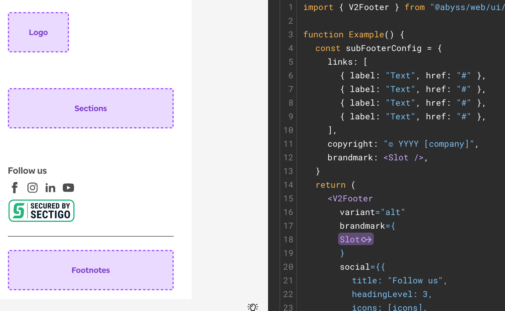 ```
### Supported components
---
id: abyss-admirals
title: Abyss Admirals
pagination_prev: null
isHidden: true
---
## Who are Abyss Admirals?
```
### Supported components
---
id: abyss-admirals
title: Abyss Admirals
pagination_prev: null
isHidden: true
---
## Who are Abyss Admirals?
An Abyss Admiral is a highly specialized role for a
software engineer who is a dedicated member of a product delivery team.
The most basic and essential function of an Admiral is to act as a bridge
between the core Abyss ecosystem and the product team leveraging the
framework.
Acting as representatives or ambassadors for their products, Admirals
enable the adoption of a{' '}
scalable, federated software development model by sharing
the Abyss community's best practices with their teams. As subject matter
experts for Abyss, Admirals are encouraged to guide and mentor their
engineering teams, empowering them to take advantage of the benefits of
working in a collaborative enterprise environment.

## Benefits for Product Stakeholders
It's very important for product stakeholders to understand that an Admiral's involvement in their new responsibilities will reduce their capacity for delivering sprint work as a standard individual contributor. However, by allocating enough time for the role, Admirals will enable engineering scrum teams to measurably improve both quality and delivery metrics. It's recommended to dedicate between **30% - 50%** of an Admiral's capacity for this role, but could be up to 100% depending on the size and scope of the project.
Product stakeholders will be able to capitalize on the efficiencies gained by leveraging the collective knowledge and shared solutions that are accessible through the broader Abyss community. The benefits of staffing a dedicated Admiral on your product include:
- **Accelerated Solution Development:**
When delivery teams are asked to identify and create solutions to common problems, they’ll need to do so in between developing new features which can result in delays. An Admiral assists their product teams at critical moments by eliminating these bottlenecks and offering proven solutions, which in turn increases the speed of delivery.
- **Minimized Duplication of Work:**
The Abyss team facilitates the creation of reusable digital assets such that, when the business makes a new request, an Admiral can utilize a similar solution that was built previously for another team rather than building a new one from scratch, greatly minimizing cost and time to value.
- **Consistent Product Quality:**
It’s reasonable to assume that most teams will not be evenly balanced when it comes to experience and skill levels, resulting in products being built with different techniques and standards. Admirals can ensure that the quality of development is both consistent and in accordance with the established standards of other products built with Abyss.
- **Expansive Specialist Network:**
When working with an Abyss Admiral, product stakeholders obtain access to a network of highly experienced and qualified specialists including software architects, lead engineers, UX designers, accessibility experts who are motivated to craft the best product experiences possible.
## Benefits for Engineering Managers
It's very important for engineering managers to understand that an Admiral's involvement in their new responsibilities will reduce their capacity for delivering sprint work as a standard individual contributor. However, by allocating enough time for the role, Admirals will enable engineering scrum teams to measurably improve both quality and delivery metrics. It's recommended to dedicate between **30% - 50%** of an Admiral's capacity for this role, but could be up to 100% depending on the size and scope of the project.
Engineering managers will be able to capitalize on the efficiencies gained by leveraging the collective knowledge and shared solutions that are accessible through the broader Abyss community. The benefits of staffing a dedicated Admiral on your delivery team include:
- **Reduced Software Fragmentation:**
When individual teams are developing within disconnected, siloed environments, they’ll often discover multiple different approaches to solve the same problem. Admirals can act as advisors to prevent this additional overhead from occuring by raising awareness of pre-existing solutions.
- **Promote Engineering Growth:**
For an engineer who is eager to progress further along their career path, the Admirals program offers an elevated set of responsibilities for overseeing software projects. Since this role is both highly technical and relationship-oriented, coupled with a sense of personal accountability, Admirals can leverage this experience to explore their interest in management or technology leadership roles.
- **Accountability for Essential Tasks:**
Engineering teams are often overburdened with upkeep and maintenance related chores because they are given a lower priority than feature work. By assigning an Admiral to each project, engineering managers can verify that code quality, versioning, and peer review processes are being observed.
- **Optimized Outcomes:**
Admirals reduce the time and cost of development through specialization and economies of scale. By tapping into a centralized community of knowledge, skills, and experience, the Admirals program is able to streamline access to those scarce capabilities while also facilitating balanced, cohesive engineering teams.
## Admiral Assignments
- **Upgrade Abyss Versions:**
It's highly beneficial to keep your product up-to-date with the newest versions of Abyss. Inform your engineering team and product stakeholders of any new components, tools, or patterns your application can leverage.
- **Review the [release notes](/web/releases/) after a release** to determine the level of effort for upgrading to the latest version.
- **Run the command "npm run abyss"** to automatically upgrade all Abyss packages in your project.
- **Support for new features and defects** will only be included in new versions.
- **Monitor Code Quality:**
As an Admiral, the accountability of maintaining high standards for code quality starts with you. Become well-versed in JavaScript, React, ESLint, and SonarQube anti-patterns and shepherd your team away from these pitfalls, reducing the burden of unrestrained technical debt and extending the lifespan of your codebase.
- **Remediate runtime errors & warnings** observed in the browser's developer console for your product.
- **Inspect problems reported by [ESLint](https://eslint.org/docs/latest/rules)** and discuss rule modifications with other Admirals.
- **Triage issues identified by [Sonar](https://sonar.optum.com)** to ensure your product meets code quality benchmarks.
- **Manage Pull Requests:**
Within the GitHub repository for your product, you should encourage your team to open pull requests regularly. By consulting with other Admirals, you are in the most well-suited position to act as a code reviewer for your team.
- **Open draft PR's early** in the sprint to give you and your team enough time to review and offer feedback on the approach.
- **Offer comments and conduct reviews** for each PR before approving.
- **Merge PR's in a timely manner** to improve time-to-build metrics for your product.
- **Leverage Assets:**
Admirals should strive to identify all of the usuable assets that exist within Abyss, as well as the network of individuals involved. Becoming familiar with the abstract concepts of a framework will elevate the engineering maturity of your team.
- **Research code developed for Abyss** to understand the patterns for consistent, repeatable software practices.
- **Review and update documentation** which demonstrates guidance for best practices, guidelines, and considerations.
- **Foster relationships with key experts** who possess very specific and unique skill-sets who can influence the growth of your product.
- **Continous Learning:**
To be successful, Admirals should provide thought leadership, direction, and appropriate recommendations for their teams and the Admiral community. The ability to both absorb and transfer knowledge is essential.
- **Have a self-starter attitude** and a passion for growing your career by being surrounded by like-minded engineers.
- **Seek opportunities for learning** by reading developer blogs, attending tech conferences, and networking with other Admirals.
- **Familiarize yourself with industry trends** by researching and recommending techniques for application development.
- **Sustainable Software:**
When left unchecked, the sustainability of an application can continuously deteriorate. Admirals are able to counteract this by taking appropriate measures to establish a healthy development environment and extend the lifespan of a product.
- **Maintain a log of tech debt** and track the ongoing scope of maintenance tasks incurred from past sprints.
- **Conduct frequent pair programming** sessions with your team to guide current feature development.
- **Discuss upcoming requirements** with architects to establish a clear path for future stories in your product pipeline.
- **Abyss Contributions:**
With the Admiral contribution process, the development process for new assets can be accelerated by building the solution yourself as the need arises; rather than waiting for your idea to reach the top of the Abyss core backlog.
- **Determine the priority** for framework enhancements based on your product delivery schedule.
- **Discuss new ideas in [Office Hours](#abyss-office-hours)** with the core team and other Admirals.
- **Follow the [Contribution Workflow](#contribution-workflow)** shown below to share your proposals with the framework.
## Admiral Developers Guide
If an existing Abyss component doesn't meet your product's requirements, you can follow this guide for building and testing changes within your application's codebase. Start by cloning the package structure of abyss within your product, such as **'src/abyss/web/ui/Badge'** demonstrated below. If you are creating a new component, you can start with a similar one as a template, otherwise cloning the existing component is the recommended approach.
```txt
└── products
└── web
├── .abyss
├── src
| ├── abyss
| | └── web
| | └── ui
| | └── Badge
| | ├── index.js
| | └── Badge.jsx
| ├── common
| ├── routes
| ├── client.jsx
| └── document.jsx
└── package.json
```
Next, replace the relative imports with absolute paths to **@uhg-abyss/web**. You can use any combination of Abyss package imports, open source libraries, and custom JavaScript dependencies to build your component.
```jsx
import React from 'react';
import PropTypes from 'prop-types';
import { styled } from '../../tools/styled';
import { useAbyssProps } from '../../hooks/useAbyssProps';
import { useVisuallyHidden } from '../../hooks/useVisuallyHidden';
```
Replace with:
```jsx
import React from 'react';
import PropTypes from 'prop-types';
import { styled } from '@uhg-abyss/web/tools/styled';
import { useAbyssProps } from '@uhg-abyss/web/hooks/useAbyssProps';
import { useVisuallyHidden } from '@uhg-abyss/web/hooks/useVisuallyHidden';
```
Finally, to test your component changes, modify your import path by changing **'@uhg-abyss/web/ui/Badge'** to **'@src/abyss/web/ui/Badge'** which will use your local Abyss component. Once you have fully verified your changes, you can submit a new Pull Request back to [Abyss](https://github.com/uhc-tech/abyss/pulls) and showcase your updates in the Abyss office hours. Once merged, your contributions will be available in the next release!
## Contribution Workflow
As an Abyss Admiral the workflow for a contribution goes as follows:
1. Office Hours: Discuss proposal for new components, designs, architecture, and tools with other Admirals.
1. Abyss Contact us: If idea can be re-used, submit a new request with Abyss "Contact Us" form.
1. Develop Locally: Follow the steps in Admiral developers guide to create re-usable asset locally in your product.
1. Abyss GitHub: Before opening a new Pull Request, ensure that all requirements are met for UX, branding, and accessibility guidelines.
1. Abyss Office Hours: Demo proposed feature with Abyss core team and other Admirals.
1. Abyss Github: Pull Request undergoes modifications from feedback, acceptance, quality checks and merge.
The contribution will end with the finalized abyss packages
## Abyss Office Hours
| Day | Time | Meeting |
| -------------------- | ---------------------- | ------------------------------------------------------------------------------------------------------------------------------------------------------------------------------------------------------------------------------------------------------------------------- |
| Tuesdays & Thursdays | 8:30 - 9:30 AM **CST** | [Join Teams Meeting](https://teams.microsoft.com/l/meetup-join/19%3ameeting_MTdkODUwYzQtZTNiZS00M2EyLWJmOTMtOGJjMTU4YTYyNWU5%40thread.v2/0?context=%7b%22Tid%22%3a%22db05faca-c82a-4b9d-b9c5-0f64b6755421%22%2c%22Oid%22%3a%22d5140f05-c25a-491a-8c4f-ad6da5e23bad%22%7d) |
---
id: abyss-contributors
title: Abyss Contributors
---
## Overview
First of all, thank you for your interest in contributing to Abyss. All of your contributions are valuable to the project! There are several ways you can get involved in the Abyss community and become a contributor:
- **Share Abyss:** Share the link to [Abyss](https://abyss.uhc.com) with members of your product team, and we'd be happy to discuss how we can help support your application.
- **Improve documentation:** Help us improve the [Abyss Docs](https://github.com/uhc-tech/abyss/tree/main/products/abyss-docs-web) by fixing incomplete or missing sections, examples, and explanations.
- **Provide feedback:** The team at Abyss are constantly working to make the project better, please let us know what features you would like to see with the [Contact Us](/web/contact-us/) form.
## Abyss code repo
```jsx render
() => {
const customIcon = (
);
return (
The Abyss source code monorepo contains both core packages and
products:
Packages:
- api
- core
- desktop
- ext
- infra
- mobile
- parcels
- utility
- web
Products:
- assets
- docs
- ext
- scaffold
- storybook
Abyss Repo
);
};
```
### Setting up project locally
For the essential system tools to get Abyss running on your local development environment, visit our [workplace setup](/web/developers/workplace-setup) guide.
To set up, clone the [abyss](https://github.com/uhc-tech/abyss) repository:
```bash
# Make the abyss-projects directory
mkdir abyss-projects && cd abyss-projects
# Clone the abyss repository
git clone https://github.com/uhc-tech/abyss.git
```
Afterwards, install the dependencies for `abyss` on your machine:
```bash
# Go into the abyss directory
cd abyss
# Install abyss dependencies
npm i
```
Then you are ready to start `abyss-docs` on your machine:
```bash
npm run docs
```
### Commit conventions
Head to the [Abyss](https://github.com/uhc-tech/abyss) source code for updates and additions to our Abyss NPM packages and documentation. With several contributors working in these repos daily, it's important to write your commit messages to be as descriptive as possible.
Commit Convention:
```
[area] Optional title: Message
```
Examples:
```
[docs] Button: Edit accessibility section
[@uhg-abyss/ui] useLoadingOverlay: Add remove handler
[@uhg-abyss/core] Fix non-prod deployment scripts
[@uhg-abyss/ui] Carousel: New feature added
[docs] Doc scripts: Fix docs deployment script
```
### Git branch names
Naming the branch you're working on helps repository maintainers understand the changes being made when the PR is opened. Using consistent branch name prefixes also allows build tools to automatically categorize the branches using labels. Branch names should be all lowercase (with the exception of US and DE) and include hyphens between words. All branches are divided into four groups:
- **story/#######** - Changes associated with a User Story, use the unique 7-digit number from Rally followed by a task description.
- **defect/#######** - Changes associated with a Defect, use the unique 7-digit number from Rally followed by a task description.
- **refactor/** - Changes to the repo that aren't documented in Rally are considered refactors, so use the task portion to add detail to your branch name.
- **release/** - Used specifically by build tools, this branch name is exclusive to release notes and documentation leading up to a new release.
Examples:
```
git checkout -b story/US2434515-developer-toolkit
git checkout -b defect/DE308703-button-accessibility
git checkout -b refactor/select-list-multi-docs
git checkout -b story/US1533842-use-loading-overlay
```
Branch Name Rules:
- Branch prefix must start with **story**, **defect**, **refactor**, or **release**
- Branch name must be only **lowercase letters, numbers, and hypens**
- **US###** and **DE###** are valid character exceptions
## Secure groups
Visit [secure.uhc.com](https://secure.uhc.com) to request permissions groups:
- **abyss_contributors**: For write access to [abyss](https://github.com/uhc-tech/abyss) code repositories
## Developer tools
Abyss is built using a list of trusted resources. Below are links to what makes up the framework of Abyss.
```jsx render
() => {
const devLinks = [
{
id: 1,
name: 'ReactJS',
href: 'https://reactjs.org/',
},
{
id: 2,
name: 'Docusaurus',
href: 'https://docusaurus.io/',
},
{
id: 3,
name: 'Stitches',
href: 'https://stitches.dev/',
},
{
id: 4,
name: 'React Hook Form',
href: 'https://react-hook-form.com/',
},
{
id: 5,
name: 'React Router',
href: 'https://reactrouter.com/',
},
{
id: 6,
name: 'npm',
href: 'https://docs.npmjs.com/about-npm',
},
];
return (
{devLinks.map((link) => {
return (
{link.name}
);
})}
);
};
```
If you're ready to get started with Abyss on your own, checkout the Abyss StarterKit (coming soon) to get started.
## Design tools
Abyss has a dedicated team of designers creating a Design Kit on Figma. Below are some resources to help developers navigate these tools:
```jsx render
() => {
const designLinks = [
{
id: 1,
name: 'Abyss Design Kit',
href: 'https://www.figma.com/design/tk08Md4NBBVUPNHQYthmqp/Abyss-Web?m=auto&node-id=0-367&t=myRGGrhQUPbwh0Zk-1',
},
{
id: 2,
name: 'Figma for developers',
href: 'https://www.figma.com/best-practices/tips-on-developer-handoff/an-overview-of-figma-for-developers/',
},
{
id: 3,
name: 'UHC branding',
href: 'https://brand.uhc.com/design-with-care',
},
{
id: 4,
name: 'Optum branding',
href: 'https://brand.optum.com/',
},
];
return (
{designLinks.map((link) => {
return (
{link.name}
);
})}
);
};
```
If you're a designer and want to dive deeper into the Abyss Design Kit, visit our Designer Getting Started (coming soon) page to learn more.
---
id: documentation-guide
title: Documentation Guide
---
## Overview
The documentation pages are organized under the **docs** directory shown below. When adding a new component, tool, or guide to Abyss Docs, create a new markdown.md file under the associated folder.
```txt
abyss-docs-web
└── docs
├── api
└── web
├── brand
├── developers
├── hooks
├── overview
├── tools
└── ui
```
## Markdown structure
Each markdown file should begin with the following metadata, as an example:
```md
---
id: carousel
category: Content
title: Carousel
description: Displays information through a series of slides.
design: https://www.figma.com/file/tk08Md4NBBVUPNHQYthmqp/Abyss-Design-System?node-id=3578%3A23477
pagination_prev: web/ui/card
pagination_next: web/ui/step-indicator
---
```
Every doc page is divided into three tabs: Overview, Integration, and Accessibility. Within the body of the markdown file, use these tabs to group sections of information.
```
**Overview Content**
**Integration Content**
**Accessibility Content**
```
## Overview tab
###### Import statement
Add the import statement for the feature like such:
```jsx
import { Alert } from '@uhg-abyss/web/ui/Alert';
```
###### Component Sandbox
Add Sandbox after the import statement for any components that make sense
to have a sandbox. Inputs are controlled props that can be adjusted by the user using the Sandbox features. Organize the inputs alphabetically when possible, starting with the simple properties first. Each input contains `prop`, `type` and optionally: `options` and, `defaultValue`.
To create a Sandbox, use the convention below:
```jsx sandbox
{
component: 'Alert',
inputs: [
{
prop: 'title',
type: 'string',
},
{
prop: 'children',
type: 'string',
},
{
prop: 'status',
type: 'select',
options: [
{ label: 'error', value: 'error' },
{ label: 'info', value: 'info' },
{ label: 'success', value: 'success' },
{ label: 'warning', value: 'warning' },
],
},
{
prop: 'dismissible',
type: 'boolean',
},
{
prop: 'showDivider',
type: 'boolean',
},
{
prop: 'inline',
type: 'boolean',
},
]
}
Lorem ipsum odor amet, consectetuer adipiscing elit. Ipsum rhoncus duis vestibulum fringilla mollis.
```
###### Property examples
Following the Sandbox, it's important to show the ability of each property separate of the others. We break each one down, giving it a title, description and jsx example showing variants of that specific property. For example, if you wanted to show the three sizes for Button, you'd write:
```jsx
() => {
return (
);
};
```
Since there are different visual variants of Button, including `primary` and `outline`, which use the same sizing convention (`'$sm'`, `'$md'`, and `'$lg'`), we can combine the two visuals under the one size example by organizing them utilizing the built-in Layout component from the Abyss library. Here's what the combined example looks like:
```jsx live
() => {
return (
);
};
```
To follow the complexity of each prop example, use the following rules to properly document the feature:
- **When organizing the list of examples,** they should be ordered from simple to complex starting with size or width
- **Start each example case** with "Use the `prop-name` property to..." followed by an explanation
- **For props with a pre-set list of variants,** add a sentence listing out the variant options "Variants include `variant-1`, `variant-2`", and so on
- **For props with a default value,** add "The default value is set to `value`"
- **For the customization example section,** include the sentence “If further customization is needed, most styles of `component-name` can be overridden using `css`”
- **Size and width examples** should include the list of Abyss style sizes (including the conversion of size to units in the label/text like $web.semantic.sizing.icon.utility.md = 24px), followed by percent, and px
- **Examples may include:** size, width, isDisabled, controlled, uncontrolled, loading, and customization. Take a look at other doc pages for examples of how to best format the component you're documenting
## Integration tab
Implementing a props table and classes table for the component, and any sub-components gives users an in-depth view of the component without having to visit the code. (The below example is modified for this template. Please refer to the Alert component for a full list of props and classes).
Follow these rules when creating a Props Table:
- **Prop name** is lowercase
- **Type** is one of the following: boolean, function, array, shape, number, string, number | string
- **Default value** is the default value from the defaultProps list, or null
- **Description** first word is uppercase, followed by a brief description of the props use
Follow these rules when creating a Classes Table:
- **Class name** starts with a period (.), is lowercase and uses dashes to separate words
- **Description** first word is uppercase, followed by a brief description of the class
#### Integration tab example
## Accessibility tab
This tab is important to be as thorough and in-detail as possible, adhering to the WAI-ARIA design guidelines.
Follow this pattern when creating the Accessibility tab:
- **Brief description** write a description about the component, and link to the WAI-ARIA website page referring to the component
- **Sandbox** allows our A11Y partners to practice assistive technology on the component in a dedicated field
- **Keyboard interactions table** referring to the WAI-ARIA keyboard interactions, create a table with all interactions usable for the specific component
- **Additional guidance** note any additional guidance features of the component, including (but not limited to) Decorative Icons, Loading State, etc.
#### Accessibility tab example
An alert is an element that displays a brief, important message in a way that attracts the user's attention without interrupting the user's task. Dynamically rendered alerts are automatically announced by most screen readers, and in some operating systems, they may trigger an alert sound. It is important to note that, at this time, screen readers do not inform users of alerts that are present on the page before the page load completes.
Adheres to the [WAI-ARIA Alert design pattern](https://www.w3.org/WAI/ARIA/apg/patterns/alert/).
The [Alert Example](https://www.w3.org/WAI/ARIA/apg/patterns/alert/examples/alert/) provided by W3.org demonstrates the Alert Pattern.
```jsx live
() => {
const [visibleAlerts, setVisibleAlerts] = useState([true, true, true, true]);
const resetButtonRef = useRef(null);
return (
{
setVisibleAlerts([
false,
visibleAlerts[1],
visibleAlerts[2],
visibleAlerts[3],
]);
resetButtonRef.current?.focus();
}}
>
We are working to restore site operations and should be back soon.
{
setVisibleAlerts([
visibleAlerts[0],
false,
visibleAlerts[2],
visibleAlerts[3],
]);
resetButtonRef.current?.focus();
}}
>
Regular business hours are 8:00AM to 8:00PM Central Time (USA).
{
setVisibleAlerts([
visibleAlerts[0],
visibleAlerts[1],
false,
visibleAlerts[3],
]);
resetButtonRef.current?.focus();
}}
cta={{
type: 'button',
props: {
children: 'Receive notifications',
onClick: () => {
console.log('CTA button clicked');
},
},
}}
>
All information successfully received. We will contact you when your
claim is updated
{
setVisibleAlerts([
visibleAlerts[0],
visibleAlerts[1],
visibleAlerts[2],
false,
]);
resetButtonRef.current?.focus();
}}
cta={{
type: 'link',
props: {
children: 'Live support',
href: '#cta',
onClick: () => {
console.log('CTA link clicked');
},
},
}}
>
Due to technical difficulties responses may be delay one to two working
days. Live support options can help get your answers sooner.
);
};
```
Decorative Icons
The brand icon in the Emphasis Banner is considered decorative and does not require a text alternative, though one can be provided if desired.
Close Button Guidance
If the close button is present—which it is by default—it must be keyboard accessible. A keyboard-only user must be able to tab to the button and activate it with the space bar and the enter key. When the Alert is closed, focus must be placed back where it previously was on the page.
ARIA Properties
If `status` is `'success'` or `'info'`, `Alert` has the following ARIA properties:
- `role="status"`
- `aria-live="polite"`
If `status` is `'warning'` or `'error'`, `Alert` has the following ARIA properties:
- `role="alert"`
BrAT Variant Behaviors
- **JAWS**
- Only announces text
- Does not announce actions or close button
- **NVDA, VoiceOver**
- Both announce all contents, though not roles (link, button)
Common issue: Immediate announcements require adding alerts to page AFTER
loading
For an `Alert` to announce immediately, they must be added AFTER the page content is loaded. This makes them a dynamic update to the page.
The examples here display them on page load. This makes them more like static banners.
Announcing "Alert" (or "Warning", etc.) - Defining alt text for icons
Even in those cases, they will not announce as "Alerts" unless alt text is defined for the icon. Otherwise, only the displayed text will be announced.
Use the `ariaText` prop to define this text.
---
id: overview
title: Overview
---
This guide is designed to help teams seamlessly integrate Abyss into their existing applications, enhancing their development capabilities with our robust suite of tools and features.
Whether you're looking to improve your app's scalability, performance, or developer experience, Abyss is the right choice to elevate your project.
---
id: installation
title: Installation
---
## Peer dependencies
Please note that react and react-dom are peer dependencies, meaning you should ensure they are installed before installing Abyss.
```jsx
"peerDependencies": {
"react": "^16.0.0 || ^17.0.0 || ^18.0.0 || ^19.0.0",
"react-dom": "^16.0.0 || ^17.0.0 || ^18.0.0 || ^19.0.0"
},
```
## Install Abyss Web
To add Abyss web to an existing application, first install the Abyss dependencies:
```jsx
npm install @uhg-abyss/web
```
Then, wrap your application root component with [`ThemeProvider`](/web/ui/theme-provider).
The `ThemeProvider` enables global theming for your application, with the option to customize or rely on the default styles of Abyss components. Utilizing React's context, it distributes your theme to all nested components.
```jsx
import { ThemeProvider } from '@uhg-abyss/web/ui/ThemeProvider';
const theme = createTheme('uhc');
function Demo() {
return (
);
}
```
## Importing components
Abyss documents give detailed directions for the importation and use of all components within the Abyss library. Simply seach Abyss docs for the component you would like to use and follow the guide. Below is an example of how to import the `Button` component into your file.
```jsx
import { Button } from '@uhg-abyss/web/ui/Button';
```
---
id: upgrading
title: Upgrading
---
## Upgrading Abyss
Abyss releases [New Versions](/web/releases/) on a biweekly basis. For further details, refer to our [Versioning Guide](/web/developers/versioning-guide).
Benefits to staying current with the latest version of Abyss include:
- **Adhering to Brand Guidelines**
- Align with the latest branding guidelines, ensuring your application maintains a consistent look and feel with the overall brand identity.
- **Enhanced Security**
- Address vulnerabilities and security enhancements to protect your application against emerging threats.
- **Improved Accessibility**
- As accessibility standards evolve, Abyss updates provide enhancements and fixes that help ensure your application is accessible to all users, including those with disabilities.
- **Access to New Components Features**
- Gain access to new components and features that can enrich the user experience and offer new functionality for your application.
- **Bug Fixes**
- Addresses defects that improve the stability and performance of your application.
- **Efficient Upgrades and Minimal Regression Testing**
- Staying updated with the latest version simplifies the upgrade process and minimizes related regression testing efforts.
## How to upgrade Abyss
You can upgrade Abyss by running the following command in the root of your application:
```bash
npm install @uhg-abyss/web@latest
```
```bash
yarn add @uhg-abyss/web@latest
```
---
id: nextjs
title: NextJS
---
## Recommendations for Abyss in Next 13+
If you are OK with only client-side rendering, put your pages under `/app`, and add the `"use client";` to those pages. This disables SSR and RSC streaming for those pages. \*
If you require SSR for some or all pages, put those pages under `/pages`, where you can use the old SSR model.
## Abyss SSR support in NextJS
| NextJS Version | /pages | /app |
| -------------- | ------ | ----------- |
| 12 | ✅ | N/A |
| 13,14,15 | ✅ | Client-only |
_\* Note: In some cases, the presence of the `"use client"` directive does NOT prevent the server from generating the HTML markup of the component! However, since the NextJS documentation contradicts this, your mileage may vary._
## Background
In NextJS versions 12 and lower, routes are defined under the `/pages` directory, and have options to render on the server (SSR), or on the client. SSR is one way to speed up a user's experience, by providing them HTML before loading and running JavaScript in the browser.
In NextJS 13, an alternate way of speeding up requests was designed - React Server Components (RSC) - which allows the server to send its results bit-by-bit. This allows the faster parts of rendering server HTML to be seen by the user sooner, as parts of the page are streamed.
This new behavior is the default for pages under `/app`. However, the streaming aspect of RSC limits what kind of functionality can be rendered and streamed. In particular, Context and Provider, can not be used, as shown in the error:
> `Error: createContext only works in Client Components.`
This happens because Abyss theming and other features are implemented using React Context - a practice which is recommended by the React team, and typical of 3rd party components.
### SSR lifecycle
The lifecycle of a typical `/pages` SSR request is:
- Page renders on the server, sending HTML to the browser
- The browser downloads the JS chunks for the page
- The browser executes the chunks, re-rendering the page in the 'hydration' process
- When hydration is complete, the static markup is now under control of React, and the page will behave as a Single-Page App, or SPA.
## References
- [NextJS: Server and Client Composition Patterns](https://nextjs.org/docs/app/building-your-application/rendering/composition-patterns)
- [NextJS: App Router](https://nextjs.org/docs/app)
- [Vercel: Context and server components](https://vercel.com/guides/react-context-state-management-nextjs)
- [Reddit: Do context providers force all child components to use client rendering?](https://www.reddit.com/r/nextjs/comments/1442a6y/do_context_providers_force_all_child_components/)
## Sample applications
A sample NextJS 14 app, with usage of `/pages` and `/app`, is located in the Abyss repo at the path:
[`/products/abyss-nextjs-14`](https://github.com/uhc-tech/abyss/tree/main/products/abyss-nextjs-14)
A sample NextJS 15 app, with usage of `/pages` and `/app`, is located in the Abyss repo at the path:
[`/products/abyss-nextjs-15`](https://github.com/uhc-tech/abyss/tree/main/products/abyss-nextjs-15)
Note: The NextJS 15 example uses React v19 and requires Abyss version 1.70.0 or higher.
---
id: faq
title: FAQ's
---
## Next.js app/page routing vs. react-router in Abyss Starter Kit
The Abyss Starter Kit will only support [react-router](https://reactrouter.com/en/main) for the following reasons:
- **Integration with Abyss Web Components**: Our Abyss UI components are intrinsically built around `react-router`. Leveraging it would ensure seamless compatibility and potentially smoother development process, leveraging the full potential of the UI components we have crafted.
- **Flexibility and Customization**: While next.js does offer a structured approach to routing, `react-router` stands out in terms of the flexibility it offers. `react-router` also includes compatibility with [Abyss Parcels](/foundations/parcels/overview/).
- **Independence from Next.js**: Although next.js is a vibrant and continually evolving framework, it often undergoes frequent updates, requiring developers to constantly adapt and update their codebase to stay aligned with the latest versions. By using `react-router`, you can maintain a stable codebase that isn’t affected by the frequent updates in next.js, hence saving time and resources in the long run.
- **Focused Usage of Next.js**: In our starter kit, we have employed next.js primarily as a build tool rather than a foundational framework for the entire application.
- **Community Support and Resources**: `react-router` has a vast community and a wealth of resources available. Its wide adoption in the industry means that you can find a robust ecosystem of tools, tutorials, and community expertise to leverage during your development process.
- **Limited Support for next.js**: It is important to note that we do not plan on extending support for next.js app or page routing in our future roadmap. Our developmental efforts and updates will be squarely focused on enhancing the capabilities and functionalities woven around `react-router`. Hence, to ensure that you have the best support and resources available for your project in the long term, we recommend aligning with our core focus on `react-router`.
Check out our [Abyss Routing](/web/developers/routing) documentation for more details.
## Version Conflict: react-router
Sometimes you're application will have various versions of `react-router`. If the version you are using elsewhere is higher than the version of Abyss you must override the version in Abyss via the root package.json. Add the following:
```json
{
...,
"overrides": {
"@uhg-abyss/web": {
"react-router": "7.9.5" // Match the version used in your application
}
}
}
```
Once you've added the override you will need to delete every node_module folder as well as the package-lock.json and run `npm install`.
**Note: This will only work with version 6 of react-router and it's minor versions**
## TypeError: Cannot read properties of undefined (reading 'default') at Object.interopDefault
To address the changes made in the next.js framework you must update the files in the `pages` directory inside your application. See below:
```txt
└── products
└── web
├── .abyss
├── pages
| ├── _app.js
| ├── _document.js
| └── index.js
├── src
└── package.json
```
Update the following files with the updated exports:
\_app.js
```jsx
export { default } from '@uhg-abyss/core/next-app';
```
\_document.js
```jsx
export { document as default } from '../src/document';
```
index.js
```jsx
export { browser as default } from '../src/browser';
```
---
id: ai-code-gen-how-to
title: How to use AI to perform code generation "CodeGen" with Abyss
sidebar_label: AI Code Generation
searchSiteWide: true
---
## Design-to-Code
## Prompt-to-Code
---
id: installation
title: Installation
---
There are two ways to go about installing Abyss - either by creating a new Abyss app or by adding Abyss to an existing application.
### Create Abyss App
Go to our [Create Abyss App Guide](/web/developers/abyss-app/overview/) to get started!
### Existing application
For teams that want to use Abyss web within an existing React framework (i.e. NextJs) or are unable to migrate their existing application to a create-abyss-app you can still use Abyss within your application. Learn more about adding Abyss to your [Existing application](/web/developers/existing-application/overview/).
## Upgrading Abyss
Abyss releases [New Versions](/web/releases/) on a biweekly basis. For further details, refer to our [Versioning Guide](/web/developers/versioning-guide).
Benefits to staying current with the latest version of Abyss include:
- **Adhering to Brand Guidelines**
- Align with the latest branding guidelines, ensuring your application maintains a consistent look and feel with the overall brand identity.
- **Enhanced Security**
- Address vulnerabilities and security enhancements to protect your application against emerging threats.
- **Improved Accessibility**
- As accessibility standards evolve, Abyss updates provide enhancements and fixes that help ensure your application is accessible to all users, including those with disabilities.
- **Access to New Components Features**
- Gain access to new components and features that can enrich the user experience and offer new functionality for your application.
- **Bug Fixes**
- Addresses defects that improve the stability and performance of your application.
- **Efficient Upgrades and Minimal Regression Testing**
- Staying updated with the latest version simplifies the upgrade process and minimizes related regression testing efforts.
### How to upgrade Abyss
- [Create Abyss App Upgrade Guide](/web/developers/abyss-app/upgrading/)
- [Existing Application Upgrade Guide](/web/developers/existing-application/upgrading/)
---
id: v0-to-v1-guide
title: V0 to V1 Guide
pagination_prev: null
---
This guide is intended for teams looking to upgrade from Abyss v0 to the latest release of Abyss.
Among the changes are some major architectural changes and updates, including consolidated packages, a new foundational UHC theme, new hooks and components, Figma integration, an upgraded CSS styling tool, and refactored form inputs and validation. We have also improved accessibility compliance, upgraded our application router, and made many performance updates across all areas.
When you install our newest package dependencies, you'll automatically be up to date with the latest version. Abyss takes care of maintaining a robust product development framework so your team can focus on shipping a better product faster.
## Version overview
With Abyss v1.0, we have consolidated the primary areas of application development into three main NPM packages - `@uhg-abyss/web`, `@uhg-abyss/api`, and `@uhg-abyss/core`.
- `@uhg-abyss/web` represents the client-side packages, React components, hooks, and tools.
- `@uhg-abyss/api` represents the server-side packages, including the GraphQL server, Express middleware, and other libraries.
- `@uhg-abyss/core` includes the configurations for ESLint and Babel, which have been consolidated along with the dev and build scripts. This package will be shared with both client and server projects built on Abyss.
```jsx render
() => {
const columns = [
{ name: 'Legacy Abyss', key: 'old' },
{ name: 'Abyss V1.0', key: 'new' },
];
const rows = [
{
id: 1,
old: '@abyss/ui',
new: '@uhg-abyss/api',
},
{
id: 2,
old: '@abyss/ui',
new: '@uhg-abyss/web',
},
{
id: 3,
old: '@abyss/core',
new: '@uhg-abyss/web',
},
{
id: 4,
old: '@abyss/scripts',
new: '@uhg-abyss/core',
},
{
id: 5,
old: '@abyss/eslint-config',
new: '@uhg-abyss/core',
},
{
id: 6,
old: '@abyss/babel-preset',
new: '@uhg-abyss/core',
},
{
id: 7,
old: '@abyss/test',
new: 'Deprecated',
},
{
id: 8,
old: '@abyss/widgets',
new: 'Deprecated',
},
];
return ;
};
```
## Component changes
Some common UI components have changed for consistency. Below is a table comparing noticeable differences from legacy versions of Abyss to Abyss v1. This is a non-exhaustive list, and components that are not included could likely have styling updates.
Our Brand and Design teams have made strong headway to update our standards since v0. We recommend following theme defaults, but if it is necessary to maintain the exact same design for your product, external styling or theme overrides can be done.
```jsx render
() => {
const columns = [
{ name: 'Legacy Abyss', key: 'old' },
{ name: 'Abyss V1', key: 'new' },
];
const rows = [
{
id: 1,
old: 'Alert, AlertBanner',
new: 'Component Name: Alert. AlertBanner deprecated.',
},
{
id: 2,
old: 'Button',
new: 'Component Props: link variant is now tertiary, theme and width props are deprecated.',
},
{
id: 3,
old: 'Card',
new: 'Component Props: width prop deprecated, many new props and classes for increased flexibility and functionality.',
},
{
id: 4,
old: 'ExternalLink',
new: 'Component Name: Link',
},
{
id: 5,
old: 'Flex',
new: 'Component Props: No longer need to use classes Flex.Flex and Flex.Content. Alignment and behavior can simply be applied directly with props such as justify, alignContent, direction, etc.',
},
{
id: 6,
old: 'Icon',
new: 'Component Name: Icon, IconMaterial, IconBrand',
},
{
id: 7,
old: 'Link',
new: 'In some cases, Link components would be wrapped with a Button component, mostly for styling purposes. This is no longer needed, can simply create a Button component with a href prop. The Link component still exists.',
},
{
id: 8,
old: 'MaterialIcon',
new: 'Component Name: IconMaterial',
},
{
id: 9,
old: 'Modal',
new: 'Component Props: New title and footer props (can still use Modal.Footer), scrollableFocus. onRequestClose is now called onClose. Modal.Scroll and Modal.Actions deprecated classes.',
},
{
id: 10,
old: 'MultiSelectList',
new: 'Component Name: SelectInputMulti',
},
{
id: 11,
old: 'RadioGroup',
new: 'Component Props: Use label prop for the title.',
},
{
id: 12,
old: 'SelectList',
new: 'Component Name: SelectInput',
},
{
id: 13,
old: 'Switch',
new: 'Component Name: Router. For Switch, use class Router.Routes.',
},
{
id: 14,
old: 'TextArea',
new: 'Component Name: TextInputArea',
},
{
id: 15,
old: 'Toggle',
new: 'Component Name: ToggleSwitch',
},
{
id: 16,
old: 'Tooltip',
new: 'Component Name: Tooltip and Popover',
},
];
return ;
};
```
## Components unavailable
The following components are not available in v1.0. Those marked "To Be Implemented" will be part of upcoming releases.
```jsx render
() => {
const columns = [
{ name: 'Legacy Abyss', key: 'old' },
{ name: 'Abyss V1.0', key: 'new' },
];
const rows = [
{
id: 1,
old: 'ErrorMessage',
new: 'To Be Implemented',
},
{
id: 2,
old: 'ReadMore',
new: 'To Be Implemented',
},
{
id: 3,
old: 'DataViz',
new: 'To Be Implemented',
},
{
id: 4,
old: 'FormControl',
new: 'Deprecated',
},
{
id: 5,
old: 'AppProvider',
new: 'Deprecated',
},
];
return (
);
};
```
Various hooks are also now deprecated, particularly in relation to forms and styling.
Hooks relating to Redux are no longer available.
```jsx render
() => {
const columns = [
{ name: 'Legacy Abyss', key: 'old' },
{ name: 'Abyss V1.0', key: 'new' },
];
const rows = [
{
id: 1,
old: 'useField',
new: 'Deprecated',
},
{
id: 2,
old: 'useFormState',
new: 'Deprecated',
},
{
id: 3,
old: 'useAction',
new: 'Deprecated',
},
{
id: 4,
old: 'useSaga',
new: 'Deprecated',
},
{
id: 5,
old: 'useModel',
new: 'Deprecated',
},
{
id: 6,
old: 'useBounds',
new: 'Deprecated',
},
{
id: 7,
old: 'useBreakpoint',
new: 'Deprecated',
},
{
id: 8,
old: 'useColor',
new: 'Deprecated',
},
{
id: 9,
old: 'useSize',
new: 'Deprecated',
},
{
id: 10,
old: 'useStyles',
new: 'Deprecated',
},
];
return (
);
};
```
## Branding
The Abyss Design System now supports branding at a foundational level, with complete UHC, UHG, and Optum themes.
A theme is comprised of several core parts that create the building blocks of the design system. See the Brand section of our docs site for [brand colors](/web/brand/{brand}/colors), [fonts and typography settings](/web/brand/{brand}/typography), [icon libraries](/web/brand/{brand}/icon-brand), and several [brand-associated logos](/web/brand/{brand}/brandmark). Simply by using Abyss as a launch point for your project, you will be fully aligned with all enterprise digital brand standards and assets, with no additional setup required.
## Design integration
To help teams quickly build and adapt a beautiful user interface, we've streamlined design and development for the Abyss Design System. We're excited to announce the addition of a dedicated design team implementing best practices on components and tools for the [Abyss Design System in Figma](https://www.figma.com/file/tk08Md4NBBVUPNHQYthmqp/Abyss-Design-System?node-id=0%3A1).
With this addition, your entire product team has the power to make updates and adjustments with ease, utilizing both developer docs and design guidelines that now live in one place. On each docs page, simply press the “View Design” button in the header that links directly to the ADS in Figma. Even more so now, design and development collaboration provides an on-brand, elevated, cohesive experience.
## CSS/styling tools
There are multiple approaches teams can take for styling. Styling can be supported inline with the `css` prop on components, which allows for targeting classes that we have mentioned in the integration tab of any docs page. While we do not explicitly support external stylesheets,
teams who already use this approach can continue doing so by applying through a `className`.
These style customizations are described further on our [Theming/styling documentation](/web/developers/theming-styling). However, our own components
are built using the [styled tool](/web/tools/styled) via Stitches.
### Stitches
We have updated our CSS-in-JS library from Styled Components to [Stitches](https://stitches.dev/). CSS-in-JS libraries have significant advantages over traditional CSS strategies by leveraging reusable variables, functions, and static code analysis.
The Stitches API shares many similarities with Styled Components; however, only object literal syntax is supported. The main benefit of Stitches over all other React CSS strategies is that nearly all CSS is generated at build time rather than runtime. This avoids unnecessary prop interpolations during the render phase, which can add up quickly when building large applications with a dynamic, theme-driven design system.
For detailed examples, review the docs for the [styled tool](/web/tools/styled/). To see a full migration guide, please read [migrating from Styled Components to Stitches](https://stitches.dev/blog/migrating-from-styled-components-to-stitches).
**Note:**
- In a future release of Abyss, we will be switching from Stitches to [Emotion](https://emotion.sh/docs/introduction).
## Routing
We base our routing off of `react-router-dom`. Check out their [migration guide](https://reactrouter.com/en/main/upgrading/v5) from v5 to v6, or our own [routing overview](/web/developers/routing/).
- router.push() should now be router.navigate()
- If deploying on AWS look at this [stack overflow post](https://stackoverflow.com/questions/51218979/react-router-doesnt-work-in-aws-s3-bucket) with deployment issues with routing
- Use the baseRoute in `.abyss/settings.json` if needed
```json
"baseRoute": "/YOURBASEPATH"
```
## State management
Redux is no longer built into any of our products. It can still be used alongside our products by any consuming team, but we also recommend using [Zustand](https://docs.pmnd.rs/zustand/getting-started/introduction).
## Forms refactor
Our new forms integration is entirely built on top of the [react-hook-form](https://react-hook-form.com/docs/useform) library. We have upgraded from the previous Redux implementation to a new [FormProvider](/web/ui/form-provider/), which allows child form inputs to consume the form context and methods returned from the upgraded [useForm hook](/web/hooks/use-form/). With the addition of useForm functionality, most of our hooks for form management have now been deprecated.
This means form components and their state management could be a large portion of a team's migration efforts. We have not only expanded the collection of form inputs that are supported, but we have also consulted with accessibility experts to create first-class [WCAG](https://www.w3.org/WAI/standards-guidelines/wcag/) compliant interactions.
## Build
Teams that are using AWS will need to use `browser-static` in `.abyss/settings.json`:
```json
"buildType": "browser-static".
```
This is instead of the default `browser-node`.
## Abyss Scripts migration guide
This guide is to help migrate from the old `@abyss/scripts` package to the new `@uhg-abyss/core` package. If a team is looking to use Parcels, see [our guides](/foundations/parcels/overview/) for additional information. It is recommended to integrate Parcels by using Path One.
### Path one
Lift and shift the application into a new `create-abyss-app`
- This will provide a more up-to-date foundation that will improve development and compatibility in the long run.
- You can leverage additional Abyss tools like API and Parcels.
---
**1.** Create a new Abyss application
- Follow the [Getting Started instructions](/web/developers/abyss-app/installation/) to scaffold a new project.
**2.** Bring over the old codebase
- When bringing over the code, start small and fix errors as they appear.
**3.** Migrate imports from `@abyss/ui` web components to `@uhg-abyss/web` components
- You can still use the old `@abyss/ui`, but you may encounter issues. (Support for `@abyss/ui` has ended)
- When installing the old `@abyss/ui`, you must force installation due to React version conflicts.
**Notes:**
- `@uhg-abyss/web` only supports `react-router-dom` v6.
- `@uhg-abyss/web` does not support Redux; use [Zustand](https://zustand.docs.pmnd.rs/getting-started/introduction) instead.
### Path two
Migrate `@abyss/scripts` to `@uhg-abyss/core`
- This option will keep you on an outdated tech stack.
---
**1.** Install packages
- `npm install @uhg-abyss/core`
- `npm install typescript`
**2.** Remove unused `@abyss` packages:
- `@abyss/babel-preset`
- `@abyss/eslint-config`
- `@abyss/scripts`
**3.** Add `prettier`, `eslintConfig`, and `bundleDependencies` configs to `package.json` (You may have to update paths):
- [https://github.com/uhc-tech/abyss-app/blob/main/products/web/package.json#L5C2-L8](https://github.com/uhc-tech/abyss-app/blob/main/products/web/package.json#L5C2-L8)
- [https://github.com/uhc-tech/abyss-app/blob/main/products/web/package.json#L23-L25](https://github.com/uhc-tech/abyss-app/blob/main/products/web/package.json#L23-L25)
**4.** Add `tsconfig.json` file to the web app root (You may have to update the `"include"` path or add additional configurations):
- [https://github.com/uhc-tech/abyss-app/blob/main/products/web/tsconfig.json](https://github.com/uhc-tech/abyss-app/blob/main/products/web/tsconfig.json)
**5.** Add `next.config.js` file to the web app root:
- [https://github.com/uhc-tech/abyss-app/blob/main/products/web/next.config.js](https://github.com/uhc-tech/abyss-app/blob/main/products/web/next.config.js)
**6.** Add the `pages/` directory to the web root:
- [https://github.com/uhc-tech/abyss-app/tree/main/products/web/pages](https://github.com/uhc-tech/abyss-app/tree/main/products/web/pages)
**7.** Add the `.abyss/` directory to the web root:
- [https://github.com/uhc-tech/abyss-app/tree/main/products/web/.abyss](https://github.com/uhc-tech/abyss-app/tree/main/products/web/.abyss)
- You can add environment variables to the `.environments.json` file: [Environments config](/foundations/overview/environments/)
## Future steps
Now that your application/product has completed the migration to V1, here are next steps for planning and executing version updates to keep your product current and leverage new functionality released by Abyss.
For more information on Abyss' release strategy, review our [versioning guide](/web/developers/versioning-guide/).
Abyss deploys biweekly minor version releases to improve our products and address any defects. It is recommended to keep up with the latest release of Abyss for the best experience.
- `npm i @uhg-abyss/web@latest` to upgrade to the latest release
- `npm i @uhg-abyss/web@1.XX.X` to upgrade to a specific version of Abyss
---
id: v1-to-v2-guide
title: V1 to V2 Guide
---
Abyss V2 is finally here! We've worked hard to make the transition from V1 as smooth as possible.
## Troubleshooting
If you encounter any issues during the migration process, please post your questions, problems, or findings on GitHub Discussions. This will allow all teams to see, respond to, and benefit from shared solutions. If someone has already asked a similar question, consider adding your insights or upvoting the existing discussion rather than creating a duplicate. This helps keep the conversation organized and makes it easier for everyone to find relevant information.
[Go to the V1 → V2 Migration Discussion](https://github.com/uhc-tech/abyss/discussions/5059)
## Getting started
The steps listed below will guide you through the migration process.
### 1. Update to the latest V1 version
Make sure your project is running on the [most recent V1 release](/web/releases) before starting any migration steps. This will help minimize potential issues during the migration process.
### 2. Update React
In Abyss V2, we have updated our peer dependencies for React and React DOM. Notably, **React 16 and 17 are no longer supported** in Abyss V2. You should ensure your application is running on React 18 or 19 before migrating to Abyss V2.
```json
// V1
- "react": "^16.0.0 || ^17.0.0 || ^18.0.0 || ^19.0.0"
- "react-dom": "^16.0.0 || ^17.0.0 || ^18.0.0 || ^19.0.0"
// V2
+ "react": "^18.0.0 || ^19.0.0"
+ "react-dom": "^18.0.0 || ^19.0.0"
```
### 3. Update component usage
**It is strongly recommended** to replacing your V1 components with their V2 counterparts before updating to Abyss V2. This way, when you move to V2, you will only need to update the import names (e.g., `V2Button` → `Button`) instead of making all the prop changes at the same time.
#### Deprecations
Below is a list of tools, hooks, and components that are no longer available in Abyss V2. To help identify these deprecated components in your codebase, we've created a [codemod detection tool](#detect-deprecated-imports) that scans your project for deprecated Abyss imports.
### 4. Update to the latest V2 version
Now that you've completed all preparation steps, you can update your project to use Abyss V2! Assuming that you have already replaced the deprecated V1 components with their recommended alternatives and switched all other components to their V2 counterparts, the migration to Abyss V2 should be straightforward.
Most of the remaining work should be **import renaming** rather than large-scale refactoring.
#### Remove the V2 prefix
We had released a number of V2 components in V1 with a `V2` prefix to allow teams to start using them early and ease the migration process. Now that you are migrating to Abyss V2, you will need to **remove the `V2` prefix** from these components in your imports. If you used an alias when importing, make sure to update that as well.
```jsx
// Before
import { V2Button } from '@uhg-abyss/web/ui/Button';
import { V2TextInput as TextInput } from '@uhg-abyss/web/ui/TextInput';
// After
import { Button } from '@uhg-abyss/web/ui/Button';
import { TextInput } from '@uhg-abyss/web/ui/TextInput';
```
#### Updating V1-prefixed components
Some existing components have been prefixed with `V1` in Abyss V2 (e.g., `DataGrid` → `V1DataGrid`). We have done this because these components are not yet tokenized and will eventually receive a new design and functionality updates, but we want them to remain available in V2 for those teams who rely on them.
Once the new versions of these components are released, teams will need to **remove the `V1` prefix** from their imports and update any props or patterns to match the new V2 design and API.
| V1 Component Name | V2 Legacy Equivalent |
| :------------------ | :-------------------- |
| `DataGrid` | `V1DataGrid` |
| `Charts` | `V1Charts` |
| `SubNavigationMenu` | `V1SubNavigationMenu` |
| `Table` | `V1Table` |
| `Flyout` | `V1Flyout` |
| `ToggleGroup` | `V1ToggleGroup` |
##### Breaking changes
The `V1` prefix approach allows teams to migrate to V2 with minimal immediate changes, keeping most existing functionality intact. However, due to dependency upgrades and API alignments, **some breaking changes still exist**. These changes are documented below so teams can address them during migration.
###### V1DataGrid
**`numericConfig.valueIsNumericString` → `numericConfig.isNumericString`**
Due to upgrading `react-number-format` from v4 to v5, the property name has changed.
```jsx
// Before
{
title: 'Percent Column',
type: 'number',
numericConfig: {
suffix: '%',
valueIsNumericString: false
}
}
// After
{
title: 'Percent Column',
type: 'number',
numericConfig: {
suffix: '%',
isNumericString: false
}
}
```
###### V1ToggleGroup
**`descriptorsDisplay` has been removed**
The `descriptorsDisplay` prop has been removed in V2. This prop was previously used to control the direction of the descriptors. All descriptors will now automatically stack vertically to improve readability and accessibility (same as `"column"` before).
```jsx
// Before
// After
```
## UHG theme
The UHG theme has been **removed in Abyss V2**. To learn more about this change and how to migrate, please navigate to the [UHG Theme](/web/developers/migration-v2/v2-uhg-theme) documentation.
## Theming
Some values in the overrides provided to the [createTheme function](/web/tools/create-theme-{brand}) have been removed to better align with brand design guidelines. If your project is using any of the following overrides, you will need to remove them.
### deprecatedOptumIcons
The `deprecatedOptumIcons` override has been removed as the old Optum brand icons were not aligned with the Optum brand guidelines. Removing this override will ensure that your application uses the correct icons. No changes to your codebase are necessary beyond removing this override from your theme configuration.
Note that it was also possible to override a single `BrandIcon` with the `useDeprecated` prop. This prop is no longer supported in V2 and should be removed from all `BrandIcon` instances.
### deprecatedFont
The `deprecatedFont` override has been removed from the Optum theme as the deprecated Optum Sans font is no longer a part of the Optum brand. Removing this override will ensure that your application uses the correct font, Enterprise Sans, as per brand guidelines.
The UHC theme still uses UHC Sans by default. You can use Enterprise Sans instead by setting the `enterpriseFont` flag to `true` in the theme configuration.
## CSS styling with Emotion
In Abyss V2, we've replacing Stitches with Emotion for our CSS-in-JS solution. Both libraries have similar APIs, so most applications won't be significantly affected, but some breaking changes are possible depending on your current usage.
For migration steps and examples, see the [Emotion migration guide](/web/developers/migration-v2/emotion-migration).
**Why are we migrating to Emotion?**
- Stitches is no longer actively maintained and we want to use a library that is actively supported and has a strong community.
- Abyss Mobile has already migrated to Emotion and we want to maintain consistency across our products.
- Emotion provides a more flexible API.
- Emotion has better support for server-side rendering, which is important for our applications.
- Shadow DOM support
To read more, please refer to our [ADR](https://github.com/uhc-tech/abyss/blob/main/products/abyss-docs-web/docs/adrs/decisions/adr-013-stitches-replacement.md).
### CSS class name prefix (styledPrefix removal)
The `styledPrefix` configuration option has been **removed in Abyss V2**. This setting was previously used to avoid CSS class name collisions when multiple applications or Parcels were embedded on the same page.
In V2, you can now control the CSS class name prefix directly in your application code using the [StyleRootProvider](/web/ui/style-root-provider) with the `cacheOptions` prop. This provides better style isolation and is especially useful when combined with a shadow DOM.
**Before (V1):**
```json
// .abyss/settings.json
{
"styledPrefix": "my-app"
}
```
**After (V2):**
```jsx
import { StyleRootProvider } from '@uhg-abyss/web/ui/ThemeProvider';
import { ThemeProvider } from '@uhg-abyss/web/ui/ThemeProvider';
import { createTheme } from '@uhg-abyss/web/tools/theme';
const theme = createTheme('uhc');
export const MyApp = () => (
);
```
## Routing
We have upgraded our routing system from v6 to v7 of `react-router`. This upgrade brings several enhancements and new features to improve the routing experience in your application. Check out their [migration guide](https://reactrouter.com/upgrading/v6) for more details.
Here are some key changes and improvements in the routing system:
- The `react-router-dom` package has been consolidated into the main `react-router` package.
- All routing functionality is available from `@uhg-abyss/web/tools/reactRouterTools`. This package re-exports the complete `react-router` package and is meant to prevent version conflicts across projects.
## API
We have upgraded the `@uhg-abyss/api` package's `express` dependency from v4 to v5. For details on breaking changes and migration steps, see the [Express v5 migration guide](https://expressjs.com/en/guide/migrating-5.html).
## Parcels/workshop
Abyss is excited to announce that Parcels is officially out of beta!
### Dependencies
We have upgraded `@uhg-abyss/parcels` package's `storybook` dependency from v8 to v10 in order to take advantage of the latest features and improvements. Due to Storybook v10 moving away completely from CommonJS to ESM, teams will need to update their story imports to include the resolution mode.
**Before (V1):**
```jsx
import type { StoryObj } from '@storybook/react';
```
**After (V2):**
```jsx
import type { StoryObj } from '@storybook/react' with { "resolution-mode": "import" };
```
**Note:** Abyss may explore moving from CommonJS to ESM in the future, but for now, this small import change ensures Storybook v10 compatibility with minimal disruption.
### Shadow DOM
The `shadowDOM` flag in story configuration has been **removed in Abyss V2**. This flag was previously used to control shadow DOM behavior in Parcels, but due to limitations within Stitches, style isolation within the shadow DOM was not able to be achieved.
**Before (V1):**
```jsx
export default {
title: 'NoShadowDOMParcel',
parcel: 'my-parcel',
component: MyParcel,
shadowDOM: false, // Flag to turn shadow DOM on or off
};
```
**After (V2):**
Style isolation within the Shadow DOM is now supported in V2. The shadow DOM is now controlled directly in your Parcel component code using [StyleRootProvider](/web/ui/style-root-provider) with the `useShadowDom` prop. This provides more granular control and better integration with theming.
```jsx
import { StyleRootProvider } from '@uhg-abyss/web/ui/ThemeProvider';
import { ThemeProvider } from '@uhg-abyss/web/ui/ThemeProvider';
import { createTheme } from '@uhg-abyss/web/tools/theme';
const theme = createTheme('uhc');
export const MyParcel = () => (
);
```
For more information on Shadow DOM configuration, see the [Shadow DOM documentation](/foundations/parcels/shadow-dom).
### Mutation observer
In Abyss V1, a `disableMutationObserver` flag was available in Parcel configuration. When not disabled, the `MutationObserver` would watch for property changes on a Parcel and trigger a full remount whenever those properties changed.
In Abyss V2, this behavior has been reversed.
The `MutationObserver` is now **disabled by default** in V2 to improve performance and preserve Parcel state. To opt into the previous remount-on-property-change behavior, a new flag, `enableMutationObserver`, has been introduced.
#### Why the change?
In V1, remounting on property change often caused state loss, UI flickering, and performance issues, especially in complex Parcels.
If your V1 Parcel relied on property changes to update its UI, you will need to explicitly enable the `MutationObserver` in V2 by setting `"enableMutationObserver": true` in your Parcel's `settings.json`.
For more details and examples, see the [Updating Parcels](/foundations/parcels/updating-parcels) documentation for more information.
## Codemods and AI tools
We have created a few codemods to help with the migration process. These codemods aim to reduce the amount of manual work required to update your codebase.
### AI-powered migration
To help with component migration, we offer an AI context package that works with tools like GitHub Copilot, ChatGPT, or other AI coding assistants. This context enables the AI to understand the V1 to V2 changes and provide accurate migration assistance.
**Note:** Please remember that AI is not perfect. Always review the generated code to ensure it performs migration steps accurately while meeting your requirements and adhering to best practices.
#### Using the AI migration info
Start by downloading the [AI migration context ZIP folder](/migration/web/ai-migration-context.zip), then extract it to your project root directory. The structure should look like this:
```text
your-project-root/
├── abyss-migration-ai-context/
│ ├── ABYSS-MIGRATION-ASSISTANT.md
| └── MigrationData.json
├── package.json
└── src/
└── ... (your project files)
```
Add the context to your AI tool of choice (e.g., Copilot, ChatGPT, etc.) referencing the folder location. Then, you can prompt the AI tool with questions like:
- "Migrate this file from V1 to V2 of Abyss."
- "Migrate the `Button` component from V1 to V2 of Abyss."
Here is an example showcasing migrating a file from V1 to V2 of Abyss using the AI tool. Given this prompt:
"Migrate `#file:HelloAbyss.tsx` from V1 to V2 of Abyss."
Copilot was able to produce the following results:
```jsx render
 ```
### Detect deprecated imports
To help with identifying deprecated components, we provide a script that scans your codebase for deprecated Abyss imports. This script will help you identify which components need to be replaced before migrating to v2.
**Note:** Abyss imports show deprecation warnings. This tool is used scan your codebase for all deprecated imports at once.
```jsx render
```
### Detect deprecated imports
To help with identifying deprecated components, we provide a script that scans your codebase for deprecated Abyss imports. This script will help you identify which components need to be replaced before migrating to v2.
**Note:** Abyss imports show deprecation warnings. This tool is used scan your codebase for all deprecated imports at once.
```jsx render
 ```
#### How to use the script
Start by downloading the [script's ZIP folder](/migration/detect-deprecated-imports.zip), then extract it to your project root directory. The structure should look like this:
```
your-project-root/
├── abyss-migration-tools/
│ ├── scan-imports.sh
│ ├── detect-deprecated-imports.js
| └── deprecated-imports.json
├── package.json
└── src/
└── ... (your project files)
```
Then, run the following commands to make the script executable and scan your codebase:
```bash
# Make the script executable
chmod +x abyss-migration-tools/scan-imports.sh
# Run the script to scan your entire codebase
./abyss-migration-tools/scan-imports.sh
# Or specify a specific directory to scan
./abyss-migration-tools/scan-imports.sh src/components
```
The script will scan your codebase for deprecated Abyss imports and report any findings. For example, running the script might show output like this:
```jsx render
```
#### How to use the script
Start by downloading the [script's ZIP folder](/migration/detect-deprecated-imports.zip), then extract it to your project root directory. The structure should look like this:
```
your-project-root/
├── abyss-migration-tools/
│ ├── scan-imports.sh
│ ├── detect-deprecated-imports.js
| └── deprecated-imports.json
├── package.json
└── src/
└── ... (your project files)
```
Then, run the following commands to make the script executable and scan your codebase:
```bash
# Make the script executable
chmod +x abyss-migration-tools/scan-imports.sh
# Run the script to scan your entire codebase
./abyss-migration-tools/scan-imports.sh
# Or specify a specific directory to scan
./abyss-migration-tools/scan-imports.sh src/components
```
The script will scan your codebase for deprecated Abyss imports and report any findings. For example, running the script might show output like this:
```jsx render
 ```
After identifying deprecated imports, refer to the [deprecation table](#deprecations) above for specific migration advice for each component or utility. For example, the table shows that `createStore` should be replaced with [Zustand](https://zustand.docs.pmnd.rs/getting-started/introduction) directly.
---
id: components
title: Component Changes
---
## Overview
This guide focuses on breaking prop changes to be aware of when migrating from Abyss V1 to V2. These include:
- Props that have been removed
- Props whose behavior or typings have been updated
- Props whose names have been changed but whose functionality remains the same.
This guide does **not** cover:
- New props added in V2, or
- Additional features and enhancements.
For complete documentation of all available props, including new features added, refer to each component's dedicated documentation page.
:::tip AI-Powered Component Migration
Need help with component migration? Use our [AI-powered migration tool](/web/developers/migration-v2/v1-to-v2-guide/#ai-powered-migration) to help convert V1 components to their V2 equivalents with proper prop mapping.
:::
## Accordion
## Alert
## Avatar
## Badge
## Breadcrumbs
## Button
## Card
## Carousel
### Slide
## Charts
## Checkbox
## CheckboxGroup
## Chip
## DataTable
Due to significant changes in `DataTable` we have created a separate [Migration Page](/web/data-table/migrating#migrating).
## DateInput
## Drawer
## DropdownMenu
## FileUpload
## FormProvider
## Fullscreen
## Heading
## Icon
## IconBrand
## IconSymbol
## Indicator
## Link
## LoadingOverlay
## LoadingSpinner
## Modal
## NavMenuPrimitives
## NumberInput
## PageBodyIntro
## PageFooter
## PageHeaderPrimitives
## Pagination
### ResultCount
## Popover
## ProgressBar
## RadioGroup
## Rating
## RichTextEditor
## SearchInput
## SelectInput
## SelectInputMulti
## Skeleton
## Slider
## StepIndicator
## Tabs
## Text
## TextInput
## TextInputArea
## TimeInput
## Timeline
## Toast
## ToggleSwitch
## Tooltip
---
id: emotion-migration
title: Migrating to Emotion-based Abyss Theming
description: A guide to migrating from the previous theming system to the new Emotion-based implementation
---
This guide will help you migrate your application from the previous Stitches-based theming system to the new Emotion-based implementation in Abyss.
> **Good news!** The migration effort should be minimal for most applications. We've designed the new Emotion-based implementation to be as compatible as possible with existing code. In many cases, your application will continue to work with just a few adjustments (see [Breaking Changes](#breaking-changes) below) after installing the new version but with the following added benefits:
## Overview of changes
- [server-side rendering support](#nextjs-server-side-rendering)
- Improved style isolation for parcels with [Shadow DOM support](#style-isolation-and-parcels)
- More consistent styling behavior across different environments and host applications
- Granular control of how styles are being processed and injected into the DOM
## Breaking changes
### ThemeProvider requirements
**Before:** CSS variables were added to the `:root` element whether or not `createTheme` or `ThemeProvider` was used and therefore some styles would still be applied to Abyss components.
**After:** In the new Emotion-based implementation [ThemeProvider](/web/ui/theme-provider) + [createTheme](/web/tools/create-theme-{brand}) is required:
- No styles will be applied to Abyss components if they're not encapsulated within a `ThemeProvider` that includes a theme provided by `createTheme`.
- CSS variables are **only** scoped to the `ThemeProvider` wrapper elements
- No default theme is created if a `ThemeProvider` is used without a theme
### AbyssProvider requirements
`AbyssProvider` follows the same requirements as `ThemeProvider` since it uses `ThemeProvider` internally:
**Before:** `AbyssProvider` could be used without providing a theme, and components would still receive default styling.
**After:** The `theme` prop is now required. You must create and pass a theme using `createTheme`:
```jsx
import { AbyssProvider } from '@uhg-abyss/web/ui/AbyssProvider';
import { createTheme } from '@uhg-abyss/web/tools/theme';
const theme = createTheme('uhc');
;
```
### Provider props
The following props have been moved from `ThemeProvider` to `createTheme`:
- `brandAssetsCdn`
- `includeBaseCss`
**Before:**
```jsx
```
**After:**
```jsx
const theme = createTheme('uhc', {
brandAssetsCdn: 'https://example.com/assets',
includeBaseCss: false,
});
;
```
### globalCss
The `globalCss` utility from `@uhg-abyss/web/tools/styled` was part of the v1 Stitches API and has been deprecated. Please use Emotion's `Global` component from `@uhg-abyss/web/ui/ThemeProvider` to define global styles instead.
**Before:**
```jsx
import { ThemeProvider } from '@uhg-abyss/web/ui/ThemeProvider';
import { createTheme } from '@uhg-abyss/web/tools/theme';
import { globalCss } from '@uhg-abyss/web/tools/styled';
const globalStyles = globalCss({
body: {
backgroundColor: '#f0f0f0',
},
});
const theme = createTheme('uhc');
export function App() => {
globalStyles();
return Your app
}
```
**After:**
```jsx
import { ThemeProvider, Global } from '@uhg-abyss/web/ui/ThemeProvider';
import { createTheme } from '@uhg-abyss/web/tools/theme';
const globalStyles = {
body: {
backgroundColor: '#f0f0f0',
},
};
const theme = createTheme('uhc');
const App = () => {
return (
...
);
};
```
### Styling API changes
While the underlying styling engine has changed from Stitches to Emotion, we've worked hard to preserve the [styled](/web/tools/styled) utility API to ensure minimal migration work. Most of your existing styling configurations should continue to work without changes.
However, due to fundamental differences between the styling engines, some specific patterns may require updates. The following are the most common patterns we've identified, but given the potential variations and complexity of custom styling, this list isn't exhaustive:
#### Component selectors
Replace component reference selectors with class-based selectors:
```diff
- [`${StyledTrigger}[data-state=open] &`]: { ... }
+ '.abyss-accordion-trigger[data-state=open] &': { ... }
```
#### CSS pseudo-selectors
Some pseudo-selectors need updates for compatibility:
```diff
- '&:first-child': { ... }
+ '&:first-of-type': { ... }
```
#### Adjacent sibling selectors
Keep using class-based selectors for adjacent siblings:
```diff
- '& + &': { ... }
+ '& + .abyss-form-input-wrapper': { ... }
```
#### Content property
String values in the `content` property need to be properly escaped:
```diff
- content: '',
+ content: "''",
```
#### CSS property names
Use camelCase for CSS property names instead of kebab-case with quotes:
```diff
- 'align-items': 'flex-start',
+ alignItems: 'flex-start',
```
## Migration scenarios
### Basic usage
For most applications, simply update your `ThemeProvider` usage and ensure all components that need theme access are within a `ThemeProvider`:
```jsx
import { ThemeProvider } from '@uhg-abyss/web/ui/ThemeProvider';
import { createTheme } from '@uhg-abyss/web/tools/theme';
const theme = createTheme('uhc');
export default function App() {
return (
);
}
```
### Next.js server-side rendering
The Emotion-based `ThemeProvider` has built-in support for Next.js server-side rendering (SSR). It integrates with Next.js's style extraction mechanisms to prevent style flashing during hydration and ensure consistent styling between server and client. For most Next.js applications, using `ThemeProvider` alone is sufficient:
```jsx
// Basic Next.js SSR setup
import { ThemeProvider } from '@uhg-abyss/web/ui/ThemeProvider';
import { createTheme } from '@uhg-abyss/web/tools/theme';
const theme = createTheme('uhc');
export default function App({ children }) {
return {children};
}
```
For more control over style extraction and injection, use the [NextStyleProvider](/web/ui/next-style-provider) (works with both App Router and Pages Router):
```jsx
import { NextStyleProvider } from '@uhg-abyss/web/next';
import { ThemeProvider } from '@uhg-abyss/web/ui/ThemeProvider';
import { createTheme } from '@uhg-abyss/web/tools/theme';
const theme = createTheme('uhc');
// For App Router: app/layout.js
// For Pages Router: pages/_app.js
export default function App({ children, Component, pageProps }) {
const content = Component ? : children;
return (
{content}
);
}
```
### Style isolation and Parcels
Another benefit of the new Emotion-based theming system is improved style isolation for parcels. The [StyleRootProvider](/web/ui/style-root-provider) with Shadow DOM support ensures that styles from the host application don't leak into your parcel and vice versa.
```jsx
// MyParcel.jsx
import React from 'react';
import { StyleRootProvider } from '@uhg-abyss/web/ui/ThemeProvider/StyleRootProvider';
import { ThemeProvider } from '@uhg-abyss/web/ui/ThemeProvider';
import { createTheme } from '@uhg-abyss/web/tools/theme';
const theme = createTheme('uhc');
export const MyParcel = () => (
{/* Your parcel content here */}
);
```
**Key Benefits:**
- Complete style isolation from host applications
- Consistent theming regardless of embedding context
- No class name collisions with host applications
- Styles scoped only to your parcel for better performance
## Advanced usage
For advanced use cases, refer to the documentation for:
- [StyleRootProvider](/web/ui/style-root-provider) - For applications that need fine-grained control over CSS injection or Shadow DOM isolation
- [NextStyleProvider](/web/ui/next-style-provider) - Optimized for Next.js applications with server-side rendering support
---
id: legacy-tokens-migration
title: Legacy Tokens Migration
---
For a long time, Abyss provided a set of "tokens" to allow teams to access standardized values for colors, typography, spacing, and more. These legacy tokens have been **removed** in Abyss V2 in favor of our new [design token system](/web/brand/{brand}/tokens).
Teams that were not using these legacy tokens previously will not need to make any changes to their codebase beyond the normal [component migrations](/web/developers/migration-v2/components), but teams that were using them will need to perform some migration steps. The largest challenge is that there is not a one-to-one mapping between the legacy tokens and the new design tokens. To better align with the Abyss V2 Design System, we highly recommend that teams migrate to the new design tokens. However, for teams wanting to minimize up-front work, there is an alternative. Both methods are described below.
## Breakpoint tokens
The breakpoint tokens are the exception to the removal of the legacy tokens. While the Abyss Design System does not officially contain breakpoint tokens, we still use and support breakpoint tokens for various practical reasons, such as mobile responsive views. **However**, the token values have been updated to match the [new design standards](https://www.figma.com/design/TlKDpeSY68pCS8OyghIiCM/Web--Component-Documentation-%7C-Abyss-DS-Core?node-id=2146-5340&m=dev). The new breakpoint token values are as follows:
| Token | Legacy Value | New Value |
| ------ | :----------- | :-------- |
| `'xs'` | 0px | 0px |
| `'sm'` | 464px | 360px |
| `'md'` | 744px | 744px |
| `'lg'` | 984px | 1248px |
| `'xl'` | 1248px | (Removed) |
```
After identifying deprecated imports, refer to the [deprecation table](#deprecations) above for specific migration advice for each component or utility. For example, the table shows that `createStore` should be replaced with [Zustand](https://zustand.docs.pmnd.rs/getting-started/introduction) directly.
---
id: components
title: Component Changes
---
## Overview
This guide focuses on breaking prop changes to be aware of when migrating from Abyss V1 to V2. These include:
- Props that have been removed
- Props whose behavior or typings have been updated
- Props whose names have been changed but whose functionality remains the same.
This guide does **not** cover:
- New props added in V2, or
- Additional features and enhancements.
For complete documentation of all available props, including new features added, refer to each component's dedicated documentation page.
:::tip AI-Powered Component Migration
Need help with component migration? Use our [AI-powered migration tool](/web/developers/migration-v2/v1-to-v2-guide/#ai-powered-migration) to help convert V1 components to their V2 equivalents with proper prop mapping.
:::
## Accordion
## Alert
## Avatar
## Badge
## Breadcrumbs
## Button
## Card
## Carousel
### Slide
## Charts
## Checkbox
## CheckboxGroup
## Chip
## DataTable
Due to significant changes in `DataTable` we have created a separate [Migration Page](/web/data-table/migrating#migrating).
## DateInput
## Drawer
## DropdownMenu
## FileUpload
## FormProvider
## Fullscreen
## Heading
## Icon
## IconBrand
## IconSymbol
## Indicator
## Link
## LoadingOverlay
## LoadingSpinner
## Modal
## NavMenuPrimitives
## NumberInput
## PageBodyIntro
## PageFooter
## PageHeaderPrimitives
## Pagination
### ResultCount
## Popover
## ProgressBar
## RadioGroup
## Rating
## RichTextEditor
## SearchInput
## SelectInput
## SelectInputMulti
## Skeleton
## Slider
## StepIndicator
## Tabs
## Text
## TextInput
## TextInputArea
## TimeInput
## Timeline
## Toast
## ToggleSwitch
## Tooltip
---
id: emotion-migration
title: Migrating to Emotion-based Abyss Theming
description: A guide to migrating from the previous theming system to the new Emotion-based implementation
---
This guide will help you migrate your application from the previous Stitches-based theming system to the new Emotion-based implementation in Abyss.
> **Good news!** The migration effort should be minimal for most applications. We've designed the new Emotion-based implementation to be as compatible as possible with existing code. In many cases, your application will continue to work with just a few adjustments (see [Breaking Changes](#breaking-changes) below) after installing the new version but with the following added benefits:
## Overview of changes
- [server-side rendering support](#nextjs-server-side-rendering)
- Improved style isolation for parcels with [Shadow DOM support](#style-isolation-and-parcels)
- More consistent styling behavior across different environments and host applications
- Granular control of how styles are being processed and injected into the DOM
## Breaking changes
### ThemeProvider requirements
**Before:** CSS variables were added to the `:root` element whether or not `createTheme` or `ThemeProvider` was used and therefore some styles would still be applied to Abyss components.
**After:** In the new Emotion-based implementation [ThemeProvider](/web/ui/theme-provider) + [createTheme](/web/tools/create-theme-{brand}) is required:
- No styles will be applied to Abyss components if they're not encapsulated within a `ThemeProvider` that includes a theme provided by `createTheme`.
- CSS variables are **only** scoped to the `ThemeProvider` wrapper elements
- No default theme is created if a `ThemeProvider` is used without a theme
### AbyssProvider requirements
`AbyssProvider` follows the same requirements as `ThemeProvider` since it uses `ThemeProvider` internally:
**Before:** `AbyssProvider` could be used without providing a theme, and components would still receive default styling.
**After:** The `theme` prop is now required. You must create and pass a theme using `createTheme`:
```jsx
import { AbyssProvider } from '@uhg-abyss/web/ui/AbyssProvider';
import { createTheme } from '@uhg-abyss/web/tools/theme';
const theme = createTheme('uhc');
;
```
### Provider props
The following props have been moved from `ThemeProvider` to `createTheme`:
- `brandAssetsCdn`
- `includeBaseCss`
**Before:**
```jsx
```
**After:**
```jsx
const theme = createTheme('uhc', {
brandAssetsCdn: 'https://example.com/assets',
includeBaseCss: false,
});
;
```
### globalCss
The `globalCss` utility from `@uhg-abyss/web/tools/styled` was part of the v1 Stitches API and has been deprecated. Please use Emotion's `Global` component from `@uhg-abyss/web/ui/ThemeProvider` to define global styles instead.
**Before:**
```jsx
import { ThemeProvider } from '@uhg-abyss/web/ui/ThemeProvider';
import { createTheme } from '@uhg-abyss/web/tools/theme';
import { globalCss } from '@uhg-abyss/web/tools/styled';
const globalStyles = globalCss({
body: {
backgroundColor: '#f0f0f0',
},
});
const theme = createTheme('uhc');
export function App() => {
globalStyles();
return Your app
}
```
**After:**
```jsx
import { ThemeProvider, Global } from '@uhg-abyss/web/ui/ThemeProvider';
import { createTheme } from '@uhg-abyss/web/tools/theme';
const globalStyles = {
body: {
backgroundColor: '#f0f0f0',
},
};
const theme = createTheme('uhc');
const App = () => {
return (
...
);
};
```
### Styling API changes
While the underlying styling engine has changed from Stitches to Emotion, we've worked hard to preserve the [styled](/web/tools/styled) utility API to ensure minimal migration work. Most of your existing styling configurations should continue to work without changes.
However, due to fundamental differences between the styling engines, some specific patterns may require updates. The following are the most common patterns we've identified, but given the potential variations and complexity of custom styling, this list isn't exhaustive:
#### Component selectors
Replace component reference selectors with class-based selectors:
```diff
- [`${StyledTrigger}[data-state=open] &`]: { ... }
+ '.abyss-accordion-trigger[data-state=open] &': { ... }
```
#### CSS pseudo-selectors
Some pseudo-selectors need updates for compatibility:
```diff
- '&:first-child': { ... }
+ '&:first-of-type': { ... }
```
#### Adjacent sibling selectors
Keep using class-based selectors for adjacent siblings:
```diff
- '& + &': { ... }
+ '& + .abyss-form-input-wrapper': { ... }
```
#### Content property
String values in the `content` property need to be properly escaped:
```diff
- content: '',
+ content: "''",
```
#### CSS property names
Use camelCase for CSS property names instead of kebab-case with quotes:
```diff
- 'align-items': 'flex-start',
+ alignItems: 'flex-start',
```
## Migration scenarios
### Basic usage
For most applications, simply update your `ThemeProvider` usage and ensure all components that need theme access are within a `ThemeProvider`:
```jsx
import { ThemeProvider } from '@uhg-abyss/web/ui/ThemeProvider';
import { createTheme } from '@uhg-abyss/web/tools/theme';
const theme = createTheme('uhc');
export default function App() {
return (
);
}
```
### Next.js server-side rendering
The Emotion-based `ThemeProvider` has built-in support for Next.js server-side rendering (SSR). It integrates with Next.js's style extraction mechanisms to prevent style flashing during hydration and ensure consistent styling between server and client. For most Next.js applications, using `ThemeProvider` alone is sufficient:
```jsx
// Basic Next.js SSR setup
import { ThemeProvider } from '@uhg-abyss/web/ui/ThemeProvider';
import { createTheme } from '@uhg-abyss/web/tools/theme';
const theme = createTheme('uhc');
export default function App({ children }) {
return {children};
}
```
For more control over style extraction and injection, use the [NextStyleProvider](/web/ui/next-style-provider) (works with both App Router and Pages Router):
```jsx
import { NextStyleProvider } from '@uhg-abyss/web/next';
import { ThemeProvider } from '@uhg-abyss/web/ui/ThemeProvider';
import { createTheme } from '@uhg-abyss/web/tools/theme';
const theme = createTheme('uhc');
// For App Router: app/layout.js
// For Pages Router: pages/_app.js
export default function App({ children, Component, pageProps }) {
const content = Component ? : children;
return (
{content}
);
}
```
### Style isolation and Parcels
Another benefit of the new Emotion-based theming system is improved style isolation for parcels. The [StyleRootProvider](/web/ui/style-root-provider) with Shadow DOM support ensures that styles from the host application don't leak into your parcel and vice versa.
```jsx
// MyParcel.jsx
import React from 'react';
import { StyleRootProvider } from '@uhg-abyss/web/ui/ThemeProvider/StyleRootProvider';
import { ThemeProvider } from '@uhg-abyss/web/ui/ThemeProvider';
import { createTheme } from '@uhg-abyss/web/tools/theme';
const theme = createTheme('uhc');
export const MyParcel = () => (
{/* Your parcel content here */}
);
```
**Key Benefits:**
- Complete style isolation from host applications
- Consistent theming regardless of embedding context
- No class name collisions with host applications
- Styles scoped only to your parcel for better performance
## Advanced usage
For advanced use cases, refer to the documentation for:
- [StyleRootProvider](/web/ui/style-root-provider) - For applications that need fine-grained control over CSS injection or Shadow DOM isolation
- [NextStyleProvider](/web/ui/next-style-provider) - Optimized for Next.js applications with server-side rendering support
---
id: legacy-tokens-migration
title: Legacy Tokens Migration
---
For a long time, Abyss provided a set of "tokens" to allow teams to access standardized values for colors, typography, spacing, and more. These legacy tokens have been **removed** in Abyss V2 in favor of our new [design token system](/web/brand/{brand}/tokens).
Teams that were not using these legacy tokens previously will not need to make any changes to their codebase beyond the normal [component migrations](/web/developers/migration-v2/components), but teams that were using them will need to perform some migration steps. The largest challenge is that there is not a one-to-one mapping between the legacy tokens and the new design tokens. To better align with the Abyss V2 Design System, we highly recommend that teams migrate to the new design tokens. However, for teams wanting to minimize up-front work, there is an alternative. Both methods are described below.
## Breakpoint tokens
The breakpoint tokens are the exception to the removal of the legacy tokens. While the Abyss Design System does not officially contain breakpoint tokens, we still use and support breakpoint tokens for various practical reasons, such as mobile responsive views. **However**, the token values have been updated to match the [new design standards](https://www.figma.com/design/TlKDpeSY68pCS8OyghIiCM/Web--Component-Documentation-%7C-Abyss-DS-Core?node-id=2146-5340&m=dev). The new breakpoint token values are as follows:
| Token | Legacy Value | New Value |
| ------ | :----------- | :-------- |
| `'xs'` | 0px | 0px |
| `'sm'` | 464px | 360px |
| `'md'` | 744px | 744px |
| `'lg'` | 984px | 1248px |
| `'xl'` | 1248px | (Removed) |
You will likely see some minor layout differences due to these changes. If you'd like to maintain the legacy breakpoint values, you can add them as custom tokens as described in [Method 2](#method-2-adding-custom-tokens) below. If you choose not to do this, you will need to remove all uses of the `'xl'` breakpoint token from your codebase, as it has been removed. Simply replace it with the `'lg'` token and adjust any other breakpoints as needed.
## Method 1: Mapping to new design tokens (Preferred)
The preferred method for migrating away from legacy tokens is to update your usages of them to the new design tokens. This will ensure your application is fully aligned with the Abyss V2 Design System and will benefit from any future updates to the design tokens. Additionally, as the legacy tokens have been removed, this method will make it easier for the Abyss team to provide support.
When migrating to the new design tokens, you will need to identify the appropriate design token that matches the legacy token you were using. Generally speaking, this will mean finding the closest matching [semantic token](/web/brand/{brand}/tokens?tab=semantic+tokens) and replacing the legacy token with that semantic token. For example, if you were previously using `'$primary1'` for the background color of a `Box`, you would replace it with `'$web.semantic.color.surface.container.primary'`, as both map to the same color—the primary brand color—and semantically, the `Box` is used as a container.
```jsx
Legacy token usage
New design token usage
```
However, if you were using `'$primary1'` for the text color of a `Text` component, you would instead replace it with `'$web.semantic.color.text.content.primary'` because even though the color is the same, the semantic use of the color is different.
```jsx
Legacy token usage
New design token usage
```
**Note:** While it is possible to use [core tokens](/web/brand/{brand}/tokens?tab=core+tokens) directly, we strongly recommend using semantic tokens whenever possible. Semantic tokens provide context for how a token should be used, which helps ensure consistency across your application.
Additionally, there will likely be some cases where a direct mapping is not possible. In these cases, you will either need to:
- Use a hard-coded value that matches the legacy token (not recommended),
- Find a semantic token that is close enough, or
- Create a custom token in your theme override to match the legacy token (see [Method 2](#method-2-adding-custom-tokens) below).
See our [migration table](#legacy-tokens-migration-table) below for help finding the appropriate tokens.
### Typography
Migrating typography tokens may require additional adjustments beyond simply replacing the token. This is because the new typography tokens, particularly the font weight tokens, are based upon the font family used in the theme, thus, changing the application theme will require a change in all typography tokens. We recommend that you migrate any text using legacy typography tokens to the new [Heading](/web/ui/heading), [Text](/web/ui/text), and [Link](/web/ui/link) components. This will ensure that your typography is consistent with the Abyss V2 Design System and will automatically adapt to changes in the base theme. You can read more about the new typography system in the [Typography documentation](/web/brand/{brand}/typography).
```jsx
Legacy usage
New usage
```
### Data visualization colors
Since the new design token system does not yet include specific tokens for data visualization colors, we have carried the previous data visualization color legacy tokens, such as `'$primaryDvz1'`, over as an object within the `V1Charts` component.
| Before | After |
| ------------- | -------------------------- |
| '$[dvzColor]' | V1Charts.colors.[dvzColor] |
It is technically possible to access these outside of the chart components, but we recommend only using them within the context of charts to ensure consistency. Here is an example of how to migrate a chart using legacy tokens to use the new design tokens:
```jsx
import { V1Charts } from '@uhg-abyss/web/ui/Charts';
const labels = ['January', 'February', 'March', 'April', 'May', 'June', 'July'];
const data = {
labels,
datasets: [
{
label: 'Dataset 1',
data: [65, 59, 80, 81, 56, 55, 40],
// borderColor: '$primaryDvz1', // Legacy token usage
borderColor: V1Charts.colors.primaryDvz1, // New usage
backgroundColor: V1Charts.colors.primaryDvz1,
},
],
};
return (
);
```
## Method 2: Adding custom tokens
The quickest way to migrate to V2 with minimal token changes is to reintroduce any legacy tokens used in your application as custom tokens in your [theme overrides](/web/tools/create-theme-{brand}#theme-overrides) in the `createTheme` tool. These tokens will be added into the theme and can be used in the same way as before.
The reason we discourage this method is that it adds extra maintenance overhead for your team and is inconsistent with the Abyss V2 Design System. However, it is valid as a temporary solution to minimize up-front work and allow your team to migrate to the new design tokens over time.
## Legacy tokens reference
Below are all the legacy tokens we supported in Abyss V1. You can use this as a reference when migrating your application to use the new design tokens.
## Legacy tokens migration table
To help with your migration, we've additionally created an interactive table that shows each legacy token, its resolved value, and all matching semantic tokens in the new system. You can click on any token to copy it to your clipboard.
**Note:** Some legacy tokens may not have direct semantic token matches. In these cases, you'll need to either find a semantically similar token, use a core token directly, or add a custom token to your theme.
---
id: v2-uhg-theme
title: UHG Theme
---
## Overview
The `uhg` theme will be removed in Abyss V2.
**Why is the UHG theme being removed?**
The `uhg` theme does not have an official set of design tokens, which means it cannot be aligned to design standards.
## Migration
All teams currently using the `uhg` theme should migrate to the `uhc` theme as soon as possible.
**Note:** All actions in this guide can/should be implemented **now** in Abyss V1.
The `uhg` and `uhc` themes are very close in appearance. If UHG-specific styling is required, you can override using tokens.
**Step by-step migration instructions are provided below.**
**Step 1:** Update the theme used in your application from `uhg` to `uhc`.
```jsx
// Old usage
const theme = createTheme('uhg');
// New usage
const theme = createTheme('uhc');
```
**Step 2:** Pass the `enterpriseFont` flag in the theme override object to maintain the Enterprise Sans font
```jsx
const themeOverride = {
enterpriseFont: true,
};
const theme = createTheme('uhc', themeOverride);
```
**Step 3:** If you are using `Brandmark` or `IconBrand` components, update them to use the `brand` prop.
```jsx
```
**Note:** Teams are welcome to use the `uhc` theme assets (logos, icons) if they prefer the updated branding.
**Step 4:** Override tokens (if needed)
If you need to preserve specific UHG token styling from V1, you can override tokens when creating your theme.
To learn more about overriding tokens, see the [Flatten Tokens](/web/tools/flatten-tokens) and [Create Theme](/web/tools/create-theme-{brand}) documentation.
**Step 5:** Test your application to ensure all components have the desired appearance.
As stated above the `uhg` and `uhc` themes are very similar, so minimal changes should be needed. However, it's important to verify that everything looks correct after the migration.
**Note:** Many teams may find the `uhc` theme meets their visual and functional needs without additional customization.
Unless your team has specific styling requirements or a business request for a different look, you should expect **little to no changes** beyond the theme switch.
## Smooth upgrade to V2
By completing the steps outlined above **now** in Abyss V1, you will have already addressed all `uhg` changes.
When Abyss V2 is officially released, your application should have **no `uhg`-specific breaking issues**, allowing for a smooth upgrade process.
## Future of the UHG theme
There is a possibility that a fully defined UHG theme - with its own complete set of design tokens - may be created in the future.
However, this is **not currently planned** and should not be expected in the near term.
Teams should use the `uhc` theme moving forward.
---
id: overview
title: Overview
---
Abyss is a full-stack web application framework that enables you to build products faster and easier than ever. It features a comprehensive set of tools that weaves together the best parts of [React](https://reactjs.org) and [GraphQL](https://graphql.org). By taking common patterns and modularizing them into accessible and reusable packages, Abyss is designed to accelerate the development of production-ready React web applications.
The framework handles all heavy lifting behind the scenes, allowing you to focus on core business logic specific to your product. Automated code quality tools analyze, identify, and correct errors in the code, giving developers real-time feedback and training to standardize programming styles. With improvements in project maintainability, scalability, and source code quality, Abyss aims to deliver the best overall development experience.
Developers looking to use Abyss must have, or obtain access via Secure, to Artifactory (repo1.uhc.com)
## Advantages of Abyss
- **Adhering to Brand Guidelines**
- Align with the latest branding guidelines across Optum, UHG, and UHC.
- **Deliver Faster**
- Don't need to reinvent the wheel we got your UI covered!
- **Improved Accessibility**
- As accessibility standards evolve, Abyss follow the four principles of the WCAG Guidelines
## Learning React
Just starting your journey with React? Abyss is a framework built on top of the [popular](https://www.npmtrends.com/react-vs-@angular/core-vs-vue) React library. Visit the [React Quick Start docs](https://react.dev/learn) to learn most of what you ned to know to get started.
## Developer tools
Abyss is built using a list of trusted resources. Below are links to the documentation for the tools that make up the framework of Abyss.
```jsx render
() => {
const devLinks = [
{
id: 1,
name: 'React',
href: 'https://react.dev/',
},
{
id: 3,
name: 'Stitches',
href: 'https://stitches.dev/',
},
{
id: 4,
name: 'React Hook Form',
href: 'https://react-hook-form.com/',
},
{
id: 5,
name: 'React Router',
href: 'https://reactrouter.com/',
},
{
id: 6,
name: 'npm ',
href: 'https://docs.npmjs.com/about-npm',
},
];
return (
{devLinks.map((link) => {
return (
{link.name}
);
})}
);
};
```
## Support
If you're ready to get started with Abyss for your next project, check out our [Contact Us page](/web/contact-us). Submit a new support request and let us know how we can help your team. If you found Abyss to be helpful, please [give us a star on GitHub](https://github.com/uhc-tech/abyss)!
---
id: routing
title: Routing
---
## Overview
When developing with Abyss, we highly recommend utilizing [React Router](https://reactrouter.com/en/main) to handle routing within your application. Many useful Abyss components, such as [Link](/web/ui/link) and [Breadcrumbs](/web/ui/breadcrumbs), are integrated seamlessly with version 7 and above of **react-router**. You can find examples of how to establish routing within your application using our collection of Abyss routing components and tools in the following sections.
Although it is technically possible to use NextJS page and app routing, this is not recommended for best results.
## Laying the foundation
To start off, wrap the base of your application with the [RouterProvider](/web/ui/router-provider) to enable react-router navigation.
Next up is generating a browser router which contains all the routes and enables client side routing for your web application. The Abyss **createRouter** tool can assist with this; import `createRouter` and provide it your `Routes` component which will hold all the individual routes for your application (more on this in the next section - [Creating Routes](#creating-routes)). `createRouter` will return a router that should then be passed into the `RouterProvider`.
```jsx
import { RouterProvider } from '@uhg-abyss/web/ui/RouterProvider';
import { createRouter } from '@uhg-abyss/web/tools/createRouter';
const router = createRouter(Routes);
export const App = ({ children }) => {
return {children};
};
```
- [Abyss - RouterProvider](/web/ui/router-provider)
## Creating routes
Before using routes in an application, they need to be defined, which is typically done within a component name, **Routes**. Into this newly created Routes component, begin by importing the [Router](/web/ui/router) component along with any page components you want to associate with a particular route. Next, add a single instance of `Router.Routes`, then define individual routes using `Router.Route` (leverages react-router [Route](https://reactrouter.com/en/main/route/route)). Whenever the URL changes, react-router will reference the `path` value defined within your `Router.Route` components to find a match. If a match is found, react-router will render the associated component within the `element` prop.
```jsx
import React from 'react';
import { Router } from '@uhg-abyss/web/ui/Router';
import { Home } from './Home';
import { Albums } from './Album';
export const Routes = () => {
return (
} />
} />
);
};
```
- [Abyss - Router](/web/ui/router)
- [React Router DOM - Route](https://reactrouter.com/en/main/route/route)
## Dynamic routing
Dynamic segments are parts of the URL path that start with ":". When the route matches the URL, dynamic segments are parsed from it and provided as params to other router APIs. In this example, any values after "/album/:" in the URL will be supplied to `params.albumId`. More information on accessing these parameters can be found in the next section, [Routing with Parameters](#routing-with-parameters).
```jsx
import React from 'react';
import { Router } from '@uhg-abyss/web/ui/Router';
import { Home } from './Home';
import { Albums } from './Album';
export const Routes = () => {
return (
} />
} />
} />
);
};
```
- [React Router DOM - Dynamic Segments](https://reactrouter.com/en/main/route/route#dynamic-segments)
## Routing with parameters
To access route params you'll need to first import [useRouter](/web/hooks/use-router). **useRouter** provides several methods that allow users to manage and interact with routing and navigation, including [getRouteParams](/web/hooks/use-router#getrouteparams). When **getRouteParams** is called, it returns an object of key/value pairs of the dynamic params available from the current URL.
```jsx
import React from 'react';
import { useRouter } from '@uhg-abyss/web/hooks/useRouter';
const Album = () => {
const { getRouteParams } = useRouter();
const { albumId } = getRouteParams();
console.log(albumId); // "thriller"
};
```
- [Abyss - getRouteParams](/web/hooks/use-router#getrouteparams)
- [React Router DOM - Dynamic Segments](https://reactrouter.com/en/main/route/route#dynamic-segments)
## Nested routing
Nested routing couples segments of the URL to component hierarchy and data. In this example, we have a parent route with the path of "artist" wrapping two child routes, with a path of "albums" and "about". When the URL path matches "/artist/albums" or "/artist/about", the components associated with these child routes are rendered within the Artist component using `Router.Outlet` (leverages react-router [Outlet](https://reactrouter.com/en/main/components/outlet)).
```jsx
import React from 'react';
import { Router } from '@uhg-abyss/web/ui/Router';
import { Artist } from './Artist';
import { Albums } from './Albums';
import { About } from './About';
export const Routes = () => {
return (
}>
} />
} />
);
};
```
Utilize `Router.Outlet` in order to render the components from the matching child routes.
```jsx
import React from 'react';
import { Router } from '@uhg-abyss/web/ui/Router';
export const Artist = () => {
return (
<>
Artist Page
// If the path matches "/artist/albums", the Albums component will be
rendered; if it matches "/artist/about", the About component will be
rendered.
);
};
```
- [React Router DOM - Nested Routing](https://reactrouter.com/en/main/start/overview#nested-routes)
- [React Router DOM - Outlet](https://reactrouter.com/en/main/components/outlet)
## Additional links
- [Abyss RouterProvider](/web/ui/router-provider)
- [Abyss Router](/web/ui/router)
- [Abyss useRouter](/web/hooks/use-router)
- [Abyss Developer Tutorials - Page Routing](/web/developers/tutorials/page-routing)
- [React Router Documentation](https://reactrouter.com/en/main)
- [React Router Tutorials](https://reactrouter.com/en/main/start/tutorial)
---
id: quality-engineering
title: Quality Engineering
description: QE Testing Overview
---
## Dedication to quality
## Test plan
## Automation testing
Automation testing of Abyss components is a top priority. Currently, our automation tests consist of the following:
### Web
### Mobile
### Unit testing
## Manual testing
## FAQ
---
id: end-user-spec
title: End User Specifications
description: Abyss Spec
tags: [browser, os, operating system, safari, chrome, edge, ios, andriod]
---
## Version requirements
## Testing and review
## How are these numbers calculated?
## Abyss Web
## Abyss Mobile
\* Last updated December 2023. To ensure this document is kept up to date and relevant, it should be revisited and revised with the latest metrics information on a set schedule, such as quarterly or bi-annually.
---
id: component-testing
title: Component Testing
description: Guide on how to facilitate testing of Abyss components.
---
## data-testid
To facilitate the usage of component testing libraries such as **React Testing Library** you have the option of adding a `data-testid` attribute to a component's corresponding elements. By passing `data-testid` in as a prop with a value of the desired string ID, this attribute will be appended to all component elements that include a unique Abyss class name. Please see the Integration tab and the Classes sub-heading for each component to determine which elements will receive this test ID. The resulting `data-testid` value will be a concatenated string that combines the value passed in with the prop and the element's unique class name.
For example, the following code:
```jsx live
() => {
const form = useForm();
return (
);
};
```
will render the following HTML:
```html
```
---
id: accessibility-testing
title: Accessibility Testing
---
## Overview
Web accessibility, also known as [a11y](https://en.wiktionary.org/wiki/a11y), is the design and creation of websites that can be used by everyone. Accessibility support is necessary to allow assistive technology to interpret web pages. Abyss fully supports building accessible websites and follows the [WCAG](https://www.w3.org/WAI/intro/wcag) accessibility standards and guidelines.
The list below are steps to take as a developer to ensure accessibility compliance. Please take a minute to read through the following testing resources and familiarize yourself with how to utilize them for best practices.
## Keyboard navigation
Use only a keyboard to navigate the page. Don't use your mouse or touchbar at all to test this. See if you notice any keyboard traps or anything that seems difficult. Expected keyboard behavior for custom components is typically the following, but there are exceptions:
- **Tab** to get into the component
- Use **arrow keys** to navigate within the component
- **Tab** to get out of the component
## Axe DevTools
[Axe DevTools](https://www.deque.com/axe) enable developers to rapidly
fix accessibility issues using built-in references and solution patterns without
requiring deep knowledge of accessibility standards. Axe can be installed as a Chrome
extension. On Mac, it can be installed directly from the
[Chrome App Store](https://chromewebstore.google.com/detail/axe-devtools-web-accessib/lhdoppojpmngadmnindnejefpokejbdd). On PC, you
have to submit a AppStore request to install it.
## HTML validation
For the [HTML Validator](https://validator.w3.org/nu/#textarea), use the [WCAG Parsing bookmarklet](https://cdpn.io/pen/debug/VRZdGJ) on top of it after submitting. To install the bookmarklet, drag the "WCAG parsing only" link at the top of the page to your browser bookmarks bar.
## Mac VoiceOver shortcuts
- **On/off** Command + F5 (or go to System Preferences > Accessibility > VoiceOver)
- **Mute/pause** Control
- **VO** Control + Option
- **Navigate focusable elements** tab
- **Navigate all content** VO + arrow keys
- **Quick nav on/off** press and hold left and right arrow keys at same time (This allows you to navigate all elements using just the left and right arrow keys without the VO keys.)
- **Open Rotor** VO + U
- **Close Rotor** Esc
- **Navigate rotor menus** left and right arrow keys
- **Navigate within existing rotor menu** up and down arrow keys
If using a PC, request Secure access to NVDA.
## NPM packages
Most NPM packages rely on axe-core. Set an impact level, and start with critical issues then work down. Remember to allow time to fix critical issues in the User Story. Otherwise, the product developers will get frustrated and learn to ignore the errors, which defeats the purpose and doesn't help anyone.
## Linting
For linting rules, work with an a11y engineer to determine what to include.
## Summary
Remember, the tools and processes mentioned above don't catch all a11y issues, but they serve as a great start to empowering the team to do some of your own testing. For further information, reach out to an a11y engineer!
## Accessibility tools
If you're looking for an in-depth overview of what accessibility standards Abyss is working towards, visit our [Accessibility page](/web/resources/accessibility).
```jsx render
() => {
const accessibilityLinks = [
{
id: 1,
name: 'WCAG 2.1',
href: 'https://www.w3.org/WAI/WCAG21/Understanding/',
},
{
id: 2,
name: 'Color Contrast Analyser (CCA)',
href: 'https://webaim.org/resources/contrastchecker/',
},
{
id: 3,
name: 'W3 Validator',
href: 'https://validator.w3.org/favelets.html',
},
{
id: 4,
name: 'Digital A11y',
href: 'https://www.digitala11y.com/accessibility-bookmarklets-testing/',
},
];
return (
{accessibilityLinks.map((link) => {
return (
{link.name}
);
})}
);
};
```
---
id: sandbox
title: Sandbox
---
import { Button } from '@uhg-abyss/web/ui/Button';
The Sandbox page is stripped down to the essentials, without extra text or elements, for a clean coding experience.
Click the button to go to the Sandbox page.
---
id: theming-styling
title: Theming/Styling
description: Guide to theming and styling Abyss components.
---
## Overview
This document provides a high-level overview on how to apply theming and style customization to Abyss components. Each component/tool mentioned below has its own dedicated documentation page, which we encourage you to visit and explore to better understand the full capabilities.
We do our best to support flexibility when applying style customizations to Abyss components but we do recommend utilizing the [Designer toolkit](/web/designers/design-kit/#designer-toolkit) and keeping customizations to a minimum, as the Abyss components are designed to create a standard appearance across all UHG-affiliated products.
## Theming setup
To ensure a consistent look and feel across your application and for proper styling customization to take effect, you must first set up theming in your application by using the `ThemeProvider` component and `createTheme` tool.
### Apply ThemeProvider
Begin by wrapping your application root with the `ThemeProvider`. This will enable all Abyss child components to receive the theme context. For details on available props and configuration, please visit the [ThemeProvider documentation](/web/ui/theme-provider).
```jsx
import { ThemeProvider } from '@uhg-abyss/web/ui/ThemeProvider';
import { createTheme } from '@uhg-abyss/web/tools/theme';
// Brand themes available are 'uhc', 'optum'.
const theme = createTheme('uhc', {
// optional theme override and configuration object
});
const App = () => {
return ...;
};
```
### Create a theme
Use the `createTheme` function to generate the base theme configuration and token values for your desired brand theme. As the first argument, this function accepts one of two brand themes, `'uhc'` or `'optum'`, and an optional theme override object as the second argument.
Once created, provide the theme object into the `theme` prop on `ThemeProvider` as shown above.
For more details, see the [createTheme documentation](/web/tools/create-theme-{brand}).
## Style customization options
Now that you've laid the foundation for the theme, you can apply style customizations to Abyss components using the following methods.
### Theme token customizations
As mentioned above, the `createTheme` function accepts an override object as a second argument. This enables you to white label on top of the base theme by applying overrides to the theme tokens.
For details on how to implement these token customizations please visit the white labeling [overview documentation](/web/white-labeling/overview).
### Styled tool
The `styled` function allows you to create styled components using a CSS-in-JS approach. This provides performance benefits and better developer experience with type checks and autocomplete suggestions. It is also compatible with all [theme tokens](/web/brand/{brand}/tokens).
```jsx
import { styled } from '@uhg-abyss/web/tools/styled';
const Button = styled('button', {
color: 'red',
fontSize: '14px',
'&:hover': {
color: 'black',
},
});
```
For more details, see the [styled documentation](/web/tools/styled).
### CSS prop
You can use the `css` prop to apply styles directly to components. This is useful for quick, minor customizations without creating a separate styled component. It is also compatible with all [theme tokens](/web/brand/{brand}/tokens).
#### Button example
Below, we have two `Button` components, one filled and one outlined, with the default styling from the theme applied.
```jsx live
```
To customize the `Button` component, you can target specific Abyss static class names to change the styles.
To find the list of available styles, go to the [Integration tab](/web/ui/button?tab=integration) located on each component's documentation page and find the "Classes" table. Or you can simply inspect the component in the browser to find the abyss class name for the element you'd like to target. Below is the table for `Button`:
Now, we can apply our custom styles and see the results!
```jsx live-expanded
```
**Note:** Please visit the [Accessibility tab](/web/ui/button?tab=accessibility) on each the component's documentation page to read more on designing an accessible component.
## Other styling options
### Static class names
Apart from the customization methods listed above, you can use each components Abyss static classes to apply overrides using regular CSS style sheets.
```css
.abyss-box-root {
color: lightblue;
background-color: verdana;
border: 3px solid red;
box-shadow: 2px 2px 7px 1px grey;
}
.abyss-text-input-label {
color: white;
text-align: center;
}
```
## Related links
- [ThemeProvider documentation](/web/ui/theme-provider)
- [createTheme documentation](/web/tools/create-theme-{brand})
- [Theme token overrides](/web/tools/create-theme-{brand}#theme-overrides)
- [Styling with styled tool](/web/tools/styled)
- [Styling with CSS prop](#css-prop)
---
id: intro
title: Introduction
pagination_prev: web/developers/faq
hide_table_of_contents: true
---
### Hello!
Welcome to Abyss Tutorials! We will take you through a step-by-step guide on the following:
```jsx render
-
Create Abyss App
-
Import Components
-
Page Routing
-
Form Building
-
Theme Customization
-
Style Components
-
Create GraphQL API
-
Connect GraphQL API
-
State Management

```
We would appreciate any feedback on our tutorial guide. If you are stuck at any time, make sure to contact the Abyss Admiral assigned to your team. If they cannot help, send a help request on our [Contact Page](/web/contact-us/).
Before starting, be sure to complete the [Workplace Setup](/web/developers/workplace-setup/) guide.
Your first tutorial will be [Create Abyss App](/web/developers/tutorials/create-abyss-app/). Make sure you have this completed before attempting any other tutorial. We hope to spark your creativity for any projects you decide to pursue. Enjoy!
---
id: create-abyss-app
title: Create Abyss App
---
---
**Note:**
We would appreciate any feedback on our tutorial guide. If you are stuck at any time, make sure to contact the Abyss Admiral assigned to your team. If they cannot help, send a help request on our [Contact Page](/web/contact-us/).
---
Before starting, be sure to complete the [Workplace Setup](/web/developers/workplace-setup/) guide.
### Step 1: Create an App
Now, let's get started. Navigate to your terminal in order to create a new project named **"my-new-app"**. Once there, run the following command:
```bash
npx github:uhc-tech/abyss-app my-new-app
```
### Step 2: Navigate to Project Directory
Next, navigate into the **my-new-app** project directory by running the command below:
```bash
cd my-new-app
```
### Step 3: Run Abyss
Finally, run the following command in order to get localhost running:
```bash
npm run web
```
Once you see the screen shown below, you are now up and running with Abyss!
```jsx render
const Home = () => {
return (
Welcome to Abyss
);
};
render(() => {
return ;
});
```
Great job, you have successfully created an abyss app!
---
id: import-components
title: Import Components
---
---
**Note:**
We would appreciate any feedback on our tutorial guide. If you are stuck at any time, make sure to contact the Abyss Admiral assigned to your team. If they cannot help, send a help request on our [Contact Page](/web/contact-us/).
---
Before starting, be sure to complete the [Create Abyss App](/web/developers/tutorials/create-abyss-app/) tutorial.
### Step 1: Open Home.tsx
In Visual Studio Code, open **my-new-app** project. From here, navigate into **products/web/src/routes/Home**, and open the **Home.tsx** file.
```txt
└── products
└── web
├── src
| ├── routes
| | └── Home
| | ├── index.ts
| | └── Home.tsx
| ├── browser.tsx
| └── document.tsx
└── package.json
```
### Step 2: Import React
Anytime you're using a React component, make sure to import the following dependency at the top:
```jsx
import React from 'react';
```
### Step 3: Importing Component
Depending on the project requirements, the **@uhg-abyss/web/ui**, **@uhg-abyss/web/hooks**, and **@uhg-abyss/web/tools** libraries have different components in order to assemble products quickly.
There are multiple ways to customize and integrate components into your project. Let's start with the **Card** component. A Card acts as a container used to display content related to a single subject.
You can access the documentation for the [Card](/web/ui/card/) through the Abyss Portal. The import statement for a card should look like this:
```jsx
import { Card } from '@uhg-abyss/web/ui/Card';
```
In **Home.tsx**, within the tsx of **Home** functional component, insert the following code:
```jsx
Hello tutorial - We did it!
```
### Step 4: Verifying Your Code
Your code in **Home.tsx** should now look like this:
```jsx
import React from 'react';
import { Router } from '@uhg-abyss/web/ui/Router';
import { Layout } from '@uhg-abyss/web/ui/Layout';
import { Button } from '@uhg-abyss/web/ui/Button';
import { Card } from '@uhg-abyss/web/ui/Card';
export const Home = () => {
return (
Hello tutorial - We did it!
);
};
```
```jsx render
const Home = () => {
const HeaderContainer = styled('header', {
backgroundColor: '$web.semantic.color.surface.container.primary',
padding: '$web.semantic.spacing.scale.lg',
textAlign: 'center',
});
const ContentContainer = styled('main', {
padding: '$web.semantic.spacing.scale.lg',
});
return (
Welcome to Abyss
Hello tutorial - We did it!
);
};
render(() => {
return ;
});
```
Great job, you have successfully imported components!
---
id: page-routing
title: Page Routing
---
---
**Note:**
We would appreciate any feedback on our tutorial guide. If you are stuck at any time, make sure to contact the Abyss Admiral assigned to your team. If they cannot help, send a help request on our [Contact Page](/web/contact-us/).
---
Before starting, be sure to complete the [Create Abyss App](/web/developers/tutorials/create-abyss-app/) tutorial.
### Step 1: Create A New Page
In Visual Studio Code, open **my-new-app** project. From here, navigate into **products/web/src/routes**, and create a new folder, name **"NewPage"**. Within this new folder, we'll be creating two new files, named **"index.ts"** and **"NewPage.tsx"**.
```txt
└── products
└── web
├── src
| ├── routes
| | ├── Home
| | ├── NewPage
| | | ├── index.ts
| | | └── NewPage.tsx
| ├── browser.tsx
| └── document.tsx
└── package.json
```
### Step 2: Add a Component to your New Page
In **NewPage.tsx**, insert the following code:
```jsx
// Import Header enables us to use headers in our program
import { Header } from '@uhg-abyss/web/ui/Header';
// Export const allows us to use NewPage outside of the file (as an import somewhere else)
export const NewPage = () => {
return (
);
};
```
In **index.ts**, insert the following export command:
```jsx
// Export NewPage allows us to import and use NewPage in Routes
export { NewPage } from './NewPage';
```
Export NewPage allows us to import and use NewPage in Routes
### Step 3: Connecting a Page to the Router
Now, in order to run and access our page, we need to connect to the router.
In **src/routes/Routes.tsx**, insert the following import command:
```jsx
import { NewPage } from './NewPage';
```
In your Routes function, add the following route within your `` tag:
```jsx
} />
```
### Note
Some routing will require parameters, below is an example of what this would look like:
```jsx
} />
```
This example could be used for social media, here path "handle" would be a placeholder for an element "Profile".
Path's URL for 'mySocialMedia' would look like the following:
```jsx
mySocialMedia.com / handle;
```
Once the profile element receives a value, the URL would become:
```jsx
mySocialMedia.com / myNewProfile;
```
### Step 4: Accessing New Page
Open the page by navigating to [http://localhost:3000/new-page](http://localhost:3000/new-page).
Your page should look like this:
```jsx render
const NewPage = () => {
return (
);
};
render(() => {
return ;
});
```
### Step 5: Create a Link to New Page
Using the **Link** or **Button** components, you can navigate between your router's pages. Navigate to the **src/routes/Home/Home.tsx** file, then insert the following import statements:
```tsx
import { Link } from '@uhg-abyss/web/ui/Link';
```
Insert the following **Card.Section** snippets at the bottom of your **Card** component:
```jsx
Hello tutorial
We did it!
Go to New Page
```
In your browser, go back to [http://localhost:3000](http://localhost:3000), and your page should look like this:
```jsx render
const Home = () => {
const HeaderContainer = styled('header', {
backgroundColor: '$web.semantic.color.surface.container.primary',
padding: '$web.semantic.spacing.scale.lg',
textAlign: 'center',
});
const ContentContainer = styled('main', {
padding: '$web.semantic.spacing.scale.lg',
});
const CardContent = styled('div', {
display: 'flex',
flexDirection: 'column',
gap: '$web.semantic.spacing.scale.sm',
'& > *': {
width: 'fit-content',
},
});
return (
Welcome to Abyss
Hello tutorial - We did it!
Go to New Page
);
};
render(() => {
return ;
});
```
Great job, you have successfully completed page routing!
---
id: form-building
title: Form Building
---
---
**Note:**
We would appreciate any feedback on our tutorial guide. If you are stuck at any time, make sure to contact the Abyss Admiral assigned to your team. If they cannot help, send a help request on our [Contact Page](/web/contact-us/).
---
Before starting, be sure to complete the [Create Abyss App](/web/developers/tutorials/create-abyss-app/) tutorial.
### Step 1: Create a Form Page
In Visual Studio Code, open **my-new-app** project. From here, navigate into **products/web/src/routes**, and create a new folder, name **"FormPage"**. Within this new folder, we'll be creating two new files, named **"index.ts"** and **"FormPage.tsx"**.
Connect your page to the router in **products/web/src/routes/Routes.tsx** by including a new Route shown below:
```jsx
} />
```
You may reference the [Page Routing](/web/developers/tutorials/page-routing/) tutorial for more information on creating pages.
### Step 2: Building A Form
Within **FormPage.tsx** we'll be adding the [FormProvider](/web/ui/form-provider) and [TextInput](/web/ui/text-input) components to create a sample form. At the top of your file, copy and paste the following import statements:
```jsx
import React from 'react';
import { useForm } from '@uhg-abyss/web/hooks/useForm';
import { FormProvider } from '@uhg-abyss/web/ui/FormProvider';
import { TextInput } from '@uhg-abyss/web/ui/TextInput';
```
A form can consist of many types of input components. In this form, we are using **TextInput** to populate the user's first name, middle name, and last name. Make sure all inputs are children of the **FormProvider** component.
Also be sure to provide default values for each field to the `defaultValues` prop within `useForm`. This ensures the form will properly reset to these default values whenever calling the `reset` method.
```jsx live
const FormPage = () => {
const emptyDefaultValues = {
firstName: '',
lastName: '',
middleName: '',
};
const form = useForm({
defaultValues: emptyDefaultValues,
});
return (
);
};
render(() => {
return ;
});
```
We can also include a **SelectInput** component as another alternative to collecting user input. Import your **SelectInput** component, and then add the following code after the last **TextInput** component:
```jsx
```
```jsx live
const FormPage = () => {
const emptyDefaultValues = {
firstName: '',
lastName: '',
middleName: '',
favoriteFruit: '',
};
const form = useForm({
defaultValues: emptyDefaultValues,
});
return (
);
};
render(() => {
return ;
});
```
Lastly, we will create buttons in order to submit and clear the form inputs. The **Layout** component will be utilized in order to format the page. Import the **Button** and **Layout** components, and then after the last **SelectInput** that you added above, within the body of **FormProvider**, insert the following code:
```jsx
```
Let's add handlers for our submit and clear functions. Below the **useForm()** hook, add the two functions below for **handleSubmit** and **handleClear**.
```jsx
const emptyDefaultValues = {
firstName: '',
lastName: '',
middleName: '',
favoriteFruit: '',
};
const form = useForm({
defaultValues: emptyDefaultValues,
});
const handleSubmit = (data) => {
console.log('Form Data', data);
alert('Submitted!');
};
const handleClear = () => {
form.reset();
};
```
Finally, attach the **handleSubmit** function by adding an **onSubmit** prop to your **FormProvider**.
```jsx
```
```jsx live
const FormPage = () => {
const emptyDefaultValues = {
firstName: '',
lastName: '',
middleName: '',
favoriteFruit: '',
};
const form = useForm({
defaultValues: emptyDefaultValues,
});
const handleSubmit = (data) => {
console.log('Form Data', data);
alert('Submitted!');
};
const handleClear = () => {
form.reset();
};
return (
);
};
render(() => {
return ;
});
```
### Step 3: Testing your Form
At the end of creating a form & submitting the data, your code in **FormPage.tsx** should look like this:
```jsx
import React from 'react';
import { useForm } from '@uhg-abyss/web/hooks/useForm';
import { FormProvider } from '@uhg-abyss/web/ui/FormProvider';
import { TextInput } from '@uhg-abyss/web/ui/TextInput';
import { SelectInput } from '@uhg-abyss/web/ui/SelectInput';
import { Button } from '@uhg-abyss/web/ui/Button';
import { Layout } from '@uhg-abyss/web/ui/Layout';
export const FormPage = () => {
const emptyDefaultValues = {
firstName: '',
lastName: '',
middleName: '',
favoriteFruit: '',
};
const form = useForm({
defaultValues: emptyDefaultValues,
});
const handleSubmit = (data) => {
console.log('Form Data', data);
alert('Submitted!');
};
const handleClear = () => {
form.reset();
};
return (
);
};
```
Great job, you have successfully built a form!
---
id: custom-themes
title: Custom Themes
---
---
**Note:**
We would appreciate any feedback on our tutorial guide. If you are stuck at any time, make sure to contact the Abyss Admiral assigned to your team. If they cannot help, send a help request on our [Contact Page](/web/contact-us/).
---
Before starting, be sure to complete the [Create Abyss App](/web/developers/tutorials/create-abyss-app/) tutorial.
### Step 1: Create a Theme Page
In Visual Studio Code, open **my-new-app** project. From here, navigate into **products/web/src/routes**, and create a new folder, name **"ThemePage"**. Within this new folder, we'll be creating two new files, named **"index.ts"** and **"ThemePage.tsx"**.
Remember to connect your page to the router in **products/web/src/routes/Routes.tsx** by including a new Route shown below:
```jsx
} />
```
You may reference the [Page Routing](/web/developers/tutorials/page-routing/) tutorial for more information on creating pages.
### Step 2: Choosing A Theme
Abyss currently has pre-defined themes for Optum, UHC, and UHG brands.
In **products/web/src/browser.tsx**, you will see `const theme = createTheme('uhg');`. Within this **createTheme** function, you can choose between these different brands demonstrated below:
[Optum Theme](/web/brand/optum/brandmark/)
```jsx
const theme = createTheme('optum');
```
[UHC Theme](/web/brand/uhc/brandmark/)
```jsx
const theme = createTheme('uhc');
```
### Step 3: Customizing your Theme
If you need to customize these default themes to meet your product's branding, you can include a configuration to override variables within the theme that are used to style Abyss components.
There are many ways to customize and style your application. For now, we will be focusing on color and font customization. If you are curious to learn more about other options, check out [ThemeProvider](/web/ui/theme-provider/).
The code below shows how to customize a theme to your preferences. In **browser.tsx**, add the following configurations to your theme:
```jsx
const coreTheme = {
core: {
color: {
brand: {
80: {
value: '#ad6589',
type: 'color',
},
100: {
value: '#993f6c',
type: 'color',
},
120: {
value: '#7a3256',
type: 'color',
},
},
},
},
};
const flattenedTokens = flattenTokens(coreTheme);
const theme = createTheme('uhc', {
theme: flattenedTokens,
});
```
### Step 4: Viewing Theme
To view some of your theme updates, import some Abyss components into your **ThemePage.tsx** and see how they look!
```jsx
import React from 'react';
import { Heading } from '@uhg-abyss/web/ui/Heading';
import { Button } from '@uhg-abyss/web/ui/Button';
export const ThemePage = () => {
return (
Themed Heading
);
};
```
In your browser, your ThemePage should look like this:
```jsx render
const coreTheme = {
core: {
color: {
brand: {
80: {
value: '#ad6589',
type: 'color',
},
100: {
value: '#993f6c',
type: 'color',
},
120: {
value: '#7a3256',
type: 'color',
},
},
},
},
};
const ThemePage = () => {
const flattenedTokens = flattenTokens(coreTheme);
const theme = createTheme('uhc', {
theme: flattenedTokens,
});
return (
Themed Heading
);
};
render(() => {
return ;
});
```
Great job, you have successfully customized a theme!
---
id: styled-components
title: Styled Components
---
---
**Note:**
We would appreciate any feedback on our tutorial guide. If you are stuck at any time, make sure to contact the Abyss Admiral assigned to your team. If they cannot help, send a help request on our [Contact Page](/web/contact-us/).
---
Before starting, be sure to complete the [Create Abyss App](/web/developers/tutorials/create-abyss-app/) tutorial.
### Step 1: Create a Styled Page
In Visual Studio Code, open **my-new-app** project. From here, navigate into **products/web/src/routes**, and create a new folder, name **"StyledPage"**. Within this new folder, we'll be creating two new files, named **"index.ts"** and **"StyledPage.tsx"**.
Remember to connect your page to the router in **products/web/src/routes/Routes.tsx** by including a new Route shown below:
```jsx
} />
```
You may reference the [Page Routing](/web/developers/tutorials/page-routing/) tutorial for more information on creating pages.
### Step 2: Creating Styled Components
You can use the **styled** tool to style html elements. It uses JSS to create CSS classes within JavaScript. Styling can consist of changing a component's font, color, size, padding, and spacing, etc. If you are curious to learn more about other options, check out [styled](/web/tools/styled/).
In your **StyledPage.tsx** file, add the following import statements:
```jsx
import React from 'react';
import { styled } from '@uhg-abyss/web/tools/styled';
import { Text } from '@uhg-abyss/web/ui/Text';
import { Layout } from '@uhg-abyss/web/ui/Layout';
import { IconBrand } from '@uhg-abyss/web/ui/IconBrand';
```
We will create an information box to demonstrate how to use `styled`.
After your import statements, insert the following code:
```jsx
const StyledContainer = styled('div', {
padding: '$web.semantic.spacing.scale.xl',
});
const StyledBox = styled('div', {
display: 'inline-block',
borderWidth: '$web.semantic.border-width.container',
borderStyle: 'solid',
borderColor: '$web.semantic.color.border.status.saturated.info',
borderRadius: '$web.semantic.border-radius.container.large',
paddingTop: '$web.semantic.spacing.scale.sm',
paddingRight: '$web.semantic.spacing.scale.lg',
paddingBottom: '$web.semantic.spacing.scale.sm',
paddingLeft: '$web.semantic.spacing.scale.lg',
backgroundColor: '$web.semantic.color.surface.container.status.info.tint',
});
const StyledIcon = styled(IconBrand, {
borderWidth: '$web.semantic.border-width.container',
borderStyle: 'solid',
borderColor: '$web.semantic.color.border.status.saturated.info',
borderRadius: '$web.semantic.border-radius.container.round',
});
```
### Step 3: Rendering Styled Components
In your **StyledPage.tsx** file, add following code below to your **StyledPage** component:
```jsx
export const StyledPage = () => {
return (
Average cost in your area: $980
);
};
```
This component uses the **StyledBox** and **StyledContainer** components we created previously. There are other features on the [styled](/web/tools/styled/) page to customize and edit your components to best fit your product's custom designs.
### Step 4: Viewing Styled Components
At the end of this tutorial, your code in your **StyledPage.tsx** file should look like this:
```jsx
import React from 'react';
import { styled } from '@uhg-abyss/web/tools/styled';
import { Text } from '@uhg-abyss/web/ui/Text';
import { Layout } from '@uhg-abyss/web/ui/Layout';
import { IconBrand } from '@uhg-abyss/web/ui/IconBrand';
const StyledContainer = styled('div', {
padding: '$web.semantic.spacing.scale.xl',
});
const StyledBox = styled('div', {
display: 'inline-block',
borderWidth: '$web.semantic.border-width.container',
borderStyle: 'solid',
borderColor: '$web.semantic.color.border.status.saturated.info',
borderRadius: '$web.semantic.border-radius.container.large',
paddingTop: '$web.semantic.spacing.scale.sm',
paddingRight: '$web.semantic.spacing.scale.lg',
paddingBottom: '$web.semantic.spacing.scale.sm',
paddingLeft: '$web.semantic.spacing.scale.lg',
backgroundColor: '$web.semantic.color.surface.container.status.info.tint',
});
const StyledIcon = styled(IconBrand, {
borderWidth: '$web.semantic.border-width.container',
borderStyle: 'solid',
borderColor: '$web.semantic.color.border.status.saturated.info',
borderRadius: '$web.semantic.border-radius.container.round',
});
export const StyledPage = () => {
return (
Average cost in your area: $980
);
};
```
In your browser, your StyledPage should look like this:
```jsx live
const StyledContainer = styled('div', {
padding: '$web.semantic.spacing.scale.xl',
});
const StyledBox = styled('div', {
display: 'inline-block',
borderWidth: '$web.semantic.border-width.container',
borderStyle: 'solid',
borderColor: '$web.semantic.color.border.status.saturated.info',
borderRadius: '$web.semantic.border-radius.container.large',
paddingTop: '$web.semantic.spacing.scale.sm',
paddingRight: '$web.semantic.spacing.scale.lg',
paddingBottom: '$web.semantic.spacing.scale.sm',
paddingLeft: '$web.semantic.spacing.scale.lg',
backgroundColor: '$web.semantic.color.surface.container.status.info.tint',
});
const StyledIcon = styled(IconBrand, {
borderWidth: '$web.semantic.border-width.container',
borderStyle: 'solid',
borderColor: '$web.semantic.color.border.status.saturated.info',
borderRadius: '$web.semantic.border-radius.container.round',
});
const StyledPage = () => {
return (
Average cost in your area: $980
);
};
render(() => {
return ;
});
```
Great job, you have successfully styled components!
---
id: graphql-endpoints
title: GraphQL Endpoints
---
---
**Note:**
We would appreciate any feedback on our tutorial guide. If you are stuck at any time, make sure to contact the Abyss Admiral assigned to your team. If they cannot help, send a help request on our [Contact Page](/web/contact-us/).
---
Before starting, be sure to complete the [Create Abyss App](/web/developers/tutorials/create-abyss-app/) tutorial.
### Step 1: Running Your API Server
Make sure you have completed all previous tutorial pages and ran them successfully. We will now be shifting our focus from the front-end of the application to the back-end API.
In your Terminal, navigate into the **my-new-app** directory. Once there, run the following command:
```bash
npm run api
```
Once you see the screen shown below, your API server is now up and running!
 ### Step 2: Adding Mock Data & Service
Navigate to **products/api/src/services**. Within the **services** folder, create a folder named **"person"**. Within this **person** folder, create an **"index.ts"** file.
```txt
└── products
└── api
├── src
| ├── routes
| | └── graphql
| ├── services
| | └── person
| | └── index.ts
| └── server.ts
└── package.json
```
Add the following code in **index.ts**:
```js
// this is a mock database with name, email, company and location properties for each person
const personDB = {
dolphin: {
name: 'Danny Dolphin',
email: 'danny@optum.com',
company: 'Optum',
location: 'Atlantic Ocean',
},
whale: {
name: 'Willy Whale',
email: 'willy@uhg.com',
company: 'UHG',
location: 'Pacific Ocean',
},
penguin: {
name: 'Penny Penguin',
email: 'penny@uhc.com',
company: 'UHC',
location: 'Arctic Ocean',
},
};
export const personServices = {
getPerson: async (args) => {
const data = personDB[args.msid];
return data;
},
};
```
### Step 3: Adding A GraphQL Schema
A GraphQL schema allows you to receive specific data from the database based on the request call. The schema allows the data to be used and displayed in the GraphQL sandbox.
Navigate to **products/api/src/routes/graphql/schema**. Within the **schema** folder, create a file named **"Person.graphql"**.
Add the following code in your **Person.graphql** file:
```jsx
# ID is a type, similar to a String. The exclamation(!) makes it a required field
extend type Query {
person(msid: ID!): Person
}
# type Person contains the information we want from the database
type Person {
name: String
email: String
company: String
location: String
}
```
### Step 4: Adding A GraphQL Resolver
We will now be adding a resolver, which acts as a GraphQL query handler.
Navigate to **products/api/src/routes/graphql/resolvers.ts**
Import the following statement:
```js
import { personServices } from '../../services/person';
```
Insert the following code within the export query statement:
```js
person: (_, args) => {
return personServices.getPerson(args);
},
```
This is how your code should look like in your **resolvers.ts** file:
```js
import { githubServices } from '../../services/github';
import { personServices } from '../../services/person';
export const resolvers = {
Query: {
user: (_, args) => {
return githubServices.getUser(args);
},
person: (_, args) => {
return personServices.getPerson(args);
},
},
};
```
### Step 5: Accessing GraphQL API
Make sure you are running `npm run api` in your terminal.
To check if you successfully created a GraphQL API, click the following link in your browser:
[GraphQL Sandbox Explorer](http://localhost:4000/graphql)
Once you launch your GraphQL webpage, follow the instructions in the following images:
### Step 2: Adding Mock Data & Service
Navigate to **products/api/src/services**. Within the **services** folder, create a folder named **"person"**. Within this **person** folder, create an **"index.ts"** file.
```txt
└── products
└── api
├── src
| ├── routes
| | └── graphql
| ├── services
| | └── person
| | └── index.ts
| └── server.ts
└── package.json
```
Add the following code in **index.ts**:
```js
// this is a mock database with name, email, company and location properties for each person
const personDB = {
dolphin: {
name: 'Danny Dolphin',
email: 'danny@optum.com',
company: 'Optum',
location: 'Atlantic Ocean',
},
whale: {
name: 'Willy Whale',
email: 'willy@uhg.com',
company: 'UHG',
location: 'Pacific Ocean',
},
penguin: {
name: 'Penny Penguin',
email: 'penny@uhc.com',
company: 'UHC',
location: 'Arctic Ocean',
},
};
export const personServices = {
getPerson: async (args) => {
const data = personDB[args.msid];
return data;
},
};
```
### Step 3: Adding A GraphQL Schema
A GraphQL schema allows you to receive specific data from the database based on the request call. The schema allows the data to be used and displayed in the GraphQL sandbox.
Navigate to **products/api/src/routes/graphql/schema**. Within the **schema** folder, create a file named **"Person.graphql"**.
Add the following code in your **Person.graphql** file:
```jsx
# ID is a type, similar to a String. The exclamation(!) makes it a required field
extend type Query {
person(msid: ID!): Person
}
# type Person contains the information we want from the database
type Person {
name: String
email: String
company: String
location: String
}
```
### Step 4: Adding A GraphQL Resolver
We will now be adding a resolver, which acts as a GraphQL query handler.
Navigate to **products/api/src/routes/graphql/resolvers.ts**
Import the following statement:
```js
import { personServices } from '../../services/person';
```
Insert the following code within the export query statement:
```js
person: (_, args) => {
return personServices.getPerson(args);
},
```
This is how your code should look like in your **resolvers.ts** file:
```js
import { githubServices } from '../../services/github';
import { personServices } from '../../services/person';
export const resolvers = {
Query: {
user: (_, args) => {
return githubServices.getUser(args);
},
person: (_, args) => {
return personServices.getPerson(args);
},
},
};
```
### Step 5: Accessing GraphQL API
Make sure you are running `npm run api` in your terminal.
To check if you successfully created a GraphQL API, click the following link in your browser:
[GraphQL Sandbox Explorer](http://localhost:4000/graphql)
Once you launch your GraphQL webpage, follow the instructions in the following images:
 {' '} {' '}
 {' '} {' '}
 {' '} {' '}
 {' '}
### Step 6: Swapping Mock Data for Live DataSource
Navigate to **products/api/src/services/person/index.ts**.
Replace the current code in **index.ts** with the following code:
```js
import { dataSource } from '@uhg-abyss/api/tools/dataSource/rest';
// create a connection to the GitHub API
const personAPI = dataSource({
url: 'https://github.optum.com/api/v3',
});
export const personServices = {
getPerson: async (args) => {
const { data } = await personAPI({
method: 'GET',
path: `/users/${args.msid}`,
});
return data;
},
};
```
You can try inserting your msid in the variable section and click the query button to see a corresponding query response. If yours doesn't work use someone elses MSID - example: "jhollow6"
Great job, you have successfully created a GraphQL API!
---
id: graphql-requests
title: GraphQL Requests
pagination_next: null
---
---
**Note:** {' '}
### Step 6: Swapping Mock Data for Live DataSource
Navigate to **products/api/src/services/person/index.ts**.
Replace the current code in **index.ts** with the following code:
```js
import { dataSource } from '@uhg-abyss/api/tools/dataSource/rest';
// create a connection to the GitHub API
const personAPI = dataSource({
url: 'https://github.optum.com/api/v3',
});
export const personServices = {
getPerson: async (args) => {
const { data } = await personAPI({
method: 'GET',
path: `/users/${args.msid}`,
});
return data;
},
};
```
You can try inserting your msid in the variable section and click the query button to see a corresponding query response. If yours doesn't work use someone elses MSID - example: "jhollow6"
Great job, you have successfully created a GraphQL API!
---
id: graphql-requests
title: GraphQL Requests
pagination_next: null
---
---
**Note:**
We would appreciate any feedback on our tutorial guide. If you are stuck at any time, make sure to contact the Abyss Admiral assigned to your team. If they cannot help, send a help request on our [Contact Page](/web/contact-us/).
---
Before starting, be sure to complete the [Create Abyss App](/web/developers/tutorials/create-abyss-app/) tutorial.
### Step 1: Running Your Full-Stack Application
Make sure you have completed all previous tutorial pages successfully. [GraphQL Endpoints](/web/developers/tutorials/graphql-endpoints/) is a prerequisite to this tutorial and must be completed beforehand.
In your Terminal, navigate into the **my-new-app** folder. Once there, run the following command:
```bash
npm run dev
```
This command will start parallel servers for both the Web & API products on your localhost.
### Step 2: Create a Query Page
In Visual Studio Code, open **my-new-app** project. From here, navigate into **products/web/src/routes**, and create a new folder, name **"QueryPage"**. Within this new folder, we'll be creating two new files, named **"index.js"** and **"QueryPage.jsx"**.
Remember to connect your page to the router in **products/web/src/routes/Routes.jsx** by including a new Route shown below:
```jsx
} />
```
You may reference the [Page Routing](/web/developers/tutorials/page-routing/) tutorial for more information on creating pages.
### Step 2: Creating A Client Query
A query fetches requested data from the API server. In order to receive information on certain data we want from our GraphQL API, we must create a query from our web client.
In this step, we are using the previous built query from our Apollo sandbox in order to search and receive the data being requested. By using the **msid** as an ID variable for our query, we should be able to retrieve a person's name, email, company, and location.
Navigate to **products/web/src**. Create a folder named **"hooks"** in the **src** folder. In your newly created **hooks** folder, create a folder called **"usePersonSearch"**. In the **usePersonSearch** folder, create the following files: **"GetPerson.gql"**, **"index.js"** and **"usePersonSearch.js"**.
Insert the following code in the **GetPerson.gql** file:
```jsx
query Person($personId: ID!) {
person(msid: $personId) {
name
email
company
location
}
}
```
Insert the following code in the **index.js** file:
```js
export { usePersonSearch } from './usePersonSearch';
```
Insert the following code in the **usePersonSearch.js** file:
```js
import { useQuery } from '@uhg-abyss/web/hooks/useQuery';
import GetPerson from './GetPerson.gql';
export const usePersonSearch = (options) => {
return useQuery(GetPerson, {
...options,
url: '/api/graphql',
accessor: 'person',
initialState: {
name: '',
email: '',
company: '',
location: '',
},
});
};
```
### Step 4: Querying From Your App
Now, we will be calling the query from within our application. We will be integrating a submit button and search box to run our query search.
Navigate to **products/web/src/routes/QueryPage/QueryPage.jsx**. Replace the current code in **QueryPage.jsx** with the following code:
```jsx
import React, { useState } from 'react';
import { Button } from '@uhg-abyss/web/ui/Button';
import { TextInput } from '@uhg-abyss/web/ui/TextInput';
import { usePersonSearch } from '@src/hooks/usePersonSearch';
export const QueryPage = () => {
const [searchValue, setSearchValue] = useState();
const [personSearchResult, getPersonSearch] = usePersonSearch();
const { person } = personSearchResult.data;
const handleSearch = () => {
getPersonSearch({
variables: {
personId: searchValue,
},
});
};
const handleChange = (e) => {
setSearchValue(e.target.value);
};
return (
- Name: {person?.name}
- Email: {person?.email}
- Company: {person?.company}
- Location: {person?.location}
);
};
```
### Step 5: Running Query On Webpage
Your page should look like this. Insert your **msid** in the text input box, then click the **Search** button to run the query and get the relevant data.
 {' '} {' '}
Great job, you have successfully connected to a GraphQL API!
---
**Congratulations! You have completed all the tutorials and are an Abyss expert. You are ready to venture off on your own Abyss path and start your journey!**
---
---
id: versioning-guide
title: Versioning Guide
---
## Overview
Stability ensures that reusable components and libraries, tutorials, tools, and learned practices don't become obsolete unexpectedly. Stability is essential for the ecosystem around Abyss to thrive.
This document contains the practices that are followed to provide you with a leading-edge UI library, balanced with stability, ensuring that future changes are always introduced in a predictable way.
## Semantic versioning
Abyss follows [Semantic Versioning 2.0.0](https://semver.org). Abyss version numbers have three parts: major.minor.patch. The version number is incremented based on the level of change included in the release.
- **Major releases** contain significant new features, some but minimal developer assistance is expected during the update. When updating to a new major release, you may need to run update scripts, refactor code, run additional tests, and learn new APIs.
- **Minor releases** contain important new features. Minor releases should be fully backward-compatible; no developer assistance is expected during update, but you can optionally modify your apps and libraries to begin using new APIs, features, and capabilities that were added in the release.
- **Patch releases** are low risk, contain bug fixes and small new features. No developer assistance is expected during update.
## Release frequency
A regular schedule of releases helps you plan and coordinate your updates with the continuing evolution of Abyss. In general, you can expect the following release cycle:
- A **major** release typically every year for major changes.
- A **minor** releases every two weeks after each sprint.
- A **patch** release at any time for urgent bugfixes.
## Deprecation practices
Sometimes **"breaking changes"**, such as the removal of support for select APIs and features, are necessary.
To make these transitions as easy as possible:
- The number of breaking changes is minimized, and migration tools provided when possible.
- The deprecation policy described below is followed, so that you have time to update your apps to the latest APIs and best practices.
## Deprecation policy
- Deprecated features are announced in the changelog, and when possible, with warnings at runtime.
- When a deprecation is announced, recommended update path is provided.
- Existing use of a stable API during the deprecation period is supported, so your code will keep working during that period.
- Peer dependency updates (React) that require changes to your apps are only made in a major release.
---
id: workplace-setup
title: Workplace Setup
---
## Overview
Developing modern JavaScript applications requires efficient, powerful, and extensible tooling. Consistency across developer machines is a priority when collaborating across highly distributed teams. The following is a guide for installing the preferred environment for JS development.

## Secure groups
Visit [secure.uhc.com](https://secure.uhc.com) to request permissions groups:
- **github_users**: To access [github.com](https://github.com)
- **Mac_Admin**: To install software for macOS users only
## VSCode Editor
To write code for UI projects, it is **highly recommended** that you download and install [Visual Studio Code](https://code.visualstudio.com).
## VSCode extensions
Recommended extensions will be suggested to you when you visit the VSCode Marketplace.
- [ESLint](https://marketplace.visualstudio.com/items?itemName=dbaeumer.vscode-eslint): code syntax validator
ESLint is a JavaScript linting tool which is used for automatically detecting incorrect patterns found in ECMAScript/JavaScript code. It is used with the purpose of improving code quality, making code more consistent, and avoiding bugs. Rules can be configured to look for all kinds of discrepancies due to discouraged code patterns or formatting. Running a Linting tool over the source code helps to improve the quality and readability of the code.
- [Prettier](https://marketplace.visualstudio.com/items?itemName=esbenp.prettier-vscode): code formatter
Prettier is very popular because it improves code readability and makes the coding style consistent for teams. Developers are more likely to adopt a standard rather than writing their own code style from scratch, so tools like Prettier will make your code look good without you ever having to dabble in the formatting.
## Chrome browser
To install Google Chrome, use the "Self Service" application on your desktop.
## Chrome browser extensions
In Chrome, you may install the following recommended extensions:
- [React Developer Tools](https://chrome.google.com/webstore/detail/react-developer-tools/fmkadmapgofadopljbjfkapdkoienihi)
- [Google Lighthouse](https://chrome.google.com/webstore/detail/lighthouse/blipmdconlkpinefehnmjammfjpmpbjk)
- [axe DevTools](https://chrome.google.com/webstore/detail/axe-devtools-web-accessib/lhdoppojpmngadmnindnejefpokejbdd)
## System essentials
To run all JS-based applications, it is **highly recommended** to have these tools installed:
- [Xcode Command Line Tools](https://mac.install.guide/commandlinetools/4.html) (Mac Only)
`xcode-select` contains necessary utilities for software development on macOS.
```bash
xcode-select --install
```
**_After install, exit and restart Terminal (CMD + Q)_**
```bash
xcode-select --version
```
---
- [oh-my-zsh](https://ohmyz.sh/) >= 5.3.0 (optional)
`zsh` is an optional upgrade to the native shell which provides a delightful terminal experience.
```bash
sh -c "$(curl -fsSL https://raw.githubusercontent.com/robbyrussell/oh-my-zsh/master/tools/install.sh)"
```
**_After install, exit and restart Terminal (CMD + Q)_**
```bash
omz version
```
---
- [node](https://github.com/nvm-sh/nvm) >= 16.0.0
`nvm` is a great tool for installing and upgrading versions of Node on your system.
```bash
curl -o- https://raw.githubusercontent.com/nvm-sh/nvm/v0.35.1/install.sh | bash
```
**_After install, exit and restart Terminal (CMD + Q)_**
```bash
nvm --version
nvm install 16 && nvm use 16 && nvm alias default 16
```
**_After install, exit and restart Terminal (CMD + Q)_**
```bash
npm --version
npm config set registry https://repo1.uhc.com/artifactory/api/npm/npm-virtual
```
---
- [git](https://git-scm.com/book/en/v2/Getting-Started-Installing-Git) >= 2.0.0
`git` is a universal version control system for working collaboratively and efficiently.
```bash
git config --global user.id "YOUR_MS_ID"
git config --global user.email "YOUR_EMAIL@optum.com"
```
---
id: use-collapse
category: UI & DOM
title: useCollapse
description: Show or hide associated section of content.
pagination_prev: web/hooks/use-router
pagination_next: web/hooks/use-fuse
---
```jsx
import { useCollapse } from '@uhg-abyss/web/hooks/useCollapse';
```
## Usage
Use the `defaultIsOpen` prop to set the initial state for collapse container. The `duration` prop is defaulted to `300ms`, we can pass custom values to vary the transition time.
```jsx live
() => {
const { collapseProps, buttonProps, isOpen } = useCollapse();
return (
Collapse example:
{isOpen ? 'Collapse' : 'Expand'}
- Aliquam non felis convallis, tempus eros vel, sagittis augue.
-
Praesent hendrerit ipsum viverra, facilisis risus et, sollicitudin
massa.
- Morbi tincidunt metus vitae quam semper hendrerit.
-
Fusce accumsan mi ut risus molestie, pretium fringilla risus
consectetur.
- Nullam vel mi gravida, eleifend est vitae, semper mauris.
);
};
```
## Maximum duration
Use the `duration` prop to set the transition timing (in milliseconds) for showing and hiding content. This prop accepts a number between `0` and `1500`. Any value greater than `1500` will be set to `1500` internally. The default value is `250`.
For users who have `prefers-reduced-motion` set to `reduced` for accessibility reasons, the duration is overridden to `0` to prevent the animation transition.
```jsx live
() => {
const { collapseProps, buttonProps, isOpen } = useCollapse({
duration: 1500,
});
return (
1500ms duration example:
{isOpen ? 'Collapse' : 'Expand'}
Showing Content Based on Duration
- Aliquam non felis convallis, tempus eros vel, sagittis augue.
-
Praesent hendrerit ipsum viverra, facilisis risus et, sollicitudin
massa.
- Morbi tincidunt metus vitae quam semper hendrerit.
-
Fusce accumsan mi ut risus molestie, pretium fringilla risus
consectetur.
- Nullam vel mi gravida, eleifend est vitae, semper mauris.
);
};
```
## Collapsing multiple
To control the expand/collapse functionality of multiple collapsible containers utilize the `CollapseProvider`. See the [CollapseProvider page](/web/ui/collapse-provider) for more details and examples on implementation.
```jsx live
() => {
const CollapseList = ({ defaultIsOpen }) => {
const { collapseProps, buttonProps, isOpen } = useCollapse({
defaultIsOpen,
});
return (
{`Default ${
defaultIsOpen ? 'open' : 'closed'
} example:`}
{isOpen ? 'Collapse' : 'Expand'}
-
Aliquam non felis convallis, tempus eros vel, sagittis augue.
-
Praesent hendrerit ipsum viverra, facilisis risus et, sollicitudin
massa.
- Morbi tincidunt metus vitae quam semper hendrerit.
-
Fusce accumsan mi ut risus molestie, pretium fringilla risus
consectetur.
- Nullam vel mi gravida, eleifend est vitae, semper mauris.
);
};
return (
);
};
```
## Properties
```typescript
useCollapse(
defaultIsOpen?: boolean,
ref?: object,
duration?: number,
): object;
```
---
id: use-countdown
category: Utilities
title: useCountdown
description: The useCountdown is a custom hook for countdown capability.
---
```jsx
import { useCountdown } from '@uhg-abyss/web/hooks/useCountdown';
```
```jsx live
() => {
const { formattedTime } = useCountdown({ time: 10 * 60 * 1000 });
return {formattedTime};
};
```
## Callback function
You can specify a callback function that will be executed every time the countdown reaches zero.
```jsx live
() => {
const [isComplete, setComplete] = useState(false);
const onCompleted = () => setComplete(true);
const { formattedTime } = useCountdown({ time: 15 * 1000, onCompleted });
if (isComplete) {
return (
Time's Up!
);
}
return {formattedTime};
};
```
## Reset countdown time
Use the `resetCountdown` function returned by the hook to reset the countdown back to its starting value.
```jsx live
() => {
const [isComplete, setComplete] = useState(false);
const onCompleted = () => setComplete(true);
const { formattedTime, resetCountdown } = useCountdown({
time: 5 * 1000,
onCompleted,
});
if (isComplete) {
return (
Time's Up!
);
}
return (
{formattedTime}
);
};
```
## Set countdown time
Use the `setCountdownTme` function returned by the hook to set the countdown to a new time.
```jsx live
() => {
const [isComplete, setComplete] = useState(true);
const onCompleted = () => setComplete(true);
const { formattedTime, setCountdownTime } = useCountdown({
time: 0,
onCompleted,
});
if (isComplete) {
return (
Time's Up!
);
}
return {formattedTime};
};
```
## Output
```jsx live
() => {
const countdown = useCountdown({ time: 31556952000 });
return {JSON.stringify(countdown, null, 2)};
};
```
---
id: use-form
category: State Management
title: useForm
description: useForm is a hook for defining, validating and submitting forms.
sourceIsTS: true
---
```tsx
import { useForm } from '@uhg-abyss/web/hooks/useForm';
```
## Usage
Use the `useForm` hook along with the [FormProvider](/web/ui/form-provider) in order to better manage your forms and fully utilize the capabilities of form management within Abyss.
Below is a simple example of a form built with `useForm`. Try filling out the inputs (or not) and submitting the form to see how it works!
```tsx live
() => {
const FormSpacing = useMemo(
() =>
styled('div', {
display: 'flex',
flexDirection: 'column',
gap: '$web.semantic.spacing.scale.sm',
}),
[]
);
const form = useForm();
const onSubmit = (data) => {
// Do something on submit
alert(`FormData: ${JSON.stringify(data)}`);
};
return (
);
};
```
## Handle submit
The `onSubmit` and `onError` props of `FormProvider` allow you to handle form submission and errors. The `onSubmit` callback will be called when the form is submitted and passes validation, while the `onError` callback will be called when the form is submitted but fails validation. Both callbacks receive the form data and the submit event as arguments.
```tsx live
() => {
const FormSpacing = useMemo(
() =>
styled('div', {
display: 'flex',
flexDirection: 'column',
gap: '$web.semantic.spacing.scale.sm',
}),
[]
);
const form = useForm({
defaultValues: {
firstName: 'John',
lastName: 'Doe',
},
});
const onSubmit = (data, e) => {
console.log('onSubmit', e);
};
const onError = (errors, e) => {
console.log('onError', e);
};
return (
);
};
```
## Parameters
### Default values
The `defaultValues` parameter populates the entire form with default values. It supports both synchronous and asynchronous assignments of default values.
```tsx live
() => {
const FormSpacing = useMemo(
() =>
styled('div', {
display: 'flex',
flexDirection: 'column',
gap: '$web.semantic.spacing.scale.sm',
}),
[]
);
const form = useForm({
defaultValues: {
firstName: 'John',
lastName: 'Doe',
},
});
const onSubmit = (data) => {
alert(`FormData: ${JSON.stringify(data)}`);
};
return (
);
};
```
### Values
The `values` parameter reacts to changes and updates the form values, which is useful when a form needs to be updated with external data.
This can be done synchronously:
```tsx
const MyForm = ({ values }) => {
const form = useForm({
values, // will get updated when values props updates
});
// ...
};
```
Or asynchronously:
```tsx
const MyForm = () => {
const values = await useFetch('/api');
const form = useForm({
defaultValues: {
firstName: '',
lastName: '',
},
values, // will get updated once `values` returns
});
// ...
};
```
### Disabled
The `disabled` parameter, if `true`, will disable all inputs within the form. The default value is `false`.
**Note:** When `disabled` is `true`, the "Submit" button is not disabled, but the form will not submit or validate and thus, the `onSubmit` callback will not be called. Because of this, it is recommended to also disable the "Submit" button (using the `isDisabled` prop) when the form is disabled to avoid confusion for users.
```tsx live
() => {
const ButtonWrapper = useMemo(() => {
return styled('div', {
display: 'flex',
flexDirection: 'row',
marginTop: '$web.semantic.spacing.scale.md',
gap: '$web.semantic.spacing.scale.sm',
});
}, []);
const [formDisabled, setFormDisabled] = useState(false);
const form = useForm({
disabled: formDisabled,
});
const onSubmit = (data) => {
console.log('submitted', data);
};
return (
);
};
```
## Returned object
The `useForm` hook returns an object with the following properties and methods.
### Form state
This `formState` object contains information about the current state of the form. It contains the following properties along with a number of methods (described in the following sections):
- `errors`: An object with field errors.
- `isDirty`: Set to true after the user modifies any of the inputs.
- `isValid`: Set to true if the form doesn't have any errors.
- `isValidating`: Set to true during validation.
- `isSubmitting`: true if the form is currently being submitted; false if otherwise.
- `isSubmitted`: Set to true after the form is submitted.
- `isSubmitSuccessful`: Indicate the form was successfully submitted without any Promise rejection or Error being thrown within the handleSubmit callback.
- `submitCount`: Number of times the form was submitted.
- `touchedFields`: An object containing all the inputs the user has interacted with.
- `dirtyFields`: An object with the user-modified fields.
When subscribing to `formState` in a `useEffect` callback, make sure to place the entire `formState` object in the dependencies array.
```tsx
() => {
const form = useForm();
useEffect(() => {
// Do something with `formState`
}, [form.formState]);
// ...
};
```
### Watch
The `watch` method will watch specified inputs and return their values. You can watch a single input, multiple inputs, or the entire form. When the value(s) of the watched input(s) change, the component will re-render.
```tsx live
() => {
const FormSpacing = useMemo(
() =>
styled('div', {
display: 'flex',
flexDirection: 'column',
gap: '$web.semantic.spacing.scale.sm',
}),
[]
);
const form = useForm();
const onSubmit = (data) => {
alert(`FormData: ${JSON.stringify(data)}`);
};
// Watch one field by model
const watchField = form.watch('firstName');
// Target specific fields by their models
const watchFields = form.watch(['firstName', 'lastName']);
// Watch everything by passing no arguments
const watchAllFields = form.watch();
return (
Watch one field: {JSON.stringify(watchField)}
Watch multiple fields: {JSON.stringify(watchFields)}
Watch all fields: {JSON.stringify(watchAllFields)}
);
};
```
### Validate
The `validate` method allows you to manually trigger validation for specific fields. It takes the field model as the first argument, a success callback as the second argument, and an error callback as the third argument.
```tsx live
() => {
const FormSpacing = useMemo(
() =>
styled('div', {
display: 'flex',
flexDirection: 'column',
gap: '$web.semantic.spacing.scale.sm',
}),
[]
);
const ButtonWrapper = styled('div', {
display: 'flex',
flexDirection: 'row',
gap: '$web.semantic.spacing.scale.sm',
flexWrap: 'wrap',
});
const form = useForm({
defaultValues: {
firstName: 'John',
},
});
const handleValidateFirst = () => {
form.validate(
'firstName',
(data) => {
alert(`FormData: ${JSON.stringify(data)}`);
},
(error) => {
delete error.ref;
alert(`Error: ${JSON.stringify(error)}`);
}
);
};
const handleValidateLast = () => {
form.validate(
'lastName',
(data) => {
alert(`FormData: ${JSON.stringify(data)}`);
},
(error) => {
delete error.ref;
alert(`Error: ${JSON.stringify(error)}`);
}
);
};
return (
);
};
```
### Reset
The `reset` method allows you to reset some or all of the form state.
**Note:** When invoking `reset({ value })` without supplying `defaultValues` via `useForm`, the library will replace `defaultValues` with a shallow clone value object that you provide (not a deep clone).
Avoid doing the following, as it can lead to unexpected behavior due to shared references:
```tsx
const defaultValues = {
object: {
deepNest: {
file: new File(),
},
},
};
useForm({ defaultValues });
reset(defaultValues); // ❌
```
It's safer to create a new object, even if the values are the same, to ensure that there are no shared references:
```tsx
useForm({
deepNest: {
file: new File(),
},
});
reset({
deepNest: {
file: new File(), // ✅
},
});
```
```tsx live
() => {
const FormSpacing = useMemo(
() =>
styled('div', {
display: 'flex',
flexDirection: 'column',
gap: '$web.semantic.spacing.scale.sm',
}),
[]
);
const ButtonWrapper = styled('div', {
display: 'flex',
flexDirection: 'row',
gap: '$web.semantic.spacing.scale.sm',
flexWrap: 'wrap',
});
const form = useForm({
defaultValues: {
firstName: 'John',
lastName: 'Doe',
},
});
const reset = () => {
form.reset();
};
const resetWithValue = () => {
form.reset({ firstName: 'John' });
};
const resetWithOptions = () => {
form.reset(
{
lastName: 'Doe',
},
{
keepErrors: true,
keepDirty: true,
keepIsSubmitted: false,
keepTouched: false,
keepIsValid: false,
keepSubmitCount: false,
}
);
};
return (
);
};
```
### Set error
The `setError` method allows you to manually set one or more field errors.
```tsx live
() => {
const FormSpacing = useMemo(
() =>
styled('div', {
display: 'flex',
flexDirection: 'column',
gap: '$web.semantic.spacing.scale.sm',
}),
[]
);
const ButtonWrapper = styled('div', {
display: 'flex',
flexDirection: 'row',
gap: '$web.semantic.spacing.scale.sm',
flexWrap: 'wrap',
});
const form = useForm({
defaultValues: {
firstName: 'John',
lastName: 'Doe',
},
});
// Set single error
const setSingleError = () => {
form.setError('firstName', {
type: 'manual',
message: 'There is an error with your name!',
});
};
// Set multiple errors
const setMultipleErrors = () => {
[
{
type: 'manual',
name: 'firstName',
message: 'Check first name',
},
{
type: 'manual',
name: 'lastName',
message: 'Check last name',
},
].forEach(({ name, type, message }) => {
form.setError(name, { type, message });
});
};
// Set error for single field errors
React.useEffect(() => {
form.setError('firstName', {
types: {
required: 'This is required',
minLength: 'This is minLength',
},
});
}, []);
return (
);
};
```
### Clear errors
The `clearErrors` method allows you to clear one or more field errors. If no arguments are provided, it will clear all errors.
```tsx live
() => {
const FormSpacing = useMemo(
() =>
styled('div', {
display: 'flex',
flexDirection: 'column',
gap: '$web.semantic.spacing.scale.sm',
}),
[]
);
const ButtonWrapper = styled('div', {
display: 'flex',
flexDirection: 'row',
gap: '$web.semantic.spacing.scale.sm',
flexWrap: 'wrap',
});
const form = useForm({
defaultValues: {
firstName: 'John',
lastName: 'Doe',
phone: '555-555-5555',
},
});
const resetErrors = () => {
[
{
type: 'manual',
name: 'firstName',
message: 'Required',
},
{
type: 'manual',
name: 'lastName',
message: 'Required',
},
{
type: 'manual',
name: 'phone',
message: 'Required',
},
].forEach(({ name, type, message }) => {
form.setError(name, { type, message });
});
};
// Clear single error
const clearSingleErrors = () => {
form.clearErrors('firstName');
};
// Clear multiple errors
const clearMultipleErrors = () => {
form.clearErrors(['firstName', 'lastName']);
};
// Clear all errors
const clearAllErrors = () => {
form.clearErrors();
};
return (
);
};
```
### Set value
The `setValue` method allows you to dynamically set the value of a registered field and attempts to avoid unnecessary re-renders by only updating the specific field that changed.
```tsx live
() => {
const FormSpacing = useMemo(
() =>
styled('div', {
display: 'flex',
flexDirection: 'column',
gap: '$web.semantic.spacing.scale.sm',
}),
[]
);
const ButtonWrapper = styled('div', {
display: 'flex',
flexDirection: 'row',
gap: '$web.semantic.spacing.scale.sm',
flexWrap: 'wrap',
});
const form = useForm();
const setSingleValue = () => {
form.setValue('firstName', 'Bob');
};
const setMultipleValues = () => {
form.setValue('address', {
street: '123 Main St',
city: 'Anytown',
state: 'CA',
zip: '12345',
});
};
const setValueWithOptions = () => {
form.setValue('lastName', 'Luo', {
shouldValidate: true,
shouldDirty: true,
});
};
return (
);
};
```
### Set focus
The `setFocus` method allows you to programmatically focus on an input by model.
```tsx live
() => {
const FormSpacing = useMemo(
() =>
styled('div', {
display: 'flex',
flexDirection: 'column',
gap: '$web.semantic.spacing.scale.sm',
}),
[]
);
const form = useForm();
const setFocus = () => {
form.setFocus('firstName');
};
return (
);
};
```
### Get values
The `getValues` method is an optimized helper for reading form values. The difference between [`watch`](#watch) and `getValues` is that `getValues` will not trigger re-renders or subscribe to input changes.
```tsx live
() => {
const FormSpacing = useMemo(
() =>
styled('div', {
display: 'flex',
flexDirection: 'column',
gap: '$web.semantic.spacing.scale.sm',
}),
[]
);
const form = useForm({
defaultValues: {
firstName: 'John',
lastName: 'Doe',
phone: '555-555-5555',
},
});
// Read an individual field value by name
const singleValue = form.getValues('firstName');
// Read multiple fields by name
const multipleValues = form.getValues(['firstName', 'lastName']);
// Reads all form values
const allValues = form.getValues();
return (
Single value: {JSON.stringify(singleValue)}
Multiple values: {JSON.stringify(multipleValues)}
All values: {JSON.stringify(allValues)}
);
};
```
### Trigger
The `trigger` method allows you to manually trigger validation on the form or specific fields. This method is also useful when you have dependent validation (i.e., when one input's validation depends on the value of another input). For an example of this, see the [Cross-field validation example](#cross-field-validation-example) below.
```tsx live
() => {
const FormSpacing = useMemo(
() =>
styled('div', {
display: 'flex',
flexDirection: 'column',
gap: '$web.semantic.spacing.scale.sm',
}),
[]
);
const ButtonWrapper = styled('div', {
display: 'flex',
flexDirection: 'row',
gap: '$web.semantic.spacing.scale.sm',
flexWrap: 'wrap',
});
const form = useForm();
// Trigger one input to validate
const triggerSingle = () => {
form.trigger('firstName');
};
// Trigger multiple inputs to validate
const triggerMultiple = () => {
form.trigger(['firstName', 'lastName']);
};
// Trigger entire form to validate
const triggerAll = () => {
form.trigger();
};
const clearErrors = () => {
form.clearErrors();
};
return (
);
};
```
## Validation strategy
There are two different validation strategies:
- `mode`: Validation strategy to use before submitting the form (default: `'onSubmit'`).
- `reValidateMode`: Validation strategy to use after submitting the form (default: `'onChange'`).
Teams should only use the following options:
- `mode`: `'onChange'` | `'onSubmit'`
- `reValidateMode`: `'onChange'` | `'onSubmit'`
**Disclaimer:** Using other validation strategies can lead to inconsistent behavior.
```tsx live
() => {
const FormSpacing = useMemo(
() =>
styled('div', {
display: 'flex',
flexDirection: 'column',
gap: '$web.semantic.spacing.scale.sm',
}),
[]
);
const form1 = useForm();
const form2 = useForm({
mode: 'onChange',
reValidateMode: 'onSubmit',
});
const onSubmit = (data) => {
console.log('data', data);
};
return (
);
};
```
## Cross-field validation example
This example shows how to use the [`trigger`](#trigger) method to create cross-field/dependent validation. In this example, the "Middle Name" field is only required if the "No Middle Name" checkbox is not checked. When the checkbox is toggled, it triggers validation on the "Middle Name" field to ensure that the error message is displayed or removed accordingly.
```tsx live
() => {
const FormSpacing = useMemo(
() =>
styled('div', {
display: 'flex',
flexDirection: 'column',
gap: '$web.semantic.spacing.scale.sm',
}),
[]
);
const form = useForm();
const onSubmit = (data) => {
console.log('data', data);
};
return (
{
const checkValue = form.getValues('lastName-check');
if (!checkValue && !v) {
return 'Required';
}
},
}}
/>
{
form.trigger('middleName');
}}
/>
);
};
```
## Form input autocomplete
To enable browser autocompletion, the `autoComplete` prop must be enabled on the `FormProvider` component (with the value `"on"`) as well as the individual input components. The value of the `autoComplete` prop on the input components should be set to the appropriate autocomplete attribute value that corresponds to the type of data being collected (e.g., `given-name` for first name, `family-name` for last name, `email` for email address, etc.). This allows browsers to recognize the type of information being requested and provide relevant autocomplete suggestions to users.
See the [Mozilla Developer Network docs](https://developer.mozilla.org/en-US/docs/Web/HTML/Attributes/autocomplete) for more information.
```tsx live
() => {
const form = useForm();
const inputs = [
{
label: 'Title',
autoComplete: 'honorific-prefix',
},
{
label: 'First Name',
autoComplete: 'given-name',
},
{
label: 'Middle Name',
autoComplete: 'additional-name',
},
{
label: 'Last Name',
autoComplete: 'family-name',
},
{
label: 'Nickname',
autoComplete: 'nickname',
},
{
label: 'Email',
autoComplete: 'email',
type: 'email',
},
{
label: 'Username',
autoComplete: 'username',
},
{
label: 'Current Password',
autoComplete: 'current-password',
type: 'password',
},
{
label: 'New Password',
autoComplete: 'new-password',
type: 'password',
},
{
label: 'One Time Code',
autoComplete: 'one-time-code',
},
{
label: 'Organization Title',
autoComplete: 'organization-title',
},
{
label: 'Organization',
autoComplete: 'organization',
},
{
label: 'Address',
autoComplete: 'street-address',
},
{
label: 'Address Line 1',
autoComplete: 'address-line1',
},
{
label: 'Address Line 2',
autoComplete: 'address-line2',
},
{
label: 'Country',
autoComplete: 'country',
},
{
label: 'Country Name',
autoComplete: 'country-name',
},
{
label: 'Postal Code',
autoComplete: 'postal-code',
mask: 'zip',
placeholder: '_____',
},
{
label: 'Name on Credit Card',
autoComplete: 'cc-name',
},
{
label: 'First Name on Credit Card',
autoComplete: 'cc-given-name',
},
{
label: 'Middle Name on Credit Card',
autoComplete: 'cc-additional-name',
},
{
label: 'Last Name on Credit Card',
autoComplete: 'cc-family-name',
},
{
label: 'Credit Card Number',
autoComplete: 'cc-number',
mask: '#### #### #### ####',
placeholder: '____ ____ ____ ____',
},
{
label: 'Credit Card Expiration Date',
autoComplete: 'cc-exp',
mask: 'date',
placeholder: 'mm/yy',
},
{
label: 'Credit Card Expiration Month',
autoComplete: 'cc-exp-month',
mask: '##',
placeholder: 'mm',
},
{
label: 'Credit Card Expiration Year',
autoComplete: 'cc-exp-year',
mask: '##',
placeholder: 'yy',
},
{
label: 'Credit Card CSC Code',
autoComplete: 'cc-csc',
mask: '###',
placeholder: '___',
},
{
label: 'Credit Card Type',
autoComplete: 'cc-type',
},
{
label: 'Transaction Currency',
autoComplete: 'transaction-currency',
},
{
label: 'Transaction Amount',
autoComplete: 'transaction-amount',
mask: 'numeric',
maskConfig: {
thousandSeparator: ',',
fixedDecimalScale: true,
decimalScale: 2,
prefix: '$',
},
},
{
label: 'Birth Date',
autoComplete: 'bday',
mask: 'date',
placeholder: 'mm/dd/yyyy',
},
{
label: 'Birth Day',
autoComplete: 'bday-day',
mask: '##',
placeholder: 'dd',
},
{
label: 'Birth Month',
autoComplete: 'bday-month',
mask: '##',
placeholder: 'mm',
},
{
label: 'Birth Year',
autoComplete: 'bday-year',
mask: '####',
placeholder: 'yyyy',
},
{
label: 'Gender',
autoComplete: 'sex',
},
{
label: 'Phone Number',
autoComplete: 'tel-local',
type: 'tel',
mask: 'phone',
placeholder: '(___) ___-____',
},
];
const handleSubmit = (data) => {
console.log('data', data);
};
return (
{inputs.map((item) => {
return (
);
})}
);
};
```
### Autofill off
```tsx live
() => {
const form = useForm();
const handleSubmit = (data) => {
console.log('data', data);
};
return (
);
};
```
## Additional documentation
`@uhg-abyss/web/hooks/useForm` is a built on top of the `useForm` hook from [React Hook Form](https://react-hook-form.com/). Teams that already leverage or want to use React Hook Form in other spots in their applications can use the `@uhg-abyss/web/tools/reactHookFormTools` package.
This package ensures you are using the same version of React Hook Form across the application and can also be used to grab type information directly.
**Note**: You should be using Abyss's `useForm` hook when using Abyss components and _not_ React Hook Form's.
```tsx
import type { SubmitHandler } from '@uhg-abyss/web/tools/reactHookFormTools';
interface FormData {
firstName: string;
}
// ...
const handleSubmit: SubmitHandler = (data) => {
console.log('data', data);
};
// ...
```
Using TypeScript with `useForm` gives you strong type checking for your form data structure.
```tsx
interface FormData {
firstName: string;
lastName: string;
}
const form = useForm({
defaultValues: {
firstName: '',
lastName: '',
pizza: 'cheese', // Throws TS error since pizza is not a field in FormData
},
});
// Throws TS error since pizza is not a field in FormData
const watchField = form.watch('pizza');
// Doesn't throw TS error since firstName and lastName are fields in FormData
const watchFields = form.watch(['firstName', 'lastName']);
```
---
id: use-form-field-Array
category: State Management
title: useFormFieldArray
description: The useFormFieldArray is custom hook for working with uncontrolled Field Arrays (dynamic inputs). This hook supplies you with functions for manipulating the array/list of fields.
---
```jsx
import { useFormFieldArray } from '@uhg-abyss/web/hooks/useFormFieldArray';
```
## Usage
```jsx live
() => {
const defaultFormValues = {
data: [{ firstName: 'Bill', lastName: 'Lou' }],
};
const replaceFormValues = [
{ firstName: 'replaceBill', lastName: 'replaceLou' },
{ firstName: 'replaceBill-2', lastName: 'replaceLou-2' },
];
const form = useForm({
defaultValues: defaultFormValues,
});
const { fields, append, prepend, insert, swap, move, replace, remove } =
useFormFieldArray({
control: form.control,
name: 'data',
});
const handleSubmit = (data) => {
console.log('Submitted', data);
};
return (
{fields.map((field, index) => {
return (
);
})}
);
};
```
## Fields
This object contains the defaultValue and key for all your inputs. It's important to assign defaultValue to the inputs.
- The field.id (and not index) must be added as the component key to prevent re-renders breaking the fields.
```jsx
// ✅ correct:
{fields.map((field, index) => (
))}
// ✅ correct:
{fields.map((field, index) => )}
// ❌ incorrect:
{fields.map((field, index) => )}
```
- useFieldArray automatically generates a unique identifier named id which is used for key prop. For more information why this is required: [React lists and keys](https://reactjs.org/docs/lists-and-keys.html#keys).
When your array field contains objects with the key name id, useFieldArray
will overwrite and remove it. If you want to keep the id field in your array
of objects, you must use keyName prop to change to other name. Refer to the
following example:
```jsx
const { fields } = useFieldArray({
keyName: 'key', // by default key name is id, and input value with name id will be omitted
});
{
fields.map((field, index) => (
// key name changed
// input value id will be retained
));
}
```
- When you append, prepend, insert and update the field array, the obj can't be empty object rather need to supply all your input's defaultValues.
```jsx
append(); ❌
append({}); ❌
append({ firstName: 'bill', lastName: 'luo' }); ✅
```
## Append
Use the `append()` function to append input/inputs to the end of your fields and focus.
```jsx live
() => {
const defaultFormValues = {
append: [{ firstName: 'Bill', lastName: 'Lou' }],
};
const form = useForm({
defaultValues: defaultFormValues,
});
const { fields, append } = useFormFieldArray({
control: form.control,
name: 'append',
});
const handleSubmit = (data) => {
console.log('Submitted', data);
};
return (
{fields.map((field, index) => {
return (
);
})}
);
};
```
## Prepend
Use the `prepend()` function to prepend input/inputs to the start of your fields and focus.
```jsx live
() => {
const defaultFormValues = {
prepend: [{ firstName: 'Bill', lastName: 'Lou' }],
};
const form = useForm({
defaultValues: defaultFormValues,
});
const { fields, prepend } = useFormFieldArray({
control: form.control,
name: 'prepend',
});
const handleSubmit = (data) => {
console.log('Submitted', data);
};
return (
{fields.map((field, index) => {
return (
);
})}
);
};
```
## Insert
Use the `insert()` function to insert input/inputs at particular position and focus.
```jsx live
() => {
const defaultFormValues = {
insert: [
{ firstName: 'Bill', lastName: 'Lou' },
{ firstName: 'Bill-2', lastName: 'Lou-2' },
],
};
const form = useForm({
defaultValues: defaultFormValues,
});
const { fields, insert, remove } = useFormFieldArray({
control: form.control,
name: 'insert',
});
const handleSubmit = (data) => {
console.log('Submitted', data);
};
return (
{fields.map((field, index) => {
return (
);
})}
);
};
```
## Swap
Use the `swap()` function to swap input/inputs position.
```jsx live
() => {
const defaultFormValues = {
swap: [
{ firstName: 'Bill', lastName: 'Lou' },
{ firstName: 'swapBill', lastName: 'swapLou' },
],
};
const form = useForm({
defaultValues: defaultFormValues,
});
const { fields, swap, remove } = useFormFieldArray({
control: form.control,
name: 'swap',
});
const handleSubmit = (data) => {
console.log('Submitted', data);
};
return (
{fields.map((field, index) => {
return (
);
})}
);
};
```
## Move
Use the `move()` function to move input/inputs to another position.
```jsx live
() => {
const defaultFormValues = {
move: [
{ firstName: 'Bill', lastName: 'Lou' },
{ firstName: 'moveBill', lastName: 'moveLou' },
],
};
const form = useForm({
defaultValues: defaultFormValues,
});
const { fields, move } = useFormFieldArray({
control: form.control,
name: 'move',
});
const handleSubmit = (data) => {
console.log('Submitted', data);
};
return (
{fields.map((field, index) => {
return (
);
})}
);
};
```
## Replace
Use the `replace()` function to replace the entire field array values with a custom list of objects.
```jsx live
() => {
const replaceFormValues = [
{ firstName: 'replaceBill', lastName: 'replaceLou' },
{ firstName: 'replaceBill-2', lastName: 'replaceLou-2' },
];
const defaultFormValues = {
data: [
{ firstName: 'Bill', lastName: 'Lou' },
{ firstName: 'Bill-2', lastName: 'Lou-2' },
],
};
const form = useForm({
defaultValues: defaultFormValues,
});
const { fields, replace } = useFormFieldArray({
control: form.control,
name: 'data',
});
const handleSubmit = (data) => {
console.log('Submitted', data);
};
return (
{fields.map((field, index) => {
return (
);
})}
);
};
```
## Remove
Use the `remove()` function to remove elements at a particular position (or positions) in the list, or remove all of them when no index is provided.
```jsx live
() => {
const defaultFormValues = {
remove: [
{ firstName: 'removeBill', lastName: 'removeLou' },
{ firstName: 'removeBill-2', lastName: 'removeLou-2' },
{ firstName: 'removeBill-3', lastName: 'removeLou-3' },
],
};
const form = useForm({
defaultValues: defaultFormValues,
});
const { fields, remove } = useFormFieldArray({
control: form.control,
name: 'remove',
});
const handleSubmit = (data) => {
console.log('Submitted', data);
};
return (
{fields.map((field, index) => {
return (
Row #{index + 1}
);
})}
);
};
```
## Additional documentation
Abyss's `useFormFieldArray` hook is simply an alias of React Hook Form's [`useFieldArray` hook](https://react-hook-form.com/docs/usefieldarray). You can view the official documentation to learn more.
---
id: use-fuse
category: UI & DOM
title: useFuse
description: The useFuse hook is used to help with fuzzy search, also known as approximate string matching.
---
```jsx
import { useFuse } from '@uhg-abyss/web/hooks/useFuse';
```
## Usage
The `useFuse` hook uses the [Fuse.js](https://fusejs.io) library to help with fuzzy searching (more formally known as approximate string matching), which is the technique of finding strings that are approximately equal to a given pattern (rather than exactly).
## Example with TextInput component
```jsx live
() => {
const [value, setValue] = useState('');
const keys = ['title', 'author'];
const totalList = [
{
title: "Old Man's War",
author: 'John Scalzi',
},
{
title: 'The Lock Artist',
author: ' Steve Hamilton',
},
{
title: 'HTML5',
author: 'Remy Sharp',
},
{
title: 'Right Ho Jeeves',
author: 'P.D Woodhouse',
},
{
title: 'The Code of the Wooster',
author: 'P.D Woodhouse',
},
{
title: 'Thank You Jeeves',
author: 'P.D Woodhouse',
},
{
title: 'The DaVinci Code',
author: 'Dan Brown',
},
{
title: 'Angels & Demons',
author: 'Dan Brown',
},
{
title: 'The Silmarillion',
author: 'J.R. Tolkien',
},
{
title: 'Syrup',
author: 'Max Barry',
},
{
title: 'The Lost Symbol',
author: 'Dan Brown',
},
{
title: 'The Book of Lies',
author: 'Brad Meltzer',
},
{
title: 'Lamb',
author: 'Christopher Moore',
},
];
const fuse = useFuse({
list: totalList,
config: {
threshold: 0.4,
},
keys,
});
return (
setValue(e.target.value)}
onClear={() => setValue('')}
placeholder="Enter search value"
/>
Search Results:
{JSON.stringify(fuse.search(value), null, 2)}
);
};
```
## Fuse keys
Fuse Keys are a list of keys that will be searched. Keys can be used to search in an object array, a nested search, as well as a weighted search. When a weight isn't provided, it will default to 1.
## Fuse config options
Listed below are options that can be added to the config provided by the Fuse.js library
### Basic options
- **isCaseSensitive**: type boolean, default set to false
- **includeScore**: type boolean, default set to false
- **includeMatches**: type boolean, default set to false
- **minMatchCharLength**: type number, default set to 1
- **shouldSort**: type boolean, default set to true
- **findAllMatches**: type boolean, default set to false
- **keys**: type Array, default set to empty array
### Fuzzy matching options
- **location**: type number, default is set to 0
- **threshold**: type number, default is set to 0.6
- **distance**: type number, default is set to 100
- **ignoreLocation**: type boolean, default is set to false
### Advanced options
- **getFn**: type Function, default (obj: T, path: string | string[]) => string | string[]
## Search object array example
```jsx
const list = [
{
title: "Old Man's War",
author: 'John Scalzi',
tags: ['fiction'],
},
{
title: 'The Lock Artist',
author: 'Steve',
tags: ['thriller'],
},
];
const config = {
includeScore: true,
};
const keys= ['author', 'tags'],
const fuse = useFuse({list, config, keys});
const result = fuse.search('tion');
```
Expected Output:
```jsx
[
{
item: {
title: "Old Man's War",
author: 'John Scalzi',
tags: ['fiction'],
},
refIndex: 0,
score: 0.03,
},
];
```
## Nested search example
You can search through nested values using dot notation, array notation, or by defining a per-key `getFN` function. It is important to note that the path has to point to a string, otherwise you will not get any results.
Example with Dot Notation:
```jsx
const list = [
{
title: "Old Man's War",
author: {
name: 'John Scalzi',
tags: [
{
value: 'American',
},
],
},
},
{
title: 'The Lock Artist',
author: {
name: 'Steve Hamilton',
tags: [
{
value: 'English',
},
],
},
},
];
const config = {
includeScore: true,
};
const keys = ['author.tags.value'];
const fuse = useFuse({ list, config, keys });
const result = fuse.search('engsh');
```
Using getFN:
```jsx
const config = {
includeScore: true,
};
const keys = [
{ name: 'title', getFn: (book) => book.title },
{ name: 'authorName', getFn: (book) => book.author.name },
];
const fuse = useFuse({ list, config, keys });
const result = fuse.search({ authorName: 'Steve' });
```
Expected output for both:
```jsx
[
{
item: {
title: 'The Lock Artist',
author: {
name: 'Steve Hamilton',
tags: [
{
value: 'English',
},
],
},
},
refIndex: 1,
score: 0.4,
},
];
```
## Properties
```typescript
useFuse({ list, config, keys });
```
---
id: use-media-query
category: UI & DOM
title: useMediaQuery
description: Subscribe to media queries with window.matchMedia
---
```jsx
import { useMediaQuery } from '@uhg-abyss/web/hooks/useMediaQuery';
```
## Usage
The `useMediaQuery` hook leverages the window.matchMedia() API and will return false if api is not available unless initial value is provided in the second argument.
Resize browser window to trigger window.matchMedia event:
```jsx live
() => {
const matches = useMediaQuery('(min-width: 900px)');
return (
Breakpoint {matches ? 'matches' : 'does not match'}
);
};
```
## Server side rendering
If you are using server side rendering the `useMediaQuery` hook will always return false as the window.matchMedia api is not available. To overcome this, you can override the initial value.
```javascript
const matches = useMediaQuery('(max-width: 700px)', true, {
getInitialValueInEffect: false,
});
```
## Properties
```typescript
useMediaQuery(
query: string,
initialValue?: boolean,
options?: {
getInitialValueInEffect: boolean;
}
): boolean;
```
---
id: use-overlay
category: State Management
title: useOverlay
description: A custom hook for managing overlays like Modal and Drawer with ease.
sourceIsTS: true
---
```jsx
import { useOverlay } from '@uhg-abyss/web/hooks/useOverlay';
```
## Usage
Use the `useOverlay` hook to handle the state of any overlay like [ModalDialog](/web/ui/modal-dialog) and [Drawer](/web/ui/drawer). Each overlay must have a unique `model` value to identify it, which must also be passed to the `useOverlay` hook.
`useOverlay` returns an object with the following methods:
- `open(data?: any)`: Opens the overlay. You can pass data to be injected into the overlay state.
- `close(data?: any)`: Closes the overlay. You can pass data to be injected into the overlay state.
- `toggle(data?: any)`: Toggles the overlay. You can pass data to be injected into the overlay state.
- `getState()`: Returns the current state of the overlay.
TypeScript users can provide a type for the state `data` to the `useOverlay` hook like so:
```ts
interface ModalData {
firstName: string;
lastName: string;
}
const modal = useOverlay('data-modal');
modal.open({ firstName: 'John', lastName: 'Doe' }); // data parameter is now typed as ModalData
```
```jsx live
() => {
const StateOutput = styled('pre', {
marginTop: '8px',
});
const model = 'data-modal';
const modal = useOverlay(model);
const { isOpen, data } = modal.getState();
return (
{JSON.stringify({ isOpen, data }, null, 2)}
First Name: {data && data.firstName}
Last Name: {data && data.lastName}
);
};
```
## OverlayProvider
Applications must be wrapped in an [OverlayProvider](/web/ui/overlay-provider) in order to use `useOverlay`.
```jsx
{children}
```
---
id: use-pagination
category: State Management
title: usePagination
description: The usePagination is a custom hook for pagination capability.
sourceIsTS: true
---
```jsx
import { usePagination } from '@uhg-abyss/web/hooks/usePagination';
```
```jsx live
() => {
const paginationProps = usePagination({ pages: 6 });
return (
Page: {paginationProps.state.currentPage}
{JSON.stringify(paginationProps, null, 2)}
);
};
```
## usePagination props
```jsx
const pagination = usePagination({ pages: 10 });
const {
canNextPage, // Boolean to check if next page can be accessed
canPreviousPage, // Boolean to check if previous page can be accessed
goToPage, // Method to go to a certain page
nextPage, // Method to go to next page
lastPage, // Method to go to last page
firstPage, // Method to go to first page
pageCount, // Method to go to a certain page
pageIndex, // Index of current page
previousPage, // Method to go to a previous page
setData, // Function to set active data
state, // Includes currentPage, pageIndex, pageCount, rows, rowCount
} = pagination;
```
## Methods
`previousPage`, `goToPage`, and `nextPage` are methods to let pagination know how to navigate to certain pages.
```jsx live
() => {
const { goToPage, previousPage, nextPage, state, ...paginationProps } =
usePagination({
pages: 10,
});
const { currentPage } = state;
return (
Page {currentPage}
);
};
```
## Boolean checks
`canPreviousPage` and `canNextPage` are used to check if the previous or next page is accessible given the current page index.
```jsx live
() => {
const { canPreviousPage, canNextPage, state, ...paginationProps } =
usePagination({ pages: 10 });
const { currentPage, pageCount } = state;
return (
Page {currentPage}
);
};
```
## Step tracker use case
Use the `usePagination` hook to handle the state and props of pagination. Methods returned include `setData`, `goToPage`, `previousPage`, and `nextPage`.
Find additional resources on how usePagination can be used to support Step Tracker in the [Step Tracker](/web/ui/step-tracker) page.
```jsx live
() => {
const paginationProps = usePagination({ pages: 7, start: 2 });
return (
<>
{JSON.stringify(paginationProps, null, 2)}
);
};
```
---
id: use-query
category: State Management
title: useQuery
description: Hook for making GraphQL queries.
---
## Usage
The `useQuery` hook allows you to turn your GraphQL queries into custom hooks. This functions similarly to the popular GraphQL library Apollo. `useQuery` helps keep your API logic in line with React methodology and best practices.
## Getting started
First, create your GQL query file. The example below queries for a person and is named **GetPerson.gql**
```jsx
query Person($personId: ID!) {
person(msid: $personId) {
name
email
company
location
}
}
```
Next, insert the following code in the **index.js**
```js
export { usePersonSearch } from './usePersonSearch';
```
Then create a custom hook for your query. This example is named **usePersonSearch.js**
```js
import { useQuery } from '@uhg-abyss/web/hooks/useQuery';
import GetPerson from './GetPerson.gql';
export const usePersonSearch = (options) => {
return useQuery(GetPerson, {
...options,
url: '/api/graphql',
accessor: 'person',
initialState: {
name: '',
email: '',
company: '',
location: '',
},
});
};
```
Now, you can call the query from within your application. This example uses a submit button and search box to run the query search. This example component is named **QueryPage.jsx**
```jsx
import React, { useState } from 'react';
import { Button } from '@uhg-abyss/web/ui/Button';
import { TextInput } from '@uhg-abyss/web/ui/TextInput';
import { usePersonSearch } from '@src/hooks/usePersonSearch';
export const QueryPage = () => {
const [searchValue, setSearchValue] = useState();
const [personSearchResult, getPersonSearch] = usePersonSearch();
const { person } = personSearchResult.data;
const handleSearch = () => {
getPersonSearch({
variables: {
personId: searchValue,
},
});
};
const handleChange = (e) => {
setSearchValue(e.target.value);
};
return (
- Name: {person?.name}
- Email: {person?.email}
- Company: {person?.company}
- Location: {person?.location}
);
};
```
## Query provider
Wrap your code in the `QueryProvider` to access all calls made from components within the provider
```jsx
import { QueryProvider } from '@uhg-abyss/web/ui/QueryProvider';
export const ReactComponentWithQueryProvider = ({ ...props }) => {
return {/* all components you wish to wrap */};
};
```
Access query data through `QueryContext`. The `queryState` property will contain your data categorized by GQL query name.
```jsx
import React, { useContext } from 'react';
import { QueryContext } from '@uhg-abyss/web/hooks/useQuery';
export const ComponentToReadQueryProvider = ({ ...props }) => {
const queryContext = useContext(QueryContext);
return (
{
queryContext?.queryState?.['nameOfYourQuery']?.data?.[
'propertyYouWishToAccess'
]
}
);
};
```
## Option arguments
Below is a list of available option arguments and their uses.
```jsx
const options = {
url: 'example/api/graphql', // URL endpoint
requestPolicy: 'no-cache' // set to 'no-cache' to disable data cache
headers:{
"Content-Type": 'application/json',
"Authorization": "bearer_token_here"
}, // header object
initialState: {} // object that holds the initial state of data being queried
onCalled: console.log('onCalled'), // function that runs when request is called
onCompleted: console.log('onCompleted'), // function that runs when request is completed
onError: console.log('onError'), // function that runs when request fails
onCache: console.log('onCache'), // function that runs when data is cached
clearCache: [''], // array of keys to clear from cache
}
```
---
id: use-router
category: State Management
title: useRouter
description: Hook for using browser information and navigation.
---
## Usage
The `useRouter` hook is based on the [React Router Dom Library](https://reactrouter.com/en/main). This hook provides several methods that allow users to manage and interact with routing and navigation.
`useRouter` should be used within the context of a [RouterProvider](/web/ui/router-provider).
```jsx
import { useRouter } from '@uhg-abyss/web/hooks/useRouter';
```
## matchPath
`matchPath` matches a path with a set of given parameters. The first argument is a path string. The second is a JSON object with a path variable and optional arguments. `matchPath` will return a JSON object if paths match or `null` if they do not.
```jsx
const { matchPath } = useRouter();
const match = matchPath('/users/123', {
path: '/users/:id', // either a single string or an array of strings
exact: true, // optional, defaults to false
strict: false, // optional, defaults to false
});
// returns object if true and null if false
// {
// isExact: true
// params: {
// id: "2"
// }
// path: "/users/:id"
// url: "/users/2"
// }
```
## navigate
The `navigate` hook returns a function that lets you navigate programmatically. Below is an example of a button component that will navigate to the getting started page when clicked.
```jsx
const NavigationButton = () => {
const { navigate } = useRouter();
return (
);
};
```
## getLocation
`getLocation` returns a JSON object with information about current router location. It is commonly used to trigger useEffect logic when location changes.
It can return one of three values:
- **React Router location object** — when inside a RouterProvider context.
- **Native browser location object** — when outside Router context in a browser.
- **null** — when no location is available (for example, in server-side rendering, certain test environments, or before the router has initialized).
```jsx
const { getLocation } = useRouter();
let location = getLocation();
React.useEffect(() => {
console.log(location);
}, [location]);
// location variable Value example
// {
// pathname: '/',
// search: '',
// hash: '',
// state: null,
// key: 'zflihx26'
// }
```
**Note on TypeScript:**
Due to TypeScript limitations in distinguishing between `RRLocation` and `Location`, the return type of `getLocation()` is `any`. You can manually cast the type before accessing type-specific properties like `state` or `href`.
```jsx
import { useRouter } from '@uhg-abyss/web/hooks/useRouter';
import { Location as RRLocation, useInRouterContext }
from '@uhg-abyss/web/tools/reactRouterTools';
//...
const { getLocation } = useRouter();
let location = getLocation();
let inRouterContext = false;
if (useInRouterContext) {
inRouterContext = useInRouterContext();
}
if (inRouterContext && location) {
const rrLoc = location as RRLocation;
console.log('React Router location state:', rrLoc.state);
} else if (location) {
const browserLoc = location as Location;
console.log('Browser location href:', browserLoc.href);
} else {
console.log('No location available (Null)');
}
```
## getRouteParams
`getRouteParams` returns an object of key/value pairs of the dynamic params from the current URL. Pass a path variable to return params specific to that path.
```jsx
const { getRouteParams } = useRouter();
const params = getRouteParams();
const paramsOnPath = getRouteParams('/pathExample');
```
## getSearchParams
`getSearchParams` is used to read the query string in the URL for the current location and returns all search parameters.
```jsx
const { getSearchParams } = useRouter();
const [searchParams] = getSearchParams();
```
## usePathComparison
`usePathComparison` is not part of `useRouter`, but functions on similar logic. It can be used to compare a given URL with the current url. Returns `true` if both paths match or `false` if they do not
```jsx
import { usePathComparison } from '../usePathComparison';
```
```jsx
const urlIsSameAsCurrent = usePathComparison('url');
```
## Additional documentation
Teams wanting to use React Router (v7) directly can import from this path to ensure consistent versions across your application:
```tsx
import { useLocation, useParams } from '@uhg-abyss/web/tools/reactRouterTools';
```
---
id: use-scroll-trigger
category: UI & DOM
title: useScrollTrigger
description: The useScrollTrigger is a custom hook for handling scroll behavior for any scrollable element.
---
```jsx
import { useScrollTrigger } from '@uhg-abyss/web/hooks/useScrollTrigger';
```
## Usage
`useScrollTrigger` handles scroll behavior for any scrollable element. Basic usage works the same way as element.scrollIntoView(). Hook adjusts scrolling animation with respect to the `reduced-motion` user preference.
```jsx live
() => {
const { scrollIntoView, targetRef, scrollableRef } = useScrollTrigger({
offset: 60,
});
return (
Hello there
);
};
```
## Api
Hook is configured with settings object:
- `onScrollFinish` - function that will be called after scroll animation
- `easing` - custom math easing function
- `duration` - duration of scroll animation in milliseconds, default is `1250`
- `axis` - axis of scroll, default is `y`
- `cancelable` - indicator if animation may be interrupted by user scrolling. Default is `true`
- `offset` - additional distance between nearest edge and element. Default is `0`
- `isList` - indicator that prevents content jumping in scrolling lists with multiple targets, e.g. Select, Carousel. Default is `false`
Hook returns an object with:
- `scrollIntoView` - function that starts scroll animation
- `scrollStop` - function that stops scroll animation
- `targetRef` - ref of target HTML node
- `scrollableRef` - ref of scrollable parent HTML element. If not used, document element will be used
Returned `scrollIntoView` function accepts single optional argument `alignment` - optional target element alignment relatively to parent based on current axis. Default value of `alignment` is `start`.
```jsx
scrollIntoView({ alignment: 'center' });
```
## Easing
Hook accept custom `easing` math function to control the flow of animation. It takes `t` argument, which is a number between `0` and `1`.
Default easing is `easeInOutQuad` - more info [here](https://easings.net/#easeInOutQuad). You can find other popular examples on [easings.net](https://easings.net/).
```jsx
default value of easeInOutQuad
useScrollTrigger({
easing: (t) => (t < 0.5 ? 2 * t * t : -1 + (4 - 2 * t) * t)
});
```
## Parent node
```jsx live
() => {
const { scrollIntoView, targetRef, scrollableRef } = useScrollTrigger();
return (
);
};
```
## Scroll X axis
```jsx live
() => {
const { scrollIntoView, targetRef, scrollableRef } = useScrollTrigger({
axis: 'x',
});
return (
);
};
```
## Drawer
```jsx live
() => {
const [isOpen, setIsOpen] = useState(false);
const { scrollIntoView, targetRef, scrollableRef } = useScrollTrigger({
offset: 60,
});
return (
setIsOpen(false)}
ref={scrollableRef}
>
Scroll me into view
);
};
```
## ModalDialog
```jsx live
() => {
const { scrollIntoView, targetRef, scrollableRef } = useScrollTrigger();
const [isOpen, setIsOpen] = useState(false);
return (
setIsOpen(false)}
ref={scrollableRef}
>
Scroll me into view
);
};
```
## Properties
```typescript
useScrollTrigger({
onScrollFinish?: () => {};
duration?: number;
axis?: 'x' | 'y';
easing?: (t: number) => number;
offset?: number;
cancelable?: boolean;
isList?: boolean;
sRef?: MutableRefObject
tRef?: MutableRefObject
}): {
targetRef: MutableRefObject;
scrollableRef: MutableRefObject;
scrollIntoView: ({
alignment?: 'start' | 'end' | 'center';
}) => {};
scrollStop: () => {};
};
```
---
id: use-token
category: Utilities
title: useToken
description: Used to get values mapped to tokens.
---
```jsx
import { useToken } from '@uhg-abyss/web/hooks/useToken';
```
This hook returns a function that is used to get the style value associated with a token defined in the theme. Use this whenever you want to pass in a prop with the value of a token string instead of the associated token value.
## Properties
```typescript
type TokenKey = 'colors' | 'space' | 'sizes' | 'fontSizes' | 'lineHeights' | 'fontWeights' | 'fonts' | 'radii' | 'borderWidths' | 'shadows' | 'letterSpacings' | 'borderStyles' | 'opacities';
interface TokenConfig {
retain?: boolean;
};
useToken(key: TokenKey, config?: TokenConfig)
```
## Usage
The `key` argument corresponds to the upper level category inside the theme. Start with defining a function and passing it the string of the token key. You can then use that function to pass in your token element and get the associated value.
A hex value can also be passed in as a `token` and it will be returned as-is, unless set not to using the `retain` configuration option.
```jsx
const theme = {
theme: {
colors: {...},
space: {...},
fontSizes: {...},
fonts: {...},
},
};
const getColorToken = useToken('colors');
const color = getColorToken('$web.semantic.color.surface.container.primary');
```
## Example
```jsx live
() => {
const getColorToken = useToken('colors');
const color = getColorToken('$web.semantic.color.surface.container.tertiary');
const getSpaceToken = useToken('space');
const space = getSpaceToken('$web.semantic.spacing.scale.md');
return (
Abyss Design System
);
};
```
### Defaults
By default, the `useToken` hook uses the passed in value if the token is not found/is invalid. This
allows it to take hex and string values and return them as given.
Using the `config` parameter, you can pass in `{retain: false}` to require tokenized values.
```jsx live
() => {
const getSpaceToken = useToken('space');
const space = getSpaceToken('$web.semantic.spacing.scale.md');
const getColorToken = useToken('colors');
const color = getColorToken('#D9E9FA');
const color2 = getColorToken('lightgray');
const getColorTokenNoRetain = useToken('colors', { retain: false });
const color3 = getColorTokenNoRetain('#D9E9FA');
return (
Abyss Design System
Abyss Design System
Abyss Design System
);
};
```
---
id: use-translate
category: Utilities
title: useTranslate
description: Used to retrieve translated strings from the Abyss i18n object and supply values to the placeholders.
sourceIsTS: true
---
```jsx
import { useTranslate } from '@uhg-abyss/web/hooks/useTranslate';
```
## Usage
```ts
interface I18nTranslate {
t: (key: string, replacements?: object) => string;
i18n: object;
}
useTranslate(key: string, replacements?: object): I18nTranslate
```
The `key` argument corresponds to the key in the `i18n` object. The `replacements` argument is an object that contains the value(s) to replace in the translated string.
## Example
Let's use an example to illustrate how the `useTranslate` hook works. The [Results](/web/ui/pagination#results) component displays the currently visible results and the total number of results. We can get the value of this text with the key `'Results.multipleResults'`.
```jsx live-expanded
() => {
const { t } = useTranslate();
return {t('Results.multipleResults')};
};
```
Notice the values in double curly braces (`{{ }}`). These are placeholder values. If we want to manually replace these, we can pass in the `replacements` object with the keys `resultFrom`, `resultTo`, and `resultsTotalCount`.
```jsx live-expanded
() => {
const { t } = useTranslate();
return (
{t('Results.multipleResults', {
resultFrom: 1,
resultTo: 5,
resultsTotalCount: 10,
})}
);
};
```
**Note:** In regular usage of Abyss components, passing these replacements in manually is unnecessary. All components will automatically replace these placeholders with the correct values.
We can also use the `useTranslate` hook to get the translated string from the `i18n` object. Note that this method does not provide a built-in way to supply values to the placeholders.
```jsx live-expanded
() => {
const { i18n } = useTranslate();
return {i18n.Results.multipleResults};
};
```
## Related links
- [I18nProvider](/web/ui/i18n-provider)
- [Translate](/web/ui/translate)
---
id: use-visually-hidden
category: Accessibility
title: useVisuallyHidden
description: The useVisuallyHidden is a custom hook for visually hiding content.
---
```jsx
import { useVisuallyHidden } from '@uhg-abyss/web/hooks/useVisuallyHidden';
```
## Usage
```jsx
export const useVisuallyHidden = () => {
const visuallyHiddenProps = {
style: {
border: 0,
clip: 'rect(0 0 0 0)',
clipPath: 'inset(50%)',
height: 1,
margin: '0 -1px -1px 0',
overflow: 'hidden',
padding: 0,
position: 'absolute',
width: 1,
whiteSpace: 'nowrap',
},
};
return { visuallyHiddenProps };
};
```
---
id: about
slug: /web/about
title: About Abyss
---
## What is Abyss?
## How Abyss works
## We support adoption
## Guiding principles
## We maintain assets
## The Abyss team
---
id: abyss-version-2
slug: /web/abyss-version-2
title: Abyss Version 2
hide_table_of_contents: true
---
## Abyss Design System version 2
## V2 prep for designers
## V2 prep for developers
## Stay connected
---
id: contact-us
slug: /web/contact-us
title: Contact Us
hide_table_of_contents: true
---
## Support
## Requests
---
id: overview
slug: /web/overview
title: Overview
hide_table_of_contents: true
---
---
id: releases
slug: /web/releases
title: Releases
hide_table_of_contents: true
---
---
id: accessibility
title: Accessibility
---
## Overview
## Interactive components
```jsx sandbox
{
component: 'Button',
inputs: [
{
prop: 'variant',
type: 'select',
options: [
{ label: 'solid', value: 'solid' },
{ label: 'outline', value: 'outline' },
{ label: 'ghost', value: 'ghost' },
],
},
{
prop: 'size',
type: 'string',
},
{
prop: 'children',
type: 'string',
},
{
prop: 'isDisabled',
type: 'boolean'
},
],
}
```
## Color contrast
```jsx render
```
## Visually hidden content
Visually hidden content refers to content that is visually hidden, but remains accessible to assistive technology. This content can be styled using the [useVisuallyHidden hook](/web/hooks/use-visually-hidden/) from the Abyss library.
This can be useful in situations where additional visual information or cues need to be conveyed to non-visual users, or in interactive control situations where the component is focusable.
## Icons
### Meaningful or control icons
If the icon is being used in a setting where it is the only element providing meaning, then that same meaning should be conveyed to screen reader users. The below implementation provides examples of situations in which the `title` property is required and should describe the purpose of the image.
Example 1: An alert icon is used to convey a sense of urgency; there is adjacent text (“There is a data outage”) but the text doesn't include any words that convey urgency. So, in this case, the icon should have a text alternative such as “Alert” or “Warning”.
```jsx live
There is a data outage
```
Example 2: An “X” material icon is used as a close button on a modal dialog. There
is no adjacent text, so the icon should have a text alternative of “close” or “close
window”.
```jsx live
```
### Decorative icons
If the icon is being used in a setting in which it is just a decorative element (which is the default case for icons), then the icon should be ignored by screen readers. The below implementation provides example of which situations would be classified as decorative.
Example 1: An alert icon is used next to an urgent message and the word “Alert” is included in the adjacent text. In this case, the icon becomes decorative in nature and should be ignored by screen readers.
```jsx live
Alert: There is a data outage
```
Example 2: An “X” material icon is used as a close button on a modal dialog; the
word “Close” appears to the right of the button. In this case, the icon should be
considered decorative and ignored by screen readers.
```jsx live
Close
```
## Additional resources
---
id: product-inclusion
title: Product Inclusion
---
## Mission statement
## Product inclusion principles
## Product inclusion checklist
## Product inclusion audit tool
## Contact us
---
id: product-resources
title: Product Resources
---
## Overview
## How does Abyss work?
## Versioning
## Branding
## Accessibility
## Support
---
id: config
category: Util
title: config
description: Tool to access environment variables.
---
```jsx
import { config } from '@uhg-abyss/web/tools/config';
```
## Dev env config example
** Note: [Abyss App Starter-Kit](/web/developers/abyss-app/installation/) Only **
In the example below we are running the config tool in the `dev` environment. Running `config` without passing it a value will return the available config including the global variables and environment specific variables. The `config` method also can accept a variable name and returns it's value.
### Environment variables
Below is a standard setup for the environment config. Read more about Abyss environment configurations [here](/web/developers/abyss-app/environments).
```json
{
"env": {
// Global variables
"APP_NAME": "Create Abyss App - Micro Frontend"
},
"env.dev": {
// Env specific variables
"ENV_VAR": "dev-only"
},
"env.test": {
"ENV_VAR": "test-only"
},
"env.stage": {
"ENV_VAR": "stage-only"
},
"env.prod": {
"ENV_VAR": "prod-only"
}
}
```
### Config
Example config uses:
```jsx
const allConfigVariables = config();
// {
// APP_NAME: 'Create Abyss App - Micro Frontend',
// ENV_VAR: 'dev-only',
// }
const appName = config('APP_NAME');
// "Create Abyss App - Micro Frontend"
const appEnv = config('ENV_VAR');
// "dev-only"
```
---
id: create-script
category: Util
title: createScript
description: Tool for create and add scripts
---
```jsx
import { createScript } from '@uhg-abyss/web/tools/script';
```
## Overview
The `createScript` tool simplifies creating and adding scripts to the document head. It takes in an id, src, and callback.
## Usage
Example of setting a script link to a variable, and passing it into createScript. The script will then get added to the document head.
```jsx
const scriptLink = 'https://examplescriptlink.com/script';
const callback = () => {
// Do something
};
createScript('unique-id', scriptLink, callback);
```
## Properties
```jsx
createScript(
id: string,
src: string || function,
callback: callback function
)
```
---
id: create-theme-optum
category: Styling
title: createTheme
description: Tool to create and modify Optum themes
customProps: { brand: optum }
sourcePath: tools/theme/createTheme/createTheme.js
---
**Note:** This page is specific to the `optum` theme. For other themes, please switch to the appropriate theme in the top right corner of the page.
```jsx
import { createTheme } from '@uhg-abyss/web/tools/theme';
```
The `createTheme` tool uses Abyss's preset themes and allows you to override those themes to fit your design needs. `createTheme` is used in conjunction with [ThemeProvider](/web/ui/theme-provider) and leverages Emotion for styling.
## Usage
`createTheme` accepts two arguments. The first is the name of a default theme (required). There are currently two themes available: `'uhc'`, `'optum'`. The second argument is an optional themeConfig object that can include theme overrides and other configuration options.
```typescript
createTheme(
themeName: 'uhc' | 'optum',
themeConfig?: {
/** Theme token overrides */
theme?: DeepPartial;
/** Global CSS style overrides */
css?: Record;
/** Whether to include base CSS styles (reset, normalize, foundational styles). @default true */
includeBaseCss?: boolean;
/** Whether to include theme-specific font face definitions. @default true */
includeFonts?: boolean;
/** Whether to include default heading styles (h1-h6). @default true */
includeHeadings?: boolean;
/** Custom CDN URL for brand assets (logos, icons, brandmarks) */
brandAssetsCdn?: string;
/** Use Enterprise Sans font family (UHC theme only). @default false */
enterpriseFont?: boolean;
/** Override the theme name */
themeName?: string;
/** Enable CSS variable caching. @default true */
enableCSSVariableCache?: boolean;
/** Enable theme object caching. @default false */
enableThemeCache?: boolean;
}
): BaseTheme;
```
## Theme overrides
The themeConfig object accepts `theme` and `css` properties to override the default [theme tokens](/web/brand/{brand}/tokens) and/or create custom tokens that can be used in the [styled tool](/web/tools/styled) or the available [css prop](/web/developers/theming-styling/#css-prop) on each component. This allows teams to customize the theme for specific projects or brands in a single location.
```jsx
import { ThemeProvider } from '@uhg-abyss/web/ui/ThemeProvider';
import { createTheme } from '@uhg-abyss/web/tools/theme';
const themeConfig = {
theme: {
breakpoints: {
xs: 0,
sm: 360,
md: 744,
lg: 1248,
},
colors: {
'core.color.brand.70': '#0C55B8',
'core.color.brand.80': '#004BA0',
'core.color.brand.100': '#002677',
},
sizes: {...},
space: {...},
fontSizes: {...},
fonts: {...},
fontWeights: {...},
lineHeights: {...},
letterSpacings: {...},
borderWidths: {...},
borderStyles: {...},
radii: {...},
shadows: {...},
opacities: {...},
},
css: { // provide custom global css overrides
p: {
marginBottom: '10px',
},
},
};
const theme = createTheme('optum', themeConfig);
const App = () => {
return ...;
};
ReactDOM.render(, document.getElementById('root'));
```
## Abyss theme tokens
You can create your own themes by white labeling and applying overrides to our [theme tokens](/web/brand/{brand}/tokens). Please see the white labeling [overview documentation](/web/white-labeling/overview) for more information.
---
id: create-theme-uhc
category: Styling
title: createTheme
description: Tool to create and modify UHC themes
customProps: { brand: uhc }
sourcePath: tools/theme/createTheme/createTheme.ts
---
**Note:** This page is specific to the `uhc` theme. For other themes, please switch to the appropriate theme in the top right corner of the page.
```jsx
import { createTheme } from '@uhg-abyss/web/tools/theme';
```
The `createTheme` tool uses Abyss's preset themes and allows you to override those themes to fit your design needs. `createTheme` is used in conjunction with [ThemeProvider](/web/ui/theme-provider) and leverages Emotion for styling.
## Usage
`createTheme` accepts two arguments. The first is the name of a default theme and is **required**. There are currently two themes available: `'uhc'` and `'optum'`. The second argument is an optional themeConfig object that can include theme overrides and other configuration options.
```typescript
createTheme(
themeName: 'uhc' | 'optum',
themeConfig?: {
/** Theme token overrides */
theme?: DeepPartial;
/** Global CSS style overrides */
css?: Record;
/** Whether to include base CSS styles (reset, normalize, foundational styles). @default true */
includeBaseCss?: boolean;
/** Whether to include theme-specific font face definitions. @default true */
includeFonts?: boolean;
/** Whether to include default heading styles (h1-h6). @default true */
includeHeadings?: boolean;
/** Custom CDN URL for brand assets (logos, icons, brandmarks) */
brandAssetsCdn?: string;
/** Use Enterprise Sans font family (UHC theme only). @default false */
enterpriseFont?: boolean;
/** Override the theme name */
themeName?: string;
/** Enable CSS variable caching. @default true */
enableCSSVariableCache?: boolean;
/** Enable theme object caching. @default false */
enableThemeCache?: boolean;
}
): BaseTheme;
```
## Theme overrides
The themeConfig object accepts `theme` and `css` properties to override the default [theme tokens](/web/brand/{brand}/tokens) and/or create custom tokens that can be used in the [styled tool](/web/tools/styled) or the available [css prop](/web/developers/theming-styling/#css-prop) on each component. This allows teams to customize the theme for specific projects or brands in a single location.
```jsx
import { ThemeProvider } from '@uhg-abyss/web/ui/ThemeProvider';
import { createTheme } from '@uhg-abyss/web/tools/theme';
const themeConfig = {
theme: {
breakpoints: {
xs: 0,
sm: 360,
md: 744,
lg: 1248,
},
colors: {
'core.color.brand.5': '#EDF3FB',
'core.color.brand.10': '#E3EEFA',
'core.color.brand.20': '#D9E9FA',
},
sizes: {...},
space: {...},
fontSizes: {...},
fonts: {...},
fontWeights: {...},
lineHeights: {...},
letterSpacings: {...},
borderWidths: {...},
borderStyles: {...},
radii: {...},
shadows: {...},
opacities: {...},
},
css: { // provide custom global css overrides
p: {
marginBottom: '10px',
},
},
};
const theme = createTheme('uhc', themeConfig);
const App = () => {
return ...;
};
ReactDOM.render(, document.getElementById('root'));
```
## Abyss theme tokens
You can create your own themes by white labeling and applying overrides to our [theme tokens](/web/brand/{brand}/tokens). Please see the white labeling [overview documentation](/web/white-labeling/overview) for more information.
## Font configuration
The default font for the UHC theme is **UHC Sans**. Teams looking to utilize **Enterprise Sans** can do so by setting the `enterpriseFont` property to `true` in the themeConfig object as shown below. This flag only applies to the UHC theme.
```jsx
const themeConfig = {
enterpriseFont: true,
};
const theme = createTheme('uhc', themeConfig);
```
For more information on fonts and other brand related information, please see the following [Brand documentation](/web/brand/{brand}/get-started).
---
id: dayjs
category: Util
title: dayjs
description: Library for parsing, validation, and manipulation of Date objects.
---
## Usage
Abyss tools include the [Day.js](https://day.js.org/en/) library, which can be used in your own components. Day.js is a minimalist JavaScript library that parses, validates, manipulates, and displays dates and times for modern browsers with a largely Moment.js-compatible API.
### Import Day.js
```jsx
import { dayjs } from '@uhg-abyss/web/tools/dayjs';
```
### Usage examples
Below are some common examples of how to use Day.js:
```jsx
const currentDate = dayjs();
const dateFromIsoString = dayjs('2018-04-04T16:00:00.000Z');
const dateFromUnix = dayjs(1318781876406);
const dateFromString = dayjs('07/01/2025', 'MM/DD/YYYY');
const dateInCurrentMonth = dayjs().date();
const sevenDaysFromCurrentDate = dayjs().add(7, 'day');
const millisecondsBetweenTwoDates = dayjs('2019-01-25').diff(
dayjs('2018-06-05')
);
```
## Installation recommendation
While Abyss provides Day.js and several common plugins out of the box, we recommend installing Day.js separately in your project if you:
- Need plugins that aren't included in Abyss
- Want to control your own Day.js version
- Have specific date/time manipulation requirements
If you only need the basic plugins we provide, you can continue using the Abyss-provided version.
## Abyss default plugins
The following [Day.js plugins](https://day.js.org/docs/en/plugin/plugin) are available in Abyss:
- `isSameOrBefore`
- `isSameOrAfter`
- `isYesterday`
- `isLeapYear`
- `isTomorrow`
- `isBetween`
- `duration`
- `toObject`
- `isToday`
- `customParseFormat`
Example usage:
```jsx
// Check if a date is between two other dates
dayjs('2019-01-25').isBetween('2019-01-01', '2019-02-01');
// Convert to object
dayjs('2019-01-25').toObject();
// Check if it's today
dayjs().isToday();
// duration
dayjs.duration(100);
// isBetween
dayjs('2010-10-20').isBetween('2010-10-19', dayjs('2010-10-25'), 'year');
// isTomorrow
dayjs().add(1, 'day').isTomorrow();
// isLeapYear
dayjs('2000-01-01').isLeapYear();
// isYesterday
dayjs().add(-1, 'day').isYesterday();
// isSameOrAfter
dayjs('2010-10-20').isSameOrAfter('2010-10-19', 'year');
// isSameOrBefore
dayjs('2010-10-20').isSameOrBefore('2010-10-19', 'year');
```
---
id: download-csv
category: Util
title: downloadCsv
description: Lightweight utility for generating and downloading CSV files
sourceIsTS: true
sourcePath: tools/downloadCsv/downloadCsv.ts
---
```jsx
import { downloadCsv } from '@uhg-abyss/web/tools/downloadCsv';
```
## Overview
The `downloadCsv` utility provides a simple, agnostic way to generate and download CSV files. It handles CSV formatting, injection protection, filename sanitization, and works anywhere in your application—whether with [DataTable](/web/data-table/overview), custom data, or external sources.
```tsx
downloadCsv({
columns: [
{ id: 'name', header: 'Name' },
{ id: 'email', header: 'Email' },
],
data: [
{ name: 'Alice', email: 'alice@example.com' },
{ name: 'Bob', email: 'bob@example.com' },
],
filename: 'contacts',
});
```
### Features
- **CSV injection protection**: Automatically prefixes formula starters (`=`, `+`, `-`, `@`) with `'` to prevent code injection
- **Quote escaping**: Handles values containing quotes and field separators correctly
- **Filename sanitization**: Removes invalid characters and normalizes filenames automatically
- **Field separator flexibility**: Supports custom separators for TSV, PSV, or other formats
- **No runtime errors**: Relies on TypeScript for type safety; minimal runtime validation
### Common use cases
- **Export filtered `DataTable` rows** to CSV based on current filters or selection
- **Generate reports** from custom data structures
- **Bulk data downloads** with column selection
- **Selective exports** (e.g., only certain columns, only selected rows)
### Parameters
| Property | Type | Required | Default | Description |
| :------------------ | :-------------- | :------: | :--------: | :--------------------------------------------------------------- |
| `columns` | `TColumn[]` | Yes | — | Column definitions specifying which fields to export and headers |
| `data` | `TRow[]` | Yes | — | Array of objects to export (one object = one row) |
| `filename` | `string` | No | `'data'` | Filename without extension; `.csv` is added automatically |
| `fieldSeparator` | `string` | No | `','` | Character(s) separating fields (e.g., `;` for TSV) |
| `columnAccessorKey` | `keyof TColumn` | No | `'id'` | Column key used to read values from each row |
| `columnLabelKey` | `keyof TColumn` | No | `'header'` | Column key used for the CSV header label |
## Usage
### Basic example
This example below creates and downloads a file named `export.csv` with two rows of data.
```jsx live-expanded
() => {
const columns = [
{ id: 'age', header: 'Age' },
{ id: 'city', header: 'City' },
];
const rows = [
{ age: 24, city: 'New York' },
{ age: 40, city: 'St. Paul' },
];
const handleDownload = () => {
downloadCsv({
columns,
data: rows,
});
};
return ;
};
```
### Table example
This example below creates and downloads a file named `contacts.csv` with two rows of data.
```jsx live
() => {
const columns = [
{ key: 'name', name: 'Name' },
{ key: 'email', name: 'Email' },
];
const rows = [
{ name: 'Alice', email: 'alice@example.com' },
{ name: 'Bob', email: 'bob@example.com' },
];
const handleDownload = () => {
downloadCsv({
columns,
data: rows,
filename: 'contacts',
columnAccessorKey: 'key',
columnLabelKey: 'name',
});
};
return (
);
};
```
### DataTable example
Use `downloadCsv` to export specific columns or filtered data from a `DataTable`. To learn more about downloading data in this component, see the [Downloading data](/web/data-table/data#downloading-data) section.
```jsx live
() => {
const { data } = dataTableUtils.useDocMockData(10, 4);
const columns = React.useMemo(
() => [
{
header: 'Column 1',
accessorKey: 'col1',
},
{
header: 'Column 2',
accessorKey: 'col2',
},
{
header: 'Column 3',
accessorKey: 'col3',
},
{
header: 'Column 4',
accessorKey: 'col4',
},
],
[]
);
const dataTableProps = useDataTable({
initialData: data,
initialColumns: columns,
});
const handleDownload = () => {
// Could also grab from state, e.g. dataTableProps.tableInstance
downloadCsv({
columns,
data,
columnAccessorKey: 'accessorKey',
});
};
return (
);
};
```
### Custom field separator
To change the delimiter, provide a custom `fieldSeparator`. For example, use `;` for semicolon-separated values or `\t` for tab-separated values.
```tsx
downloadCsv({
columns: [
{ id: 'col1', header: 'Column 1' },
{ id: 'col2', header: 'Column 2' },
],
data: [{ col1: 'A', col2: 'B' }],
filename: 'export',
fieldSeparator: ';', // Semicolon-separated
});
```
### Custom column keys (header & accessor)
If your column definitions use different keys for labels and accessors, specify them with `columnAccessorKey` and `columnLabelKey`.
```tsx
downloadCsv({
columns: [
{ key: 'name', name: 'Name' },
{ key: 'email', name: 'Email' },
],
data: [
{ name: 'Alice', email: 'alice@example.com' },
{ name: 'Bob', email: 'bob@example.com' },
],
filename: 'contacts',
columnAccessorKey: 'key',
columnLabelKey: 'name',
});
```
---
id: event
category: Util
title: event
description: Tool for storing, retrieving and triggering events based on the event type.
---
```jsx
import { event } from '@uhg-abyss/web/tools/event';
```
## Overview
The `event` tool provides various functions for storing, retrieving, adding listeners to the window storage and also triggers custom events to track the analytics of the application.
## Triggering event
The `event` function provided by the tool accepts `eventId` and `data` as parameters and performs the required action based on the event id passed which are defined in the events of listeners and gives the update data.
```jsx
event('HOME_PAGE_LOAD', { message: 'page loaded successfully' });
```
## Get data
The event tool provides `getData` function to get the data from window storage.
```jsx
event.getData();
```
## Set data
The event tool provides `setData` function to set the data in window storage.
```jsx
event.setData({ message: 'set data' });
```
---
id: flatten-tokens
category: Styling
title: flattenTokens
description: Tool to combine tokens from multiple sources into a single object.
customProps: { brand: [optum, uhc] }
sourcePath: tools/theme/flattenTokens/flattenTokens.ts
---
```jsx
import { flattenTokens } from '@uhg-abyss/web/tools/theme';
```
## Properties
```typescript
flattenTokens(...themes: TokenTheme[])
```
## Usage
The `flattenTokens` function is designed to flatten and merge tokens from multiple JSON structures, to support a layered system where tokens from different themes can override [core- and semantic-level tokens](/web/brand/{brand}/tokens).
The Abyss theme accepts an object with the following style category keys to define the theme: `sizing`, `spacing`, `color`, `borderRadius`, `borderWidth`, `boxShadow`, `fontFamilies`, `fontWeights`, `fontSizes`, `lineHeights`, `letterSpacing`, `border`, and `opacity`.
This function will return a single object in this format that can be used to create a theme object via [createTheme](/web/tools/create-theme-{brand}) for later use in the [ThemeProvider](/web/ui/theme-provider).
## Token Format Support
The `flattenTokens` function supports both legacy and DTCG (Design Tokens Community Group) token formats, allowing for backward compatibility during the transition to the standardized DTCG format.
### DTCG Format (Current Standard)
The DTCG format uses `$`-prefixed properties to distinguish token metadata from user-defined properties:
```json
{
"brand": {
"$value": "#0071e3",
"$type": "color",
"$description": "Primary brand color"
}
}
```
### Legacy Format (Deprecated)
The legacy format uses unprefixed properties:
```json
{
"brand": {
"value": "#0071e3",
"type": "color",
"description": "Primary brand color"
}
}
```
### Format Detection
The `flattenTokens` function automatically detects which format is being used by checking for the presence of `$value` (DTCG) or `value` (legacy) properties. Both formats are parsed identically and produce the same output, ensuring seamless compatibility regardless of which format your tokens use.
**Key features:**
- Automatic format detection per token
- Support for mixed formats within the same token structure
- Identical output regardless of input format
- Type inheritance from parent groups (for DTCG format with hoisted `$type`)
## Overriding Abyss token theme
In this example, we use `flattenTokens` and `createTheme` to create a new theme object, which is then passed into `ThemeProvider` to override the Abyss theme and customize the [Button](/web/ui/button) and [Accordion](/web/ui/accordion) components.
```jsx live
const coreTheme = {
core: {
color: {
brand: {
100: {
$value: '#0071e3',
$type: 'color',
$description:
'Overrides core token used to define, primary Button background color, secondary Button text and outline color and Accordion trigger text',
},
},
},
spacing: {
200: {
$value: '24px',
$type: 'spacing',
$description:
'Overrides core token used to define $sm Button padding and Accordion trigger padding',
},
300: {
$value: '32px',
$type: 'spacing',
$description:
'Overrides core token used to define $md/$lg Button padding',
},
},
},
};
const semanticTheme = {
web: {
semantic: {
color: {
surface: {
interactive: {
standards: {
hover: {
default: {
primary: {
$value: '#0053A6',
$type: 'color',
$description:
'Overrides semantic token used to define primary Button hover color',
},
},
},
},
buttons: {
hover: {
cta: {
$value: '{core.color.brand.10}',
$type: 'color',
$description:
'Overrides semantic token used to define secondary Button hover color',
},
},
},
},
},
},
sizing: {
icon: {
utility: {
md: {
$value: '32px',
$type: 'sizing',
$description:
'Overrides semantic token used to define Accordion collapse chevron icon size and the Button icon size',
},
},
},
width: {
sm: {
$value: '36px',
$type: 'sizing',
$description:
'Overrides semantic token used to define $sm Button height',
},
md: {
$value: '42px',
$type: 'sizing',
$description:
'Overrides semantic token used to define $md Button height',
},
},
},
},
},
};
const Buttons = () => {
return (
);
};
const Accordions = () => {
return (
Sandbox Accordion 1
Sandbox Accordion 1 Content
Sandbox Accordion 2
Sandbox Accordion 2 Content
Sandbox Accordion 3
Sandbox Accordion 3 Content
);
};
const overrideCode = { ...coreTheme, ...semanticTheme };
const flattenedTokens = flattenTokens(coreTheme, semanticTheme);
render(() => {
const currentTheme = useAbyssTheme();
const theme = createTheme(currentTheme.themeName, { theme: flattenedTokens });
const StyledList = styled('ul', {
padding: '$web.semantic.spacing.scale.sm',
margin: '$web.semantic.spacing.scale.sm',
listStyle: 'disc',
});
return (
Original Theme
Custom Theme
);
});
```
## Related links
- [Theming/styling overview](/web/developers/theming-styling)
- [Token documentation](/web/brand/{brand}/tokens)
- [ThemeProvider documentation](/web/ui/theme-provider)
- [createTheme documentation](/web/tools/create-theme-{brand})
---
id: is-valid-asset-name
category: Util
title: isValidAssetName
description: Tool to verify the validity of an asset name.
---
```jsx
import { isValidAssetName } from '@uhg-abyss/web/tools/isValidAssetName';
```
The `isValidAssetName` tool is used to check if a given string is a valid asset name for a given component. Using this tool is only necessary when using TypeScript, as it provides type safety for asset names. The function has the following signature:
```ts
type Component =
| 'IconBrand'
| 'IconMaterial'
| 'IconSymbol'
| 'IllustratedIconBrand'
| 'IllustrationBrand';
const isValidAssetName: (name: string, component: Component) => boolean;
```
## Usage
`isValidAssetName` is primarily used as a way to contitionally render components if the asset name is valid. Try providing a value of `home` or `star` below to see this in action!
```jsx live
() => {
const [assetName, setAssetName] = React.useState('');
return (
{
setAssetName(event.target.value);
}}
isClearable
/>
{isValidAssetName(assetName, 'IconSymbol') ? (
) : (
'Invalid IconSymbol Name'
)}
);
};
```
---
id: styled
category: Styling
title: styled
description: Tool to style elements.
---
```jsx
import { styled } from '@uhg-abyss/web/tools/styled';
```
## Object syntax only
Write CSS using the object style syntax. The reasons for this are: performance, bundle size and developer experience (type checks and autocomplete suggestions for both properties and values).
```jsx
const Button = styled('button', {
color: 'red',
fontSize: '14px';
'&:hover': {
color: 'black',
fontSize: '14px';
},
});
```
## Chaining selectors
All chained selectors require the `&` sign.
```jsx
const Button = styled('button', {
// all chained
'&:hover': {},
'&::before': {},
'&.class': {},
});
```
## Prop interpolation vs variants
You can conditionally apply variants at the consumption level, including at different breakpoints.
```jsx
const Button = styled('button', {
variants: {
color: {
violet: { backgroundColor: 'blueviolet' },
gray: { backgroundColor: 'gainsboro' },
},
},
});
() => ;
```
## Tokens and themes
You can define tokens in the [createTheme](/web/tools/create-theme-{brand}) config file and seamlessly consume and access them directly in the Style Object.
See the [Tokens](/web/brand/{brand}/tokens) documentation page for more information.
```jsx
const Example = styled('div', {
backgroundColor: '$core.color.brand.100',
height: 100,
width: 100,
});
```
## Focus rings
You can use the `focusRing` property to add focus rings to your styled components.
```jsx
const Example = styled('div', {
'&:focus-visible': {
focusRing: 'default',
},
});
```
Available focus ring styles:
| Option | Description |
| ------------------- | ---------------------------------------------------------------------------------- |
| `default` | Standard focus for most interactive elements. Includes outline with border radius. |
| `boundingBorder` | Use when focus outline should align exactly with element borders. |
| `activeImmediately` | Use for buttons and clickable elements to show focus on mouse click. |
| `inset` | Use when focus should appear inside element boundaries (e.g., in tight layouts). |
| `insetHighlight` | Use for form inputs and controls requiring prominent inset focus indication. |
| `none` | Remove all focus styles |
**Modifiers:**
- Add `!alt` to any style (e.g., `focusRing: 'default !alt'`) to use the alternate focus color.
- You can override the focus color by passing a token (e.g., `focusRing: 'default $core.color.brand.100'`).
## Global styles
You can add global styles with the globalStyles API.
```jsx
import { globalCss } from '@uhg-abyss/web/tools/styled';
const globalStyles = globalCss({
body: {
margin: '0',
},
});
export function App() => {
globalStyles();
return Your app
}
```
## Animations
You can use the keyframes function to add animations
```jsx
import { keyframes } from '@uhg-abyss/web/tools/styled';
const fadeIn = keyframes({
'0%': { opacity: '0' },
'100%': { opacity: '1' },
});
const Box = styled('div', {
animationName: fadeIn,
});
```
## Dynamic/static
When Emotion variants won't work and the CSS styling you need is variable, you can use the `static` and `dynamic` config in the `styled` tool. Place all of your static CSS along with `variants`, `compoundVariants`, and `defaultVariants` in the `static` config. The `dynamic` config accepts a function that returns any properties that are passed to the component. You can then use those props to handle dynamic styles like sizing and colors.
For the best results and performance, it is recommended to use variants whenever possible.
```jsx live
const StyledDiv = styled('div', {
static: {
display: 'flex',
alignItems: 'center',
justifyContent: 'center',
borderWidth: '$web.semantic.border-width.container',
borderStyle: 'solid',
borderRadius: '$web.semantic.border-radius.container.large',
variants: {
variant: {
solid: {
color: '$web.semantic.color.text.content.primary-alt',
backgroundColor: '$web.semantic.color.surface.container.primary',
borderColor: '$web.semantic.color.border.content.primary',
},
outline: {
color: '$web.semantic.color.text.content.primary',
backgroundColor: '$web.semantic.color.surface.container.secondary',
borderColor: '$web.semantic.color.border.content.primary',
},
},
isDisabled: {
true: {
backgroundColor:
'$web.semantic.color.surface.interactive.standards.disabled.default.primary',
color: '$web.semantic.color.text.interactive.disabled.primary',
borderColor:
'$web.semantic.color.border.interactive.controls.disabled.default',
cursor: 'not-allowed',
},
},
},
compoundVariants: [
{
variant: 'solid',
isDisabled: true,
css: {
borderColor: 'transparent',
},
},
],
},
dynamic: ({ cssProps }) => {
const { padding: basePadding, fontSize } = cssProps;
const parsedPadding = parseInt(basePadding, 10);
return {
padding: parsedPadding,
fontSize,
};
},
});
render(() => {
const [variant, setVariant] = useState('solid');
const [isDisabled, setIsDisabled] = useState(false);
const [padding, setPadding] = useState('12');
return (
{
setVariant(e.target.value);
}}
>
{
setIsDisabled(e.target.checked);
}}
/>
setPadding(e)}
/>
{'Styled element'}
);
});
```
## Related links
- [Theming/styling overview](/web/developers/theming-styling)
- [createTheme documentation](/web/tools/create-theme-{brand})
- [Theme token overrides](/web/tools/create-theme-{brand}#theme-overrides)
- [Styling with CSS prop](/web/developers/theming-styling/#css-prop)
---
id: abyss-provider
category: Providers
title: AbyssProvider
description: Convenience wrapper for I18nProvider, OverlayProvider, ThemeProvider, and RouterProvider.
sourceIsTS: true
---
```jsx
import { AbyssProvider } from '@uhg-abyss/web/ui/AbyssProvider';
```
## Usage
Use `AbyssProvider` at the root of your application to configure theming, routing, translations, and overlay functionality. This is a convenience wrapper that combines multiple provider components into a single, easy-to-use component.
The `AbyssProvider` internally wraps:
- [I18nProvider](/web/ui/i18n-provider) - For managing translations
- [OverlayProvider](/web/ui/overlay-provider) - For managing overlays like modals and popovers
- [ThemeProvider](/web/ui/theme-provider) - For managing theming and styling
- [RouterProvider](/web/ui/router-provider) - For managing routing
## Example
Here's an example showing theme and translations configuration.
```jsx live
() => {
const currentThemeName = useAbyssTheme()?.themeName;
const theme = createTheme(currentThemeName, {
theme: {
colors: {
'step-tracker.color.border.indicator.incomplete': '#D32F2F',
},
},
});
const translations = {
StepTracker: {
stepStatus: {
completed: 'Completed',
currentStep: 'In progress',
incomplete: 'Not started',
},
},
};
return (
);
};
```
```jsx render
```
---
id: accordion
category: Content
title: Accordion
description: A vertically stacked list of headers that reveal or hide associated sections of content.
design: https://www.figma.com/design/TlKDpeSY68pCS8OyghIiCM/Docs---Web-Global?node-id=24-313
sourceIsTS: true
---
```jsx
import { Accordion } from '@uhg-abyss/web/ui/Accordion';
```
```jsx sandbox
{
component: 'Accordion',
inputs: [
{
prop: 'type',
type: 'select',
options: [
{ label: 'single', value: 'single' },
{ label: 'multiple', value: 'multiple' },
],
},
{
prop: 'defaultValue',
type: 'select',
options: [
{ label: 'none', value: '' },
{ label: 'sandbox-1', value: 'sandbox-1' },
{ label: 'sandbox-2', value: 'sandbox-2' },
{ label: 'sandbox-3', value: 'sandbox-3' },
],
},
{
prop: 'isCollapsible',
type: 'boolean',
},
{
prop: 'isDisabled',
type: 'boolean',
},
]
}
Sandbox Accordion 1
SURPRISE - Sandbox Accordion 1
Sandbox Accordion 2
SURPRISE - Sandbox Accordion 2
Sandbox Accordion 3
SURPRISE - Sandbox Accordion 3
```
## Definitions
(The terms in parentheses are the official names used by the WAI-ARIA)
### Accordion heading
On `Accordion` use the `heading` prop to set a heading for the entire accordion component. Use the `headingLevel` prop to set the heading level. The default is set to `2` which renders the heading element as an ``.
It also holds the optional "Expand all / Collapse all" button, which is further defined in the section [Controlled expanded state](#controlled-expanded-state).
```jsx live
() => {
const accordionConfig = [
{ value: 'sandbox-1', label: 'Sandbox Accordion 1' },
{ value: 'sandbox-2', label: 'Sandbox Accordion 2' },
{ value: 'sandbox-3', label: 'Sandbox Accordion 3' },
];
return (
value)}
>
{accordionConfig.map(({ value, label }) => {
return (
{label}
SURPRISE - {label}
);
})}
);
};
```
### Accordion header
- Label or thumbnail representing a section of content that also serves as a control for showing and, in some implementations, hiding the section of content.
- Use the `headingLevel` prop available on `Accordion.Header` to set the heading level of the accordion item. The default is set to `3` which renders the heading element as an ``.
- Use the `icon` prop to add an [IconSymbol](/web/ui/icon-symbol) to the header. `icon` accepts a string (the name of the IconSymbol to use) or an object of the following type:
```ts
{
icon: string;
variant: 'filled' | 'outlined';
}
```
```jsx live
Heading Level 2 Example
The heading for this accordion item is set to level 2.
Heading Level 3 Example (Default)
The heading for this accordion item is set to level 3.
Header with Icon
This accordion header has an icon.
```
#### Nesting heading level correctly
Whether the first heading of the Accordion is the main (group) heading or accordion header, make sure the component nests correctly in your main content. The `` default for the (group) heading assumes it is a "top" level item that is one level below the primary `` heading. The accordion headings default to `` since it's assumed it will be part of a content section starting with `` which can be the main content without a group heading.
If these assumptions do not apply to where Accordion is nested in main page content, be sure to adjust the `headingLevel` prop to nest the (group) heading - if used - or the accordion header (if heading is not included).
### Accordion content (accordion panel)
Section of content associated with an accordion header.
Use prop `subheading` on `Accordion.Content` to add a subheading to the content area.
```jsx live
Sandbox Accordion 1
SURPRISE - Sandbox Accordion 1
Sandbox Accordion 2
SURPRISE - Sandbox Accordion 2
Sandbox Accordion 3
SURPRISE - Sandbox Accordion 3
```
## Type and default value
Use the `type` property to control whether the accordion can have one or multiple items open at a time. The possible values are `'single'` and `'multiple'`. The default is set to `'single'`.
Use the `defaultValue` property to set which item or items are open by default. The value of `defaultValue` depends on the value of `type`.
### Single
When `type` is set to `'single'`, `defaultValue` accepts a string.
```jsx live
Is it accessible?
Yes. It adheres to the WAI-ARIA design pattern.
Is it unstyled?
Yes. It's unstyled by default, giving you freedom over the look and feel.
Can it be animated?
Yes! You can animate the Accordion with CSS or JavaScript.
```
### Multiple
When `type` is set to `'multiple'`, `defaultValue` accepts an array of strings.
```jsx live
Is it accessible?
Yes. It adheres to the WAI-ARIA design pattern.
Is it unstyled?
Yes. It's unstyled by default, giving you freedom over the look and feel.
Can it be animated?
Yes! You can animate the Accordion with CSS or JavaScript.
```
## Collapsible
The `isCollapsible` property allows closing content when clicking the trigger for an open item when `type` is `'single'`. When `true`, all items can be collapsed. When `false`, one item will always remain open. The default is set to `false`.
**Note:** When `type` is `'multiple'`, `isCollapsible` does not apply and is `undefined`.
```jsx live
Is it accessible?
Accordion Content 1
Is it unstyled?
Accordion Content 2
Default Accordion Item 1
Accordion Content 1
Can it be animated?
Accordion Content Item 2
```
## Trigger position
Use the `triggerPosition` prop on `Accordion` to set the position of the trigger to the left or right of the accordion header. The default value is `'right'`.
```jsx live
Left Position Item 1
Trigger position is on the left
Left Position Item 2
Trigger position is on the left
Left Position Item 3
Trigger position is on the left
Right Position Item 1
Trigger position is on the right
Right Position Item 2
Trigger position is on the right
Right Position Item 3
Trigger position is on the right
```
## Disabled
Use the `isDisabled` property to disable the entire `Accordion` or individual items. The default is set to `false`.
```jsx live
Item is not disabled
Not disabled
Item disabled
Disabled
Item is not disabled
Not disabled
Entire accordion is disabled
Disabled
Entire accordion is disabled
Disabled
```
## onValueChange
The `onValueChange` property is an event handler that is called when the expanded state of any item changes.
```jsx live
() => {
const [multiValue, setMultiValue] = useState([]);
const [singleValue, setSingleValue] = useState('');
const onValueChangeMulti = (e) => {
console.log('Multi Value', e);
setMultiValue(e);
};
const onValueChangeSingle = (e) => {
console.log('Single Value', e);
setSingleValue(e);
};
return (
Single Accordion Item 1
Accordion Content 1
Single Accordion Item 2
Accordion Content 2
Single Accordion Item 3
Accordion Content 3
Multiple Accordion Item 1
Accordion Content 1
Multiple Accordion Item 2
Accordion Content 2
Multiple Accordion Item 3
Accordion Content 3
);
};
```
## Controlled expanded state
### Expand all button
When the accordion has `type` `'multiple'` and the `expandValues` prop is provided, an "Expand all / Collapse all" button will appear in the accordion heading.
`expandValues` accepts an array of strings that correspond to the `value` of each `Accordion.Item` that should be expanded or collapsed when "Expand all / Collapse all" is clicked. For the optimal user experience, it is recommended you provide the values for all accordion items.
```jsx live
() => {
const accordionConfig = [
{ value: 'sandbox-1', label: 'Sandbox Accordion 1' },
{ value: 'sandbox-2', label: 'Sandbox Accordion 2' },
{ value: 'sandbox-3', label: 'Sandbox Accordion 3' },
];
return (
value)}
>
{accordionConfig.map(({ value, label }) => {
return (
{label}
SURPRISE - {label}
);
})}
);
};
```
### Custom controlled expanded state
You can additionally control the expanded state of the accordion by using the `value` prop in combination with `onValueChange`. This allows you to programmatically control which items are expanded.
```jsx live
() => {
[expandedValues, setExpandedValues] = useState([]);
const accordionConfig = [
{ value: 'sandbox-1', label: 'Sandbox Accordion 1' },
{ value: 'sandbox-2', label: 'Sandbox Accordion 2' },
{ value: 'sandbox-3', label: 'Sandbox Accordion 3' },
];
const isAllExpanded = useMemo(() => {
return accordionConfig.every(({ value }) => {
return expandedValues.includes(value);
});
}, [expandedValues]);
const handleExpandAll = () => {
setExpandedValues(
isAllExpanded ? [] : accordionConfig.map(({ value }) => value)
);
};
return (
{accordionConfig.map(({ value, label }) => {
return (
{label}
SURPRISE - {label}
);
})}
);
};
```
An accordion is a vertically stacked set of interactive headings that each contain a title, content snippet, or thumbnail representing a section of content. The headings function as controls that enable users to reveal or hide their associated sections of content. Accordions are commonly used to reduce the need to scroll when presenting multiple sections of content on a single page.
Adheres to the [Accordion WAI-ARIA design pattern](https://www.w3.org/WAI/ARIA/apg/patterns/accordion/).
[Accordion WAI-ARIA Example](https://www.w3.org/WAI/ARIA/apg/patterns/accordion/examples/accordion/)
```jsx live
Is it accessible?
Yes. It adheres to the WAI-ARIA design pattern.
Is it unstyled?
Yes. It's unstyled by default, giving you freedom over the look and feel.
Can it be animated?
Yes! You can animate the Accordion with CSS or JavaScript.
```
Reduced Motion
For users who have `prefers-reduced-motion` set to `reduced`, the animation of the spinning caret and expand/collapse is disabled.
Component Tokens
**Note:** Click on the token row to copy the token to your clipboard.
---
id: accumulator
category: Data Display
title: Accumulator
description: Accumulates and displays multiple loading states.
design: https://www.figma.com/design/TlKDpeSY68pCS8OyghIiCM/Docs---Web-Global?node-id=13339-1325
sourceIsTS: true
---
```jsx
import { Accumulator } from '@uhg-abyss/web/ui/Accumulator';
```
## Overview
The `Accumulator` component is designed to accumulate and display multiple loading states in a visually appealing manner. It provides a progress bar, summary information, and optional metadata, making it suitable for various use cases where tracking progress is essential.
```jsx live
```
## Label and subText
The `label` prop is used to display the main title of the accumulator, while the `subText` (optional) prop provides additional context or information related to the accumulator's state.
Note: The `label` is rendered as an `h3` element by default, but you can change the heading level using the `headingLevel` prop.
```jsx live
```
## Popover
The `popover` (optional) prop allows you to provide additional information in a popover format. It includes a title and content, which can be used to give context or details about the accumulator's state.
```jsx live
```
## Summary
The `summary` prop is used to display a summary of the accumulator's state. It can include information such as the current value and target value, providing a quick overview of progress.
**Note:** Even though both fields are open fields, it is recommended to use the `current` field to represent the current value and the `target` field to represent the target value as it helps maintain consistency across different accumulators. The example below shows how to use the `summary` prop effectively.
```jsx live
```
## Percentage and showEndpoint
- The `percentage` prop is used to indicate the progress of the accumulator. It should be a number between 0 and 100, representing the percentage of completion.
- The `showEndpoint` prop, when set to `true`, displays the endpoint of the progress bar, providing a visual cue for the completion point.
```jsx live
```
## Paragraph and metadata
The `paragraph` (optional) prop allows you to add additional descriptive text to the accumulator, while the `metadata` (optional) prop can be used to display information such as the last updated date or other relevant details.
```jsx live
```
## Badge
- The `badge` (optional) prop allows you to display a badge under the progress bar. This uses our `Badge` component, which can be customized with different options (you can read more about it in the [Badge documentation](/web/ui/badge)).
**Note:** The badge will only be displayed if the `percentage` is 100.
```jsx live
```
## Call to action (cta)
The `cta` (optional) prop allows you to add a call to action button or link. It uses our [Link](/web/ui/link) and [Button](/web/ui/button) components. You need to pass a `type` prop with a value of `button` or `link`, and then provide the appropriate props for each type.
```jsx live
alert('Button clicked!'),
variant: 'outline',
}}
summary={{
current: '$100 spent of $100',
target: '$100 remaining',
}}
percentage={100}
/>
```
The `Accumulator` component is designed with accessibility in mind. It uses the `label` and `subText` props to provide clear context for screen readers.
```jsx live
alert('More to learn!'),
}}
/>
```
Component Tokens
**Note:** Click on the token row to copy the token to your clipboard.
---
id: activity-tracker
category: Data Display
title: ActivityTracker
description: Non-interactive visual component that displays activity progress over time.
design: https://www.figma.com/design/TlKDpeSY68pCS8OyghIiCM/Docs---Web-Global?node-id=12519-1306
sourceIsTS: true
---
```jsx
import { ActivityTracker } from '@uhg-abyss/web/ui/ActivityTracker';
```
## Overview
The `ActivityTracker` is designed to visually represent the completion of activities over a period of time, such as a week or two weeks. It displays a series of circles representing each day, with filled circles indicating completed days.
```jsx live
() => {
const completedDays = ['MON', 'TUE'];
return (
);
};
```
## Variants
Use the `variant` prop to determine which type of tracker you want to display. Depending on the variant, the component will accept different formats of `completedDays`.
- `oneweek`:
- The `completedDays` prop should be an array of strings representing the days of the week.
- Accepted values for the `completedDays` prop are: `"SUN" | "MON" | "TUE" | "WED" | "THU" | "FRI" | "SAT"`.
- `twoweek`:
- The `completedDays` prop should be an array of strings representing the days of the 14-day period.
- Accepted values for the `completedDays` prop are strings of numbers from `"1" to "14"`.
```jsx live
() => {
const completedOneWeek = ['MON', 'SUN'];
const completedTwoWeeks = ['1', '2', '4', '9', '14'];
return (
);
};
```
## Show today
Use the `showToday` prop to display the indicator for today's date.
**Note:** This prop only applies for the `oneweek` variant. The default is set to `true`.
```jsx live
() => {
return (
);
};
```
## Sizing
Day visuals are evenly distributed in the main container. When the container resizes, the gap between elements grows or shrinks, and the visuals have a static size. It is recommended to use a container with a minimum size of `304px`.
```jsx live
() => {
const completedOneWeek = ['MON', 'SUN'];
return (
);
};
```
## Heading
The `title` prop is used to display a heading for the activity tracker. It is rendered as an `h3` element by default, but you can change the heading level using the `headingLevel` prop.
```jsx live
() => {
const completedDays = ['MON', 'TUE'];
return (
);
};
```
ActivityTracker is a non-interactive visual representation of an activity over time that helps people monitor progress and patterns.
ARIA Labels
Incomplete days have different ARIA labels depending on if the day is in the past
or in the future:
- In the past, the ARIA label would announce the name of the day and followed with "incomplete"
- In the future, the ARIA label will announce only the name of the day
This only applies to the weekly tracker
```jsx live
() => {
const completedDays = ['MON', 'TUE'];
const completedLastWeek = ['SUN', 'MON', 'TUE', 'FRI', 'SAT'];
const completedTwoWeeks = ['1', '2', '4', '9', '14'];
return (
);
};
```
Known BrAT Issues
- **MacOS: VoiceOver and Safari (WebKit)**
- Ignores `aria-hidden` setting for entries
- Announces offscreen content for:
- Status icon
- 3-letter day abbreviation (1-week variant)
- Number (2-week variant)
- New line
- Appears to be a known issue with older versions of VoiceOver (See: [Known issues](https://a11y-dialog.netlify.app/further-reading/known-issues/) | [a11y-dialog](https://a11y-dialog.netlify.app/further-reading/known-issues/))
- VoiceOver and Chrome announce correctly
Component Tokens
**Note:** Click on the token row to copy the token to your clipboard.
---
id: alert
category: Feedback
title: Alert
description: Provides a brief application status message.
design: https://www.figma.com/design/TlKDpeSY68pCS8OyghIiCM/Docs---Web-Global?node-id=10548-3914
sourceIsTS: true
---
```jsx
import { Alert } from '@uhg-abyss/web/ui/Alert';
```
```jsx sandbox
{
component: 'Alert',
inputs: [
{
prop: 'title',
type: 'string',
},
{
prop: 'children',
type: 'string',
},
{
prop: 'status',
type: 'select',
options: [
{ label: 'error', value: 'error' },
{ label: 'info', value: 'info' },
{ label: 'success', value: 'success' },
{ label: 'warning', value: 'warning' },
],
},
{
prop: 'dismissible',
type: 'boolean',
},
{
prop: 'showDivider',
type: 'boolean',
},
{
prop: 'inline',
type: 'boolean',
},
]
}
Lorem ipsum odor amet, consectetuer adipiscing elit. Ipsum rhoncus duis vestibulum fringilla mollis.
```
## Title
Use the `title` prop to set the title of the Alert. A `title` is not required. By default, the title is rendered as an ``, but this can be configured using the `headingLevel` prop.
```jsx live
() => {
const [visibleAlerts, setVisibleAlerts] = useState([true, true, true]);
const resetButtonRef = useRef(null);
return (
{
setVisibleAlerts([false, visibleAlerts[1], visibleAlerts[2]]);
resetButtonRef.current?.focus();
}}
>
Lorem ipsum odor amet, consectetuer adipiscing elit. Ipsum rhoncus duis
vestibulum fringilla mollis.
{
setVisibleAlerts([visibleAlerts[0], false, visibleAlerts[2]]);
resetButtonRef.current?.focus();
}}
>
Lorem ipsum odor amet, consectetuer adipiscing elit. Ipsum rhoncus duis
vestibulum fringilla mollis.
{
setVisibleAlerts([visibleAlerts[0], visibleAlerts[1], false]);
resetButtonRef.current?.focus();
}}
>
This Alert has no title.
);
};
```
## Content
The children of the Alert will be displayed as the main content. The content can only be a string and is limited to 100 characters in length.
```jsx live
() => {
const [isVisible, setIsVisible] = useState(true);
const resetButtonRef = useRef(null);
return (
{
setIsVisible(false);
resetButtonRef.current?.focus();
}}
>
Text is placed here.
);
};
```
## Status
Use the `status` prop to change the style of the Alert. The available options are `'error'`, `'info'`, `'success'`, and `'warning'`. The default value is `'error'`.
```jsx live
() => {
const [visibleAlerts, setVisibleAlerts] = useState([true, true, true, true]);
const resetButtonRef = useRef(null);
return (
{
setVisibleAlerts([
false,
visibleAlerts[1],
visibleAlerts[2],
visibleAlerts[3],
]);
resetButtonRef.current?.focus();
}}
>
Lorem ipsum odor amet, consectetuer adipiscing elit. Ipsum rhoncus duis
vestibulum fringilla mollis.
{
setVisibleAlerts([
visibleAlerts[0],
false,
visibleAlerts[2],
visibleAlerts[3],
]);
resetButtonRef.current?.focus();
}}
>
Lorem ipsum odor amet, consectetuer adipiscing elit. Ipsum rhoncus duis
vestibulum fringilla mollis.
{
setVisibleAlerts([
visibleAlerts[0],
visibleAlerts[1],
false,
visibleAlerts[3],
]);
resetButtonRef.current?.focus();
}}
>
Lorem ipsum odor amet, consectetuer adipiscing elit. Ipsum rhoncus duis
vestibulum fringilla mollis.
{
setVisibleAlerts([
visibleAlerts[0],
visibleAlerts[1],
visibleAlerts[2],
false,
]);
resetButtonRef.current?.focus();
}}
>
Lorem ipsum odor amet, consectetuer adipiscing elit. Ipsum rhoncus duis
vestibulum fringilla mollis.
);
};
```
## CTA
Use the `cta` prop to add a call to action to the Alert. The `cta` prop accepts an object of the following type:
```ts
{
type: 'button' | 'link',
props: ButtonProps | LinkProps,
}
```
`ButtonProps` and `LinkProps` are objects that accept most props of the [Button](/web/ui/button) and [Link](/web/ui/link) components, respectively, except for `size`, which is set by the Alert and cannot be altered.
```jsx live
() => {
const [visibleAlerts, setVisibleAlerts] = useState([true, true]);
const resetButtonRef = useRef(null);
return (
{
setVisibleAlerts([false, visibleAlerts[1]]);
resetButtonRef.current?.focus();
}}
cta={{
type: 'button',
props: {
children: 'Button',
onClick: () => {
console.log('CTA button clicked');
},
},
}}
>
Lorem ipsum odor amet, consectetuer adipiscing elit. Ipsum rhoncus duis
vestibulum fringilla mollis.
{
setVisibleAlerts([visibleAlerts[0], false]);
resetButtonRef.current?.focus();
}}
cta={{
type: 'link',
props: {
children: 'Link',
href: '#cta',
onClick: () => {
console.log('CTA link clicked');
},
},
}}
>
Lorem ipsum odor amet, consectetuer adipiscing elit. Ipsum rhoncus duis
vestibulum fringilla mollis.
);
};
```
## Programmatically displaying alerts
Use the `isVisible` prop to control whether the Alert is displayed. The default value is `true`.
```jsx live
() => {
const [isVisible, setIsVisible] = useState(true);
const toggleButtonRef = useRef(null);
const toggleVisibility = () => {
setIsVisible(!isVisible);
};
return (
{
setIsVisible(false);
toggleButtonRef.current?.focus();
}}
>
Lorem ipsum odor amet, consectetuer adipiscing elit. Ipsum rhoncus duis
vestibulum fringilla mollis.
);
};
```
## Dismissible
Use the `dismissible` prop to control whether the Alert can be closed manually. The default value is `true`. This prop must be used in conjunction with `isVisible` and `onClose` to work properly.
```jsx live
() => {
const [visibleAlerts, setVisibleAlerts] = useState([true, true]);
const resetButtonRef = useRef(null);
return (
{
setVisibleAlerts([false, visibleAlerts[1]]);
resetButtonRef.current?.focus();
}}
>
This Alert can be dismissed manually.
This Alert cannot be dismissed manually.
);
};
```
## onClose
Use the `onClose` prop to execute a custom callback when the Alert is closed.
**Note:** `onClose` is only executed when the close button is clicked (i.e., when `dismissible` is `true`). It is not executed when the Alert is closed programmatically.
```jsx live
() => {
const [isVisible, setIsVisible] = useState(true);
const toggleButtonRef = useRef(null);
const toggleVisibility = () => {
setIsVisible(!isVisible);
};
return (
{
console.log('Alert closed');
setIsVisible(false);
toggleButtonRef.current?.focus();
}}
>
Lorem ipsum odor amet, consectetuer adipiscing elit. Ipsum rhoncus duis
vestibulum fringilla mollis.
);
};
```
## Show divider
Use the `showDivider` prop to control whether a divider is shown before the close button. The default value is `true`. This prop is only used when `dismissible` is `true`.
**Note**: Since the [inline variant](#inline) does not use a divider, this prop has no effect when `inline` is `true`.
```jsx live
() => {
const [visibleAlerts, setVisibleAlerts] = useState([true, true]);
const resetButtonRef = useRef(null);
return (
{
setVisibleAlerts([false, visibleAlerts[1]]);
resetButtonRef.current?.focus();
}}
showDivider={false}
>
Lorem ipsum odor amet, consectetuer adipiscing elit. Ipsum rhoncus duis
vestibulum fringilla mollis.
{
setVisibleAlerts([visibleAlerts[0], false]);
resetButtonRef.current?.focus();
}}
>
Lorem ipsum odor amet, consectetuer adipiscing elit. Ipsum rhoncus duis
vestibulum fringilla mollis.
);
};
```
## Timestamp
Use the `timestamp` prop to display a timestamp below the content of the Alert.
**Note:** This example uses the [Day.js library](/web/tools/dayjs/) to format the timestamp, but you're free to use any method you like. We recommend using Day.js, though, as it is easy to use, very readable, and already included with Abyss. Timestamps can automatically be formatted based on the user's locale using the [`LocalizedFormat` plugin](https://day.js.org/docs/en/display/format#localized-formats).
```jsx live
() => {
const [isVisible, setIsVisible] = useState(true);
const toggleButtonRef = useRef(null);
return (
{
setIsVisible(false);
toggleButtonRef.current?.focus();
}}
>
Lorem ipsum odor amet, consectetuer adipiscing elit. Ipsum rhoncus duis
vestibulum fringilla mollis.
);
};
```
## Inline
Use the `inline` prop to display Alert as an inline element instead of as a banner. The default value is `false`.
```jsx live
() => {
const [visibleAlerts, setVisibleAlerts] = useState([true, true]);
const resetButtonRef = useRef(null);
return (
{
setVisibleAlerts([false, visibleAlerts[1]]);
resetButtonRef.current?.focus();
}}
cta={{
type: 'button',
props: {
children: 'Button',
onClick: () => {
console.log('CTA button clicked');
},
},
}}
>
Lorem ipsum odor amet, consectetuer adipiscing elit. Ipsum rhoncus duis
vestibulum fringilla mollis.
{
setVisibleAlerts([visibleAlerts[0], false]);
resetButtonRef.current?.focus();
}}
cta={{
type: 'button',
props: {
children: 'Button',
onClick: () => {
console.log('CTA button clicked');
},
},
}}
>
Lorem ipsum odor amet, consectetuer adipiscing elit. Ipsum rhoncus duis
vestibulum fringilla mollis.
);
};
```
## Accessibility
Use the `ariaText` prop to provide additional information denoted by the color/status. This will be announced before visible text. For more information, visit the [Accessibility tab](/web/ui/alert?tab=accessibility).
```jsx live
() => {
const [isVisible, setIsVisible] = useState(true);
const resetButtonRef = useRef(null);
return (
{
setIsVisible(false);
resetButtonRef.current?.focus();
}}
>
Lorem ipsum odor amet, consectetuer adipiscing elit. Ipsum rhoncus duis
vestibulum fringilla mollis.
);
};
```
## Responsiveness
On screens less than 744px wide, the Alert will adjust its layout. Resize the window to see the change!
```jsx live
() => {
const [isVisible, setIsVisible] = useState(true);
const toggleButtonRef = useRef(null);
return (
{
setIsVisible(false);
toggleButtonRef.current?.focus();
}}
cta={{
type: 'button',
props: {
children: 'Button',
onClick: () => {
console.log('CTA button clicked');
},
},
}}
>
Lorem ipsum odor amet, consectetuer adipiscing elit. Ipsum rhoncus duis
vestibulum fringilla mollis.
);
};
```
An alert is an element that displays a brief, important message in a way that attracts the user's attention without interrupting the user's task. Dynamically rendered alerts are automatically announced by most screen readers, and in some operating systems, they may trigger an alert sound. It is important to note that, at this time, screen readers do not inform users of alerts that are present on the page before the page load completes.
Adheres to the [WAI-ARIA Alert design pattern](https://www.w3.org/WAI/ARIA/apg/patterns/alert/).
The [Alert Example](https://www.w3.org/WAI/ARIA/apg/patterns/alert/examples/alert/) provided by W3.org demonstrates the Alert Pattern.
```jsx live
() => {
const [visibleAlerts, setVisibleAlerts] = useState([true, true, true, true]);
const resetButtonRef = useRef(null);
return (
{
setVisibleAlerts([
false,
visibleAlerts[1],
visibleAlerts[2],
visibleAlerts[3],
]);
resetButtonRef.current?.focus();
}}
>
We are working to restore site operations and should be back soon.
{
setVisibleAlerts([
visibleAlerts[0],
false,
visibleAlerts[2],
visibleAlerts[3],
]);
resetButtonRef.current?.focus();
}}
>
Regular business hours are 8:00AM to 8:00PM Central Time (USA).
{
setVisibleAlerts([
visibleAlerts[0],
visibleAlerts[1],
false,
visibleAlerts[3],
]);
resetButtonRef.current?.focus();
}}
cta={{
type: 'button',
props: {
children: 'Receive notifications',
onClick: () => {
console.log('CTA button clicked');
},
},
}}
>
All information successfully received. We will contact you when your
claim is updated
{
setVisibleAlerts([
visibleAlerts[0],
visibleAlerts[1],
visibleAlerts[2],
false,
]);
resetButtonRef.current?.focus();
}}
cta={{
type: 'link',
props: {
children: 'Live support',
href: '#cta',
onClick: () => {
console.log('CTA link clicked');
},
},
}}
>
Due to technical difficulties responses may be delay one to two working
days. Live support options can help get your answers sooner.
);
};
```
Decorative Icons
The brand icon in the Emphasis Banner is considered decorative and does not require a text alternative, though one can be provided if desired.
Close Button Guidance
If the close button is present—which it is by default—it must be keyboard accessible. A keyboard-only user must be able to tab to the button and activate it with the space bar and the enter key. When the Alert is closed, focus must be placed back where it previously was on the page.
ARIA Properties
If `status` is `'success'` or `'info'`, `Alert` has the following ARIA properties:
- `role="status"`
- `aria-live="polite"`
If `status` is `'warning'` or `'error'`, `Alert` has the following ARIA properties:
- `role="alert"`
BrAT Variant Behaviors
- **JAWS**
- Only announces text
- Does not announce actions or close button
- **NVDA, VoiceOver**
- Both announce all contents, though not roles (link, button)
Common issue: Immediate announcements require adding alerts to page AFTER
loading
For an `Alert` to announce immediately, they must be added AFTER the page content is loaded. This makes them a dynamic update to the page.
The examples here display them on page load. This makes them more like static banners.
Announcing "Alert" (or "Warning", etc.) - Defining alt text for icons
Even in those cases, they will not announce as "Alerts" unless alt text is defined for the icon. Otherwise, only the displayed text will be announced.
Use the `ariaText` prop to define this text.
Component Tokens
**Note:** Click on the token row to copy the token to your clipboard.
---
id: avatar
category: Data Display
title: Avatar
description: The Avatar component is used to represent a user, and displays the profile picture or the user initials as content.
design: https://www.figma.com/design/TlKDpeSY68pCS8OyghIiCM/Docs---Web-Global?node-id=12465-505
sourceIsTS: true
---
```jsx
import { Avatar } from '@uhg-abyss/web/ui/Avatar';
```
```jsx sandbox
{
component: 'Avatar',
inputs: [
{
prop: 'children',
type: 'string',
},
{
prop: 'variant',
type: 'select',
options: [
{ label: '1', value: 1 },
{ label: '2', value: 2 },
{ label: '3', value: 3 },
{ label: '4', value: 4 },
{ label: '5', value: 5 },
]
},
]
}
JA
```
## Clicking the avatar
By default, the Avatar component is read-only, but can be made interactive by configuring it as a button or link.
Use the `href` prop to create a link avatar (renders as an anchor tag) and the `onClick` prop to
create a button avatar (renders as a button element). The `type` prop can be used to specify the button type
when using `onClick`. When interactive, the Avatar receives focus styles and proper keyboard navigation support.
```jsx live
TB
Tony Braasch
As Link
console.log('avatar was clicked!')}>
EP
Esteban Palacio
As Button
```
## Avatar image and children
Use the `src` and `alt` props to set the Avatar image source and alternate name. If the image cannot be loaded or is not provided, the Avatar will display a placeholder instead. By default, the placeholder is the `IconSymbol` "person" icon.
Children for the Avatar accepts either a React node or a string. If a string is provided, it will be modified to display the first two characters in uppercase.
```jsx live
JA
```
## Color variants
Use the `variant` prop to set the color of the Avatar. The available variants are `1`, `2`, `3`, `4`, and `5`. Each variant has a different color scheme.
```jsx live
JA
JA
JA
JA
JA
```
## Notification
Use the [Indicator](/web/ui/indicator) component in combination with the Avatar to display a notification.
When an indicator is used on a focusable Avatar, make sure to use the `ariaLabel` prop to provide context to screen readers.
```jsx live
() => {
const [notifications, setNotification] = useState(1);
return (
console.log('there is a notification')}
ariaLabel={`avatar with ${notifications} notification(s) indicated`}
/>
JA
);
};
```
## Aria label
Use the `ariaLabel` prop to provide an accessible name. If an `ariaLabel` is not provided, by default it will read as `avatar` for images and icons, and `X Y avatar` for lettered avatars.
```jsx live
JA
```
Avatars are not focusable, use the `ariaLabel` prop for providing an accessible name. If an `ariaLabel` is not provided, by default it will read as `avatar` for images and icons. For initial lettered avatars it will read as `X Y avatar`.
#### Aria Label
Below is an example usage of passing `ariaLabel` to different avatar types.
```jsx live
() => {
return (
JA
JA
console.log('there is a notification')}
ariaLabel={'Your avatar'}
variant={4}
size="60px"
>
);
};
```
Component Tokens
**Note:** Click on the token row to copy the token to your clipboard.
---
id: badge
category: Data Display
title: Badge
description: Provides a small descriptor for UI elements.
design: https://www.figma.com/design/TlKDpeSY68pCS8OyghIiCM/Docs---Web-Global?node-id=3-21872
sourceIsTS: true
---
```jsx
import { Badge } from '@uhg-abyss/web/ui/Badge';
```
```jsx sandbox
{
component: 'Badge',
inputs: [
{
prop: 'children',
type: 'string',
},
{
prop: 'variant',
type: 'select',
options: [
{ label: 'success', value: 'success' },
{ label: 'warning', value: 'warning' },
{ label: 'error', value: 'error' },
{ label: 'info', value: 'info' },
{ label: 'neutral', value: 'neutral' },
]
},
{
prop: 'outline',
type: 'boolean',
},
]
}
Badge Sandbox
```
## Variants
Use the `variant` property to set the color of the `Badge`. The options are `'success'`, `'warning'`, `'error'`, `'info'`, and `'neutral'`. The default is `'success'`.
```jsx live
Success Badge
Warning Badge
Error Badge
Info Badge
Neutral Badge
Success Badge
Warning Badge
Error Badge
Info Badge
Neutral Badge
```
## Outline
Use the `outline` property to turn on the outline of the `Badge`. The default is `false`.
```jsx live
Badge
Outline Badge
```
## Icons
To insert an [IconSymbol](/web/ui/icon-symbol) into the `Badge`, use the `icon` property. The `icon` prop accepts either a string (the name of the IconSymbol to use) or an object of the following type:
```ts
{
icon: string;
variant: 'filled' | 'outlined';
}
```
See the [IconSymbol](/web/ui/icon-symbol#symbol-icon-variants) docs for more info on the possible variants.
```jsx live
Error
Warning
Success
Info
Neutral
```
## Width
The `Badge` component has a max width of 200px. Excess text will truncate.
```jsx live
Max width of 200 pixels. Excess text will truncate.
```
## Accessibility
Use the `ariaText` prop to provide additional information denoted by the color. This will be announced before visible text. For more information, visit the [Accessibility tab](/web/ui/badge?tab=accessibility).
```jsx live
Password validation
12+ characters
Upper & lower case
Number(s)
Special character(s)
```
Badges are not focusable, visual text elements used to show a status for quick recognition. Avoid using badge for text truncated beyond 200 pixels, because it will not be accessible.
#### Decorative Icons
In the badge below, since there is sufficient text next to the icon, the icon is considered decorative and and does not need to be exposed to assistive technology.
```jsx live
Warning
```
#### Meaningful Colors
Conveying Meaning Via Color Alone: Color must not used as the only means of conveying information, actions, prompting a response, or distinguishing elements. Using color to add meaning only provides a visual indication, which will not be conveyed to users of assistive technologies – such as screen readers. Ensure that information denoted by the color is either obvious from the content itself (e.g. the visible text), or is included through alternative means, such as additional text hidden with the .sr-only class. This can also be done by using the ariaText prop.
```jsx live
Password validation
12+ characters
Upper & lower case
Number(s)
Special character(s)
```
Component Tokens
**Note:** Click on the token row to copy the token to your clipboard.
---
id: bar-v1
category: Data Visualization
title: V1Bar
description: A graphical representation of data in a bar-shaped graph.
design: https://www.figma.com/design/NnKHAtlU3Q0Xq3RzN9PJe1/Abyss-Data-Visualization?node-id=3-22732
sourcePath: ui/Charts/v1/Bar/Bar.jsx
---
```jsx
import { V1Charts } from '@uhg-abyss/web/ui/Charts';
```
## Bar chart
Simple bar chart with `title` and `subtitle` props passed. `xAxisLabel` and `yAxisLabel` are required props for chart.
```jsx live
() => {
const labels = [
'January',
'February',
'March',
'April',
'May',
'June',
'July',
];
const data = {
labels,
datasets: [
{
label: 'Dataset 1',
data: [65, 59, 80, 81, 56, 55, 40],
borderColor: V1Charts.colors.primaryDvz1,
backgroundColor: V1Charts.colors.primaryDvz1,
},
],
};
return (
);
};
```
## Border radius
Bar chart example showing different border radius by passing `borderRadius` property to each dataset.
```jsx live
() => {
const labels = [
'January',
'February',
'March',
'April',
'May',
'June',
'July',
];
const data = {
labels,
datasets: [
{
label: 'Fully Rounded',
data: [-30, -7, -31, 26, -69, -93, -7],
borderColor: V1Charts.colors.primaryDvz1,
backgroundColor: V1Charts.colors.primaryDvz3,
borderWidth: 2,
borderRadius: Number.MAX_VALUE,
borderSkipped: false,
},
{
label: 'Small Radius',
data: [-66, -3, -65, 67, -91, -80, 1],
borderColor: V1Charts.colors.secondaryDvz1,
backgroundColor: V1Charts.pattern.draw(
'diagonal',
V1Charts.colors.secondaryDvz1
),
borderWidth: 2,
borderRadius: 5,
borderSkipped: false,
},
],
};
return (
);
};
```
## Floating bar chart
Using [number, number][] as the type for data to define the beginning and end value for each bar. This is instead of having every bar start at 0.
```jsx live
() => {
const labels = [
'January',
'February',
'March',
'April',
'May',
'June',
'July',
];
const data = {
labels,
datasets: [
{
label: 'Dataset 1',
data: labels.map(() => {
return [Math.random().toFixed(3), Math.random().toFixed(3)];
}),
backgroundColor: V1Charts.colors.primaryDvz1,
},
{
label: 'Dataset 2',
data: labels.map(() => {
return [Math.random().toFixed(3), Math.random().toFixed(3)];
}),
backgroundColor: V1Charts.pattern.draw(
'dot',
V1Charts.colors.secondaryDvz1
),
},
],
};
return (
);
};
```
## Horizontal bar chart
Pass `indexAxis` property as `y` to chart options to show chart horizontal. Configuration for the options can be found in the [Chart Js](https://www.chartjs.org/docs/latest/) docs.
```jsx live
() => {
const labels = [
'January',
'February',
'March',
'April',
'May',
'June',
'July',
];
const data = {
labels,
datasets: [
{
label: 'Dataset 1',
data: [-32, -61, 57, 89, 59, 6, 75],
backgroundColor: V1Charts.colors.primaryDvz1,
},
{
label: 'Dataset 2',
data: [-66, -67, -7, 28, -99, -91, 10],
backgroundColor: V1Charts.pattern.draw(
'line-vertical',
V1Charts.colors.secondaryDvz1
),
},
],
};
return (
);
};
```
## Stacked bar chart
Pass `stacked` property as `true` in scales for both x and y axises.
```jsx live
() => {
const labels = [
'January',
'February',
'March',
'April',
'May',
'June',
'July',
];
const data = {
labels,
datasets: [
{
label: 'Dataset 1',
data: [-21, 89, -54, 31, 1, -98, -72],
backgroundColor: V1Charts.colors.primaryDvz1,
},
{
label: 'Dataset 2',
data: [-88, -55, -66, 86, -58, -85, -6],
backgroundColor: V1Charts.pattern.draw(
'square',
V1Charts.colors.secondaryDvz1
),
},
{
label: 'Dataset 3',
data: [-41, -61, 97, 62, 71, 67, -79],
backgroundColor: V1Charts.pattern.draw(
'cross',
V1Charts.colors.purpleDvz1
),
},
],
};
return (
);
};
```
## Stacked bar with groups
Pass `stacked` property as `true` in scales for both x and y axises and pass `stack` property to each dataset to group the stacks.
```jsx live
() => {
const labels = [
'January',
'February',
'March',
'April',
'May',
'June',
'July',
];
const data = {
labels,
datasets: [
{
label: 'Dataset 1',
data: [-21, 89, -54, 31, 1, -98, -72],
backgroundColor: V1Charts.colors.primaryDvz1,
stack: 'Stack 0',
},
{
label: 'Dataset 2',
data: [-88, -55, -66, 86, -58, -85, -6],
backgroundColor: V1Charts.colors.secondaryDvz1,
stack: 'Stack 0',
},
{
label: 'Dataset 3',
data: [-41, -61, 97, 62, 71, 67, -79],
backgroundColor: V1Charts.colors.purpleDvz1,
stack: 'Stack 1',
},
],
};
return (
);
};
```
## Data structure
Data in the datasets can be different structures and can be found in the [Data Structures](https://www.chartjs.org/docs/latest/general/data-structures.html) docs.
```jsx live
() => {
const data = {
datasets: [
{
label: 'Dataset',
data: [
{ x: '2016-12-25', y: 20 },
{ x: '2016-12-26', y: 10 },
{ x: '2016-12-27', y: 25 },
{ x: '2016-12-28', y: 30 },
{ x: '2016-12-29', y: 50 },
],
borderColor: V1Charts.colors.primaryDvz1,
backgroundColor: V1Charts.colors.primaryDvz1,
},
],
};
return (
);
};
```
## Options
Use `options` prop to customize the chart level and dataset level. Configuration for the options can be found in the [Options](https://www.chartjs.org/docs/latest/general/options.html) docs.
```jsx live
() => {
const labels = [
'January',
'February',
'March',
'April',
'May',
'June',
'July',
];
const data = {
labels,
datasets: [
{
label: 'Dataset 1',
data: [65, 59, 80, 81, 56, 55, 40],
borderColor: V1Charts.colors.primaryDvz1,
backgroundColor: V1Charts.colors.primaryDvz1,
hoverBorderWidth: 2,
hoverBorderColor: 'black',
},
{
label: 'Dataset 2',
data: [22, 65, 75, 85, 34, 23, 54],
borderColor: V1Charts.colors.secondaryDvz1,
backgroundColor: V1Charts.pattern.draw(
'diagonal',
V1Charts.colors.secondaryDvz1
),
},
],
};
return (
);
};
```
## Chart description
Use `chartDescription` prop to describe the chart and will be shown in chart description accordion below the view data table accordion. The default value of `chartDescription` is `null`. Whether displayed or not, the chart description accordion, including its content, are announced as the “long description” for the chart.
```jsx live
() => {
const labels = [
'January',
'February',
'March',
'April',
'May',
'June',
'July',
];
const data = {
labels,
datasets: [
{
label: 'Optum',
data: [65, 59, 80, 81, 56, 55, 40],
borderColor: V1Charts.colors.primaryDvz1,
backgroundColor: V1Charts.colors.primaryDvz1,
},
{
label: 'Uhg',
data: [22, 65, 75, 85, 34, 23, 54],
borderColor: V1Charts.colors.secondaryDvz1,
backgroundColor: V1Charts.pattern.draw(
'diagonal',
V1Charts.colors.secondaryDvz1
),
},
],
};
return (
);
};
```
## Chart type
Use `chartType` prop to describe the type of Bar chart. The default value is `Bar Chart`.
```jsx live
() => {
const labels = [
'January',
'February',
'March',
'April',
'May',
'June',
'July',
];
const data = {
labels,
datasets: [
{
label: 'Dataset 1',
data: labels.map(() => {
return [Math.random().toFixed(3), Math.random().toFixed(3)];
}),
backgroundColor: V1Charts.colors.primaryDvz1,
},
{
label: 'Dataset 2',
data: labels.map(() => {
return [Math.random().toFixed(3), Math.random().toFixed(3)];
}),
backgroundColor: V1Charts.pattern.draw(
'diagonal',
V1Charts.colors.secondaryDvz1
),
},
],
};
return (
);
};
```
## Pattern bar chart
Use `V1Charts.pattern` prop in dataset to make patterns in the bar chart which helps viewers with vision deficiencies. Refer [Patternomaly](https://github.com/ashiguruma/patternomaly) library to generate patterns to fill datasets.
```jsx live
() => {
const labels = [
'January',
'February',
'March',
'April',
'May',
'June',
'July',
];
const data = {
labels,
datasets: [
{
label: 'Dataset 1',
data: [65, 59, 80, 81, 56, 55, 40],
backgroundColor: V1Charts.pattern.draw(
'circle',
V1Charts.colors.secondaryDvz1
),
},
],
};
return (
);
};
```
## Title offset
Use `titleOffset` prop to change the heading level of graph title in a page. The default value is `1`. You can use titleOffset={1|2|3|4|5}.
```jsx live
() => {
const labels = [
'January',
'February',
'March',
'April',
'May',
'June',
'July',
];
const data = {
labels,
datasets: [
{
label: 'Dataset',
data: [65, 59, 80, 81, 56, 55, 40],
borderColor: V1Charts.colors.primaryDvz1,
backgroundColor: V1Charts.colors.primaryDvz1,
},
],
};
return (
);
};
```
## Hiding dropdowns
Use the `hideDataTable` prop to remove the "View Data Table" accordion dropdown below the chart.
Use the `hideDownloadDropdown` prop to remove the download options dropdown in the upper right corner of the chart.
The default setting for both options is `false`.
```jsx live
() => {
const labels = [
'January',
'February',
'March',
'April',
'May',
'June',
'July',
];
const data = {
labels,
datasets: [
{
label: 'Dataset 1',
data: [65, 59, 80, 81, 56, 55, 40],
borderColor: V1Charts.colors.primaryDvz1,
backgroundColor: V1Charts.colors.primaryDvz1,
},
],
};
return (
);
};
```
## Showing dropdowns
Use the `openDataTable` prop to expand the "View Data Table" accordion dropdown below the chart by default.
The default is `false`. Setting to `true` expands the accordion by default, while setting it to `'always'` prevents the accordion from being collapsible, and is thus always open.
```jsx live
() => {
const labels = [
'January',
'February',
'March',
'April',
'May',
'June',
'July',
];
const data = {
labels,
datasets: [
{
label: 'Dataset 1',
data: [65, 59, 80, 81, 56, 55, 40],
borderColor: V1Charts.colors.primaryDvz1,
backgroundColor: V1Charts.colors.primaryDvz1,
},
],
};
return (
);
};
```
## Custom Download
Use the `customDownload` prop to provide your own download handler. Return `false` to fall back to the default download for specific formats. This example creates a custom PDF with header, footer, and centered chart.
```jsx live
() => {
const labels = [
'January',
'February',
'March',
'April',
'May',
'June',
'July',
];
const data = {
labels,
datasets: [
{
label: 'Dataset 1',
data: [65, 59, 80, 81, 56, 55, 40],
borderColor: V1Charts.colors.primaryDvz1,
backgroundColor: V1Charts.colors.primaryDvz1,
},
],
};
const handleCustomDownload = (format, chartRef, headingContainerId) => {
// Only customize PDF downloads, use default for PNG/JPG
if (format !== 'pdf') {
return false;
}
// Create PDF with jsPDF
const doc = AdditionalLibs.pdfCreater();
const pageWidth = doc.internal.pageSize.getWidth();
const pageHeight = doc.internal.pageSize.getHeight();
// Add header
doc.setFontSize(16);
doc.text('Custom Chart Export', pageWidth / 2, 20, { align: 'center' });
// Add footer
doc.setFontSize(10);
doc.text(
`Generated on ${new Date().toLocaleDateString()}`,
pageWidth / 2,
pageHeight - 10,
{ align: 'center' }
);
// Get chart canvas and add to PDF (centered vertically)
const canvas = chartRef.current?.canvas;
if (canvas) {
const imgData = canvas.toDataURL('image/png');
const imgWidth = pageWidth - 40; // 20px margin on each side
const imgHeight = (canvas.height * imgWidth) / canvas.width;
// Center vertically
const yPosition = (pageHeight - imgHeight) / 2;
doc.addImage(imgData, 'PNG', 20, yPosition, imgWidth, imgHeight);
}
doc.save('custom-bar-chart.pdf');
};
return (
);
};
```
Chart accessibility requirements
- Text contrast must be 4.5:1 or greater
- Single chart bar color contrast must be 3:1 or greater
- Multiple dataset must be more than a difference in color
- For bar charts: use patterns
Chart “long description”
- Whether displayed or not, the chart description accordion, including its content, are announced as the “long description” for the chart.
```jsx live
() => {
const labels = [
'January',
'February',
'March',
'April',
'May',
'June',
'July',
];
const data = {
labels,
datasets: [
{
label: 'Dataset',
data: [65, 59, 80, 81, 56, 55, 40],
borderColor: V1Charts.colors.primaryDvz1,
backgroundColor: V1Charts.colors.primaryDvz1,
},
],
};
return (
);
};
```
Reduced Motion
Animations and transitions that have been changed when a user has `prefers-reduced-motion` set to `reduced` for all Data Visualizations:
- No inflation of bars, sections or lines upon initial data rendering
- Data point tooltip navigation has animation removed
- View Data Table Accordion has transitions removed
Known screen reader issues
NVDA and JAWS
Datapoint navigation announce tooltip content twice
- The second time includes chart name
---
id: box
category: Layout
title: Box
description: Used as a blanket filler to surround just about any component(s) with color or create a box of predefined size.
design: https://www.figma.com/design/tk08Md4NBBVUPNHQYthmqp/Abyss-Web-1.0?node-id=20234-77414
sourceIsTS: true
---
```jsx
import { Box } from '@uhg-abyss/web/ui/Box';
```
```jsx sandbox
{
component: 'Box',
inputs: [
{
prop: 'children',
type: 'string',
},
{
prop: 'color',
type: 'string',
},
{
prop: 'padding',
type: 'string',
},
{
prop: 'height',
type: 'string',
},
{
prop: 'width',
type: 'string',
},
{
prop: 'align',
type: 'select',
options: [
{ label: 'start', value: 'start' },
{ label: 'center', value: 'center' },
{ label: 'end', value: 'end' },
{ label: 'none', value: undefined },
],
},
]
}
Box Sandbox
```
## Padding
Use the `padding` prop to adjust the amount of padding around the contents of the `Box`. This prop accepts and valid [CSS padding value](https://developer.mozilla.org/en-US/docs/Web/CSS/padding) (px, rem, em, etc.) as well as Abyss spacing tokens. The default value is `'$web.semantic.spacing.scale.lg'`.
```jsx live
() => {
return (
Small Padding
Medium Padding
Large Padding - Default
Large Padding
);
};
```
## Color
Use the `color` prop to set the color of the `Box`. This prop accepts any valid [CSS color identifier](https://developer.mozilla.org/en-US/docs/Web/CSS/color) (RGB, HSL, named color, etc.) as well as [Abyss color tokens](/web/brand/{brand}/colors). The default value is `'$web.semantic.color.surface.container.tertiary'`.
**Note**: Non-text elements _must_ meet the minimum 3:1 contrast ratio as per [WCAG 2.1 non-text contrast guidelines](https://www.w3.org/TR/WCAG21/#non-text-contrast). Text colors _must_ meet the minimum 4.5:1 contrast ratio for normal text and 3:1 for large text as per [WCAG 2.1 contrast minimum guidelines](https://www.w3.org/TR/WCAG21/#contrast-minimum).
```jsx live
() => {
return (
Default
Token
Hex
Named color
);
};
```
## Align
Use the `align` prop to adjust the alignment of children within the `Box`. The available options are `'start'`, `'center'`, and `'end'`.
```jsx live
() => {
return (
Start
Center
End
);
};
```
## Width
Use the `width` prop to adjust the width of the `Box`. This prop accepts a number (pixels) or a string (percentage, rem, etc.). The default value is `'100%'`.
```jsx live
() => {
return (
100% (Default)
Pixel value
Percentage value
);
};
```
## Height
Use the `height` prop to adjust the height of the `Box`. This prop accepts a number (pixels) or a string (percentage, rem, etc.). The default is set to `'100%'`.
```jsx live
() => {
return (
100% (Default)
Pixel value
);
};
```
## Example usage
Use `Box` to surround groups of components and provide a custom colored background.
```jsx live
() => {
return (
);
};
```
```jsx live
() => {
return (
Check out this text inside a box container inside a card container
);
};
```
---
id: breadcrumbs
category: Navigation
title: Breadcrumbs
description: Used to separate nodes and assist navigation.
design: https://www.figma.com/design/TlKDpeSY68pCS8OyghIiCM/Docs---Web-Global?node-id=3-23123
sourceIsTS: true
---
```jsx
import { Breadcrumbs } from '@uhg-abyss/web/ui/Breadcrumbs';
```
## Usage
Integrate Breadcrumbs with [Router](/web/ui/router) by using [Links](/web/ui/link) and Router routes. The Breadcrumbs component displays breadcrumbs based on the URL of the current location. Breadcrumbs are used for navigation through multi-level pages. The example below simulates this behavior.
```jsx live
() => {
const Page = ({ title }) => {
return (
{title}
{title} Page
);
};
return (
} />
}
/>
}
/>
Click on these links to mimic the use of breadcrumb navigation
-
Home Page
-
Getting Started
-
Breadcrumbs
);
};
```
## Title
The `title` prop accepts either a string or a function. For static titles, use a string. For dynamic titles, provide a function that accepts the router URL parameters and returns a string.
To use URL parameters, utilize [React Router's dynamic path segments](https://reactrouter.com/en/main/start/overview#dynamic-segments) syntax in the `path` prop of the `Router.Route` and the `href` prop of the breadcrumb.
**Note**: The use of dynamic titles using dynamic path segments requires React Router v6. As such, the example below is not a live example, as our docs site is using v5.
```jsx
() => {
return (
{
return `Component: ${component || 'None'}`;
},
href: '/web/ui/:component',
},
]}
/>
} />
} />
);
};
```
## Variant
Use the `variant` prop to change the styling of the Breadcrumbs. The possible options are `'default'`, and `'alt'`. The default is set to `'default'`.
```jsx live
() => {
return (
);
};
```
## Comparator
The `comparator` prop takes in a custom callback function to directly handle the determination of which breadcrumbs are displayed. This function must match the following interface:
```ts
comparator?: (href: string, location: Location) => boolean;
```
`href` is the href of the breadcrumb to compare and `location` is the current location object.
If no function is specified, the default comparison is between the breadcrumb item href and the current location pathname.
```jsx live
() => {
const Page = ({ title }) => {
return (
{title}
{title} Page
);
};
const customComparator = (href, location) => {
return href.includes(location.hash) && href.includes(location.pathname);
};
return (
} />
}
/>
}
/>
Click on these links to mimic the use of breadcrumb navigation
-
Home Page
-
Getting Started
-
Breadcrumbs
);
};
```
## Mobile width
On screens less than 744px wide, the Breadcrumbs will only display the previous page title. Resize the window to see the change!
```jsx live
() => {
return (
);
};
```
## Hide breadcrumb items
Use `hide` on an item to exclude it from the rendered breadcrumb trail. The default is `false`.
**Note:** This is particularly helpful for adhering to [Abyss design guidelines](https://www.figma.com/design/TlKDpeSY68pCS8OyghIiCM/Web--Component-Documentation-%7C-Abyss-DS-Core?node-id=3-23166). We strongly recommend hiding the root breadcrumb (e.g., "Home") when there is an equivalent link in the page's global navigation to avoid duplicate links.
```jsx live
() => {
return (
);
};
```
## onClick
Use the `onClick` prop to provide a function that is called when a breadcrumb is clicked. The function receives two arguments: the event and the data of the clicked breadcrumb.
```jsx live
() => {
return (
{
// These two functions are only here for demonstration purposes to prevent the page from navigating
e.stopPropagation();
e.preventDefault();
console.log({ e, data });
}}
/>
);
};
```
A breadcrumb trail consists of a list of links to the parent pages of the current page in hierarchical order. It helps users find their place within a website or web application. Breadcrumbs are often placed horizontally before a page's main content. Useful links to learn more about the WAI-ARIA design pattern for breadcrumbs: [Breadcrumb WAI-ARIA example](https://www.w3.org/WAI/ARIA/apg/patterns/breadcrumb/examples/breadcrumb/) | [ARIA Current](https://developer.mozilla.org/en-US/docs/Web/Accessibility/ARIA/Attributes/aria-current).
Adheres to the [Breadcrumb WAI-ARIA design pattern](https://www.w3.org/WAI/ARIA/apg/patterns/breadcrumb/).
```jsx live
() => {
return (
);
};
```
Component Tokens
**Note:** Click on the token row to copy the token to your clipboard.
---
id: button
category: Navigation
title: Button
description: Used to trigger an action or event, such as submitting a form, opening a dialog, cancelling an action, or performing a delete operation.
design: https://www.figma.com/design/TlKDpeSY68pCS8OyghIiCM/Docs---Web-Global?node-id=24-6564
sourceIsTS: true
---
```jsx
import { Button } from '@uhg-abyss/web/ui/Button';
```
```jsx sandbox
{
component: 'Button',
inputs: [
{
prop: 'color',
type: 'select',
options: [
{ label: 'brand', value: 'brand' },
{ label: 'neutral', value: 'neutral' },
{ label: 'destructive', value: 'destructive' },
{ label: 'inverse', value: 'inverse' },
],
},
{
prop: 'variant',
type: 'select',
options: [
{ label: 'filled', value: 'filled' },
{ label: 'outline', value: 'outline' },
{ label: 'text', value: 'text' },
],
},
{
prop: 'size',
type: 'select',
options: [
{ label: 'sm', value: 'sm' },
{ label: 'md', value: 'md' },
{ label: 'lg', value: 'lg' },
],
},
{
prop: 'children',
type: 'string',
},
{
prop: 'isDisabled',
type: 'boolean'
},
],
}
```
## Size
Use the `size` prop to change the size of the button. The default is set to `'md'`. The size prop can take in the Abyss standardized `'sm'`, `'md'`, and `'lg'`.
```jsx live
```
## Button colors and variants
Button provides distinct visual styles through separate `color` and `variant` props:
- Use the `variant` prop to specify the button style category: `filled`, `outline`, or `text`.
- Use the `color` prop to indicate color and purpose: `brand` (primary actions), `neutral` (secondary actions), `destructive` (dangerous actions), or `inverse` (on dark backgrounds).
By default, `brand` color and `filled` variant are enabled.
```jsx live
```
## Icons
To insert an [IconSymbol](/web/ui/icon-symbol) into the `Button`, use the `icon` props. This prop accepts an object of the following type:
```ts
{
icon: string;
position: 'leading' | 'trailing' | 'icon-only';
variant?: 'filled' | 'outlined';
}
```
- `icon`: The name of the icon to display.
- `position`: The position of the icon relative to the button text.
- `variant`: The variant of the icon.
```jsx live
() => {
const [isDisabled, setIsDisabled] = useState(true);
return (
);
};
```
### Icon-only
Buttons can also be created without any text by providing an icon with position `'icon-only'`. This button can be used with any of the available [variants](#button-colors-and-variants).
**Note:** The child text of the button will be visually hidden, but will remain accessible for screen readers.
```jsx live
() => {
return (
span': {
marginTop: '4px',
},
},
}}
>
);
};
```
## useForm (recommended)
Using the `useForm` hook lets the DOM handle form data.
```jsx live
() => {
const form = useForm({});
const onSubmit = (data) => {
console.log('Submitted');
};
return (
);
};
```
## useState
Using the `useState` hook gets values from the component state.
```jsx live
() => {
const onSubmit = () => {
console.log('Submitted');
};
return ;
};
```
## Href
If the `href` prop is present, the button will render as an HTML anchor (``) and navigate to the given href when clicked. For an accessible and user-friendly site, it is recommended to use buttons only for executing actions and using [Links](/web/ui/link) instead for navigating to other pages.
Additionally, you can set the `openNewWindow` prop to true if you want the link to open in a new window. **Note:** The `icon` prop will be overridden with a trailing icon indicating the link opens in a new window.
```jsx live
```
## Disabled
Use the `isDisabled` prop to disable the button.
**Note:** It is recommended that screen readers be provided a reason for a button being in a disabled state. For example, if a form submit button is disabled because all fields must have valid inputs before the user is allowed to submit the form, it is helpful to convey this information so the user understands why the button is disabled. As shown in the example below, this can be achieved using the `aria-describedby` attribute and the `VisuallyHidden` component to point to off-screen content that conveys the reason for the disabled state.
```jsx live
The submit button is disabled because some form fields have invalid input.
The submit button is disabled because some form fields have invalid input.
The submit button is disabled because some form fields have invalid input.
```
## Loading
**Note:** `isDisabled` takes precedence over `isLoading`. If both props are passed, the button will be disabled and the loading spinner will not be shown.
A UI concept which merges the loading spinner indicator into the action that invokes it. Primarily intended for use with forms where it gives users immediate feedback upon pressing submit.
The use of the `ariaLoadingLabel` prop is highly encouraged for accessibility standards. Be as descriptive as possible when coming up with a description. Common labels are 'Submitting Form', 'Downloading Files', 'Content is loading', etc.
When button is passed the `ariaLoadingLabel` prop, it also takes in the `isLoading` attribute to dynamically toggle the Loading Spinner to populate after the text within button.
```jsx
```
With this feature, the accessibility of spinner changes so when being read by a screen reader, the [live region](https://developer.mozilla.org/en-US/docs/Web/Accessibility/ARIA/ARIA_Live_Regions) of the button will be read. Visit the [LoadingSpinner](/web/ui/loading-spinner) documentation to learn more about this accessibility feature.
```jsx live
() => {
const [isLoading, setIsLoading] = useState(false);
const toggleLoading = () => {
setIsLoading(!isLoading);
};
const onSubmit = () => {
console.log('Submit Clicked');
};
return (
);
};
```
A button is a widget that enables users to trigger an action or event, such as submitting a form, opening a dialog, canceling an action, or performing a delete operation. A common convention for informing users that a button launches a dialog is to append "…" (ellipsis) to the button label, e.g., "Save as…".
Adheres to the [Button WAI-ARIA design pattern](https://www.w3.org/TR/wai-aria-practices-1.2/#button).
```jsx sandbox
{
component: 'Button',
inputs: [
{
prop: 'color',
type: 'select',
options: [
{ label: 'brand', value: 'brand' },
{ label: 'neutral', value: 'neutral' },
{ label: 'destructive', value: 'destructive' },
{ label: 'inverse', value: 'inverse' },
],
},
{
prop: 'variant',
type: 'select',
options: [
{ label: 'filled', value: 'filled' },
{ label: 'outline', value: 'outline' },
{ label: 'text', value: 'text' },
],
},
{
prop: 'size',
type: 'select',
options: [
{ label: 'sm', value: 'sm' },
{ label: 'md', value: 'md' },
{ label: 'lg', value: 'lg' },
],
},
{
prop: 'children',
type: 'string',
},
{
prop: 'isDisabled',
type: 'boolean'
},
],
}
```
Disabled Accessibility Guidance
It is recommended that a screen reader be provided with a reason for a button being in a disabled state. For example if a form submit button is disabled because all fields must have valid inputs before the user is allowed to submit the form, it can be helpful to convey this information, so the user understands why the button is disabled. Target the disabled button state with the prop `isDisabled`, and use the `aria-describedby` attribute and the `VisuallyHidden` component to point to off-screen content that conveys the reason for the disabled state.
```jsx live
The submit button is disabled because form fields have invalid input.
```
Loading State Button
For a loading state, button pulls in the Loading Spinner component and renders a status message to convey the action of loading without taking focus.
Loading Spinner is programmed through the `ariaLoadingLabel` property, and has been tested using a screen reader to present a status message to assistive technology without receiving focus.
Following the requirements of WAI-ARIA, Loading Spinner follows the requirements [4.1.3: Status Messages](https://www.w3.org/WAI/WCAG21/Understanding/status-messages.html). Status messages are defined by WCAG as messages that provide information on the success or results of a user action, but do not change the users context (i.e. take focus).
The Toggle Loading button below can be used to toggle the loading state of the Submit button for screen readers.
```jsx live
() => {
const [isLoading, setIsLoading] = useState(false);
const toggleLoading = () => {
setIsLoading(!isLoading);
};
const onSubmit = () => {
console.log('Submit Clicked');
};
return (
);
};
```
Triggering Elements
Use the `aria-haspopup` attribute on buttons or other triggering elements that open content like dialogs, listboxes, trees, menus, grids, etc. Use a corresponding value that indicates what kind of popup will be displayed when the trigger element is activated. In turn, the element that pops up must be of the role indicated. For example, use `aria-haspopup="dialog"` on buttons that open modal dialogs. Be sure to include `role="dialog"` on the containing element of the dialog itself, too.
See the [docs on aria-haspopup](https://developer.mozilla.org/en-US/docs/Web/Accessibility/ARIA/Attributes/aria-haspopup) for more details.
Component Tokens
**Note:** Click on the token row to copy the token to your clipboard.
---
id: calendar
category: Content
title: Calendar
description: Displays a calendar for users to select a date or date range.
design: https://www.figma.com/design/TlKDpeSY68pCS8OyghIiCM/Docs---Web-Global?node-id=10742-8733
sourceIsTS: true
---
```jsx
import { useCalendar } from '@uhg-abyss/web/hooks/useCalendar';
import { Calendar } from '@uhg-abyss/web/ui/Calendar';
```
## Day.js
`Calendar` relies on the Day.js library to handle date operations. All date inputs to the `Calendar` are `Dayjs` objects and the `selectedDates` value returned by the [useCalendar hook](#usecalendar) is also a `Dayjs` object.
Abyss includes a [Day.js tool](/web/tools/dayjs), which includes a number of preset Day.js plugins, but you can also [install Day.js separately](https://day.js.org/docs/en/installation/typescript).
```jsx
import { dayjs } from '@uhg-abyss/web/tools/dayjs';
```
## useCalendar
Using the `Calendar` requires the `useCalendar` hook to manage the calendar's date selection logic.
The `useCalendar` hook accepts two optional parameters:
- `selectedDates`: The initial selected date(s) in the calendar.
- `isDateRange`: A boolean that indicates whether the calendar is in date range mode. The default is `false`. See [Date range selection](#date-range-selection) for more information.
The `useCalendar` hook returns an object with the following properties:
- `selectedDates`: The currently selected date(s) in the calendar.
- `onDateClick`: A callback function executed when a date is clicked.
`Calendar` needs both of these values to function correctly, but the returned `selectedDates` can be used in your own logic as well.
```jsx live
() => {
const { selectedDates, onDateClick } = useCalendar({
selectedDates: dayjs(),
});
return (
Selected date: {selectedDates?.format('MMMM D, YYYY') || 'None'}
);
};
```
## Navigating the calendar
The `Calendar` header contains buttons to navigate between months and years. The outermost buttons navigate to the same month of the previous/next year, while the inner buttons navigate to the previous/next month.
See the [Accessibility tab](?tab=accessibility) for more information on keyboard navigation.
## Initial active month
By default, when `Calendar` first renders, it will display the real-world current month. Use the `initialActiveMonth` prop to override this and display a different month on initial render. This prop accepts a `Dayjs` object.
```jsx live
() => {
const { ...calendarProps } = useCalendar({});
return ;
};
```
## Month/year picker
Clicking on the month or year displayed at the top of the calendar will open the respective picker, allowing users to quickly change the displayed month or year.
```jsx live
() => {
const { ...calendarProps } = useCalendar({});
return ;
};
```
## onMonthChange
Use the `onMonthChange` prop to provide a callback function that will be executed whenever the active month changes. The callback function receives the new active month as a `Dayjs` object.
```jsx live
() => {
const { ...calendarProps } = useCalendar({});
return (
{
console.log('Active month changed to:', newMonth.format('YYYY-MM'));
}}
/>
);
};
```
## Minimum and maximum dates
Use the `minDate` and `maxDate` props to only allow dates within a given range to be selected. Both props accept a `Dayjs` object. These values are inclusive endpoints, meaning that the date(s) provided can be selected.
When using `minDate` and/or `maxDate`, the options in the [month or year picker(s)](#monthyear-picker) will be restricted to the range provided. If the range is entirely within a single year, the year picker button will be removed. The same is true for the month picker button with a range within a single month.
In the example below, only the dates from one month before today's date to one month after can be selected.
```jsx live
() => {
const { ...calendarProps } = useCalendar({});
return (
);
};
```
## Exclude dates
Use the `excludeDate` prop to prevent certain dates from being selected. `excludeDate` accepts a predicate function and checks each date in the current month against it. If the function returns `true`, the matching date will be disabled.
In the example below, the `excludeDate` function disables all Sundays and Saturdays.
```jsx live
() => {
const { ...calendarProps } = useCalendar({});
return (
{
return date.day() === 0 || date.day() === 6;
}}
/>
);
};
```
## Footer
Use the `footer` prop to add a footer to the calendar. The `footer` prop accepts an object of the following type:
```ts
interface CalendarFooter {
filledButton?: CalendarFooterButton;
outlineButton?: CalendarFooterButton;
}
```
`CalendarFooterButton` is an object that accepts most props of the [Button](/web/ui/button) component, with the exception of `variant`, `size`, and `color`, which are set by the Calendar and cannot be altered.
```jsx live
() => {
const { ...calendarProps } = useCalendar({});
return (
{
console.log('Filled button clicked');
},
},
outlineButton: {
children: 'Outline',
onClick: () => {
console.log('Outline button clicked');
},
},
}}
/>
);
};
```
## Date range selection
Set the `isDateRange` parameter of the `useCalendar` hook to `true` to enable date range selection. The `selectedDates` property will return an object with `start` and `end` properties, both of which are `Dayjs` objects.
**Note:** Ranges consisting of a single date are valid.
```jsx live
() => {
const { selectedDates, onDateClick } = useCalendar({
isDateRange: true,
});
const formatSelection = () => {
if (!selectedDates) {
return 'None';
}
if (selectedDates.start && !selectedDates.end) {
return `${selectedDates.start.format('MMMM D, YYYY')}`;
}
return `${selectedDates.start.format(
'MMMM D, YYYY'
)} through ${selectedDates.end.format('MMMM D, YYYY')}`;
};
return (
{`Selected dates: ${formatSelection()}`}
);
};
```
## ARIA label
Use the `ariaLabel` prop to provide extra screen reader text for the Calendar.
```jsx live
() => {
const { ...calendarProps } = useCalendar({});
return ;
};
```
```jsx live
() => {
const { selectedDates, onDateClick } = useCalendar({
isDateRange: true,
});
const formatSelection = () => {
if (!selectedDates) {
return 'None';
}
if (selectedDates.start && !selectedDates.end) {
return `${selectedDates.start.format('MMMM D, YYYY')}`;
}
return `${selectedDates.start.format(
'MMMM D, YYYY'
)} through ${selectedDates.end.format('MMMM D, YYYY')}`;
};
return (
{`Selected dates: ${formatSelection()}`}
{
return date.day() === 0 || date.day() === 6;
}}
onDateClick={onDateClick}
footer={{
filledButton: {
children: 'Save',
onClick: () => {
console.log('Filled button clicked');
},
},
outlineButton: {
children: 'Cancel',
onClick: () => {
console.log('Outline button clicked');
},
},
}}
/>
);
};
```
Known screen reader issues
- JAWS+Chrome - Works as designed
- NVDA+Chrome - Works "mostly" as designed in pass-through (forms) mode
- Browse mode does not announce all settings
- VO+Safari - Works "partially" as designed
- Does not announce:
- Grouping (ariaLabel)
- Selected dates (single or range)
Component Tokens
**Note:** Click on the token row to copy the token to your clipboard.
---
id: card
category: Content
title: Card
description: A container used to display content related to a single subject.
design: https://www.figma.com/design/TlKDpeSY68pCS8OyghIiCM/Docs---Web-Global?node-id=24-8026
sourceIsTS: true
---
```jsx
import { Card } from '@uhg-abyss/web/ui/Card';
```
## Usage
```jsx live
Here's a base card container
Wrapping any component
```
## V1 replication
If teams previously used `Card.Header` and `Card.Section`, a similar look can be created with css overrides.
```jsx live
Here's a Header
Here's a Section
```
## Custom examples
Customize a card by adding components inside the base. Any CSS styles can be added using the `abyss-card-root` class.
```jsx live
() => {
return (
be-nev-o-lent
Adjective
well meaning and kindly. "a benevolent smile"
Learn More
);
};
```
Default padding within the `Card` is 16px. This can be overridden, as can the width, etc.
```jsx live
() => {
return (
Card Title
Card description
);
};
```
Headings are commonly used within the `Card`. The following examples are accessible and have passed Evinced WFA testing.
```jsx live
() => {
return (
be-nev-o-lent
Adjective
well meaning and kindly. "a benevolent smile"
Learn More
);
};
```
```jsx live
() => {
return (
Card Title
Card description
);
};
```
Component Tokens
**Note:** Click on the token row to copy the token to your clipboard.
---
id: carousel
category: Content
title: Carousel
description: Displays information through a series of slides.
design: https://www.figma.com/design/TlKDpeSY68pCS8OyghIiCM/Docs---Web-Global?node-id=10472-46992
sourceIsTS: true
---
```jsx
import { Carousel, Slide } from '@uhg-abyss/web/ui/Carousel';
```
## Usage
```jsx live
() => {
const content =
'Lorem ipsum dolor sit amet, consectetur adipiscing elit, sed do eiusmod tempor incididunt ut labore et dolore magna aliqua. Ut enim ad minim veniam. ';
const src = utils.useBaseUrl('img/graphics/1_1.jpg');
const slides = Array.from(Array(4).keys()).map((i) => {
return (

Slide {i + 1}
{content}
);
});
return (
{
console.log('previous slide button clicked');
}}
slideIndexOnClick={(index) => {
console.log('moved to slide ', index);
}}
nextSlideOnClick={() => {
console.log('next slide button clicked');
}}
/>
);
};
```
## Label
Use the `label` prop to provide the title of the carousel. This is required for accessibility and, if no label is provided, will default to `'Carousel'`.
By default, `label` is displayed as an `'h2'`. This can be customized with the `headingLevel` prop.
```jsx live
() => {
const content =
'Lorem ipsum dolor sit amet, consectetur adipiscing elit, sed do eiusmod tempor incididunt ut labore et dolore magna aliqua. Ut enim ad minim veniam, quis nostrud exercitation ullamco laboris nisi ut aliquip ex ea commodo consequat. Lorem ipsum dolor sit amet, consectetur adipiscing elit, sed do eiusmod tempor incididunt ut labore et dolore magna aliqua. Ut enim ad minim veniam, quis nostrud exercitation ullamco laboris nisi ut aliquip ex ea commodo consequat.';
const slides = Array.from(Array(4).keys()).map((i) => {
return (
);
});
return ;
};
```
## SubText
Use the optional prop `subText` to provide more contextual information about the carousel.
```jsx live
() => {
const content =
'Lorem ipsum dolor sit amet, consectetur adipiscing elit, sed do eiusmod tempor incididunt ut labore et dolore magna aliqua. Ut enim ad minim veniam, quis nostrud exercitation ullamco laboris nisi ut aliquip ex ea commodo consequat. Lorem ipsum dolor sit amet, consectetur adipiscing elit, sed do eiusmod tempor incididunt ut labore et dolore magna aliqua. Ut enim ad minim veniam, quis nostrud exercitation ullamco laboris nisi ut aliquip ex ea commodo consequat.';
const slides = Array.from(Array(4).keys()).map((i) => {
return (
);
});
return (
);
};
```
## View all
Use the optional `onViewAll` prop to provide a custom method to showcase all the carousel slides. If provided, `onViewAll` will be assigned to the `onClick` event of the "View all" link.
The example below demonstrates how to use the `onViewAll` prop to display all the slides using the `ModalDialog` component with `size="fullscreen"`.
```jsx live
() => {
const [isOpen, setIsOpen] = useState(false);
const onViewAll = () => {
console.log('Implement your own custom method');
setIsOpen(true);
};
const content =
'Lorem ipsum dolor sit amet, consectetur adipiscing elit, sed do eiusmod tempor incididunt ut labore et dolore magna aliqua. Ut enim ad minim veniam, quis nostrud exercitation ullamco laboris nisi ut aliquip ex ea commodo consequat. Lorem ipsum dolor sit amet, consectetur adipiscing elit, sed do eiusmod tempor incididunt ut labore et dolore magna aliqua. Ut enim ad minim veniam, quis nostrud exercitation ullamco laboris nisi ut aliquip ex ea commodo consequat.';
const slides = Array.from(Array(4).keys()).map((i) => {
return (
);
});
return (
setIsOpen(false)}
size="fullscreen"
>
{slides}
);
};
```
## Slides
To define a slide of the carousel, wrap your contents in our `Slide` sub-component. Use the `slides` prop to pass an array of `Slide`s to the carousel.
```jsx live
() => {
const content =
'Lorem ipsum dolor sit amet, consectetur adipiscing elit, sed do eiusmod tempor incididunt ut labore et dolore magna aliqua. Ut enim ad minim veniam. ';
const src = utils.useBaseUrl('img/graphics/3_4.jpg');
const slides = Array.from(Array(4).keys()).map((i) => {
return (
Slide {i + 1}
{content}
);
});
return ;
};
```
## SlidesPerView
Use `slidesPerView` to change how many full slides are viewed at one time. Width of the slides is dynamically adjusted to properly fit the number of `slidesPerView`, while always providing a 24px peek of the next slide. This is to indicate that there are more slides to view. The default is set to `1`.
```jsx live
() => {
const slides = Array.from(Array(10).keys()).map((i) => {
return Card {i + 1};
});
return (
);
};
```
## SlidesPerScroll
Use `slidesPerScroll` to define how far the carousel should move per scroll. If no value is provided, it will default to match the value of `slidesPerView`.
```jsx live
() => {
const slides = Array.from(Array(10).keys()).map((i) => {
return Card {i + 1};
});
return (
);
};
```
## Programatic slide navigation
The `Carousel` component offers three external ref functions to programatically navigate through it:
- `goToPrevSlide` to navigate to the previous slide.
- `goToNextSlide` to navigate to the next slide.
- `goToSlide` to navigate to a desired slide by passing the slide's index. **Note:** This function is zero-based index.
```jsx live
() => {
/**
* Typescript Note:
* When using the Carousel's external ref, you can obtain and implement its types the following way:
* import { CarouselHandle } from '@uhg-abyss/web/ui/Carousel';
* const carouselRef = useRef(null);
*/
const carouselRef = useRef(null);
const slides = Array.from(Array(10).keys()).map((i) => {
return Card {i + 1};
});
return (
);
};
```
## EmblaOverrides
`Carousel` uses the library `'embla-carousel-react'`. For further customization, you can use prop `emblaOverrides` to pass in additional options. For more information, look here: https://www.embla-carousel.com/api/options/.
**Note:** We do not support all overrides. Teams who wish to do so may need further individual customization.
```jsx live
() => {
const slides = Array.from(Array(10).keys()).map((i) => {
return Card {i + 1};
});
return (
);
};
```
A carousel presents a set of items, referred to as slides, by sequentially displaying a subset of one or more slides. Typically, one slide is displayed at a time, and users can activate a next or previous slide control that hides the current slide and "rotates" the next or previous slide into view. In some implementations, rotation automatically starts when the page loads, and it may also automatically stop once all the slides have been displayed. While a slide may contain any type of content, image carousels where each slide contains nothing more than a single image are common.
Adheres to the [Carousel WAI-ARIA design pattern](https://www.w3.org/WAI/ARIA/apg/patterns/carousel/), in particular, the [Carousel with tabs for slide control](https://www.w3.org/WAI/ARIA/apg/patterns/carousel/examples/carousel-2-tablist/).
```jsx live
() => {
const content =
'Carousels allow multiple pieces of content to occupy a single, coveted space. This may placate corporate infighting, but on large or small viewports, people often scroll past carousels. A static hero or integrating content in the UI may be better solutions. But if a carousel is your hero, good navigation and content can help make it effective.';
const src = utils.useBaseUrl('img/graphics/carousel/pillsMd.png');
const slides = Array.from(Array(7).keys()).map((i) => {
return (
Topic #{i + 1}
{content}
Source: Nielsen/Norman Group:
Carousel Usability: Designing an Effective UI for Websites with
Content Overload
);
});
return (
);
};
```
Component Tokens
**Note:** Click on the token row to copy the token to your clipboard.
---
id: checkbox
category: Forms
title: Checkbox
description: Used to mark an option as true/checked or false/not checked.
design: https://www.figma.com/design/TlKDpeSY68pCS8OyghIiCM/Docs---Web-Global?node-id=3386-4417
sourceIsTS: true
---
```jsx
import { Checkbox } from '@uhg-abyss/web/ui/Checkbox';
```
```jsx sandbox
{
component: 'Checkbox',
inputs: [
{
prop: 'label',
type: 'string',
},
{
prop: 'isDisabled',
type: 'boolean',
},
]
}
() => {
const [isChecked, setChecked] = useState(true);
return (
setChecked(e.target.checked)}
/>
);
};
```
## States
- **Default** - The default checkbox is unchecked.
- **Checked** - Use the `isChecked` prop to mark a checkbox as checked.
- **Disabled** - Use the `isDisabled` prop to disable a checkbox. A disabled checkbox is unusable and unclickable.
- **Error Message** - Use the `errorMessage` prop to display a custom error message below the checkbox.
- **Success Message** - Use the `successMessage` prop to display a custom success message below the checkbox.
- **Hidden Label** - Use the `hideLabel` prop to hide the label but retain screen reader accessibility.
- **Indeterminate** - Use the `isIndeterminate` prop to set the checkbox as indeterminate, which overrides the `checked` prop. Do note, the `isIndeterminate` prop is part of a tri-state property that is unique to checkbox inputs. The indeterminate state _should only be used_ in conjunction with a set of checkboxes like in [CheckboxGroup](/web/ui/checkbox-group/).
```jsx live
() => {
const FormSpacing = React.useMemo(
() =>
styled('div', {
display: 'flex',
flexDirection: 'column',
gap: '$web.semantic.spacing.scale.sm',
}),
[]
);
const form = useForm({
defaultValues: {
indeterminate: true,
'indeterminate-disabled': true,
disabledchecked: true,
},
});
const [isChecked, setChecked] = useState(true);
return (
setChecked(e.target.checked)}
/>
);
};
```
## useForm (recommended)
**Note:** The default error message when `required` is `true` is minimally acceptable for accessibility. It is highly recommended to customize it to be more specific to the use of the field and form.
```jsx live
() => {
const form = useForm();
const onSubmit = (data) => {
console.log('submitted', data);
};
return (
);
};
```
## useState
Using the `useState` hook gets values from the component state.
```jsx live
() => {
const [isChecked, setChecked] = useState(true);
return (
setChecked(e.target.checked)}
/>
);
};
```
## Helper
**Note:** `helper` is right aligned to the parent container. The gap between `label` and `helper` is defined by `space-between`.
```jsx live
() => {
const FormSpacing = React.useMemo(
() =>
styled('div', {
display: 'flex',
flexDirection: 'column',
gap: '$web.semantic.spacing.scale.sm',
}),
[]
);
const form = useForm();
return (
}
model="helper-custom"
validators={{ required: true }}
/>
);
};
```
Checkbox Types
Adheres to the [Checkbox WAI-ARIA design pattern](https://www.w3.org/WAI/ARIA/apg/patterns/checkbox/).
The component's input wrapper has a `role="radiogroup"` attribute, which is essential for screen readers to identify the group of radio buttons and further allow the usage of `aria-required` and `aria-invalid` inside the component. For more details, please visit the following:
Although we've added role="radioGroup" to the checkbox wrapper, it serves the same purpose of allowing the usage of `aria-required` and `aria-invalid` attributes inside the component.
- [TPGi's Required Groups](https://www.tpgi.com/everythings-more-complicated-in-groups-required-groups/)
- [Marking Support](https://adrianroselli.com/2022/02/support-for-marking-radio-buttons-required-invalid.html)
WAI-ARIA supports two types of checkbox widgets:
Dual-State Checkbox
The most common type of checkbox, allows the user to toggle between two choices: checked and not checked.
```jsx live
() => {
const FormSpacing = React.useMemo(
() =>
styled('div', {
display: 'flex',
flexDirection: 'column',
gap: '$web.semantic.spacing.scale.sm',
}),
[]
);
const form = useForm({
defaultValues: {
standard: false,
'pre-selected': true,
indeterminate: true,
disabled: false,
'disabled-checked': true,
'disabled-indeterminate': true,
'form-checkbox': false,
'hidden-label': false,
},
});
const onSubmit = (data) => {
console.log('submitted', data);
};
return (
);
};
```
For more information, see the [WAI-ARIA mixed checkbox example](https://www.w3.org/WAI/ARIA/apg/patterns/checkbox/examples/checkbox-mixed/).
Component Tokens
**Note:** Click on the token row to copy the token to your clipboard.
---
id: checkbox-group
category: Forms
title: CheckboxGroup
description: Allows a user to select one or multiple items from a list.
design: https://www.figma.com/design/TlKDpeSY68pCS8OyghIiCM/Docs---Web-Global?node-id=3386-4418
sourceIsTS: true
---
```jsx
import { CheckboxGroup } from '@uhg-abyss/web/ui/CheckboxGroup';
```
## useForm (recommended)
```jsx live
() => {
const form = useForm({
defaultValues: {
'checkbox-form': ['two'],
},
});
const onSubmit = (data) => {
console.log('submitted', data);
};
return (
);
};
```
## useState
Using the `useState` hook gets values from the component state.
```jsx live
() => {
const [value, setValue] = React.useState(['1']);
const onSubmit = () => {
console.log('submitted', value);
};
return (
{
setValue(e);
}}
>
);
};
```
## CheckboxGroup.Column
The checkbox group is organized into `CheckboxGroup.Column` subcomponents. Each `Checkbox` is required to be wrapped in a `CheckboxGroup.Column` when using `CheckboxGroup`.
```jsx live
() => {
const FormSpacing = React.useMemo(
() =>
styled('div', {
display: 'flex',
flexDirection: 'column',
gap: '$web.semantic.spacing.scale.sm',
variants: {
direction: {
row: {
flexDirection: 'row',
},
},
},
}),
[]
);
const form = useForm({});
return (
);
};
```
## CheckboxGroup.SelectAll
Use the `CheckboxGroup.SelectAll` component to create a checkbox for selecting all options. It must live as a child of `CheckboxGroup.Column`.
```jsx live
() => {
const form = useForm({
defaultValues: {
'checkbox-form': ['two'],
},
});
const onSubmit = (data) => {
console.log('submitted', data);
};
return (
);
};
```
```jsx live
() => {
const [value, setValue] = React.useState(['one']);
const onSubmit = () => {
console.log('submitted', value);
};
return (
{
setValue(e);
}}
>
);
};
```
## Validation
Use the `validators` prop to pass in required or custom validations like minimum selection amount.
**Note:** The default error message when `required` is `true` is minimally acceptable for accessibility. It is highly recommended to customize it to be more specific to the use of the field and form.
```jsx live
() => {
const form = useForm();
const onSubmit = (data) => {
console.log('submitted', data);
};
return (
(value && value.length >= 2) || 'Select At Least 2 Options',
}}
>
);
};
```
## Label
Use the `label` prop to add a custom checkbox group label. If you do not want to display any label, use prop `hideLabel`.
```jsx live
() => {
const form = useForm();
const onSubmit = (data) => {
console.log('submitted', data);
};
return (
);
};
```
```jsx live
() => {
const form = useForm();
const onSubmit = (data) => {
console.log('submitted', data);
};
return (
);
};
```
## Helper
```jsx live
() => {
const FormSpacing = React.useMemo(
() =>
styled('div', {
display: 'flex',
flexDirection: 'column',
gap: '$web.semantic.spacing.scale.sm',
}),
[]
);
const form = useForm();
const onSubmit = (data) => {
console.log('submitted', data);
};
return (
}
model="helper-custom"
validators={{ required: true }}
>
);
};
```
## Disabled
Use the `isDisabled` prop to disable the entire group.
```jsx live
() => {
const form = useForm();
return (
);
};
```
## Multi-line wrapping
The `label` for each checkbox button, has a maximum width of `743px`. After that, the text will wrap.
```jsx live
() => {
const form = useForm();
return (
);
};
```
## Subtext
Use the `subText` prop to display helpful information related to the input field. The prop can take a string or an object in the form of `{text: string; position: 'above' | 'below'}` which allows you to decide if you want to place the `subText` above or below the input field.
```jsx live
() => {
const FormSpacing = React.useMemo(
() =>
styled('div', {
display: 'flex',
flexDirection: 'column',
gap: '$web.semantic.spacing.scale.sm',
}),
[]
);
const form = useForm();
const onSubmit = (data) => {
console.log('submitted', data);
};
return (
);
};
```
## Error message
Use the `errorMessage` prop to insert a custom error message below the checkbox group.
**Note:** The errorMessage prop does not work with useForm and is only applicable within our form input components when useState is being utilized. See the [useForm Docs](/web/hooks/use-form#set-error) for example use cases with useForm.
```jsx live
() => {
const [value, setValue] = React.useState(['one']);
const onSubmit = () => {
console.log('submitted', value);
};
return (
{
setValue(e);
}}
>
);
};
```
## Success message
```jsx live
() => {
const form = useForm({
defaultValues: {
'checkbox-form': ['two'],
},
});
const onSubmit = (data) => {
console.log('submitted', data);
};
return (
);
};
```
```jsx live
() => {
const form = useForm({});
const onSubmit = (data) => {
console.log('submitted', data);
};
return (
}
validators={{ required: true }}
>
);
};
```
#### ARIA settings on <fieldset>
The CheckboxGroup component applies the following ARIA attributes to the <fieldset> element:
- **aria-labelledby**: Added since `
Component Tokens
**Note:** Click on the token row to copy the token to your clipboard.
---
id: chip
category: Data Display
title: Chip
description: Chips are compact elements that represent an action, input, or attribute.
design: https://www.figma.com/design/TlKDpeSY68pCS8OyghIiCM/Docs---Web-Global?node-id=10607-21568
sourceIsTS: true
---
```jsx
import { Chip } from '@uhg-abyss/web/ui/Chip';
```
## onClose
Use the `onClose` function to handle the action when the close button is triggered.
```jsx live
{
console.log('Close button clicked');
}}
text="Chip with a close button"
/>
```
## leftAddOn
Use the `leftAddOn` prop to add a custom element before the text, such as an [IconSymbol](/web/ui/icon-symbol).
```jsx live
{
console.log('Close button clicked');
}}
text="Chip with addon"
leftAddOn={
}
/>
```
## maxWidth
Chips have a max width of `fit-content` by default. Use the optional `maxWidth` prop to pass a number or a string to set a max width. Exceeding the max width will truncate the content on the chip and will be fully visualized with a `Tooltip` on hover.
```jsx live
{}}
maxWidth={200}
text="Hover over this chip. This is a chip with a max width of 200"
/>
{}}
maxWidth="300px"
text="This is a chip with a max width of 300px"
/>
{}}
text="This is a chip that is not using a maxWidth prop, thus the default 'fit-content' is applied"
/>
```
## Group
Use `Chip.Group` to group multiple chips together. Use `title` to give the group of chips a label. `title` is required.
```jsx live
{}} text="Chip in Group" />
{}} text="Chip in Group" />
{}} text="Chip in Group" />
```
Chips are focusable and truncated with an ellipsis (if a `maxWidth` is defined). Once a chip has been removed, it cannot be re-rendered. These are primarily used for Select List Multi and Data Table filter.
## Setting focus onClose
When implementing `onClose`, the keyboard focus that was on the close button will be lost. As part of implementing `onClose`, update focus (setFocus) needs to be set to a logical place. This may vary depending on use. In general, keep focus in chip groups unless there are none.
Unless provided clear design guidance, set focus `onClose` in this order:
- Previous Chip (if there is one)
- Next Chip (if there is one)
- Previous focusable element
```jsx live
{}}
maxWidth={200}
text="Hover over this chip. This is a chip with a max width of 200"
/>
{}}
maxWidth="300px"
text="This is a chip with a max width of 300px"
/>
{}}
text="This is a chip that is not using a maxWidth prop, thus the default 'fit-content' is applied"
/>
```
Component Tokens
**Note:** Click on the token row to copy the token to your clipboard.
---
id: coachmark
category: Overlay
title: Coachmark
description: A temporary message that guides a user through a new or unfamiliar experience.
design: https://www.figma.com/design/TlKDpeSY68pCS8OyghIiCM/Docs---Web-Global?node-id=11049-907
sourcePath: ui/Coachmark/Coachmark.tsx
sourceIsTS: true
---
```jsx
import { CoachmarkTour } from '@uhg-abyss/web/ui/Coachmark';
```
## Running a tour
`CoachmarkTour` is a provider component that wraps the content of your page and provides the context for the Coachmarks within the tour. The tour's active state is controlled by the `startTour` prop, which is a boolean. If `startTour` is `true`, the tour will begin. To end the tour, set `startTour` to `false`. Typically, this only needs to occur in the `onSkip` and `onFinish` callbacks.
```jsx live
() => {
const Text = styled('p', {
static: {
marginBottom: '0',
color: '$web.semantic.color.text.content.secondary',
},
dynamic: () => {
const typography = useToken('typography')(
'$web.semantic.typography.p.md-reg'
);
return {
typography,
};
},
});
const [startTour, setStartTour] = useState(false);
const step1Id = useAbyssId();
const step2Id = useAbyssId();
const step3Id = useAbyssId();
return (
{
setStartTour(false);
}}
onFinish={() => {
setStartTour(false);
}}
>
Step 1
Step 2
Step 3
);
};
```
## Global callbacks
The `CoachmarkTour` provider accepts three callbacks that are triggered at various points in the tour:
- `onStart`: Called when the tour starts.
- `onSkip`: Called when the user skips the tour by clicking the close button. The 1-indexed current step number is passed as an argument.
- `onFinish`: Called when the user finishes the tour.
These can be used to provide extra functionality at these points, such as logging or analytics tracking.
**Note:** Each step also has its own callbacks for when the user clicks the "Next" or "Previous" buttons, which can be used to provide extra functionality at those points as well. See the [Callbacks](#callbacks) section below for more details.
```jsx live
() => {
const Text = styled('p', {
static: {
marginBottom: '0',
color: '$web.semantic.color.text.content.secondary',
},
dynamic: () => {
const typography = useToken('typography')(
'$web.semantic.typography.p.md-reg'
);
return {
typography,
};
},
});
const [startTour, setStartTour] = useState(false);
const step1Id = useAbyssId();
const step2Id = useAbyssId();
const step3Id = useAbyssId();
return (
{
console.log('Tour started');
}}
onSkip={(currentStep) => {
console.log(`Tour skipped on step ${currentStep}`);
setStartTour(false);
}}
onFinish={() => {
console.log('Tour finished');
setStartTour(false);
}}
>
Open the console to see the callbacks in action!
Step 1
Step 2
Step 3
);
};
```
## Default variant
The `variant` prop controls the appearance of all Coachmarks in the tour. The valid values are `'gray'` and `'white'`. The default is `'white'`.
**Note:** Individual steps can [override this default](#variant) by setting their own `variant` prop.
```jsx live
() => {
const Text = styled('p', {
static: {
marginBottom: '0',
color: '$web.semantic.color.text.content.secondary',
},
dynamic: () => {
const typography = useToken('typography')(
'$web.semantic.typography.p.md-reg'
);
return {
typography,
};
},
});
const [startTour, setStartTour] = useState(false);
const step1Id = useAbyssId();
const step2Id = useAbyssId();
const step3Id = useAbyssId();
return (
{
setStartTour(false);
}}
onFinish={() => {
setStartTour(false);
}}
>
Step 1
Step 2
Step 3
);
};
```
## Footer
The footer of a Coachmark contains the step count and the "Next" and "Previous" buttons. This footer will always be visible if there are multiple steps in the tour and will be removed if there is only a single step.
```jsx live
() => {
const Text = styled('p', {
static: {
marginBottom: '0',
color: '$web.semantic.color.text.content.secondary',
},
dynamic: () => {
const typography = useToken('typography')(
'$web.semantic.typography.p.md-reg'
);
return {
typography,
};
},
});
const [startMultiStepTour, setStartMultiStepTour] = useState(false);
const [startSingleStepTour, setStartSingleStepTour] = useState(false);
const step1Id = useAbyssId();
const step2Id = useAbyssId();
const step3Id = useAbyssId();
return (
{
setStartMultiStepTour(false);
}}
onFinish={() => {
setStartMultiStepTour(false);
}}
>
This tour will have a footer since there are multiple steps.
Step 1
Step 2
{
setStartSingleStepTour(false);
}}
onFinish={() => {
setStartSingleStepTour(false);
}}
>
This tour will not have a footer since there is only one step.
Step 1
);
};
```
## Overlay
Use the `overlay` prop to add an overlay with a cutout highlighting the target elements in the tour. The default value is `false`.
```jsx live
() => {
const Text = styled('p', {
static: {
marginBottom: '0',
color: '$web.semantic.color.text.content.secondary',
},
dynamic: () => {
const typography = useToken('typography')(
'$web.semantic.typography.p.md-reg'
);
return {
typography,
};
},
});
const [startTour, setStartTour] = useState(false);
const step1Id = useAbyssId();
const step2Id = useAbyssId();
const step3Id = useAbyssId();
return (
{
setStartTour(false);
}}
onFinish={() => {
setStartTour(false);
}}
>
Step 1
Step 2
Step 3
);
};
```
## Steps
Use the `steps` prop to provide an array of steps for the tour. Each step is an object that contains the following required properties:
- `target`: A CSS selector that identifies the element to highlight during the tour.
- `title`: The title of the Coachmark.
- `description`: The description of the Coachmark.
These and the other optional properties are described in more detail below.
The order of the elements in the `steps` array determines the order in which the Coachmarks will be displayed during the tour, regardless of the order of the elements in the DOM, giving you full control over the flow of the tour.
### Target and content
The `target` value is a CSS selector that identifies the element to highlight during the tour. It can be any valid [query selector](https://developer.mozilla.org/en-US/docs/Web/API/Document/querySelector) that uniquely identifies an element on the page. If the selector does not match any elements on the page, the Coachmark will not be displayed for that step.
**Note:** The examples on this page use the `useAbyssId` hook to generate unique IDs for the elements. You are free to use any method you'd like to generate the selectors.
The `title` and `description` properties are used to set the content of the Coachmark. `description` is always required, but `title` is optional.
Use the `extraContent` prop to add any extra content you'd like below the description.
```jsx live
() => {
const Text = styled('p', {
static: {
marginBottom: '0',
color: '$web.semantic.color.text.content.secondary',
},
dynamic: () => {
const typography = useToken('typography')(
'$web.semantic.typography.p.md-reg'
);
return {
typography,
};
},
});
const ExtraContentWrapper = styled('div', {
display: 'flex',
alignItems: 'center',
});
const [startTour, setStartTour] = useState(false);
const step1Id = useAbyssId();
const step2Id = useAbyssId();
const step3Id = useAbyssId();
return (
),
},
]}
startTour={startTour}
onSkip={() => {
setStartTour(false);
}}
onFinish={() => {
setStartTour(false);
}}
>
Step 1
Step 3
Step 2
);
};
```
### Variant
The `variant` prop controls the appearance of the Coachmark. The valid values are `'gray'` and `'white'`. The default is `'white'`.
**Note:** The `variant` prop in the step definition overrides the [default variant](#default-variant) set by the `CoachmarkTour` provider.
```jsx live
() => {
const Text = styled('p', {
static: {
marginBottom: '0',
color: '$web.semantic.color.text.content.secondary',
},
dynamic: () => {
const typography = useToken('typography')(
'$web.semantic.typography.p.md-reg'
);
return {
typography,
};
},
});
const [startTour, setStartTour] = useState(false);
const whiteId = useAbyssId();
const grayId = useAbyssId();
return (
{
setStartTour(false);
}}
onFinish={() => {
setStartTour(false);
}}
>
White
Gray
);
};
```
### Position
Use the `position` prop to change the position of the Coachmark relative to its target. The valid options are `'top'`, `'right'`, `'bottom'`, and `'left'`. The default value is `'top'`.
**Note:** The Coachmark will automatically reposition itself to stay within the viewport. This may result in the Coachmark not appearing on the side defined by the `position` prop and/or not being center-aligned with the target element. Additionally, the use of `'right'` and `'left'` on mobile screens is highly discouraged; prefer using `'top'` and `'bottom'` instead. The example below shows one method of achieving this.
```jsx live
() => {
const Text = styled('p', {
static: {
marginBottom: '0',
color: '$web.semantic.color.text.content.secondary',
},
dynamic: () => {
const typography = useToken('typography')(
'$web.semantic.typography.p.md-reg'
);
return {
typography,
};
},
});
const [startTour, setStartTour] = useState(false);
const topId = useAbyssId();
const rightId = useAbyssId();
const bottomId = useAbyssId();
const leftId = useAbyssId();
const mobileBreakpoint = useToken('sizes')('$core.size.md');
const isMobile = useMediaQuery(`(max-width: ${mobileBreakpoint})`);
return (
{
setStartTour(false);
}}
onFinish={() => {
setStartTour(false);
}}
>
Top
Right
Bottom
Left
);
};
```
### Callbacks
Use the `onNext` and `onPrevious` props to provide extra functionality when the user navigates through the tour. These callbacks are called when the user clicks the "Next" or "Previous" buttons in the Coachmark, respectively.
**Note:** [Additional callbacks](#global-callbacks) are handled by the `CoachmarkTour` provider.
```jsx live
() => {
const Text = styled('p', {
static: {
marginBottom: '0',
color: '$web.semantic.color.text.content.secondary',
},
dynamic: () => {
const typography = useToken('typography')(
'$web.semantic.typography.p.md-reg'
);
return {
typography,
};
},
});
const [startTour, setStartTour] = useState(false);
const step1Id = useAbyssId();
const step2Id = useAbyssId();
const step3Id = useAbyssId();
return (
{
console.log('Next clicked on Step 1');
},
},
{
target: `#${step2Id}`,
title: 'Step 2',
description:
'Lorem ipsum dolor sit amet, consectetur adipiscing elit. Integer vitae molestie risus, ut semper mi.',
onPrevious: () => {
console.log('Previous clicked on Step 2');
},
onNext: () => {
console.log('Next clicked on Step 2');
},
},
{
target: `#${step3Id}`,
title: 'Step 3',
description:
'Lorem ipsum dolor sit amet, consectetur adipiscing elit. Integer vitae molestie risus, ut semper mi.',
onPrevious: () => {
console.log('Previous clicked on Step 3');
},
},
]}
startTour={startTour}
onStart={() => {
console.log('Tour started');
}}
onSkip={(currentStep) => {
console.log(`Tour skipped on step ${currentStep}`);
setStartTour(false);
}}
onFinish={() => {
console.log('Tour finished');
setStartTour(false);
}}
>
Open the console to see the callbacks in action!
Step 1
Step 2
Step 3
);
};
```
## Full example
```jsx live
Full Page Layout
```
Implementation
There is no explicit WAI-ARIA design pattern for this component.
- Steps are updates to single modal dialog
- `aria-labelledby` is set to `` (the `title` prop) and included off-screen step location
- `aria-describedby` is set to contents (the `description` prop)
- Step (dialog) announcement is triggered by setting focus to close button to announce:
- Heading content
- Description Content
- Close button
- Navigation between steps
- Blurs dialog
- Updates dialog content
- Resets focus on close button
- UX design: Keyboard focus operation is not same as [ModalDialog](/web/ui/modal-dialog)
- By design, tours do not return keyboard focus to starting point, such as "start tour" button below
- Exiting the tour sets keyboard focus on the last item highlighted whether using the close button, finishing the tour, or pressing the Escape key
- Includes normally non-focusable content
- Example: The large icons below are not in tab order but receive focus on exit
```jsx live
() => {
const Text = styled('p', {
static: {
marginBottom: '0',
color: '$web.semantic.color.text.content.secondary',
},
dynamic: () => {
const typography = useToken('typography')(
'$web.semantic.typography.p.md-reg'
);
return {
typography,
};
},
});
const [startTour, setStartTour] = useState(false);
const topId = useAbyssId();
const rightId = useAbyssId();
const bottomId = useAbyssId();
const leftId = useAbyssId();
const mobileBreakpoint = useToken('sizes')('$core.size.md');
const isMobile = useMediaQuery(`(max-width: ${mobileBreakpoint})`);
return (
{
setStartTour(false);
}}
onFinish={() => {
setStartTour(false);
}}
>
Abyss feature tour
Take our tour to learn about some of our core features.
);
};
```
Known screen reader issues
Though dialog implementation is standard, announcement and operation is inconsistent across different screen readers and browsers (BrATs).
Testing as of 7/16/2025
- JAWS + Chrome: Works as designed
- NVDA + Chrome: Works "mostly" as designed, with extra announcements
- First step announced twice
- Second time is full dialog content including footer content
- Subsequent steps announce as intended but include trigger element
- Example: The above example includes "Start Tour button expanded"
- NVDA + Edge: In Forms (pass-through) mode (only) - Works as designed
- Non-responsive to keyboard in browser mode
- VO + Safari: Functional, but announcement is poor
- Keyboard operation is correct but only "Close button" is announced
- User must manually explore contents
- Works with keyboard but content updates (`aria-labelledby`, `aria-describedby`) never announced
- Failed F12 experiments included: Adding `aria-live` to dialog do not address issue
Component Tokens
**Note:** Click on the token row to copy the token to your clipboard.
---
id: code-highlighter
category: Data Display
title: CodeHighlighter
description: Used to highlight segments of code.
---
```jsx
import { CodeHighlighter } from '@uhg-abyss/web/ui/CodeHighlighter';
```
```jsx sandbox
{
component: 'CodeHighlighter',
inputs: [
{
prop: 'code',
type: 'string',
},
{
prop: 'language',
type: 'string',
},
{
prop: 'showLineNumbers',
type: 'boolean',
},
]
}
```
## Language
Use the `language` prop to set the desired language for highlighting. See the following [documentation](https://prismjs.com/#supported-languages) for the complete list of supported languages and their corresponding values. Default value is set to `jsx` (React JSX).
```jsx live
() => {
const defaultCodeSnippet = `body {
background-color: lightblue;
}
h1 {
color: white;
text-align: center;
}
p {
font-family: verdana;
font-size: 20px;
}`;
const [value, setValue] = useState(defaultCodeSnippet);
return (
setValue(e.target.value)}
css={{
'abyss-text-input-area-root': {
marginBottom: '$web.semantic.spacing.scale.lg',
},
'abyss-text-input-area': {
fontFamily: 'Menlo, Monaco, "Lucida Console", monospace',
},
}}
/>
);
};
```
## Show line numbers
Use the `showLineNumbers` prop to display line numbers within your highlighted code block.
```jsx live
() => {
const defaultCodeSnippet = `
Hello World
`;
return (
);
};
```
---
id: collapse-provider
category: Providers
title: CollapseProvider
description: Collapse/expand all collapsible children within the provider.
design: https://www.figma.com/file/tk08Md4NBBVUPNHQYthmqp/Abyss-Web?node-id=19283%3A68923&t=JCj9pCNkF0FPfk5f-0
---
```jsx
import { CollapseProvider } from '@uhg-abyss/web/ui/CollapseProvider';
```
## Usage
Wrap any number of collapsible child components utilizing the [useCollapse](/web/hooks/use-collapse/) hook in the `CollapseProvider` to allow for collapse/expand control of all children.
## CollapseProvider.Button
Use `CollapseProvider.Button` within the CollapseProvider to interface directly with the collapse/expand functionality. The collapsed state will be uncontrolled and handled internally by the component. If you'd like to provide a default state to all collapsible child components, utilize the [defaultIsOpen](#defaultisopen) prop detailed below.
Use the `expandText` and `collapseText` props to set custom text for the expand and collapse buttons. The default text is "Expand All" and "Collapse All", respectively.
```jsx live
() => {
const CollapseList = ({ defaultIsOpen }) => {
const { collapseProps, buttonProps, isOpen } = useCollapse({
defaultIsOpen,
});
return (
Collapse example:
{isOpen ? 'Collapse' : 'Expand'}
-
Aliquam non felis convallis, tempus eros vel, sagittis augue.
-
Praesent hendrerit ipsum viverra, facilisis risus et, sollicitudin
massa.
- Morbi tincidunt metus vitae quam semper hendrerit.
-
Fusce accumsan mi ut risus molestie, pretium fringilla risus
consectetur.
- Nullam vel mi gravida, eleifend est vitae, semper mauris.
);
};
return (
);
};
```
## useCollapseContext (custom button)
```jsx
import { useCollapseContext } from '@uhg-abyss/web/hooks/useCollapseContext';
```
To use a custom button that interfaces with the collapse/expand functionality of the `CollapseProvider` use the `useCollapseContext` hook. This hook provides access to the global collapse state and methods to toggle all collapsible children.
```jsx live
() => {
const CustomCollapseButton = () => {
const collapseContext = useCollapseContext();
console.log('collapseContext', collapseContext);
const isOpen = collapseContext.state.globalIsOpen;
const buttonText = isOpen ? 'Collapse all' : 'Expand all';
const handleClick = () => {
collapseContext.methods.toggleAll({ isOpen: !isOpen });
};
return (
);
};
const CollapseList = ({ defaultIsOpen }) => {
const { collapseProps, buttonProps, isOpen } = useCollapse({
defaultIsOpen,
});
return (
Custom button example:
{isOpen ? 'Collapse' : 'Expand'}
-
Aliquam non felis convallis, tempus eros vel, sagittis augue.
-
Praesent hendrerit ipsum viverra, facilisis risus et, sollicitudin
massa.
- Morbi tincidunt metus vitae quam semper hendrerit.
-
Fusce accumsan mi ut risus molestie, pretium fringilla risus
consectetur.
- Nullam vel mi gravida, eleifend est vitae, semper mauris.
);
};
return (
);
};
```
## defaultIsOpen
Use the `defaultIsOpen` prop to set a default collapse state for all collapsible child components within the CollapseProvider. This should be utilized when using `Collapse.Button`. Default value is `true`.
```jsx live
() => {
const CollapseList = ({ defaultIsOpen }) => {
const { collapseProps, buttonProps, isOpen } = useCollapse({
defaultIsOpen,
});
return (
{`Default ${
defaultIsOpen ? 'open' : 'closed'
} example:`}
{isOpen ? 'Collapse' : 'Expand'}
-
Aliquam non felis convallis, tempus eros vel, sagittis augue.
-
Praesent hendrerit ipsum viverra, facilisis risus et, sollicitudin
massa.
- Morbi tincidunt metus vitae quam semper hendrerit.
-
Fusce accumsan mi ut risus molestie, pretium fringilla risus
consectetur.
- Nullam vel mi gravida, eleifend est vitae, semper mauris.
);
};
return (
);
};
```
---
id: data-grid-v1
category: Data Display
title: V1DataGrid
description: Edit a matrix of data with columns, rows, and information that can operate dynamically.
design: https://www.figma.com/design/YdMuE47bDFEbNxNLAQeqmL/Grid--Eliana-?node-id=34880-116899
sourcePath: ui/DataGrid/v1/DataGrid.jsx
---
```jsx
import { V1DataGrid } from '@uhg-abyss/web/ui/DataGrid';
```
## Overview
The data grid features are ideal for displaying and editing a matrix of data within the UI. This component shares similar features to a spreadsheet application such as Excel with similar layout, user experience and available functionality. See the following sections below for further details on available features and implementation.
## Usage (useDataGridV1)
```jsx
import { useDataGridV1 } from '@uhg-abyss/web/hooks/useDataGrid';
```
V1DataGrid requires usage of the `useDataGridV1` hook. All available props as displayed within the API integration tab and shown in the examples below must be passed into `useDataGridV1`. The return should then be supplied to the `gridState` prop within the `V1DataGrid` component. There are also methods available in the return from `useDataGridV1` such as [updateData](#update-data), [getData](#get-data), [updateColumns](#update-columns), [updateGrid](#update-grid), etc.
```jsx live-in-view
() => {
const data = [
['Cell Text', '01/01/2023', '1', 10, 10.25, 10, 10],
['Cell Text', '02/01/2023', '2', 20, -20, 20, 20],
['Cell Text', '03/01/2023', '3', 30, 30.5, 30.5, 30],
['Cell Text', '04/01/2023', '4', 40, 40.75, 40.75, 40],
['Cell Text', '05/01/2023', '1', 50, 50.05, 50.05, 50],
['Cell Text', '06/01/2023', '2', 60, -60, 60, 60],
];
const today = dayjs().format('MM/DD/YYYY');
const getRowHighlightClass = ({ rowIndex }) => {
if (rowIndex === 1) {
return 'custom-highlight-row';
}
return '';
};
const columns = useMemo(
() => [
{
placeholder: 'Enter Text',
cellClassName: ({ rowIndex }) => {
return `custom-indicator ${getRowHighlightClass({ rowIndex })}`;
},
},
{
type: 'date',
defaultValue: today,
minWidth: 120,
cellClassName: getRowHighlightClass,
},
{
type: 'select',
options: [
{ value: '1', label: 'Option 1' },
{ value: '2', label: 'Option 2' },
{ value: '3', label: 'Option 3' },
{ value: '4', label: 'Option 4' },
],
placeholder: 'Pick an option',
cellClassName: getRowHighlightClass,
},
{
type: 'number',
placeholder: 'add number here',
disabled: ({ rowData, rowIndex }) => {
return rowData > 40;
},
cellClassName: getRowHighlightClass,
},
{
type: 'number',
numericConfig: {
prefix: '$',
decimalScale: 2,
fixedDecimalScale: true,
},
cellClassName: ({ rowData, rowIndex }) => {
const customClassNames = [getRowHighlightClass({ rowIndex })];
if (typeof rowData === 'number' && rowData < 0) {
customClassNames.push('custom-red-text');
}
return customClassNames.join(' ');
},
},
{
type: 'number',
numericConfig: {
decimalScale: 2,
fixedDecimalScale: true,
},
cellClassName: getRowHighlightClass,
},
{
type: 'number',
numericConfig: {
suffix: '%',
},
cellClassName: getRowHighlightClass,
},
],
[]
);
const dataGridProps = useDataGridV1({
initialData: data,
initialColumns: columns,
rowResize: true,
columnMove: true,
rowMove: true,
columnSort: true,
columnFilter: true,
css: {
'abyss-data-grid-row-cell': {
'&.custom-indicator': {
'&:before': {
content: '""',
position: 'absolute',
margin: 'auto',
width: 0,
borderTopWidth: '8px',
borderTopStyle: 'solid',
borderTopColor: '$web.semantic.color.border.content.neutral',
borderRightWidth: '8px',
borderRightStyle: 'solid',
borderRightColor: 'transparent',
},
},
'&.custom-highlight-row': {
backgroundColor:
'$web.semantic.color.surface.container.status.warning.tint',
},
'&.custom-red-text': {
'.abyss-text-input, .abyss-data-grid-cell-display-text': {
color: '$web.semantic.color.text.status.error',
fontWeight: '700',
},
},
},
},
});
return ;
};
```
## Grid title
A title is required for accessibility reasons. Use the `gridTitle` prop to pass in a title that describes the grid. The title is hidden by default. If you'd like the title to be displayed pass in the `showGridTitle` prop.
## Grid read-only
Set the `readOnly` prop to `true` on `useDataGridV1` to place all data cells within the grid into read-only mode. Read-only cells are not editable, but the cell's data can be copied.
If you'd like to manage the read-only configuration at the column level, please see the [Column Read-Only](#disabled--read-only) section below.
```jsx live-in-view
() => {
const [readOnly, setReadOnly] = useState(true);
const { data, columns } = utils.useDocDataGrid(6, 4);
const dataGridProps = useDataGridV1({
initialData: data,
initialColumns: columns,
readOnly,
});
return (
setReadOnly(e.target.checked)}
/>
);
};
```
## Data
Use the `initialData` prop to provide the data to V1DataGrid on load. This takes in an array of arrays with the values that correspond to the desired row and column. After load, you can use the following data methods:
### Update data
To make any updates to the grid data after load, use the `updateData` method that's returned from `useDataGridV1`.
```jsx live-in-view
() => {
const { data } = utils.useDocDataGrid(2, 6);
const dataGridProps = useDataGridV1({
initialData: data,
});
const handleDataOnClick = () => {
const { data } = utils.useDocDataGrid(4, 6);
dataGridProps.updateData(data);
};
return (
);
};
```
### Get data
To retrieve the current state of the data from the grid, call the `getData` method that's returned from `useDataGridV1`.
```jsx live-in-view
() => {
const [retrievedData, setRetrievedData] = useState([]);
const { data } = utils.useDocDataGrid(2, 6);
const dataGridProps = useDataGridV1({
initialData: data,
});
const handleRetrieveOnClick = () => {
const data = dataGridProps.getData();
setRetrievedData(data);
};
return (
);
};
```
## Columns
Use the `initialColumns` prop to supply the V1DataGrid with the column information for your grid. Columns is an array of objects that take in the following properties covered below.
After initial load, if you need to change the columns content, please set the [Update Columns](#update-columns) section below.
Note: If no column information is provided, all column properties will be set to their respective default values. The number of columns will be determined by the length of the `initialData` provided. If no data is available, it will be set by [startColumns](#start-columnsrows) or default to `5` columns.
### Title
Use the `title` prop to provide a custom name to a column header. If no title is provided for a column, the default headers (A, B, C, etc.) will be displayed in alphabetical order.
```jsx live-in-view
() => {
const { data } = utils.useDocDataGrid(2, 6);
const columns = [
{ title: 'Col 1' },
{ title: 'Col 2' },
{},
{},
{ title: 'Col 5' },
{ title: 'Col 6' },
];
const dataGridProps = useDataGridV1({
initialData: data,
initialColumns: columns,
});
return ;
};
```
### Type
All cells of a given column are of the same type and have the same widget. The following columns types are available:
#### text (default)
```jsx live-in-view
() => {
const data = [['Text data goes here']];
const columns = [{ title: 'Text Column', type: 'text' }];
const dataGridProps = useDataGridV1({
initialData: data,
initialColumns: columns,
maxWidth: 250,
});
return ;
};
```
#### date
Note the below configurations only affect the calendar picker and do not provide validation on the input field. Use the validator prop to handle validation of the input field on blur.
Additional Configurations:
- **Min/Max Date** - Use the `minimumDate` and `maximumDate` props to set the min and max dates in the calendar picker.
- **Excluded Dates** - To exclude dates within the calendar picker, use the `excludeDates` prop. Set a function that receives date as an argument and returns true if date should be disabled.
- **Starting/Ending Year** - Use the `startingYear` and `endingYear` props to set the min and max years in the calendar picker.
```jsx live-in-view
() => {
const data = [['01/01/2023']];
const columns = [{ title: 'Date Column', type: 'date' }];
const dataGridProps = useDataGridV1({
initialData: data,
initialColumns: columns,
maxWidth: 250,
});
return ;
};
```
#### select
Additional Configurations:
- **Label/Value Key** - Use the `valueKey` and `labelKey` props to change the key that is used to read the labels and values from the options list.
- **Section Headers** - Add description headers to your drop-down option list items.
- **Custom Render** - Used the `customRender` prop to customize the render of each option item. Provides the item object as the first parameter and the item state as the second.
- **Option List Height** - Use the `maxListHeight` prop to set the maximum height of the drop-down menu. The default value is 185px.
```jsx live-in-view
() => {
const selectOptions = [
{ value: '1', label: 'Option 1' },
{ value: '2', label: 'Option 2' },
{ value: '3', label: 'Option 3' },
{ value: '4', label: 'Option 4' },
];
const data = [['1']];
const columns = [
{
title: 'Select Column',
type: 'select',
options: selectOptions,
},
];
const dataGridProps = useDataGridV1({
initialData: data,
initialColumns: columns,
maxWidth: 250,
});
return (
);
};
```
#### number
Below are examples of the available number configurations. For further configurations please see the following [site](https://s-yadav.github.io/react-number-format/docs/numeric_format) for additional props that can be passed into the `numericConfig` property.
```jsx live-in-view
() => {
const data = [[100, 10.25, 100, 10.25]];
const columns = [
{ title: 'Number Column', type: 'number' },
{
title: 'Decimal Column',
type: 'number',
numericConfig: {
decimalScale: 2,
},
},
{
title: 'Percent Column',
type: 'number',
numericConfig: {
suffix: '%',
valueIsNumericString: false,
},
},
{
title: 'Currency Column',
type: 'number',
numericConfig: {
prefix: '$',
decimalScale: 2,
fixedDecimalScale: true,
},
},
];
const dataGridProps = useDataGridV1({
initialData: data,
initialColumns: columns,
});
return (
);
};
```
### Default value
Use the `defaultValue` prop to set a default value within each empty cell in the column. To generate an empty grid with no data, please see the [Start Columns/Rows](#start-columnsrows) section.
```jsx live-in-view
() => {
const columns = [
{ title: 'Col 1', defaultValue: 'Column 1 Default Data' },
{ title: 'Col 2' },
{},
{},
{ title: 'Col 5' },
{ title: 'Col 6' },
];
const dataGridProps = useDataGridV1({
initialColumns: columns,
startRows: 2,
startColumns: 6,
});
return (
);
};
```
### Column width
Column width is dynamically computed using flex settings. To control minimum and maximum width values for a particular column, use the `minWidth` and `maxWidth` props. The default `minWidth` value is `100` and anything below will not be applied.
```jsx live-in-view
() => {
const { data } = utils.useDocDataGrid(4, 10);
const columns = useMemo(
() => [
{ minWidth: 120, title: 'Min-Width 120' },
{ title: 'Min-Width Default 100' },
{ minWidth: 140, title: 'Min-Width 140' },
{ title: 'Min-Width Default 100' },
{ minWidth: 160, title: 'Min-Width 160' },
{ title: 'Min-Width Default 100' },
{ minWidth: 180, title: 'Min-Width 180' },
{ title: 'Min-Width Default 100' },
{ title: 'Min-Width Default 100' },
{ title: 'Min-Width Default 100' },
],
[]
);
const dataGridProps = useDataGridV1({
initialData: data,
initialColumns: columns,
});
return ;
};
```
### Hide
The `hide` prop can be used when you do not want to display all columns of data in the `V1DataGrid`.
```jsx live-in-view
() => {
const { data } = utils.useDocDataGrid(4, 7);
const columns = useMemo(
() => [
{ title: 'Col 1' },
{ hide: true, title: 'Col 2 Hidden' },
{ title: 'Col 3' },
{ hide: true, title: 'Col 4 Hidden' },
{ title: 'Col 5' },
{ hide: true, title: 'Col 6 Hidden' },
{ title: 'Col 7' },
],
[]
);
const dataGridProps = useDataGridV1({
initialData: data,
initialColumns: columns,
});
return ;
};
```
### Sort
Use the `sort` prop within a column object to designate its sort functionality. If a sort value is applied, either true or false, this will override the global sort configuration. For more information on column sorting please see the [Column Sort](#column-sort) section.
```jsx live-in-view
() => {
const { data } = utils.useDocDataGrid(6, 4);
const columns = useMemo(() => [{ title: 'Is Sortable', sort: true }], []);
const dataGridProps = useDataGridV1({
initialData: data,
initialColumns: columns,
});
return ;
};
```
### Filter
Use the `filter` prop within a column object to designate its filter functionality. If a filter value is applied, either true or false, this will override the global filter configuration. For more information on column filtering please see the [Column Filter](#column-filter) section.
```jsx live-in-view
() => {
const { data } = utils.useDocDataGrid(6, 4);
const columns = useMemo(() => [{ title: 'Is Filterable', filter: true }], []);
const dataGridProps = useDataGridV1({
initialData: data,
initialColumns: columns,
});
return ;
};
```
### Update columns
To make any updates to the grid columns after load, use the `updateColumns` method that's returned from `useDataGridV1`. If you'd like to update both the columns and interior cell data use [updateGrid](#update-grid).
```jsx live-in-view
() => {
const { data, columns } = utils.useDocDataGrid(2, 6);
const dataGridProps = useDataGridV1({
initialData: data,
initialColumns: columns,
});
const handleUpdateColOnClick = () => {
const { columns: updatedColumns } = utils.useDocDataGrid(2, 3);
dataGridProps.updateColumns(updatedColumns);
};
return (
);
};
```
### Disabled / read-only
The `disabled` prop accepts either a boolean or a function. If a boolean value of `true` is provided, it will disable the entire column. If a function is provided, it receives an object containing `rowIndex` and `rowData` and must return a boolean. Disabled columns are not editable and do not allow copying of cell data.
The `readOnly` prop mirrors `disabled` with one exception: read-only cells allow copying of cell data. To apply a read-only state to all data cells within a grid, please see the [Grid Read-Only](#grid-read-only) section above.
```jsx live-in-view
() => {
const DISABLED_CELL_ROWS = [4, 5];
const READ_ONLY_CELL_ROWS = [1, 2];
const createData = (count, columnCount) => {
const data = [];
for (let i = 0; i < count; i++) {
let row = [];
for (let columnIndex = 0; columnIndex < columnCount; columnIndex++) {
let cellData = `Col ${columnIndex + 1}/Row ${i + 1}`;
if (
columnIndex === 0 ||
(columnIndex === 2 && DISABLED_CELL_ROWS.includes(i + 1))
) {
cellData = `${cellData} (Disabled)`;
}
if (
columnIndex === 1 ||
(columnIndex === 3 && READ_ONLY_CELL_ROWS.includes(i + 1))
) {
cellData = `${cellData} (Read Only)`;
}
row = [...row, cellData];
}
data.push(row);
}
return data;
};
const columns = useMemo(() => {
return [
{ title: 'Disabled Column', disabled: true },
{ title: 'Read Only Column', readOnly: true },
{
title: 'Disabled Cells',
disabled: ({ rowIndex, rowData }) => {
return DISABLED_CELL_ROWS.includes(rowIndex + 1);
},
},
{
title: 'Read Only Cells',
readOnly: ({ rowIndex, rowData }) => {
return READ_ONLY_CELL_ROWS.includes(rowIndex + 1);
},
},
];
}, []);
const dataGridProps = useDataGridV1({
initialData: createData(6, 4),
initialColumns: columns,
});
return (
);
};
```
### Custom component
Use the `component` prop within a column object to pass a custom component to render within the cell. See below for the props that will be passed to the component.
```jsx live-in-view
() => {
const data = [
[true, 'Col 1/Row 1'],
[false, 'Col 2/Row 1'],
[true, 'Col 1/Row 2'],
[false, 'Col 2/Row 2'],
];
const CheckboxCellContainer = styled('div', {
display: 'flex',
alignItems: 'center',
justifyContent: 'center',
width: '100%',
height: '100%',
'.abyss-checkbox-input': {
'&:focus': {
outline: 'none',
},
},
});
const CheckboxInput = ({
rowData,
setRowData,
focus,
stopEditing,
active,
columnData,
rowIndex,
...props
}) => {
const inputRef = useRef(null);
useEffect(() => {
if (focus) {
stopEditing({ nextRow: false }); // prevent from entering edit mode and moving to next row
}
if (active) {
setTimeout(() => {
inputRef.current?.focus(); // set focus to checkbox input when cell is active
}, 10);
}
}, [active, focus]);
return (
{
setRowData(e.target.checked);
}}
tabIndex={-1}
ref={inputRef}
/>
);
};
const columns = useMemo(
() => [
{
title: 'Custom Component',
component: CheckboxInput,
ariaRoleDescription: 'checkbox',
pasteValue: ({ rowData, value }) => {
return value === 'true'; // ensure pasted value is boolean
},
columnData: {
label: 'Checkbox Cell', // additional data to be passed to the component
},
},
],
[]
);
const dataGridProps = useDataGridV1({
initialData: data,
initialColumns: columns,
});
return ;
};
```
#### Custom component props
When creating a custom component, the following props are available:
| Prop | Type | Description |
| --------------- | -------- | ----------------------------------------------- |
| `rowData` | any | The data for the current cell |
| `setRowData` | function | Function to update the cell data |
| `active` | boolean | Whether the cell is currently active (selected) |
| `focus` | boolean | Whether the cell is in edit mode |
| `stopEditing` | function | Function to exit edit mode |
| `setEditing` | function | Function to enter edit mode |
| `setActiveCell` | function | Function to set the active cell |
| `rowIndex` | number | The index of the current row |
| `columnIndex` | number | The index of the current column |
| `isDisabled` | boolean | Whether the cell is disabled |
| `columnData` | object | Additional column data passed to the component |
| `defaultValue` | any | Default value for the cell |
### Other column props
- `updateOnChange`
When true, cell data will be written on input change. Default is false and recommended for better performance.
- `validator`
Use to handle validation of the cell. It takes a function that receives two arguments, the newly entered value and previous value (if available), and must return the desired value. The function is called on blur of cell edit and when pasting values to the cell. If updateOnChange is set to true, it will be called on input change.
- `cellClassName`
Takes either a string with a single class name or a function that receives a single argument as an object with the `rowIndex` and `rowData`. Use to add a custom class to a cell that can be targeted using the `css` prop.
- `textAlign`
Determines text alignment within a columns cells. Available options are `'left' | 'center' | 'right'`. Default value is `right` for all numeric values and `left` for all others.
- `placeholder`
Adds a placeholder value to the columns cells. The placeholder value will only be displayed when a cell is active/selected and contains no data.
- `disabled`
Takes either a boolean or a function. If a boolean is provided, it will disable the entire column. If a function is provided, it receives an object with the `rowIndex` and `rowData` and must return a boolean. Disabled columns will not be editable or allow for copying of cell data.
- `readOnly`
Takes either a boolean or a function. If a boolean is provided, it will set the entire column as read-only. If a function is provided, it receives an object with the `rowIndex` and `rowData` and must return a boolean. Read-only columns will not be editable but will allow for copying of cell data.
- `move`
Set whether the column is movable. If a value is applied, either true or false, this will override the global `columnMove` configuration.
- `disableContextMenu`
Set whether the context menu is disabled for all cells within a column. If a value is applied, either true or false, this will NOT override the global `disableContextMenu` configuration.
- `ariaRoleDescription`
Use when utilizing a custom component to set the role description for the column. When using a built in column type, the role description is automatically set by the type.
```jsx
{
updateOnChange: boolean,
validator: function,
cellClassName: function | string,
textAlign: string,
placeholder: string,
disabled: boolean | function
readOnly: boolean | function
move: boolean
disableContextMenu: boolean
ariaRoleDescription: string
}
```
## Layout
### Start columns/rows
If no `initialData` is set, the `startColumns` and `startRows` props are used to generate a grid with empty cells. Both default to a value of `5`.
```jsx live-in-view
() => {
const dataGridProps = useDataGridV1({
startRows: 2,
startColumns: 6,
});
return (
);
};
```
### Hide gutter column
If `hideGutterColumn` is set to `true`, the left-most numerical gutter column will not be visible. The gutter column is displayed by default.
```jsx live-in-view
() => {
const dataGridProps = useDataGridV1({
startRows: 2,
startColumns: 6,
hideGutterColumn: true,
});
return (
);
};
```
### Grid height/width
Use the `maxHeight` and `maxWidth` props to set the maximum height and width of the grid. If no height or width is provided, both will default to a value of `100%`. If the content becomes larger than these values, the grid will become scrollable.
```jsx live-in-view
() => {
const dataGridProps = useDataGridV1({
startRows: 6,
startColumns: 6,
maxHeight: 200,
maxWidth: 500,
});
return (
);
};
```
### Row height
Use the `rowHeight` prop to either pass in an array of row heights or a single number value that will be applied across all rows. If no row height is supplied, it will default to a value of `40px`. The minimum height allowed is `20px`.
```jsx live-in-view
() => {
const dataGridProps = useDataGridV1({
startRows: 4,
startColumns: 6,
rowHeight: [40, 60, 80, 100],
});
return ;
};
```
### Header row height
Use the `headerRowHeight` prop to set the height of the column header row. The default value is `40px`.
```jsx live-in-view
() => {
const dataGridProps = useDataGridV1({
startRows: 2,
startColumns: 6,
headerRowHeight: 80,
});
return ;
};
```
## Operations
### Update grid
To make any updates after load to both the grid columns and the interior cell values, use the `updateGrid` method that's returned from `useDataGridV1`.
```jsx live-in-view
() => {
const { data, columns } = utils.useDocDataGrid(2, 6);
const dataGridProps = useDataGridV1({
initialData: data,
initialColumns: columns,
});
const handleColAndDataOnClick = () => {
const { columns: updatedColumns } = utils.useDocDataGrid(2, 3);
const { data: updatedData } = utils.useDocDataGrid(4, 6);
dataGridProps.updateGrid(updatedColumns, updatedData);
};
const handleUpdateColOnClick = () => {
const { columns: updatedColumns } = utils.useDocDataGrid(2, 3);
dataGridProps.updateColumns(updatedColumns);
};
const handleDataOnClick = () => {
const { data: updatedData } = utils.useDocDataGrid(4, 6);
dataGridProps.updateData(updatedData);
};
const handleResetOnClick = () => {
dataGridProps.updateGrid(columns, data);
};
return (
);
};
```
### Reorder rows/columns
Use the `rowMove` and `columnMove` props to enable the ability to reorder rows and/or columns. A row or column must first be selected in order to drag it to another location on the grid. Once a row/column is selected by clicking on the corresponding row/column header cell, the hand tool will display and the selected row/column can be moved. Currently, only one row/column may be moved at a time.
```jsx live-in-view
() => {
const { data } = utils.useDocDataGrid(6, 6);
const dataGridProps = useDataGridV1({
initialData: data,
rowMove: true,
columnMove: true,
});
return (
);
};
```
### Column sort
Use the `columnSort` prop to globally turn on sort functionality for all columns. When applied the sort arrow indicators will display within the column header cells and sort functionality can be accessed within the [Context Menu](#context-menu). When sorting is active for a column, the corresponding ascending/descending sorting indicator will be highlighted blue. Note that the sort configuration within an individual column will take precedence over this global setting.
```jsx live-in-view
() => {
const { data } = utils.useDocDataGrid(6, 4);
const dataGridProps = useDataGridV1({
initialData: data,
columnSort: true,
});
return ;
};
```
### Column filter
Use the `columnFilter` prop to globally turn on filter functionality for all columns. When applied, the filter indicator will display within the column header cells and filter functionality can be accessed within the [Context Menu](#context-menu). When filtering is active for a column, the corresponding indicator will be highlighted blue. Note that there is a limit of 2 filters per column, and the filter configuration within an individual column will take precedence over this global setting.
```jsx live-in-view
() => {
const { data } = utils.useDocDataGrid(6, 4);
const dataGridProps = useDataGridV1({
initialData: data,
columnFilter: true,
});
return ;
};
```
#### Update filtering
To programmatically make filter updates, use the `updateFilter` method that's returned from useDataGridV1. See the configuration details below, along with an example of how you can set an initial filter state on load.
```jsx
const filters = [
{
columnIndex: 1, // The index of the column to apply the filter on
value: [ // Limited to 2 filters per column
{
condition: 'contains', // The condition to filter on
filterValue: '10' // The filter value
operator: 'and' // The operator if more than one filter is applied. Can be either 'and'/'or'; default is 'and'
},
]
},
... // More filters on other columns
],
```
The `condition` property within `value` must be one of the following strings:
- `is-empty` - Empty cell
- `not-empty` - Non-empty cell
- `equals` - Equal to
- `not-equal` - Not equal to
- `contains` - Contains
- `starts-with` - Starts with
- `ends-with` - Ends with
- `greater` - Greater than (number type only)
- `greater-equal` - Greater than or equal to (number type only)
- `less` - Less than (number type only)
- `less-equal` - Less than or equal to (number type only)
- `before` - Before (date type only)
- `after` - After (date type only)
- `between` - Between (date type only)
```jsx live-in-view
() => {
const { data } = utils.useDocDataGrid(6, 4);
const dataGridProps = useDataGridV1({
initialData: data,
columnFilter: true,
});
useEffect(() => {
const filters = [
{
columnIndex: 1,
value: [
{ condition: 'contains', filterValue: 'Row 2', operator: 'or' },
{ condition: 'contains', filterValue: 'Row 4' },
],
},
];
dataGridProps.updateFilters(filters);
}, []);
return ;
};
```
### Resize rows
Use the `rowResize` prop to enable the ability to resize rows by dragging the resize handle available on hover of the bottom of each row header cell.
```jsx live-in-view
() => {
const { data } = utils.useDocDataGrid(6, 4);
const dataGridProps = useDataGridV1({
initialData: data,
rowResize: true,
});
return ;
};
```
### Disable auto fill
Use the `disableAutoFill` prop to disable the UI fill handle and the ability to drag and copy cell values across multiple column and row cells. Auto-fill is enabled by default.
```jsx live-in-view
() => {
const [isDisabled, setIsDisabled] = useState(true);
const { data } = utils.useDocDataGrid(6, 4);
const dataGridProps = useDataGridV1({
initialData: data,
disableAutoFill: isDisabled,
});
return (
setIsDisabled(e.target.checked)}
/>
);
};
```
### Context menu
Use the context menu to access contextual actions such as copying data or deleting/inserting columns or rows. To open the context menu, right-click or press `Shift + F10` for Mac and `Control + Shift + F10` for Windows, while on any cell and the applicable options will be made available. While on a column or row header cell the `Enter` key will open the context menu and simultaneously select the contents for the selected column or row. Here is a list of the currently available options:
- Sort Ascending
- Sort Descending
- Filter
- Copy
- Cut
- Paste
- Insert row above
- Insert row below
- Delete row(s)
- Insert column before
- Insert column after
- Delete column(s)
To disable the context menu, use the `disableContextMenu` prop. The menu is enabled by default.
```jsx live-in-view
() => {
const [isDisabled, setIsDisabled] = useState(false);
const { data } = utils.useDocDataGrid(2, 4);
const dataGridProps = useDataGridV1({
initialData: data,
disableContextMenu: isDisabled,
});
return (
setIsDisabled(e.target.checked)}
/>
);
};
```
### Insert row/column
To programmatically insert new rows or columns, call `insertRow` or `insertColumn` method that's returned from `useDataGridV1`. It takes two arguments: the index of the row or column you'd like to insert around and the insert position of either 'before' or 'after'.
```jsx live-in-view
() => {
const { data } = utils.useDocDataGrid(2, 6);
const [type, setType] = useState('row');
const [insertPosition, setInsertPosition] = useState('before');
const [index, setIndex] = useState(0);
const typeLabel = type.charAt(0).toUpperCase() + type.slice(1);
const dataGridProps = useDataGridV1({
initialData: data,
});
useEffect(() => {
setIndex(0);
}, [type]);
const options = useMemo(() => {
const currentData = dataGridProps.getData();
const columns = dataGridProps.columns;
const indexLengths = {
row: currentData.length,
column: columns.length,
};
return new Array(indexLengths[type]).fill({}).map((_, index) => {
const typeTitle = type === 'row' ? index + 1 : columns[index].title;
return { value: index, label: `${typeLabel} ${typeTitle}` };
});
}, [data, type]);
const handleInsertRow = () => {
dataGridProps.insertRow(index, insertPosition);
};
const handleInsertColumn = () => {
dataGridProps.insertColumn(index, insertPosition);
};
const insertFunction = {
row: handleInsertRow,
column: handleInsertColumn,
};
return (
setType(e.target.value)}
value={type}
>
setInsertPosition(e.target.value)}
value={insertPosition}
>
);
};
```
### Delete rows/columns
To programmatically delete rows or columns, call the `deleteRows` or `deleteColumns` method that's returned from `useDataGridV1`. It takes two arguments: the starting and then ending row or column for the selection range you'd like to delete. If you'd like to only delete a single row or column, only the starting index is required.
```jsx live-in-view
() => {
const { data } = utils.useDocDataGrid(2, 6);
const [type, setType] = useState('row');
const [startIndex, setStartIndex] = useState('0');
const [endIndex, setEndIndex] = useState('0');
const typeLabel = type.charAt(0).toUpperCase() + type.slice(1);
const dataGridProps = useDataGridV1({
initialData: data,
});
useEffect(() => {
setStartIndex('0');
setEndIndex('0');
}, [type]);
const options = useMemo(() => {
const currentData = dataGridProps.getData();
const columns = dataGridProps.columns;
const indexLengths = {
row: currentData.length,
column: columns.length,
};
return new Array(indexLengths[type]).fill({}).map((_, index) => {
const typeTitle = type === 'row' ? index + 1 : columns[index].title;
return { value: index.toString(), label: `${typeLabel} ${typeTitle}` };
});
}, [data, type]);
const handleDeleteRow = () => {
dataGridProps.deleteRows(startIndex, endIndex);
};
const handleDeleteColumn = () => {
dataGridProps.deleteColumns(startIndex, endIndex);
};
const insertFunction = {
row: handleDeleteRow,
column: handleDeleteColumn,
};
return (
setType(e.target.value)}
value={type}
>
);
};
```
## Events
### onActiveCellChange
The `onActiveCellChange` prop take a function that is called each time the active cell is changed and includes the active cell's column index, row index and column id.
```typescript
{
col: number, // active cell column index
row: number, // active cell row index
colId: string,
}
```
```jsx live-in-view
() => {
const { data } = utils.useDocDataGrid(2, 4);
const dataGridProps = useDataGridV1({
initialData: data,
onActiveCellChange: (activeCellData) => {
console.log('active cell data', activeCellData);
},
});
return (
);
};
```
### onSelectionChange
The `onSelectionChange` prop take a function that is called each time cell selection is changed and includes the min and max cell data.
```typescript
{
min: {
col: number,
row: number,
colId: string,
},
max: {
col: number,
row: number,
colId: string,
}
}
```
```jsx live-in-view
() => {
const { data } = utils.useDocDataGrid(2, 4);
const dataGridProps = useDataGridV1({
initialData: data,
onSelectionChange: (selectionData) => {
console.log('selection data', selectionData);
},
});
return (
);
};
```
### onEditEnter / onEditLeave
The `onEditEnter` and `onEditLeave` props take a function that is called each time a cell enters or leaves edit mode and includes the current cell's column index, row index and column id.
```typescript
{
col: number, // active cell column index
row: number, // active cell row index
colId: string,
}
```
```jsx live-in-view
() => {
const { data } = utils.useDocDataGrid(2, 4);
const dataGridProps = useDataGridV1({
initialData: data,
onEditEnter: (editCellData) => {
console.log('on edit enter cell data', editCellData);
},
onEditLeave: (editCellData) => {
console.log('on edit leave cell data', editCellData);
},
});
return (
);
};
```
### onRowCreate
The `onRowCreate` prop takes a function that includes the column data as an argument and should return a new row object. It is called each time the user adds a new row. The return object must include the `id` for the columns you'd like to apply new data. This is typically used for adding custom data whenever a new row is added. If not used, an empty row will be generated and any column default data will be applied to the applicable cells.
```jsx live-in-view
() => {
const { data } = utils.useDocDataGrid(2, 4);
const handleRowCreate = (columns) => {
const defaultData = columns.reduce((dataObj, { id, title }) => {
return {
...dataObj,
[id]: `Col ${title} Default Data`,
};
}, {});
return defaultData;
};
const dataGridProps = useDataGridV1({
initialData: data,
onRowCreate: handleRowCreate,
});
return ;
};
```
### onColumnCreate
The `onColumnCreate` prop takes a function that should return a new column object. It is called each time the user adds a new column. Use this function to return custom column settings. If not utilized, the default [text](#text-default) type column will be created.
```jsx live-in-view
() => {
const { data } = utils.useDocDataGrid(2, 4);
const handleColumnCreate = () => {
return {
type: 'date',
defaultValue: '01/01/2023',
};
};
const dataGridProps = useDataGridV1({
initialData: data,
onColumnCreate: handleColumnCreate,
});
return ;
};
```
### onDelete
The `onDelete` prop is a callback function passed into `useDataGridV1`. When any cells are deleted, the function is called and two arguments are provided. The first argument is an array of objects that contain the `row` and `col` indexes of the cells being deleted, along with the corresponding deleted cell `value`. The second argument is the post-delete grid data.
```typescript
(
deletedCells?: { row: number, col: number, value: any }[],
data?: any[][]
)
```
```jsx live-in-view
() => {
const { data } = utils.useDocDataGrid(6, 4);
const onDelete = (deletedCells, data) => {
console.log({ deletedCells, data });
};
const dataGridProps = useDataGridV1({
initialData: data,
onDelete,
});
return ;
};
```
void',
description: 'Callback fired each time user deletes cells',
},
{
name: 'readOnly',
type: 'boolean',
description:
'Place all content cells within the V1DataGrid into read-only mode',
},
]}
/>
```jsx live-in-view
() => {
const { data } = utils.useDocDataGrid(20, 6);
const dataGridProps = useDataGridV1({
initialData: data,
columnSort: true,
columnFilter: true,
});
return (
);
};
```
#### Additional MacOS context menu option: Shift + F10
`Shift + F10` can also trigger the context menu. This requires the Mac's keyboard be set to support F1-F12 (or F15) to as standard function keys.
According to MacOS User Guide in Use keyboard function keys on Mac:
- On your Mac, choose Apple menu > System Settings, then click Keyboard in the sidebar. (You may need to scroll down.)
- Click Keyboard Shortcuts, then click Function Keys in the sidebar.
- Turn on “Use F1, F2, etc. keys as standard function keys.”
---
id: date-input
category: Forms
title: DateInput
description: Capture date input from user.
design: https://www.figma.com/design/a8XbEI7AmNb94mOBgYUB7y/v1.72.0-Web-Abyss-Global%E2%80%A8Component-Library?node-id=4543-169
sourceIsTS: true
---
```jsx
import { DateInput } from '@uhg-abyss/web/ui/DateInput';
```
```jsx sandbox
{
component: 'DateInput',
inputs: [
{
prop: 'label',
type: 'string',
},
{
prop: 'subText',
type: 'string',
},
{
prop: 'errorMessage',
type: 'string',
},
{
prop: 'successMessage',
type: 'string',
},
{
prop: 'dateFormat',
type: 'string',
defaultValue: 'MM/DD/YYYY',
},
{
prop: 'hideLabel',
type: 'boolean',
},
{
prop: 'isClearable',
type: 'boolean',
},
{
prop: 'isDisabled',
type: 'boolean',
},
{
prop: 'highlighted',
type: 'boolean',
},
{
prop: 'matchAnchorWidth',
type: 'boolean',
defaultValue: true,
},
]
}
() => {
const [value, setValue] = useState();
return (
setValue(e.target.value)}
/>
);
};
```
## Day.js
`DateInput` relies on the Day.js library to handle date operations. Several inputs to the `DateInput` are `Dayjs` objects.
Abyss includes a [Day.js tool](/web/tools/dayjs), which includes a number of preset Day.js plugins, but you can also [install Day.js separately](https://day.js.org/docs/en/installation/typescript).
```jsx
import { dayjs } from '@uhg-abyss/web/tools/dayjs';
```
## Variants
### Input with calendar
The default variant for `DateInput` is an input field with a button to open a calendar.
```jsx live
() => {
const form = useForm({
defaultValues: {
'input-with-calendar': dayjs().format('MM/DD/YYYY'),
},
});
return (
);
};
```
### Input only
Use the `inputOnly` prop when the date can be easily entered without a calendar; for example, when entering a birthday.
```jsx live
() => {
const form = useForm({
defaultValues: {
'input-only': dayjs().format('MM/DD/YYYY'),
},
});
return (
),
description: 'Schedule appointment',
}}
/>
);
};
```
## useForm (recommended)
```jsx live
() => {
const form = useForm({
defaultValues: {
dateForm: dayjs().format('MM/DD/YYYY'),
},
});
const onSubmit = (data) => {
console.log('data', data);
};
return (
);
};
```
## useState
Using the `useState` hook gets values from the component state.
```jsx live
() => {
const [value, setValue] = useState(dayjs().format('MM/DD/YYYY'));
const onSubmit = () => {
console.log('value', value);
};
return (
{
console.log('onChange', e.target.value);
setValue(e.target.value);
}}
isClearable
/>
);
};
```
## Display properties
### Label
Use the `label` prop to display a label above the input. To hide the input label, set `hideLabel` to `true`.
Use `isRequired` and `isOptional` for further customization.
**Note:** If using `useForm`, do not use `isRequired`. The same functionality can be achieved with `required: true` in `validators`.
```jsx live
() => {
return (
);
};
```
### Helper
```jsx live
() => {
const form = useForm();
return (
}
model="helper-custom"
validators={{ required: true }}
/>
);
};
```
### Subtext
Use the `subText` prop to display helpful information related to the input field. The prop accepts either a string or an object of the form:
```ts
{
text: string;
position: 'above' | 'below';
}
```
The `position` property determines where the subtext will be displayed in relation to the input field. The default value is `'below'`.
```jsx live
() => {
const form = useForm();
return (
);
};
```
### Date format
Use the `dateFormat` prop to specify the format of the date displayed in the input field. The value given will also change the field's formatting hint and input mask. The default format is `'MM/DD/YYYY'`.
**Note**: The format must be compatible with the [Day.js library](https://day.js.org/docs/en/display/format). Due to the input mask used, `DateInput` does not support any substrings that would require non-numeric characters. Of the available formatting substrings, only the following are supported:
| Format | Description |
| :------- | :------------------------------------ |
| `'YY'` | Two-digit year |
| `'YYYY'` | Four-digit year |
| `'M'` | The month, beginning at 1 |
| `'MM'` | The month, 2-digits |
| `'D'` | The day of the month |
| `'DD'` | The day of the month, 2-digits |
| `'d'` | The day of the week, with Sunday as 0 |
**Note**: The initial/default value, provided either through `useForm` or `useState`, must also be in the specified date format.
```jsx live
() => {
const defaultDateFormat = 'MM/DD/YYYY';
const customDateFormat = 'DD.MM.YYYY';
const form = useForm({
defaultValues: {
'default-date-format': dayjs().format(defaultDateFormat),
'custom-date-format': dayjs().format(customDateFormat),
},
});
const onSubmit = (data) => {
console.log('data', data);
};
return (
);
};
```
### Hide placeholder
By default, the input will contain a formatting placeholder that matches the specified [date format](#date-format). Use the `hidePlaceholder` prop to control the placeholder's visibility. The default value is `false`.
**Note**: The formatting mask is unaffected by this prop. The placeholder is only visible if there is no text in the input.
```jsx live
() => {
const form = useForm();
return (
);
};
```
### Width
Use the `width` prop to set the width of the input field.
```jsx live
() => {
const form = useForm();
return (
);
};
```
### Left element
Use the `inputLeftElement` prop to add an element inside of the text input field. The recommended usage is for inserting icons. The prop accepts an object with the following properties:
- `element`: The element to be displayed inside the input field.
- `description`: An optional string that describes the purpose of the element for screen readers.
These are considered decorative and do not need to be exposed to screen readers. That said, please note that icons should _not_ provide any information that is not also conveyed in a screen-readable way. For example, an exclamation mark (!) icon to indicate errors needs to be accompanied by `aria-invalid`.
If the icon is used to convey additional information, use the `inputLeftElement.description` prop to provide a description for screen readers.
**Note:** The recommended usage is when using the `inputOnly` prop.
```jsx live
() => {
const form = useForm({
defaultValues: {
'left-element': dayjs().format('MM/DD/YYYY'),
},
});
return (
),
description: 'Schedule appointment',
}}
/>
);
};
```
### Match anchor width
By default, the calendar will match the width of the input field. To disable this behavior, set the `matchAnchorWidth` prop to `false`. The calendar will then take up the minimum width required.
**Note**: If the input field width is less than the minimum width of the calendar (340px), the value of `matchAnchorWidth` will be ignored to prevent the calendar from overflowing the container.
```jsx live
() => {
const form = useForm();
return (
);
};
```
## Validation
### Validators (useForm)
Use the `validators` prop to set validation rules for the field when using `useForm`. See the examples below for implementation on various types of validation.
**Note:** The default error message when `required` is `true` is minimally acceptable for accessibility. It is highly recommended to customize it to be more specific to the use of the field and form.
```jsx live
() => {
const form = useForm();
return (
{
if (!value) {
return 'Select a date';
}
const date = dayjs(value, 'MM/DD/YYYY', true);
if (!date.isValid()) {
return 'Provide a valid date';
}
return date.date() % 2 === 0 || 'Date must be even';
},
},
}}
/>
);
};
```
### Error message (useState)
Use the `errorMessage` prop to display a custom error message below the input field when using `useState`.
```jsx live
() => {
const [value, setValue] = useState(dayjs().format('MM/DD/YYYY'));
return (
setValue(e.target.value)}
errorMessage="Custom error message"
/>
);
};
```
### Success message
```jsx live
() => {
const form = useForm();
const onSubmit = (data) => {
console.log(data);
};
return (
{
const date = dayjs(value, 'MM/DD/YYYY', true);
if (!date.isValid()) {
return 'Provide a valid date';
}
return date.day() === 1 || 'Date must be a Monday';
},
},
}}
/>
);
};
```
```jsx live
() => {
const inputRef = useRef(null);
const [value, setValue] = useState('');
const [isSubmitted, setIsSubmitted] = useState(false);
const [errorMessage, setErrorMessage] = useState('');
const [successMessage, setSuccessMessage] = useState('');
const validateDate = () => {
if (!value) {
setErrorMessage('Select a date');
setSuccessMessage('');
inputRef.current.focus();
return;
}
const parsedValue = dayjs(value, 'MM/DD/YYYY', true);
if (!parsedValue.isValid()) {
setErrorMessage('Provide a valid date');
setSuccessMessage('');
inputRef.current.focus();
} else if (parsedValue.day() !== 1) {
setErrorMessage('Date must be a Monday');
setSuccessMessage('');
inputRef.current.focus();
} else {
setErrorMessage('');
setSuccessMessage('Date is valid!');
}
};
useEffect(() => {
if (isSubmitted) {
validateDate();
}
}, [value]);
const onSubmit = (e) => {
e.preventDefault();
validateDate();
setIsSubmitted(true);
};
return (
);
};
```
### Highlighted
```jsx live
() => {
const form = useForm();
return (
);
};
```
```jsx live
() => {
const [value, setValue] = useState('');
return (
setValue(e.target.value)}
isRequired
highlighted
/>
);
};
```
### Minimum and maximum dates
Use the `minDate` and `maxDate` props to only allow dates within a given range to be selected in the calendar. Both props accept a `Dayjs` object. These values are inclusive endpoints, meaning that the date(s) provided can be selected. Learn more about these values in the [Calendar documentation](/web/ui/calendar#minimum-and-maximum-dates).
In the example below, only the dates from one month before today's date to one month after can be selected.
**Note**: The input field will still allow users to enter dates outside of the defined `minDate` and `maxDate` values, so manual validation is required.
```jsx live
() => {
const form = useForm();
const minDate = dayjs().subtract(1, 'month');
const maxDate = dayjs().add(1, 'month');
const message = `Select a date between ${minDate.format(
'MM/DD/YYYY'
)} and ${maxDate.format('MM/DD/YYYY')}`;
const onSubmit = (data) => {
console.log('data', data);
};
return (
{
const date = dayjs(value, 'MM/DD/YYYY', true);
if (!date.isValid()) {
return 'Provide a valid date';
}
return (
(date.isSameOrAfter(minDate) && date.isSameOrBefore(maxDate)) ||
message
);
},
},
}}
/>
);
};
```
### Exclude dates
Use the `excludeDate` prop to prevent certain dates from being selected in the calendar. `excludeDate` accepts a predicate function and checks each date in the current month against it. If the function returns `true`, the matching date will be disabled.
In the example below, the `excludeDate` function disables all Sundays and Saturdays.
**Note**: The input field will still allow users to enter dates that are excluded, so manual validation is required.
```jsx live
() => {
const form = useForm();
const message = 'Enter weekdays only';
const onSubmit = (data) => {
console.log('data', data);
};
return (
{
return date.day() === 0 || date.day() === 6;
}}
validators={{
validate: {
isValid: (value) => {
const date = dayjs(value, 'MM/DD/YYYY', true);
if (!date.isValid()) {
return 'Provide a valid date';
}
return (date.day() !== 0 && date.day() !== 6) || message;
},
},
}}
/>
);
};
```
### Validation below menu
Set the `validationBelowMenu` prop to `true` to relocate the error and success message validation to below the menu, when open.
The default is `false` and the validation message will always remain displayed below the selection container, even when the calendar is open.
```jsx live-in-view
() => {
const [value, setValue] = useState();
return (
setValue(e.target.value)}
isClearable
isRequired
errorMessage="Select a date"
validationBelowMenu
/>
);
};
```
## Interactivity
### Clearable
Set the `isClearable` prop to `true` to display a clear button in the input field. The optional `onClear` callback prop can be used to trigger additional actions when the clear button is clicked.
```jsx live
() => {
const form = useForm({
defaultValues: {
clearable: dayjs().format('MM/DD/YYYY'),
},
});
return (
console.log('input cleared')}
/>
);
};
```
### Disabled
Set the `isDisabled` prop to `true` to disable the input field, preventing user interaction. The input will still display the current value, but users cannot change it.
```jsx live
() => {
const form = useForm({
defaultValues: {
disabled: dayjs().format('MM/DD/YYYY'),
},
});
return (
);
};
```
### Enable outside scroll
Set the `enableOutsideScroll` prop to `true` to allow the page to be scrolled while the calendar is open. The default value is `false`.
```jsx live
() => {
const form = useForm({
defaultValues: {
outsideScroll: dayjs().format('MM/DD/YYYY'),
},
});
return (
);
};
```
### Confirm selection
By default, clicking on a date in the calendar will set that date as the selected date and close the calendar. By setting the `confirmSelection` prop to `true`, the calendar will display "Apply" and "Cancel" buttons and the user will have to press the "Apply" button to confirm the selection and close the calendar.
Use the `onApply` and `onCancel` props to add extra behavior to execute when the "Apply" and "Cancel" buttons are clicked, respectively. `onApply` will receive the selected date as a `Dayjs` object.
```jsx live
() => {
const form = useForm({
defaultValues: {
dateForm: dayjs().format('MM/DD/YYYY'),
},
});
const onSubmit = (data) => {
console.log('data', data);
};
return (
{
console.log('Applied date:', selectedDate.format('MM/DD/YYYY'));
}}
onCancel={() => {
console.log('Selection cancelled');
}}
/>
);
};
```
## Responsiveness
On screens 360px wide or smaller, the calendar will be placed in a full-screen takeover instead of a popup. Resize the window and open the calendar to see the change!
```jsx live
() => {
const form = useForm({
defaultValues: {
dateForm: dayjs().format('MM/DD/YYYY'),
},
});
const onSubmit = (data) => {
console.log('data', data);
};
return (
);
};
```
Adheres to the [Date Picker Dialog WAI-ARIA design pattern](https://www.w3.org/TR/wai-aria-practices/examples/dialog-modal/datepicker-dialog.html).
For calendar accessibility information, see: [Calendar Accessibility documentation](/web/ui/calendar?tab=accessibility).
```jsx live
() => {
const form = useForm();
const minDate = dayjs().subtract(0, 'month');
const maxDate = dayjs().add(2, 'month');
const message = `Select weekday from ${minDate.format(
'MM/DD/YYYY'
)} to ${maxDate.format('MM/DD/YYYY')}`;
const onSubmit = (data) => {
console.log('data', data);
};
return (
}
model="helper-custom"
excludeDate={(date) => {
return date.day() === 0 || date.day() === 6;
}}
validators={{
required: true,
validate: {
isValid: (value) => {
const date = dayjs(value, 'MM/DD/YYYY', true);
if (!date.isValid()) {
return 'Select a weekday in the next two months';
}
if (date.day() == 0 || date.day() == 6) {
return 'Not a weekday';
}
return (
(date.isSameOrAfter(minDate) && date.isSameOrBefore(maxDate)) ||
'Date is not within next two months'
);
},
},
}}
/>
);
};
```
Component Tokens
**Note:** Click on the token row to copy the token to your clipboard.
---
id: date-input-range
category: Forms
title: DateInputRange
description: Capture date range input from user.
design: https://www.figma.com/design/a8XbEI7AmNb94mOBgYUB7y/v1.76.0-Web-Abyss-Global%E2%80%A8Component-Library?node-id=7536-404
sourceIsTS: true
---
```jsx
import { DateInputRange } from '@uhg-abyss/web/ui/DateInputRange';
```
```jsx sandbox
{
component: 'DateInputRange',
inputs: [
{
prop: 'label',
type: 'string',
},
{
prop: 'subText',
type: 'string',
},
{
prop: 'errorMessage',
type: 'string',
},
{
prop: 'successMessage',
type: 'string',
},
{
prop: 'dateFormat',
type: 'string',
defaultValue: 'MM/DD/YYYY',
},
{
prop: 'hideLabel',
type: 'boolean',
},
{
prop: 'isClearable',
type: 'boolean',
},
{
prop: 'isDisabled',
type: 'boolean',
},
{
prop: 'highlighted',
type: 'boolean',
},
{
prop: 'matchAnchorWidth',
type: 'boolean',
defaultValue: true,
},
]
}
() => {
const [values, setValues] = useState({
from: dayjs().format('MM/DD/YYYY'),
to: dayjs().add(5, 'day').format('MM/DD/YYYY'),
});
return (
);
};
```
## Day.js
`DateInputRange` relies on the Day.js library to handle date operations. Several inputs to the `DateInputRange` are `Dayjs` objects.
Abyss includes a [Day.js tool](/web/tools/dayjs), which includes a number of preset Day.js plugins, but you can also [install Day.js separately](https://day.js.org/docs/en/installation/typescript).
```jsx
import { dayjs } from '@uhg-abyss/web/tools/dayjs';
```
## Variants
### Inputs with calendar
The default variant for `DateInputRange` shows two input fields, each with a button to open a calendar.
```jsx live
() => {
const form = useForm({
defaultValues: {
'input-with-calendar': {
from: dayjs().format('MM/DD/YYYY'),
to: dayjs().add(5, 'day').format('MM/DD/YYYY'),
},
},
});
return (
);
};
```
### Inputs only
Use the `inputOnly` prop when the dates can be easily entered without a calendar.
```jsx live
() => {
const form = useForm({
defaultValues: {
'input-only': {
from: dayjs().format('MM/DD/YYYY'),
to: dayjs().add(5, 'day').format('MM/DD/YYYY'),
},
},
});
return (
),
description: 'Drop-off date',
},
}}
toFieldConfig={{
inputLeftElement: {
element: (
),
description: 'Pick-up date',
},
}}
/>
);
};
```
## useForm (recommended)
```jsx live
() => {
const form = useForm({
defaultValues: {
dateRangeForm: {
from: dayjs().format('MM/DD/YYYY'),
to: dayjs().add(5, 'day').format('MM/DD/YYYY'),
},
},
});
const onSubmit = (data) => {
console.log('data', data);
};
return (
);
};
```
## useState
Using the `useState` hook gets values from the component state.
```jsx live
() => {
const [values, setValues] = useState({
from: dayjs().format('MM/DD/YYYY'),
to: dayjs().add(5, 'day').format('MM/DD/YYYY'),
});
const onSubmit = () => {
console.log('values', values);
};
return (
{
console.log('onChange', { newValues });
setValues(newValues);
}}
isClearable
/>
);
};
```
## Display properties
### Label
Use the `label` prop to display a label above the inputs. To hide the label, set `hideLabel` to `true`.
Use `isRequired` and `isOptional` for further customization.
**Note:** If using `useForm`, do not use `isRequired`. The same functionality can be achieved with `required: true` in `validators`.
```jsx live
() => {
const form = useForm();
const onSubmit = (data) => {
console.log('data', data);
};
return (
);
};
```
### Helper
```jsx live
() => {
const form = useForm();
return (
}
model="helper-custom"
validators={{ required: true }}
/>
);
};
```
### Subtext
Use the `subText` prop to display helpful information related to the input fields.
```jsx live
() => {
const form = useForm();
return (
);
};
```
### Date format
Use the `dateFormat` prop to specify the format of the date displayed in the input fields. The value given will also change the fields' formatting hints and input masks. The default format is `'MM/DD/YYYY'`.
**Note**: The format must be compatible with the [Day.js library](https://day.js.org/docs/en/display/format). Due to the input mask used, `DateInputRange` does not support any substrings that would require non-numeric characters. Of the available formatting substrings, only the following are supported:
| Format | Description |
| :------- | :------------------------------------ |
| `'YY'` | Two-digit year |
| `'YYYY'` | Four-digit year |
| `'M'` | The month, beginning at 1 |
| `'MM'` | The month, 2-digits |
| `'D'` | The day of the month |
| `'DD'` | The day of the month, 2-digits |
| `'d'` | The day of the week, with Sunday as 0 |
**Note**: The initial/default value(s), provided either through `useForm` or `useState`, must also be in the specified date format.
```jsx live
() => {
const defaultDateFormat = 'MM/DD/YYYY';
const customDateFormat = 'DD.MM.YYYY';
const form = useForm({
defaultValues: {
'default-date-format': {
from: dayjs().format(defaultDateFormat),
to: dayjs().add(5, 'day').format(defaultDateFormat),
},
'custom-date-format': {
from: dayjs().format(customDateFormat),
to: dayjs().add(5, 'day').format(customDateFormat),
},
},
});
const onSubmit = (data) => {
console.log('data', data);
};
return (
);
};
```
### Hide placeholders
By default, the inputs will contain a formatting placeholder that matches the specified [date format](#date-format). Use the `hidePlaceholders` prop to control the placeholders' visibility. The default value is `false`.
**Note**: The formatting masks are unaffected by this prop. The placeholders are only visible if there is no text in the input.
```jsx live
() => {
const form = useForm();
return (
);
};
```
### Width
Use the `width` prop to set the width of the input fields.
```jsx live
() => {
const form = useForm();
return (
);
};
```
### Match anchor width
By default, the calendar will match the width of the input fields. To disable this behavior, set the `matchAnchorWidth` prop to `false`. The calendar will then take up the minimum width required.
**Note**: If the input field width is less than the minimum width of the calendar (340px), the value of `matchAnchorWidth` will be ignored to prevent the calendar from overflowing the container.
```jsx live
() => {
const form = useForm();
return (
);
};
```
## Validation
### Validators (useForm)
Use the `validators` prop to set validation rules for the field when using `useForm`. See the examples below for implementation on various types of validation.
**Note:** The default error message when `required` is `true` is minimally acceptable for accessibility. It is highly recommended to customize it to be more specific to the use of the field and form.
```jsx live
() => {
const form = useForm();
return (
{
const startDate = dayjs(values.from, 'MM/DD/YYYY', true);
const endDate = dayjs(values.to, 'MM/DD/YYYY', true);
if (endDate.diff(startDate, 'day') < 3) {
return 'The range must be at least four days';
}
return true;
},
},
}}
/>
);
};
```
### Error message (useState)
Use the `errorMessage` prop to display a custom error message below the input fields when using `useState`.
```jsx live
() => {
const [values, setValues] = useState({
from: dayjs().format('MM/DD/YYYY'),
to: dayjs().add(5, 'day').format('MM/DD/YYYY'),
});
return (
);
};
```
### Success message
```jsx live
() => {
const form = useForm();
const [successMessage, setSuccessMessage] = useState('');
const onSubmit = (data) => {
console.log(data);
};
return (
{
const startDate = dayjs(values.from, 'MM/DD/YYYY', true);
const endDate = dayjs(values.to, 'MM/DD/YYYY', true);
// Check individual field errors
const fromMissing = !values.from;
const toMissing = !values.to;
const fromInvalid = values.from && !startDate.isValid();
const toInvalid = values.to && !endDate.isValid();
// Return an object with field-specific error messages
if (fromMissing || toMissing || fromInvalid || toInvalid) {
return {
range: 'Select a date range',
...(fromMissing && { from: 'Provide a valid From date' }),
...(toMissing && { to: 'Provide a valid To date' }),
...(fromInvalid && { from: 'Provide a valid From date' }),
...(toInvalid && { to: 'Provide a valid To date' }),
};
}
// Both dates are present and valid, check range validation
if (endDate.diff(startDate, 'day') < 4) {
return {
range: 'The range must be at least four days',
};
}
// All validation passed
setSuccessMessage('Date range is valid!');
return true;
},
},
}}
/>
);
};
```
```jsx live
() => {
const startDateInputRef = useRef(null);
const endDateInputRef = useRef(null);
const [values, setValues] = useState({
from: '',
to: '',
});
const [isSubmitted, setIsSubmitted] = useState(false);
const [errorMessage, setErrorMessage] = useState('');
const [successMessage, setSuccessMessage] = useState('');
const [fieldErrorMessages, setFieldErrorMessages] = useState({
from: '',
to: '',
});
const requiredMessage = 'Select a date range';
const validateDates = () => {
if (!values.from && !values.to) {
setErrorMessage(requiredMessage);
setSuccessMessage('');
setFieldErrorMessages({
from: 'Provide a valid From date',
to: 'Provide a valid To date',
});
startDateInputRef.current?.focus();
return;
}
const parsedStartValue = dayjs(values.from, 'MM/DD/YYYY', true);
const parsedEndValue = dayjs(values.to, 'MM/DD/YYYY', true);
if (values.from && !parsedStartValue.isValid()) {
setFieldErrorMessages((prev) => ({
...prev,
from: 'Provide a valid From date',
}));
setErrorMessage(requiredMessage);
setSuccessMessage('');
startDateInputRef.current?.focus();
} else if (values.to && !parsedEndValue.isValid()) {
setFieldErrorMessages((prev) => ({
...prev,
to: 'Provide a valid To date',
}));
setErrorMessage(requiredMessage);
setSuccessMessage('');
endDateInputRef.current?.focus();
} else if (!values.from || !values.to) {
setErrorMessage(requiredMessage);
setSuccessMessage('');
setFieldErrorMessages({
from: !values.from ? 'Provide a valid From date' : '',
to: !values.to ? 'Provide a valid To date' : '',
});
} else if (parsedEndValue.diff(parsedStartValue, 'day') < 4) {
setFieldErrorMessages({ from: '', to: '' });
setErrorMessage('The range must be at least four days');
setSuccessMessage('');
} else {
setFieldErrorMessages({ from: '', to: '' });
setErrorMessage('');
setSuccessMessage('Date range is valid!');
}
};
useEffect(() => {
if (isSubmitted) {
validateDates();
}
}, [values]);
const onSubmit = (e) => {
e.preventDefault();
validateDates();
setIsSubmitted(true);
console.log({ values });
};
return (
);
};
```
### Highlighted
```jsx live
() => {
const form = useForm();
return (
);
};
```
```jsx live
() => {
const [values, setValues] = useState();
return (
);
};
```
### Minimum and maximum dates
Use the `minDate` and `maxDate` props to only allow dates within a given range to be selected in the calendar. Both props accept a `Dayjs` object. These values are inclusive endpoints, meaning that the date(s) provided can be selected. Learn more about these values in the [Calendar documentation](/web/ui/calendar#minimum-and-maximum-dates).
In the example below, only the dates from one month before today's date to one month after can be selected.
**Note**: The input fields will still allow users to enter dates outside of the defined `minDate` and `maxDate` values, so manual validation is required.
```jsx live
() => {
const form = useForm();
const minDate = dayjs().subtract(1, 'month');
const maxDate = dayjs().add(1, 'month');
const message = `Select a date range between ${minDate.format(
'MM/DD/YYYY'
)} and ${maxDate.format('MM/DD/YYYY')}`;
const onSubmit = (data) => {
console.log('data', data);
};
return (
{
const startDate = dayjs(values.from, 'MM/DD/YYYY', true);
const endDate = dayjs(values.to, 'MM/DD/YYYY', true);
if (!startDate.isValid()) {
return 'Provide a valid date';
}
return (
(startDate.isSameOrAfter(minDate) &&
startDate.isSameOrBefore(maxDate)) ||
message
);
},
},
}}
/>
);
};
```
### Exclude dates
Use the `excludeDate` prop to prevent certain dates from being selected in the calendar. `excludeDate` accepts a predicate function and checks each date in the current month against it. If the function returns `true`, the matching date will be disabled.
In the example below, the `excludeDate` function disables all Sundays and Saturdays.
**Note**: The `excludeDate` function does not prevent the excluded dates from being contained within a range, only from being selected as endpoints. Additionally, the input fields will still allow users to enter dates that are excluded, so manual validation is required.
```jsx live
() => {
const form = useForm();
const message = 'Enter weekdays only';
const onSubmit = (data) => {
console.log('data', data);
};
return (
{
return date.day() === 0 || date.day() === 6;
}}
validators={{
validate: {
isValid: (value) => {
const date = dayjs(value, 'MM/DD/YYYY', true);
if (!date.isValid()) {
return 'Provide a valid date';
}
return (date.day() !== 0 && date.day() !== 6) || message;
},
},
}}
/>
);
};
```
### Validation below menu
Set the `validationBelowMenu` prop to `true` to relocate the error and success message validation to below the menu, when open.
The default is `false` and the validation message will always remain displayed below the selection container, even when the calendar is open.
```jsx live-in-view
() => {
const [values, setValues] = useState();
return (
);
};
```
## Interactivity
### Clearable
Set the `isClearable` prop to `true` to display a clear button in the input fields. The optional `onClear` callback prop can be used to trigger additional actions when the clear button is clicked.
```jsx live
() => {
const form = useForm({
defaultValues: {
clearable: {
from: dayjs().format('MM/DD/YYYY'),
to: dayjs().add(5, 'day').format('MM/DD/YYYY'),
},
},
});
return (
{
console.log('start date input cleared');
},
}}
toFieldConfig={{
onClear: () => {
console.log('end date input cleared');
},
}}
/>
);
};
```
### Disabled
Set the `isDisabled` prop to `true` to disable the input fields, preventing user interaction. The inputs will still display the current values, but users cannot change them.
```jsx live
() => {
const form = useForm({
defaultValues: {
disabled: {
from: dayjs().format('MM/DD/YYYY'),
to: dayjs().add(5, 'day').format('MM/DD/YYYY'),
},
},
});
return (
);
};
```
### Enable outside scroll
Set the `enableOutsideScroll` prop to `true` to allow the page to be scrolled while the calendar is open. The default value is `false`.
```jsx live
() => {
const form = useForm({
defaultValues: {
outsideScroll: {
from: dayjs().format('MM/DD/YYYY'),
to: dayjs().add(5, 'day').format('MM/DD/YYYY'),
},
},
});
return (
);
};
```
### Confirm selection
By default, selecting a date range in the calendar will set the range and close the calendar. By setting the `confirmSelection` prop to `true`, the calendar will display "Apply" and "Cancel" buttons and the user will have to press the "Apply" button to confirm the selection and close the calendar.
Use the `onApply` and `onCancel` props to add extra behavior to execute when the "Apply" and "Cancel" buttons are clicked, respectively. `onApply` will receive the selected dates as an object of the form:
```ts
{
from: dayjs.Dayjs;
to: dayjs.Dayjs;
}
```
```jsx live
() => {
const form = useForm({
defaultValues: {
dateForm: {
from: dayjs().format('MM/DD/YYYY'),
to: dayjs().add(5, 'day').format('MM/DD/YYYY'),
},
},
});
const onSubmit = (data) => {
console.log('data', data);
};
return (
{
console.log('Applied dates:', {
from: selectedDates.from.format('MM/DD/YYYY'),
to: selectedDates.to.format('MM/DD/YYYY'),
});
}}
onCancel={() => {
console.log('Selection cancelled');
}}
/>
);
};
```
## Individual DateInput props
The `DateInput` components that make up `DateInputRange` can be customized to a degree. The following props can be passed to either the `fromFieldConfig` or `toFieldConfig` object to customize the respective `DateInput`:
- `ref`
- `label`
- `hideLabel`
- `subText`
- `onFocus`
- `onBlur`
- `onPaste`
- `successMessage`
- `errorMessage`
- `onClear`
- `inputLeftElement`
- `onPickerButtonClick`
See the [DateInput docs](/web/ui/date-input) for more information on the usage of these props.
**Note**: When using `DateInputRange` with `useForm`, the overall component's validation is used as described in the [Validation section](#validators-useform) above, but the individual `DateInput` components will still use the `successMessage` and `errorMessage` props to display messages below the respective input fields.
```jsx live
() => {
const form = useForm({
defaultValues: {
customInputs: {
from: dayjs().format('MM/DD/YYYY'),
to: dayjs().add(5, 'day').format('MM/DD/YYYY'),
},
},
});
return (
);
};
```
## Responsiveness
On screens 420px wide or smaller, the inputs will stack vertically and the calendar will be placed in a full-screen takeover instead of a popup. Resize the window to see the changes!
```jsx live
() => {
const defaultFromDate = dayjs();
const defaultToDate = defaultFromDate.add(5, 'day');
const endOfYear = dayjs().endOf('year');
const form = useForm({
defaultValues: {
dateForm: {
from: defaultFromDate.format('MM/DD/YYYY'),
to: defaultToDate.format('MM/DD/YYYY'),
},
},
});
const onSubmit = (data) => {
console.log('data', data);
};
return (
);
};
```
The example below includes date input range field that open a date picker that implements the dialog design pattern. The dialog contains a calendar that uses the grid pattern to present buttons that enable the user to choose a day from the calendar. Choosing a date from the calendar closes the dialog and populates the date input field. When the dialog is opened, if the input field is empty, or does not contain a valid date, then the current date is focused in the calendar. Otherwise, the focus is placed on the day in the calendar that matches the value of the date input field. Opening the calendar from either the start date or end date button prompts the user to select the first day and then the last day.
Adheres to the [Date Picker Dialog WAI-ARIA design pattern](https://www.w3.org/TR/wai-aria-practices/examples/dialog-modal/datepicker-dialog.html).
```jsx live
() => {
const dateFormat = 'MM/DD/YYYY';
const form = useForm({
defaultValues: {
fourDays: {
from: dayjs('2025-07-01').format(dateFormat),
to: dayjs('2025-07-08').format(dateFormat),
},
},
});
const [successMessage, setSuccessMessage] = useState('');
const requiredMessage = 'Select a date range';
const { errors, isSubmitted, isSubmitSuccessful } = form.formState;
const getIconProps = useCallback(
(model) => {
// Always show error icon if field has error after submit
const getFieldIcon = (field) => {
if (isSubmitted && errors[model]) {
return (
);
}
// Show success icon if form is successfully submitted and field has no error
if (isSubmitSuccessful && !errors[model]) {
return (
);
}
return undefined;
};
return {
from: getFieldIcon('from'),
to: getFieldIcon('to'),
};
},
[isSubmitted, isSubmitSuccessful, errors]
);
const onSubmit = (data) => {
console.log(data);
};
return (
{
return date.day() === 0 || date.day() === 6;
}}
minDate={dayjs('2025-01-01')}
helper={
}
validators={{
required: requiredMessage,
validate: {
length: (values) => {
const startDate = dayjs(values.from, 'MM/DD/YYYY', true);
const endDate = dayjs(values.to, 'MM/DD/YYYY', true);
// Check individual field errors
const fromMissing = !values.from;
const toMissing = !values.to;
const fromInvalid = values.from && !startDate.isValid();
const toInvalid = values.to && !endDate.isValid();
// Return field-specific error messages
if (fromMissing || toMissing || fromInvalid || toInvalid) {
return {
range: requiredMessage,
...(fromMissing && { from: 'Enter a valid From date' }),
...(toMissing && { to: 'Enter a valid Until date' }),
...(fromInvalid && { from: 'Enter a valid From date' }),
...(toInvalid && { to: 'Enter a valid Until date' }),
};
}
// Both dates are present and valid, check range validation
if (endDate.diff(startDate, 'day') < 4) {
return {
range: 'The range must be at least four days',
};
}
// All validation passed
setSuccessMessage('Appointment range is acceptable');
return true;
},
},
}}
fromFieldConfig={{
label: 'From',
helper: 'From date must be weekday',
inputLeftElement: {
element: getIconProps('fourDays')?.from,
},
}}
toFieldConfig={{
label: 'Until',
helper: (
),
inputLeftElement: {
element: getIconProps('fourDays')?.to,
},
}}
/>
);
};
```
```jsx render
```
Known BrAT issues
JAWS announces formatting hint characters (default: "\_\_/\_\_/\_\_\_\_") in date inputs.
- By default, JAWS announces the date format characters shown in the field
- NVDA and VoiceOver ignore these characters and announce updates without them
Component Tokens
**Note:** Click on the token row to copy the token to your clipboard.
---
id: default-props-provider
category: Providers
title: DefaultPropsProvider
description: Used to provide default props to all child components.
sourceIsTS: true
---
```jsx
import { DefaultPropsProvider } from '@uhg-abyss/web/ui/DefaultPropsProvider';
```
## Usage
`DefaultPropsProvider` is a powerful context provider that enables teams to establish consistent default props components throughout their application. Instead of repeatedly specifying the same props across multiple instances of a component, you can define these defaults once at a higher level in your component tree. This approach offers several benefits:
- **Consistency**: Enforce uniform styling and behavior across your application
- **Maintainability**: Update default props in one place rather than hunting for each component instance
- **Customization**: Create themed sections of your application by nesting providers with different defaults
- **Flexibility**: Override defaults when needed or opt out entirely with [`disableDefaultProviderProps`](#opting-out-of-defaults)
```jsx
{/* ...children */}
```
**Note:** This provider is compatible with the majority of Abyss components. A complete list of supported components can be found [here](https://github.com/uhc-tech/abyss/blob/main/packages/abyss-web/src/ui/DefaultPropsProvider/DefaultPropsProvider.types.ts).
## Opting out of defaults
To opt out of the defaults provided by `DefaultPropsProvider` for a given component instance, set the `disableDefaultProviderProps` prop to `true` on the component. This will prevent the component from inheriting any default props set by the provider.
## Examples
Here are some example use cases with different component configurations and default prop setups.
### Button
```jsx live-expanded
```
### Link
```jsx live-expanded
Provider defaults
Provider defaults with variant override
Opt out of provider defaults
```
### Accordion & Accordion.Header
```jsx live-expanded
Provider defaults
Lorem ipsum dolor sit amet, consectetur adipiscing elit, sed do eiusmod
tempor incididunt ut labore et dolore magna aliqua.
Provider defaults with icon override
Lorem ipsum dolor sit amet, consectetur adipiscing elit, sed do eiusmod
tempor incididunt ut labore et dolore magna aliqua.
Opt out of provider defaults
Lorem ipsum dolor sit amet, consectetur adipiscing elit, sed do eiusmod
tempor incididunt ut labore et dolore magna aliqua.
```
### Tabs & Tabs.Tab
```jsx live-expanded
Provider defaults
Provider defaults with subLabel override
Opt out of provider defaults
```
---
id: divider
category: Layout
title: Divider
description: Used to add visual or semantic separation between content.
design: https://www.figma.com/design/tk08Md4NBBVUPNHQYthmqp/Abyss-Web-1.0?node-id=19923-77152
---
```jsx
import { Divider } from '@uhg-abyss/web/ui/Divider';
```
```jsx sandbox
{
component: 'Divider',
inputs: [
{
prop: 'orientation',
type: 'select',
options: [
{ label: 'horizontal', value: 'horizontal' },
{ label: 'vertical', value: 'vertical' },
],
},
{
prop: 'margin',
type: 'string',
},
{
prop: 'height',
type: 'string',
},
{
prop: 'width',
type: 'string',
},
{
prop: 'color',
type: 'string',
},
]
}
```
## Usage
```jsx live
() => {
const VerticalDivider = () => {
return ;
};
return (
Abyss Divider component
Add visual separation between content
Orientation
Width
Height
Color
);
};
```
## Orientation
Use the `orientation` prop to adjust the orientation to either `horizontal` or `vertical`. The default setting is `horizontal`.
```jsx live
() => {
return ;
};
```
```jsx live
() => {
return (
);
};
```
## Width and height
Use the `width` and `height` props to set the desired sizing dimensions.
When `horizontal` orientation is selected the settings are applied as follows:
- `width` : determines the left-to-right length of the of the divider; default setting is `100%`
- `height` : determines the thickness of the divider; default setting is `2px`
```jsx live
() => {
return ;
};
```
When `vertical` orientation is selected the settings are applied as follows:
- `width` : determines the thickness of the divider; default setting is `2px`
- `height` : determines the top-to-bottom length of the of the divider; default setting is `100%`
```jsx live
() => {
return (
);
};
```
## Color
Use the `color` prop to set the color of the Divider. The default value is `'$web.semantic.color.border.content.secondary'`.
```jsx live
() => {
return ;
};
```
---
id: donut-v1
category: Data Visualization
title: V1Donut
description: A graphical representation of data in a circular-shaped graph with a cutout.
design: https://www.figma.com/design/NnKHAtlU3Q0Xq3RzN9PJe1/Abyss-Data-Visualization?node-id=3-22730
sourcePath: ui/Charts/v1/Donut/Donut.jsx
---
```jsx
import { V1Charts } from '@uhg-abyss/web/ui/Charts';
```
## Donut chart
Simple Donut chart with two data sets having `title` and `subtitle` props passed. `xAxisLabel` and `yAxisLabel` are required props for chart.
```jsx live
() => {
const labels = ['Promoters', 'Passives', 'Detractors'];
const data = {
labels,
datasets: [
{
label: 'Score',
data: [65, 59, 80],
backgroundColor: [
V1Charts.colors.primaryDvz1,
V1Charts.pattern.draw('line', V1Charts.colors.secondaryDvz1),
V1Charts.pattern.draw('diagonal', V1Charts.colors.purpleDvz1),
],
borderColor: [
V1Charts.colors.primaryDvz1,
V1Charts.colors.secondaryDvz1,
V1Charts.colors.purpleDvz1,
],
},
],
};
return (
);
};
```
## Donut options
Pass `cutout`, `rotation`, `circumference` values to options of the Donut chart to set the thickness of the arc, the start angle to draw the arc from, and the sweep to allow the arcs to cover. The default values are `50%`, `0`, `360`, respectively.
```jsx live
() => {
const labels = ['Promoters', 'Passives', 'Detractors'];
const data = {
labels,
datasets: [
{
label: 'Donut Options',
data: [65, 65, 65],
backgroundColor: [
V1Charts.colors.primaryDvz1,
V1Charts.pattern.draw('line', V1Charts.colors.secondaryDvz1),
V1Charts.pattern.draw('diagonal', V1Charts.colors.purpleDvz1),
],
borderColor: [
V1Charts.colors.primaryDvz1,
V1Charts.colors.secondaryDvz1,
V1Charts.colors.purpleDvz1,
],
},
],
};
return (
);
};
```
## Limitation
Limiting the number of data points to 6. If the data set is larger than 6 items or the donut segments are small in size , we recommend using a different chart type for better readability, such as Bar Chart.
```jsx live
() => {
const labels = [
'Promoters',
'Passives',
'Detractors',
'Buyers',
'Recruiters',
'Sellers',
];
const data = {
labels,
datasets: [
{
label: 'Dataset',
data: [65, 59, 80, 81, 56, 55],
backgroundColor: [
V1Charts.colors.primaryDvz1,
V1Charts.pattern.draw('line', V1Charts.colors.secondaryDvz1),
V1Charts.pattern.draw('diagonal', V1Charts.colors.purpleDvz1),
V1Charts.pattern.draw('dot', V1Charts.colors.tangerineDvz1),
V1Charts.pattern.draw('dash', V1Charts.colors.sapphireDvz1),
V1Charts.pattern.draw('weave', '$core.color.neutral.60'),
],
borderColor: [
V1Charts.colors.primaryDvz1,
V1Charts.colors.secondaryDvz1,
V1Charts.colors.purpleDvz1,
V1Charts.colors.tangerineDvz1,
V1Charts.colors.sapphireDvz1,
'$core.color.neutral.60',
],
},
],
};
return (
);
};
```
## Data structure
Data in the datasets can be different structures and can be found in the [Data Structures](https://www.chartjs.org/docs/latest/general/data-structures.html) docs. When using the Donut chart type, the parsing object should have a `key` item that points to the value to look at. In this example, the Donut chart will show two items with values 1500 and 500.
```jsx live
() => {
const labels = ['Sales', 'Purchases'];
const data = {
labels,
datasets: [
{
label: 'Dataset 1',
data: [
{ id: 'Sales', nested: { value: 1500 } },
{ id: 'Purchases', nested: { value: 500 } },
],
backgroundColor: [
V1Charts.colors.primaryDvz1,
V1Charts.colors.secondaryDvz1,
],
borderColor: [
V1Charts.colors.primaryDvz1,
V1Charts.colors.secondaryDvz1,
],
},
],
};
return (
);
};
```
## Options
Use `options` prop to customize the chart level and dataset level. Configuration for the options can be found in the [Options](https://www.chartjs.org/docs/4.4.7/charts/doughnut.html#config-options) docs.
```jsx live
() => {
const labels = ['Promoters', 'Passives', 'Detractors'];
const data = {
labels,
datasets: [
{
label: 'Dataset 1',
data: [65, 59, 80],
backgroundColor: [
V1Charts.colors.tangerineDvz1,
V1Charts.pattern.draw('dot', V1Charts.colors.sapphireDvz1),
V1Charts.pattern.draw('dash', V1Charts.colors.statusDvz1),
],
borderColor: [
V1Charts.colors.tangerineDvz1,
V1Charts.colors.sapphireDvz1,
V1Charts.colors.statusDvz1,
],
datalabels: {
labels: {
index: {
formatter: function (value, ctx) {
const total = ctx.dataset.data.reduce(
(previousValue, currentValue) => {
return previousValue + currentValue;
}
);
const percentage = Math.floor((value / total) * 100 + 0.5);
return [ctx.chart.data.labels[ctx.dataIndex], `${percentage}%`];
},
},
},
},
},
],
};
return (
{
return previousValue + currentValue;
}
);
const percentage = Math.floor(
(pointValue / total) * 100 + 0.5
);
return `${dataset.label}: ${percentage}%`;
},
},
},
},
}}
/>
);
};
```
## Chart description
Use `chartDescription` prop to describe the chart, which will be shown in the chart description accordion below the view data table accordion. The default value of `chartDescription` is `null`. Whether displayed or not, the chart description accordion, including its content, are announced as the “long description” for the chart.
```jsx live
() => {
const labels = ['Promoters', 'Passives', 'Detractors', 'Buyers'];
const data = {
labels,
datasets: [
{
label: 'NPS Visitors',
data: [22, 65, 75, 85],
backgroundColor: [
V1Charts.colors.tangerineDvz1,
V1Charts.pattern.draw('dash', V1Charts.colors.sapphireDvz1),
V1Charts.pattern.draw('weave', V1Charts.colors.redDvz1),
V1Charts.pattern.draw('line', V1Charts.colors.statusDvz1),
],
borderColor: [
V1Charts.colors.tangerineDvz1,
V1Charts.colors.sapphireDvz1,
V1Charts.colors.redDvz1,
V1Charts.colors.statusDvz1,
],
},
],
};
return (
);
};
```
## Chart type
Use `chartType` prop to describe the type of Donut chart. The default value is `Donut Chart`.
```jsx live
() => {
const labels = ['Promoters', 'Passives'];
const data = {
labels,
datasets: [
{
label: 'Dataset 1',
data: [65, 50],
backgroundColor: [
V1Charts.colors.primaryDvz1,
V1Charts.pattern.draw('dot', V1Charts.colors.secondaryDvz1),
],
borderColor: [
V1Charts.colors.primaryDvz1,
V1Charts.colors.secondaryDvz1,
],
},
],
};
return (
);
};
```
## Pattern donut chart
Use `V1Charts.pattern` prop in dataset to make patterns in the Donut chart, which helps viewers with vision deficiencies. Refer to the [Patternomaly](https://github.com/ashiguruma/patternomaly) library to generate patterns to fill datasets.
```jsx live
() => {
const labels = ['Promoters', 'Passives', 'Detractors', 'Buyers'];
const data = {
labels,
datasets: [
{
data: [45, 25, 20, 10],
backgroundColor: [
V1Charts.pattern.draw('square', V1Charts.colors.primaryDvz1),
V1Charts.pattern.draw('circle', V1Charts.colors.secondaryDvz1),
V1Charts.pattern.draw('diamond', V1Charts.colors.purpleDvz1),
V1Charts.pattern.draw('triangle', V1Charts.colors.tangerineDvz1),
],
borderColor: [
V1Charts.pattern.draw('square', V1Charts.colors.primaryDvz1),
V1Charts.pattern.draw('circle', V1Charts.colors.secondaryDvz1),
V1Charts.pattern.draw('diamond', V1Charts.colors.purpleDvz1),
V1Charts.pattern.draw('triangle', V1Charts.colors.tangerineDvz1),
],
},
],
};
return (
);
};
```
## Title offset
Use `titleOffset` prop to change the heading level of graph title in a page. The default value is `1`. You can use titleOffset={1|2|3|4|5}.
```jsx live
() => {
const labels = ['Promoters', 'Passives', 'Detractors'];
const data = {
labels,
datasets: [
{
label: 'Dataset',
data: [65, 59, 80],
backgroundColor: [
V1Charts.colors.primaryDvz1,
V1Charts.pattern.draw('line', V1Charts.colors.secondaryDvz1),
V1Charts.pattern.draw('diagonal', V1Charts.colors.purpleDvz1),
],
borderColor: [
V1Charts.colors.primaryDvz1,
V1Charts.colors.secondaryDvz1,
V1Charts.colors.purpleDvz1,
],
},
],
};
return (
);
};
```
## Data labels
Use `datalabels` plugins option to add custom labels to the Donut chart.`datalabels` can also be configured in dataset level, as shown below. More details for customizing datalabels can found here [Datalabels](https://chartjs-plugin-datalabels.netlify.app/samples/advanced/multiple-labels.html)
```jsx live
() => {
const labels = ['Promoters', 'Passives', 'Detractors'];
const data = {
labels,
datasets: [
{
label: 'Dataset',
data: [65, 59, 80],
backgroundColor: [
V1Charts.colors.primaryDvz1,
V1Charts.pattern.draw('line', V1Charts.colors.secondaryDvz1),
V1Charts.pattern.draw('diagonal', V1Charts.colors.purpleDvz1),
],
borderColor: [
V1Charts.colors.primaryDvz1,
V1Charts.colors.secondaryDvz1,
V1Charts.colors.purpleDvz1,
],
datalabels: {
labels: {
index: {
formatter: function (value, ctx) {
const total = ctx.dataset.data.reduce(
(previousValue, currentValue) => {
return previousValue + currentValue;
}
);
const percentage = Math.floor((value / total) * 100 + 0.5);
return [ctx.chart.data.labels[ctx.dataIndex], `${percentage}%`];
},
},
},
},
},
],
};
return (
{
return previousValue + currentValue;
}
);
const percentage = Math.floor(
(pointValue / total) * 100 + 0.5
);
return `${dataset.label}: ${percentage}%`;
},
},
},
},
}}
/>
);
};
```
## Hiding dropdowns
Use the `hideDataTable` prop to remove the "View Data Table" accordion dropdown below the chart.
Use the `hideDownloadDropdown` prop to remove the download options dropdown in the upper right corner of the chart.
The default setting for both options is `false`.
```jsx live
() => {
const labels = ['Promoters', 'Passives', 'Detractors'];
const data = {
labels,
datasets: [
{
label: 'Score',
data: [65, 59, 80],
backgroundColor: [
V1Charts.colors.primaryDvz1,
V1Charts.pattern.draw('line', V1Charts.colors.secondaryDvz1),
V1Charts.pattern.draw('diagonal', V1Charts.colors.purpleDvz1),
],
borderColor: [
V1Charts.colors.primaryDvz1,
V1Charts.colors.secondaryDvz1,
V1Charts.colors.purpleDvz1,
],
},
],
};
return (
);
};
```
## Showing dropdowns
Use the `openDataTable` prop to expand the "View Data Table" accordion dropdown below the chart by default.
The default is `false`. Setting to `true` expands the accordion by default, while setting it to `'always'` prevents the accordion from being collapsible, and is thus always open.
```jsx live
() => {
const labels = ['Promoters', 'Passives', 'Detractors'];
const data = {
labels,
datasets: [
{
label: 'Score',
data: [65, 59, 80],
backgroundColor: [
V1Charts.colors.primaryDvz1,
V1Charts.pattern.draw('line', V1Charts.colors.secondaryDvz1),
V1Charts.pattern.draw('diagonal', V1Charts.colors.purpleDvz1),
],
borderColor: [
V1Charts.colors.primaryDvz1,
V1Charts.colors.secondaryDvz1,
V1Charts.colors.purpleDvz1,
],
},
],
};
return (
);
};
```
## Custom Download
Use the `customDownload` prop to provide your own download handler. Return `false` to fall back to the default download for specific formats. This example creates a custom PDF with header, footer, and centered chart.
```jsx live
() => {
const labels = ['Promoters', 'Passives', 'Detractors'];
const data = {
labels,
datasets: [
{
label: 'Score',
data: [65, 59, 80],
backgroundColor: [
V1Charts.colors.primaryDvz1,
V1Charts.pattern.draw('line', V1Charts.colors.secondaryDvz1),
V1Charts.pattern.draw('diagonal', V1Charts.colors.purpleDvz1),
],
borderColor: [
V1Charts.colors.primaryDvz1,
V1Charts.colors.secondaryDvz1,
V1Charts.colors.purpleDvz1,
],
},
],
};
const handleCustomDownload = (format, chartRef, headingContainerId) => {
// Only customize PDF downloads, use default for PNG/JPG
if (format !== 'pdf') {
return false;
}
// Create PDF with jsPDF
const doc = AdditionalLibs.pdfCreater();
const pageWidth = doc.internal.pageSize.getWidth();
const pageHeight = doc.internal.pageSize.getHeight();
// Add header
doc.setFontSize(16);
doc.text('Custom Chart Export', pageWidth / 2, 20, { align: 'center' });
// Add footer
doc.setFontSize(10);
doc.text(
`Generated on ${new Date().toLocaleDateString()}`,
pageWidth / 2,
pageHeight - 10,
{ align: 'center' }
);
// Get chart canvas and add to PDF (centered vertically)
const canvas = chartRef.current?.canvas;
if (canvas) {
const imgData = canvas.toDataURL('image/png');
const imgWidth = pageWidth - 40; // 20px margin on each side
const imgHeight = (canvas.height * imgWidth) / canvas.width;
// Center vertically
const yPosition = (pageHeight - imgHeight) / 2;
doc.addImage(imgData, 'PNG', 20, yPosition, imgWidth, imgHeight);
}
doc.save('custom-donut-chart.pdf');
};
return (
);
};
```
**Note: Use `doughnut` for chart config overrides of chart.js defaults instead of `donut`**
Chart accessibility requirements
- Text contrast must be 4.5:1 or greater
- Single chart bar color contrast must be 3:1 or greater
- Donut segments must be more than a difference in color
- For donut charts: use patterns
Chart “long description”
- Whether displayed or not, the chart description accordion, including its content, are announced as the “long description” for the chart.
```jsx live
() => {
const labels = ['Promoters', 'Passives', 'Detractors'];
const data = {
labels,
datasets: [
{
label: 'Score',
data: [65, 59, 80],
backgroundColor: [
V1Charts.colors.primaryDvz1,
V1Charts.pattern.draw('line', V1Charts.colors.secondaryDvz1),
V1Charts.pattern.draw('diagonal', V1Charts.colors.purpleDvz1),
],
borderColor: [
V1Charts.colors.primaryDvz1,
V1Charts.colors.secondaryDvz1,
V1Charts.colors.purpleDvz1,
],
},
],
};
return (
);
};
```
Reduced Motion
Animations and transitions that have been changed when a user has `prefers-reduced-motion` set to `reduced` for all Data Visualizations:
- No inflation of bars, sections or lines upon initial data rendering
- Data point tooltip navigation has animation removed
- View Data Table Accordion has transitions removed
Known screen reader issues
NVDA and JAWS
Datapoint navigation announce tooltip content twice
- The second time includes chart name
---
id: drawer
category: Overlay
title: Drawer
description: Displays an overlay area at any side of the screen.
design: https://www.figma.com/design/TlKDpeSY68pCS8OyghIiCM/Docs---Web-Global?node-id=10763-41143
sourceIsTS: true
---
```jsx
import { Drawer } from '@uhg-abyss/web/ui/Drawer';
```
```jsx sandbox
{
component: 'Drawer',
inputs: [
{
prop: 'children',
type: 'string',
},
{
prop: 'size',
type: 'select',
options: [
{ label: 'sm', value: 'sm' },
{ label: 'custom', value: '600' },
],
},
{
prop: 'position',
type: 'select',
options: [
{ label: 'left', value: 'left' },
{ label: 'right', value: 'right' },
],
},
{
prop: 'closeOnClickOutside',
type: 'boolean',
},
],
}
() => {
const [isOpen, setIsOpen] = useState(false);
return (
setIsOpen(false)}
>
Press escape to close the drawer
);
}
```
## Opening the drawer
There are two methods of controlling the open state of a Drawer: by using the `useOverlay` hook or by using the `isOpen` prop.
### useOverlay
The [useOverlay hook](/web/hooks/use-overlay) returns an object containing various methods used to control the state of the modal. Each modal must be assigned a unique `model` prop and wrapped in an [OverlayProvider](/web/ui/overlay-provider).
**Note:** If you're encountering issues ensure the modal is properly wrapped in an `OverlayProvider` / refer to the docs perspective pages for troubleshooting.
```jsx live
() => {
const drawer = useOverlay('drawer-form');
const form = useForm();
const onSubmit = (data) => {
console.log('data', data);
};
const footer = (
{
form.handleSubmit(onSubmit)();
if (!form.formState.isValid) {
return { preventClose: true };
}
}}
>
Submit
Close
);
return (
{
console.log('Drawer closed');
}}
footer={footer}
>
);
};
```
### useState
Using the `useState` hook to set the open state of the drawer.
```jsx live
() => {
const [isOpen, setIsOpen] = useState(false);
const form = useForm();
const onSubmit = (data) => {
console.log('data', data);
};
const footer = (
{
form.handleSubmit(onSubmit)();
if (!form.formState.isValid) {
return { preventClose: true };
}
}}
>
Submit
Close
);
return (
setIsOpen(false)}
footer={footer}
>
);
};
```
## Header
Use the `header` prop to set the header of the drawer. This prop is optional but strongly recommended. It accepts a React node, and is typically a string representing the title of the drawer.
If not using `header`, please use `ariaLabel` to provide a title and keep the component accessible.
```jsx live
() => {
const [isHeaderDrawerOpen, setHeaderDrawerOpen] = useState(false);
const [isNoHeaderDrawerOpen, setNoHeaderDrawerOpen] = useState(false);
const [isCustomHeaderDrawerOpen, setCustomHeaderDrawerOpen] = useState(false);
const sharedText =
'Lorem ipsum odor amet, consectetuer ultricey elit. Pretium rhoncus non ultricies arcu ultricies luctus montes. Consequat nostra risus proin netus condimentum cursus. Donec tempor orci aliquet, primis feugiat ad leo ullamcorper malesuada. Efficitur mollis non tristique himenaeos iaculis. Fusce viverra pellentesque sit iaculis porttitor vulputate. Aliquam pretium faucibus inceptos per porta habitasse. Ipsum praesent auctor fames taciti tortor. Venenatis aenean blandit tellus neque penatibus laoreet metus lorem eleifend. ';
const customHeader = (
Custom Header
);
return (
setHeaderDrawerOpen(false)}
>
{sharedText}
setCustomHeaderDrawerOpen(false)}
>
{sharedText}
setNoHeaderDrawerOpen(false)}
>
{sharedText}
);
};
```
## Footer
Use the `footer` prop to add a footer to the drawer. It accepts a React node, typically one or two buttons.
**Note:** If closing the drawer with a button, please refer to our [Drawer.Close](#drawerclose) documentation.
```jsx live
() => {
const [isOpen, setIsOpen] = useState(false);
const footer = Close;
return (
setIsOpen(false)}
>
Lorem ipsum odor amet, consectetuer adipiscing elit. Pretium rhoncus non
ultricies arcu ultricies luctus montes. Consequat nostra risus proin
netus condimentum cursus. Donec tempor orci aliquet, primis feugiat ad
leo ullamcorper malesuada. Efficitur mollis non tristique himenaeos
iaculis. Fusce viverra pellentesque sit iaculis porttitor vulputate.
Aliquam pretium faucibus inceptos per porta habitasse. Ipsum praesent
auctor fames taciti tortor. Venenatis aenean blandit tellus neque
penatibus laoreet metus lorem eleifend.
);
};
```
## Closing the drawer
`Drawer` shows a close (X) button in the top right corner by default (to hide it, set `hideClose={true}`).
**Important:** For proper animation, always use the [Drawer.Close](#drawerclose) sub-component when adding a button for closing the drawer. Direct state manipulation (like `setIsOpen(false)`) will skip the closing animation.
### Drawer.Close
The `Drawer.Close` sub-component is used to close `Drawer` with animation, and accepts all the same props as the [Button](/web/ui/button) component.
The only difference is in how the `onClick` handler works: If your `onClick` callback returns `{ preventClose: true }`, the drawer will remain open. Otherwise, the drawer will close and play its animation.
```jsx
{
form.handleSubmit(onSubmit)();
// If the form is not valid, prevent the drawer from closing
if (!form.formState.isValid) {
return { preventClose: true };
}
// Otherwise, the drawer will close
}}
>
Submit / Close
```
```jsx live
() => {
const drawer = useOverlay('drawer-close');
const form = useForm();
const onSubmit = (data) => {
console.log('data', data);
};
return (
{
form.handleSubmit(onSubmit)();
if (!form.formState.isValid) {
return { preventClose: true };
}
}}
>
Submit / Close
}
>
);
};
```
### closeOnClickOutside
Use the `closeOnClickOutside` prop to control whether a user can dismiss the drawer by clicking on the overlay. The default value is `true`.
```jsx live
() => {
const drawer = useOverlay('drawer-closeOnClickOutside');
return (
Not closing on outside click
);
};
```
## Passing data
External data can be passed into the drawer when using the `useOverlay` hook. The `open` and `toggle` methods returned by the hook accept an object of the following type:
```ts
{
isOpen?: boolean;
data?: object;
}
```
The `getState` method retrieves the state of the drawer as an object of the same type.
```jsx live
() => {
const StateOutput = styled('pre', {
marginTop: '8px',
});
const drawer = useOverlay('data-drawer');
const { isOpen, data } = drawer.getState();
return (
{JSON.stringify({ isOpen, data }, null, 2)}
First Name: {data && data.firstName}
Last Name: {data && data.lastName}
);
};
```
## Size
Use the `size` prop to set the width of the drawer. The options are `'sm'` or custom.
```jsx live
() => {
const [isOpen, setIsOpen] = useState(false);
const [size, setSize] = useState('450px');
const openDrawer = (size) => {
setSize(size);
setIsOpen(true);
};
return (
setIsOpen(false)}
size={size}
/>
);
};
```
## Position
Use the `position` prop to set the position of the drawer. The default is `'right'`.
```jsx live
() => {
const [isOpen, setIsOpen] = useState(false);
const [position, setPosition] = useState('left');
const openDrawer = (position) => {
setPosition(position);
setIsOpen(true);
};
return (
setIsOpen(false)}
position={position}
/>
);
};
```
## Overflow
Overflow is handled within the content of the Drawer. The header and footer, if present, will remain fixed.
**Note:** If no header is provided and `hideClose={false}` the close button will be fixed to the top right corner of the drawer.
```jsx live
() => {
const drawer = useOverlay('overflow-drawer');
const footer = Close;
return (
{Array.from(Array(50).keys()).map((item) => {
return (
Overflow Example - Scroll
);
})}
);
};
```
Drawer Accessible Example
```jsx live
() => {
const drawer = useOverlay('drawer-footer');
const footer = Dismiss;
return (
{Array.from(Array(30).keys()).map((item) => {
return (
Meaningless text to fill screen and force the creation of a
scrolling region.
);
})}
);
};
```
Drawer Content
The content included on the Drawer must be accessible.
```jsx live
() => {
const drawer = useOverlay('accessible-drawer');
return (
<>
);
};
```
Triggering Elements
Use the `aria-haspopup` attribute on buttons or other triggering elements that open content like dialogs, listboxes, trees, menus, grids, etc. Use a corresponding value that indicates what kind of popup will be displayed when the trigger element is activated. In turn, the element that pops up must be of the role indicated. In the case of Drawer, use `aria-haspopup="dialog"` on the element that opens the drawer. Drawer sets `role="dialog"` on the dialog container internally.
See the docs on [aria-haspopup](https://developer.mozilla.org/en-US/docs/Web/Accessibility/ARIA/Attributes/aria-haspopup) for more details.
Dialog descriptions
Drawer sets `aria-describedby` to the drawer body by default, which works best for short drawers that need a concise description. For long or content-heavy drawers (where the full body would be repeated), set `disableAriaDescribedBy` to remove the attribute and avoid redundant announcements.
```jsx live
() => {
const drawer = useOverlay('aria-describedby');
const footer = Dismiss;
return (
{Array.from(Array(30).keys()).map((item) => {
return (
Meaningless text to fill screen and force a long dialog
description.
);
})}
);
};
```
Reduced Motion
Animations and transitions that have been changed when a user has `prefers-reduced-motion` set to `reduced`:
- Transition upon expand/collapse is removed
Component Tokens
**Note:** Click on the token row to copy the token to your clipboard.
---
id: dropdown-menu
category: Content
title: DropdownMenu
description: Displays a menu triggered by a button, such as a set of actions or functions.
design: https://www.figma.com/design/TlKDpeSY68pCS8OyghIiCM/Docs---Web-Global?node-id=12639-269
sourceIsTS: true
---
```jsx
import { DropdownMenu } from '@uhg-abyss/web/ui/DropdownMenu';
```
## Overview
The `DropdownMenu` component displays a menu triggered by a button, known as the Action Menu. This menu can contain various items, including action items, checkboxes, radio groups, and submenus. Each item can have an icon.
```jsx live
() => {
const [person, setPerson] = useState('Pedro');
const [urlsChecked, setUrlsChecked] = useState(false);
const [foldersChecked, setFoldersChecked] = useState(true);
const [bookmarksChecked, setBookmarksChecked] = useState(false);
const [termsChecked, setTermsChecked] = useState(false);
const menuItems = [
{
title: 'New Window',
onClick: () => {
console.log('Clicked New Window!');
},
},
{
title: 'New Private Window',
onClick: () => {
console.log('Clicked New Private Window!');
},
disabled: true,
},
{
title: 'Home',
icon: (
),
onClick: () => {
console.log('Clicked Home');
},
},
{
title: 'Sub menu',
icon: (
),
subMenu: [
{
title: 'Save As...',
icon: (
),
onClick: () => {
console.log('Clicked Save As');
},
},
{
checkboxes: [
{
label: 'Accept Terms',
value: 'Accept Terms',
checked: termsChecked,
onChange: setTermsChecked,
},
],
},
],
},
{
checkboxes: [
{
label: 'Show Bookmarks',
value: 'Show Bookmarks',
checked: bookmarksChecked,
onChange: setBookmarksChecked,
},
{
label: 'Show Full Urls',
value: 'Show Full Urls',
checked: urlsChecked,
onChange: setUrlsChecked,
disabled: true,
},
{
label: 'Show Folders',
value: 'Show Folders',
checked: foldersChecked,
onChange: setFoldersChecked,
},
],
},
{
label: 'Radio Group',
value: person,
onChange: setPerson,
radios: [
{
label: 'Pedro Pascal',
value: 'Pedro',
},
{ label: 'Tom Cruise', value: 'Tom' },
{
label: 'Dwayne Johnson',
value: 'Dwayne',
disabled: true,
},
],
},
];
return (
);
};
```
## Label
Use the `label` prop to set the text displayed on the trigger. Alternatively, you can use the `iconOnly` prop to display only an icon without text.
**Note**: To meet accessibility standards, you must still provide a `label` prop when using `iconOnly`.
```jsx live
() => {
const menuItems = [
{
title: 'New Window',
onClick: () => {
console.log('Clicked New Window!');
},
},
{
title: 'Open New Tab',
onClick: () => {
console.log('Open New Tab!');
},
},
{
title: 'Save As...',
onClick: () => {
console.log('Save As...');
},
},
];
return (
);
};
```
## Outline
Use the `outline` prop to control the outline of the `Dropdown` menu. The default is `true`. When setting the prop to `false`, the border radius will be removed and the component will have a flat appearance.
**Note**: An `outline` should be used if the `DropdownMenu` is used on a background that does not meet the 3:1 color contrast ratio.
```jsx live
() => {
const menuItems = [
{
title: 'New Window',
onClick: () => {
console.log('Clicked New Window!');
},
},
{
title: 'Open New Tab',
onClick: () => {
console.log('Open New Tab!');
},
},
{
title: 'Save As...',
onClick: () => {
console.log('Save As...');
},
},
];
return (
);
};
```
## isDisabled
Use the `isDisabled` prop to disable the `DropdownMenu`.
```jsx live
() => {
const menuItems = [
{
title: 'New Window',
onClick: () => {
console.log('Clicked New Window!');
},
disabled: false,
},
];
return (
);
};
```
## isLoading
Use the `isLoading` prop to place the Action Menu in a loading state. This will display a loading spinner in place of the menu items while the menu is loading.
You can also provide the optional prop `loadingLabel` for additional context when the menu is in a loading state. This prop takes the form of an object, as explained in our [LoadingSpinner](/web/ui/loading-spinner#label) documentation.
```jsx live
() => {
const [loading, setLoading] = useState(false);
const menuItems = [
{
title: 'New Window',
onClick: () => {
console.log('Clicked New Window!');
},
},
];
return (
);
};
```
## Menu items
Use the `menuItems` prop to specify what will be displayed in the Action Menu. The prop requires an array of objects that have the following forms:
### Action item
```ts
interface ActionMenuItemProps {
title: string;
onClick: Function;
icon: ReactNode; //optional
isSeparated: boolean; //optional
disabled: boolean; //optional
}
```
### Checkbox
```ts
interface ActionMenuCheckboxItemProps {
checkboxes: Array<{
label: string;
checked: bool;
onChange: func;
disabled: bool; //optional
}>;
}
```
### Radio group
```ts
interface ActionMenuRadioItemProps {
label: string;
value: string;
onChange: Function;
radios: Array<{
label: string;
value: string;
disabled: bool; //optional
}>;
}
```
### Submenu
```ts
interface ActionMenuItemGroupSubMenuItem {
title: string;
subMenu: ActionMenuItemGroupItem[]; // any of the above types
}
```
## Inserting icons
There are three different types of icons that can be added to the `DropdownMenu`:
- Use the `before` prop to insert an icon before the trigger label.
- Use the `iconOnly` prop to only display an icon in the trigger button without displaying the label.
- The `iconOnly` prop can be used to display only an icon in the trigger button without displaying the label.
- `iconOnly` also accepts a React node, allowing you to use any custom icon component.
- Use the `icon` prop in the menu items to insert icons before to the item title. While this prop accepts any React node, the examples on this page use our [IconSymbol](/web/ui/icon-symbol) component.
```jsx live
() => {
const menuItems = [
{
title: 'Home',
onClick: () => {
console.log('Clicked Home');
},
icon: (
),
},
{
title: 'New Window',
onClick: () => {
console.log('New Window!');
},
icon: (
),
},
{
title: 'Open New Tab',
onClick: () => {
console.log('Open New Tab!');
},
icon: (
),
},
{
title: 'Save As...',
onClick: () => {
console.log('Save As...');
},
icon: (
),
},
];
return (
}
/>
}
/>
);
};
```
## onClick
Use the `onClick` function on each menu item to trigger a custom function when that item is clicked.
```jsx live
() => {
const menuItems = [
{
title: 'New Window',
onClick: () => {
console.log('New Window!');
},
},
{
title: 'Open New Tab',
onClick: () => {
console.log('Open New Tab!');
},
},
{
title: 'Save As...',
onClick: () => {
console.log('Save As...');
},
icon: (
),
disabled: true,
},
];
return ;
};
```
## onChange
Use the `onChange` function to trigger a custom function when a checkbox or a radio item is clicked. You can use this to update your checked state, among other things.
```jsx live
() => {
const [person, setPerson] = useState('Pedro');
const [urlsChecked, setUrlsChecked] = useState(false);
const [foldersChecked, setFoldersChecked] = useState(true);
const [bookmarksChecked, setBookmarksChecked] = useState(false);
const [termsChecked, setTermsChecked] = useState(false);
const menuItems = [
{
title: 'New Window',
onClick: () => {
console.log('Clicked New Window!');
},
},
{
title: 'New Private Window',
onClick: () => {
console.log('Clicked New Private Window!');
},
disabled: true,
},
{
title: 'Home',
icon: (
),
onClick: () => {
console.log('Clicked Home');
},
},
{
title: 'Sub menu',
icon: (
),
subMenu: [
{
title: 'Save As...',
icon: (
),
onClick: () => {
console.log('Clicked Save As');
},
},
{
checkboxes: [
{
label: 'Accept Terms',
value: 'Accept Terms',
checked: termsChecked,
onChange: setTermsChecked,
},
],
},
],
},
{
checkboxes: [
{
label: 'Show Bookmarks',
value: 'Show Bookmarks',
checked: bookmarksChecked,
onChange: setBookmarksChecked,
},
{
label: 'Show Full Urls',
value: 'Show Full Urls',
checked: urlsChecked,
onChange: setUrlsChecked,
disabled: true,
},
{
label: 'Show Folders',
value: 'Show Folders',
checked: foldersChecked,
onChange: setFoldersChecked,
},
],
},
{
label: 'Radio Group',
value: person,
onChange: setPerson,
radios: [
{
label: 'Pedro Pascal',
value: 'Pedro',
},
{ label: 'Tom Cruise', value: 'Tom' },
{
label: 'Dwayne Johnson',
value: 'Dwayne',
disabled: true,
},
],
},
];
return ;
};
```
## Disabled menu items
When the `disabled` flag is set to `true` on a menu item, that item cannot be interacted with. This prop applies to all item types, including action items, checkboxes, and radio groups. The item will be visually styled to indicate that it is disabled.
```jsx live
() => {
const [bookmarksChecked, setBookmarksChecked] = useState(false);
const [urlsChecked, setUrlsChecked] = useState(true);
const [person, setPerson] = useState('Tom');
const menuItems = [
{
title: 'New Window',
onClick: () => {
console.log('New Window!');
},
disabled: true,
},
{
title: 'New Private Window',
onClick: () => {
console.log('Clicked New Private Window!');
},
},
{
checkboxes: [
{
label: 'Show Bookmarks',
value: 'Show Bookmarks',
checked: bookmarksChecked,
onChange: setBookmarksChecked,
disabled: true,
},
{
label: 'Show Full Urls',
value: 'Show Full Urls',
checked: urlsChecked,
onChange: setUrlsChecked,
},
],
},
{
label: 'Radio Group',
value: person,
onChange: setPerson,
radios: [
{
label: 'Pedro Pascal',
value: 'Pedro',
},
{ label: 'Tom Cruise', value: 'Tom' },
{
label: 'Dwayne Johnson',
value: 'Dwayne',
disabled: true,
},
],
},
];
return ;
};
```
## isSeparated
When the `isSeparated` flag is set to `true` on a menu item, a horizontal divider will be inserted after that item. [Checkbox](#checkbox) and [radio group](#radio-group) items automatically render a divider both before and after the item, so no `isSeparated` flag is required. A divider will not be rendered before the first item or after the last item.
```jsx live
() => {
const [person, setPerson] = useState('Pedro');
const [urlsChecked, setUrlsChecked] = useState(false);
const [foldersChecked, setFoldersChecked] = useState(true);
const [bookmarksChecked, setBookmarksChecked] = useState(false);
const [termsChecked, setTermsChecked] = useState(false);
const menuItems = [
{
title: 'New Window',
onClick: () => {
console.log('Clicked New Window!');
},
},
{
title: 'New Private Window',
onClick: () => {
console.log('Clicked New Private Window!');
},
disabled: true,
isSeparated: true,
},
{
title: 'Home',
icon: (
),
onClick: () => {
console.log('Clicked Home');
},
},
{
title: 'Sub menu',
icon: (
),
subMenu: [
{
title: 'Save As...',
icon: (
),
onClick: () => {
console.log('Clicked Save As');
},
},
{
checkboxes: [
{
label: 'Accept Terms',
value: 'Accept Terms',
checked: termsChecked,
onChange: setTermsChecked,
},
],
},
],
},
{
checkboxes: [
{
label: 'Show Bookmarks',
value: 'Show Bookmarks',
checked: bookmarksChecked,
onChange: setBookmarksChecked,
},
{
label: 'Show Full Urls',
value: 'Show Full Urls',
checked: urlsChecked,
onChange: setUrlsChecked,
disabled: true,
},
{
label: 'Show Folders',
value: 'Show Folders',
checked: foldersChecked,
onChange: setFoldersChecked,
},
],
},
{
label: 'Radio Group',
value: person,
onChange: setPerson,
radios: [
{
label: 'Pedro Pascal',
value: 'Pedro',
},
{ label: 'Tom Cruise', value: 'Tom' },
{
label: 'Dwayne Johnson',
value: 'Dwayne',
disabled: true,
},
],
},
];
return ;
};
```
## onOutsideClick
Use `onOutsideClick` prop to trigger a custom function when the user clicks outside an open menu.
```jsx live
() => {
const menuItems = [
{
title: 'New Window',
onClick: () => {
console.log('New Window!');
},
},
{
title: 'Open New Tab',
onClick: () => {
console.log('Open New Tab!');
},
},
{
title: 'Save As...',
onClick: () => {
console.log('Save As...');
},
icon: (
),
disabled: true,
},
];
return (
{
console.log('Custom Outside Click', e);
}}
/>
);
};
```
## Dropdown open state
Use the `open` and `onOpenChange` props together to control the dropdown open state. `open` is a boolean that determines whether the dropdown is open or closed, and `onOpenChange` is a function that is called when the open state changes. This allows you to manage the open state of the dropdown programmatically.
```jsx live
() => {
const [controlledOpen, setControlledOpen] = useState(false);
const toggleOpen = (newOpenState) => {
console.log('new open state', newOpenState);
setControlledOpen(newOpenState);
};
const menuItems = [
{
title: 'New Window',
onClick: () => {
console.log('New Window!');
},
},
{
title: 'Open New Tab',
onClick: () => {
console.log('Open New Tab!');
},
},
{
title: 'Save As...',
onClick: () => {
console.log('Save As...');
},
icon: (
),
disabled: true,
},
];
return (
);
};
```
## Height
Use the `height` prop to set a custom height for the Action Menu. The default height is `500px`. This prop accepts any valid CSS height value.
```jsx live
() => {
const actionButtonClick = () => {
console.log('Primary Action Clicked');
};
const menuItems = [
{
title: 'New Window',
onClick: () => {
console.log('New Window!');
},
},
{
title: 'Open New Tab',
onClick: () => {
console.log('Open New Tab!');
},
},
{
title: 'New Private Window',
onClick: () => {
console.log('New Private Window!');
},
},
{
title: 'New Incognito Window',
onClick: () => {
console.log('New Incognito Window!');
},
},
{
title: 'Save As...',
onClick: () => {
console.log('Save As...');
},
icon: (
),
},
{
title: 'Save All',
onClick: () => {
console.log('Save All!');
},
icon: (
),
},
];
return (
);
};
```
## SplitButton vs. DropdownMenu
`DropdownMenu` is a versatile component that can be used for various menu actions, while [SplitButton](/web/ui/split-button) is specifically designed for a button with a dropdown menu that allows users to perform an action or select from a list of options.`SplitButton` is more suitable when you want to combine a primary action with a secondary dropdown menu.
```jsx live
() => {
const actionButtonClick = () => {
console.log('Primary Action Clicked');
};
const menuItems = [
{
title: 'New Private Window',
onClick: () => {
console.log('Clicked New Private Window!');
},
},
{
title: 'Save URL As...',
onClick: () => {
console.log('Clicked Save URL As');
},
icon: (
),
},
];
return (
);
};
```
Use for application menu settings and actions only - NOT navigation
From an accessibility and WAI-ARIA perspective, dropdown and split button menus are intended **only** for application settings and actions—**not** navigation. Unlike navigation components, these rely solely on arrow keys for making selections. When using navigation components, tabbing between links is an expected behavior. Use [NavMenu](/web/ui/nav-menu) or other components for navigating between web pages.
WAI-ARIA implementation
This component implements several WAI-ARIA design patterns beginning with [Menu Button](https://www.w3.org/WAI/ARIA/apg/patterns/menu-button/). Nested menus are of single-menu examples from [Menu Bar](https://www.w3.org/WAI/ARIA/apg/patterns/menubar/) (using [roving tabindex](https://www.w3.org/WAI/ARIA/apg/practices/keyboard-interface/#keyboardnavigationinsidecomponents) to manage focus movement). Radio button and checkbox option operation are based upon the [Editor Menu Example](https://www.w3.org/WAI/ARIA/apg/patterns/menubar/examples/menubar-editor/).
```jsx live
() => {
const [bookmarksChecked, setBookmarksChecked] = useState(true);
const [urlsChecked, setUrlsChecked] = useState(false);
const [person, setPerson] = useState('Paul');
const menuItems = [
{
title: 'New Window',
icon: (
),
onClick: () => {
console.log('Clicked New Window!');
},
},
{
title: 'New Private Window',
icon: (
),
onClick: () => {
console.log('Clicked New Private Window!');
},
disabled: true,
},
{
title: 'Home',
icon: (
),
onClick: () => {
console.log('Clicked Home');
},
},
{
title: 'Save options',
icon: ,
subMenu: [
{
title: 'Save',
icon: (
),
onClick: () => {
console.log('Clicked Save As');
},
},
{
title: 'Save As...',
icon: (
),
onClick: () => {
console.log('Clicked Save As');
},
},
{
title: 'Save to web...',
icon: (
),
onClick: () => {
console.log('Clicked Save to web');
},
},
],
},
{
checkboxes: [
{
label: 'Show Bookmarks',
value: 'Show Bookmarks',
checked: bookmarksChecked,
onChange: setBookmarksChecked,
},
{
label: 'Show Full Urls',
value: 'Show Full Urls',
checked: urlsChecked,
onChange: setUrlsChecked,
},
],
},
{
label: 'Favorite Beatle',
value: person,
onChange: setPerson,
radios: [
{
label: 'Pete Best',
value: 'Pete',
disabled: true,
},
{
label: 'George Harrison',
value: 'George',
},
{
label: 'John Lennon',
value: 'John',
},
{
label: 'Paul McCartney',
value: 'Paul',
},
{
label: 'Ringo Starr',
value: 'Ringo',
},
],
},
];
return (
);
};
```
Component Tokens
**Note:** Click on the token row to copy the token to your clipboard.
---
id: emphasis-banner
category: Content
title: EmphasisBanner
description: Displays a banner to emphasize important information
design: https://www.figma.com/design/TlKDpeSY68pCS8OyghIiCM/Docs---Web-Global?node-id=10572-6369
sourceIsTS: true
---
```jsx
import { EmphasisBanner } from '@uhg-abyss/web/ui/EmphasisBanner';
```
```jsx sandbox
{
component: 'EmphasisBanner',
inputs: [
{
prop: 'children',
type: 'string',
},
{
prop: 'title',
type: 'string',
},
{
prop: 'color',
type: 'select',
options: [
{ label: 'Emphasis 1', value: 'emphasis1' },
{ label: 'Emphasis 2', value: 'emphasis2' },
{ label: 'Emphasis 3', value: 'emphasis3' },
{ label: 'Emphasis 4', value: 'emphasis4' },
],
},
{
prop: 'dismissible',
type: 'boolean',
},
],
}
() => {
return (
Lorem ipsum odor amet, consectetuer adipiscing elit. Ipsum rhoncus duis vestibulum fringilla mollis.
);
};
```
## Title
Use the `title` prop to set the title of the Emphasis Banner. By default, the title is rendered as an ``, but this can be configured using the `headingLevel` prop.
```jsx live
() => {
const focusTargetRef = useRef(null);
return (
{
focusTargetRef.current?.focus();
}}
>
Lorem ipsum odor amet, consectetuer adipiscing elit. Ipsum rhoncus duis
vestibulum fringilla mollis.
{
focusTargetRef.current?.focus();
}}
>
Lorem ipsum odor amet, consectetuer adipiscing elit. Ipsum rhoncus duis
vestibulum fringilla mollis.
);
};
```
## Content
### Text content
The children of the Emphasis Banner will be displayed as the main content. The content can only be a string and is limited to 100 characters in length.
```jsx live
() => {
const focusTargetRef = useRef(null);
return (
{
focusTargetRef.current?.focus();
}}
>
Text is placed here.
);
};
```
### Custom content
Use the `customContent` prop to add custom content below the main text content. This prop accepts any valid `ReactNode`.
```jsx live
() => {
const CustomContentWrapper = styled('div', {
display: 'flex',
flexDirection: 'row',
});
const focusTargetRef = useRef(null);
return (
{
focusTargetRef.current?.focus();
}}
customContent={
Custom link
}
>
Lorem ipsum odor amet, consectetuer adipiscing elit. Ipsum rhoncus duis
vestibulum fringilla mollis.
);
};
```
## Color
Use the `color` prop to set the color of the Emphasis Banner. The available options are `'emphasis1'`, `'emphasis2'`, `'emphasis3'`, and `'emphasis4'`.
```jsx live
() => {
const focusTargetRef = useRef(null);
return (
{
focusTargetRef.current?.focus();
}}
>
Lorem ipsum odor amet, consectetuer adipiscing elit. Ipsum rhoncus duis
vestibulum fringilla mollis.
{
focusTargetRef.current?.focus();
}}
>
Lorem ipsum odor amet, consectetuer adipiscing elit. Ipsum rhoncus duis
vestibulum fringilla mollis.
{
focusTargetRef.current?.focus();
}}
>
Lorem ipsum odor amet, consectetuer adipiscing elit. Ipsum rhoncus duis
vestibulum fringilla mollis.
{
focusTargetRef.current?.focus();
}}
>
Lorem ipsum odor amet, consectetuer adipiscing elit. Ipsum rhoncus duis
vestibulum fringilla mollis.
);
};
```
## Brand icon
Use the `iconBrand` prop to add an [IconBrand](/web/brand/{brand}/icon-brand) to the Emphasis Banner. The `iconBrand` prop accepts an object of most props of the IconBrand component, except `size`, which is set by the Emphasis Banner and cannot be altered.
```jsx live
() => {
const focusTargetRef = useRef(null);
return (
{
focusTargetRef.current?.focus();
}}
>
Lorem ipsum odor amet, consectetuer adipiscing elit. Ipsum rhoncus duis
vestibulum fringilla mollis.
{
focusTargetRef.current?.focus();
}}
>
Lorem ipsum odor amet, consectetuer adipiscing elit. Ipsum rhoncus duis
vestibulum fringilla mollis.
);
};
```
## CTA
Use the `cta` prop to add a call-to-action to the Emphasis Banner. The `cta` prop accepts an object with the following structure:
```ts
{
primaryButton?: ButtonProps;
secondaryButton?: ButtonProps;
link?: LinkProps;
}
```
Rules for cta:
- `primaryButton`: A primary button must always be used with a secondary button and cannot be used alone.
- `secondaryButton`: A secondary button can be used alone, but not with a link.
- `link`: If a link is provided, it is exclusive and cannot be used with a primary button or secondary button.
`ButtonProps` and `LinkProps` are objects that accept most props of the [Button](/web/ui/button) and [Link](/web/ui/link) components, respectively, except for `size`, which is set by the Emphasis Banner and cannot be altered.
```jsx live
() => {
const focusTargetRef = useRef(null);
return (
{
console.log('Link clicked');
},
},
}}
onClose={() => {
focusTargetRef.current?.focus();
}}
>
Lorem ipsum dolor sit amet, consectetur adipiscing elit.
{
console.log('Secondary button clicked');
},
},
}}
onClose={() => {
focusTargetRef.current?.focus();
}}
>
Vestibulum fringilla mollis duis rhoncus ipsum.
{
console.log('Primary button clicked');
},
},
secondaryButton: {
children: 'Secondary',
onClick: () => {
console.log('Secondary button clicked');
},
},
}}
onClose={() => {
focusTargetRef.current?.focus();
}}
>
Lorem ipsum dolor sit amet, consectetur adipiscing elit.
);
};
```
## Dismissible
Use the `dismissible` prop to control whether the Emphasis Banner can be closed. The default value is `true`.
```jsx live
() => {
const focusTargetRef = useRef(null);
return (
{
focusTargetRef.current?.focus();
}}
>
This Emphasis Banner can be dismissed.
This Emphasis Banner cannot be dismissed.
);
};
```
### onClose
Use the `onClose` prop to execute a custom callback when the Emphasis Banner is closed.
**Note:** `onClose` is only used when `dismissible` is `true`.
```jsx live
() => {
const focusTargetRef = useRef(null);
return (
{
focusTargetRef.current?.focus();
}}
>
Lorem ipsum odor amet, consectetuer adipiscing elit. Ipsum rhoncus duis
vestibulum fringilla mollis.
);
};
```
## Responsiveness
On screens less than 744px wide, the Emphasis Banner will adjust its layout. Resize the window to see the change!
```jsx live
() => {
const focusTargetRef = useRef(null);
return (
{
console.log('Secondary button clicked');
},
},
}}
onClose={() => {
focusTargetRef.current?.focus();
}}
>
Lorem ipsum odor amet, consectetuer adipiscing elit. Ipsum rhoncus duis
vestibulum fringilla mollis.
);
};
```
```jsx live
() => {
const focusTargetRef = useRef(null);
return (
{
console.log('Secondary button clicked');
},
},
}}
onClose={() => {
focusTargetRef.current?.focus();
}}
>
Accessibility is built into the new EmphasisBanner component. Be sure to
define all props if they communicate information.
);
};
```
Decorative Icons
The brand icon in the Emphasis Banner is considered decorative and does not require a text alternative, though one can be provided if desired.
Close Button Guidance
If the close button is present—which it is by default—it must be keyboard accessible. A keyboard-only user must be able to tab to the button, and activate it with the space bar and the enter key. When the Emphasis Banner is closed, focus must be placed back where it previously was on the page.
Component Tokens
**Note:** Click on the token row to copy the token to your clipboard.
---
id: exposed-filters
category: Data Display
title: ExposedFilters
description: Analyzes a set of data items and presents outcomes that match selected criteria
design: https://www.figma.com/design/TlKDpeSY68pCS8OyghIiCM/Web--Component-Documentation-%7C-Abyss-DS-Core?node-id=7-9754
sourceIsTS: true
---
```jsx
import { ExposedFilters } from '@uhg-abyss/web/ui/ExposedFilters';
```
```jsx live
() => {
const data = [
{
name: 'John Doe',
role: 'Developer',
product: 'Abyss',
location: 'MSP',
dateJoined: '2022-01-15',
},
{
name: 'Jane Smith',
role: 'Designer',
product: 'Abyss',
location: 'MSP',
dateJoined: '2022-01-15',
},
{
name: 'Alice Johnson',
role: 'Product Manager',
product: 'UHC Mobile App',
location: 'NYC',
dateJoined: '2022-03-22',
},
{
name: 'Bob Brown',
role: 'Developer',
product: 'UHC Mobile App',
location: 'MSP',
dateJoined: '2021-11-30',
},
{
name: 'Charlie Davis',
role: 'Engineering Manager',
product: 'UHC.com',
location: 'MSP',
dateJoined: '2020-07-19',
},
{
name: 'Raj Patel',
role: 'Designer',
product: 'UHC.com',
location: 'HYD',
dateJoined: '2021-11-30',
},
{
name: 'Linda Lee',
role: 'Developer',
product: 'Abyss',
location: 'LA',
dateJoined: '2022-03-22',
},
{
name: 'Ankita Sharma',
role: 'Engineering Manager',
product: 'UHC Mobile App',
location: 'BLR',
dateJoined: '2021-11-30',
},
];
const { filteredData, ...exposedFiltersProps } = useExposedFilters({
data,
filters: [
{
label: 'Role',
value: 'role',
type: 'multiple',
options: [
{
label: 'Developer',
value: 'Developer',
predicate: (item) => item.role === 'Developer',
},
{
label: 'Designer',
value: 'Designer',
predicate: (item) => item.role === 'Designer',
},
{
label: 'Product Manager',
value: 'Product Manager',
predicate: (item) => item.role === 'Product Manager',
},
{
label: 'Engineering Manager',
value: 'Engineering Manager',
predicate: (item) => item.role === 'Engineering Manager',
},
],
},
{
label: 'Product',
value: 'product',
type: 'single',
options: [
{
label: 'Abyss',
value: 'abyss',
predicate: (item) => item.product === 'Abyss',
},
{
label: 'UHC Mobile App',
value: 'uhc-mobile-app',
predicate: (item) => item.product === 'UHC Mobile App',
},
{
label: 'UHC.com',
value: 'uhc.com',
predicate: (item) => item.product === 'UHC.com',
},
],
},
{
label: 'Location',
value: 'location',
type: 'multiple',
options: [
{
section: 'United States',
options: [
{
label: 'Los Angeles',
value: 'LA',
predicate: (item) => item.location === 'LA',
},
{
label: 'Minneapolis',
value: 'MSP',
predicate: (item) => item.location === 'MSP',
},
{
label: 'New York City',
value: 'NYC',
predicate: (item) => item.location === 'NYC',
},
],
},
{
section: 'India',
options: [
{
label: 'Bangalore',
value: 'BLR',
predicate: (item) => item.location === 'BLR',
},
{
label: 'Hyderabad',
value: 'HYD',
predicate: (item) => item.location === 'HYD',
},
],
},
],
},
{
label: 'Date Joined',
value: 'date-joined-range',
type: 'date-range',
predicate: (item, filterValue) => {
const parsedItemDate = dayjs(item.dateJoined, true);
if (!parsedItemDate.isValid()) {
return false;
}
return parsedItemDate.isBetween(
filterValue.start,
filterValue.end,
'day',
'[]'
);
},
},
],
sortOptions: [
{
label: 'Name: A to Z',
value: 'name-asc',
comparator: (a, b) => {
return a.name.localeCompare(b.name);
},
},
{
label: 'Name: Z to A',
value: 'name-desc',
comparator: (a, b) => {
return b.name.localeCompare(a.name);
},
},
{
label: 'Newest to Oldest',
value: 'date-joined-desc',
// Note that we use name as a secondary sort to ensure a stable sort
comparator: (a, b) => {
if (a.dateJoined === b.dateJoined) {
return a.name.localeCompare(b.name);
}
return dayjs(b.dateJoined).diff(dayjs(a.dateJoined));
},
},
{
label: 'Oldest to Newest',
value: 'date-joined-asc',
comparator: (a, b) => {
if (a.dateJoined === b.dateJoined) {
return a.name.localeCompare(b.name);
}
return dayjs(a.dateJoined).diff(dayjs(b.dateJoined));
},
},
],
});
const firstCardId = useAbyssId();
return (
{filteredData.map((employee, i) => {
return (
{employee.name
.split(' ')
.map((n) => n[0])
.join('')}
{employee.name}
{`${employee.role}, ${employee.product}`}
{employee.location}
{`Joined: ${dayjs(
employee.dateJoined
).format('MMMM D, YYYY')}`}
);
})}
);
};
```
## useExposedFilters
Using `ExposedFilters` requires the `useExposedFilters` hook to manage the filter and sort state as well as the filtered data.
The `useExposedFilters` hook accepts the following parameters:
- `data`: An array of data items to be filtered and sorted.
- `filters`: An array of filter configurations, each defining a filter's label, value, options, predicate, and type.
- `filterMode`: The mode of filtering, either `'real-time'` or `'batch'`.
- `showMatchCount`: A boolean indicating whether to show the count of matching items for each filter option.
- `sortOptions`: An optional array of sort option configurations, each defining a sort option's label, value, and comparator.
**Note:** When using TypeScript, the component and hook will infer the type of the data items from the `data` parameter.
The `useExposedFilters` hook returns an object with the following properties:
- `filteredData`: The array of data items that match the selected filters (sorted by the selected sort option, if applicable).
- `filterState`: The current state of the filters, including selected options and methods to update them.
- `sortState`: The current state of the sorting, including the selected sort option and methods to update it.
`ExposedFilters` needs the `filterState` and `sortState` values to function correctly. `filteredData` can be used to render the filtered and sorted data items however you need.
## Filtering
`ExposedFilters` supports three types of filters: [simple filters](#simple-filters), [date filters](#date-filters), and [date range filters](#date-range-filters).
### Behavior
Within an individual filter, options are combined in a disjunctive manner (OR). This means that items from `data` that match _any_ of the selected options will be returned in `filteredData`. Note that this only applies to filters of type `'multiple'`, as filters of type `'single'` can only have one selected option at a time.
Between different filters, the filtering is done in a conjunctive manner (AND). This means that only items from `data` that match the selected options from _all_ filters will be returned in `filteredData`.
### Simple filters
A simple filter allows users to select one or more options from a list. The filter must have a `type` value as well as an `options` array. The two possible `type` values are:
- `'single'`: Allows users to select only one option at a time.
- `'multiple'`: Allows users to select multiple options.
```jsx
const { filteredData, ...exposedFiltersProps } = useExposedFilters({
// ...
filters: [
{
type: 'single',
options: [
// ...
],
},
{
type: 'multiple',
options: [
// ...
],
},
],
// ...
});
```
Each option has the following properties:
- `label`: The display label for the option.
- `value`: The unique value for the option.
- `predicate`: A function that takes a data item and returns a boolean indicating whether the item matches the option.
- `selected`: An optional boolean indicating whether the option is selected. This is managed by the `useExposedFilters` hook, but can be used to set a default selection if needed.
```jsx
const { filteredData, ...exposedFiltersProps } = useExposedFilters({
// ...
filters: [
{
type: 'multiple',
options: [
{
label: 'Option 1',
value: 'option-1',
predicate: (item) => item.property1 === 'value1',
},
{
label: 'Option 2',
value: 'option-2',
predicate: (item) => item.property1 === 'value2',
},
// ...
],
},
{
type: 'single',
options: [
{
label: 'Option A',
value: 'option-a',
predicate: (item) => item.property2 === 'valueA',
},
{
label: 'Option B',
value: 'option-b',
predicate: (item) => item.property2 === 'valueB',
},
// ...
],
},
],
// ...
});
```
Options can also be grouped into sections by providing a `section` property with an array of `options`.
```jsx
const { filteredData, ...exposedFiltersProps } = useExposedFilters({
// ...
filters: [
{
type: 'multiple',
options: [
{
section: 'Group 1',
options: [
{
label: 'Option 1',
value: 'option-1',
predicate: (item) => item.property1 === 'value1',
},
{
label: 'Option 2',
value: 'option-2',
predicate: (item) => item.property1 === 'value2',
},
],
},
{
section: 'Group 2',
options: [
{
label: 'Option 3',
value: 'option-3',
predicate: (item) => item.property1 === 'value3',
},
{
label: 'Option 4',
value: 'option-4',
predicate: (item) => item.property1 === 'value4',
},
],
},
],
},
],
// ...
});
```
Each filter dropdown contains a search input by default, allowing users to search for options by label. This can be disabled with the [`hideFilterSearch`](#hide-filter-search) prop. This search input is also displayed within the all filters drawer, regardless of the `hideFilterSearch` value. Note that within the drawer, the search input ignores [date filters](#date-filters) and [date range filters](#date-range-filters) since these filters do not have options.
#### Simple filter example
```jsx live
() => {
const data = [
{
name: 'John Doe',
role: 'Developer',
product: 'Abyss',
location: 'MSP',
dateJoined: '2022-01-15',
},
{
name: 'Jane Smith',
role: 'Designer',
product: 'Abyss',
location: 'MSP',
dateJoined: '2022-01-15',
},
{
name: 'Alice Johnson',
role: 'Product Manager',
product: 'UHC Mobile App',
location: 'NYC',
dateJoined: '2022-03-22',
},
{
name: 'Bob Brown',
role: 'Developer',
product: 'UHC Mobile App',
location: 'MSP',
dateJoined: '2021-11-30',
},
{
name: 'Charlie Davis',
role: 'Engineering Manager',
product: 'UHC.com',
location: 'MSP',
dateJoined: '2020-07-19',
},
{
name: 'Narendar Singh',
role: 'Designer',
product: 'UHC.com',
location: 'HYD',
dateJoined: '2021-11-30',
},
{
name: 'Linda Lee',
role: 'Developer',
product: 'Abyss',
location: 'LA',
dateJoined: '2022-03-22',
},
{
name: 'Lakshmi Gowda',
role: 'Engineering Manager',
product: 'UHC Mobile App',
location: 'BLR',
dateJoined: '2021-11-30',
},
];
const { filteredData, ...exposedFiltersProps } = useExposedFilters({
data,
filters: [
{
label: 'Role',
value: 'role',
type: 'multiple',
options: [
{
label: 'Developer',
value: 'Developer',
predicate: (item) => item.role === 'Developer',
},
{
label: 'Designer',
value: 'Designer',
predicate: (item) => item.role === 'Designer',
},
{
label: 'Product Manager',
value: 'Product Manager',
predicate: (item) => item.role === 'Product Manager',
},
{
label: 'Engineering Manager',
value: 'Engineering Manager',
predicate: (item) => item.role === 'Engineering Manager',
},
],
},
{
label: 'Product',
value: 'product',
type: 'single',
options: [
{
label: 'Abyss',
value: 'abyss',
predicate: (item) => item.product === 'Abyss',
},
{
label: 'UHC Mobile App',
value: 'uhc-mobile-app',
predicate: (item) => item.product === 'UHC Mobile App',
},
{
label: 'UHC.com',
value: 'uhc.com',
predicate: (item) => item.product === 'UHC.com',
},
],
},
{
label: 'Location',
value: 'location',
type: 'multiple',
options: [
{
section: 'United States',
options: [
{
label: 'Los Angeles',
value: 'LA',
predicate: (item) => item.location === 'LA',
},
{
label: 'Minneapolis',
value: 'MSP',
predicate: (item) => item.location === 'MSP',
},
{
label: 'New York City',
value: 'NYC',
predicate: (item) => item.location === 'NYC',
},
],
},
{
section: 'India',
options: [
{
label: 'Bangalore',
value: 'BLR',
predicate: (item) => item.location === 'BLR',
},
{
label: 'Hyderabad',
value: 'HYD',
predicate: (item) => item.location === 'HYD',
},
],
},
],
},
],
});
const firstCardId = useAbyssId();
return (
{filteredData.map((employee, i) => {
return (
{employee.name
.split(' ')
.map((n) => n[0])
.join('')}
{employee.name}
{`${employee.role}, ${employee.product}`}
{employee.location}
{`Joined: ${dayjs(
employee.dateJoined
).format('MMMM D, YYYY')}`}
);
})}
);
};
```
### Date filters
#### Day.js
[Date filters](#date-filters) and [date range filters](#date-range-filters) rely on the Day.js library to handle date operations. The predicate functions for these filters receive Day.js objects as filter values.
Abyss includes a [Day.js tool](/web/tools/dayjs), which includes a number of preset Day.js plugins, but you can also [install Day.js separately](https://day.js.org/docs/en/installation/typescript).
```jsx
import { dayjs } from '@uhg-abyss/web/tools/dayjs';
```
#### Configuration
A date filter allows users to select a specific date. The filter must have a `type` value of `'date'` and a `predicate` function that accepts the item to compare and the selected date as a Day.js object.
The example below shows a date filter that matches items whose `dateProperty` value matches the selected `filterValue`. It is strongly recommended to compare dates to the day, since the interface for date filters allows users to select a single day. Comparing other units of time, such as months or years, may lead to confusion.
```jsx
const { filteredData, ...exposedFiltersProps } = useExposedFilters({
// ...
filters: [
{
type: 'date',
predicate: (item, filterValue) => {
const parsedItemDate = dayjs(item.dateProperty, dateFormat, true);
if (!parsedItemDate.isValid()) {
return false;
}
return parsedItemDate.isSame(filterValue, 'day');
},
},
],
// ...
});
```
The date filter can also accept an optional `selectedDate` property. This is managed by the `useExposedFilters` hook, but can be used to set a default date if needed.
#### Date filter example
```jsx live
() => {
const data = [
{
name: 'John Doe',
role: 'Developer',
product: 'Abyss',
location: 'MSP',
dateJoined: '2022-01-15',
},
{
name: 'Jane Smith',
role: 'Designer',
product: 'Abyss',
location: 'MSP',
dateJoined: '2022-01-15',
},
{
name: 'Alice Johnson',
role: 'Product Manager',
product: 'UHC Mobile App',
location: 'NYC',
dateJoined: '2022-03-22',
},
{
name: 'Bob Brown',
role: 'Developer',
product: 'UHC Mobile App',
location: 'MSP',
dateJoined: '2021-11-30',
},
{
name: 'Charlie Davis',
role: 'Engineering Manager',
product: 'UHC.com',
location: 'MSP',
dateJoined: '2020-07-19',
},
{
name: 'Narendar Singh',
role: 'Designer',
product: 'UHC.com',
location: 'HYD',
dateJoined: '2021-11-30',
},
{
name: 'Linda Lee',
role: 'Developer',
product: 'Abyss',
location: 'LA',
dateJoined: '2022-03-22',
},
{
name: 'Lakshmi Gowda',
role: 'Engineering Manager',
product: 'UHC Mobile App',
location: 'BLR',
dateJoined: '2021-11-30',
},
];
const { filteredData, ...exposedFiltersProps } = useExposedFilters({
data,
filters: [
{
label: 'Date Joined',
value: 'date-joined',
type: 'date',
predicate: (item, filterValue) => {
const parsedItemDate = dayjs(item.dateJoined, true);
if (!parsedItemDate.isValid()) {
return false;
}
return parsedItemDate.isSame(filterValue, 'day');
},
},
],
});
const firstCardId = useAbyssId();
return (
{filteredData.map((employee, i) => {
return (
{employee.name
.split(' ')
.map((n) => n[0])
.join('')}
{employee.name}
{`${employee.role}, ${employee.product}`}
{employee.location}
{`Joined: ${dayjs(
employee.dateJoined
).format('MMMM D, YYYY')}`}
);
})}
);
};
```
#### Date input config
Date filters accept an optional `dateInputConfig` property, which allows you to customize the underlying [DateInput](/web/ui/date-input) component used in the filter UI. This is an object that can accept any of the following properties from the `DateInput` component:
- `errorMessage`
- `excludeDate`
- `helper`
- `hidePlaceholder`
- `highlighted`
- `inputLeftElement`
- `maxDate`
- `minDate`
- `onBlur`
- `onChange`
- `onClear`
- `onFocus`
- `onMonthChange`
- `onPaste`
- `subText`
- `successMessage`
**Note:** While most of these remain unchanged, since the value of the input is controlled by `ExposedFilters` internally, the `errorMessage` and `successMessage` properties are provided as functions that receive the current raw input string (or `undefined`) and return a string (the message to display) or `undefined`. If needed, parse the raw value manually.
**Note:** The `dateFormat` property is not supported here, since it is already provided by the `useExposedFilters` hook (See [Date format](#date-format) below). This is to ensure that all date and date range filters use the same format for consistency.
```jsx live
() => {
const data = [
{
name: 'John Doe',
role: 'Developer',
product: 'Abyss',
location: 'MSP',
dateJoined: '2022-01-15',
},
{
name: 'Jane Smith',
role: 'Designer',
product: 'Abyss',
location: 'MSP',
dateJoined: '2022-01-15',
},
{
name: 'Alice Johnson',
role: 'Product Manager',
product: 'UHC Mobile App',
location: 'NYC',
dateJoined: '2022-03-22',
},
{
name: 'Bob Brown',
role: 'Developer',
product: 'UHC Mobile App',
location: 'MSP',
dateJoined: '2021-11-30',
},
{
name: 'Charlie Davis',
role: 'Engineering Manager',
product: 'UHC.com',
location: 'MSP',
dateJoined: '2020-07-19',
},
{
name: 'Narendar Singh',
role: 'Designer',
product: 'UHC.com',
location: 'HYD',
dateJoined: '2021-11-30',
},
{
name: 'Linda Lee',
role: 'Developer',
product: 'Abyss',
location: 'LA',
dateJoined: '2022-03-22',
},
{
name: 'Lakshmi Gowda',
role: 'Engineering Manager',
product: 'UHC Mobile App',
location: 'BLR',
dateJoined: '2021-11-30',
},
];
const minDate = dayjs('2020-01-01');
const maxDate = dayjs('2022-12-31');
const hasFullDateInput = (value) => {
return (value?.replace(/\D/g, '').length ?? 0) === 8;
};
const { filteredData, ...exposedFiltersProps } = useExposedFilters({
data,
filters: [
{
label: 'Date Joined',
value: 'date-joined',
type: 'date',
predicate: (item, filterValue) => {
const parsedItemDate = dayjs(item.dateJoined, true);
if (!parsedItemDate.isValid()) {
return false;
}
return parsedItemDate.isSame(filterValue, 'day');
},
dateInputConfig: {
helper:
'Try typing an invalid date into the input to see the error message.',
subText: `Select a date between ${minDate.format(
'MMMM D, YYYY'
)} and ${maxDate.format('MMMM D, YYYY')}`,
minDate,
maxDate,
errorMessage: (value) => {
const parsed = dayjs(value, 'MM/DD/YYYY', true);
if (!value) {
return undefined;
}
if (!hasFullDateInput(value)) {
return undefined;
}
if (!parsed || !parsed.isValid()) {
return 'Enter a valid date';
}
if (parsed.isBefore(minDate)) {
return `Date cannot be before ${minDate.format('MMMM D, YYYY')}`;
} else if (parsed.isAfter(maxDate)) {
return `Date cannot be after ${maxDate.format('MMMM D, YYYY')}`;
}
return undefined;
},
},
},
],
});
const firstCardId = useAbyssId();
return (
{filteredData.map((employee, i) => {
return (
{employee.name
.split(' ')
.map((n) => n[0])
.join('')}
{employee.name}
{`${employee.role}, ${employee.product}`}
{employee.location}
{`Joined: ${dayjs(
employee.dateJoined
).format('MMMM D, YYYY')}`}
);
})}
);
};
```
### Date range filters
A date range filter allows users to select a range of dates. The filter must have a `type` value of `'date-range'` and a `predicate` function that accepts the item to compare and the selected dates as an object of the following type:
```ts
{
start: Dayjs;
end: Dayjs;
}
```
**Note:** This predicate function is only called when both a valid start and end date have been selected, so the `start` and `end` values will always be defined.
The example below shows a date range filter that matches items whose `dateProperty` value is between the selected `filterValue` dates (inclusive). It is strongly recommended to compare dates to the day, since the interface for date range filters allows users to select two days. Comparing other units of time, such as months or years, may lead to confusion.
See the Day.js documentation for more information on the [`isBetween`](https://day.js.org/docs/en/query/is-between) method.
```jsx
const { filteredData, ...exposedFiltersProps } = useExposedFilters({
// ...
filters: [
{
type: 'date-range',
predicate: (item, filterValue) => {
const parsedItemDate = dayjs(item.dateProperty, dateFormat, true);
if (!parsedItemDate.isValid()) {
return false;
}
return parsedItemDate.isBetween(
filterValue.start,
filterValue.end,
'day',
'[]'
);
},
},
],
// ...
});
```
#### Date range filter example
```jsx live
() => {
const data = [
{
name: 'John Doe',
role: 'Developer',
product: 'Abyss',
location: 'MSP',
dateJoined: '2022-01-15',
},
{
name: 'Jane Smith',
role: 'Designer',
product: 'Abyss',
location: 'MSP',
dateJoined: '2022-01-15',
},
{
name: 'Alice Johnson',
role: 'Product Manager',
product: 'UHC Mobile App',
location: 'NYC',
dateJoined: '2022-03-22',
},
{
name: 'Bob Brown',
role: 'Developer',
product: 'UHC Mobile App',
location: 'MSP',
dateJoined: '2021-11-30',
},
{
name: 'Charlie Davis',
role: 'Engineering Manager',
product: 'UHC.com',
location: 'MSP',
dateJoined: '2020-07-19',
},
{
name: 'Narendar Singh',
role: 'Designer',
product: 'UHC.com',
location: 'HYD',
dateJoined: '2021-11-30',
},
{
name: 'Linda Lee',
role: 'Developer',
product: 'Abyss',
location: 'LA',
dateJoined: '2022-03-22',
},
{
name: 'Lakshmi Gowda',
role: 'Engineering Manager',
product: 'UHC Mobile App',
location: 'BLR',
dateJoined: '2021-11-30',
},
];
const { filteredData, ...exposedFiltersProps } = useExposedFilters({
data,
filters: [
{
label: 'Date Joined',
value: 'date-joined',
type: 'date-range',
predicate: (item, filterValue) => {
const parsedItemDate = dayjs(item.dateJoined, true);
if (!parsedItemDate.isValid()) {
return false;
}
return parsedItemDate.isBetween(
filterValue.start,
filterValue.end,
'day',
'[]'
);
},
},
],
});
const firstCardId = useAbyssId();
return (
{filteredData.map((employee, i) => {
return (
{employee.name
.split(' ')
.map((n) => n[0])
.join('')}
{employee.name}
{`${employee.role}, ${employee.product}`}
{employee.location}
{`Joined: ${dayjs(
employee.dateJoined
).format('MMMM D, YYYY')}`}
);
})}
);
};
```
#### Date input range config
Date range filters accept an optional `dateInputRangeConfig` property, which allows you to customize the underlying [DateInputRange](/web/ui/date-input-range) component used in the filter UI. This is an object that can accept any of the following properties from the `DateInputRange` component:
- `errorMessage`
- `excludeDate`
- `fromFieldConfig`
- `hidePlaceholders`
- `highlighted`
- `maxDate`
- `minDate`
- `onBlur`
- `onChange`
- `onClear`
- `onFocus`
- `successMessage`
- `toFieldConfig`
**Note:** While most of these remain unchanged, since the value of the inputs is controlled by `ExposedFilters` internally, the `errorMessage` and `successMessage` properties are provided as functions that receive raw values only. At the root level, callbacks receive an object with `{ from, to }` input strings. Within `fromFieldConfig` and `toFieldConfig`, callbacks receive the corresponding field's raw input string. If you need parsed dates, parse the raw values manually.
**Note:** The `dateFormat` property is not supported here, since it is already provided by the `useExposedFilters` hook (See [Date format](#date-format) below). This is to ensure that all date and date range filters use the same format for consistency.
```jsx live
() => {
const data = [
{
name: 'John Doe',
role: 'Developer',
product: 'Abyss',
location: 'MSP',
dateJoined: '2022-01-15',
},
{
name: 'Jane Smith',
role: 'Designer',
product: 'Abyss',
location: 'MSP',
dateJoined: '2022-01-15',
},
{
name: 'Alice Johnson',
role: 'Product Manager',
product: 'UHC Mobile App',
location: 'NYC',
dateJoined: '2022-03-22',
},
{
name: 'Bob Brown',
role: 'Developer',
product: 'UHC Mobile App',
location: 'MSP',
dateJoined: '2021-11-30',
},
{
name: 'Charlie Davis',
role: 'Engineering Manager',
product: 'UHC.com',
location: 'MSP',
dateJoined: '2020-07-19',
},
{
name: 'Narendar Singh',
role: 'Designer',
product: 'UHC.com',
location: 'HYD',
dateJoined: '2021-11-30',
},
{
name: 'Linda Lee',
role: 'Developer',
product: 'Abyss',
location: 'LA',
dateJoined: '2022-03-22',
},
{
name: 'Lakshmi Gowda',
role: 'Engineering Manager',
product: 'UHC Mobile App',
location: 'BLR',
dateJoined: '2021-11-30',
},
];
const minDate = dayjs('2020-01-01');
const maxDate = dayjs('2022-12-31');
const hasFullDateInput = (value) => {
return (value?.replace(/\D/g, '').length ?? 0) === 8;
};
const { filteredData, ...exposedFiltersProps } = useExposedFilters({
data,
filters: [
{
label: 'Date Joined',
value: 'date-joined',
type: 'date-range',
predicate: (item, filterValue) => {
const parsedItemDate = dayjs(item.dateJoined, true);
if (!parsedItemDate.isValid()) {
return false;
}
return parsedItemDate.isBetween(
filterValue.start,
filterValue.end,
'day',
'[]'
);
},
dateInputRangeConfig: {
minDate,
maxDate,
errorMessage: (values) => {
if (!values?.from && !values?.to) {
return undefined;
}
const parsedStart = values?.from
? dayjs(values.from, 'MM/DD/YYYY', true)
: undefined;
const parsedEnd = values?.to
? dayjs(values.to, 'MM/DD/YYYY', true)
: undefined;
const fromHasInput = !!values?.from;
const toHasInput = !!values?.to;
const fromIsComplete = hasFullDateInput(values?.from);
const toIsComplete = hasFullDateInput(values?.to);
if (
(fromHasInput && !fromIsComplete) ||
(toHasInput && !toIsComplete)
) {
return undefined;
}
if (
(fromIsComplete && !parsedStart?.isValid()) ||
(toIsComplete && !parsedEnd?.isValid())
) {
return 'Enter valid start and end dates';
}
if (!parsedStart?.isValid() || !parsedEnd?.isValid()) {
return undefined;
}
if (parsedStart.isBefore(minDate) || parsedEnd.isAfter(maxDate)) {
return 'Selected dates are out of range';
}
return undefined;
},
fromFieldConfig: {
errorMessage: (value) => {
const parsed = dayjs(value, 'MM/DD/YYYY', true);
if (!value) {
return undefined;
}
if (!hasFullDateInput(value)) {
return undefined;
}
if (!parsed || !parsed.isValid()) {
return 'Enter a valid start date';
}
if (parsed.isBefore(minDate)) {
return `Date cannot be before ${minDate.format(
'MMMM D, YYYY'
)}`;
}
return undefined;
},
},
toFieldConfig: {
errorMessage: (value) => {
const parsed = dayjs(value, 'MM/DD/YYYY', true);
if (!value) {
return undefined;
}
if (!hasFullDateInput(value)) {
return undefined;
}
if (!parsed || !parsed.isValid()) {
return 'Enter a valid end date';
}
if (parsed.isAfter(maxDate)) {
return `Date cannot be after ${maxDate.format('MMMM D, YYYY')}`;
}
return undefined;
},
},
},
},
],
});
const firstCardId = useAbyssId();
return (
{filteredData.map((employee, i) => {
return (
{employee.name
.split(' ')
.map((n) => n[0])
.join('')}
{employee.name}
{`${employee.role}, ${employee.product}`}
{employee.location}
{`Joined: ${dayjs(
employee.dateJoined
).format('MMMM D, YYYY')}`}
);
})}
);
};
```
## Date format
Use the `dateFormat` parameter to specify the format of the date displayed in the date and date range inputs as well as the active filter chips. The default format is `'MM/DD/YYYY'`.
**Note**: The format must be compatible with the [Day.js library](https://day.js.org/docs/en/display/format). Due to the input mask used, `DateInput` does not support any substrings that would require non-numeric characters. Of the available formatting substrings, only the following are supported:
| Format | Description |
| :------- | :------------------------------------ |
| `'YY'` | Two-digit year |
| `'YYYY'` | Four-digit year |
| `'M'` | The month, beginning at 1 |
| `'MM'` | The month, 2-digits |
| `'D'` | The day of the month |
| `'DD'` | The day of the month, 2-digits |
| `'d'` | The day of the week, with Sunday as 0 |
```jsx
const { filteredData, ...exposedFiltersProps } = useExposedFilters({
// ...
dateFormat: 'DD.MM.YYYY',
filters: [
{
type: 'date',
predicate: (item, filterValue) => {
const parsedItemDate = dayjs(item.dateProperty, dateFormat, true);
if (!parsedItemDate.isValid()) {
return false;
}
return parsedItemDate.isSame(filterValue, 'day');
},
},
],
// ...
});
```
## Sorting
To enable sorting, provide the `sortOptions` parameter to the `useExposedFilters` hook. Each sort option has the following properties:
- `label`: The display label for the sort option.
- `value`: The unique value for the sort option.
- `comparator`: A function that takes two data items and returns a number indicating their sort order.
- `selected`: An optional boolean indicating whether the sort option is selected. This is managed by the `useExposedFilters` hook, but can be used to set a default selection if needed.
By default, the first sort option in the array is selected.
```jsx
const { filteredData, ...exposedFiltersProps } = useExposedFilters({
// ...
sortOptions: [
{
label: 'Option A',
value: 'option-a',
comparator: (a, b) => a.stringProperty.localeCompare(b.stringProperty),
},
{
label: 'Option B',
value: 'option-b',
comparator: (a, b) => b.numberProperty - a.numberProperty,
},
],
// ...
});
```
```jsx live
() => {
const data = [
{
name: 'John Doe',
role: 'Developer',
product: 'Abyss',
location: 'MSP',
dateJoined: '2022-01-15',
},
{
name: 'Jane Smith',
role: 'Designer',
product: 'Abyss',
location: 'MSP',
dateJoined: '2022-01-15',
},
{
name: 'Alice Johnson',
role: 'Product Manager',
product: 'UHC Mobile App',
location: 'NYC',
dateJoined: '2022-03-22',
},
{
name: 'Bob Brown',
role: 'Developer',
product: 'UHC Mobile App',
location: 'MSP',
dateJoined: '2021-11-30',
},
{
name: 'Charlie Davis',
role: 'Engineering Manager',
product: 'UHC.com',
location: 'MSP',
dateJoined: '2020-07-19',
},
{
name: 'Raj Patel',
role: 'Designer',
product: 'UHC.com',
location: 'HYD',
dateJoined: '2021-11-30',
},
{
name: 'Linda Lee',
role: 'Developer',
product: 'Abyss',
location: 'LA',
dateJoined: '2022-03-22',
},
{
name: 'Ankita Sharma',
role: 'Engineering Manager',
product: 'UHC Mobile App',
location: 'BLR',
dateJoined: '2021-11-30',
},
];
const { filteredData, ...exposedFiltersProps } = useExposedFilters({
data,
filters: [
{
label: 'Role',
value: 'role',
type: 'multiple',
options: [
{
label: 'Developer',
value: 'Developer',
predicate: (item) => item.role === 'Developer',
},
{
label: 'Designer',
value: 'Designer',
predicate: (item) => item.role === 'Designer',
},
{
label: 'Product Manager',
value: 'Product Manager',
predicate: (item) => item.role === 'Product Manager',
},
{
label: 'Engineering Manager',
value: 'Engineering Manager',
predicate: (item) => item.role === 'Engineering Manager',
},
],
},
{
label: 'Product',
value: 'product',
type: 'single',
options: [
{
label: 'Abyss',
value: 'abyss',
predicate: (item) => item.product === 'Abyss',
},
{
label: 'UHC Mobile App',
value: 'uhc-mobile-app',
predicate: (item) => item.product === 'UHC Mobile App',
},
{
label: 'UHC.com',
value: 'uhc.com',
predicate: (item) => item.product === 'UHC.com',
},
],
},
{
label: 'Location',
value: 'location',
type: 'multiple',
options: [
{
section: 'United States',
options: [
{
label: 'Los Angeles',
value: 'LA',
predicate: (item) => item.location === 'LA',
},
{
label: 'Minneapolis',
value: 'MSP',
predicate: (item) => item.location === 'MSP',
},
{
label: 'New York City',
value: 'NYC',
predicate: (item) => item.location === 'NYC',
},
],
},
{
section: 'India',
options: [
{
label: 'Bangalore',
value: 'BLR',
predicate: (item) => item.location === 'BLR',
},
{
label: 'Hyderabad',
value: 'HYD',
predicate: (item) => item.location === 'HYD',
},
],
},
],
},
{
label: 'Date Joined',
value: 'date-joined-range',
type: 'date-range',
predicate: (item, filterValue) => {
const parsedItemDate = dayjs(item.dateJoined, true);
if (!parsedItemDate.isValid()) {
return false;
}
return parsedItemDate.isBetween(
filterValue.start,
filterValue.end,
'day',
'[]'
);
},
},
],
sortOptions: [
{
label: 'Name: A to Z',
value: 'name-asc',
comparator: (a, b) => {
return a.name.localeCompare(b.name);
},
},
{
label: 'Name: Z to A',
value: 'name-desc',
comparator: (a, b) => {
return b.name.localeCompare(a.name);
},
},
{
label: 'Newest to Oldest',
value: 'date-joined-desc',
// Note that we use name as a secondary sort to ensure a stable sort
comparator: (a, b) => {
if (a.dateJoined === b.dateJoined) {
return a.name.localeCompare(b.name);
}
return dayjs(b.dateJoined).diff(dayjs(a.dateJoined));
},
},
{
label: 'Oldest to Newest',
value: 'date-joined-asc',
comparator: (a, b) => {
if (a.dateJoined === b.dateJoined) {
return a.name.localeCompare(b.name);
}
return dayjs(a.dateJoined).diff(dayjs(b.dateJoined));
},
},
],
});
const firstCardId = useAbyssId();
return (
{filteredData.map((employee, i) => {
return (
{employee.name
.split(' ')
.map((n) => n[0])
.join('')}
{employee.name}
{`${employee.role}, ${employee.product}`}
{employee.location}
{`Joined: ${dayjs(
employee.dateJoined
).format('MMMM D, YYYY')}`}
);
})}
);
};
```
## Filter mode
The `filterMode` parameter controls when filtering and sorting selections are applied to the data. It can be set to either `'real-time'` or `'batch'`. By default, it is set to `'real-time'`, meaning that changes to the filtering or sorting selections will be applied to the data immediately and the `filteredData` value will be updated accordingly. When set to `'batch'`, changes to the filtering or sorting selections will not be applied to the data until the user clicks the "Apply" button in the dropdown.
**Note:** The `filterMode` value only affects the dropdowns. The all filters drawer will always operate in batch mode, as updating a window behind a modal is considered a poor user experience.
```jsx live
() => {
const data = [
{
name: 'John Doe',
role: 'Developer',
product: 'Abyss',
location: 'MSP',
dateJoined: '2022-01-15',
},
{
name: 'Jane Smith',
role: 'Designer',
product: 'Abyss',
location: 'MSP',
dateJoined: '2022-01-15',
},
{
name: 'Alice Johnson',
role: 'Product Manager',
product: 'UHC Mobile App',
location: 'NYC',
dateJoined: '2022-03-22',
},
{
name: 'Bob Brown',
role: 'Developer',
product: 'UHC Mobile App',
location: 'MSP',
dateJoined: '2021-11-30',
},
{
name: 'Charlie Davis',
role: 'Engineering Manager',
product: 'UHC.com',
location: 'MSP',
dateJoined: '2020-07-19',
},
{
name: 'Raj Patel',
role: 'Designer',
product: 'UHC.com',
location: 'HYD',
dateJoined: '2021-11-30',
},
{
name: 'Linda Lee',
role: 'Developer',
product: 'Abyss',
location: 'LA',
dateJoined: '2022-03-22',
},
{
name: 'Ankita Sharma',
role: 'Engineering Manager',
product: 'UHC Mobile App',
location: 'BLR',
dateJoined: '2021-11-30',
},
];
const { filteredData, ...exposedFiltersProps } = useExposedFilters({
data,
filterMode: 'batch',
filters: [
{
label: 'Role',
value: 'role',
type: 'multiple',
options: [
{
label: 'Developer',
value: 'Developer',
predicate: (item) => item.role === 'Developer',
},
{
label: 'Designer',
value: 'Designer',
predicate: (item) => item.role === 'Designer',
},
{
label: 'Product Manager',
value: 'Product Manager',
predicate: (item) => item.role === 'Product Manager',
},
{
label: 'Engineering Manager',
value: 'Engineering Manager',
predicate: (item) => item.role === 'Engineering Manager',
},
],
},
{
label: 'Product',
value: 'product',
type: 'single',
options: [
{
label: 'Abyss',
value: 'abyss',
predicate: (item) => item.product === 'Abyss',
},
{
label: 'UHC Mobile App',
value: 'uhc-mobile-app',
predicate: (item) => item.product === 'UHC Mobile App',
},
{
label: 'UHC.com',
value: 'uhc.com',
predicate: (item) => item.product === 'UHC.com',
},
],
},
{
label: 'Location',
value: 'location',
type: 'multiple',
options: [
{
section: 'United States',
options: [
{
label: 'Los Angeles',
value: 'LA',
predicate: (item) => item.location === 'LA',
},
{
label: 'Minneapolis',
value: 'MSP',
predicate: (item) => item.location === 'MSP',
},
{
label: 'New York City',
value: 'NYC',
predicate: (item) => item.location === 'NYC',
},
],
},
{
section: 'India',
options: [
{
label: 'Bangalore',
value: 'BLR',
predicate: (item) => item.location === 'BLR',
},
{
label: 'Hyderabad',
value: 'HYD',
predicate: (item) => item.location === 'HYD',
},
],
},
],
},
{
label: 'Date Joined',
value: 'date-joined-range',
type: 'date-range',
predicate: (item, filterValue) => {
const parsedItemDate = dayjs(item.dateJoined, true);
if (!parsedItemDate.isValid()) {
return false;
}
return parsedItemDate.isBetween(
filterValue.start,
filterValue.end,
'day',
'[]'
);
},
},
],
sortOptions: [
{
label: 'Name: A to Z',
value: 'name-asc',
comparator: (a, b) => {
return a.name.localeCompare(b.name);
},
},
{
label: 'Name: Z to A',
value: 'name-desc',
comparator: (a, b) => {
return b.name.localeCompare(a.name);
},
},
{
label: 'Newest to Oldest',
value: 'date-joined-desc',
// Note that we use name as a secondary sort to ensure a stable sort
comparator: (a, b) => {
if (a.dateJoined === b.dateJoined) {
return a.name.localeCompare(b.name);
}
return dayjs(b.dateJoined).diff(dayjs(a.dateJoined));
},
},
{
label: 'Oldest to Newest',
value: 'date-joined-asc',
comparator: (a, b) => {
if (a.dateJoined === b.dateJoined) {
return a.name.localeCompare(b.name);
}
return dayjs(a.dateJoined).diff(dayjs(b.dateJoined));
},
},
],
});
const firstCardId = useAbyssId();
return (
{filteredData.map((employee, i) => {
return (
{employee.name
.split(' ')
.map((n) => n[0])
.join('')}
{employee.name}
{`${employee.role}, ${employee.product}`}
{employee.location}
{`Joined: ${dayjs(
employee.dateJoined
).format('MMMM D, YYYY')}`}
);
})}
);
};
```
## Show match count
Set the `showMatchCount` parameter to `true` to display the number of matching items next to each filter option in the dropdowns and drawer. This count considers all applied filters and is updated in real-time as users select or deselect filter options, providing immediate feedback on how many items would be displayed if a given option were to be applied.
**Note:** As date and date range filters do not have predefined options, match counts are not displayed for these filter types.
```jsx live
() => {
const data = [
{
name: 'John Doe',
role: 'Developer',
product: 'Abyss',
location: 'MSP',
dateJoined: '2022-01-15',
},
{
name: 'Jane Smith',
role: 'Designer',
product: 'Abyss',
location: 'MSP',
dateJoined: '2022-01-15',
},
{
name: 'Alice Johnson',
role: 'Product Manager',
product: 'UHC Mobile App',
location: 'NYC',
dateJoined: '2022-03-22',
},
{
name: 'Bob Brown',
role: 'Developer',
product: 'UHC Mobile App',
location: 'MSP',
dateJoined: '2021-11-30',
},
{
name: 'Charlie Davis',
role: 'Engineering Manager',
product: 'UHC.com',
location: 'MSP',
dateJoined: '2020-07-19',
},
{
name: 'Raj Patel',
role: 'Designer',
product: 'UHC.com',
location: 'HYD',
dateJoined: '2021-11-30',
},
{
name: 'Linda Lee',
role: 'Developer',
product: 'Abyss',
location: 'LA',
dateJoined: '2022-03-22',
},
{
name: 'Ankita Sharma',
role: 'Engineering Manager',
product: 'UHC Mobile App',
location: 'BLR',
dateJoined: '2021-11-30',
},
];
const { filteredData, ...exposedFiltersProps } = useExposedFilters({
data,
showMatchCount: true,
filters: [
{
label: 'Role',
value: 'role',
type: 'multiple',
options: [
{
label: 'Developer',
value: 'Developer',
predicate: (item) => item.role === 'Developer',
},
{
label: 'Designer',
value: 'Designer',
predicate: (item) => item.role === 'Designer',
},
{
label: 'Product Manager',
value: 'Product Manager',
predicate: (item) => item.role === 'Product Manager',
},
{
label: 'Engineering Manager',
value: 'Engineering Manager',
predicate: (item) => item.role === 'Engineering Manager',
},
],
},
{
label: 'Product',
value: 'product',
type: 'single',
options: [
{
label: 'Abyss',
value: 'abyss',
predicate: (item) => item.product === 'Abyss',
},
{
label: 'UHC Mobile App',
value: 'uhc-mobile-app',
predicate: (item) => item.product === 'UHC Mobile App',
},
{
label: 'UHC.com',
value: 'uhc.com',
predicate: (item) => item.product === 'UHC.com',
},
],
},
{
label: 'Location',
value: 'location',
type: 'multiple',
options: [
{
section: 'United States',
options: [
{
label: 'Los Angeles',
value: 'LA',
predicate: (item) => item.location === 'LA',
},
{
label: 'Minneapolis',
value: 'MSP',
predicate: (item) => item.location === 'MSP',
},
{
label: 'New York City',
value: 'NYC',
predicate: (item) => item.location === 'NYC',
},
],
},
{
section: 'India',
options: [
{
label: 'Bangalore',
value: 'BLR',
predicate: (item) => item.location === 'BLR',
},
{
label: 'Hyderabad',
value: 'HYD',
predicate: (item) => item.location === 'HYD',
},
],
},
],
},
{
label: 'Date Joined',
value: 'date-joined-range',
type: 'date-range',
predicate: (item, filterValue) => {
const parsedItemDate = dayjs(item.dateJoined, true);
if (!parsedItemDate.isValid()) {
return false;
}
return parsedItemDate.isBetween(
filterValue.start,
filterValue.end,
'day',
'[]'
);
},
},
],
});
const firstCardId = useAbyssId();
return (
{filteredData.map((employee, i) => {
return (
{employee.name
.split(' ')
.map((n) => n[0])
.join('')}
{employee.name}
{`${employee.role}, ${employee.product}`}
{employee.location}
{`Joined: ${dayjs(
employee.dateJoined
).format('MMMM D, YYYY')}`}
);
})}
);
};
```
## Hide filter search
By default, each simple filter dropdown will contain a search input to help users find filter options. These search inputs can be hidden by setting the `hideFilterSearch` prop to `true`.
**Note:** This prop only affects simple filter dropdowns. The all filters drawer, as well as date and date range filters, will always contain their respective input fields. The sort dropdown, if present, never contains a search input.
```jsx
() => {
const { filteredData, ...exposedFiltersProps } = useExposedFilters({
// ...
});
return (
;
)
}
```
```jsx live
() => {
const data = [
{
name: 'John Doe',
role: 'Developer',
product: 'Abyss',
location: 'MSP',
dateJoined: '2022-01-15',
},
{
name: 'Jane Smith',
role: 'Designer',
product: 'Abyss',
location: 'MSP',
dateJoined: '2022-01-15',
},
{
name: 'Alice Johnson',
role: 'Product Manager',
product: 'UHC Mobile App',
location: 'NYC',
dateJoined: '2022-03-22',
},
{
name: 'Bob Brown',
role: 'Developer',
product: 'UHC Mobile App',
location: 'MSP',
dateJoined: '2021-11-30',
},
{
name: 'Charlie Davis',
role: 'Engineering Manager',
product: 'UHC.com',
location: 'MSP',
dateJoined: '2020-07-19',
},
{
name: 'Raj Patel',
role: 'Designer',
product: 'UHC.com',
location: 'HYD',
dateJoined: '2021-11-30',
},
{
name: 'Linda Lee',
role: 'Developer',
product: 'Abyss',
location: 'LA',
dateJoined: '2022-03-22',
},
{
name: 'Ankita Sharma',
role: 'Engineering Manager',
product: 'UHC Mobile App',
location: 'BLR',
dateJoined: '2021-11-30',
},
];
const { filteredData, ...exposedFiltersProps } = useExposedFilters({
data,
showMatchCount: true,
filters: [
{
label: 'Role',
value: 'role',
type: 'multiple',
options: [
{
label: 'Developer',
value: 'Developer',
predicate: (item) => item.role === 'Developer',
},
{
label: 'Designer',
value: 'Designer',
predicate: (item) => item.role === 'Designer',
},
{
label: 'Product Manager',
value: 'Product Manager',
predicate: (item) => item.role === 'Product Manager',
},
{
label: 'Engineering Manager',
value: 'Engineering Manager',
predicate: (item) => item.role === 'Engineering Manager',
},
],
},
{
label: 'Product',
value: 'product',
type: 'single',
options: [
{
label: 'Abyss',
value: 'abyss',
predicate: (item) => item.product === 'Abyss',
},
{
label: 'UHC Mobile App',
value: 'uhc-mobile-app',
predicate: (item) => item.product === 'UHC Mobile App',
},
{
label: 'UHC.com',
value: 'uhc.com',
predicate: (item) => item.product === 'UHC.com',
},
],
},
{
label: 'Location',
value: 'location',
type: 'multiple',
options: [
{
section: 'United States',
options: [
{
label: 'Los Angeles',
value: 'LA',
predicate: (item) => item.location === 'LA',
},
{
label: 'Minneapolis',
value: 'MSP',
predicate: (item) => item.location === 'MSP',
},
{
label: 'New York City',
value: 'NYC',
predicate: (item) => item.location === 'NYC',
},
],
},
{
section: 'India',
options: [
{
label: 'Bangalore',
value: 'BLR',
predicate: (item) => item.location === 'BLR',
},
{
label: 'Hyderabad',
value: 'HYD',
predicate: (item) => item.location === 'HYD',
},
],
},
],
},
{
label: 'Date Joined',
value: 'date-joined-range',
type: 'date-range',
predicate: (item, filterValue) => {
const parsedItemDate = dayjs(item.dateJoined, true);
if (!parsedItemDate.isValid()) {
return false;
}
return parsedItemDate.isBetween(
filterValue.start,
filterValue.end,
'day',
'[]'
);
},
},
],
});
const firstCardId = useAbyssId();
return (
{filteredData.map((employee, i) => {
return (
{employee.name
.split(' ')
.map((n) => n[0])
.join('')}
{employee.name}
{`${employee.role}, ${employee.product}`}
{employee.location}
{`Joined: ${dayjs(
employee.dateJoined
).format('MMMM D, YYYY')}`}
);
})}
);
};
```
## Custom content
`ExposedFilters` allows you to insert custom content in a few different locations.
### Menu content
Use the `topContent` and `bottomContent` values of a simple filter to render custom content at the top or bottom of that filter's menu UI.
**Note:** Date and date range filters do not support custom menu content. See the [Date input config](#date-input-config) and [Date input range config](#date-input-range-config) sections for information on how to add custom content to those filter types.
```jsx live
() => {
const data = [
{
name: 'John Doe',
role: 'Developer',
product: 'Abyss',
location: 'MSP',
dateJoined: '2022-01-15',
},
{
name: 'Jane Smith',
role: 'Designer',
product: 'Abyss',
location: 'MSP',
dateJoined: '2022-01-15',
},
{
name: 'Alice Johnson',
role: 'Product Manager',
product: 'UHC Mobile App',
location: 'NYC',
dateJoined: '2022-03-22',
},
{
name: 'Bob Brown',
role: 'Developer',
product: 'UHC Mobile App',
location: 'MSP',
dateJoined: '2021-11-30',
},
{
name: 'Charlie Davis',
role: 'Engineering Manager',
product: 'UHC.com',
location: 'MSP',
dateJoined: '2020-07-19',
},
{
name: 'Raj Patel',
role: 'Designer',
product: 'UHC.com',
location: 'HYD',
dateJoined: '2021-11-30',
},
{
name: 'Linda Lee',
role: 'Developer',
product: 'Abyss',
location: 'LA',
dateJoined: '2022-03-22',
},
{
name: 'Ankita Sharma',
role: 'Engineering Manager',
product: 'UHC Mobile App',
location: 'BLR',
dateJoined: '2021-11-30',
},
];
const { filteredData, ...exposedFiltersProps } = useExposedFilters({
data,
showMatchCount: true,
filters: [
{
label: 'Role',
value: 'role',
type: 'multiple',
options: [
{
label: 'Developer',
value: 'Developer',
predicate: (item) => item.role === 'Developer',
},
{
label: 'Designer',
value: 'Designer',
predicate: (item) => item.role === 'Designer',
},
{
label: 'Product Manager',
value: 'Product Manager',
predicate: (item) => item.role === 'Product Manager',
},
{
label: 'Engineering Manager',
value: 'Engineering Manager',
predicate: (item) => item.role === 'Engineering Manager',
},
],
topContent: This is custom top content!,
bottomContent: (
This is custom bottom content!
),
},
{
label: 'Product',
value: 'product',
type: 'single',
options: [
{
label: 'Abyss',
value: 'abyss',
predicate: (item) => item.product === 'Abyss',
},
{
label: 'UHC Mobile App',
value: 'uhc-mobile-app',
predicate: (item) => item.product === 'UHC Mobile App',
},
{
label: 'UHC.com',
value: 'uhc.com',
predicate: (item) => item.product === 'UHC.com',
},
],
topContent: This is custom top content!,
bottomContent: (
This is custom bottom content!
),
},
{
label: 'Location',
value: 'location',
type: 'multiple',
options: [
{
section: 'United States',
options: [
{
label: 'Los Angeles',
value: 'LA',
predicate: (item) => item.location === 'LA',
},
{
label: 'Minneapolis',
value: 'MSP',
predicate: (item) => item.location === 'MSP',
},
{
label: 'New York City',
value: 'NYC',
predicate: (item) => item.location === 'NYC',
},
],
topContent: (
You can even add custom content to a section!
),
},
{
section: 'India',
options: [
{
label: 'Bangalore',
value: 'BLR',
predicate: (item) => item.location === 'BLR',
},
{
label: 'Hyderabad',
value: 'HYD',
predicate: (item) => item.location === 'HYD',
},
],
},
],
},
],
});
const firstCardId = useAbyssId();
return (
{filteredData.map((employee, i) => {
return (
{employee.name
.split(' ')
.map((n) => n[0])
.join('')}
{employee.name}
{`${employee.role}, ${employee.product}`}
{employee.location}
{`Joined: ${dayjs(
employee.dateJoined
).format('MMMM D, YYYY')}`}
);
})}
);
};
```
### No options content
Use the `noOptionsContent` prop to render custom content above the "No results" text in the filter dropdowns and the all filters drawer.
```jsx live
() => {
const data = [
{
name: 'John Doe',
role: 'Developer',
product: 'Abyss',
location: 'MSP',
dateJoined: '2022-01-15',
},
{
name: 'Jane Smith',
role: 'Designer',
product: 'Abyss',
location: 'MSP',
dateJoined: '2022-01-15',
},
{
name: 'Alice Johnson',
role: 'Product Manager',
product: 'UHC Mobile App',
location: 'NYC',
dateJoined: '2022-03-22',
},
{
name: 'Bob Brown',
role: 'Developer',
product: 'UHC Mobile App',
location: 'MSP',
dateJoined: '2021-11-30',
},
{
name: 'Charlie Davis',
role: 'Engineering Manager',
product: 'UHC.com',
location: 'MSP',
dateJoined: '2020-07-19',
},
{
name: 'Raj Patel',
role: 'Designer',
product: 'UHC.com',
location: 'HYD',
dateJoined: '2021-11-30',
},
{
name: 'Linda Lee',
role: 'Developer',
product: 'Abyss',
location: 'LA',
dateJoined: '2022-03-22',
},
{
name: 'Ankita Sharma',
role: 'Engineering Manager',
product: 'UHC Mobile App',
location: 'BLR',
dateJoined: '2021-11-30',
},
];
const { filteredData, ...exposedFiltersProps } = useExposedFilters({
data,
showMatchCount: true,
filters: [
{
label: 'Role',
value: 'role',
type: 'multiple',
options: [
{
label: 'Developer',
value: 'Developer',
predicate: (item) => item.role === 'Developer',
},
{
label: 'Designer',
value: 'Designer',
predicate: (item) => item.role === 'Designer',
},
{
label: 'Product Manager',
value: 'Product Manager',
predicate: (item) => item.role === 'Product Manager',
},
{
label: 'Engineering Manager',
value: 'Engineering Manager',
predicate: (item) => item.role === 'Engineering Manager',
},
],
topContent: This is custom top content!,
bottomContent: This is custom bottom content!,
},
{
label: 'Product',
value: 'product',
type: 'single',
options: [
{
label: 'Abyss',
value: 'abyss',
predicate: (item) => item.product === 'Abyss',
},
{
label: 'UHC Mobile App',
value: 'uhc-mobile-app',
predicate: (item) => item.product === 'UHC Mobile App',
},
{
label: 'UHC.com',
value: 'uhc.com',
predicate: (item) => item.product === 'UHC.com',
},
],
},
{
label: 'Location',
value: 'location',
type: 'multiple',
options: [
{
section: 'United States',
options: [
{
label: 'Los Angeles',
value: 'LA',
predicate: (item) => item.location === 'LA',
},
{
label: 'Minneapolis',
value: 'MSP',
predicate: (item) => item.location === 'MSP',
},
{
label: 'New York City',
value: 'NYC',
predicate: (item) => item.location === 'NYC',
},
],
},
{
section: 'India',
options: [
{
label: 'Bangalore',
value: 'BLR',
predicate: (item) => item.location === 'BLR',
},
{
label: 'Hyderabad',
value: 'HYD',
predicate: (item) => item.location === 'HYD',
},
],
},
],
},
],
});
const firstCardId = useAbyssId();
return (
Try searching for a nonexistent option in one of the filters to see the
custom content.
Custom content!}
skipToSelector={`#${firstCardId}`}
/>
{filteredData.map((employee, i) => {
return (
{employee.name
.split(' ')
.map((n) => n[0])
.join('')}
{employee.name}
{`${employee.role}, ${employee.product}`}
{employee.location}
{`Joined: ${dayjs(
employee.dateJoined
).format('MMMM D, YYYY')}`}
);
})}
);
};
```
## Skip to selector
The `skipToSelector` prop is required for accessibility. When the list of applied filter chips is long, it can be tedious for keyboard and screen reader users to navigate through them to reach the filtered data. When that list is too long, a [SkipLink](/web/ui/skip-link) will be added before the filter chips that allows users to skip directly to the filtered content. This prop must be a selector that targets the first element in the filtered content, such as the first card in these examples. See `SkipLink`'s [Targeting elements](/web/ui/skip-link#targeting-elements) section for more details.
```jsx
const { filteredData, ...exposedFiltersProps } = useExposedFilters({
// ...
});
const firstCardId = useAbyssId();
return (
{filteredData.map((employee, i) => {
return (
);
})}
);
```
An additional `SkipLink` will automatically be inserted if there are more than 5 filter dropdowns and any filters are applied. This prevents users from needing to tab through a long list of filters to reach the chips to clear the filters or the filtered content. This `SkipLink` is managed automatically by `ExposedFilters` and does not require a `skipToSelector` prop to function.
## Responsiveness
On screens less than 744px wide, the filter dropdowns will be hidden and the all filters drawer button expanded. The sort dropdown, if present, will remain visible. Resize the window to see the change!
```jsx live
() => {
const data = [
{
name: 'John Doe',
role: 'Developer',
product: 'Abyss',
location: 'MSP',
dateJoined: '2022-01-15',
},
{
name: 'Jane Smith',
role: 'Designer',
product: 'Abyss',
location: 'MSP',
dateJoined: '2022-01-15',
},
{
name: 'Alice Johnson',
role: 'Product Manager',
product: 'UHC Mobile App',
location: 'NYC',
dateJoined: '2022-03-22',
},
{
name: 'Bob Brown',
role: 'Developer',
product: 'UHC Mobile App',
location: 'MSP',
dateJoined: '2021-11-30',
},
{
name: 'Charlie Davis',
role: 'Engineering Manager',
product: 'UHC.com',
location: 'MSP',
dateJoined: '2020-07-19',
},
{
name: 'Raj Patel',
role: 'Designer',
product: 'UHC.com',
location: 'HYD',
dateJoined: '2021-11-30',
},
{
name: 'Linda Lee',
role: 'Developer',
product: 'Abyss',
location: 'LA',
dateJoined: '2022-03-22',
},
{
name: 'Ankita Sharma',
role: 'Engineering Manager',
product: 'UHC Mobile App',
location: 'BLR',
dateJoined: '2021-11-30',
},
];
const { filteredData, ...exposedFiltersProps } = useExposedFilters({
data,
filters: [
{
label: 'Role',
value: 'role',
type: 'multiple',
options: [
{
label: 'Developer',
value: 'Developer',
predicate: (item) => item.role === 'Developer',
},
{
label: 'Designer',
value: 'Designer',
predicate: (item) => item.role === 'Designer',
},
{
label: 'Product Manager',
value: 'Product Manager',
predicate: (item) => item.role === 'Product Manager',
},
{
label: 'Engineering Manager',
value: 'Engineering Manager',
predicate: (item) => item.role === 'Engineering Manager',
},
],
},
{
label: 'Product',
value: 'product',
type: 'single',
options: [
{
label: 'Abyss',
value: 'abyss',
predicate: (item) => item.product === 'Abyss',
},
{
label: 'UHC Mobile App',
value: 'uhc-mobile-app',
predicate: (item) => item.product === 'UHC Mobile App',
},
{
label: 'UHC.com',
value: 'uhc.com',
predicate: (item) => item.product === 'UHC.com',
},
],
},
{
label: 'Location',
value: 'location',
type: 'multiple',
options: [
{
section: 'United States',
options: [
{
label: 'Los Angeles',
value: 'LA',
predicate: (item) => item.location === 'LA',
},
{
label: 'Minneapolis',
value: 'MSP',
predicate: (item) => item.location === 'MSP',
},
{
label: 'New York City',
value: 'NYC',
predicate: (item) => item.location === 'NYC',
},
],
},
{
section: 'India',
options: [
{
label: 'Bangalore',
value: 'BLR',
predicate: (item) => item.location === 'BLR',
},
{
label: 'Hyderabad',
value: 'HYD',
predicate: (item) => item.location === 'HYD',
},
],
},
],
},
{
label: 'Date Joined',
value: 'date-joined-range',
type: 'date-range',
predicate: (item, filterValue) => {
const parsedItemDate = dayjs(item.dateJoined, true);
if (!parsedItemDate.isValid()) {
return false;
}
return parsedItemDate.isBetween(
filterValue.start,
filterValue.end,
'day',
'[]'
);
},
},
],
sortOptions: [
{
label: 'Name: A to Z',
value: 'name-asc',
comparator: (a, b) => {
return a.name.localeCompare(b.name);
},
},
{
label: 'Name: Z to A',
value: 'name-desc',
comparator: (a, b) => {
return b.name.localeCompare(a.name);
},
},
{
label: 'Newest to Oldest',
value: 'date-joined-desc',
// Note that we use name as a secondary sort to ensure a stable sort
comparator: (a, b) => {
if (a.dateJoined === b.dateJoined) {
return a.name.localeCompare(b.name);
}
return dayjs(b.dateJoined).diff(dayjs(a.dateJoined));
},
},
{
label: 'Oldest to Newest',
value: 'date-joined-asc',
comparator: (a, b) => {
if (a.dateJoined === b.dateJoined) {
return a.name.localeCompare(b.name);
}
return dayjs(a.dateJoined).diff(dayjs(b.dateJoined));
},
},
],
});
const firstCardId = useAbyssId();
return (
{filteredData.map((employee, i) => {
return (
{employee.name
.split(' ')
.map((n) => n[0])
.join('')}
{employee.name}
{`${employee.role}, ${employee.product}`}
{employee.location}
{`Joined: ${dayjs(
employee.dateJoined
).format('MMMM D, YYYY')}`}
);
})}
);
};
```
ExposedFilters structure diverges from obvious ARIA standards
Each individual exposed filter is a simple button labeling the filter (and setting count) and opens a small dialog box that looks like a combobox. The first field in the dialog is a SelectInput (multi or single), followed by "Apply" (batch mode) and "Clear" buttons. There are minor differences between the ExposedFilters presentation of these components and the ARIA standards, the most significant being the use of radio buttons instead of a checkmark to indicate a single selection.
Hybrid single-selection operation
In the case of the sort button and `hideFilterSearch` (where there is no textbox option filter search), the operation only displays the listbox. This changes the `
Component Tokens
**Note:** Click on the token row to copy the token to your clipboard.
---
id: file-upload
category: Forms
title: FileUpload
description: An HTML5 file upload component with a drag-drop zone and file browser for selection.
design: https://www.figma.com/design/a8XbEI7AmNb94mOBgYUB7y/v1.74.0-Web-Abyss-Global%E2%80%A8Component-Library?node-id=4497-574
sourceIsTS: true
---
```jsx
import { FileUpload } from '@uhg-abyss/web/ui/FileUpload';
```
## Upload patterns
The FileUpload component supports two primary upload patterns:
- **Queued Uploads** - Files are added to a local queue in the component.
Intake rules (e.g., `fileTypes`, `maxFileSize`, `customValidation`) run immediately,
but the actual upload happens later, typically after a form submit or explicit action.
- **Immediate Uploads** - Files begin uploading to your server as soon as they are added.
Controlled via `onValidate`, with full control over progress, errors, and cancellation.
Does not require a submit button.
See [Immediate upload](#immediate-upload) for details on implementing the second pattern.
**Note:** The majority of examples in this documentation use the **queued upload** pattern.
## Display properties
### Label
Use the `label` prop to display a label above the input. To hide the input label, set `hideLabel` to `true`.
Use `isRequired` and `isOptional` for further customization.
**Note:** If using `useForm`, do not use `isRequired`. The same functionality can be achieved with `required: true` in `validators`.
```jsx live
() => {
return (
);
};
```
### Helper
Use the `helper` prop to display a help icon next to the label. Simply passing a string value will render the default helper, a [Tooltip](/web/ui/tooltip) containing that string. The helper can be customized by passing in a node. It is recommended to use either a [Tooltip](/web/ui/tooltip) or a [Popover](/web/ui/popover). See [When should I use a Tooltip vs. a Popover?](/web/ui/tooltip/#when-should-i-use-a-tooltip-vs-a-popover) for more information on best practices regarding the two.
```jsx live
() => {
const form = useForm();
return (
}
maxFileSize={5}
model="helper-custom"
validators={{ required: true }}
/>
);
};
```
### Subtext
Use the `subText` prop to display helpful information related to the input field, such as accepted file types or maximum file size. The prop accepts a string.
```jsx live
() => {
return ;
};
```
### Hide upload icon
Set the `hideUploadIcon` prop to `true` to hide the upload icon in the drag-and-drop area. The default value is `false`.
```jsx live
() => {
return ;
};
```
### Variant
Use the `variant` prop to change the visual style of the FileUpload. The possible values are `'default'` and `'minimal'`. The default value is `'default'`.
On mobile screens, the view will automatically change for both variants to save space and improve usability.
```jsx live
() => {
return (
);
};
```
### Max height
By default, the space for the file list below the dropzone will expand to fit all files added. To restrict the height and enable scrolling for large file lists, use the `maxHeight` prop. The default is `100%`, which allows the file list to expand to fill the available space of its container.
```jsx live
() => {
const form = useForm();
const onSubmit = (data) => {
console.log('Submitting form...');
setTimeout(() => {
console.log('Submitted!', data);
}, 2000);
};
return (
);
};
```
## Custom rendering & content
### File thumbnails & previews
Use the `renderCustomThumbnail` and `renderCustomPreview` props to add support of previews for custom file types beyond images. The component provides the modal wrapper and pagination controls automatically.
```ts
interface QueuedFile {
file: File;
status: 'default' | 'uploading' | 'error' | 'success';
uploadProgress: number;
error?: FileError;
hideThumbnail?: boolean;
key: string;
}
type renderCustomThumbnail = (file: QueuedFile) => React.ReactNode;
type renderCustomPreview = (
file: QueuedFile,
pageIndex: number
) => { content: React.ReactNode; pageCount?: number } | null;
```
```jsx live
() => {
const form = useForm();
// Custom thumbnail renderer for PDF files
const renderCustomThumbnail = React.useCallback((queuedFile) => {
const fileType = queuedFile.file.type;
if (fileType === 'application/pdf') {
return ;
}
// Return null to use default image thumbnail
return null;
}, []);
// Custom preview renderer for PDF and text files
const renderCustomPreview = React.useCallback((queuedFile, pageIndex) => {
const file = queuedFile.file;
const fileType = file.type;
if (fileType === 'application/pdf') {
// Simulate a multi-page PDF with 3 pages
const totalPages = 3;
return {
content: (
{file.name}
Page {pageIndex + 1} of {totalPages}
PDF preview would be rendered here
),
pageCount: totalPages,
};
}
// Return null to use default image preview
return null;
}, []);
return (
);
};
```
### Additional content
Any child elements of the FileUpload will be added below the component.
```jsx live
() => {
return (
This is some custom content below the FileUpload.
);
};
```
### File name formatting
Use the `formatFileName` callback to customize how file names are displayed in the file list. This is useful for implementing custom truncation with ellipsis for long file names. When this prop is provided, a tooltip with the full file name will automatically appear on hover.
The callback receives the file name and should return the formatted string to display.
```jsx live
() => {
// Custom formatter that puts ellipsis in the middle for long names
const formatFileName = (fileName) => {
const maxLength = 30; // Maximum characters to display
if (fileName.length <= maxLength) {
return fileName; // No truncation needed
}
// Find the file extension
const lastDotIndex = fileName.lastIndexOf('.');
const extension =
lastDotIndex !== -1 ? fileName.substring(lastDotIndex) : '';
const nameWithoutExt =
lastDotIndex !== -1 ? fileName.substring(0, lastDotIndex) : fileName;
// Calculate how many characters to keep
const availableLength = maxLength - extension.length - 3; // -3 for "..."
const frontChars = Math.ceil(availableLength / 2);
const backChars = Math.floor(availableLength / 2);
// Truncate with ellipsis in the middle
return (
nameWithoutExt.substring(0, frontChars) +
'...' +
nameWithoutExt.substring(nameWithoutExt.length - backChars) +
extension
);
};
return (
);
};
```
## Form integration
### useForm (recommended)
```jsx live
() => {
const form = useForm();
const onSubmit = (data) => {
console.log('Submitting form...');
setTimeout(() => {
console.log('Submitted!', data);
}, 2000);
};
return (
);
};
```
### useState
Using the `useState` hook gets values from the component state.
```jsx live
() => {
const [files, setFiles] = useState([]);
const onSubmit = () => {
console.log('Submitting files:', files);
};
return (
{
// Extract File objects from QueuedFile array
const fileObjects = queuedFiles.map((qf) => qf.file);
setFiles(fileObjects);
}}
/>
);
};
```
## Validation
### Validators (useForm)
Use the `validators` prop to set validation rules for the field when using `useForm`. The `validators` prop validates the **entire file array** at the form level (overall system validation). This is different from per-file validation that happens through `maxFileSize`, `fileTypes`, and `customValidation` props.
See the examples below for implementation on various types of validation.
**Note:** The `validators` prop receives an array of `File` objects, not `QueuedFile` objects.
```jsx live
() => {
const form = useForm();
const onSubmit = (data) => {
console.log('Form submitted:', data);
};
return (
);
};
```
### Custom validators
Use the `validate` property within `validators` to create custom validation rules that operate on the entire file array. This allows you to enforce complex business rules like checking for duplicate files, validating total file size, or ensuring specific file combinations.
```jsx live
() => {
const form = useForm({
mode: 'onChange',
});
const onSubmit = (data) => {
console.log('Form submitted successfully:', data);
};
const onError = (errors) => {
console.log('Form has validation errors:', errors);
};
return (
{
if (!files || files.length === 0) return true;
const fileNames = files.map((f) => f.name);
const hasDuplicates =
fileNames.length !== new Set(fileNames).size;
return hasDuplicates
? 'Duplicate file names are not allowed'
: true;
},
},
}}
/>
{
return files && files.length >= 2
? true
: 'Please upload at least 2 files';
},
maxFiles: (files) => {
return files && files.length <= 5
? true
: 'Maximum 5 files allowed';
},
},
}}
/>
{
if (!files || files.length === 0) return true;
const hasPdf = files.some(
(file) => file.type === 'application/pdf'
);
return hasPdf ? true : 'At least one PDF file is required';
},
},
}}
/>
);
};
```
### Error message (useState)
Use the `errorMessage` prop to display a custom error message in an Alert below the input field when using `useState`.
```jsx live
() => {
return (
);
};
```
### Error alert customization
Use the `errorConfig` prop to customize the error alert that appears when validation fails. You can set a custom title and heading level for accessibility.
```ts
errorConfig?: {
title?: string;
headingLevel?: 1 | 2 | 3 | 4 | 5 | 6;
}
```
```jsx live
() => {
return (
);
};
```
## File intake rules
### File types
Use the `fileTypes` prop to specify the allowed file types for the file upload. The prop accepts an object whose keys are [MIME type](https://developer.mozilla.org/en-US/docs/Web/HTTP/Guides/MIME_types/Common_types) and whose values are the corresponding file extensions for that type.
```jsx live
() => {
return (
);
};
```
### Max file size
Use the `maxFileSize` prop to limit the maximum allowed file size (in MB). If a file is selected that exceeds the file size limit it will be not be added to the file upload queue and an error message will be displayed. By default, there is no file size limit.
```jsx live
() => {
const form = useForm();
return (
);
};
```
### Custom file intake rule
Use the `customValidation` prop to provide a synchronous validation function that is called when files are dropped or selected. This function is executed immediately as part of [react-dropzone](https://react-dropzone.js.org/#section-custom-validation)'s built-in validation, allowing you to reject files before they are added to the queue.
The function must be synchronous and has the following type:
```ts
(file: File) => string | null;
```
The `file` parameter is a JavaScript [`File` object](https://developer.mozilla.org/en-US/docs/Web/API/File). If the file is valid, return `null`. If invalid, return a string containing the error message to be displayed.
**Capabilities:**
- Executes synchronously during the file drop event
- Files that fail validation are immediately marked with `status: 'error'`
- Files that pass validation start with `status: 'default'`
**Limitations:**
- Cannot set `'success'` or `'uploading'` states
- Cannot perform async operations (use [Immediate upload](#immediate-upload) below for async validation)
```jsx live
() => {
const form = useForm();
const validateFileWithMockAPI = (file) => {
console.log('Synchronous validation: Starting for', file.name);
// Simulate API delay (synchronous - blocks for demo purposes)
const startTime = Date.now();
while (Date.now() - startTime < 1000) {
// Wait 1 second
}
// Validate filename format
console.log('Synchronous validation: Checking file properties...');
console.log(' - File name:', file.name);
console.log(' - File type:', file.type);
if (!file.name.match(/^[a-zA-Z0-9_-]+\.[a-z]+$/)) {
console.log('Synchronous validation: Invalid filename. File rejected.');
return 'Filename must contain only letters, numbers, underscores, and hyphens';
}
console.log('Synchronous validation: Passed - file accepted');
return null;
};
return (
);
};
```
## Immediate upload
For full control over file statuses, including async validation and upload operations, use the `onValidate` callback. This callback is triggered for each new file added to the queue, providing an `updateStatus` function to programmatically update the file's status, progress, and errors.
Use the `onChange` callback to track all file changes, and the `onDelete` callback to handle cleanup when successfully uploaded files are removed.
**Note:** The `onValidate` callback is only compatible with `useState` (uncontrolled mode). It cannot be used with `useForm` or controlled `value`/`onChange` patterns.
**Capabilities:**
- Supports async operations (API calls, file uploads, etc.)
- Full control over all file states: `'default'`, `'uploading'`, `'success'`, `'error'`
- Can update progress indicators and error messages
- Multiple files can be processed independently and in parallel
- Files start in `'default'` state and can transition to any other state
- Supports canceling uploads in progress
- Supports deleting successfully uploaded files with confirmation
```ts
interface QueuedFile {
file: File;
status: 'default' | 'uploading' | 'error' | 'success';
uploadProgress: number;
error?: { code: string; message: string };
hideThumbnail?: boolean;
key: string;
}
type onValidate = (
file: QueuedFile,
updateStatus: (
status: 'default' | 'uploading' | 'success' | 'error',
options?: {
error?: { code: string; message: string };
uploadProgress?: number;
}
) => void
) => void;
type onChange = (files: QueuedFile[]) => void;
type onDelete = (file: QueuedFile) => void;
```
```jsx live
() => {
const [fileList, setFileList] = React.useState([]);
const abortControllersRef = React.useRef(new Map());
// Handle file list changes
const handleChange = React.useCallback((files) => {
console.log('File list updated:', files);
setFileList(files);
// Clean up abort controllers for files that were removed
const fileKeys = new Set(files.map((f) => f.key));
for (const [key, controller] of abortControllersRef.current.entries()) {
if (!fileKeys.has(key)) {
controller.abort();
abortControllersRef.current.delete(key);
}
}
}, []);
// Handle async validation and upload for a single file
const handleValidate = React.useCallback(async (queuedFile, updateStatus) => {
const file = queuedFile.file;
console.log(`Starting upload for ${file.name}`);
// Create an AbortController for this upload so it can be canceled
const abortController = new AbortController();
abortControllersRef.current.set(queuedFile.key, abortController);
try {
// Set to uploading with 0% progress
updateStatus('uploading', { uploadProgress: 0 });
// Simulate async validation (e.g., checking file with server)
await new Promise((resolve, reject) => {
if (abortController.signal.aborted) {
reject(new Error('Upload canceled'));
return;
}
const timeout = setTimeout(resolve, 1000);
abortController.signal.addEventListener('abort', () => {
clearTimeout(timeout);
reject(new Error('Upload canceled'));
});
});
console.log(`${file.name} validated, starting upload...`);
// Simulate upload progress
for (let progress = 20; progress <= 100; progress += 20) {
if (abortController.signal.aborted) {
throw new Error('Upload canceled');
}
await new Promise((resolve, reject) => {
const timeout = setTimeout(resolve, 500);
abortController.signal.addEventListener('abort', () => {
clearTimeout(timeout);
reject(new Error('Upload canceled'));
});
});
if (abortController.signal.aborted) {
throw new Error('Upload canceled');
}
updateStatus('uploading', { uploadProgress: progress });
}
// One final check before marking as success
if (abortController.signal.aborted) {
throw new Error('Upload canceled');
}
// Simulate different outcomes based on file name
// Files with "fail" in the name will fail, others succeed
const shouldFail = file.name.toLowerCase().includes('fail');
if (shouldFail) {
console.log(`${file.name} rejected by server`);
updateStatus('error', {
error: {
code: 'validation-failed',
message: 'Server rejected the file. Please try again.',
},
});
} else {
console.log(`${file.name} uploaded successfully!`);
updateStatus('success');
}
} catch (error) {
if (error.message === 'Upload canceled') {
console.log(`Upload canceled: ${file.name}`);
} else {
console.error(`Upload error for ${file.name}:`, error);
updateStatus('error', {
error: {
code: 'upload-error',
message: 'An unexpected error occurred during upload.',
},
});
}
} finally {
// Clean up the abort controller
abortControllersRef.current.delete(queuedFile.key);
}
}, []);
// Handle file deletion
const handleDelete = React.useCallback((deletedFile) => {
console.log(`File deleted: "${deletedFile.file.name}"`);
// Perform cleanup (e.g., remove from server)
}, []);
return (
);
};
```
```jsx live
() => {
const form = useForm({
mode: 'onChange',
});
const validateFileWithMockAPI = (file) => {
console.log('Upload graphics: Starting for', file.name);
// Simulate API delay (synchronous - blocks for demo purposes)
const startTime = Date.now();
while (Date.now() - startTime < 1000) {
// Wait 1 second
}
// Validate filename format
console.log('Synchronous validation: Checking file properties...');
console.log(' - File name:', file.name);
console.log(' - File type:', file.type);
if (!file.name.match(/^[a-zA-Z0-9_-]+\.[a-z]+$/)) {
console.log('Upload graphics: Invalid filename. File rejected.');
return 'File not allowed, filename contains text other than letters, numbers, underscores, and hyphens';
}
console.log('Synchronous validation: Passed - file accepted');
return null;
};
return (
{
return files && files.length <= 3
? true
: `More than 3 files selected, remove at least ${
files.length - 3
} files to continue`;
},
},
}}
customValidation={validateFileWithMockAPI}
/>
);
};
```
### Known issue: Reannouncement of FileUpload group and information
#### File selection dialog triggers full change of context
The use of the native "Select file" dialog to pick files triggers a "change of context" with the browser itself. This causes screen readers treat the return of focus to browser window as if the user changed applications. This causes screen readers to announce the full page context, starting with the page title down to the location of the "Browse Files" button.
In the case of the `FileUpload` component, this includes `label`, group role, required indication, `subText`, error messages and any other information using `aria-describedby`.
**_Example originally using JAWS & Chrome_**
```
FileUpload | Abyss - Google Chrome Unavailable
FileUpload | Abyss - Google Chrome page
FileUpload | Abyss
MainRegion
TabPanel
Upload graphics* group required JPEG and PNG files only; Max file name length: 20 characters, using only letters, numbers, underscores, and hyphens with no spaces; Max. file size: 5MB; Max. files: 3
Browse Files Button
```
**Note:** In the content above, all announcements prior to "Upload graphics\*" are separate from the `FileUpload` component and cannot be addressed.
#### Partial solution implementation
To minimize what `FileUpload` announces in these cases, the component removes `aria-describedby` from the `
Component Tokens
**Note:** Click on the token row to copy the token to your clipboard.
---
id: flex
category: Layout
title: Flex
description: Used to incorporate CSS Flexbox into UI layouts.
---
```jsx
import { Flex } from '@uhg-abyss/web/ui/Flex';
```
```jsx sandbox
{
component: 'Flex',
inputs: [
{
prop: 'justify',
type: 'select',
options: [
{ label: 'Default', value: '' },
{ label: 'flex-start', value: 'flex-start' },
{ label: 'flex-end', value: 'flex-end' },
{ label: 'center', value: 'center' },
{ label: 'space-between', value: 'space-between' },
{ label: 'space-around', value: 'space-around' },
{ label: 'space-evenly', value: 'space-evenly' },
{ label: 'start', value: 'start' },
{ label: 'end', value: 'end' },
{ label: 'left', value: 'left' },
{ label: 'right', value: 'right' },
],
},
{
prop: 'alignItems',
type: 'select',
options: [
{ label: 'Default', value: '' },
{ label: 'stretch', value: 'stretch' },
{ label: 'flex-start', value: 'flex-start' },
{ label: 'flex-end', value: 'flex-end' },
{ label: 'center', value: 'center' },
{ label: 'baseline', value: 'baseline' },
{ label: 'first baseline', value: 'first baseline' },
{ label: 'last baseline', value: 'last baseline' },
{ label: 'start', value: 'start' },
{ label: 'end', value: 'end' },
{ label: 'self-start', value: 'self-start' },
{ label: 'self-end', value: 'self-end' },
],
},
{
prop: 'alignContent',
type: 'select',
options: [
{ label: 'Default', value: '' },
{ label: 'flex-start', value: 'flex-start' },
{ label: 'flex-end', value: 'flex-end' },
{ label: 'center', value: 'center' },
],
},
{
prop: 'direction',
type: 'select',
options: [
{ label: 'Default', value: '' },
{ label: 'row', value: 'row' },
{ label: 'row-reverse', value: 'row-reverse' },
{ label: 'column', value: 'column' },
{ label: 'column-reverse', value: 'column-reverse' },
]
},
],
}
Flex Start
Flex Start
Flex Start
```
## Justify
Flexbox justify-content css property. Use the `justify` prop to define the alignment along the main axis. Types include: `'flex-start'`, `'flex-end'`, `'center'`, `'space-between'`, `'space-around'`, `'space-evenly'`, `'start'`, `'end'`, `'left'`, `'right'`.
```jsx live
Flex Start
Flex Start
Flex Start
Center
Center
Center
Flex End{' '}
Flex End{' '}
Flex End{' '}
Space Between
Space Between
Space Between
Space Around
Space Around
Space Around
Space Evenly
Space Evenly
Space Evenly
```
## alignItems
Flexbox align-items css property. Use the `alignItems` prop to define the default behavior for how flex items are laid out along the cross axis on the current line. Types include: `'stretch'`, `'flex-start'`, `'flex-end'`, `'center'`, and `'baseline'`.
```jsx live
Flex Start
Flex Start
Flex Start
Center
Center
Center
Flex End
Flex End
Flex End
Stretch
Stretch
Stretch
Baseline
Baseline
Baseline
```
## alignContent
Use the `alignContent` prop to orient horizontal location of columns. Types include: `'stretch'`, `'flex-start'`, `'flex-end'`, `'center'`, and `'space-between'`, and `'space-around'`.
```jsx live
Flex Start
Flex Start
Flex Start
Flex End
Flex End
Flex End
Center
Center
Center
Stretch
Stretch
Stretch
```
## Direction
Flexbox flex-direction css property. Use the `direction` prop to establish the main-axis, thus defining the direction flex items are placed in the flex container. Types include: `'row'`, `'row-reverse'`, `'column'`, `'column-reverse'`.
```jsx live
Flex Row 1
Flex Row 2
Flex Row 3
Flex Column 1
Flex Column 2
Flex Column 3
```
---
id: flyout-v1
category: Navigation
title: V1Flyout
description: Static component with child elements that displays from the right or bottom side of the window and overlays all other content until it is closed.
design: https://www.figma.com/design/tk08Md4NBBVUPNHQYthmqp/Abyss-Web-1.0?node-id=44010-121609
sourceIsTS: true
---
```jsx
import { V1Flyout } from '@uhg-abyss/web/ui/Flyout';
```
```jsx sandbox
{
component: 'V1Flyout',
inputs: [
{
prop: 'children',
type: 'string',
},
{
prop: 'position',
type: 'select',
options: [
{ label: 'bottom', value: 'bottom' },
{ label: 'right', value: 'right' },
],
},
{
prop: 'label',
type: 'string',
},
{
prop: 'indent',
type: 'string',
},
{
prop: 'variant',
type: 'select',
options: [
{ label: 'filled', value: 'filled' },
{ label: 'outlined', value: 'outlined' },
],
},
],
}
() => {
const Container = React.useMemo(
() =>
styled('div', {
padding: '$web.semantic.spacing.scale.md',
}),
[]
);
return (
V1Flyout example starts on the right of the screen. See 'V1Flyout Label'.
This V1Flyout can be opened with the access key 'F'; the underlined 'F' in the label is to indicate this.
Press Ctrl + Option + F on Mac (Chrome/Safari) or Alt + F on Windows (Chrome).
Press Ctrl + Option + F on Mac (Chrome/Safari) or Alt + F on Windows (Chrome).
See the Access Key section below for more details, including a full list of shortcuts.
Here is the V1Flyout content from the sandbox example.
);
}
```
## Access key
The `accessKey` prop sets a keyboard shortcut to open the V1Flyout from anywhere on the page. This is recommended for accessibility purposes, for users who navigate with the keyboard.
**By default, `accessKey` is set to the first character of the `label` prop**, assuming a label is provided. As a visual indicator, the first character of the label is underlined and bolded to show the access key. To disable this, use the `disableUnderlineAccessKey` prop.
If a custom access key is set via the prop, no character is underlined/bolded in the label.
To disable the `accessKey` entirely, set the prop to an empty string.
The value must consist of a single printable character. This forms part of a keyboard shortcut, which varies depending on the browser and operating system.
For Chrome and Safari on Mac, the shortcut is `Ctrl + Option + key`. For Chrome on Windows, the shortcut is `Alt + key`.
See the [MDN Web Docs](https://developer.mozilla.org/en-US/docs/Web/HTML/Global_attributes/accesskey) for more information, including browser-specific shortcuts.
## Button only
The primary function of the V1Flyout component, as the title suggests, is to expand a small V1Flyout drawer via a sticky button.
Additionally, the V1Flyout component can be used as a button, to do something like open a modal or a link. This is achieved by passing the `buttonOnly` prop.
Use the `onClick` prop to customize the action of the button, such as to open a modal.
To use the button as a link, see the `href` prop.
```jsx live
() => {
return (
Example with button only, no expanding V1Flyout drawer. Button has href
set with a link to Abyss home.
}
variant="outlined"
indent="40%"
buttonOnly
showArrowIcon={false}
/>
);
};
```
## Variant
The `variant` prop offers two color/styling options for the button - `'filled'` and `'outlined'`.
`'filled'` is designed for the classic flyout scenario where a small drawer can expand out.
`'outlined'` is a secondary style, and is useful for actions such as going to an external feedback form via the `onClick` callback. It can technically be used in the same way as the filled variant, too. For example, if there are 2 different Flyouts on the same page, one can be filled and the other outlined.
## Positioning
Use the `position` prop to change where the V1Flyout is anchored on the screen. Options include `'right'` or `'bottom'` The default position is `'right'`.
The `indent` prop offsets the V1Flyout from its anchored edge. This prop accepts values like pixels ('px') or percentages ('%') to represent the offset distance. The default indent is `'35%'`.
- With `position="right"`, increasing the `indent` value moves the V1Flyout vertically, away from the bottom of the screen.
- For `position="bottom"`, increasing the `indent` values moves the V1Flyout horizontally away from the right side of the screen.
`` can be anchored to either the right side or bottom of a screen, as specified by the required `position` prop.
Further customization of the `` position can be made with the `indent` prop.
If the position is 'bottom', the indent specifies how far up from the bottom of the screen the `` is positioned.
If the position is 'right', the indent specifies how far up from the right the `` is positioned.
`indent` examples include '30px' or '50%'.
```jsx live
() => {
const Container = React.useMemo(
() =>
styled('div', {
padding: '$web.semantic.spacing.scale.md',
}),
[]
);
return (
Bottom position with a filled variant
{
console.log('Bottom V1Flyout open', isExpanded);
}}
label="Bottom Example"
color="$web.semantic.color.surface.interactive.standards.rest.selected.tertiary"
variant="filled"
indent="100px"
icon={}
contentFocus
>
You can also customize the color and icon of the V1Flyout.
);
};
```
## href
The `href` prop allows the V1Flyout to act as a link. When the V1Flyout is clicked, the user is redirected to the specified URL.
See the [ButtonOnly](#button-only) example for a use case.
## Height and width
The height and width props set the size of the V1Flyout's **opened content drawer**.
The Abyss design team has specified a recommended height and width:
- `height` should be between `208px` and `320px` (default: `208px`)
- `width` should be between `400px` and `504px` (default: `400px`)
When the variant is `'filled'`, and the position is `'right'`, the height of the button is fixed to match the height of the opened menu.
Otherwise, the button is sized dynamically.
## Icon
An icon can be added to the left side of the V1Flyout button by passing an [Icon](/web/ui/icon) or [IconSymbol](/web/ui/icon-symbol) component to the icon prop.
The left icon is customizable. The right icon is reserved for a chevron icon that can be toggled on or off with the `showArrowIcon` prop - see below.
For examples, see [Positioning](#positioning) or [Variant](#variant).
## Show arrow icon
The `showArrowIcon` prop displays a chevron icon on the right side of the V1Flyout button. This is useful for indicating that the button expands a drawer.
## Overflow scrolling
When the V1Flyout is expanded, the V1Flyout content is scrollable if the content exceeds the height of the V1Flyout.
```jsx live
() => {
const Container = React.useMemo(
() =>
styled('div', {
padding: '$web.semantic.spacing.scale.md',
}),
[]
);
return (
Example with overflow scrolling and contentFocus prop
{
console.log('Toggle Overflow V1Flyout Example');
}}
label="Overflow"
icon={}
variant="outlined"
indent="10%"
buttonOnly={false}
showArrowIcon
contentFocus
>
- The content scrolls vertically if it overflows.
- In this example, the contentFocus prop is true to allow keyboard
focus for accessible navigation.
- Try using the tab button to set focus here and scroll with
arrow keys.
{Array.from(Array(10).keys()).map((item) => {
return (
---
);
})}
);
};
```
## Content focus
The `contentFocus` prop allows the V1Flyout content container to receive focus when the V1Flyout is expanded. Then, keyboard users can use the tab key to navigate to the content.
This is intended to be used if the contents of the V1Flyout overflow. Otherwise, it adds an unnecessary tab stop.
If there are interactive elements placed within the V1Flyout content, these will already appear in the tab order, regardless of the contentFocus prop. For example, form controls (``, ` | |